If you are searching for kpi reporting software, you are likely trying to solve one of three problems: you need a better way to track business performance, you want clearer dashboards and reports for stakeholders, or you need a platform that can standardize KPI visibility across teams.
KPI reporting software helps organizations collect business metrics, visualize them in dashboards or scorecards, and distribute recurring reports so leaders and teams can monitor progress against goals. For some companies, that means simple weekly scorecards. For others, it means enterprise-wide reporting with permissions, scheduling, drill-down analysis, and operational reports that support day-to-day decision-making.
For IT managers, operations leaders, finance teams, and analysts, the challenge is not just finding attractive dashboards. It is choosing a tool that fits your reporting maturity, data complexity, and workflow requirements.
 Click To Try The Dashboard
Key Elements of Good KPI Reporting Software
- Clear KPI visibility: Dashboards and scorecards should show performance at a glance.
- Reliable data connectivity: The platform should connect to core business systems and refresh data consistently.
- Drill-down analysis: Users should be able to move from a high-level KPI to supporting detail.
- Scheduled reporting: Recurring reports should be easy to automate and distribute.
- Goal and target tracking: Teams should be able to compare actual performance against benchmarks or objectives.
- Role-based access: Executives, managers, and frontline users often need different views of the same data.
- Collaboration and sharing: Reports should be easy to publish, export, or share securely.
- Scalability: The tool should support growth from small-team dashboards to broader enterprise reporting.
Best KPI Reporting Software for 2026 at a Glance
Choosing the best KPI reporting software depends on whether you need lightweight tracking, deep analytics, or structured enterprise reporting. Some tools focus on simple dashboards for marketing and sales teams. Others are better suited to governed analytics, embedded reporting, or operational reporting across departments.
Quick Comparison Table
| Tool | Best for | Dashboarding | Pixel-perfect reporting | Paginated reports | Data entry/forms | Scheduling and distribution | Enterprise deployment | Ease of use | Recommended users |
|---|---|---|---|---|---|---|---|---|---|
| Power BI | Microsoft-centric analytics teams | Strong | Limited compared with dedicated reporting tools | Available in Microsoft reporting ecosystem | Limited | Strong | Strong | Moderate | Enterprises, analysts, IT teams |
| Tableau | Advanced visual analytics | Excellent | Not a primary strength | Limited | No native focus | Good | Strong | Moderate to advanced | Data teams, large organizations |
| Databox | SMB KPI tracking | Good | Limited | Limited | No | Good | Moderate | Easy | Marketing, sales, SMBs |
| Klipfolio | Custom KPI dashboards | Good | Limited | Limited | No | Good | Moderate | Moderate | Ops teams, growing businesses |
| Geckoboard | Real-time team visibility | Simple and clear | Limited | Limited | No | Basic | Light | Easy | Lean teams, operations displays |
| Looker Studio | Budget dashboarding | Good for simple use cases | Limited | Limited | No | Basic | Light to moderate | Easy | Marketing teams, startups |
| Zoho Analytics | Affordable business reporting | Good | Limited | Basic to moderate | Limited | Good | Moderate | Moderate | Growing businesses |
| SimpleKPI | Straightforward KPI scorecards | Good | Limited | Limited | No | Good | Light to moderate | Easy | Non-technical teams |
| Domo | Large-scale connected reporting | Strong | Limited | Limited | Some workflow support depending on use case | Strong | Strong | Moderate | Enterprises, cross-functional teams |
| Sisense | Embedded KPI analytics | Strong | Limited | Limited | Customizable in embedded scenarios | Strong | Strong | Advanced | Product teams, technical organizations |
The main differences between these platforms usually come down to four factors:
- Setup time: Lightweight KPI tools are faster to launch, while enterprise BI platforms need more modeling and governance work.
- Analytics depth: Tools like Power BI, Tableau, and Sisense support deeper analysis than simple scorecard software.
- Customization: Some products offer flexible dashboard design, while others prioritize templates and speed.
- Pricing model: Simpler tools can be more affordable for small teams, while enterprise platforms often scale in cost with users, capacity, or deployment needs.
How to Choose the Right KPI Reporting Software
The right platform depends on the kind of reporting you actually need. Many teams start by asking for KPI dashboards, but their real requirement may be broader: monthly management packs, department scorecards, scheduled PDF reports, or operational reports that combine summary KPIs with transaction-level details.
A practical selection process starts with your reporting audience and decision-making workflow.
Define whether you need executive dashboards, team-level scorecards, or company-wide reporting
Executive dashboards usually prioritize concise visibility: a few high-value metrics, trends, and exceptions. Team-level scorecards often need more granularity, frequent refreshes, and ownership by department. Company-wide reporting introduces additional needs such as security, governance, standard definitions, and centralized distribution.
If you only need at-a-glance performance monitoring, many dashboard-first tools can work well. If you also need printable reports, standardized layouts, or formal reporting workflows, your shortlist may need to include platforms with stronger reporting capabilities.
Check data integrations, real-time refresh options, and report-sharing workflows
A KPI platform is only as useful as its data pipeline. Evaluate whether the tool can connect to your existing CRM, ERP, spreadsheets, databases, cloud apps, and internal systems. Then review how refresh works:
- Is data real-time, scheduled, or manual?
- Can business users trust data freshness?
- How are reports shared with stakeholders?
- Can users subscribe, export, or receive scheduled distributions?
These practical details matter more than chart variety in most business environments.
Compare ease of use for non-technical teams versus advanced analysis for power users
Some KPI reporting software is built for quick adoption by managers and department heads. Other tools are more flexible but assume stronger data modeling or analytics skills.
If your organization has a central BI or IT team, a more powerful platform may be manageable. If your goal is department-led reporting with minimal technical involvement, usability becomes a higher priority.
Consider total cost, scalability, governance, and implementation support
Do not compare tools only on entry pricing. Consider:
- User licensing or viewer costs
- Admin and modeling effort
- Training requirements
- Deployment complexity
- Security and governance controls
- Vendor or partner implementation support
A low-cost tool can become expensive if it requires constant manual work. A more structured platform can be worthwhile if it reduces reporting overhead and standardizes KPI delivery across departments.
Must-have features to compare
When evaluating KPI reporting software, compare these capabilities directly:
- Dashboard builders for KPI summaries and trend views
- KPI scorecards for departmental and executive reporting
- Alerts for thresholds, exceptions, or performance drops
- Scheduled reports for recurring stakeholder updates
- Drill-down analysis from KPI summary to detailed records
- Goal tracking against targets, plans, or benchmarks
- Performance monitoring across sales, finance, operations, HR, or service teams
- Role-based access for secure distribution
- Collaboration features for comments, sharing, and review
- Mobile visibility for leaders who consume metrics on the go
10 Best KPI Reporting Software Tools Compared
Below is a balanced review of 10 widely used KPI reporting software options. Each serves a different type of organization, from simple SMB scorecards to enterprise analytics environments.
1. Power BI
Power BI is a strong option for organizations that want flexible KPI dashboards, rich visualizations, and close alignment with the Microsoft ecosystem. It is commonly used for interactive analytics, executive dashboards, and departmental reporting.
Its strengths include broad data connectivity, strong visualization options, and support for enterprise-scale analytics. Organizations already using Microsoft products often find Power BI easier to position strategically.
That said, Power BI can require more setup and data modeling expertise than simpler KPI tools. Teams without BI support may find the learning curve steeper, especially when reports become more complex or governance requirements increase.
Best fit: Enterprises, analysts, and Microsoft-centric organizations that want broad BI functionality alongside KPI tracking.
2. Tableau

Tableau is widely recognized for interactive dashboards and visual analytics. It is especially well suited to organizations that want to explore trends, present performance insights to stakeholders, and create highly interactive data stories.
Its main strength is data exploration through sophisticated visual analysis. For KPI reporting, Tableau works well when users want to investigate performance changes, compare segments, and communicate trends in a visually compelling format.
The tradeoff is that Tableau can be less approachable for some business users and may be more costly for teams that only need straightforward KPI scorecards and recurring reports.
Best fit: Data-driven organizations that value exploratory analytics and presentation-quality dashboards.
3. Databox
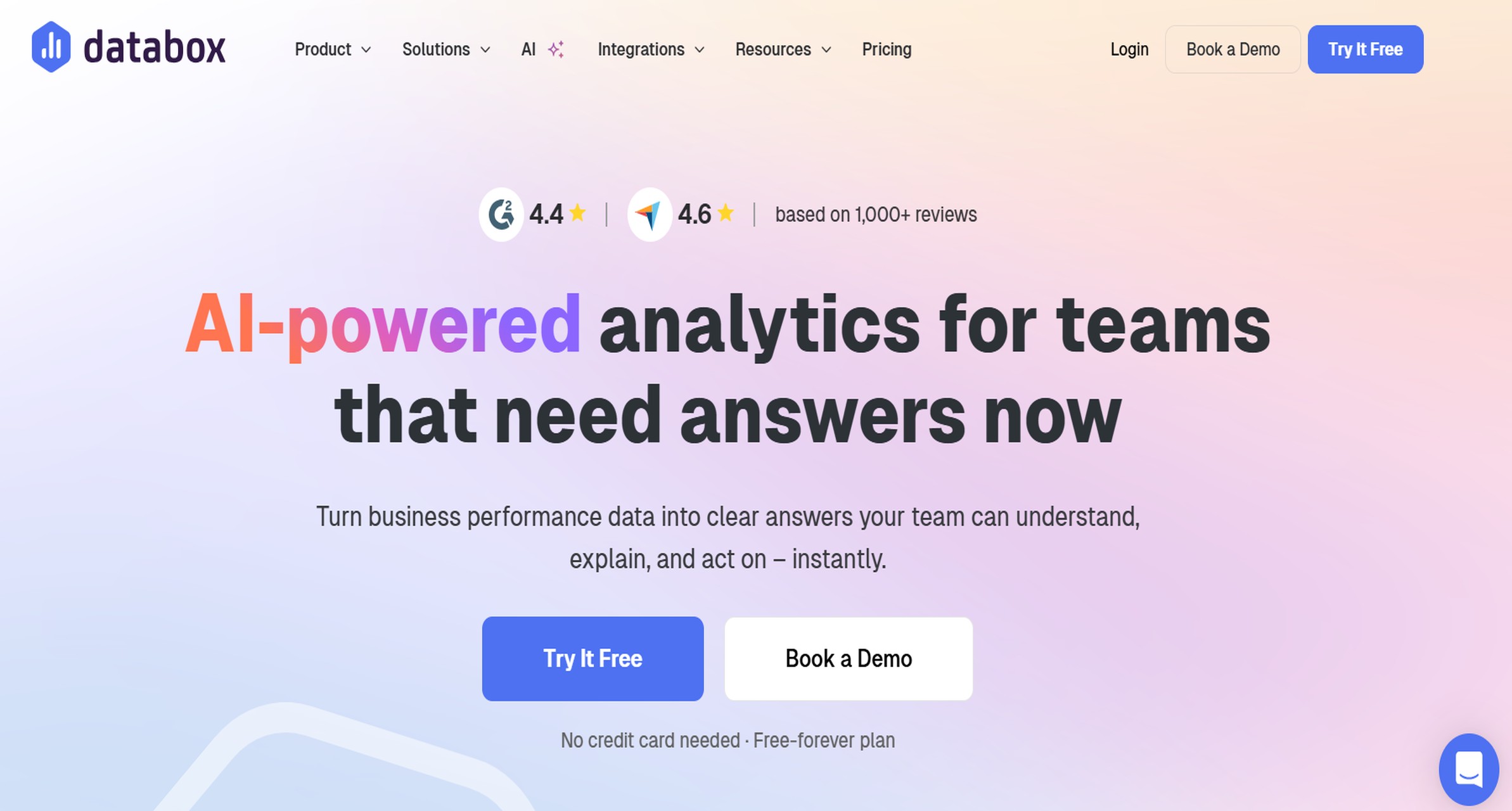
Databox is often chosen by marketing, sales, and SMB teams that want fast KPI visibility without a long implementation cycle. It is known for easy-to-build dashboards, prebuilt templates, and scorecards designed for quick business monitoring.
Its usability is a key advantage. Teams can often assemble dashboards quickly and share KPIs without a full BI project.
However, Databox is generally less suited to highly complex enterprise data environments or advanced governed reporting scenarios.
Best fit: SMBs and commercial teams that want speed, templates, and practical KPI visibility.
4. Klipfolio
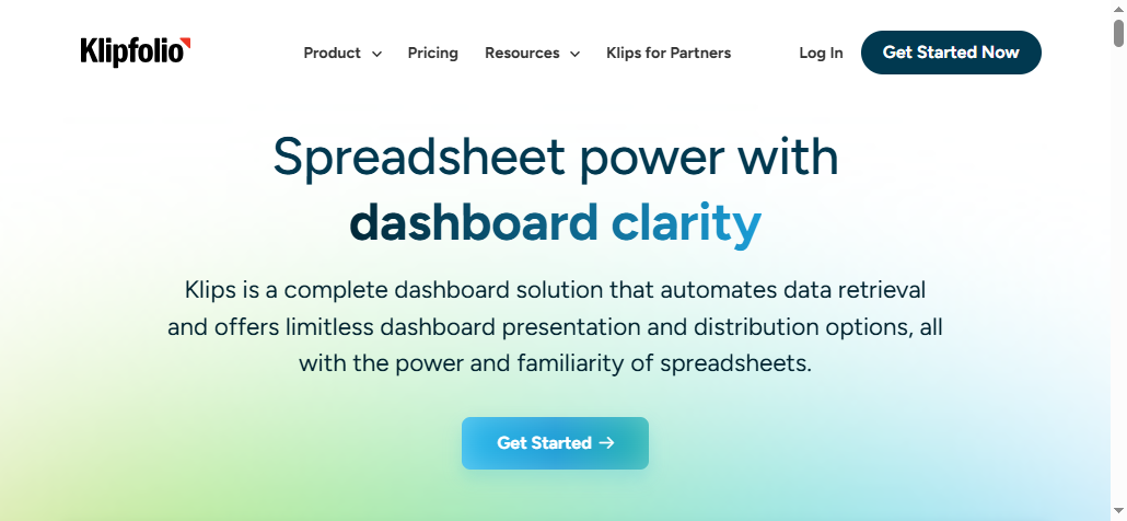
Klipfolio is a flexible KPI dashboard platform for teams that want customizable dashboards and live metric tracking. It is often used where businesses need to combine multiple data sources and shape dashboards around specific operational needs.
Its strength is flexibility. Teams that are comfortable configuring their own views may appreciate the control.
The downside is that setup can take longer than with simpler plug-and-play tools, especially for teams that want ready-made reporting experiences.
Best fit: Growing businesses and operations teams that want customizable KPI monitoring.
5. Geckoboard
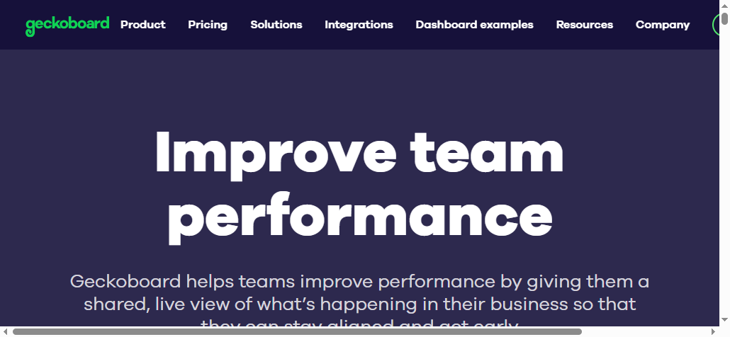
Geckoboard is designed for simple, real-time KPI visibility. It is frequently used for office displays, team performance boards, and operational metrics where clarity matters more than analytical depth.
It is easy to set up and effective for surfacing a small set of live metrics. That makes it appealing for support teams, sales floors, and operational environments.
But Geckoboard is more lightweight than a full BI or enterprise reporting platform, so it may not satisfy advanced analysis or formal reporting needs.
Best fit: Lean teams that want simple KPI dashboards and real-time display visibility.
6. Looker Studio
 Looker Studio is a budget-friendly option for teams that need shareable dashboards and basic reports. It is commonly used for marketing, website, and campaign performance reporting.
Its appeal comes from accessibility and low barrier to entry. For organizations that mainly need web and marketing reporting, it can be a practical choice.
Its limitations show up when teams need more advanced governed analytics, broad enterprise deployment, or sophisticated reporting workflows.
Best fit: Budget-conscious teams and marketing-focused reporting use cases.
7. Zoho Analytics
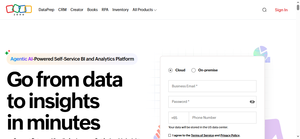 Zoho Analytics is often considered by growing businesses that want dashboards and reporting with broader business app connectivity. It offers a practical balance between affordability, automation, and reporting coverage.
For organizations already using Zoho applications, the platform can be especially convenient. It can support dashboard creation, recurring reporting, and growing reporting needs at a reasonable level of complexity.
Some advanced enterprise scenarios may require more customization or a more specialized analytics architecture.
Best fit: Growing businesses that want broader reporting without moving immediately to a heavyweight BI stack.
8. SimpleKPI
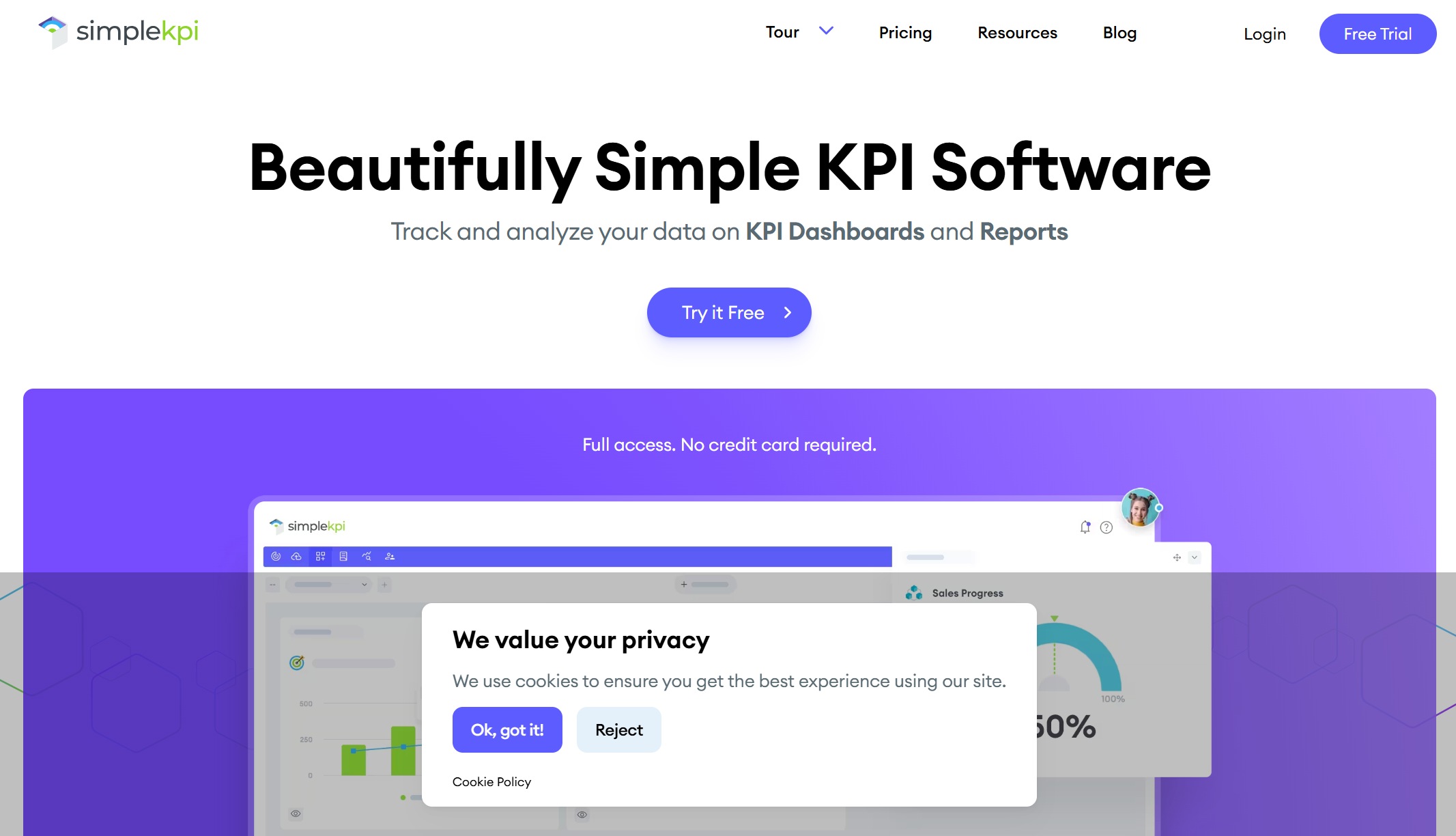 SimpleKPI focuses on straightforward KPI dashboards, reports, and scorecards. Its design is oriented toward quick setup and easier adoption by non-technical users.
That makes it attractive for companies that want a dedicated KPI management environment rather than a broad analytics platform. Scorecards, dashboards, and simple reporting are the core value.
The tradeoff is that it is generally less robust for complex analytics, data modeling, and enterprise-wide BI requirements than larger BI suites.
Best fit: Teams that prioritize simplicity and fast KPI adoption.
9. Domo
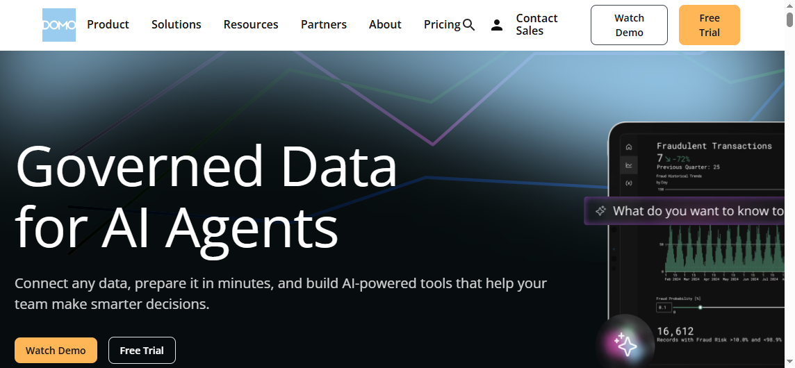 Domo is positioned for organizations that need broad integrations, large-scale reporting workflows, and operational visibility across many business functions. It combines dashboards, alerts, and collaboration-oriented data access.
Its strength is breadth. It can support large organizations that need many data sources, distributed reporting, and strong internal data visibility.
For smaller teams, premium pricing may be a barrier, and implementation can be more than what a lightweight KPI use case requires.
Best fit: Enterprises that want connected, organization-wide KPI visibility.
10. Sisense
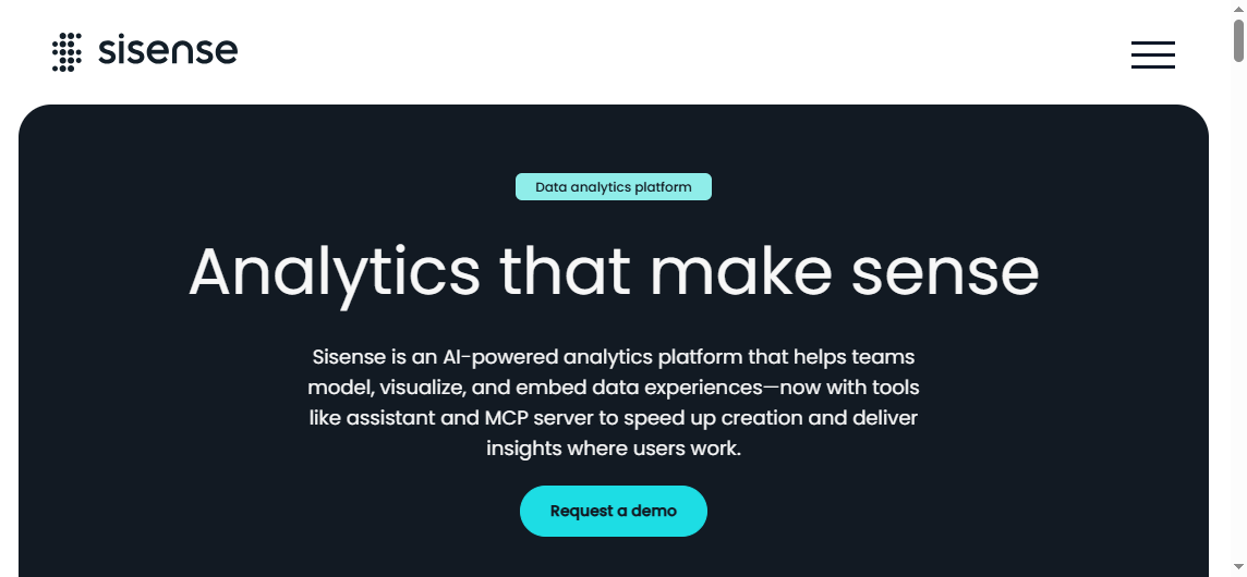 Sisense is often selected for embedded analytics and highly customized KPI reporting environments. Product teams and technically capable organizations may use it when KPI reporting must be integrated into applications or tailored deeply to specific user experiences.
Its strength lies in flexibility for embedded and customized analytics scenarios.
The tradeoff is that implementation may be more involved than with lightweight KPI dashboard tools, especially for teams without strong technical resources.
Best fit: Technical teams and organizations building embedded KPI analytics experiences.
Which KPI Reporting Tool Is Best for Different Use Cases?
No single tool is right for every organization. The better question is which platform matches your reporting maturity, technical resources, and stakeholder expectations.
Best for small businesses and lean teams
Small businesses and lean teams should usually prioritize:
- Fast setup
- Templates
- Easy sharing
- Affordable pricing
- Minimal admin overhead
In these scenarios, tools like Databox, Geckoboard, Looker Studio, and SimpleKPI are often practical starting points. They help teams move quickly without requiring a full BI program.
Best for enterprise reporting and governance
Enterprise environments typically need more than KPI tiles on a dashboard. They often require:
- Security and role-based permissions
- Scalable deployment
- Standardized metric definitions
- Cross-department reporting consistency
- Broad integration coverage
- More formal distribution workflows
Power BI, Tableau, Domo, and Sisense are more likely to fit these needs, depending on the organization’s analytics model and technical depth.
For companies that also need structured operational reporting, printable documents, scheduled reports, and report workflows alongside dashboards, a dedicated enterprise reporting platform may be necessary in addition to or instead of a dashboard-first BI tool.
Best for simple KPI tracking versus advanced analytics
If your main goal is simple visibility, a lightweight KPI platform is often enough. If your team needs to investigate root causes, explore trends across dimensions, or support forecasting and deeper analysis, a broader BI platform is usually the better fit.
A useful rule of thumb:
- Choose lightweight KPI software for quick scorecards and routine performance monitoring.
- Choose BI platforms for multi-source analytics, exploration, and enterprise data modeling.
- Choose enterprise reporting platforms when dashboards alone are not enough and your workflows depend on scheduled, formatted, or operational reports.
Practical Recommendations Before You Buy
Based on common reporting projects, here are five practical ways to choose the right KPI reporting software.
1. Start with reporting workflows, not just dashboard screenshots
Many buying decisions are influenced by attractive visual examples. But the real question is how your KPI reports will be used: in weekly meetings, operational reviews, executive packs, email distributions, or branch-level drill-down workflows.
2. Separate monitoring needs from analysis needs
A dashboard that shows KPI status is not the same as a reporting process that explains why performance changed. Some teams need both summary monitoring and structured follow-up reports.
3. Test stakeholder sharing early
Before committing, validate how executives, managers, and department users will actually consume the output. A platform may look strong in authoring mode but create friction in publishing, mobile access, or recurring delivery.
4. Evaluate governance before scale exposes weaknesses
Metric definitions, permissions, and standardized templates become more important as reporting spreads across departments. What works for one team may become inconsistent at enterprise scale.
5. Shortlist tools based on your next two years, not just today
Select a platform that fits your current use cases but can also support increased data volume, broader adoption, and more formal reporting requirements as the organization matures.
When Dashboard Tools Are Not Enough
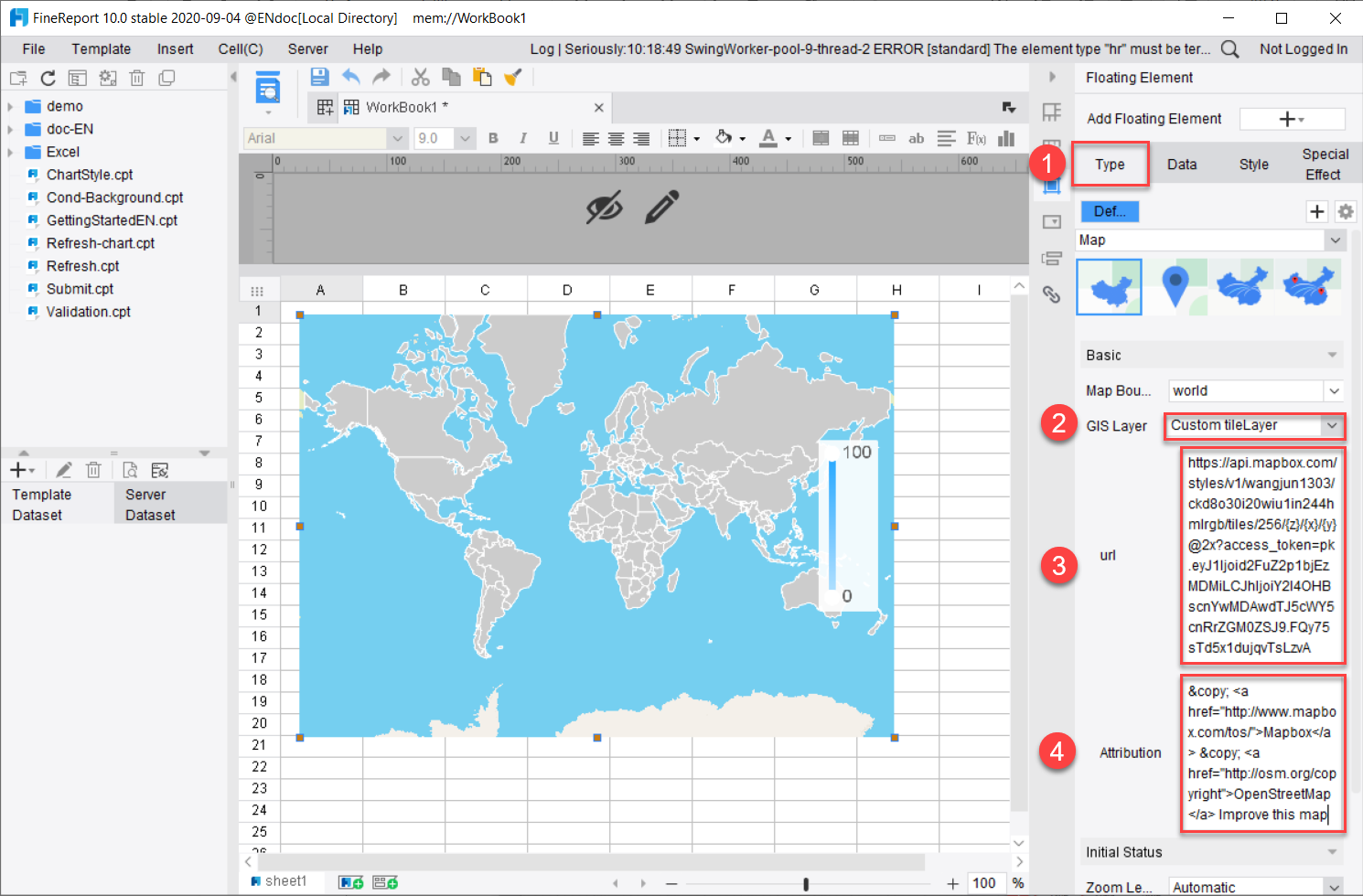
Tools like Tableau and Power BI are widely used for visualization and BI analysis, but teams with complex reporting workflows may also need a dedicated enterprise reporting platform like FineReport.
This is especially true when KPI reporting extends beyond interactive dashboards into operational and management reporting requirements such as:
- Pixel-perfect report layouts
- Paginated and printable reports
- Parameter-based queries
- Scheduled report generation and distribution
- Dashboard and report integration
- Data entry or form-based workflows
- Department-level operational reporting across finance, manufacturing, sales, logistics, or management
Dashboard-first platforms are often strong for visual exploration. But some organizations also need highly formatted reports that look consistent every time, support recurring distribution, and align with existing business processes.
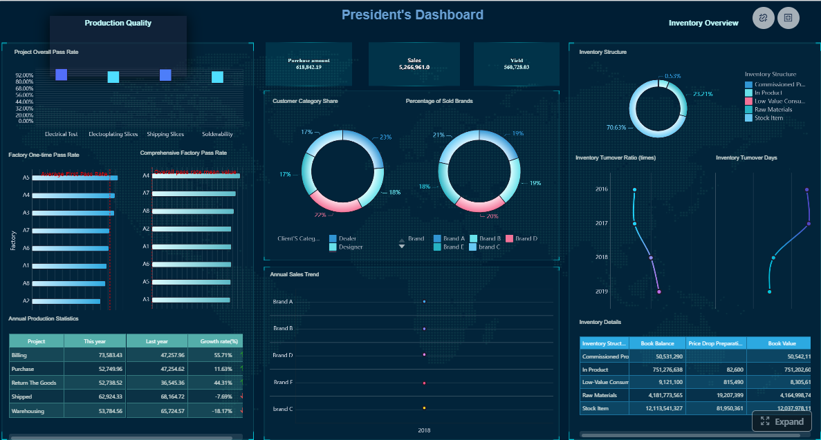
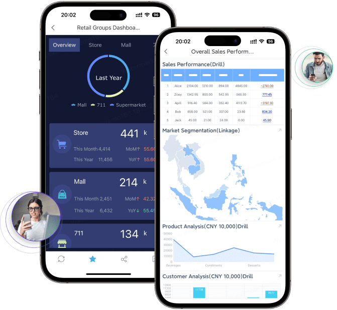
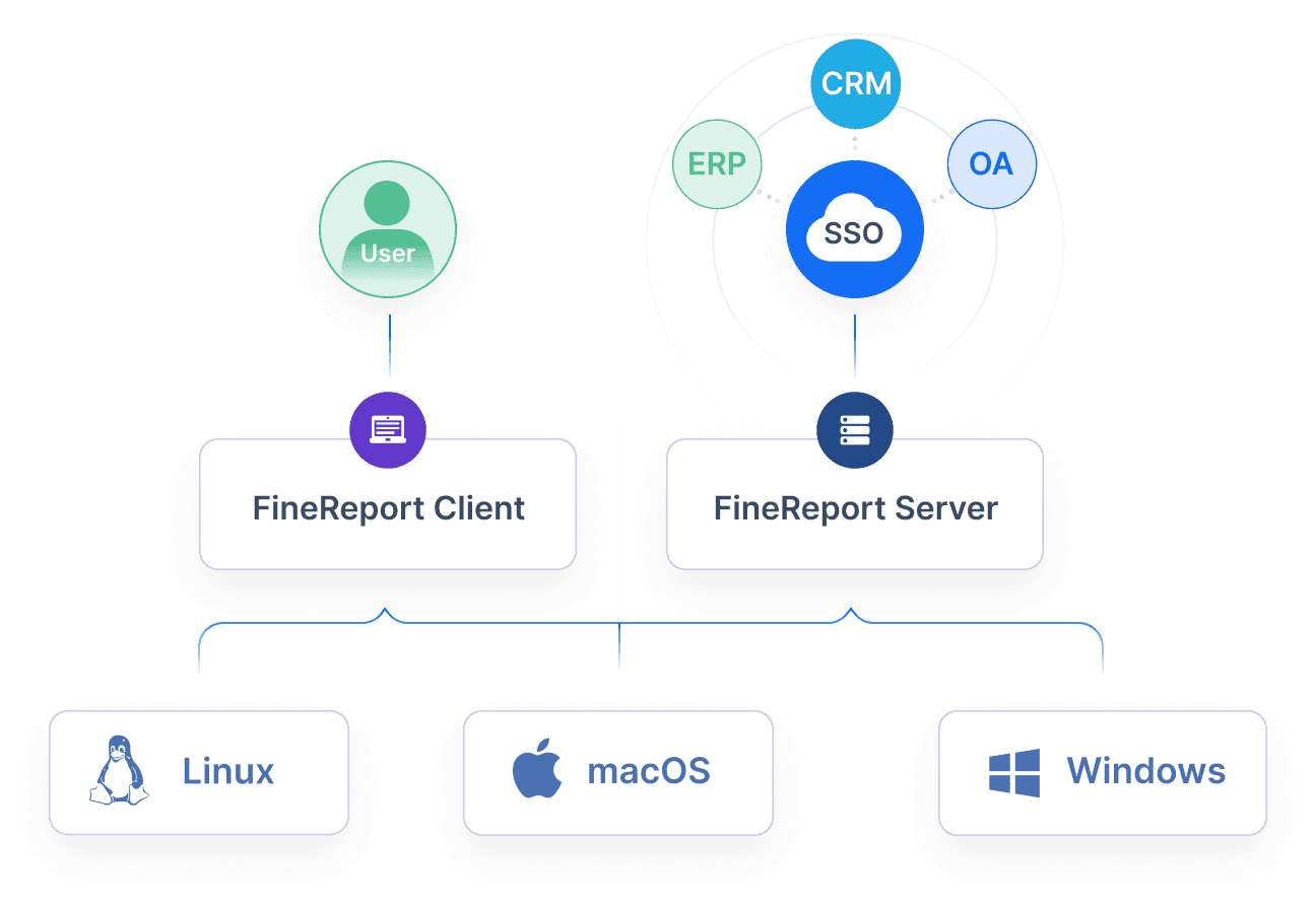
Where FineReport Fits in KPI Reporting Software
FineReport is best understood as an enterprise reporting and dashboard platform for organizations that need more than visual KPI charts. It supports dashboard creation, structured report design, parameter queries, scheduled distribution, and form-based workflows in one environment.
That makes it relevant for KPI reporting scenarios where teams need both management dashboards and formal business reports.
Practical use cases include:
- Executive KPI dashboards with linked detail reports
- Sales performance reports with parameter filtering by region, product, or manager
- Financial and operational reports that need printable, paginated layouts
- Manufacturing or logistics KPI reports that combine summary metrics with transactional detail
- Department workflows where users need to input or update information through forms
FineReport is particularly relevant for enterprises that want to unify dashboard visibility with standardized reporting output, rather than treating KPI dashboards and operational reports as separate projects.

Get Ready-to-Use Dashboard and Report Templates in Fine Gallery
Final Verdict: How to Pick the Best KPI Reporting Software
The best KPI reporting software for 2026 depends on what your organization actually needs to do with KPIs.
If your focus is simple, fast visibility for a small team, a lightweight dashboard tool may be enough. If you need governed analytics and interactive exploration, Power BI, Tableau, Domo, or Sisense may be a better fit. If your KPI workflows also require structured reports, scheduled distribution, printable output, and operational reporting, it is worth evaluating a platform like FineReport alongside dashboard-first BI tools.
A practical buying path looks like this:
- Match the tool to your reporting maturity and data complexity
- Shortlist two or three options based on integrations, usability, and reporting depth
- Test dashboards, drill-down workflows, scheduled reports, and stakeholder sharing before rollout
The goal is not just to track KPIs. It is to make performance information easier to trust, easier to share, and easier to act on.
FAQs
KPI reporting software helps businesses track key metrics, visualize performance in dashboards or scorecards, and share reports with stakeholders. It is commonly used to monitor progress toward goals and support faster decision-making.
Look for strong data connectivity, clear dashboards, drill-down analysis, scheduled reporting, target tracking, and role-based access. The best tools also make it easy to share reports securely across teams.
KPI dashboards are usually interactive and designed for at-a-glance monitoring of current performance. KPI reports are often more structured and are used to deliver recurring summaries, trends, and detailed analysis to stakeholders.
Start by identifying your audience, reporting workflow, and data sources. Then compare tools based on ease of use, reporting depth, scheduling, scalability, and how well they fit your team’s technical requirements.
Yes, most KPI reporting tools connect to common systems such as CRM, ERP, accounting platforms, spreadsheets, and cloud databases. Reliable integrations are important for keeping dashboards and reports accurate and up to date.


The Author
Yida Yin
FanRuan Industry Solutions Expert
Related Articles
12 Best KPI Reporting Tools for 2026: Compare Dashboarding, Automation, and Reporting Depth
If you are searching for the best KPI $1 , you are likely trying to solve a practical problem: how to track the metrics that matter, present them clearly, automate recurring updates, and turn performance data into decisi
Yida Yin
Jun 29, 2026

What Is Business Reporting? A Practical Guide for Executives, Analysts, and IT Teams
Business reporting is how organizations turn raw operational data into decisions, accountability, and follow up. For executives, it provides visibility into whether the business is on plan. For analysts, it creates a str
Yida Yin
Jun 28, 2026

ERP Reporting Explained: What It Is, How It Works, and Why Enterprise Teams Rely on It
ERP reporting is the process of turning data inside your enterprise resource planning system into usable business insight. For finance leaders, operations directors, supply chain managers, and IT teams, that matters beca
Yida Yin
Jun 25, 2026