Client dashboards are instrumental in optimizing business operations, enabling the transformation of raw data into actionable insights for quick, informed decision-making. Utilizing tools such as FineBI and FineReport, these dashboards allow for effective data visualization, highlighting patterns and trends that are critical for strategic planning but may otherwise remain hidden. A well-crafted client dashboard not only facilitates data-driven decisions but also aligns closely with key business objectives, ensuring that every strategic move is supported by precise and relevant data. By integrating these powerful tools, businesses can enhance operational efficiency and achieve superior outcomes, leveraging their data to its fullest potential.

Understanding Client Dashboard Needs
To construct a client dashboard that effectively drives results, a profound comprehension of your clients' specific needs is paramount. This process entails a meticulous examination of their business goals and the key metrics they prioritize. By customizing the dashboard to align with these precise requirements, it transforms into an indispensable tool for informed decision-making. This tailored approach not only boosts client satisfaction but also significantly enhances business performance, making it a cornerstone of strategic operations.
Customization Examples and Solutions
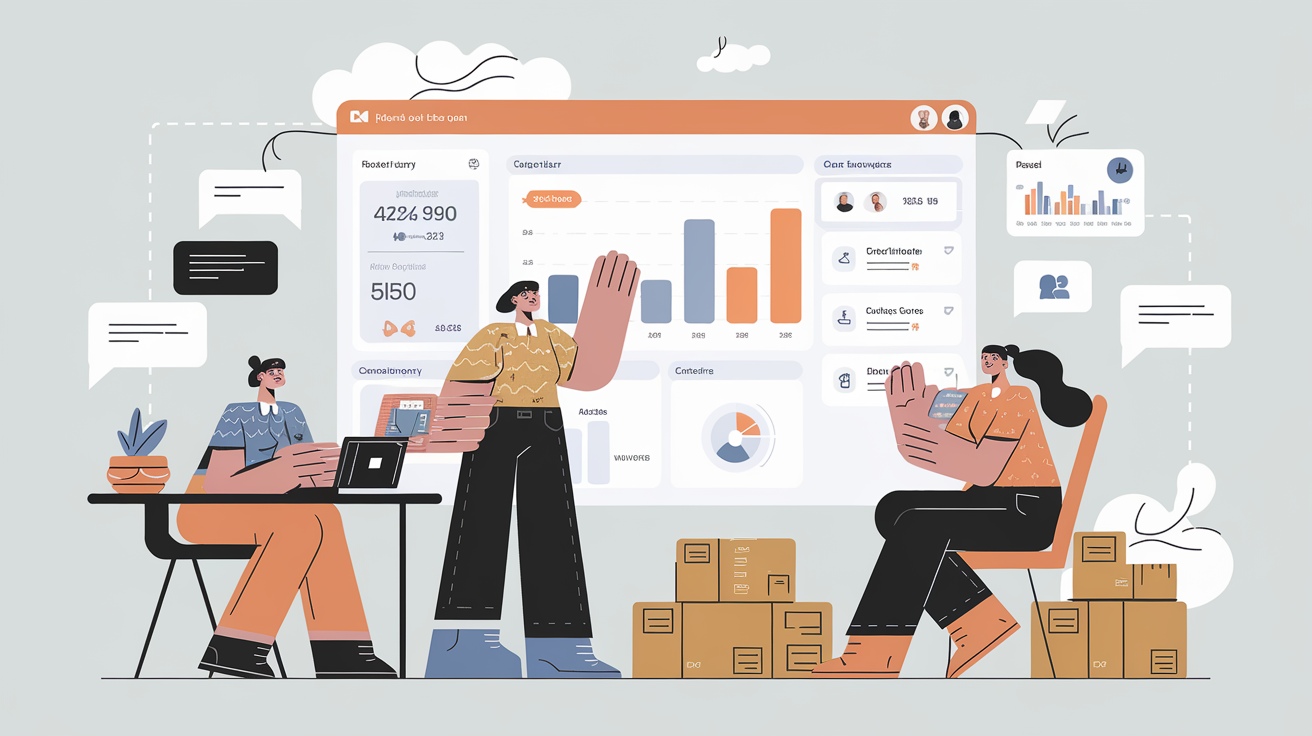
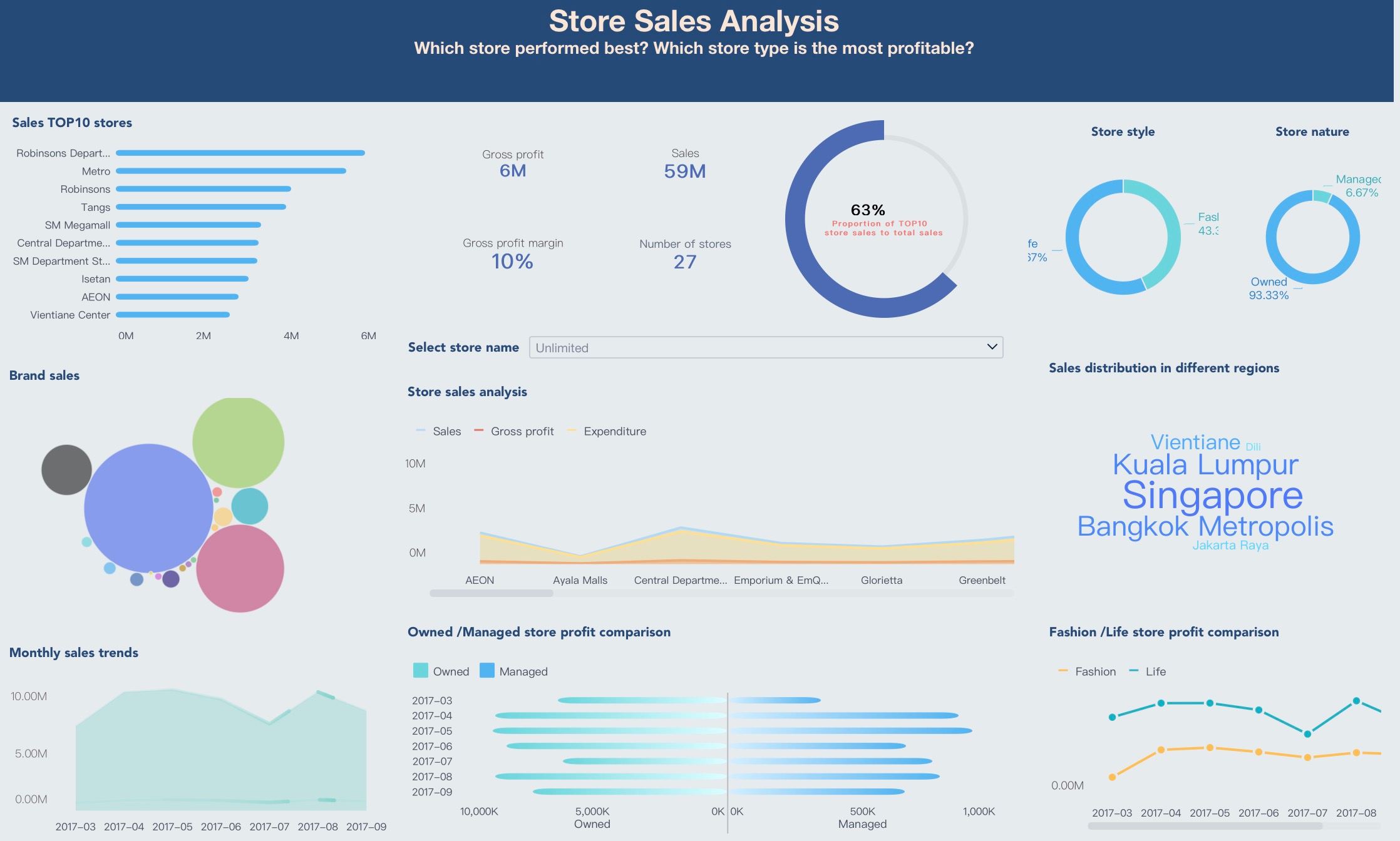
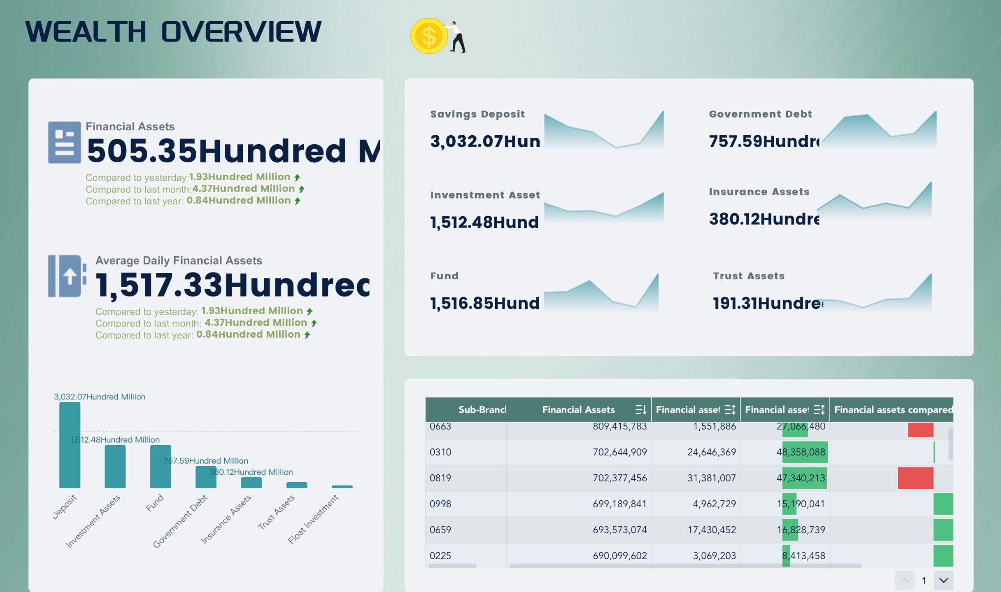
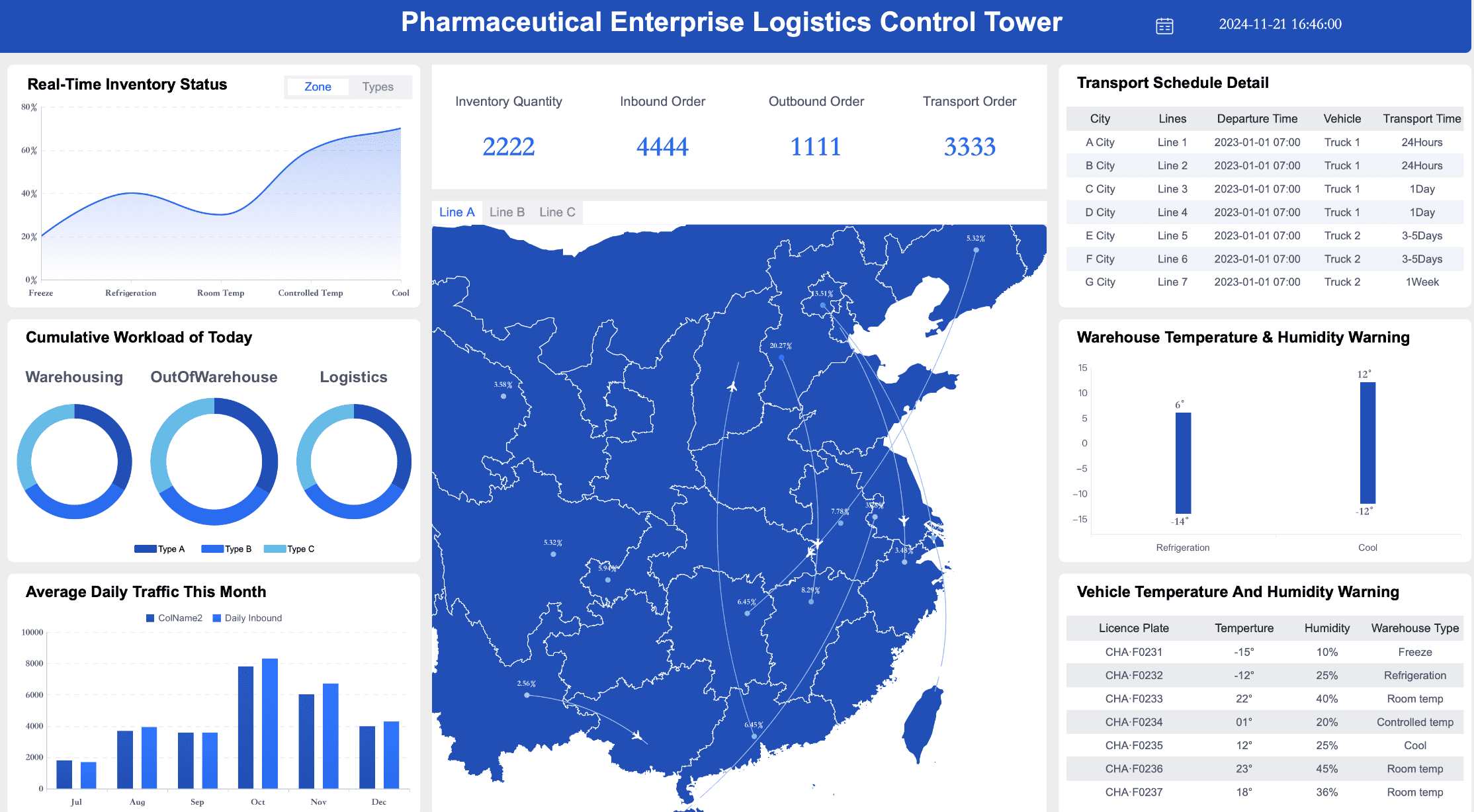
After understanding the basic needs our clients have from their dashboards, we delve deeper into showcasing how these solutions can be customized through specific examples. For instance, in a project with a retail client, the necessity to track daily sales, inventory levels, and customer satisfaction was clear. Utilizing the FineBI tool, we designed a multifunctional dashboard that not only displays these metrics in real-time but also highlights key trends and anomalies through color coding and dynamic charts. Additionally, we equipped the dashboard with interactive filters that allow the client to customize views by product category or time period, significantly enhancing the flexibility and speed of decision-making.
This tailored implementation enabled our client to monitor their business conditions more precisely and adjust their marketing strategies promptly, thus maintaining a competitive edge in a fierce market. This case not only demonstrates the practical application of customized dashboards but also underscores the importance of deeply understanding the unique needs of each client.
Next, in the "Conducting Client Interviews" section, we will discuss how direct client conversations can refine dashboard designs to better meet specific business objectives. This continuous dialogue ensures that dashboards evolve with client needs, essential for their long-term success.
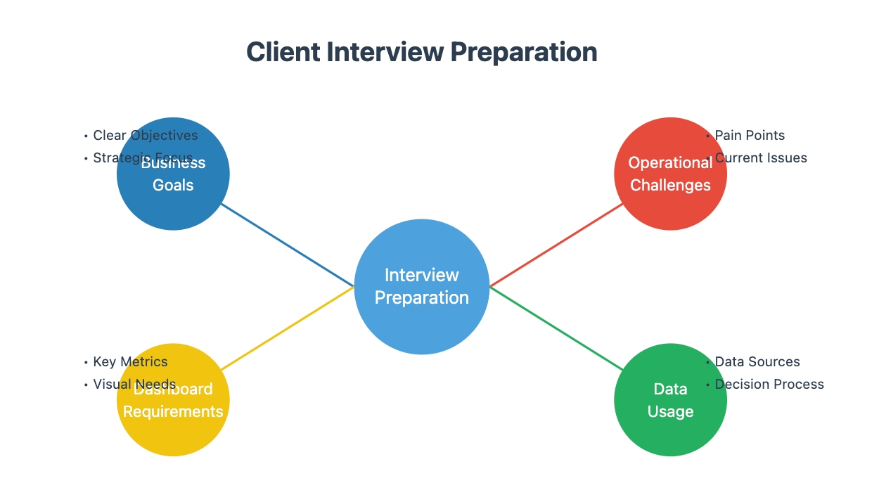
Conducting Client Interviews
Crafting a client dashboard that yields tangible outcomes necessitates a profound understanding of your clients' unique requirements. This process begins with meticulous business needs analysis and an in-depth exploration of the metrics that are most critical to their objectives. By customizing the dashboard to align with these specific needs, it transforms into an indispensable tool for strategic decision-making, significantly enhancing both client satisfaction and business efficacy.
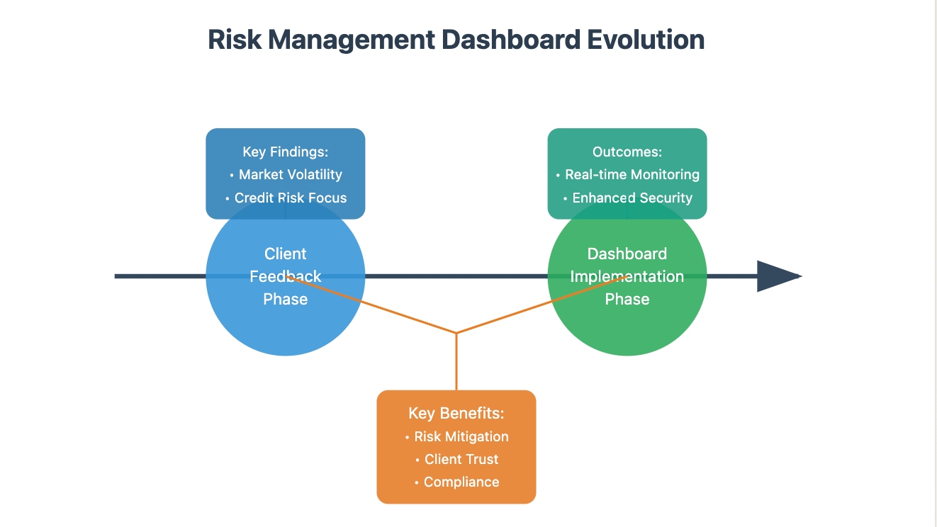
Take, for example, a financial services company that leveraged client feedback to refine their risk management dashboard. The interviews revealed a critical need for real-time monitoring of market volatility and credit risk. In response, the dashboard was tailored to integrate these specific metrics, providing the company with the ability to dynamically assess and respond to potential financial threats. This proactive approach not only bolstered their risk mitigation strategies but also fortified client trust and compliance with regulatory standards.
By attentively listening to client feedback and systematically analyzing business requirements, the dashboard becomes more than just a reporting tool—it evolves into a dynamic platform that supports informed decisions, driving substantial improvements in operational efficiency and strategic foresight.
Preparing Questions
To ensure the effectiveness of client interviews, it is imperative to meticulously prepare a tailored set of questions. These questions should aim to uncover the specific business goals of the client, the challenges they face in their operations, and how they currently utilize data to drive decisions. This preparation is crucial for gathering data that is both relevant and actionable, supporting the creation of a client dashboard that truly aligns with their needs.
For those looking to streamline the process, you can refer to the interview question template below. This template serves as a customizable foundation to help you dive deep into the specifics of your client's business metrics and operations. By focusing on these targeted areas during the interview preparation, you can ensure that the insights you gather will significantly impact the development and effectiveness of the resulting business dashboard.
Analyzing Responses
Upon completing the client interviews, it is crucial to undertake a meticulous analysis of the responses to distill essential themes and pinpoint specific requirements. This process involves identifying patterns that reveal both broad needs and unique specifications which could significantly impact the design of the dashboard. For example, a healthcare provider used feedback to enhance their client dashboard. Analysts noticed a recurring request for real-time patient data, leading to the integration of live health statistics, which improved patient monitoring and healthcare delivery.
A structured framework to convert this feedback into actionable dashboard inputs might be referenced from the following infographic:
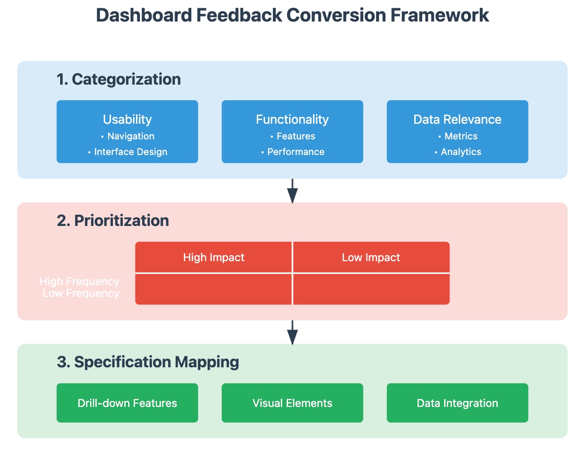
This rigorous approach ensures that the dashboard not only aligns with client expectations but actively supports their strategic objectives. Ultimately, such detailed attention to data analysis and responsiveness to client needs facilitates the crafting of a dashboard that drives improved outcomes and richer insights.
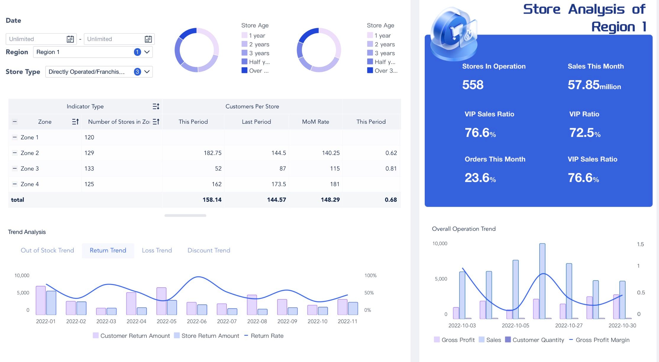
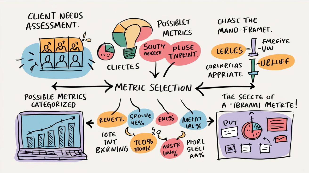
Identifying Key Metrics of Client Dashboard
After gaining a solid understanding of your clients' needs, the next crucial step involves meticulously identifying the key metrics that will drive the client dashboard. These metrics, pivotal in reflecting the client's business objectives, must also furnish actionable insights that bolster informed decision-making processes. To facilitate this, integrating a diagrammatic representation of the metric identification and categorization process can be highly instructive.
For instance, an e-commerce platform striving to enhance its conversion rates. By analyzing user behavior metrics such as page visit durations, cart abandonment rates, and click-through rates on product recommendations, the dashboard can illuminate patterns that pinpoint opportunities for optimization. Through strategic adjustments—like optimizing checkout processes or personalizing product displays—businesses can transform these insights into tangible enhancements in customer engagement and sales figures. This example illustrates the profound impact that well-chosen metrics can have on steering business strategies and refining operational tactics in real-time.
Aligning Metrics with Business Goals
Aligning dashboard metrics with a client's overarching business goals is crucial for driving strategic decisions. For example, a marketing firm focused on optimizing advertising return on investment (ROI). By pinpointing KPIs such as the click-through rate (CTR), cost per acquisition (CPA), and the overall conversion rate, the dashboard can provide insightful data that directly impacts budget allocations and campaign strategies. For a visual breakdown of how these metrics can enhance advertising ROI, see the infographic below.
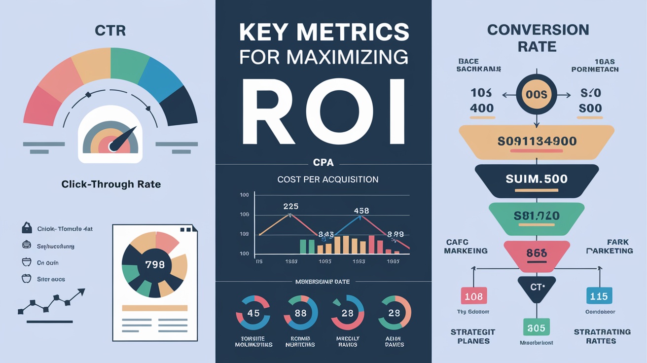
This precise alignment of metrics with business objectives ensures the dashboard’s relevance and utility, enabling the firm to monitor campaign effectiveness and make informed adjustments. By keeping these metrics in focus, the company not only tracks progress effectively but also enhances its strategic decision-making process, ensuring that every marketing euro spent is an investment towards achieving desired business outcomes.
Prioritizing Critical Data Points
Understanding the significance of each data point is crucial for crafting an effective dashboard. It's essential to focus on data that offers the most substantial value to the client, prioritizing metrics that directly influence their strategic objectives. For instance, incorporating visual examples of data filtering and priority settings can vividly demonstrate how to streamline data for clarity and impact. This selective visualization helps in emphasizing key data points, thus avoiding the clutter of non-essential information.
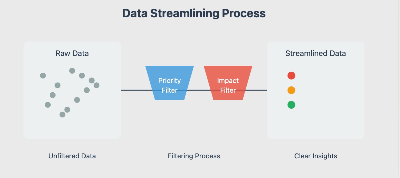
Moreover, considering the frequency of updates and the granularity needed for each metric is pivotal. By honing in on the most critical data, the dashboard not only prevents information overload but also boosts its practical utility, ensuring it serves as a robust tool for the clients. This targeted approach allows clients to swiftly identify trends, assess performance against their goals, and make informed decisions. Effective data prioritization directly aligns with enhanced decision-making and can lead to significant improvements in business outcomes. Through strategic data management, dashboards transform from mere reporting tools to essential instruments of business intelligence.
Ensuring Actionability
To ensure each metric on your dashboard is actionable, it is crucial to design them so they directly inform strategic decisions and operational adjustments. Actionable metrics must serve as more than mere data points; they should act as clear indicators for specific actions. For instance, if a metric reveals a drop in weekly sales, it should prompt an immediate review of marketing strategies or customer engagement approaches. This practice of aligning metrics with specific business actions facilitates real-time response to business dynamics, enhancing overall efficiency.
Moreover, incorporate strategic decision support throughout your dashboard by linking each metric to overarching business goals. For example, if increasing customer retention is a goal, a metric to monitor could be the rate of repeat customer purchases. By observing this metric, businesses can quickly gauge the effectiveness of loyalty programs and tailor their marketing efforts accordingly. This approach not only ensures that each piece of data is utilised but also that it contributes to a dynamic strategy of continuous improvement and business growth.
Emphasizing actionable metrics and strategic decision support turns your client dashboard from a static collection of figures into a vital tool that actively shapes business strategy and operational tactics.
Choosing the Right Client Dashboard Tools
Selecting the right tools for your client dashboard is paramount to effective data visualization and interpretation, playing a crucial role in enhancing both the user experience and the decision-making processes. The ideal software not only improves how data is viewed and understood but also integrates seamlessly into your business operations, making it indispensable for informed decision-making. This part will delve into the various tools available, comparing their strengths and weaknesses, and providing guidance on choosing the software best suited to specific business needs. We aim to equip you with the knowledge to make an informed choice that aligns perfectly with your strategic objectives.
Client Dashboard Software Options
When evaluating software options, consider the features and capabilities that best align with your specific needs. Each tool offers distinct advantages, catering to various use cases and user preferences.
Comparison of Popular Tools
- Looker Studio: Designed for integration within the Google ecosystem, Looker Studio allows for extensive customization and is available for free. Its seamless compatibility with other Google services makes it a versatile option, ideal for teams already using Google tools.
- FineBI: Renowned for its pixel-perfect visualizations, FineBI ensures high data quality and powerful analytics capabilities. However, it may be challenging for non-technical users due to its complex interface. Nonetheless, its depth of functionality makes it a favorite among data professionals.
- Qlik Sense: This tool excels in enabling complex calculations and offers flexibility in data analysis. Qlik Sense is particularly suited for users seeking detailed insights and those comfortable with more advanced analytical tasks.
- Geckoboard: With its user-friendly interface, Geckoboard is perfect for users who prioritize simplicity and ease of navigation. While it may lack some advanced features found in other BI tools, its straightforward design makes it accessible for users of all skill levels.

When comparing popular dashboard tools like Looker Studio and FineBI, it’s essential to assess their fit for specific business requirements. Looker Studio is well-suited for teams already using Google services, offering seamless integration and customization. Its main limitation is in handling more complex, data-intensive analytics tasks.
FineBI, on the other hand, excels with its superior data visualization capabilities and robust analytics. It is ideal for industries that rely heavily on detailed and precise data analysis. FineBI’s strengths in creating pixel-perfect visualizations and providing powerful analytical tools make it an invaluable asset for businesses aiming to leverage detailed insights for strategic decision-making. Thus, FineBI stands out as a preferred option for organizations seeking to advance their data-driven capabilities significantly.
Exploring No-code/Low-code Dashboard Tools
In today's data-driven landscape, the emergence of no-code/low-code dashboard tools marks a significant evolution in how businesses approach data analytics. These tools cater to professionals at all technical levels, enabling them to craft comprehensive dashboards with minimal coding expertise.
Microsoft Power BI: This tool is particularly beneficial for those entrenched in the Microsoft ecosystem, offering advanced integration with other Microsoft services, which streamlines processes and enhances productivity. It is ideal for organizations looking to leverage existing Microsoft-based infrastructure.
Tableau: This tool is differentiates itself with superior data visualization capabilities. Its strength lies in transforming complex datasets into intuitive and visually engaging graphics, making it a favorite among users who prioritize detailed, insightful visualizations to drive decision-making.
Google Data Studio: This tool excels in its ability to handle large volumes of data and its integration with Google's analytics and advertising tools, making it especially useful for marketing professionals who rely heavily on Google's services for digital marketing insights.
These platforms not only simplify the process of data analysis but also empower users to customize their data interaction, ensuring that businesses of all sizes can leverage powerful insights to make informed decisions quickly and efficiently.
Cost vs. Features Analysis
When evaluating software options, it’s essential to balance cost with features. Some tools, like Looker Studio, provide free access but may lack advanced functionalities. In contrast, others like Tableau offer extensive capabilities at a higher price point. Assess your budget alongside the specific needs of your dashboard, prioritizing tools that deliver the best value for your investment. By choosing the right software, you can create a client dashboard that not only meets functional requirements but also enhances the overall data-driven experience for your clients.
Integration with Existing Systems
Seamless integration is crucial in enhancing business workflows and improving decision quality. By ensuring that your chosen software integrates effortlessly with existing systems, you boost operational efficiency and data reliability. This integration facilitates quick, informed decision-making and reduces manual data handling errors, enhancing overall functionality. Utilizing keywords like 'integration,' 'efficiency,' and 'functionality' also optimizes visibility in European search engines, aligning with regional search behaviors.
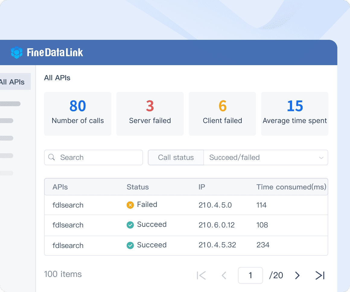
API Compatibility
One of the key factors to consider is whether the software supports API integration. This capability allows you to connect various data sources with ease, ensuring that your dashboard reflects real-time information. By facilitating seamless data flow, API compatibility enhances the dashboard's reliability and empowers users to make informed decisions based on up-to-date insights.
Data Security Considerations
Data security must be a top priority when selecting dashboard tools. Opt for software that offers robust security features, including encryption protocols and access controls. These measures are essential for protecting sensitive information and maintaining client trust. By prioritizing security, you safeguard your data against breaches and ensure compliance with data protection regulations, thereby reinforcing your commitment to data integrity and privacy.
User Permissions and Access Management
Additionally, consider the importance of user permissions and access management within the software. A well-designed dashboard tool should allow you to define roles and permissions for different users, ensuring that sensitive data is accessible only to authorized personnel. This not only enhances security but also streamlines collaboration by providing team members with the information they need while protecting confidential data.
By focusing on integration capabilities and robust security measures, you can create a client dashboard that not only meets functional requirements but also fosters a secure and trustworthy environment for data-driven decision-making.
Designing the User Interface of Client Dashboard
Designing an effective client dashboard interface requires careful planning and strategic execution. This part offers specific solutions to enhance usability and data visualization, ensuring that users can effortlessly navigate and interact with your dashboard. We'll explore advanced visualization techniques, responsive design, and interactive elements to engage users actively. These insights will help you create a visually appealing and functional dashboard, tailored for the European market, enhancing user experience with best practices in client dashboard user interface design.
Layout and Navigation of Client Dashboard
Intuitive Design Principles
When designing the layout, it’s essential to adhere to intuitive design principles. Arrange elements in a logical flow that guides users naturally through the dashboard. Use clear, descriptive labels and recognizable icons to help users quickly understand the functions of each component. Emphasizing simplicity and consistency is vital; a clean, uniform design not only enhances the user experience but also conveys professionalism. To enhance understanding, a visual example has been included below this paragraph, demonstrating how effectively organizing elements can improve the user experience.
To avoid clutter, prioritize displaying essential information prominently. This strategic focus allows users to locate what they need without confusion, promoting a smooth navigation experience. Consider using whitespace effectively to separate different sections, which can further enhance clarity and focus.
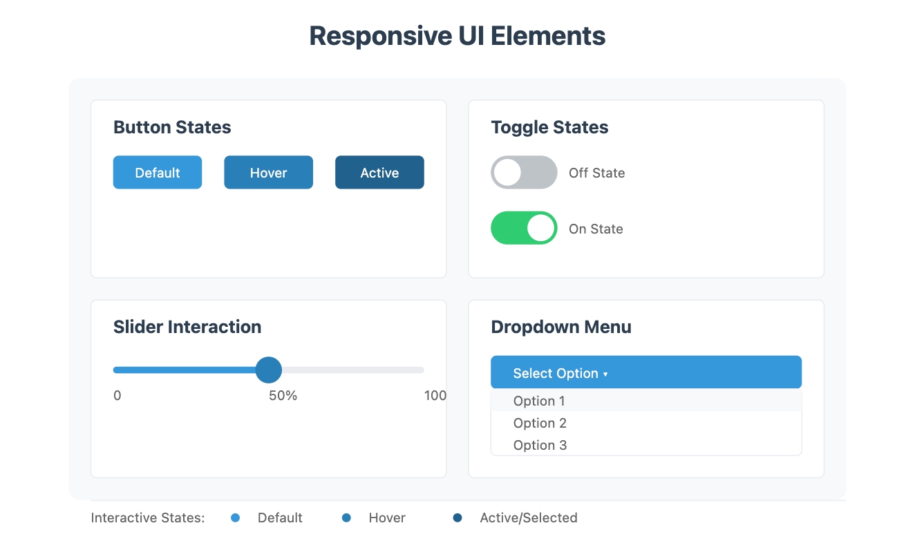
To further enhance user intuition, implementing a UI design that responds to user actions is essential. For instance, interface elements can dynamically change—such as buttons altering color upon being clicked, or sliders reacting to user drags—providing immediate feedback. (Please view the specific results in the chart below.)This interaction not only heightens user engagement but also clearly communicates the effect of their actions in real-time, helping users quickly grasp how their operations impact data presentation. Such design not only ensures intuitiveness but also adds an element of fun and educational value, making the dashboard more user-friendly and effective.
User Testing and Feedback
User Testing and Feedback play pivotal roles in the iterative process of dashboard refinement. We set up a controlled environment where real users interacted with the dashboard under typical usage scenarios. Their navigation behaviors were closely monitored, and particular attention was paid to any obstacles or confusion they faced. This hands-on approach was invaluable in uncovering latent usability issues that were not initially evident during the design phase.
Following the testing, we actively solicited detailed feedback from the participants, pinpointing specific areas that needed improvement. This feedback was essential, as it directly influenced the subsequent revisions, enhancing both usability and user satisfaction. We implemented changes that made the interface more intuitive and user-friendly, based on this targeted feedback.
Moreover, we established a continuous feedback loop, encouraging users to provide ongoing input about their dashboard experience. This constant flow of feedback ensures that the dashboard not only meets but adapts to the evolving needs of its users, fostering a sense of ownership and engagement with the tool.
By integrating rigorous user testing and a robust feedback mechanism, we create a client dashboard that is not only aesthetically pleasing but also highly functional and adaptive. This approach ultimately leads to a more effective tool for data-driven decision-making, tailored specifically to meet the needs of its users in a dynamic business environment.
Visualizing Data Effectively
Choosing the Right Charts
Data visualization is a critical component of effective dashboard design, allowing complex information to be presented in a clear and engaging manner. Selecting the right charts is essential for accurately conveying data and insights. Different types of charts serve distinct purposes: for instance, bar charts are ideal for making comparisons between categories, while line charts effectively illustrate trends over time. When choosing charts, ensure they align with the nature of the data and the specific insights you aim to communicate. This thoughtful approach not only enhances usability but also makes the information more accessible and easier to interpret for users.
Dynamic charts significantly enhance user engagement by enabling deeper interaction with data directly within client dashboards. By integrating hover-over tooltips, users can access detailed data points such as exact figures and contextual insights without visual clutter. Additionally, clickable elements within the charts allow for an expanded view and deeper analysis of the metrics of interest. These interactive features not only make the dashboard more engaging but also empower users with better decision-making capabilities by facilitating a personalized and insightful data exploration experience.
Color Schemes and Accessibility
Color is a powerful tool in data visualization that can significantly impact readability and user engagement. Selecting appropriate color schemes is crucial; use contrasting colors to draw attention to key data points and enhance visual clarity. Additionally, it's important to consider users with color vision deficiencies. Incorporating accessibility features, such as color-blind friendly palettes, ensures that your dashboard reaches a wider audience and that all users can interact with the data effectively. By prioritizing both aesthetic appeal and functionality, you create a dashboard that is not only visually striking but also inclusive and user-friendly.
Integrating Interactive Elements
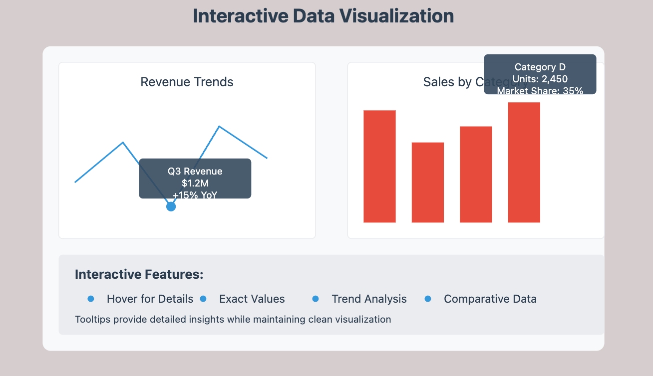
Incorporating interactive elements such as tooltips, filters, and clickable segments can significantly boost the effectiveness of your data visualizations. These features enable users to delve deeper into the data, allowing for a more personalized analysis based on their specific interests and needs. For example, tooltips can provide additional details when users hover over data points, enhancing their understanding without cluttering the visual presentation. Similarly, filters empower users to customize views according to various criteria, such as time periods or demographic segments, making the dashboard more relevant and engaging. For specific examples, please refer to the image below the paragraph.
Moreover, interactive elements like drill-down capabilities allow users to explore underlying data right within the same interface. This seamless interaction not only keeps the user engaged but also encourages exploratory analysis, which is crucial for discovering hidden insights. By thoughtfully integrating these interactive features with well-chosen charts and appropriate color schemes, the dashboard transforms into a dynamic and intuitive tool. This not only enhances the user experience but also supports more informed and confident decision-making, thereby increasing the overall impact of your dashboard in driving strategic business actions.
Enhancing User Experience Through Interactive Dashboard Features
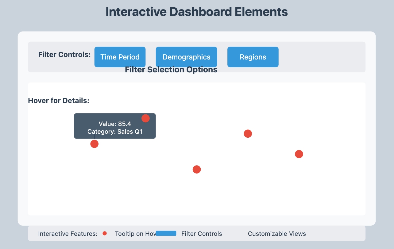
To elevate the utility and user engagement of dashboards, integrating interactive features is essential. Elements such as dynamic filters, drill-down capabilities, and tooltips significantly enhance the user experience and data interpretability.
Dynamic filters allow users to customize their data views in real-time, focusing on what’s most relevant to their specific needs. This flexibility ensures that users are not overwhelmed by extraneous information, allowing them to concentrate on key metrics that drive their decisions.
Drill-down features enable users to explore deeper layers of data directly from the dashboard. By clicking on specific elements, users can uncover detailed insights hidden within aggregated data, facilitating a more thorough analysis and understanding of trends.
Tooltips provide instant, contextual information as users hover over data points. This immediate access to detailed data helps clarify complex charts and supports quicker, more informed decision-making without the need to navigate away from the dashboard.
Incorporating these interactive tools not only makes the dashboard more engaging but also empowers users to tailor their analytical experience. By improving how users interact with and customize their data exploration, dashboards become not only more functional but also inherently more valuable to their daily operations.
Implementing Best Practices of Client Dashboard
Adopting best practices in your client dashboard design is essential for delivering accurate data and providing an exceptional user experience. By prioritizing data accuracy and fostering user engagement, you can create a dashboard that effectively meets your clients' needs and expectations.
Ensuring Data Accuracy in Client Dashboard
Accurate data is the foundation of any successful client dashboard. It is imperative to ensure that the information displayed is both current and correct, as this directly impacts decision-making and client trust.
Real-time Data Updates
Real-time data updates are essential for maintaining the relevance and accuracy of your client dashboard. Selecting tools like Looker Studio or FineBI, which support real-time data feeds, guarantees that users always access the most current information. This capability not only boosts decision-making but also builds trust among clients who rely on timely data to guide their decisions. Immediate insights allow clients to react quickly to changing circumstances, transforming your dashboard into a critical component of their strategic toolkit.
Error Checking Mechanisms
To prevent inaccuracies, integrating robust error-checking mechanisms within your client dashboard is vital. Opt for tools that feature automated checks to regularly identify and correct data discrepancies. For instance, platforms like Qlik Sense and Geckoboard provide extensive error-checking features that ensure the integrity of the data presented. These safeguards enhance the reliability of your dashboard, instilling confidence in the users regarding the accuracy of the data they rely on. Prioritizing data integrity not only elevates the dashboard's credibility but also its overall utility for clients.
Tool Selection for Enhanced Data Accuracy
When choosing a dashboard tool, consider those that offer comprehensive functionalities for real-time updates and data validation. Tools such as FineBI are renowned for their advanced data processing capabilities, including real-time updates and sophisticated error detection algorithms, which are critical for maintaining data accuracy. Additionally, the ease of integrating these tools with existing IT ecosystems without extensive coding makes them ideal for dynamic business environments.
User-Centric Design Principles
Beyond ensuring data accuracy, emphasizing user-centric design principles is imperative. Designing an intuitive interface facilitates easy navigation, enabling users to find necessary information effortlessly. Involving clients in the design process through iterative feedback helps pinpoint specific needs and preferences, further refining the user experience.
By integrating these advanced tool functionalities with meticulous design and user engagement, your client dashboard not only meets but surpasses expectations, driving enhanced success for both your organization and your clients.
Enhancing User Experience of Client Dashboard
A positive user experience is crucial for the success of your client dashboard. By prioritizing customization and responsiveness, you can create an interface that users find intuitive, engaging, and aligned with their specific needs.
Customization Options
Customization options empower users to tailor the client dashboard to their individual preferences and requirements. Allowing users to modify layouts, select their preferred data views, and set personalized alerts fosters a sense of ownership and relevance. This flexibility not only enhances user satisfaction but also encourages deeper engagement with the dashboard. By providing various customization features, you ensure that the dashboard can adapt to the diverse needs of its users, making it a more valuable tool for decision-making.
Responsive Design for Mobile
With the growing reliance on mobile devices, implementing a responsive design is essential for your client dashboard. Ensure that the dashboard adapts seamlessly to different screen sizes and orientations, providing an optimal viewing experience regardless of the device. A mobile-friendly design enables users to access data on the go, enhancing convenience and accessibility. By prioritizing mobile responsiveness, you cater to a wider audience and improve the overall user experience, allowing clients to engage with their data anytime, anywhere.
User Feedback and Iteration
In addition to customization and responsiveness, actively seeking user feedback is vital for continuous improvement. Conduct regular surveys or usability tests to gather insights on user experiences and preferences. This feedback loop enables you to identify areas for enhancement and implement changes that resonate with users. By fostering an iterative design process, you can refine the dashboard to better meet user expectations and adapt to evolving needs.
By focusing on these key elements—customization, responsiveness, and user feedback—you can significantly enhance the user experience of your client dashboard, ensuring it remains a powerful and indispensable tool for your clients.
Leveraging No-Code/Low-Code Tools to Enhance User Experience
To further enhance the user experience of client dashboards, selecting no-code/low-code tools can be incredibly beneficial. These tools simplify the dashboard creation and maintenance process, making it accessible for users without extensive technical expertise. Platforms like Microsoft Power BI, Tableau, and Zapier offer intuitive drag-and-drop interfaces that empower users to customize their dashboards effectively. By utilizing these user-friendly tools, clients can easily modify layouts, adjust data visualizations, and update metrics to reflect real-time changes without the need for complex coding.
Moreover, no-code/low-code solutions accelerate the deployment of dashboards, enabling businesses to respond quickly to evolving market dynamics and internal feedback loops. This adaptability ensures that dashboards remain highly relevant and continuously aligned with strategic business objectives. Additionally, these tools often come with pre-built templates and integrations that further reduce the time and effort required to launch functional and aesthetically pleasing dashboards.

Incorporating no-code/low-code platforms not only streamlines the development process but also enhances the overall engagement by providing a seamless user experience. As these tools evolve, they continue to offer more advanced features such as AI-driven analytics and automated data insights, making them indispensable for businesses looking to harness the full potential of data-driven decision-making. Therefore, when designing client dashboards, consider the immense value these tools bring in empowering users and driving operational efficiency.
Testing and Iteration of Client Dashboard
Gathering User Feedback by Client Dashboard
To effectively refine your client dashboard, gathering user feedback is crucial. This process allows you to gain insights into user interactions and identify areas ripe for improvement.
Surveys and Interviews
Conducting surveys and interviews is an effective way to collect valuable feedback from users. Surveys enable you to reach a broad audience quickly, providing a wealth of data that can reveal general trends and preferences. When designing survey questions, focus on key areas such as user satisfaction, ease of use, and desired features. On the other hand, interviews facilitate deeper insights by allowing for more nuanced discussions. During these conversations, use open-ended questions to encourage detailed responses, helping you uncover unique user needs and challenges that may not be apparent through surveys alone.

Analyzing Usage Patterns
In addition to direct feedback, analyzing usage patterns offers another essential layer of understanding. By examining how users navigate the dashboard, you can identify which features are most frequently utilized and which ones may be underused. Look for trends in data access and interaction to pinpoint areas where users may struggle or excel. This analysis not only highlights valuable features but also reveals pain points that need addressing. Armed with this information, you can prioritize improvements that align with user expectations and enhance overall functionality.
Iterative Testing
Implementing an iterative testing process is vital for continuous improvement. After gathering feedback and analyzing usage patterns, make targeted adjustments to the dashboard. Roll out these changes in stages, allowing users to experience the updates and provide further feedback. This cycle of testing and iteration ensures that the dashboard evolves in response to user needs and remains relevant over time.
By integrating comprehensive user feedback and thorough analysis of usage patterns into your development process, you can create a client dashboard that not only meets but exceeds user expectations, ultimately driving greater satisfaction and engagement.
Making Iterative Improvements
Once you have gathered user feedback and analyzed usage patterns, the next step is to focus on making iterative improvements. This approach ensures that the dashboard evolves in alignment with user needs, resulting in a more effective and satisfying experience.

Prioritizing Changes
Start by prioritizing changes based on the insights gleaned from user feedback and usage analysis. Identify the most critical issues impacting the user experience, and address these first to enhance overall satisfaction. Consider both the feasibility and potential impact of each proposed change. Focus on improvements that provide the greatest benefit with minimal disruption. This strategic prioritization not only ensures efficient use of resources but also maximizes user satisfaction by delivering meaningful updates.
Version Control and Updates
Implementing version control is essential for managing updates effectively. This practice allows you to track changes and maintain a stable dashboard environment. Regular updates are crucial for keeping the dashboard relevant and functional. Schedule updates to minimize downtime and inconvenience, ensuring that users can continue their work seamlessly. Communicate changes clearly to users, highlighting new features and improvements. This transparency fosters trust and encourages continued engagement with the dashboard.
Experts from Towards Data Science emphasize the significance of usability testing in refining dashboards, stating, "Usability testing plays a pivotal role in ensuring that data dashboard examples deliver an optimal user experience by identifying areas for improvement based on direct user interaction." Incorporating usability testing into your iterative process will provide valuable insights that inform future enhancements.
By actively incorporating user feedback and committing to iterative improvements, you create a client dashboard that consistently delivers results. This ongoing process ensures the dashboard remains a valuable tool for decision-making, ultimately enhancing user satisfaction and engagement.

Launching the Client Dashboard
Launching your client dashboard is not merely about making it accessible to users; it involves a comprehensive strategy to ensure that users can effectively utilize the dashboard and that it maintains optimal performance over time. This section outlines essential steps in training, support, and performance monitoring.
Training and Support of Client Dashboard
Effective training and support are critical for the successful adoption of your client dashboard. By providing thorough training and continuous support, you empower users to fully leverage the dashboard's capabilities, ensuring they can extract valuable insights from the data.
Creating User Guides
User guides are indispensable resources for new users, offering clear, step-by-step instructions on how to navigate and utilize the client dashboard effectively. When developing these guides, prioritize clarity and simplicity. Incorporate visuals such as screenshots, diagrams, and flowcharts to illustrate key functionalities and workflows. This visual approach helps demystify complex features and makes the dashboard more approachable. A well-crafted user guide not only reduces the learning curve but also boosts user confidence, enabling them to explore the dashboard’s capabilities with ease.
Providing Ongoing Assistance
Ongoing assistance is vital in ensuring users have access to support whenever needed. Offer multiple support channels, including email, live chat, and phone support, to accommodate different preferences. Regularly update your support resources—such as FAQs and troubleshooting guides—to address common questions and issues effectively. As noted by Katie Grotenhuis, "The knowledge shared has been integral to our efforts to standardize our dashboards." This underscores the significance of continuous support in maintaining the dashboard’s effectiveness and user satisfaction.

Monitoring Performance
Monitoring the performance of your client dashboard is essential to ensure it meets user needs and business objectives. By setting clear KPIs and conducting regular reviews, you can maintain and improve dashboard performance.
Setting KPIs
Key Performance Indicators (KPIs) help you measure the success of your client dashboard. Identify metrics that align with your business goals. These could include user engagement rates, data accuracy, or response times. Regularly review these KPIs to assess the dashboard's effectiveness. Adjust your strategies based on these insights to enhance performance.
Regular Review Meetings
Conduct regular review meetings to discuss the dashboard's performance. These meetings provide an opportunity to gather feedback from users and stakeholders. Use this feedback to identify areas for improvement. Nic Picard emphasized the value of workshops in improving design decisions, noting, "Nick’s workshop made our people aware of the many common mistakes." This underscores the importance of continuous learning and adaptation in maintaining a high-performing dashboard.
By following these steps, you ensure that your client dashboard not only launches successfully but also continues to deliver value over time. Training, support, and performance monitoring are key components in achieving this goal.
Real-world Examples of Client Dashboard
Exploring real-world examples of client dashboards can provide valuable insights into their practical applications. These examples demonstrate how businesses have successfully implemented dashboards to achieve their goals. One such example is the implementation of FineBI, a powerful business intelligence tool.
Case Study: FineBI Implementation
In this case study, you will learn about the challenges faced during the implementation of FineBI and the solutions that were applied. This example highlights the effectiveness of FineBI in transforming data into actionable insights.
Challenges and Solutions
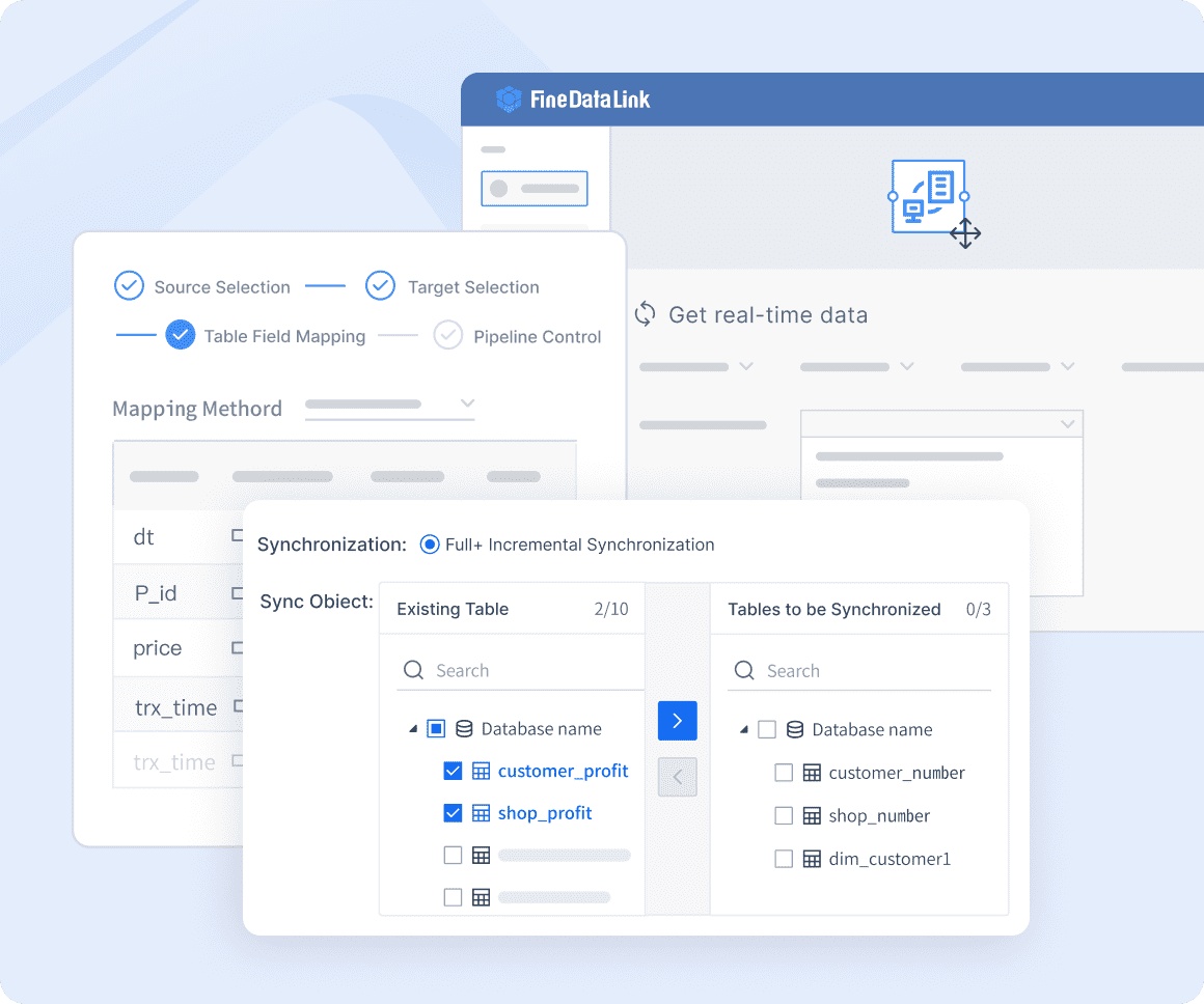
When implementing FineBI, businesses often encounter several challenges. One common challenge is integrating FineBI with existing data systems. You may find it difficult to connect various data sources seamlessly. To overcome this, businesses utilize FineBI's robust integration capabilities. FineBI supports multiple data connections, allowing you to link different databases effortlessly.

Another challenge involves ensuring data accuracy and data consistency. FineBI addresses this by providing real-time data updates and error-checking mechanisms. These features ensure that the data displayed on the dashboard remains accurate and reliable. By implementing these solutions, businesses can maintain data integrity and trust.
Customization is another area where challenges may arise. Users often require dashboards tailored to their specific needs. FineBI offers extensive customization options, enabling you to modify layouts, select data views, and set personalized alerts. This flexibility ensures that the dashboard aligns with your unique requirements.

Results Achieved
The implementation of FineBI has led to significant results for businesses. By using FineBI, companies have improved their decision-making processes. The tool provides real-time insights, allowing you to make informed choices quickly. This capability enhances operational efficiency and drives better business outcomes.
FineBI's data visualization features have also played a crucial role in achieving results. By choosing the right charts and color schemes, businesses can present data clearly and effectively. This approach makes information more accessible and engaging, improving user experience.
Moreover, FineBI's mobile responsiveness has expanded its reach. Users can access dashboards on-the-go, ensuring that they have the information they need at their fingertips. This convenience enhances user satisfaction and engagement.
Designing a client dashboard involves several key steps. You start by understanding client needs and identifying essential metrics. Choose the right tools, like FineBI, to visualize data effectively. Design an intuitive user interface and implement best practices to ensure data accuracy. Testing and iteration play a crucial role in refining the dashboard. Continuous improvement is vital. Regularly gather user feedback and make necessary adjustments. This iterative process ensures the dashboard remains aligned with business goals and user needs. Begin designing a client dashboard with client needs in mind, and leverage FineBI to deliver impactful results.
Continue Reading About Dashboard
How to Quickly Build a Core App Dashboard
Store Performance Dashboard: Your Retail Command Center


FAQ

The Author
Lewis
Senior Data Analyst at FanRuan
Related Articles

How to Build an Investment Portfolio Reporting Dashboard for Executives: KPIs, Benchmarks, and Drill-Down Views
Investment portfolio reporting for executives is not about showing every holding, transaction, and chart your investment team can produce. It is about giving CEOs, CFOs, CIOs, boards, and investment committees a fast, re
Yida YIn
Jun 25, 2026

12 KPI Reporting Examples for Executive Dashboards: What to Show in Weekly, Monthly, and Quarterly Reviews
Executive leaders do not need more data. They need decision ready $1 examples that match how often they review the business and what actions they are expected to take. A weekly $1 should surface fast moving risks and per
Yida YIn
Jun 25, 2026

How to Build a Digital Marketing Reports Dashboard: Executive Examples, KPIs, and Templates
A $1 is the control layer that helps executives and marketing leaders turn scattered channel data into fast, confident decisions. If you are a CEO, CMO, operations director, or marketing analytics lead, the real problem
Yida Yin
May 07, 2026