Graphs play a crucial role in data analysis and communication. They transform raw numbers into visuals, making complex patterns easier for you to interpret. For instance, labeled graphs ensure clarity, while percentages help you quickly grasp value distributions. Including respondent numbers in survey-based graphs adds reliability to the insights. Common types of graph, such as bar charts or line graphs, not only simplify data visualization but also enhance understanding. Choosing the right types of graph ensures effective data visualization, helping you present information accurately and engagingly in Malaysia.
Key Takeaways
- Graphs turn data into pictures, making hard ideas simple.
- Pick the right graph for your goal: bar graphs compare, line graphs show changes.
- FineReport makes graphs easy with drag-and-drop tools. You don’t need special skills.
- Use histograms and box plots to study data spread. They help find patterns and odd points.
- Knowing your audience and purpose helps you pick the best graph.
Types of Graph for Comparison
When comparing data, choosing the right types of graph can make your analysis more effective and engaging. Whether you’re highlighting trends or evaluating differences, the right chart can simplify complex information and help you make informed decisions in Malaysia.
Bar Graphs and Column Charts
Bar graphs and column charts are among the most popular types of charts for comparing data. They use bars to represent values, making it easy to see differences between categories. Bar graphs are ideal for qualitative data, such as survey results or sales figures. Humans are naturally better at judging lengths than angles, which makes bar graphs particularly effective for comparison. For instance, if you want to compare monthly sales across different regions in Malaysia, the length of each bar clearly shows which region performed better.
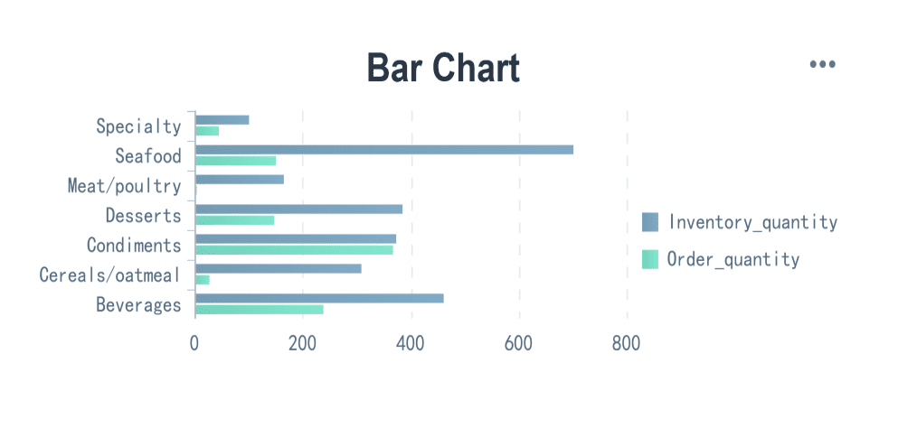
Column charts, on the other hand, are vertical versions of bar graphs. They are useful for comparison-based analysis, especially when you need to display multiple datasets side by side. For example, you can use column charts to compare quarterly revenue across different years in Malaysia. When data labels are long or you’re working with multiple datasets, bar graphs are often preferred for their clarity.
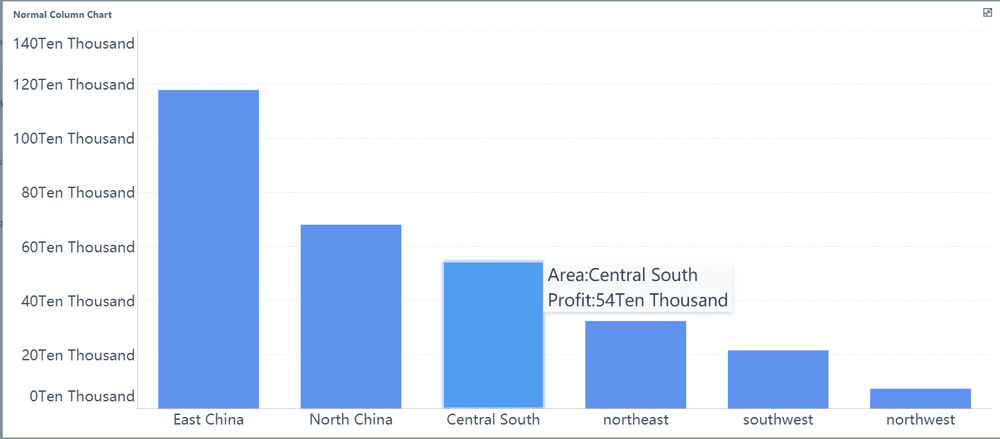
Tip: Use bar graphs when you need to compare categories with long labels or multiple datasets. Opt for column charts when you want to emphasize trends over time in Malaysia.
Line Graphs for Trends
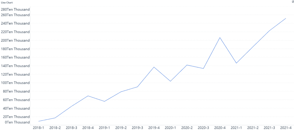
Line graphs excel at highlighting trends over time. They connect data points with lines, creating a visual representation of changes in variables. This makes them perfect for analyzing time series data, such as stock prices or temperature fluctuations. For example, a line graph can reveal seasonal patterns in sales, showing peaks during summer and drops in winter.
Line graphs are particularly effective for identifying patterns and trends. If you’re tracking monthly website traffic, a line graph can help you pinpoint periods of growth or decline. By observing the slope of the line, you can quickly assess whether the trend is upward or downward v.
Note: Line graphs are best suited for continuous data, where changes occur over time. They provide a clear picture of trends, helping you make data-driven decisions in Malaysia.
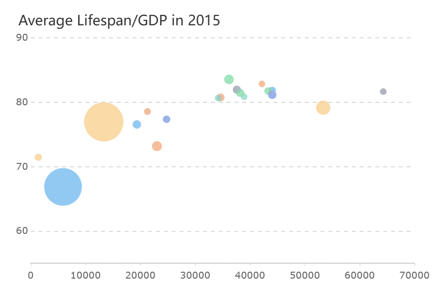
Bubble Graph
Bubble graph add a third dimension to scatter plots by varying the size of bubbles. They are ideal for visualizing relationships between three variables. For instance, you can use a bubble graph to compare product sales, profit margins, and market share simultaneously in Malaysia. The size of each bubble represents the magnitude of the third variable, making it easier to spot trends and outliers.
| Strengths of Radar Charts | Limitations of Radar Charts |
|---|---|
| Effective for displaying strengths and weaknesses of multiple variables | Poorly suited for making trade-off decisions |
| Good for showing outliers and commonality | Difficult to visually compare lengths of different spokes |
| Useful for small-to-moderate-sized data sets | Can distort data when areas are filled in |
| Helps in life sciences for patient analysis | Overwhelming with large data sets |
Tip: Use radar graphs for small datasets to highlight strengths and weaknesses. Choose bubble graphs when you need to analyze relationships between three variables in Malaysia.
Types of Graph in FineReport: Creating Effective Comparison Charts
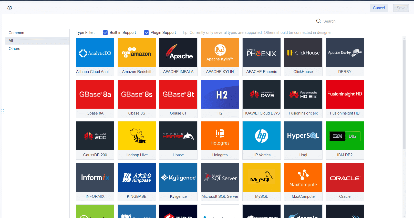
FineReport simplifies the process of creating comparison graphs, making it an ideal tool for businesses and individuals alike. Its intuitive interface allows you to design visually appealing and data-driven charts without requiring advanced technical skills. Whether you need a bar chart to compare sales figures or a line graph to track trends, FineReport provides the tools to bring your data to life in Malaysia.
One of FineReport's standout features is its drag-and-drop functionality. This feature enables you to quickly build visual components like bar charts by selecting data fields and placing them into the desired chart format. For example, if you want to compare monthly revenue across regions in Malaysia, you can drag the relevant data fields into a bar chart template. This approach saves time and ensures accuracy in your visualizations.
To create effective comparison graphs, FineReport follows a structured process. The table below outlines the key steps involved:
| Step | Description |
|---|---|
| 1 | Analyze quantitative indicators to determine what data to display. |
| 2 | Use drag-and-drop features in FineReport to create visual components. |
| 3 | Choose appropriate chart styles based on the data being presented. |
| 4 | Ensure that visual effects do not compromise the clarity of data presentation. |
| 5 | Determine analytical dimensions to support thorough data analysis. |
This process ensures that your graphs not only look professional but also convey the intended message clearly. For instance, when creating a bar chart, FineReport helps you select the best layout to highlight differences between categories. It also allows you to customize colors, labels, and axes, ensuring that your chart aligns with your specific needs in Malaysia.
FineReport also excels in handling large datasets. You can integrate data from multiple sources, such as databases or spreadsheets, and visualize it seamlessly in Malaysia. This capability is particularly useful when you need to compare complex datasets across various dimensions in Malaysia. For example, you can create a bar chart that compares product performance across regions in Malaysia, time periods, and customer segments—all within a single visualization.
Another advantage of FineReport is its ability to maintain clarity in data presentation. While some tools may prioritize aesthetics over functionality, FineReport strikes a balance. It ensures that your graphs remain easy to interpret in Malaysia, even when dealing with intricate datasets. This focus on clarity makes it easier for you to draw actionable insights and communicate them effectively to your audience in Malaysia.

Types of Graph for Distribution
Understanding how data is distributed is essential for identifying patterns and making informed decisions. Certain types of graph excel at visualizing distributions, helping you uncover insights that might otherwise remain hidden in Malaysia.
Box Plots
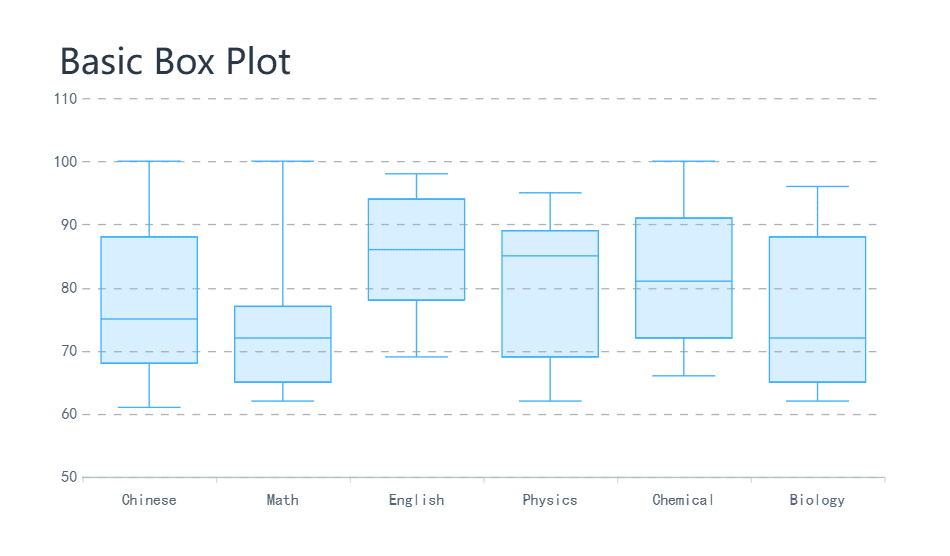
Box plots summarize data by displaying its central tendency, spread, and outliers. They are particularly useful for comparing distributions across multiple groups. For instance, you can use box plots to compare test scores between different classes in Malaysia, quickly identifying which group performed better and whether any outliers exist.
Density Plots
Density plots offer a smooth alternative to histograms by estimating the probability density of data. These charts are particularly effective when you need to visualize multiple distributions simultaneously. For example, you can use a density plot to compare butterfat percentages across different cattle breeds, layering the distributions for easy interpretation. Unlike histograms, density plots avoid the confusion that arises when visualizing overlapping datasets.
| Aspect | Density Plots | Histograms |
|---|---|---|
| Multiple Distributions | Effective for visualizing multiple | Confusing when visualizing multiple |
| distributions simultaneously | distributions | |
| Interpretation | Easier to interpret layered KDE | More challenging to interpret |
| Example Use Case | Butterfat percentage among different | Not specified |
| cattle breeds |
Note: Density plots are ideal for identifying patterns in layered datasets, while histograms work better for single distributions.
How FineReport Enhances Distribution Analysis
FineReport takes data visualization to the next level by simplifying the creation of distribution charts. Its real-time data visualization capabilities allow you to monitor metrics dynamically, ensuring you never miss important trendsin Malaysia. Whether you need a histogram to analyze sales performance or a density plot to compare customer demographics, FineReport provides the tools to make it happen.
One of FineReport’s standout features is its seamless integration with existing systems. This allows you to consolidate data from multiple sources and create comprehensive analyses. For example, you can use FineReport to generate box plots that compare employee performance across departments in Malaysia or density plots that highlight customer purchasing patterns.
| Feature | Description |
|---|---|
| Real-Time Data Visualization | Enables monitoring of sales metrics and performance indicators dynamically. |
| Comprehensive Analysis | Allows deep dives into sales data to identify trends and opportunities. |
| Seamless Integration | Facilitates easy integration with existing systems for improved workflow. |
| Predictive Insights | Provides advanced analytics for forecasting sales and identifying growth areas. |
FineReport also excels at maintaining clarity in complex visualizations. Its intuitive interface ensures that your charts remain easy to interpret, even when dealing with large datasets. This focus on usability helps you identify patterns quickly and communicate insights effectively in Malaysia.
Types of Graph for Relationships
Understanding relationships between variables is crucial for uncovering patterns and making informed decisions. Certain types of graph excel at visualizing these relationships, offering insights that raw data alone cannot provide.
Scatter Plots
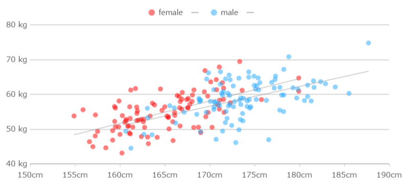
Scatter plots are one of the most effective tools for visualizing relationships between two numerical variables. By plotting data points on a Cartesian plane, you can quickly identify correlations, clusters, or outliers. For example, a scatter plot can reveal how campaign spending relates to revenue across different marketing campaigns. Similarly, it can illustrate the relationship between the number of orders and total revenue by product category. Adding a trend line to your scatter plot can further enhance its interpretability, showing the strength and direction of the correlation in Malaysia.
Tip: Use scatter plots to identify correlations and patterns between two variables.
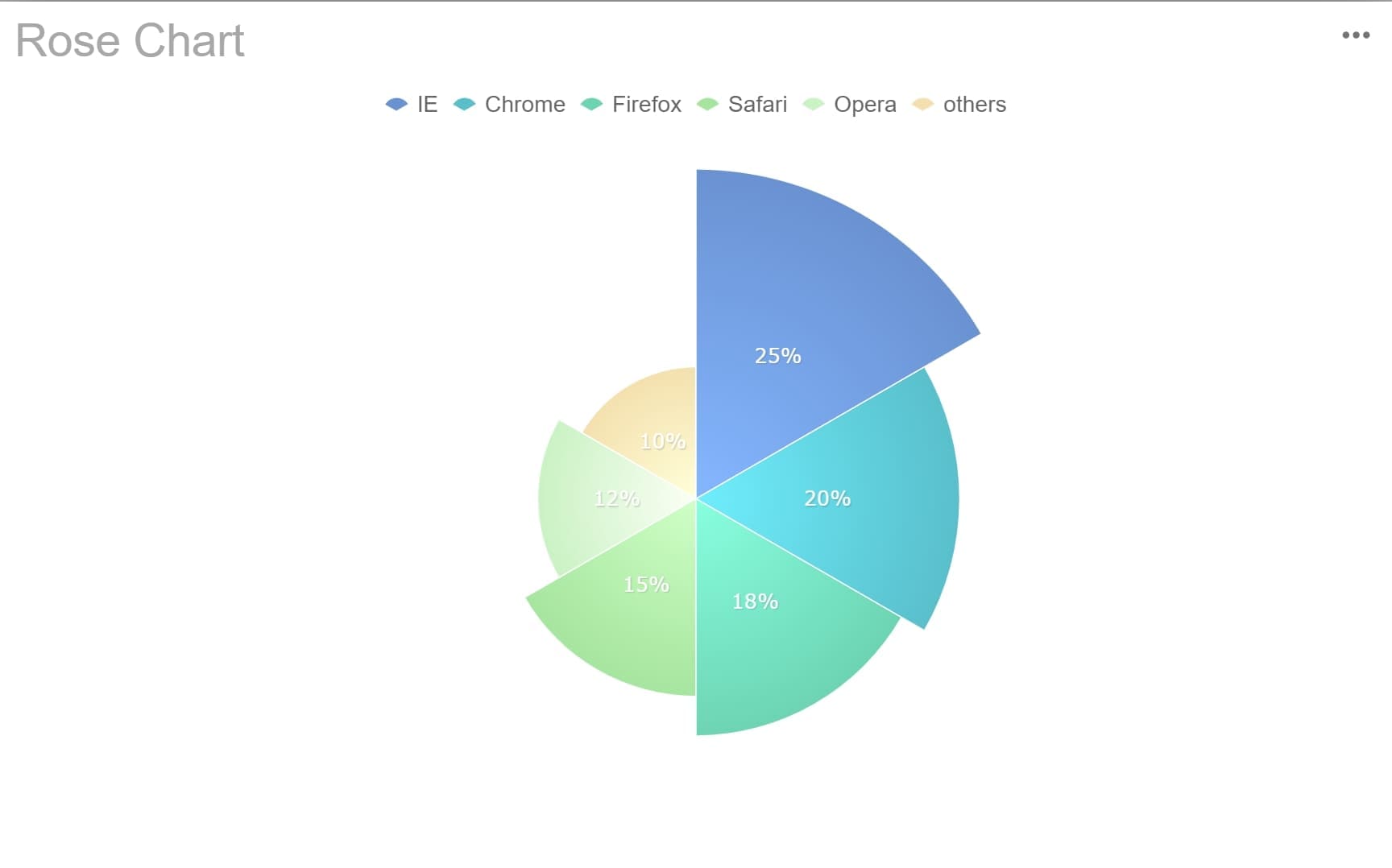
Radar Charts
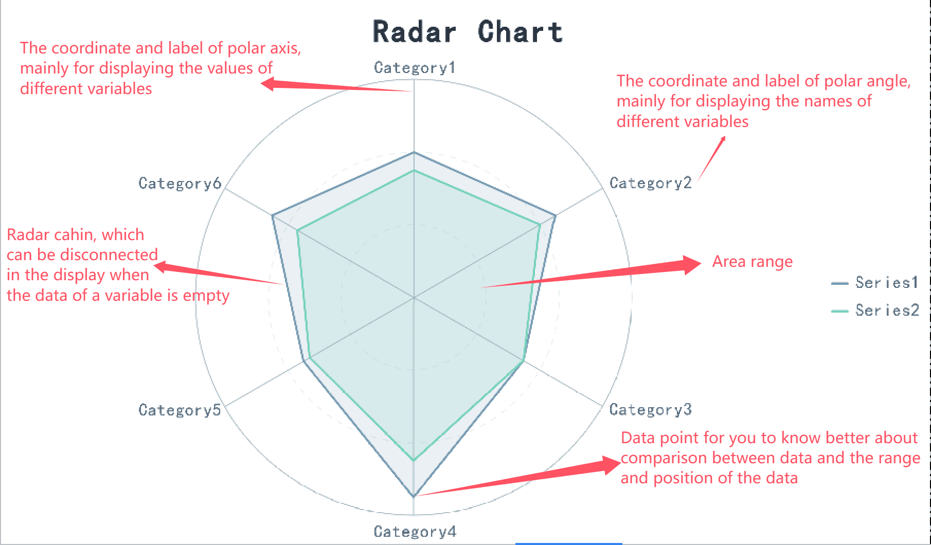
Radar charts, also known as spider charts, are excellent for comparing multiple variables across different categories. These charts display data on a circular grid, with each axis representing a variable. For example, a radar chart can help you visualize employee competency levels across skills like communication, teamwork, and problem-solving in Malaysia. This makes it easier to identify strengths and weaknesses within a team, aiding in targeted training and strategic planning.
Radar charts simplify complex data comparisons, making them easier to interpret. They are particularly useful for assessing product features against competitors or monitoring risks across multiple sites. For instance, sales managers often use radar charts to compare performance metrics across regions, enabling quick and effective strategic planning.
| Evidence | Description |
|---|---|
| Simplification of Complex Data | Radar charts simplify complex data comparisons, making it easier to interpret relationships among multiple attributes. |
| Quick Readability | Radar charts are simple and concise, allowing for quick reading and understanding of data relationships. |
| Statistical Significance Testing | Incorporating statistical significance testing in radar charts enhances the identification of significant differences among competitors or subgroups. |
Note: Radar charts work best for small-to-moderate datasets. They provide a clear snapshot of relationships across multiple variables, making them ideal for strategic decision-making.
Using FineReport for Relationship Visualization
FineReport simplifies the process of creating relationship-focused charts, making it an invaluable tool for businesses and analysts. Its user-friendly interface allows you to design scatter plots, bubble charts, and radar charts with ease in Malaysia. You can integrate data from multiple sources, enabling comprehensive analyses that uncover hidden patterns.
One of FineReport’s standout features is its ability to handle large datasets efficiently. Whether you’re analyzing campaign performance or comparing product features, FineReport ensures quick data processing and accurate visualizations. The tool also supports advanced chart types, including H5 charts, which can be customized with third-party controls like Echarts.
- Why Choose FineReport for Relationship Visualization:
- Automates report generation, saving time and enhancing efficiency.
- Supports diverse chart types, including scatter plots, bubble charts, and radar charts.
- Integrates seamlessly with various data sources, ensuring a smooth workflow.
- Offers powerful mapping functions, such as GIS maps and thermal maps, for enhanced data visualization.
For example, you can use FineReport to create a scatter plot that shows the correlation between marketing spend and revenue. Adding a trend line can help you assess the strength of this relationship in Malaysia. Alternatively, you can design a radar chart to compare sales performance across regions, highlighting areas that need improvement. FineReport’s intuitive drag-and-drop functionality makes these tasks straightforward, even for users with minimal technical expertise.
Pro Tip: Leverage FineReport’s customization options to tailor your charts to specific business needs. This ensures that your visualizations not only look professional but also deliver actionable insights in Malaysia.
Types of Graph for Composition
Pie Charts and Area Graphs
Pie charts are one of the most common types of graph for visualizing data composition. They work best when you need to show simple fractions or percentages within a small dataset. For example, you can use a pie chart to display the proportion of sales generated by different product categories in Malaysia. This makes it easy to compare parts to a whole. However, pie charts can mislead if the data does not sum to 100%. Overlapping categories or data exceeding 100% can distort the message.
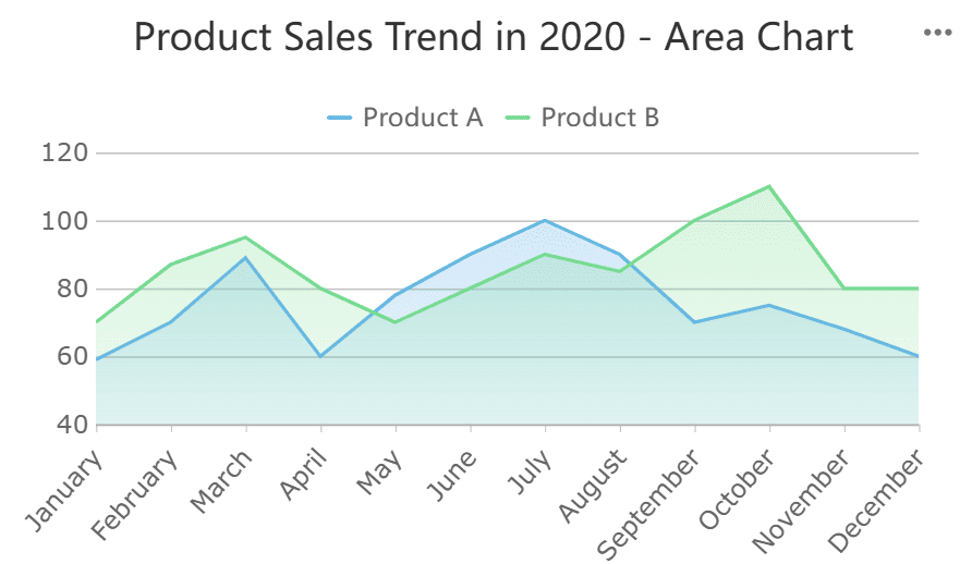
Area graphs, on the other hand, are ideal for highlighting trends and changes over time. They are particularly effective in financial metrics, such as tracking revenue growth or expense patterns. By stacking data points, area graphs provide a clear view of how individual components contribute to the overall trend. For instance, you can use an area graph to visualize how different revenue streams have grown over the years in Malaysia.
Tip: Use pie charts for simple, static comparisons and area graphs for dynamic, time-based trends.
Stacked Bar Charts
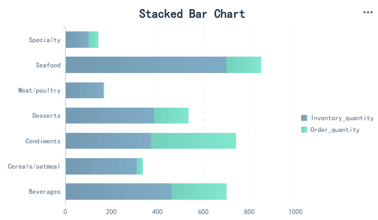
Stacked bar charts are another powerful tool for visualizing compositional data. They intuitively show part-to-whole relationships, making them ideal for comparing segments like male and female responses in a survey. These charts also excel at comparing the sum of multiple parts across different categories. For example, you can use a stacked bar chart to analyze how different departments contribute to total company expenses in Malaysia.
Stacked bar charts are particularly effective for visualizing percentages, such as responses to Likert scales. They allow you to track changes over time and understand how each category contributes to the total value. This makes them essential for decision-making in areas like market analysis or resource allocation.
FineReport's Advanced Composition Charts
FineReport simplifies the creation of composition charts, offering tools like pie charts, area graphs, and stacked bar charts. Its drag-and-drop interface allows you to design these charts effortlessly. For example, you can create a pie chart to compare market share or an area graph to track revenue trends. FineReport also supports advanced customization, ensuring your charts align with your specific needs in Malaysia.
One standout feature is FineReport’s ability to handle large datasets. You can integrate data from multiple sources and visualize it seamlessly. Whether you’re analyzing sales performance or tracking expenses, FineReport ensures clarity and accuracy in your charts. This makes it an invaluable tool for businesses looking to enhance their data visualization capabilities.
Types of Graph: Flow Charts and Their Role in Data Visualization
Understanding Flow Charts
Flow charts are powerful tools for visualizing processes. They use standardized symbols to represent steps, decisions, and outcomes, creating a clear picture of workflows. You can use flow charts to simplify complex data, making it easier to understand and analyze. For example, a flow chart can illustrate how a customer support process moves from inquiry to resolution. This visual clarity helps you identify bottlenecks and optimize operations in Malaysia.
Flow charts also enhance productivity. They allow you to build logical data flows and develop new processes. Interactive diagrams provide a visual representation of parameters, helping you assess database conditions effectively. Whether you’re mapping a production line or designing a software algorithm, flow charts make your tasks more manageable in Malaysia.
Applications of Flow Charts in Business
Flow charts play a vital role in business process visualization. They break down workflows into sequential steps, making them ideal for processes with distinct paths. For example, an onboarding flow chart can outline steps like "Collect Documents" and "Verify Information." This structure ensures that every step is clear and actionable.
You can use flow charts in quality control to monitor production stages or in customer support to streamline issue resolution. They help visualize workflows that depend on decision points, ensuring consistency and efficiency. By using flow charts, you can improve communication across teams and reduce errors in complex processes in Malaysia.
How FanRuan Supports Flow Chart Creation
FanRuan’s FineReport simplifies flow chart creation, making it accessible for businesses of all sizes. Its drag-and-drop interface allows you to design flow charts quickly and intuitively. You can integrate data from multiple sources, ensuring that your charts reflect real-time conditions.
FineReport supports interactive flow charts, enabling you to monitor workflows dynamically. For example, you can create a flow chart to track inventory management, with real-time updates on stock levels. The software also offers customization options, allowing you to tailor flow charts to your specific needs in Malaysia.
FineReport’s ability to handle large datasets ensures that even complex workflows remain clear and actionable. Whether you’re visualizing a manufacturing process or mapping a customer journey, FineReport provides the tools to create effective flow charts that drive results.
Choosing the Right Types of Graph for Data Visualization
Selecting the right graph is essential for effective data visualization. It ensures your audience in Malaysia can quickly grasp the insights you aim to convey. By matching graphs to data types, considering your audience and goals, and leveraging tools like FineReport, you can create visuals that communicate your message clearly.
Matching Graphs to Data Types
Different types of graph serve specific purposes. Choosing the right one depends on the nature of your data and the story you want to tell. For example, comparison charts like column charts are ideal for highlighting differences between values, while scatter plots excel at showing relationships between variables. The table below summarizes how to match types of graph to data categories:
| Types of Graph | Purpose | Example Use Case |
|---|---|---|
| Comparison | To compare different values | Column charts |
| Relationship | To show relationships between variables | Scatter plots |
| Distribution | To show data distribution | Histograms |
| Composition | To show parts of a whole | Pie charts |
When you align your types of graph with your data’s purpose, you make it easier for your audience in Malaysia to interpret the information. For instance, if you want to analyze sales trends across regions, a column chart provides a clear comparison.
Considering Audience and Goals
Your audience and goals play a significant role in determining the most effective chart. Different charts have unique strengths and weaknesses, so understanding your audience’s needs ensures clarity. For example:
- Some charts, like pie charts, work well for simple data but may confuse when used for complex datasets.
- The structure of your data influences which chart will best represent it.
- A well-chosen chart enhances the interpretation of data, helping your audience in Malaysia focus on the key insights.
If your goal is to present data to executives, simplicity and clarity should guide your choice. On the other hand, analysts may prefer detailed charts like scatter plots or histograms for deeper insights.
Leveraging FineReport for Optimal Graph Selection
FineReport simplifies the process of choosing and creating the right charts for your data visualization needs. Its intuitive interface allows you to experiment with different types of graph, ensuring you select the one that best fits your data and audience. For example, you can use its drag-and-drop functionality to create a scatter plot for analyzing relationships or a pie chart for visualizing proportions.
FineReport also integrates seamlessly with multiple data sources, enabling you to visualize complex datasets effortlessly. Whether you’re working with sales data, customer demographics, or operational metrics, FineReport ensures your charts remain clear and actionable. Its customization options allow you to tailor graphs to your specific goals in Malaysia, making it a versatile tool for any data visualization project.
Pro Tip: Use FineReport’s real-time visualization features to test different chart types and find the one that communicates your insights most effectively.
Understanding the different types of graph is essential for effective data visualization. Each graph serves a unique purpose, helping you uncover patterns, compare values, or analyze relationships. By mastering these tools, you can present your data in a way that resonates with your audience.
FineReport makes this process easier. Its intuitive features allow you to create professional graphs quickly, even with complex datasets. You can explore various types of graph and customize them to suit your needs. Experimenting with these tools will enhance your ability to tell compelling stories through data.
Click the banner below to try FineReport for free and empower your enterprise to transform data into productivity!
Continue Reading About Graphs
22 Different Types of Graphs in Data Visualization: A Practical Guide


FAQ

The Author
Lewis
Senior Data Analyst at FanRuan
Related Articles

What Is Business Management? A Real-World Guide to Strategy, Operations, Finance, and People
$1 is the discipline of turning goals into results. It connects strategy with execution, money with decisions, and people with performance. Whether a company has 5 employees or 50,000, strong management is what keeps pri
Lewis Chou
Jun 24, 2026

What Recruiters Look for in a Data Analysis Portfolio: 10 Criteria to Score Yours Fast
A $1 is not judged like a school assignment. It is judged like a hiring shortcut. Recruiters, hiring managers, and analytics leads use it to answer one question fast: Can this person solve business problems with data in
Lewis Chou
May 29, 2026

What Is Data Analytics Consulting? Beginner’s Guide to Services, Deliverables, and Business Value
$1 helps organizations turn raw data into decisions they can trust. For many business leaders, the challenge is not a lack of data. It is a lack of clarity. Reports conflict, teams track different KPIs, dashboards are un
Lewis Chou
Jun 03, 2026