A strong portfolio management reporting dashboard helps executives make faster, better decisions about where to invest, what to stop, which risks to address, and how to reallocate constrained resources. For PMO leaders, IT directors, transformation offices, and operations executives, the challenge is rarely a lack of data. The real problem is too much fragmented project detail and too little portfolio-level insight. An effective dashboard translates scattered updates into a concise decision system for funding, prioritization, governance, and strategic alignment.
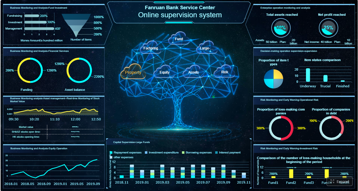 Click To Try The Dashboard
All reports in this article are built with FineReport
What a portfolio management reporting dashboard should achieve for executives
Executive dashboards are not project trackers. They are decision tools. If your leadership team still has to ask, “What needs a decision today?” after reviewing the report, the dashboard is not doing its job.
At the portfolio level, reporting must support a short list of high-value decisions:
- Funding decisions: Which initiatives deserve continued investment?
- Prioritization decisions: Which projects should move up, pause, or stop?
- Risk response decisions: Which emerging issues need executive intervention?
- Resource reallocation decisions: Where should talent and budget shift now?
A practical dashboard starts by defining the audience. A CIO, CFO, PMO head, and business unit leader do not need the same level of detail. Executives usually need monthly or biweekly cadence, not daily task movement. The dashboard should focus on business outcomes such as strategic alignment, expected value, delivery confidence, financial exposure, and capacity constraints.
Another critical design choice is separating strategic portfolio reporting from project status reporting. Project managers may need milestone logs, issue trackers, and detailed workstream updates. Executives do not. They need signals, trends, exceptions, and action prompts. Mixing these levels creates noise, slows meetings, and weakens governance.
Key Metrics (KPIs) executives need in portfolio management reporting
For featured-snippet clarity, these are the most important KPIs to include in a portfolio dashboard:
- Strategic Alignment Score: Measures how strongly each initiative supports approved business objectives.
- Value Realization Progress: Tracks whether expected benefits are being delivered on time and at the planned level.
- Investment Health: Summarizes whether an initiative is on track, at risk, or off track based on agreed thresholds.
- Budget Consumption Rate: Shows how much approved funding has been used relative to time elapsed.
- Forecast Variance: Compares expected final cost or delivery date against baseline plans.
- Milestone Performance: Indicates whether key milestones are being met, delayed, or trending late.
- Resource Capacity Utilization: Shows whether critical teams or roles are overallocated, balanced, or underused.
- Portfolio Risk Exposure: Aggregates major risks by probability, impact, and urgency across initiatives.
- Dependency Criticality: Flags cross-project dependencies that could cause cascading delays or blocked value.
- Change Velocity: Tracks major scope, priority, or governance shifts that may destabilize delivery.
- Decision Backlog: Shows unresolved executive decisions affecting funding, scope, resourcing, or timing.
- Delivery Confidence: A forward-looking indicator of whether initiatives can achieve target outcomes under current conditions.
Core metrics to include in portfolio management reporting
The best portfolio management reporting dashboards combine strategic, financial, operational, and risk-based views. Each metric should connect directly to an executive decision.
Strategic alignment and value delivery
Portfolio dashboards should first answer a strategic question: Are we investing in the right work?
Every initiative should map to one or more business goals, whether that means revenue growth, cost reduction, customer experience improvement, compliance, or digital transformation. If a project no longer supports a live strategic priority, executives need to know quickly.
Core measures in this section include:
- alignment to strategic objectives
- expected benefits by initiative
- benefits realized to date
- initiatives by strategic theme
- value at risk from delayed or underperforming investments
This section should also identify investments that are:
- On track: still aligned and delivering expected value
- At risk: aligned but showing weak realization or delivery confidence
- Misaligned: no longer tied to current priorities or business case assumptions
A useful executive view here is a bubble chart that compares strategic value, cost, and delivery confidence. It helps leaders see where high-cost, low-alignment work may be consuming scarce capacity.
Financial, schedule, and resource health
Once alignment is clear, the next question becomes: Can the portfolio deliver within available constraints?
Executives need a clean view of budget performance, forecasted outcomes, milestone confidence, and talent capacity. This is where many dashboards become overloaded with project-level accounting detail. Resist that urge. Focus on portfolio-level signals and exception trends.
Key measures include:
- planned budget vs. actual spend
- forecast at completion
- budget variance by initiative or program
- milestone completion rate
- delayed milestones with executive impact
- role-based capacity utilization
- critical talent shortages
- demand vs. available resource trends
The executive value of this section is in surfacing tradeoffs. For example:
- speeding one strategic initiative may delay another
- protecting budget may reduce scope or benefits
- filling a critical skills gap may require vendor support or reprioritization
Good portfolio reporting does not just show that a problem exists. It makes the tradeoff visible.
Risk, dependency, and change indicators
Most portfolio failures are visible before they become visible in status reports. That is why executives need early-warning indicators, not only lagging results.
This section should track:
- portfolio-level risk exposure
- top enterprise or cross-program risks
- dependency bottlenecks between initiatives
- scope changes affecting business case viability
- priority shifts that alter sequencing or resource assumptions
- unresolved escalations requiring leadership action
The strongest dashboards highlight not just the current number of risks, but whether exposure is rising or falling. Trend arrows, threshold alerts, and dependency maps are especially effective for executive reviews because they convert complexity into action.
How to structure the dashboard for fast executive decision-making
A dashboard can include the right metrics and still fail if the structure is confusing. Executives should be able to understand the portfolio in minutes, not navigate through layers of operational reporting.
Start with a one-page summary view
The first page should work as the executive control panel. It needs to answer four questions immediately:
- What is the overall health of the portfolio?
- What changed since the last review?
- What exceptions need attention?
- What decisions are recommended now?
That summary should typically include:
- overall portfolio health score
- number of initiatives on track / at risk / off track
- top financial variance signals
- top resource constraints
- top risks and dependencies
- 3 to 5 recommended executive actions
Keep the visuals concise. Use scorecards, simple trend lines, heatmaps, and short commentary. A dashboard overloaded with gauges, tiny labels, and crowded tables slows decision-making rather than supporting it.
Organize detail by decision area
After the one-page summary, structure deeper views around how executives actually decide:
- Investment performance
- Strategic alignment
- Delivery confidence
- Resource constraints
- Risk and dependency management
This structure is much more useful than organizing tabs by department or source system. Leaders think in decisions, not in data architecture.
A strong drill-down flow works like this:
- summary signal
- decision area view
- exception list
- project or program drivers
- supporting narrative
This approach preserves clarity while still giving leaders access to the root cause of a trend.
Design for clarity, not completeness
One of the biggest mistakes in portfolio management reporting is trying to include everything. Executives do not need everything. They need consistency and relevance.
Use the following design rules:
- include only metrics tied to governance decisions
- use consistent KPI definitions across business units
- apply standard RAG logic with clear thresholds
- keep time horizons consistent, such as current month, quarter, and forecast
- avoid duplicate metrics that tell the same story
- write short commentary in business language, not PMO jargon
The best dashboards feel simple because the hard work happened before the visual design. Metric governance, data ownership, and business definitions matter more than decorative charts.
How to make a portfolio management report that leaders will actually use
Adoption is the real test. A dashboard is only successful if executives use it to run reviews, make decisions, and govern the portfolio.
Build the reporting process before the visuals
Before you design charts, define the reporting operating model:
- What are the trusted source systems?
- Who owns each metric?
- How often is data refreshed?
- What approval rules apply before publishing?
- How are exceptions validated?
- Who writes the executive commentary?
This matters because portfolio reporting often fails due to process inconsistency, not dashboard design. If finance, PMO, delivery, and business units define budget variance or risk severity differently, no visualization can fix the confusion.
A seasoned PMO should establish a reporting calendar and exception-review routine. That means validating major deviations before the portfolio pack reaches leadership. Executives should not discover basic data disputes during the meeting.
Turn raw data into a practical narrative
Numbers alone rarely move decisions. The dashboard must explain:
- What changed
- Why it matters
- What decision is needed
This can be done with a short action-oriented summary on each major view. For example:
- “Two customer-facing initiatives remain strategically critical but are now forecast to exceed budget by 8%. Decision needed: approve contingency funding or de-scope Q4 functionality.”
- “Cybersecurity program remains aligned but is blocked by infrastructure capacity. Decision needed: reassign architects from lower-priority modernization work.”
This mirrors how executive portfolio reviews actually run. Leaders want insight with an action path, not just a collection of traffic lights.
Choose the right tools and software
Tool selection should follow the reporting model, not the other way around. For enterprise-grade portfolio management reporting, evaluate whether your stack can handle:
- integration with PM, ERP, HR, and finance systems
- automated refresh and distribution
- role-based access and governance
- exception-based alerting
- drill-down from portfolio to initiative detail
- scalable performance across multiple business units
- standardized templates for recurring reporting
If your current process still depends on manual spreadsheet consolidation, version confusion, and slide rebuilding before every review, you already have a signal that the reporting stack is limiting governance maturity.
Best practices to implement your dashboard successfully
Here are four practical, consultant-style steps to implement a high-value portfolio dashboard:
-
Define the decision model first
List the exact executive decisions the dashboard must support: fund, stop, escalate, reprioritize, or reallocate. Remove any metric that does not support one of those decisions. -
Standardize KPI definitions and thresholds
Establish shared definitions for alignment, risk, budget variance, milestone status, and resource utilization. Lock these rules before dashboard rollout. -
Launch with a controlled metric set
Start with 8 to 12 trusted KPIs, not 30. Early adoption rises when leaders can understand and trust the first version quickly. -
Create an exception-review workflow
Require PMO and business owners to validate major variances and write concise explanations before executive distribution. -
Design for drill-down without clutter
Use a one-page summary for leadership, then provide structured detail pages by decision area. Keep the first screen clean and action-oriented.
Common mistakes to avoid in portfolio reporting
Even mature organizations weaken decision quality through avoidable reporting mistakes.
The most common problems include:
-
Too much project detail
Portfolio dashboards should not look like project status packs. Executive readers need aggregate signals and exceptions. -
Inconsistent definitions
If one business unit calls a 5% budget deviation “green” and another calls it “amber,” leadership cannot compare performance reliably. -
Too many lagging indicators
Reporting only what already happened limits executive response. Add forward-looking indicators such as delivery confidence, dependency risk, and capacity pressure. -
Status without recommendations
“Red” is not a recommendation. Every major exception should include a proposed action or decision path. -
Overdesigned visuals
Fancy charts do not improve governance. Simplicity, consistency, and interpretability matter more.
A dashboard should reduce ambiguity. If leaders need a separate meeting to interpret the dashboard, the format is not mature enough.
A practical roadmap to improve your dashboard over time
No portfolio dashboard is perfect at launch. The goal is to create a trusted baseline and improve it based on executive usage.
Launch with a minimum viable dashboard
Start with a small set of reliable metrics and a one-page executive summary. Test each element against a real decision:
- Does this KPI support funding review?
- Does this view improve prioritization?
- Does this trend help with governance or risk response?
- Would leadership act differently because this metric exists?
If the answer is no, remove it.
A minimum viable dashboard is easier to trust, easier to maintain, and faster to improve.
Evolve your portfolio metrics with feedback
After a few reporting cycles, assess actual usage:
- Which sections do executives discuss most?
- Which metrics lead to real decisions?
- Which visuals are ignored?
- Which definitions still create confusion?
- Where are new strategy shifts changing portfolio oversight needs?
Retire low-value content. Strengthen metrics that shape action. Refine the dashboard as strategy, governance, and organizational complexity evolve.
Building this manually is complex—use FineReport to automate the workflow
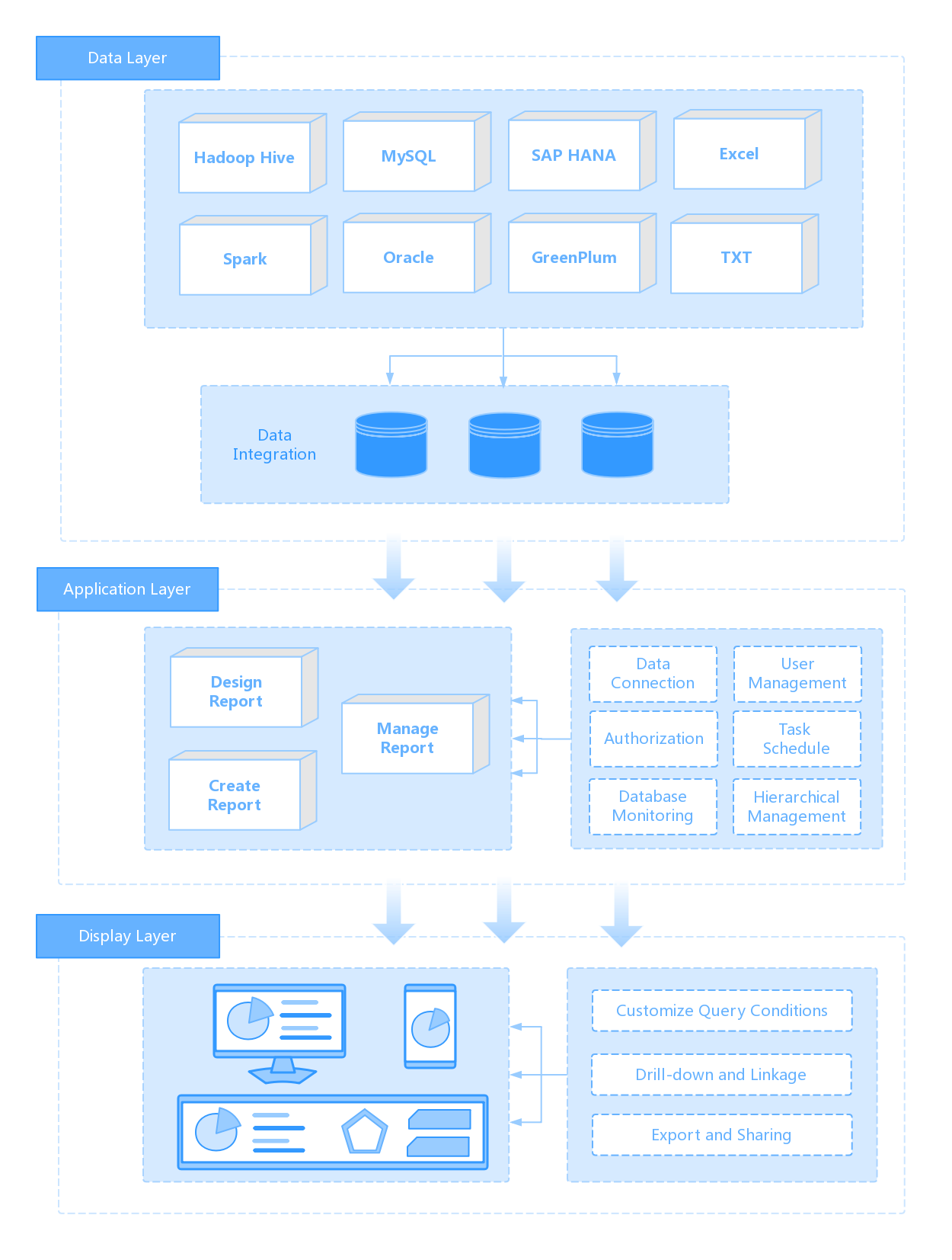
Building executive-grade portfolio management reporting manually is complex; use FineReport to utilize ready-made templates and automate this entire workflow. For enterprise teams, the real burden is not just dashboard design. It is integrating multiple systems, standardizing definitions, automating refresh cycles, controlling access, and delivering a consistent executive experience across functions and regions.
FineReport helps teams turn fragmented portfolio data into actionable executive dashboards with:
- ready-made dashboard templates
- flexible data integration
- role-based access control
- automated reporting workflows
- drill-down analysis from summary to detail
- scalable enterprise deployment
- consistent KPI presentation across business units

Get Ready-to-Use Dashboard Templates in Fine Gallery
With FineReport, PMOs and executive reporting teams can reduce manual consolidation, improve trust in KPI definitions, and deliver a dashboard that leaders will actually use in steering meetings.
If your organization is still assembling portfolio review packs by hand, this is the right time to modernize the process.
FAQs
It gives executives a high-level view of portfolio performance so they can make faster decisions on funding, prioritization, risk response, and resource shifts. Its purpose is to turn scattered project data into clear actions.
The most useful KPIs usually include strategic alignment, value realization, budget consumption, forecast variance, resource capacity, risk exposure, and delivery confidence. These metrics help leaders judge whether the portfolio is still worth funding and able to deliver.
Portfolio reporting focuses on trends, exceptions, and strategic decisions across many initiatives, while project status reporting tracks detailed milestones, tasks, and issues within a single project. Executives typically need the first, not the second.
For most leadership teams, a monthly or biweekly cadence works best because it supports governance without creating noise from daily changes. The right frequency depends on how quickly priorities, risks, and funding decisions evolve.
An effective dashboard is concise, audience-specific, and tied directly to decisions leaders need to make. It should highlight strategic alignment, financial health, risks, resource constraints, and action-worthy exceptions rather than too much project detail.


The Author
Yida Yin
FanRuan Industry Solutions Expert
Related Articles

What Is a PPC Dashboard? Metrics, Views, and Use Cases Explained for Beginners
A $1 is a single view that pulls your paid advertising data into one place so you can quickly see what is working, what is wasting budget, and where to optimize next. For beginners, this matters because PPC data usually
Yida Yin
Jun 08, 2026

How to Build a Customer Service Metrics Dashboard: 12 KPIs, Use Cases, and Examples
A $1 should help support leaders make faster operational decisions, reduce service risk, and improve customer outcomes without waiting for static weekly reports. If you manage a support team, you already know the pain po
Yida Yin
Jun 05, 2026

Email Metrics Dashboard: 15 Essential KPIs and Templates for Ecommerce, SaaS, and B2B
An email $1 is the operating console that helps marketing leaders, CRM managers, lifecycle teams, and revenue operations stakeholders see campaign health, engagement quality, and business impact in one place. If you are
Yida Yin
Jun 04, 2026