If you are searching for power bi dax, you are probably trying to understand one practical question: when should you create a measure, a calculated column, or a calculated table in a real Power BI report? That confusion is one of the biggest beginner roadblocks.
DAX, short for Data Analysis Expressions, is the formula language used in Power BI to create calculations inside your data model. It helps you turn raw fields like sales amount, order date, customer, and product into business answers such as total revenue, profit margin, year-to-date performance, customer segments, and trend comparisons.
This tutorial is built for beginners who want more than syntax. Instead of listing random functions, it explains how power bi dax works in actual report-building scenarios so you can choose the right calculation type with more confidence.
Quick Comparison Table
Before going deeper, here is the fastest way to understand the three most common DAX outputs:
DAX option
Best for
When it is calculated
Where result is stored
Can be used in slicers/axes
Responds to visual filters
Measure
KPIs, ratios, totals, dynamic metrics
At query time, when the visual is rendered
Not stored as row-by-row values
No, not like a regular field
Yes
Calculated Column
Labels, categories, flags, sort keys
During data refresh
Stored in the model
Yes
No, value stays fixed until refresh
Calculated Table
Helper tables, date tables, summary tables
During data refresh
Stored as a new table in the model
Yes, if used in the model
Not dynamically like measures
For most interactive dashboards, measures are the default choice. Use calculated columns when you need a field people can group or filter by. Use calculated tables when you need to create a new supporting table in the model.
What Power BI DAX Does in a Real Report
In plain language, DAX is what lets a Power BI report calculate meaning, not just display data.
A report may already contain tables such as:
Sales transactions
Customers
Products
Dates
Regions
But those tables alone do not answer business questions. A sales manager does not just want to see rows of orders. They want to know:
What is total revenue this month?
Which product category has the highest margin?
How does this quarter compare with last quarter?
Which customers fall into high-value segments?
What changed after filtering to one region or one sales team?
That is where power bi dax becomes useful. It sits between raw data and business decisions.
Where DAX Fits in the Reporting Flow
A simple way to think about Power BI is this:
Raw data is loaded from source systems.
Relationships connect tables like Sales, Date, Customer, and Product.
DAX defines business logic.
Visuals display results using that logic.
Users interact with filters and slicers.
The report recalculates or displays outputs based on the type of DAX used.
Measures, calculated columns, and calculated tables all belong to DAX, but they behave very differently. That difference matters because the wrong choice can lead to:
Slow reports
Incorrect totals
Confusing slicer behavior
Bigger model size
More maintenance later
The Three Core Output Types Beginners Confuse Most
Beginners often know they need “a DAX formula,” but not which kind.
The three main DAX outputs are:
Measures for dynamic calculations in visuals
Calculated columns for row-level fields stored in the model
Calculated tables for creating new tables from existing data
By the end of this tutorial, a beginner should be able to:
Tell the difference between the three
Pick the right option for common report tasks
Avoid the most frequent design mistakes
Build more reliable KPI cards, filters, trends, and helper tables
Measure vs Calculated Column vs Calculated Table: The Core Difference
The main difference is when the calculation happens and how the result is used.
A measure is calculated when a user views a visual.
A calculated column is computed during refresh and saved row by row.
A calculated table is also created during refresh, but it builds an entirely new table in the model.
This affects everything from performance to user interaction.
How Each Option Behaves in Visuals and Filters
Here is the practical difference:
Measures work best when the answer should change based on slicers, filters, rows, columns, or visual context.
Calculated columns work best when you need a stable field that behaves like a category or attribute.
Calculated tables work best when your model needs an extra supporting structure.
For example:
A KPI card for total sales should usually use a measure
A customer band such as Bronze, Silver, Gold often fits a calculated column
A dedicated calendar table often fits a calculated table
Why the Wrong Choice Causes Problems
Choosing the wrong DAX type creates common issues:
Using a column instead of a measure can produce static results that do not react correctly to filters.
Using columns for dynamic calculations can increase model size unnecessarily.
Using a measure where you actually need a slicer field can make report design impossible.
Building too many model tables in DAX can make maintenance harder if the logic belongs upstream in data preparation.
Measures
Measures are the most important DAX concept for report users because they power the numbers people actually read in dashboards.
A measure recalculates based on the current filter context. Filter context means the set of filters currently affecting the visual, such as:
Selected date range
Region slicer
Product category
Cross-filtering from another chart
Matrix row or column selections
If you create a measure like total sales, it can show one value in a KPI card, a different value per product in a bar chart, and another value after the user selects only one region.
That dynamic behavior is what makes measures so useful.
These are all strong candidates for measures because they should respond to report interaction.
When measures are the best default choice
In most interactive reports, start by asking:
Does this result need to change when the user filters the report?
If the answer is yes, you probably need a measure.
Measures are usually the best default for:
KPI cards
Trend charts
Variance analysis
Ratios and percentages
Time intelligence
Dynamic comparisons
Calculated Columns
Calculated columns are created row by row and stored in the model after refresh. Their values do not recalculate every time a user clicks a slicer.
This row-by-row logic is often explained through row context. In simple terms, Power BI evaluates the formula for each row of the table and saves the result.
That makes calculated columns useful when you need a field that behaves like regular data.
Common calculated column examples
Category labels
Status flags
Sort order keys
Customer bands
Conditional grouping
Extracted year or month labels
“High value” or “low value” indicators
For example, you might create a column that classifies each order as:
Large order
Medium order
Small order
Or create a field that groups customers into revenue bands.
Because the output is stored as a column, it can be used in:
Slicers
Legends
Axes
Grouping fields
Sorting logic
Why columns should not replace measures
A common beginner mistake is trying to create sales totals or ratios as calculated columns. That usually causes problems because:
The value is fixed after refresh
It does not naturally react to visual context like a measure
It increases model storage
It often creates repeated values across rows
Use columns for descriptive attributes, not for most dashboard KPIs.
Calculated Tables
Calculated tables create a new table in the model using DAX.
Instead of returning one number or one new field, they return a full table structure. That makes them useful when your model needs extra support for analysis.
Common calculated table examples
Date tables
Summary tables
Bridge tables
Scenario helper tables
What-if style support tables
Filter mapping tables
A classic beginner example is a dedicated calendar table that helps support time-based reporting.
Another example is creating a summarized table for a specific reporting structure when the raw source is too detailed or not organized the right way for the model.
When calculated tables help
Calculated tables can simplify modeling when you need to:
Standardize a date structure
Create a clean supporting dimension
Build a model helper table for relationships
Simplify repeated report logic
When Power Query may be better
Even though DAX can create tables, that does not mean it is always the best place.
If the logic is really data transformation logic, Power Query is often a better choice, especially when you want to:
Clean raw data
Split or merge columns
Standardize formats
Remove duplicates
Shape data before modeling
A good beginner mindset is this:
Use Power Query for data preparation
Use DAX for analytical logic inside the model
Real Report Scenarios: Which Power BI DAX Option Should You Choose?
Theory makes more sense when tied to report-building tasks. Here are the most common beginner scenarios.
Scenario 2: Segmenting rows for filtering and grouping
If you want to create:
Customer spend bands
Product status labels
Order size buckets
Risk flags
Region clusters
You usually need a calculated column.
Why? Because you are creating a field users will use to group, filter, or slice data.
For example, suppose you assign each customer to:
Low Value
Mid Value
High Value
That result should behave like a normal category field. Users should be able to put it in a slicer, legend, axis, or table grouping. A calculated column is the right fit for that.
Why a calculated column works here
Calculated columns are useful when the result must:
Exist per row
Be stored in the model
Act like a field in the field list
Support filtering or grouping
This is especially helpful for business-friendly reporting where technical raw data needs simpler categories.
Scenario 3: Building reusable supporting tables
If you need to create:
A date table
A bridge table
A summarized helper table
A scenario-specific mapping structure
A calculated table may be appropriate.
For example, a beginner sales report often becomes much easier to manage with a dedicated calendar table tied to transaction dates. That table can support:
Time intelligence
Consistent month sorting
YTD analysis
Period filtering
A calculated table can also help when your raw model structure is missing a clean reporting table.
Why calculated tables support cleaner design
Used carefully, calculated tables can make a model easier to understand because they:
Organize reporting structures more clearly
Separate helper logic from raw transaction data
Improve reuse across multiple visuals
That said, beginners should not overuse them. If the logic belongs in ETL or data shaping, move it upstream instead.
How to Decide Faster: A Simple Beginner-Friendly Framework
If you feel stuck, use this decision framework.
Ask whether the result should change with visual context
First question:
Should this result change when users click slicers, visuals, or filters?
If yes, use a measure
If no, continue to the next question
This is the fastest first filter.
Check whether the output should appear as a field
Second question:
Do users need to use this result as a field in slicers, legends, axes, or grouping?
If yes, use a calculated column
If no, it may still be a measure or possibly a calculated table, depending on the need
Think about model structure
Third question:
Am I trying to create a whole new table to support the model?
If yes, consider a calculated table
If not, stay with a measure or column
Consider model size and performance
Before choosing, also ask:
Will this add unnecessary storage?
Will this increase refresh time?
Will this make the model harder to maintain?
Is this logic really better done in Power Query?
Quick decision checklist
Use this beginner checklist:
Need a KPI or dynamic number? Use a measure
Need a slicer or grouping field? Use a calculated column
Need a new helper table in the model? Use a calculated table
Need data cleanup or transformation? Consider Power Query
Unsure? Start with a measure, because many interactive reporting needs are measure-driven
Common Power BI DAX Mistakes Beginners Make and How to Avoid Them
Using a calculated column when a measure is needed
This is one of the most common mistakes in power bi dax learning.
Symptoms include:
Wrong totals in visuals
Repeated values across many rows
Static outputs that do not respond properly to filters
Larger model size than necessary
For example, if you create a column for profit margin rather than a measure, the report may not aggregate or display the result the way you expect at summary level.
How to avoid it
Ask: Is this supposed to be one dynamic answer per visual context?
If yes, build a measure.
Using a measure when a slicer field is needed
The opposite mistake also happens often.
A measure can return a value, but it does not behave like a categorical field that users can place directly in slicers, axes, or legends in the same way as a regular column.
If your real goal is to let users filter by a label such as:
High Margin
Active Customer
Delayed Order
You probably need a calculated column, not a measure.
How to avoid it
Ask: Do users need to select or group by this output as if it were a normal field?
If yes, create a column.
Ignoring context, relationships, and model design
Many beginners focus too much on formula syntax and not enough on the model behind it.
In DAX, results are influenced by:
Row context
Filter context
Relationships
Direction of filtering
Table design
Date model quality
That means even a correct-looking formula can produce unexpected results if:
Tables are not related correctly
Filters do not flow as expected
The wrong date table is used
Granularity is inconsistent
How to avoid it
Validate every new DAX calculation with simple visuals first:
Put it in a card
Add it to a table by category
Test it with one slicer at a time
Compare against manual totals
This step catches problems much earlier than debugging a complex dashboard later.
Next Steps for Learning Power BI DAX with Confidence
The best way to learn power bi dax is not by memorizing hundreds of functions. It is by practicing a small number of core concepts in a realistic report.
Here is a practical path for moving from beginner to intermediate:
Learn the difference between measures, columns, and tables.
Understand row context and filter context.
Practice basic aggregation functions.
Learn CALCULATE and how filters change results.
Build simple time-based reporting with a proper date table.
Move into year-to-date and period comparison patterns.
Validate performance and model design as reports grow.
Focus on core patterns before advanced syntax
You do not need advanced DAX immediately. Build confidence first with:
SUM
COUNTROWS
DISTINCTCOUNT
DIVIDE
IF
CALCULATE
Basic date-based calculations
Once those feel natural, time intelligence and context transition will make more sense.
Practical Recommendations Before You Build Your Next DAX Report
Here are five practical recommendations I give beginner BI teams:
Default to measures for dashboard KPIs. Most report metrics should be dynamic and filter-aware.
Create columns only when users need a field to slice, group, or sort by.
Keep transformation logic upstream when possible. Do not force DAX to do work better handled during data preparation.
Test every calculation in a simple table visual first. It is the fastest way to catch context errors.
Design the model before writing too much DAX. Clean relationships often matter more than complicated formulas.
Beyond Power BI DAX: When Teams Need Easier Self-Service BI
Power BI is widely used for dashboarding and DAX-based analysis, especially by analysts and technically comfortable report builders. But many organizations eventually run into a broader challenge: not everyone who needs insight is comfortable building measures, managing model logic, or interpreting context-heavy metrics.
That is where teams may also evaluate more business-user-friendly BI platforms.
Tools like Power BI are widely used in the BI market, but teams that need a more business-user-friendly, self-service BI platform may also consider FineBI.
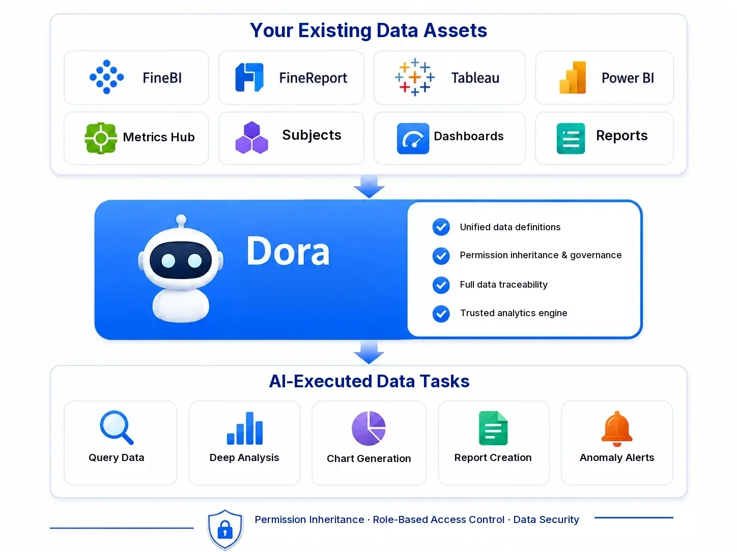
For teams that already have trusted data assets and want to expand from reporting into AI-assisted analysis, FineBI + Dora adds another layer.
Dora is FanRuan’s enterprise Data Agent platform. It acts as an AI assistant and AI digital employee layer on top of FineBI and existing enterprise data assets. Rather than replacing dashboards, Dora helps enterprises move from simply viewing reports to enabling governed, scenario-specific AI support.
That can include workflows such as:
Natural-language data requests
Trusted semantic understanding
Governed query or skill execution
Answers, summaries, charts, actions, and follow-up
Dora runs on trusted data.
In that positioning, FineBI provides the trusted metric and dashboard foundation, while Dora extends it into Agentic BI for enterprise use cases such as:
This approach is especially relevant when a business wants not just analytics consumption, but also more guided action across reporting workflows.
Get Ready-to-Use Dashboard Templates in Fine Gallery
Final Thoughts
Learning power bi dax gets much easier when you stop treating it as a syntax problem and start treating it as a report-design decision.
Remember the core rule:
Use a measure for dynamic values in visuals
Use a calculated column for row-level fields used in grouping or filtering
Use a calculated table when the model needs a new supporting table
If you master that distinction early, the rest of DAX becomes much easier to learn.
Whether you continue building in Power BI or explore other self-service BI options like FineBI, the goal stays the same: create reports that are accurate, maintainable, and useful for real business decisions.
FAQs
A measure is calculated when a visual is queried, so it changes with filters and slicers. A calculated column is computed during refresh and stored row by row, so it stays fixed until the next refresh.
Use a measure for KPIs, totals, percentages, and other results that should react to report context. If the value needs to update when users filter the report, a measure is usually the right choice.
Yes, calculated columns behave like regular fields in the model, so they can be used in slicers, rows, columns, and axes. That makes them useful for categories, flags, labels, and sort fields.
A calculated table creates a new table during data refresh based on existing model data. It is commonly used for helper structures such as calendar tables, summary tables, or other modeling support tables.
The wrong choice can lead to incorrect filter behavior, larger model size, and slower reports. For example, using calculated columns for dynamic logic can make a report less efficient and harder to maintain.
Product Trial
FineReport
Pixel-perfect reports · Interactive dashboards · Easy data entry · Digital twins



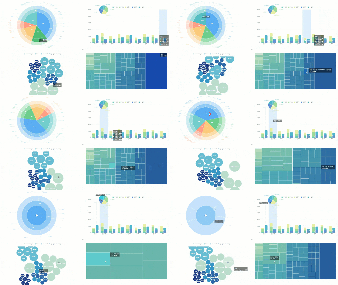 FineBI's Dynamic Charts
 Dora runs on trusted data.