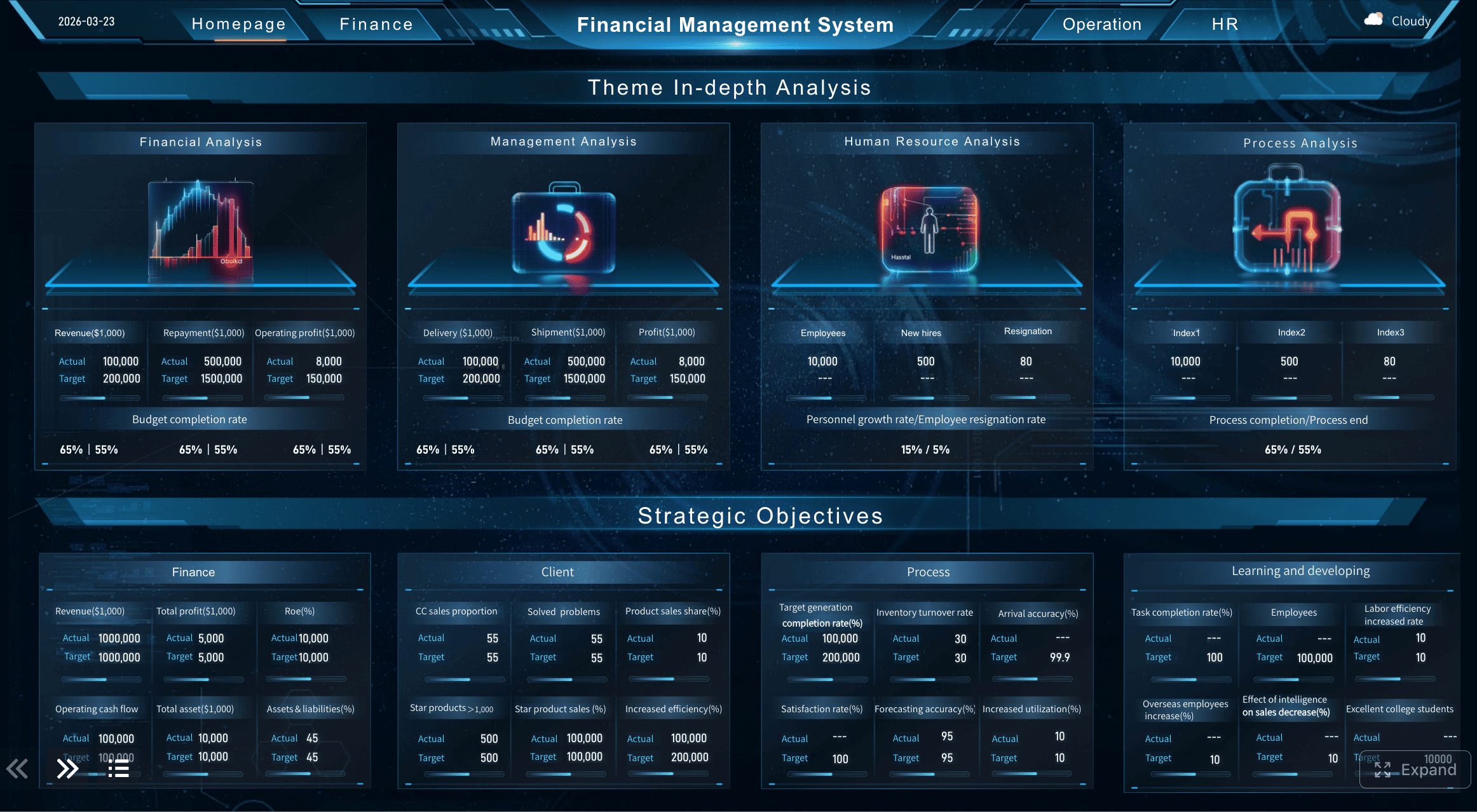
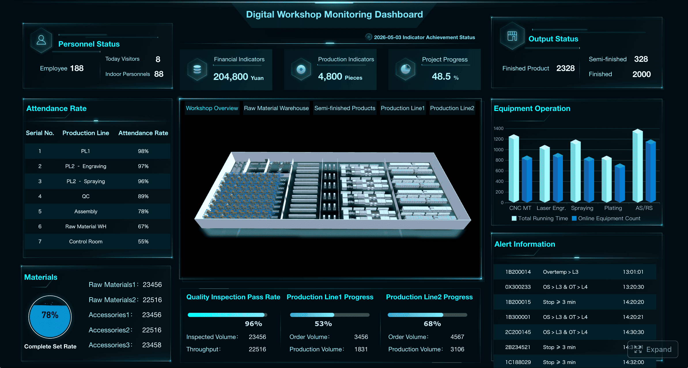
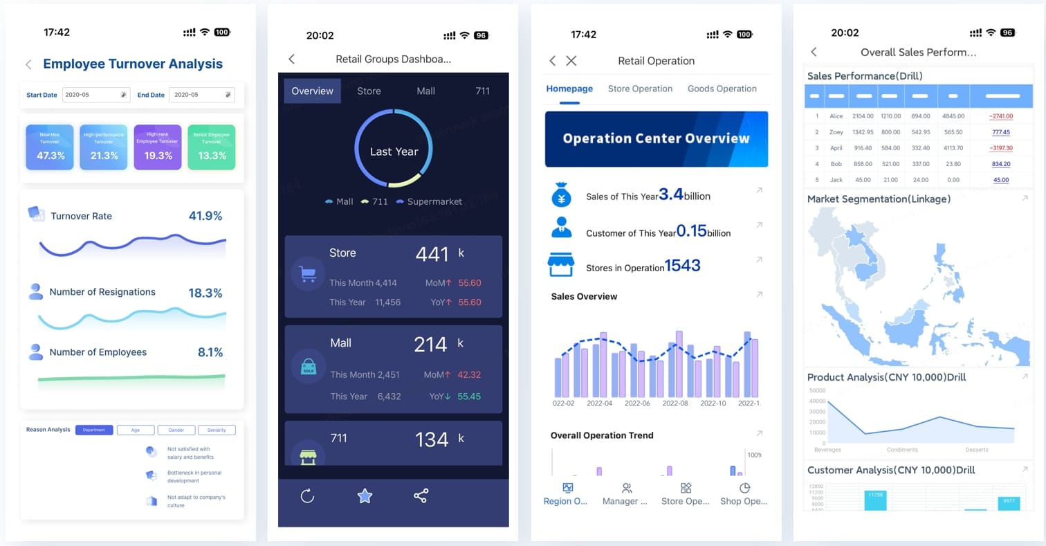
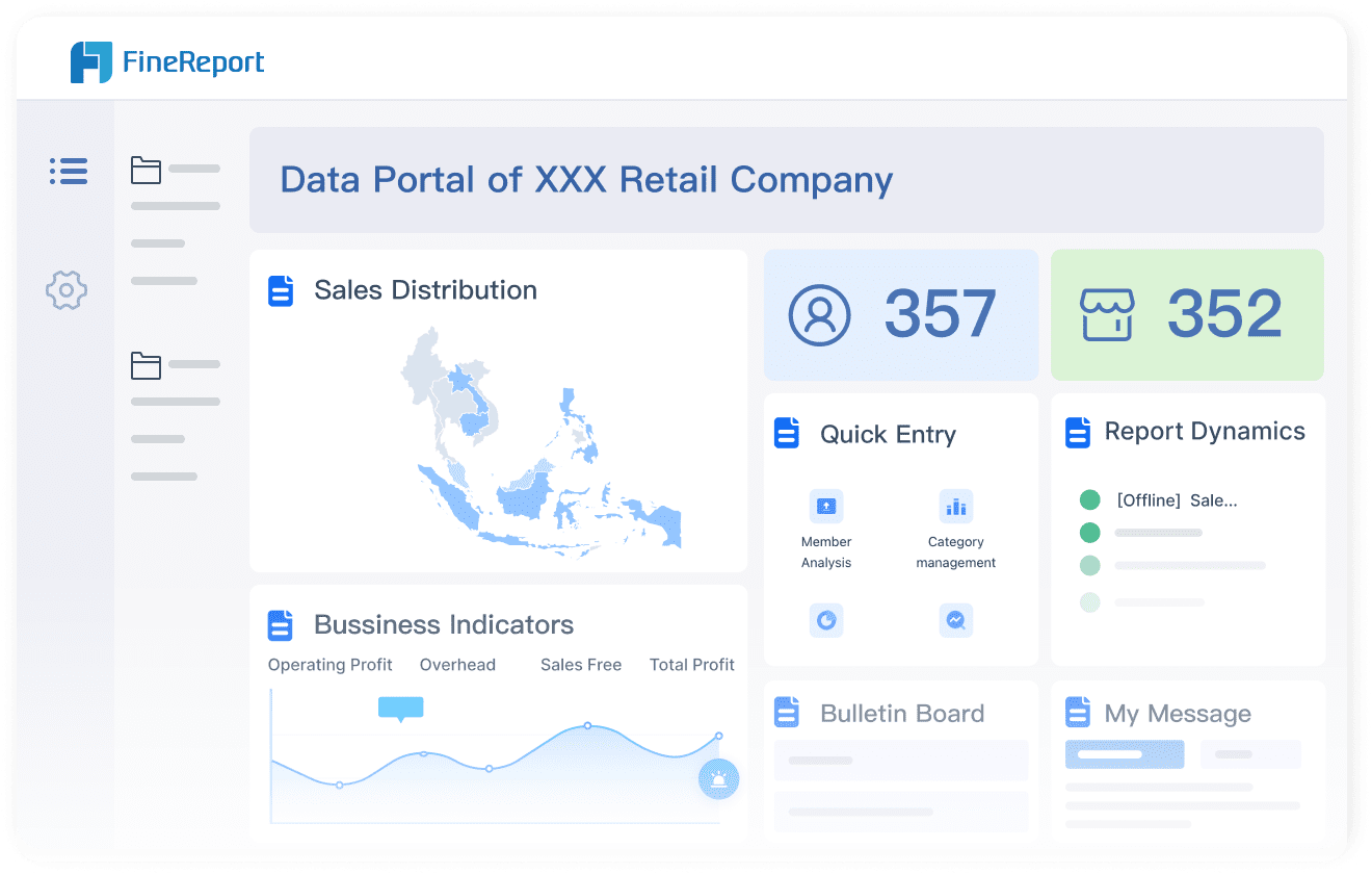
Admin dashboard design inspiration is easy to find. Turning that inspiration into a live, data-connected enterprise dashboard is the hard part. This guide bridges both: concrete admin dashboard design examples organized by use case and visual style, followed by practical guidance on moving from UI mockups to production-grade dashboards with real data, permissions, and automated refresh.
All dashboards in this article were created by FineReport.
Each example below includes design principles, when to use it, and signals that indicate readiness for enterprise-grade implementation.
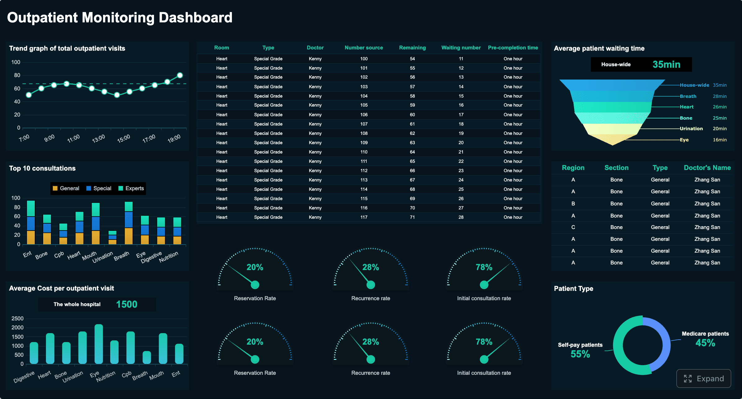
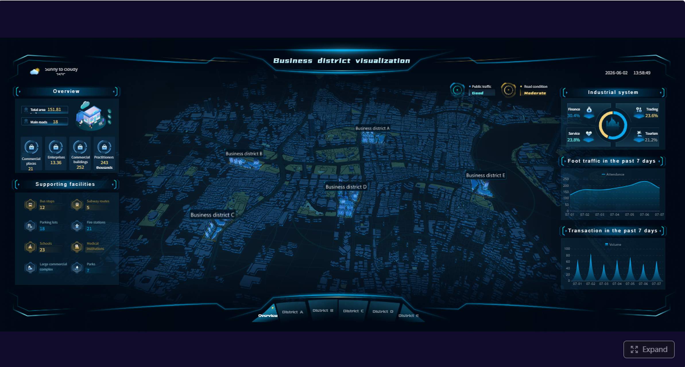
Dark Mode Admin Dashboard Design
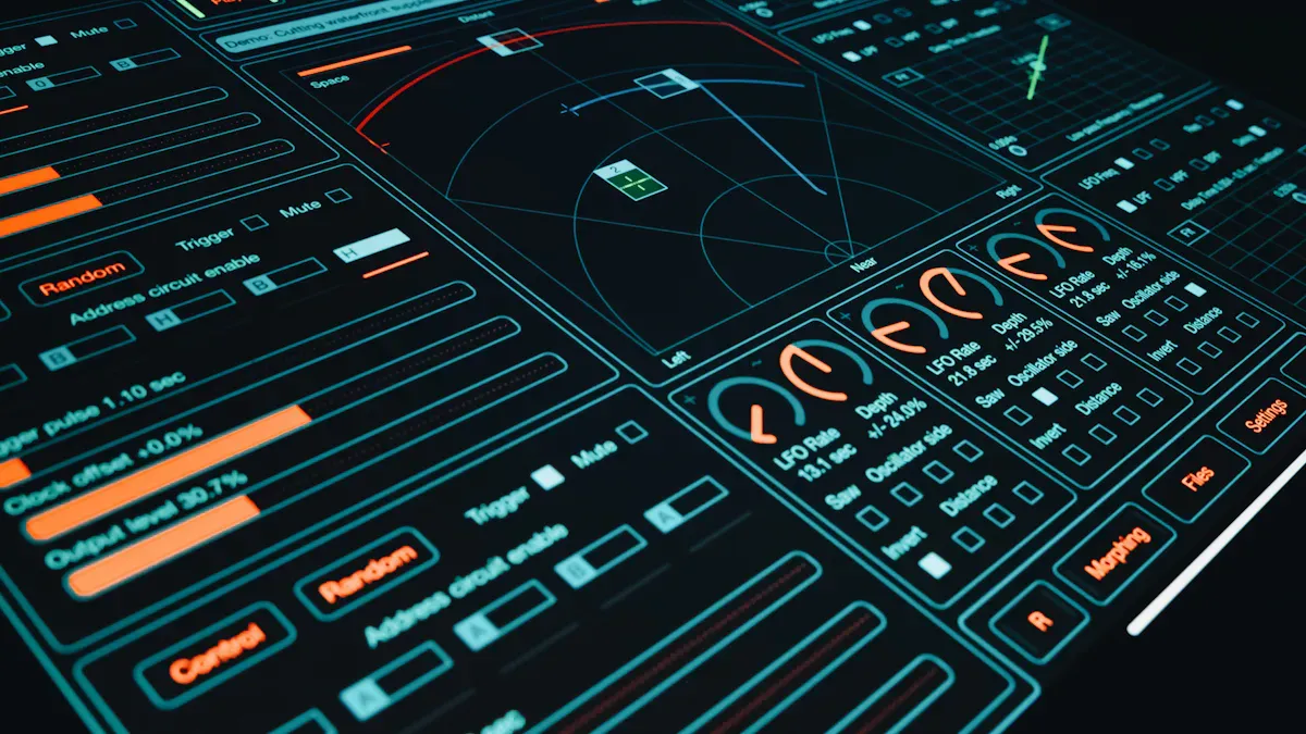
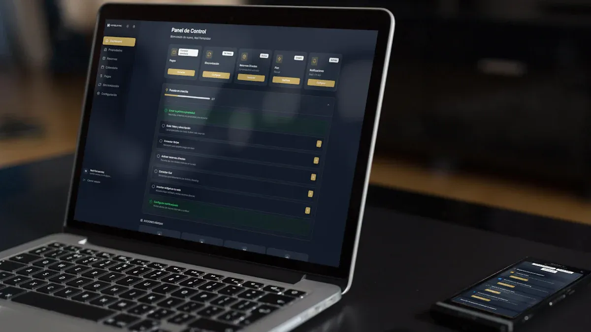
Dark mode is not an aesthetic preference — it is a functional requirement for monitoring centers, network operations, overnight shifts, and any environment where screens are viewed for extended periods in low ambient light.
When Dark Mode Is the Right Choice
Monitoring and NOC environments: Operators watch dashboards for hours; dark backgrounds reduce cumulative eye strain.
Real-time operations and incident response: Alerts must pop against the background; dark surfaces make color-coded severity instantly scannable.
Low-light or shift-work settings: Warehouses, factories, hospitals, and 24/7 support centers benefit from reduced glare.
Data-dense visualization: Charts with many overlapping elements gain clarity when gridlines and labels recede into dark backgrounds.
Dark Mode Design Principles
Principle
Do
Don't
Background hierarchy
Use 2–3 shades of dark gray (#121212, #1E1E1E, #2C2C2C) to separate panels, cards, and modals
Use pure black (#000000) everywhere; it flattens depth and causes smearing on OLED
Text contrast
Maintain WCAG AA minimum (4.5:1 for body, 3:1 for large text); prefer off-white (#E0E0E0) over pure white
Use pure white (#FFFFFF) on dark backgrounds; it causes halation and fatigue
Alert colors
Reserve red/orange/yellow for genuine anomalies; use muted tones for normal states
Color-code every element; desensitizes operators to real alerts
Chart readability
Use saturated but not neon chart colors; add subtle glow or border for distinction against dark
Use low-saturation pastels that disappear against dark backgrounds
Spacing and grouping
Increase padding between modules; dark mode compresses perceived whitespace
Crowd elements together; legibility suffers more in dark mode than light
Toggle option
Always offer light/dark toggle; respect system preference as default
Force dark mode on all users regardless of context or preference
Common Dark Mode Mistakes
Inverting light-mode designs directly: Colors, shadows, and borders that work on white fail on dark. Redesign, don't invert.
Using color alone to convey status: Add icons, labels, or position cues for accessibility and color-vision deficiency.
Ignoring ambient lighting variation: A dashboard that looks perfect in a dim NOC may be unreadable in a sunlit office. Test in actual deployment conditions.
Neglecting print/export: Dark-mode dashboards printed or exported to PDF waste ink and lose legibility. Auto-switch to light theme for export.
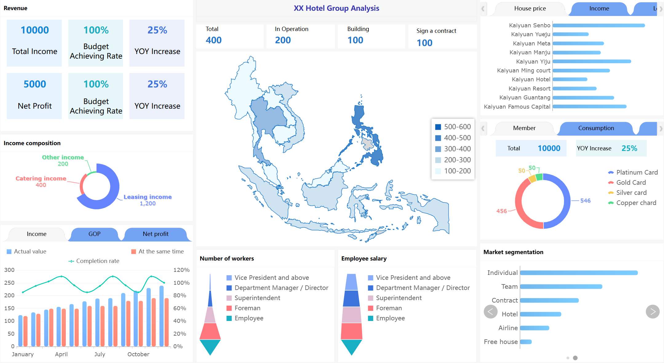
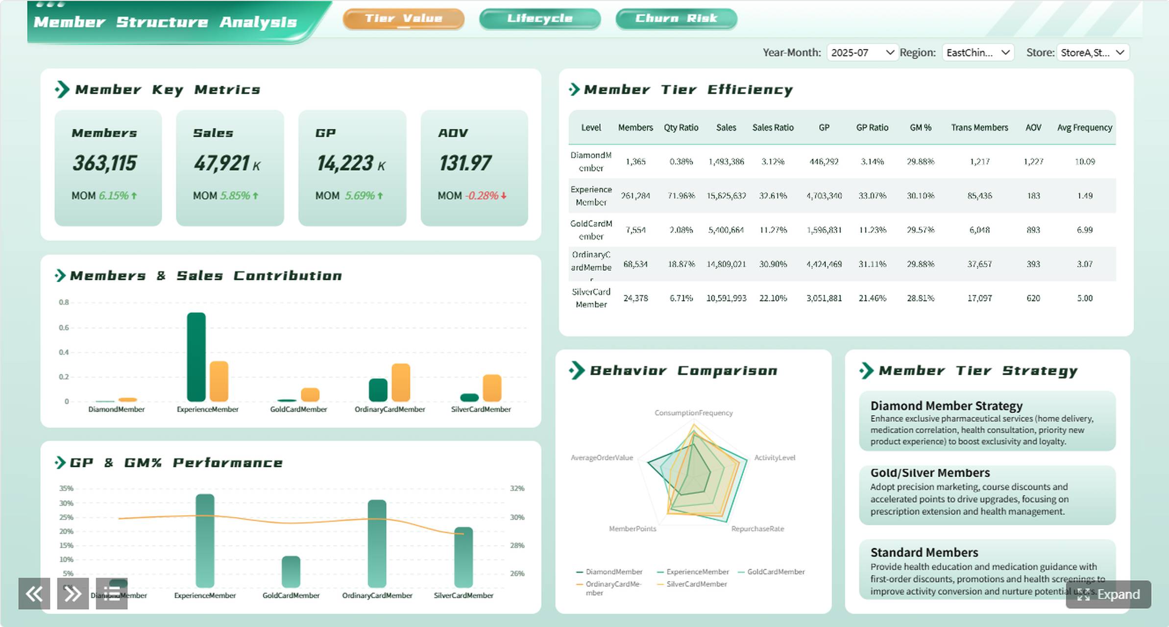
Light Mode Admin Dashboard Design
Light mode remains the default for most business admin dashboards used during daytime office hours. Its advantages are familiarity, print compatibility, and lower cognitive load for text-heavy interfaces.
When Light Mode Is the Right Choice
General business administration: User management, content moderation, approval workflows.
Text-dense interfaces: Tables, forms, document previews where readability depends on high contrast black-on-white.
Printed or exported reports: Light backgrounds translate directly to paper and PDF without adaptation.
Mixed-audience dashboards: When the same dashboard serves executives, analysts, and operators across varying environments.
Light Mode Design Principles
Whitespace as structure: Use consistent spacing (8px grid) to separate sections. Whitespace reduces cognitive load more effectively than borders or dividers.
Color with restraint: Limit to 3–5 semantic colors (success, warning, error, info, neutral). Decorative color adds noise without information.
Typography hierarchy: Establish 3 levels maximum (heading, subheading, body). Size and weight do more work than color for scanning.
Subtle elevation: Use light shadows or 1px borders to distinguish cards. Avoid heavy drop shadows that create visual clutter.
Accessible contrast: Maintain WCAG AA standards. Test with grayscale filter to ensure information is not conveyed by color alone.
Executive KPI Admin Dashboard
Executive dashboards answer one question: "Are we on track?" They prioritize breadth over depth, summaries over detail, and exceptions over completeness.
Design essentials: Large KPI cards with trend sparklines; single-screen layout requiring no scroll; conditional formatting for variance thresholds; drill-down available but not visible by default.
When this works: Monthly or quarterly management reviews; board reporting; strategic health checks.
When to upgrade: Executives ask follow-up questions that require slicing by dimension; KPI definitions vary across departments; data must reconcile automatically from multiple source systems.
Operations Admin Dashboard
Operations dashboards monitor the pulse of daily business. They emphasize real-time status, exception visibility, and quick triage over historical analysis.
Design essentials: Status grids with color-coded cells; countdown timers for SLAs; sortable/filterable exception lists; compact density for high information volume.
When this works: Shift handovers; daily standups; operational control rooms.
When to upgrade: Multiple data sources must merge in real time; alert routing requires role-based logic; historical pattern detection informs proactive intervention.
Sales Admin Dashboard
Sales admin dashboards serve sales leadership and regional managers who need pipeline visibility, rep performance tracking, and forecasting inputs.
Design essentials: Funnel visualization with stage conversion rates; rep leaderboard with quota attainment bars; geographic or segment filters; trend lines comparing current vs prior period.
When this works: Weekly sales reviews; territory planning; compensation validation.
When to upgrade: CRM data must integrate with ERP for margin analysis; forecasting models require statistical methods beyond visual trends; mobile access needed for field reps.
Finance Admin Dashboard
Finance dashboards support FP&A, controllership, and CFO-level oversight. Accuracy, auditability, and drill-through capability matter more than visual flair.
Design essentials: Variance tables with favorable/unfavorable indicators; waterfall charts for P&L bridges; period-over-period comparisons; clickable drill-down to transaction-level detail.
When this works: Month-end close review; budget vs actual monitoring; cash flow forecasting.
When to upgrade: Multi-entity consolidation required; intercompany eliminations must automate; regulatory reporting demands version-controlled audit trails.
Manufacturing Admin Dashboard
Manufacturing dashboards track production efficiency, equipment health, and quality metrics. They often run on shop-floor displays alongside traditional office screens.
Design essentials: OEE gauges with target overlays; equipment status matrices; defect Pareto charts; shift-comparison views; large fonts for distance readability.
When this works: Production shift reviews; quality standups; maintenance planning.
When to upgrade: Machine sensor data streams require real-time ingestion; cross-line benchmarking needs centralized data; predictive maintenance models integrate with operational dashboards.
Mobile Admin Dashboard
Mobile admin dashboards serve managers and on-call staff who need critical information away from their desks. They are not shrunken desktop dashboards — they are purpose-built for small screens and intermittent attention.
When this works: Approval workflows; on-call incident triage; field team check-ins; executive travel.
When to upgrade: Complex filtering or multi-dimensional analysis is needed (redirect to desktop); real-time streaming exceeds mobile bandwidth constraints; security policies restrict sensitive data on personal devices.
Beyond specific types, effective admin dashboards share universal design principles:
Answer a specific question first: Every dashboard should have a primary purpose stated in one sentence. If you cannot articulate it, the dashboard lacks focus.
Match granularity to audience: Executives need summaries; operators need detail. Do not serve both in the same view without progressive disclosure.
Prioritize signal over decoration: Remove any element that does not change a decision. Charts without actionable interpretation are wallpaper.
Design for the worst-case data state: Empty states, error states, loading states, and outlier values. Dashboards that look great with sample data but break with real data fail in production.
Test with real users early: Observe actual usage, not self-reported preferences. Where users click, what they ignore, and where they get stuck reveal design truth.
Plan for evolution: Business questions change. Build modular, configurable dashboards rather than pixel-perfect static designs that require full rebuilds when requirements shift.
Admin Dashboard Design Checklist
Use this checklist before approving any admin dashboard design for development:
Category
Check
Purpose
Primary question articulated in one sentence
Audience
User roles defined; access levels mapped
Data sources
All required sources identified; refresh frequency confirmed
Layout
Information hierarchy matches user priority; tested with real data volumes
Visual encoding
Color, size, and position convey meaning consistently; accessible contrast verified
Interaction
Filters, drill-down, and exports specified; edge cases documented
Responsiveness
Behavior defined for desktop, tablet, and mobile breakpoints
Performance
Load time target set (<3 seconds); tested with production-scale data
Security
Row-level and object-level permissions designed; authentication method confirmed
Maintenance
Ownership assigned; update process documented; monitoring configured
Skipping this checklist is the most common reason dashboard projects stall between design approval and production deployment.
When to Move from UI Mockups to Live Dashboards
UI inspiration is useful for layout, but enterprise admin dashboards also need live data, permissions, scheduled reports, drill-down, mobile access, and multi-source integration. FineReport helps teams turn dashboard design ideas into working business dashboards connected to real enterprise data.
Use UI templates when...
Use FineReport when...
You only need a static mockup
You need a live enterprise dashboard
The dashboard is for design review
The dashboard is used by managers daily
Data can be pasted manually
Data comes from databases, ERP, CRM, or Excel
No permissions are needed
Different roles need different views
No refresh is required
Data must refresh automatically
The transition point is not when the design is "finished." It is when the business requires data freshness, access control, or distribution that static files cannot provide.
How FineReport Helps Build Enterprise Admin Dashboards
FineReport connects dashboard design to enterprise reality through capabilities that UI tools cannot provide:
Live data connectivity: Direct connections to databases, APIs, ERP, CRM, and spreadsheets eliminate manual data preparation and ensure dashboards reflect current state.
Role-based permissions: Row-level and component-level security ensures each user sees only authorized data within the same dashboard template. Scheduled generation and distribution: Dashboards auto-refresh and distribute via email, portal, or mobile app on configured schedules without manual intervention. Interactive drill-down: Click-through from summary KPIs to underlying detail records within the same governed environment. Responsive and mobile-native layouts: Single design adapts to desktop, tablet, and mobile form factors with device-appropriate interaction patterns. Parameterized templates: One dashboard template serves multiple entities, regions, or time periods through user-selected parameters rather than duplicated files.
How Dora Adds AI Summaries to Dashboard Monitoring
After a FineReport admin dashboard is live, Dora can help managers summarize KPI changes, detect unusual movements, and ask follow-up questions in natural language instead of manually checking every chart.
Dora operates on governed FineReport assets. It does not build dashboards or replace visual monitoring. It accelerates the path from "dashboard viewed" to "insight understood" by providing conversational access to the same trusted data that powers the dashboard.
CXO Dashboards for Public Sector (ADPIC Story)
Managing government projects comes with big challenges. You need to keep everything on track and show the public how resources are used. The Abu Dhabi Projects and Infrastructure Centre (ADPIC) used FineReport to build a CXO dashboard that transformed their operations.
This dashboard design brings together project data, safety metrics, and sustainability goals. Executives see real-time updates on project progress, budget allocations, and quality standards. The dashboard makes it easy to spot delays or risks and respond quickly.
Public-facing dashboards play a huge role in building trust. They let residents see how their government works, where money goes, and how projects move forward. When you use dashboards to share complex data in a visual format, you help everyone understand what’s happening. This kind of data visualization improves transparency and accountability. It also encourages community engagement.
FineReport’s dashboard design for ADPIC shows how you can:
Consolidate data from multiple sources for a single source of truth
Visualize KPIs for better executive decision-making
Communicate progress and challenges to the public
Promote transparency and trust in government operations
You get a dashboard that supports both internal management and public communication. This is a best practice for any organization that values openness and efficiency.
Access a wealth of case studies, industry insights, and solution guides to accelerate digital transformation.
FAQ
What is an admin dashboard?
An admin dashboard is a centralized interface that consolidates key business metrics, operational status, and management tools into a single view. It enables administrators, managers, and executives to monitor performance, identify exceptions, and make decisions without navigating multiple systems.
What should an admin dashboard include?
At minimum: clearly labeled KPIs aligned to business objectives, real-time or appropriately refreshed data, exception/alert visibility, drill-down capability for root cause investigation, and role-appropriate access controls. Content should match the audience's decision-making scope — executive dashboards emphasize summaries; operational dashboards emphasize detail and status.
What is the best layout for an admin dashboard?
There is no universal best layout. Effective layouts match information hierarchy to user priority: place the most critical metric or status indicator in the top-left (for LTR languages), group related elements spatially, and use progressive disclosure to manage complexity. Test layouts with real users and real data volumes before finalizing.
Should admin dashboards use dark mode?
Dark mode is recommended for monitoring centers, overnight shifts, low-light environments, and data-dense real-time operations where extended viewing causes eye strain. Light mode is preferable for text-heavy interfaces, daytime office use, printed outputs, and mixed-audience dashboards. Always offer a toggle and respect system preferences.
How do I turn an admin dashboard design into a live dashboard?
Connect the design to live data sources, implement role-based permissions, configure automated refresh and distribution, test with production-scale data, and deploy through a governed platform like FineReport. Static UI mockups become live dashboards when they require data freshness, access control, or recurring distribution that file-based tools cannot sustain.
Can FineReport replicate any admin dashboard design?
FineReport supports highly customizable layouts, rich visualization components, and responsive design. Most admin dashboard designs can be implemented faithfully. For extremely custom visual effects, evaluate feasibility during prototyping. The priority should always be functional accuracy and data reliability over pixel-perfect replication of static mockups.