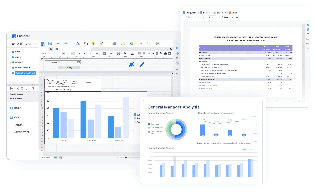
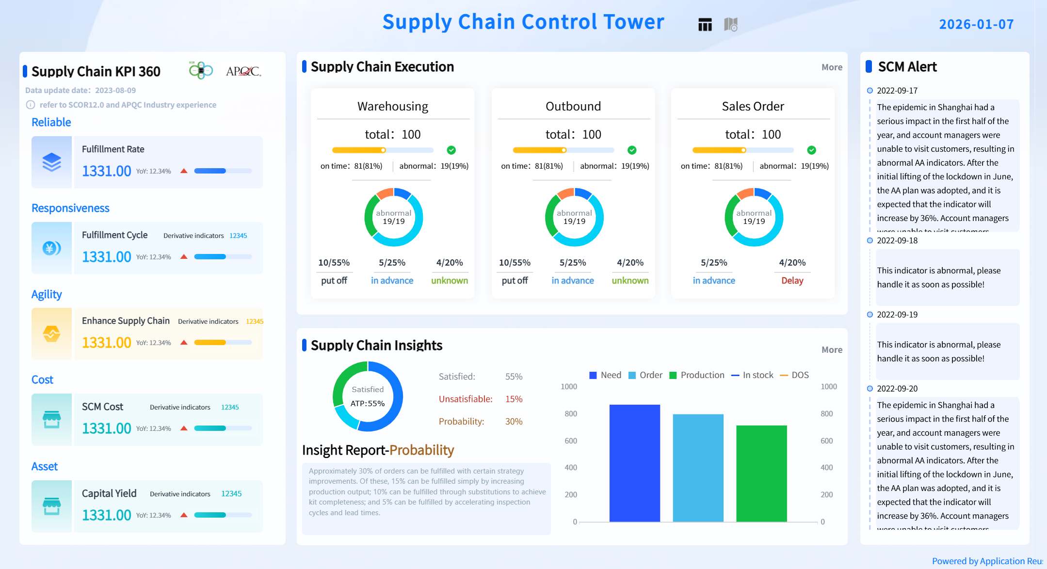
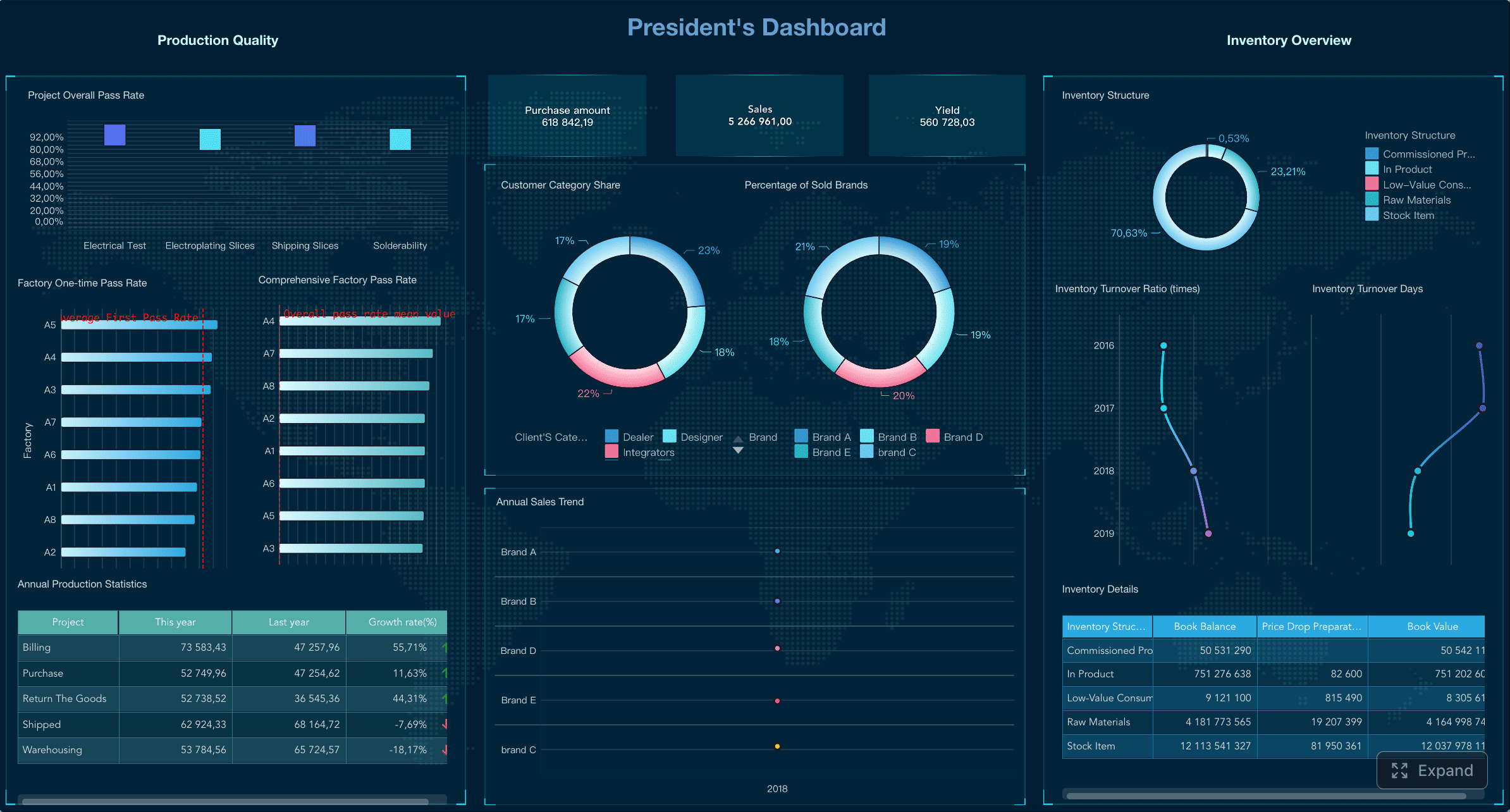
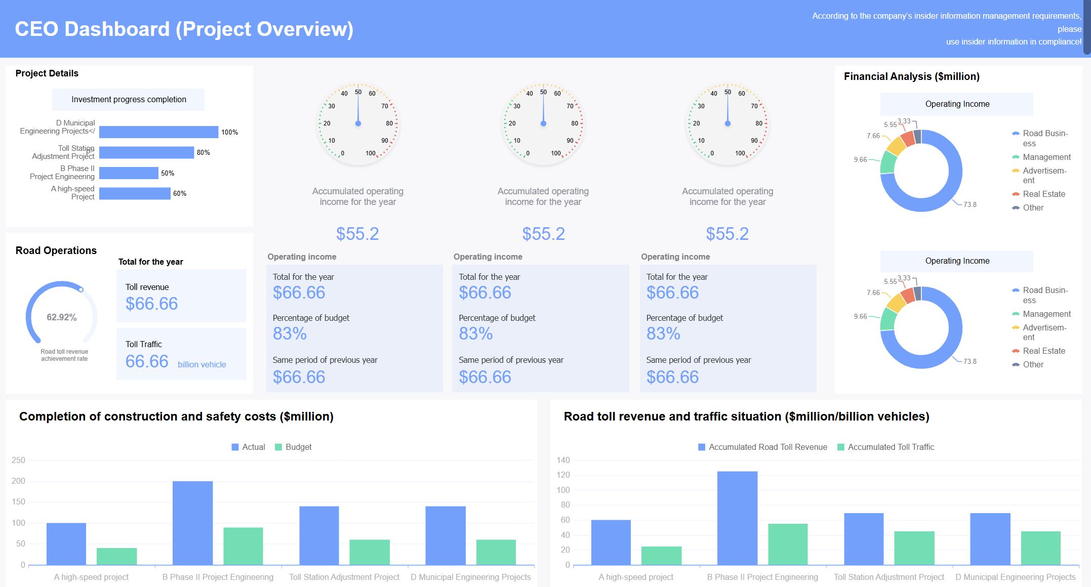
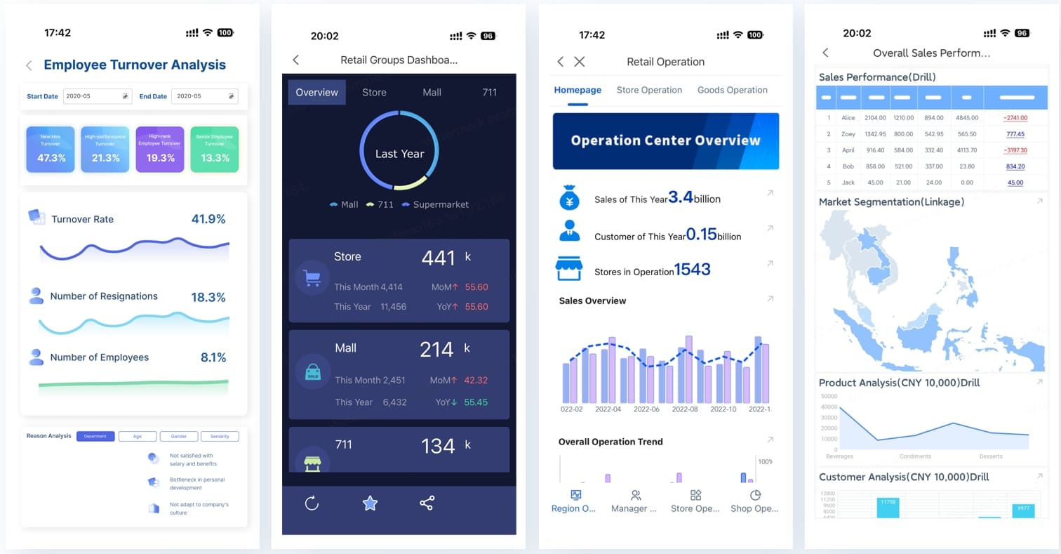
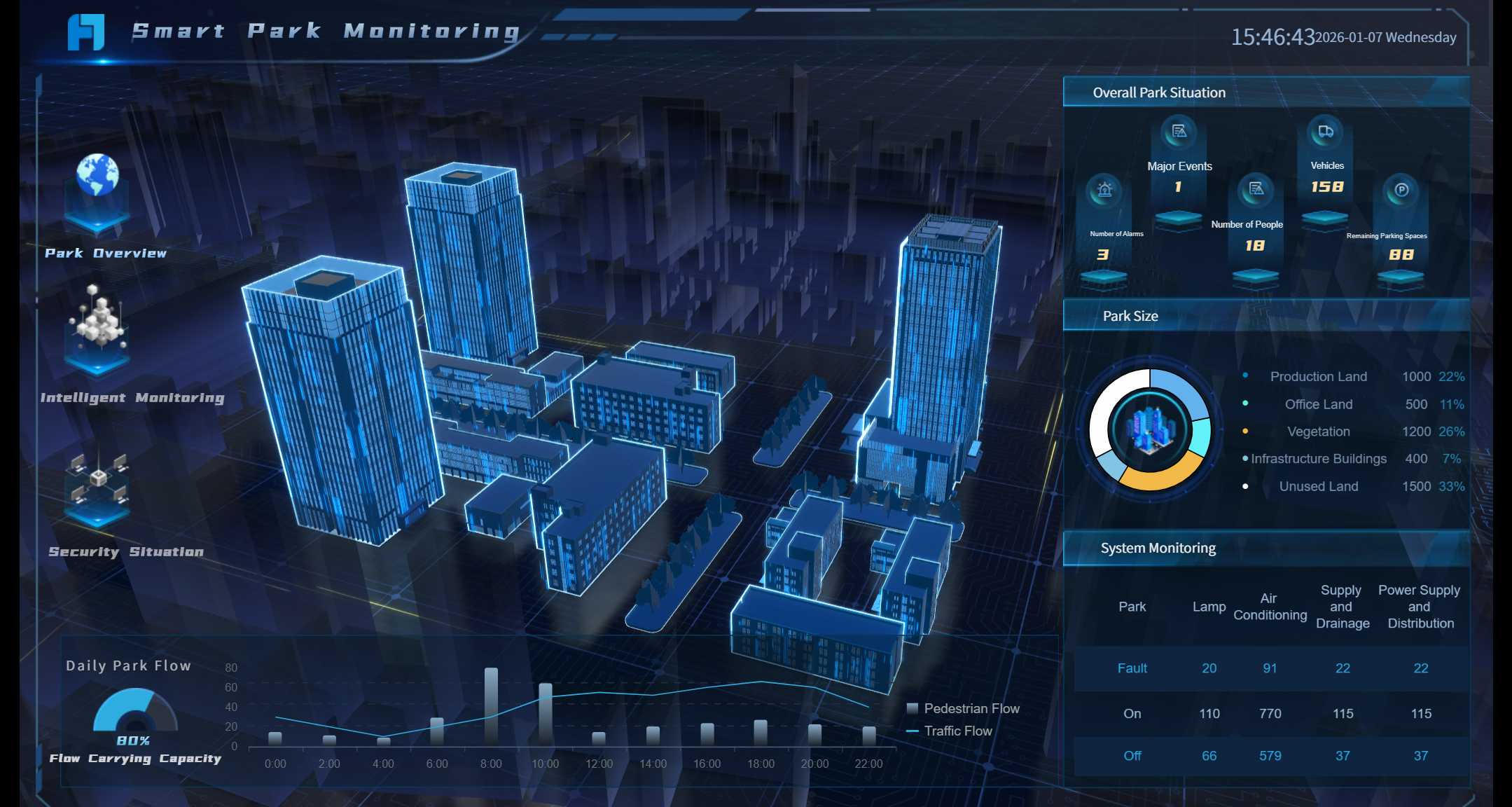
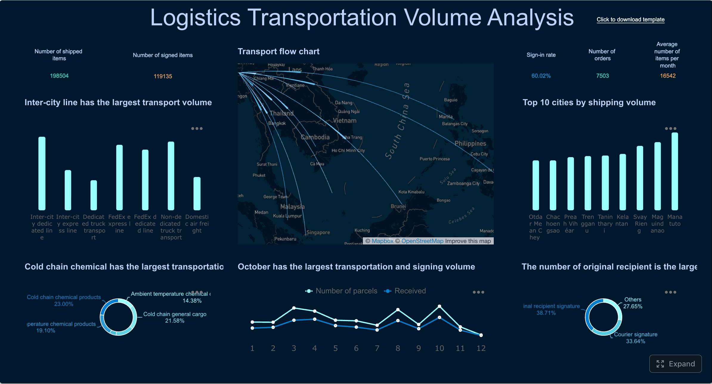
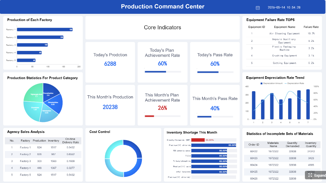
Modern dashboard design balances visual clarity, functional density, and data freshness. Whether you are designing an analytics workspace, an executive summary screen, a mobile operations view, or an immersive 3D command center, the right template accelerates delivery — but only if it connects to real data and serves real users.
This guide presents 15 modern dashboard design examples organized by type and use case, followed by practical guidance on choosing templates, distinguishing UI mockups from production dashboards, and turning designs into live enterprise systems with FineReport.
Modern dashboard design in 2026 means smarter, more interactive dashboards that help you make decisions faster. You get real-time insights, intuitive UI, and tools that adapt to your needs. FineReport leads the way with flexible templates and advanced features for every business.
Why Modern Dashboard Design Matters in 2026
You want dashboards that do more than just look good. In 2026, dashboards must deliver real value. They need to help you spot trends, act quickly, and stay ahead. The modern concept dashboard design puts you in control, making complex data simple and actionable.
Let’s look at the biggest trends shaping dashboard design for 2026:
Trend
Description
AI as the Core Engine
AI powers automated insights and personalizes your dashboard experience.
Ubiquitous Analytics
You see analytics everywhere, right inside your business apps.
Human-Centric Design
Dashboards focus on trust, privacy, and user needs.
Hyper-Personalization
Your dashboard adapts to your habits and preferences.
Real-Time and Proactive Intelligence
Dashboards alert you to issues and predict outcomes instantly.
Immersive Experiences
3D and AR/VR dashboards let you interact with data in new ways.
Mobile-First Design
Dashboards look great and work smoothly on any device.
Interactive Dashboards
You can explore and drill into data with ease.
FineReport stands out by embracing these trends. You get dashboards with AI-powered insights, real-time updates, and a UI that feels natural. FineReport’s templates support immersive 3D dashboards, mobile dashboards, and interactive features that keep you engaged.
Key Features of Modern Dashboard Design
You need dashboards that are easy to use, fast, and flexible. Here’s what defines a top dashboard template in 2026:
Feature
Description
Design & User-friendliness
Clean UI and simple navigation make dashboards easy for everyone.
Customization & Responsiveness
Dashboards adjust to any screen and let you tweak layouts and colors.
Built-in Components
You get a wide range of charts, tables, and widgets for rich data visualization.
Performance Optimization
Dashboards load quickly and run smoothly, even with big data.
FineReport brings all these features together. You can create dashboards with drag-and-drop design, responsive layouts, and a UI that works on any device. The platform supports advanced visualizations, including 3D and mobile dashboards, so you always have the right tools for your data.
Tip: Choose a dashboard template that matches your workflow and lets you customize the UI. This way, you get a dashboard that grows with your business.
You want the best analytics dashboard templates for 2026. These templates give you powerful analytics, clean design, and a UI that makes data easy to understand. You can track KPIs, spot trends, and make smarter decisions with the right dashboard template.
Analytics-Focused Dashboard Designs
Analytics dashboards serve analysts and business users who explore data, test hypotheses, and communicate findings. They prioritize flexibility over fixed narratives.
Design essentials: Interactive filters (date, segment, dimension); multiple chart types in linked views; comparison toggles (YoY, MoM, vs target); exportable outputs; clean typography and consistent color semantics.
When this works: Ad-hoc analysis; monthly business reviews; self-service exploration for trained users.
When to upgrade: Data sources exceed manual import capacity; governed metric definitions must be enforced centrally; team sharing requires role-based access rather than file distribution.
Modern Dashboard Design created by FineReport (Click to Engage)
You can use these templates for finance saas dashboard projects, sales analytics, or any business that needs a modern dashboard design. The UI stays clean and easy to use, so you can focus on your data.
Executive Dashboard Design Templates
Executive dashboards answer "Are we on track?" in under 10 seconds. They sacrifice granularity for speed and clarity.
Design essentials: 4–6 large KPI cards with trend sparklines; conditional formatting for variance thresholds; single-screen layout requiring no scroll; drill-down available but hidden by default; minimal chart complexity.
When this works: Board meetings; quarterly business reviews; strategic health checks.
When to upgrade: Executives consistently ask follow-up questions requiring dimensional slicing; KPI definitions vary across departments; data reconciliation from multiple systems must be automated.
Project dashboards track delivery progress, resource allocation, and risk exposure across initiatives.
Design essentials: Gantt or timeline visualization; milestone markers with status indicators; workload heatmap by team member; budget burn chart; sortable task/issue list with priority tagging.
When this works: Weekly standups; portfolio reviews; client status reporting.
When to upgrade: Projects span multiple tools (Jira, Asana, MS Project) requiring unified view; resource conflicts must be detected automatically; historical velocity data informs future estimation.
When this works: Approval workflows; on-call incident triage; field team check-ins; executive travel.
When to upgrade: Complex filtering or multi-dimensional analysis is needed (redirect to desktop); real-time streaming exceeds mobile bandwidth; security policies restrict sensitive data on personal devices.
3D Dashboard Design Templates
3D dashboards add spatial context to operational data. They are justified when physical layout, geographic distribution, or equipment topology is central to understanding.
Design essentials: Digital twin or GIS base layer; overlaid KPI markers with color-coded status; camera controls for zoom/rotate; performance optimization for smooth rendering; fallback 2D view for low-spec devices.
Use cases: Factory floor monitoring; smart city infrastructure; logistics network visualization; warehouse layout optimization; energy grid management.
When to avoid: When 2D charts convey the same information more efficiently. 3D adds cognitive load and development cost; justify it with demonstrable operational benefit, not visual novelty.
Easier to meet contrast standards; familiar to most users
Always offer a toggle. Respect system preference as default. Never force one mode on all users regardless of context.
Dark Mode Dashboard (Click to Engage)Light Mode Dashboard (Click to Engage)
Free UI Templates vs Live Business Dashboards
UI templates provide visual inspiration and layout starting points. Live business dashboards deliver governed, connected, actionable intelligence. Confusing the two is the most common reason dashboard projects stall between design approval and production deployment.
Use UI templates when...
Use FineReport when...
You need a static design mockup
You need a live dashboard connected to real data
You are designing an admin interface
Managers use the dashboard every day
Data can be manually pasted
Data comes from databases, Excel, ERP, or APIs
No permission control is needed
Different roles need different dashboard views
No automatic refresh is required
Dashboards must refresh on schedule or in real time
Popular UI template sources (Colorlib, WrapPixel, TailAdmin, Tabler) are valuable for prototyping and design review. They are not enterprise dashboard platforms. The transition to FineReport occurs when business requirements demand data freshness, access control, automated distribution, or multi-source integration that static files cannot provide.
How to Choose a Modern Dashboard Template
Selection criteria should match organizational maturity and use case specificity:
Define the primary question first: "What decision does this dashboard support?" If you cannot answer in one sentence, no template will save you.
Match granularity to audience: Executives need summaries; operators need detail. Do not serve both in the same view without progressive disclosure.
Assess data source reality: Templates designed for CSV imports fail when data lives in SAP, Salesforce, or SQL Server. Verify connectivity before committing to a design.
Test with real data volumes: Sample datasets hide performance issues. Load production-scale data early to validate rendering speed and layout stability.
Plan for permissions and distribution: If multiple roles need different views or scheduled delivery, choose a platform that supports these natively rather than building workarounds.
Evaluate mobile requirements separately: Responsive desktop templates rarely translate well to mobile. Purpose-built mobile layouts outperform adaptive ones for field and on-call use cases.
Budget for maintenance: Dashboards evolve. Choose configurable, parameterized templates over pixel-perfect static designs that require full rebuilds when requirements shift.
How FineReport Turns Dashboard Designs into Live Enterprise Dashboards
FineReport bridges the gap between dashboard inspiration and production deployment through capabilities that UI template libraries cannot provide:
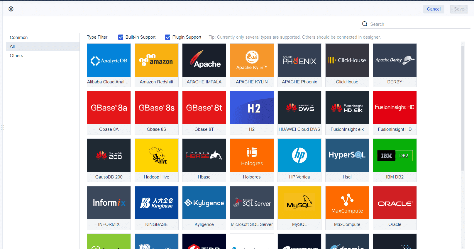
Live data connectivity: Direct connections to databases, APIs, ERP, CRM, and spreadsheets eliminate manual data preparation and ensure dashboards reflect current state.
Role-based permissions: Row-level and component-level security ensures each user sees only authorized data within the same dashboard template.
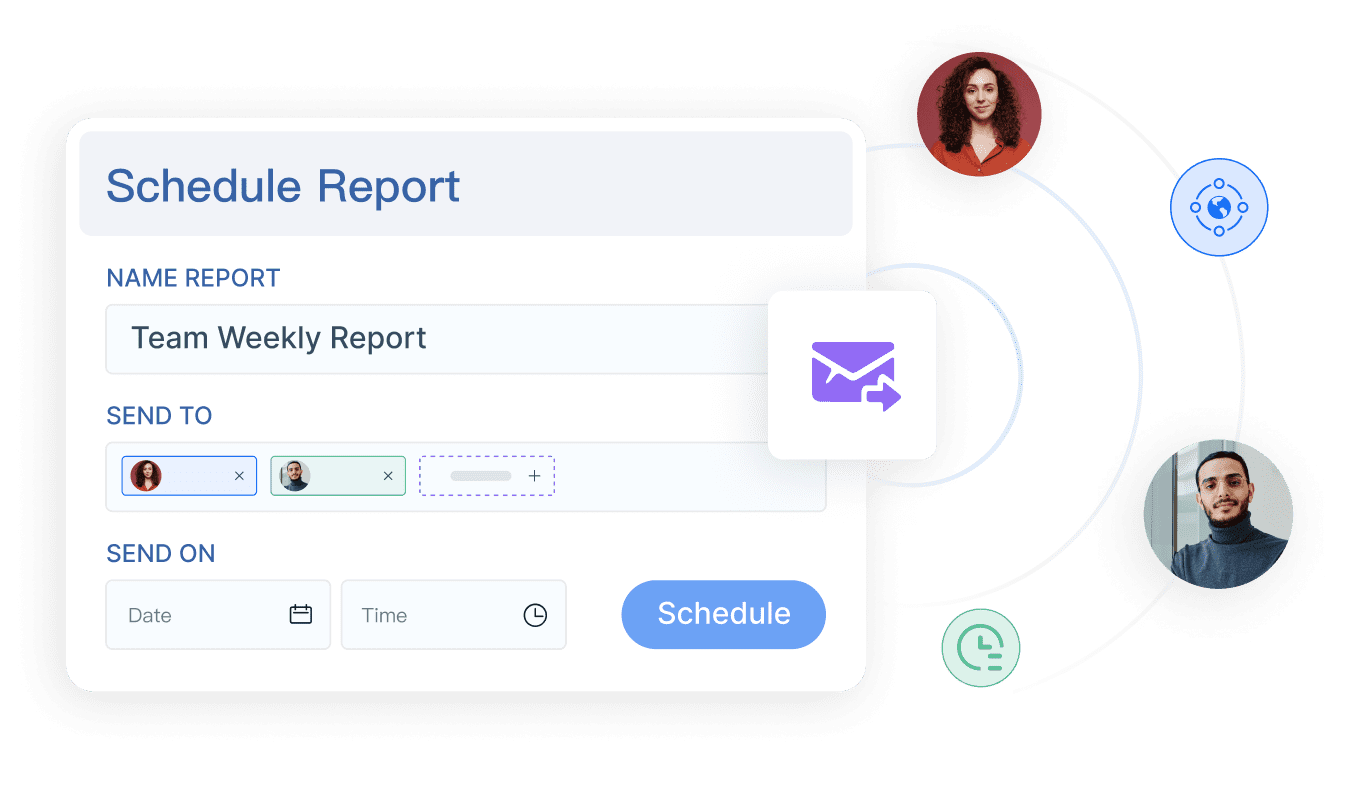
Scheduled generation and distribution: Dashboards auto-refresh and distribute via email, portal, or mobile app on configured schedules without manual intervention.
Interactive drill-down: Click-through from summary KPIs to underlying detail records within the same governed environment.
Responsive and mobile-native layouts: Single design adapts to desktop, tablet, and mobile form factors with device-appropriate interaction patterns.
3D and immersive visualization: Built-in 3D components for factory, logistics, and smart city dashboards without external rendering dependencies.
Parameterized templates: One dashboard template serves multiple entities, regions, or time periods through user-selected parameters rather than duplicated files.
FineReport's Live Data ConnectivityScheduled Generation and Distribution
How Dora Adds AI Summaries to Dashboard Monitoring
After a FineReport dashboard is connected to live data, Dora can help managers summarize KPI changes, explain unusual movements, and ask follow-up questions in natural language.
Dora operates on governed FineReport assets. It does not build dashboards or replace visual monitoring. It accelerates the path from "dashboard viewed" to "insight understood" by providing conversational access to the same trusted data that powers the dashboard.
Product Trial
FineReport
Pixel-perfect reports · Interactive dashboards · Easy data entry · Digital twins
Access a wealth of case studies, industry insights, and solution guides to accelerate digital transformation.
FAQ
What is a modern dashboard design template?
A modern dashboard design template gives you a ready-made layout for tracking data. You can use it to build dashboards fast, customize the look, and show key metrics in a clear way.
Can I use FineReport templates for mobile dashboards?
Yes, you can. FineReport templates work on phones, tablets, and PCs. You get a responsive design that looks sharp everywhere. You can check data, track KPIs, and make decisions on the go.
How do I connect my data to a dashboard template?
You just pick your data source and use the template’s integration tools. FineReport connects to databases, Excel files, and cloud services. You can see your data in real time without extra coding.
Are there free modern dashboard design templates available?
Yes! You can find free templates from FineReport, Colorlib, and WrapPixel. These options let you start building dashboards without spending money. You get clean layouts and easy customization.
What makes a dashboard template easy to use?
A good template has a simple UI, drag-and-drop features, and clear navigation. You can add charts, tables, and widgets without coding. The design helps you focus on your data and make smart decisions.