A time series graph is a simple way to show how something changes over time. You might use it to track sales, website visits, or even the weather. With a time series graph, you can spot trends, patterns, and sudden changes quickly. Businesses rely on these graphs to make smart decisions and notice problems early. Recent studies show that time series graphs help people see patterns and connections that would be hard to find in raw data. They also make it easier to spot unusual events and predict what might happen next.
Time Series Graph Basics
What Is a Time Series Graph
A time series graph is a type of line chart used to visualize data points in chronological order—typically over days, months, quarters, or years. It helps track changes, patterns, or trends in a variable over time. A time series graph helps you see how something changes as time passes. You plot each data point at a specific moment, like every day, week, or month. The horizontal axis always shows time, while the vertical axis shows the value you want to track. You connect the points with lines to make it easy to spot patterns.
A time series is an ordered sequence of numbers, each tied to a particular time. This order is important because it lets you see how things move and shift over time.
You often use a time series graph to track things like sales, temperature, or website visits. When you look at the graph, you can quickly notice trends, such as steady growth or sudden drops. You can also spot seasonality, which means regular changes that repeat, like higher sales every summer. These graphs help you find outliers, which are unusual points that stand out from the rest.
Here is a simple way to build a time series graph:
- Place time on the x-axis.
- Put your data values on the y-axis.
- Plot each point at the right time and value.
- Connect the points with lines to show how things change.
A time series graph is different from other charts because it always puts time first. This focus on time order helps you see how things develop, not just how they compare at one moment.
Key Features
Time order is the heart of every time series graph. You cannot mix up the order of the points, or you will lose the story the data tells. This order lets you see trends, seasonality, and sudden changes that would be hidden in a table or a bar chart.
Some key features set time series graphs apart:
- Chronological Order: Every point follows the one before it, showing how things change step by step.
- Trends: You can spot long-term rises or falls in your data.
- Seasonality: You see repeating patterns, like higher sales every December.
- Outliers: Unusual points jump out, making it easy to notice problems or surprises.
- Irregular Fluctuations: You can see random ups and downs that do not follow a pattern.
Other charts, like pie charts or bar charts, show how things compare at one time or how parts make up a whole. They do not show how things change over time. A time series graph always shows the journey, not just the snapshot.
Tip: When you use a time series graph, make sure your time intervals are equal. This keeps the graph clear and easy to read.
You can use many types of time series graphs, such as line charts, area charts, or bar charts. Each type helps you see different details, but all focus on how things move through time.
FanRuan stands out as a leader in data visualization and analytics. With tools like FineBI, you can easily create time series graphs from your business data. FineBI helps you connect to many data sources, clean your data, and build clear, interactive graphs. This makes it simple for you to spot trends, understand seasonality, and make better decisions.

How to Build a Time Series Graph
Time Series Data and Axes
When you want to create a time series plot, you first need to understand what makes data suitable for this type of graph. Time series data is a collection of values recorded at different points in time. Each value must have a timestamp, and the order of these timestamps matters. You cannot shuffle the order or you will lose the meaning behind the changes.
To qualify as time series data, your dataset should meet these criteria:
- You collect the data over a continuous period.
- Each entry arrives in chronological order.
- Time is the main axis in your dataset.
- You add new records without changing the old ones.
- The data can be regular (like daily sales) or irregular (like event logs).
- Regular measurements, called metrics, work best for modeling and forecasting.
Tip: Always check that your data uses consistent time intervals. This helps you spot real trends and patterns.
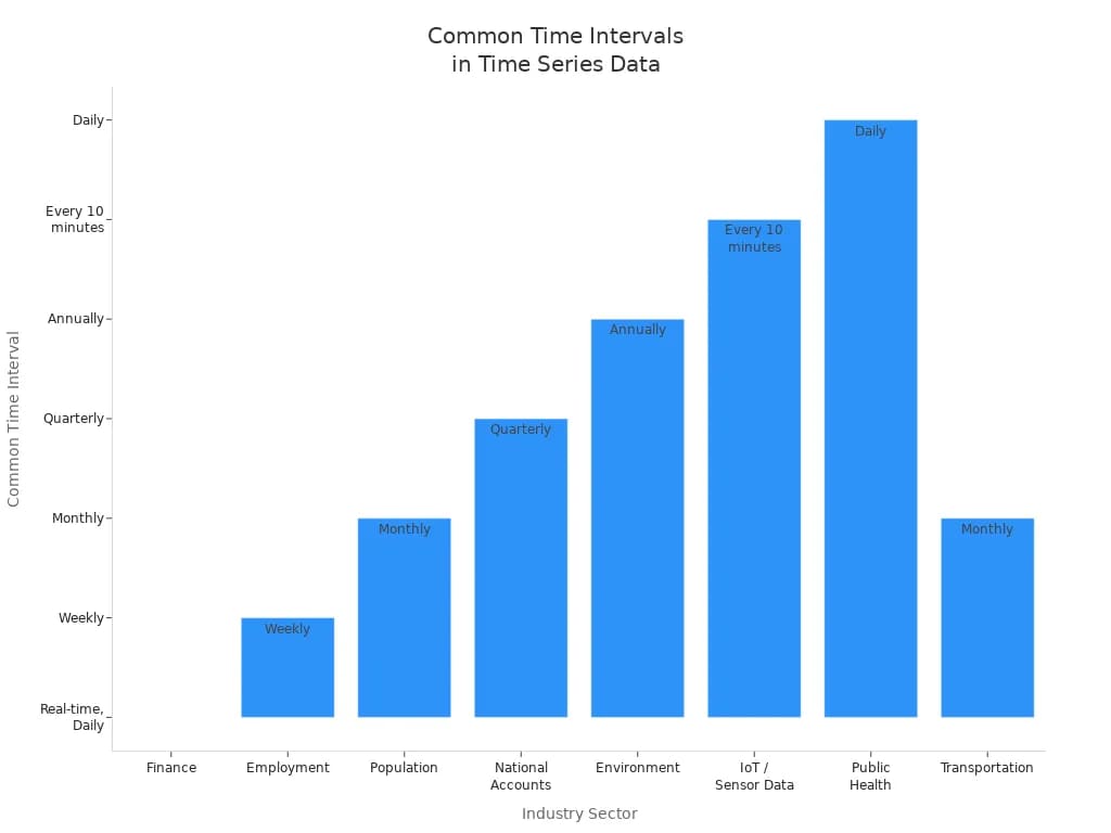
Different industries use different time intervals for their time series plot. Here is a table showing common intervals:
| Industry Sector | Example Data Type | Common Time Intervals |
|---|---|---|
| Finance | Interest Rates, Exchange Rates | Real-time, Daily |
| Employment | Nonfarm Private Payroll | Weekly |
| Population | US Population Data | Monthly |
| National Accounts | Federal Debt | Quarterly |
| Environment | CO2 Emissions | Annually |
| IoT / Sensor Data | Jena Climate Dataset | Every 10 minutes |
| Public Health | COVID-19 Cases | Daily |
| Transportation | NYC Yellow Taxi Trip Data | Monthly (with individual trip records) |
You should always match your time intervals to the needs of your analysis. For example, if you want to track temperature changes, you might use hourly or daily data. If you want to see long-term trends in population, yearly data works better.
When you set up your time series plot, place time on the x-axis. The y-axis will show the value you want to track, such as sales, temperature, or website visits. This setup lets you see how your data changes as time moves forward.
Plotting and Connecting Points
Now you are ready to build your time series plot. Follow these steps to make sure your graph is clear and accurate:
- Label the axes. Put time on the x-axis and your chosen value on the y-axis.
- Choose a scale for the y-axis that fits your data range.
- Find the coordinate pairs from your dataset. Each pair has a time and a value.
- Plot each point on the graph at the correct spot.
- Connect the points with line segments. This line helps you see trends, patterns, and sudden changes.
A time series plot often uses a line to connect the points. This line shows how your data moves from one time to the next. You can spot trends, such as steady growth or sudden drops. You might also notice repeating patterns, called seasonality, or unusual spikes that stand out from the rest.
Note: Always check your data before plotting. Make sure it is reliable and represents the pattern you want to study.
When you use FineBI, you can create a time series plot from many data sources without writing any code. FineBI lets you:
- Connect to databases, Excel files, or cloud data sources.
- Prepare your data by building datasets from tables or SQL queries.
- Drag the time field (like Year or Date) to the x-axis.
- Drag one or more value fields to the y-axis. This lets you create multi-series line charts if you want to compare several trends at once.
- Customize your chart by changing colors, adjusting axis settings, or formatting values.
- Add your chart to a dashboard for easy sharing and real-time updates.

FineBI makes it simple to combine data from different places and turn it into a clear, interactive time series plot. You can explore trends, compare different lines, and make better decisions based on what you see.
Tip: Use a line chart for your time series plot when you want to highlight changes over time. This type of chart is easy to read and helps you spot important patterns quickly.
Time Series Graph in Business Intelligence
Applications with FineBI
You use time series data in business intelligence to track changes and spot patterns that help you make better decisions. Many industries rely on this approach. In finance, you can analyze stock prices and interest rates to react quickly to market changes. In manufacturing, you monitor equipment performance to prevent breakdowns and improve efficiency. IoT devices collect sensor data, letting you see how machines or environments change over time. You also find time series data in healthcare, transportation, and even system monitoring for IT.
FineBI gives you powerful tools to work with time series data. You can connect to many data sources and build dashboards with a simple drag-and-drop interface. You do not need to be a technical expert. FineBI lets you group, sort, and filter your data, making it easy to highlight trends, seasonality, and outliers. You can use line charts, area charts, and other visualizations to see how values change over time. These features help you spot repeating patterns, sudden changes, and long-term shifts. You can also compare multiple data sets to see how different factors move together.

Tip: Use FineBI's interactive dashboards to track seasonality and trends in real time. This helps you respond quickly to changes and plan for the future.
Real-World Examples
Manufacturing companies use time series graphs to monitor equipment efficiency and improve operations. For example, you can track Overall Equipment Effectiveness (OEE) over time. This lets you see when machines slow down or need maintenance. By visualizing OEE data, you can find the root causes of problems and schedule repairs before breakdowns happen. You also use these graphs to compare performance across different machines or plants.
In agile manufacturing, you analyze time series data to adjust production schedules and manage resources. You can spot seasonality in demand, helping you plan for busy or slow periods. Companies like Amazon use time series analysis to optimize logistics and ensure on-time deliveries. Financial firms rely on these methods to manage risk and predict market movements. Health tech startups use time series graphs to predict medical complications, while retailers like Walmart track inventory and supply chain trends.
With FineBI, you can bring all this data together. You create dashboards that show real-time updates, making it easy to spot trends, seasonality, and outliers. This supports continuous improvement and smarter decision-making across your business.
Best Practices of Time Series Graph
Tips for Clear Graphs
You want your time series graphs to be easy to read and understand. Start by choosing the right chart type. Line charts work best for showing how values change over time. Always label your axes clearly, including the units you use. This helps everyone know what the graph shows.
Follow these steps to make your graphs clear:
- Align axis tick marks with their labels for accurate reading.
- Use faint grid lines to guide the eye without distracting from the data.
- Keep the vertical scale tight around your data points. You do not always need to start at zero, but make sure all points fit.
- Remove extra legend boxes and unnecessary text to reduce clutter.
- Use horizontal text for axis labels so people can read them easily.
- Add effect estimates or confidence intervals if you want to show more detail.
- Use color and font size to highlight important information and create a clear visual order.
- Test your graph with others and refine it based on feedback.
Tip: Define the main insight you want to share before you design your graph. This helps you focus on what matters most.
Avoiding Common Mistakes
Many people make simple mistakes when creating time series graphs. One common error is picking the wrong time scale. If you use intervals that are too small, your graph may look noisy. If you use intervals that are too large, you might miss important details or trends.
Here are some mistakes to avoid:
- Do not use pie charts or bar charts for time series data. Line charts or area charts show changes over time much better.
- Avoid using too many colors or symbols. Stick to a simple color palette and use the same colors for the same categories.
- Always start your y-axis at zero or make it clear where it starts. This prevents misleading impressions of the data.
- Do not crop your timeline too tightly. You might hide important spikes or dips.
- Provide clear labels, titles, and legends. This gives viewers the context they need.
- Avoid overloading your chart with too much information. If you have a lot of data, break it into several simpler charts.
- Use annotations to explain sudden changes or outliers. This helps people understand the story behind the data.
Note: Consistency in design—like using the same fonts, colors, and chart types—makes it easier for people to compare and understand your graphs.
Guide to Smarter Line Graphs
Common Line Chart
A common line chart is the most familiar way to display a time series plot. You use it to connect data points with a straight line, showing how values change over time. This chart helps you spot trends, patterns, and outliers quickly. When you build a line graph, always sort your data by time and use equal intervals for the x-axis.
- Connect each point with a line to show smooth changes.
- Choose the right time interval to avoid too much noise or missing details.
- Limit the number of lines to five or fewer. Too many lines can make the chart hard to read.
- Use color to highlight important lines and keep less important ones in the background.
- Show missing data as gaps, not as connected lines.
Tip: A line graph works best when you want to see how something changes over time, like sales or temperature. You do not always need to start the y-axis at zero. Focus on the changes, not just the absolute values.
Partitioned Line Chart
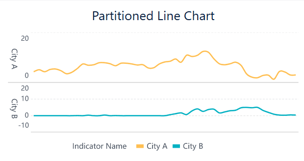
A partitioned line chart takes a time series plot and breaks it into segments. You use this method to find key changes in your data, such as sudden jumps or drops. First, sort your data by date. Then, split the time series into intervals and fit a separate line to each part. This helps you see where trends shift. For example, you might spot the first big increase in a sales campaign or a sudden drop in website visits.
- Divide the time series plot into sections.
- Fit a line to each segment.
- Look for points where the trend changes direction.
- Use dual y-axes if you compare lines with different scales.
Partitioned line charts make it easier to find important moments in your data and compare trends across different periods.
Multi-Series Line Chart
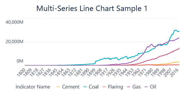
A multi-series line chart lets you compare several time series plots on the same graph. You use this chart to see how different datasets move together over time. Each line represents a different group or variable. This makes it easy to spot patterns, trends, and correlations.
- Use a shared time axis for all lines.
- Keep the number of lines to four or fewer to avoid clutter.
- Make sure all lines use the same scale for fair comparison.
- Use different colors or markers for each line.
Multi-series line charts help you see if two or more variables rise and fall together. For example, you might compare sales in different regions or track website visits and ad clicks at the same time. This chart type helps you make better decisions by showing how different factors relate.
Note: If you need to compare many lines, try grouping them into subplots or using interactive features.
Dimension Comparison Line Chart
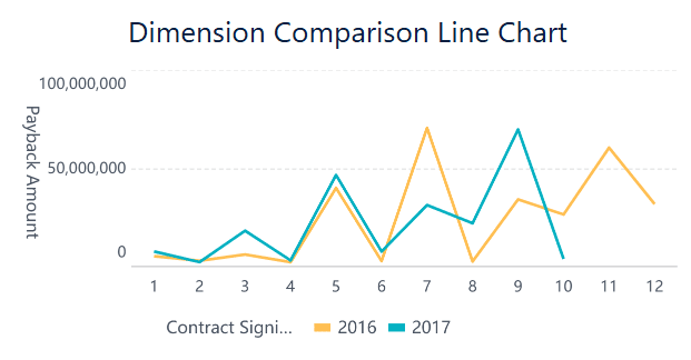
A dimension comparison line chart lets you compare metrics across different categories over time. You use this chart to break down your time series plot by groups, such as sales channels or product types. Each line shows the trend for one category. You can also drill down to see more detail, like switching from yearly to monthly views.
- Name all axes and units clearly.
- Add a descriptive title to your chart.
- Provide comparison values, such as targets or previous periods.
- Avoid putting too much data on one chart.
Dimension comparison line charts help you see how different groups perform over time. You can spot which category leads or lags and adjust your strategy. Always keep your chart clear and focused so viewers can understand the main message in just a few seconds.
You have learned how visualizing data over time uncovers trends, seasonality, and outliers that drive smarter decisions. Interactive and scalable tools help you spot patterns, test ideas, and solve problems faster. Businesses that use these insights can optimize inventory, improve forecasts, and boost revenue. FineBI from FanRuan makes it easy for you to turn raw data into clear, actionable insights. Start using data to fuel your business growth today.
Click the banner below to try FineBI for free and empower your enterprise to transform data into productivity!

Continue Reading About Time Series Graph
16 Types of Chart for Effective Data Visualization
22 Different Types of Graphs in Data Visualization: A Practical Guide


FAQ

The Author
Lewis
Senior Data Analyst at FanRuan
Related Articles

10 Good Data Visualization Examples by Use Case: Sales, Surveys, Finance & Time-Series
If you are searching for $1 , you likely do not need another gallery of pretty charts. You need examples that help sales leaders hit targets, finance teams explain variance, operations managers monitor change, and analys
Yida Yin
Jun 15, 2026

12 Best Data Visualization Tools for 2026: Features, Pricing, Pros and Cons
$1 are software platforms that turn raw data into charts, dashboards, maps, and interactive visual stories for analysis and decision making. 12 best data visualization tools for 2026 at a glance
Lewis Chou
Apr 23, 2026

Top 8 Data Visualization softwares You Should Try in 2026
Compare the top 8 data visualization software for 2026, including FineReport, Tableau, Power BI, and more to find the best fit for your business needs.
Lewis
Mar 19, 2026