If you are searching what is Tableau used for, you are probably trying to understand whether Tableau is a data visualization tool, a reporting platform, or a full business intelligence solution. In simple terms, Tableau is used to turn raw data into charts, dashboards, and interactive visual insights so people can monitor performance, explore trends, and make better business decisions.
Organizations use Tableau for a few core reasons: to connect data from different systems, build dashboards around key metrics, and let teams interact with the data instead of relying only on static reports. It is commonly used by data analysts, managers, executives, and business teams that need a clearer view of operations, sales, finance, marketing, or customer performance.
Tableau is mainly used for data analysis, dashboarding, and business reporting. It helps users connect to data sources such as spreadsheets, databases, and cloud platforms, then organize that information into visual formats that are easier to understand.
For beginners, the easiest way to think about Tableau is this:
It connects to your data
It helps you analyze the data visually
It lets you build dashboards to track important metrics
It makes it easier to share insights with other people
The main reason organizations use Tableau is not just to create nice-looking charts. They use it to:
Lets users filter, drill down, and compare segments visually
Reporting
Replaces or improves static spreadsheets and recurring reports
Decision support
Helps teams identify trends, outliers, and performance gaps
Cross-functional visibility
Shares dashboards across departments for aligned decision-making
Geographic analysis
Uses maps to visualize regional performance and location data
Executive communication
Presents metrics in a more visual, easier-to-understand format
This is why Tableau is widely associated with self-service analytics and visual BI. It gives users a way to move from raw rows of data to more actionable business insight.
Introduction to Tableau
What Tableau is and how it works
Tableau is a business intelligence and analytics platform designed to help users connect to data, analyze it, and present the results visually. It is especially known for interactive dashboards and data visualization.
A typical Tableau workflow looks like this:
Connect to data from files, databases, or cloud systems
Prepare or organize the data for analysis
Build visualizations such as bar charts, line charts, maps, or scatter plots
Combine visuals into dashboards
Publish and share dashboards with teams or stakeholders
This workflow makes Tableau useful in both small analysis projects and broader enterprise reporting environments.
Core features beginners should know
If you are new to Tableau, these are the core features worth understanding first:
Drag-and-drop dashboard creation: Users can place fields into views without writing code for many common tasks
Interactive filters: Dashboards can be filtered by date, product, region, team, or other dimensions
Calculated fields: Users can create custom metrics and logic inside the platform
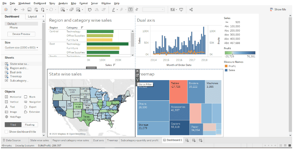
Mapping and geographic visuals: Tableau supports maps for location-based analysis
Live or scheduled updates: Dashboards can connect to live data or refresh on a schedule
Dashboard sharing: Reports and dashboards can be published for broader consumption
One of Tableau’s biggest strengths is that it supports visual exploration without requiring advanced coding skills for routine reporting and dashboard work. More technical users can go deeper, but many business questions can be answered through the interface itself.
Common Use Cases for Tableau
Business reporting and dashboarding
One of the most common answers to what Tableau is used for is business reporting. Teams use Tableau to build dashboards that monitor the metrics they care about most.
Operations dashboards: fulfillment speed, defect rates, service levels, inventory metrics
Executive dashboards: high-level KPI summaries across departments
Instead of pulling numbers manually into presentations every week, teams can use Tableau to create dashboards that update more consistently and allow users to interact with the data directly.
Data analysis and decision support
Tableau is also used for interactive analysis, not just recurring reports. Analysts and business users often use it to answer questions such as:
Why did revenue drop in one region?
Which products are growing fastest?
Which customer segment has the highest churn risk?
Where are operational bottlenecks appearing?
Which branch, store, or team is underperforming?
By filtering and comparing different segments, users can identify:
Trends over time
Performance differences across categories
Outliers that need investigation
Correlations between metrics
Exceptions that static reports might hide
This makes Tableau useful for decision support, especially when leaders need to move quickly from “what happened” to “where should we look next.”
Industry examples
Tableau use cases vary by industry, but the core purpose stays the same: making data easier to analyze and communicate.
Healthcare
Healthcare teams may use Tableau to monitor patient volumes, service utilization, wait times, operational capacity, or quality indicators. Dashboards can help administrators and department leaders identify trends and allocate resources more effectively.
Retail
Retail organizations often use Tableau for sales performance, store comparisons, inventory visibility, basket analysis, and promotion tracking. Geographic views can help teams compare regional performance.
Finance
Finance teams use Tableau for management reporting, profitability analysis, budget tracking, variance reporting, and risk monitoring. It can help turn detailed financial data into a more accessible executive reporting layer.
Education
Educational institutions may use Tableau to analyze enrollment trends, student outcomes, attendance, departmental performance, and resource utilization.
Logistics
Logistics and supply chain teams can use Tableau to monitor delivery times, route efficiency, warehouse performance, order fulfillment, and service exceptions.
Key Benefits of Using Tableau
Why people choose Tableau
People often choose Tableau because it helps them analyze data faster and present insights more clearly. Its visual approach makes large datasets more understandable for both technical and non-technical users.
Key benefits include:
Fast visual analysis: Users can identify patterns more quickly than in rows of spreadsheet data
Stronger data storytelling: Charts and dashboards make insights easier to explain
Better communication: Teams can align around shared visuals instead of isolated reports
More interactive exploration: Users can click, filter, and drill into dashboards
Improved access to insights: Self-service dashboards reduce dependence on one reporting team for every question
For many organizations, Tableau is part of the shift from static reporting toward more interactive, exploratory analytics.
Strengths for beginners and growing teams
For beginners, Tableau is often appealing because the interface is relatively visual and approachable. While there is still a learning curve, especially around data modeling and advanced calculations, many users can start building basic charts and dashboards fairly quickly.
Support for both individual analysis and shared reporting
Scalability from team dashboards to enterprise distribution
Collaboration through shared dashboards and centralized access
When dashboards need to be distributed across multiple departments, Tableau’s sharing and publishing model becomes especially important.
Who Uses Tableau and When It’s the Right Tool
Typical Tableau users
Different groups use Tableau in different ways:
Data analysts: build dashboards, perform exploratory analysis, create calculated fields, and prepare visual reports
Business users: consume dashboards, filter views, and answer routine business questions
Executives and managers: review KPI summaries and monitor performance trends
IT and BI teams: manage deployment, governance, access, and broader reporting infrastructure
This broad user range is one reason Tableau is common in organizations that want both analyst-led development and business-facing dashboard consumption.
When Tableau is a good fit
Tableau is often a good fit when an organization has:
Multiple data sources that need to be analyzed together
Users who want interactive exploration rather than static files
A need to share reporting across departments
It is especially useful when the business values visual communication and wants to make metrics easier to understand across different roles.
When another tool may be better
Tableau is not the right fit for every situation.
In some cases, another tool may be better if:
Cost sensitivity is very high
The team only needs simple spreadsheet-style reporting
The organization needs a more business-user-friendly self-service experience
Advanced data preparation requirements call for additional tooling or a different workflow
The business wants a BI platform that can be easier for non-technical users to adopt broadly
That does not make Tableau weak. It simply means tool selection should depend on user skills, reporting complexity, governance needs, and budget.
Getting Started with Tableau as a Beginner
Tableau products and setup basics
For beginners, the most important Tableau product to understand is Tableau Desktop, which is typically where dashboards and visualizations are created. From there, organizations can publish and share content through Tableau’s broader sharing and deployment options.
A simple way to think about setup is:
Build in Tableau Desktop
Publish and share through Tableau’s server or cloud-based sharing environment
Distribute dashboards to users who need to view or interact with them
This structure helps separate content creation from content consumption.
First steps to learn effectively
If you are just starting, do not try to master every feature at once. Focus on a simple learning path:
Start with a sample dataset
Build a basic dashboard with a few common charts
Learn essential chart types like bar, line, map, and table views
Practice adding filters
Try a few calculated fields
Learn how dashboards are arranged and shared
For beginners, the fastest way to get value from Tableau is to focus on:
Understanding your data fields
Choosing the right chart for the question
Building one clean dashboard
Learning how filters and drill-down improve analysis
Avoiding clutter
Practical Tips for Evaluating Tableau for Your Team
Before choosing Tableau or any BI platform, use these practical recommendations:
Start with the business question, not the chart type.
The right dashboard begins with a decision-making need.
Test with a real dataset.
Product demos look smooth, but your actual data complexity matters more.
Evaluate both creators and viewers.
A platform may work well for analysts but be harder for business users to adopt widely.
Check how reporting, exploration, and sharing work together.
A good BI tool should support the full workflow, not only visualization.
Consider long-term governance and iteration.
Dashboards need to be maintained, updated, and trusted over time.
Considering Alternatives: Where FineBI + Dora Fit
Tools like Tableau and Power BI are widely used in the BI market, but teams that need a more business-user-friendly, self-service BI platform may also consider FineBI.
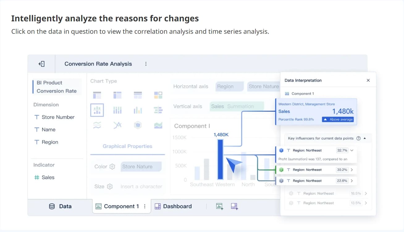
FineBI is designed for organizations that want business teams to do more of their own analysis through:
For companies evaluating what Tableau is used for, a common follow-up question is whether they need a platform centered mainly on visualization, or one that also emphasizes broader business-user adoption in day-to-day analytics work. That is where FineBI can be relevant.
Together, FineBI + Dora help organizations move beyond static dashboard consumption. FineBI provides the trusted dashboard, metric, and semantic foundation, while Dora adds a more guided Agentic BI experience.
That can include workflows such as:
Natural-language business requests
Governed query and skill execution
AI-generated summaries and charts
Follow-up analysis and guided actions
Scenario-based AI assistants such as a Data Analystdigital employee, Report Researcher, Daily Briefing Secretary, or Risk Alert Officer
This is best understood not as a generic chatbot, and not as a replacement for BI, but as a governed AI layer that helps enterprises ask, analyze, generate, push, alert, and follow up more effectively on trusted data foundations.
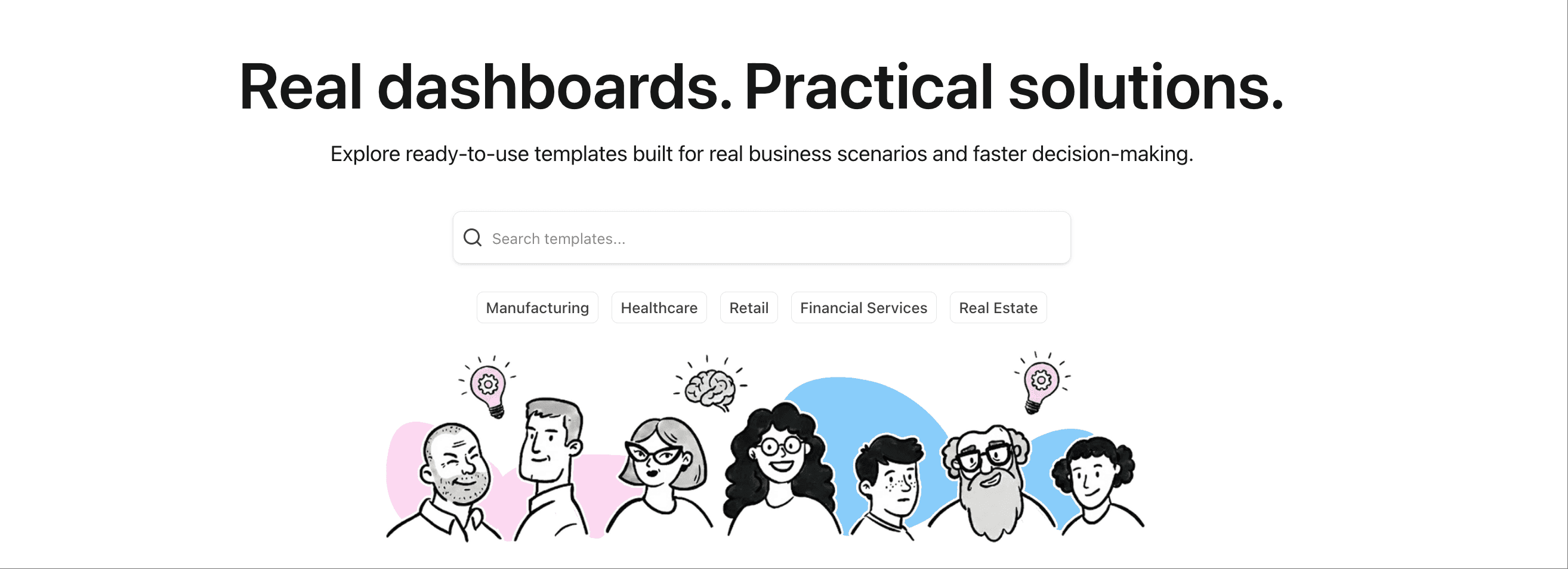
Get Ready-to-Use Dashboard Templates in Fine Gallery
Final Thoughts: What Is Tableau Used For?
So, what is Tableau used for?
Tableau is used to connect data, analyze it visually, build dashboards, track KPIs, and support business decisions. It is popular because it helps organizations move from raw data and static reports to more interactive, understandable insights.
For beginners, Tableau is often a strong entry point into BI and data visualization. For growing organizations, it can support broad dashboarding and reporting needs. But if your priority is easier self-service analytics for business users, broader dashboard adoption, or a path toward governed AI-assisted analytics, it also makes sense to evaluate platforms like FineBI + Dora alongside Tableau.
FAQs
Tableau is mainly used to turn raw data into charts, dashboards, and interactive reports. Teams use it to track KPIs, explore trends, and support business decisions with visual analysis.
Tableau is commonly used by data analysts, managers, executives, and business teams. It helps both technical and non-technical users understand performance data more easily.
Yes, Tableau can connect to spreadsheets, databases, and many cloud platforms. This makes it useful for combining data from multiple systems into one dashboard or report.
No, Tableau is also used for interactive data exploration and ad hoc analysis. Users can filter, drill down, and compare segments to answer specific business questions.
Businesses choose Tableau because it makes complex data easier to understand through interactive visuals. It also helps teams share insights faster and monitor changing performance more effectively.
Product Trial
FineReport
Pixel-perfect reports · Interactive dashboards · Easy data entry · Digital twins


 Website: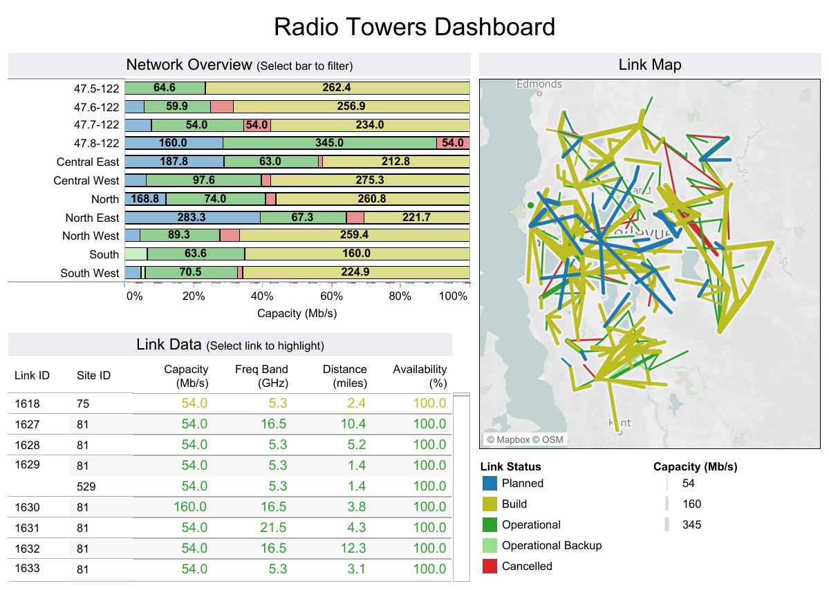
 Real-time Analysis
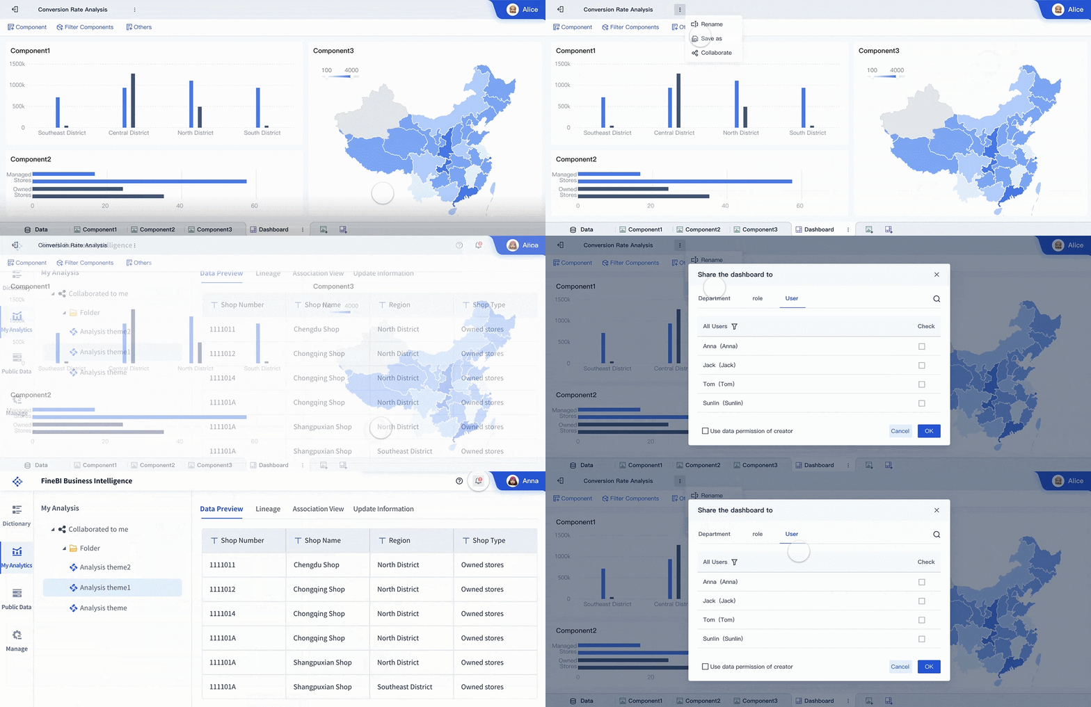 Dashboard sharing across teams
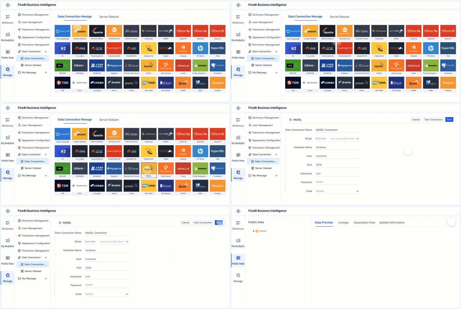 FineBI's Data Connection