Bar chart vs histogram may appear similar, but they serve different purposes. A bar chart displays categorical data with distinct bars, while a histogram visualizes numerical data through continuous intervals. You use bar charts to compare categories and histograms to analyze distributions in Malaysia.
Understanding the differences between bar chart vs histogram enhances your ability to choose the right tool for data visualization. The proper chart ensures clarity, accuracy, and better insights for decision-making in Malaysia.
Histogram vs Bar Graph: Understanding the Basics
What Is a Histogram?
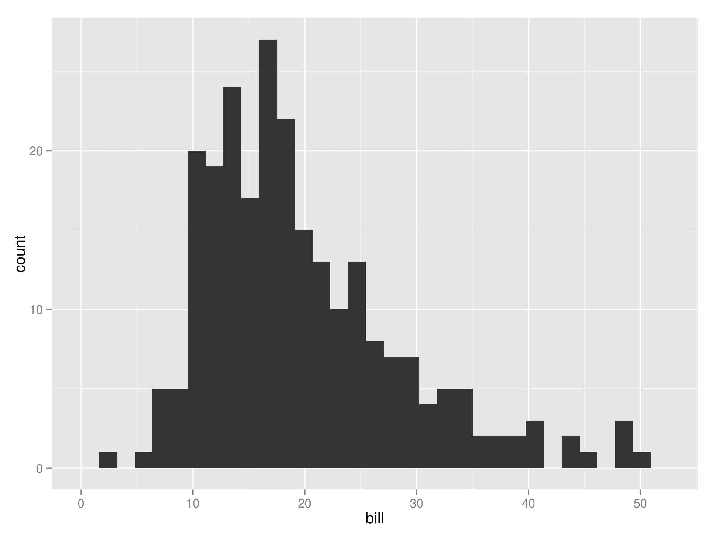
A histogram is a type of graph that represents numerical data. It groups data into continuous intervals, also called bins, and displays them as adjacent bars. The height of each bar shows the frequency of data points within that interval. Unlike bar graphs, histograms focus on ranges rather than distinct categories. For example, you might use a histogram to analyze the age distribution of a population. This makes it an essential tool for understanding patterns and trends in data.
Histograms are particularly useful when you want to visualize how data is distributed. They help you identify peaks, gaps, or outliers in your dataset. By using a histogram, you can gain insights into the spread and concentration of your data points.
What Is a Bar Chart?
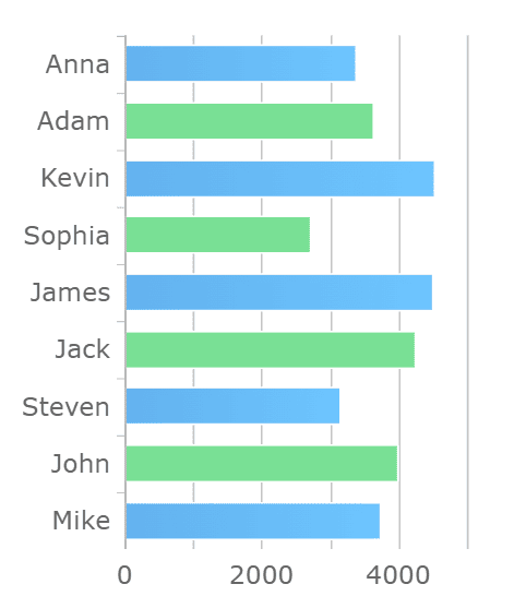
A bar chart is one of the most common types of graphs used to compare categories. It uses rectangular bars to represent data, with the length of each bar corresponding to the value it represents. Unlike histograms, bar charts have spaces between the bars, emphasizing that the data is categorical rather than continuous. You might use a bar chart to compare sales figures across different product categories or survey responses in Malaysia.
Stacked Bar Chart
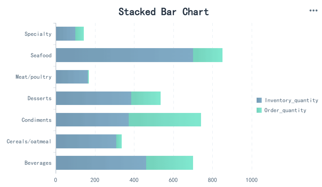
A stacked bar chart allows you to compare multiple data series within the same categories. Each bar is divided into segments, with each segment representing a part of the total. This type of graph is ideal for showing how individual components contribute to a whole.
Custom Bar Chart
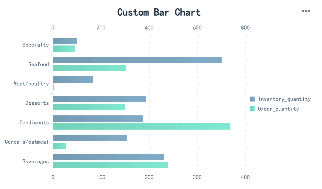
Custom bar charts let you tailor the design to fit your specific needs in Malaysia. You can adjust the bar width, orientation, or even add annotations. This flexibility makes custom bar charts a versatile option for data visualization.
Color Interlacing for Bar Charts
Color interlacing enhances the readability of bar charts by using alternating colors for adjacent bars. This technique helps you distinguish between categories more easily, especially when dealing with large datasets.
Stacked Percentage Bar Chart
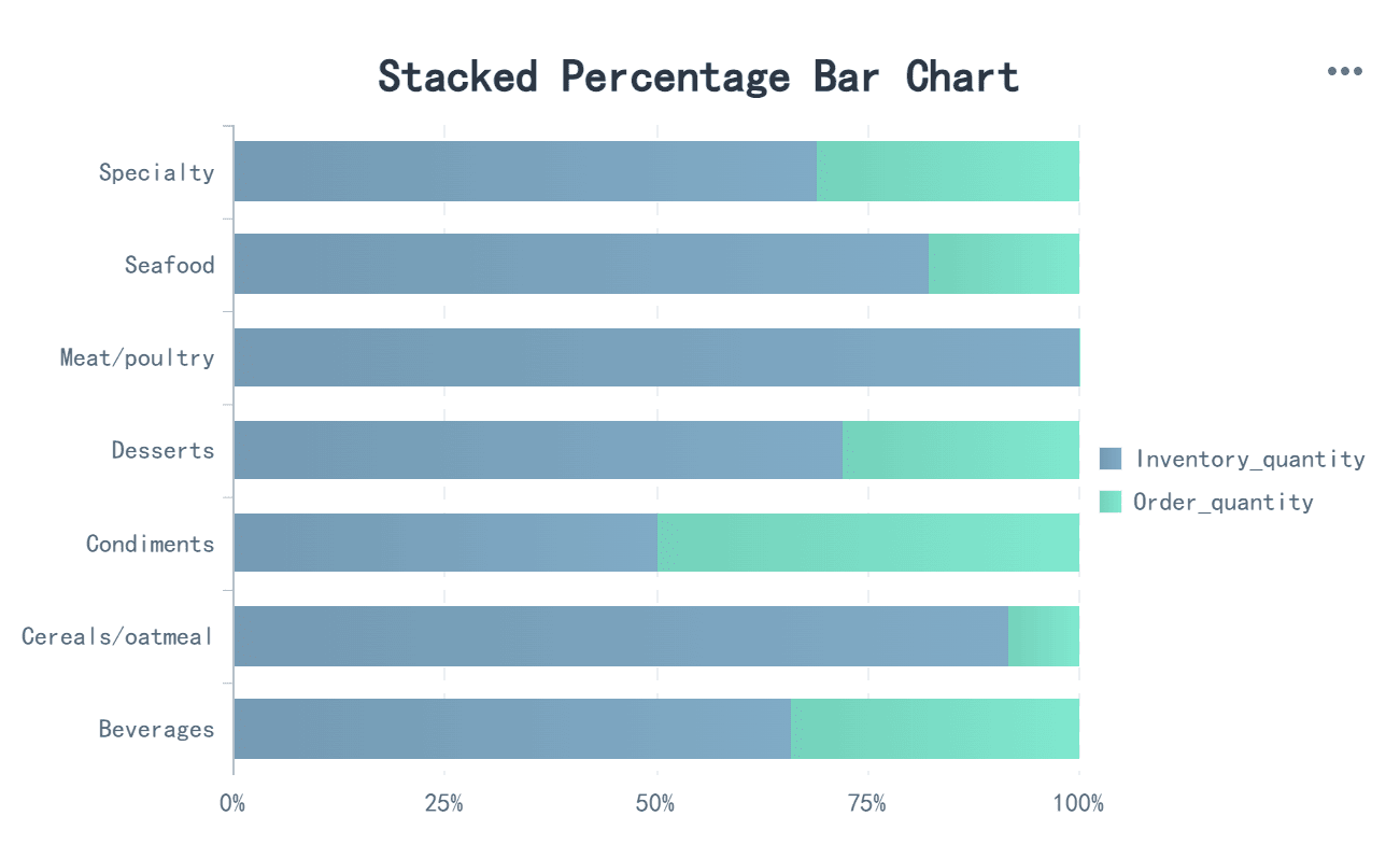
A stacked percentage bar chart displays data as a percentage of the total for each category. Instead of showing absolute values, it highlights the proportional contribution of each segment. This type of graph is useful for comparing relative differences across categories.
Bar Chart vs Histogram: Key Differences
Differences in the x-axis
The x-axis is one of the most noticeable distinctions between histograms and bar graphs. In a histogram, the x-axis represents continuous intervals or ranges of numerical data. These intervals are adjacent, meaning there are no gaps between the bars. This design emphasizes the flow and distribution of data across a spectrum. For example, if you analyze the ages of a group of people, the x-axis might display ranges like 10-20, 20-30, and so on.
Bar charts, on the other hand, use the x-axis to display distinct categories. Each category stands alone, separated by spaces to highlight its individuality. These spaces make it clear that the data is categorical rather than continuous. For instance, if you compare sales figures for different products, the x-axis might list categories like "Shoes," "Bags," and "Accessories." This separation helps you focus on comparing individual items rather than analyzing trends or distributions.
Differences in Data Representation
The way data is represented in histograms and bar graphs is another key difference. Histograms focus on frequency. Each bar’s height corresponds to the number of data points within a specific range. This makes histograms ideal for understanding how data is distributed across intervals. For example, you might use a histogram to visualize the frequency of test scores in a class, showing how many students in Malaysia scored within certain ranges.
Bar graphs, however, represent data values for distinct categories. The height of each bar reflects the value associated with that category. Unlike histograms, bar graphs do not emphasize frequency or distribution. Instead, they highlight comparisons between categories. For instance, you might use a bar graph to compare the number of votes received by different candidates in an election in Malaysia. This approach makes bar graphs one of the most versatile types of graphs for categorical data.
Differences in Applications
The applications of histograms and bar charts depend on the type of data you want to visualize. Histograms are best suited for analyzing distributions and patterns in numerical data. They help you identify trends, peaks, and gaps in datasets in Malaysia. For example, if you want to study the distribution of rainfall over a year, a histogram can reveal which months had the most or least precipitation.
Bar charts excel at comparing categories. They are widely used in business, education, and research in Malaysia to present data in a clear and straightforward manner. For instance, you might use a bar chart to compare the popularity of different social media platforms among teenagers in Malaysia. The ability to customize bar charts, such as adding colors or stacking segments, makes them a powerful tool for data visualization.
Practical Examples of Bar Chart vs Histogram
Example 1: Comparing Sales Data (Bar Chart)
Bar charts excel at comparing sales data across distinct categories. They provide a clear visual representation of how different products, regions, or time periods perform. For instance, you can use a bar chart to compare monthly sales figures or identify top-performing products. This approach simplifies decision-making by highlighting trends and differences in Malaysia.
Consider the following table, which outlines key metrics for sales data analysis:
| Metric | Description |
|---|---|
| Top 5 countries by sales | Provides a visual comparison of sales performance to identify key markets and growth prospects. |
| Top 5 products by sales | Helps optimize marketing strategies and manage inventory efficiently. |
| Monthly sales performance: units ordered | Quantifiable measure of monthly sales volume for tracking performance and planning strategies. |
| Sales by month | Overview of monthly revenue for sales trend analysis. |
Using bar graphs to visualize these metrics allows you to spot patterns quickly. For example, a bar chart comparing sales by month can reveal seasonal trends, helping you plan inventory and marketing strategies effectively in Malaysia. Similarly, a stacked bar chart can show how different product categories contribute to total sales, offering deeper insights into your business performance in Malaysia.
Example 2: Analyzing Age Distribution (Histogram)
Histograms are ideal for analyzing age distribution in demographic studies. They group numerical data into intervals, making it easier to understand how ages are spread across a population. This type of data visualization highlights patterns that might otherwise go unnoticed.
When analyzing age distribution, histograms provide insights into several statistical aspects:
- Frequency Distribution quantifies how data points are spread across different ranges.
- Central Tendency Measures such as the mean, median, and mode pinpoint the core of the data distribution.
- Variability and Spread inform about the consistency and dispersion in the dataset.
- Skewness indicates whether the data leans towards higher or lower values relative to the mean.
- Kurtosis alerts to the presence of outliers and the heaviness of the data distribution’s tails.
For example, a histogram analyzing the age distribution of a city’s population might reveal that most residents fall within the 20–40 age range. This insight can guide decisions on public services, housing, or marketing strategies in Malaysia. By visualizing the frequency of age intervals, you can identify peaks and gaps in the data, enabling more informed planning.
Example 3: Visualizing Survey Results (Bar Chart vs Histogram)
Survey results often require careful analysis to uncover meaningful insights. Both bar chart vs histogram can be used, depending on the type of data collected. Bar graphs work well for categorical data, such as responses to multiple-choice questions. Histograms, on the other hand, are better suited for numerical data, like age or income ranges.
Imagine you conducted a survey on social media usage among teenagers. A bar chart could compare the popularity of different platforms, such as Instagram, TikTok, and Snapchat. This visualization would clearly show which platform dominates and how others rank. If the survey included age data, a histogram could analyze the distribution of respondents’ ages, revealing which age groups are most active on social media in Malaysia.
Using both types of charts together enhances your ability to interpret survey results. Bar charts highlight differences between categories, while histograms uncover patterns in numerical data. This combination ensures a comprehensive understanding of the survey findings, helping you make data-driven decisions in Malaysia.
Bar Chart vs Histogram: Choosing the Right Chart for Your Data with FineReport
Factors to Consider When Choosing
Selecting the right chart for your data depends on several factors. First, identify the type of data you want to visualize. Numerical data often works best with histograms, while categorical data pairs well with bar graphs. Consider the purpose of your analysis. If you aim to compare categories, a bar chart is ideal. For understanding distributions, histograms provide better insights.
Next, think about your audience. Choose a chart that communicates your message clearly. For example, bar graphs are easy to interpret and work well for presentations. On the other hand, histograms are more suitable for detailed data analysis. Also, evaluate the complexity of your dataset. Simple datasets may only require basic types of charts, while complex data might benefit from customized visualizations.
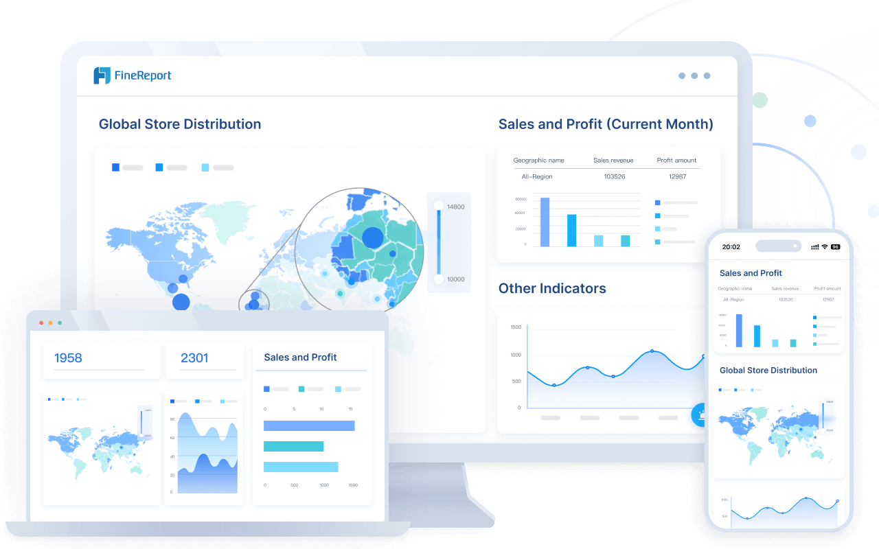
FineReport simplifies this process by offering a wide range of chart options. Its intuitive interface allows you to experiment with different types of charts, ensuring you find the perfect fit for your data in Malaysia.
Tips for Effective Data Visualization
Effective data visualization requires clarity and precision. Start by organizing your data. Clean and structured data ensures accurate visual representation. Use appropriate chart types to match your data. For instance, bar graphs are excellent for comparing sales figures, while histograms excel at showing age distributions.
Keep your charts simple. Avoid clutter by limiting the number of elements. Use contrasting colors to highlight key points. FineReport’s color interlacing feature can enhance readability, especially for bar graphs. Label your axes and include a legend if necessary. These small details make your charts easier to understand in Malaysia.
Lastly, test your visualizations. Share them with colleagues or stakeholders to gather feedback. FineReport’s interactive features allow you to refine your charts based on input, ensuring your data visualization effectively communicates your insights in Malaysia.

How FanRuan Supports Data Visualization Needs
Leveraging FineReport for Bar Chart vs Histogram
FineReport simplifies the process of creating bar chart vs histogram. Its intuitive drag-and-drop interface allows you to design charts quickly without needing advanced technical skills. You can connect FineReport to multiple data sources, ensuring your charts reflect real-time data. This feature is especially useful for tracking frequency distributions or comparing categories across datasets.
FineReport offers over 70 chart styles, including customizable bar chart vs histogram. You can adjust colors, sizes, and labels to make your charts more engaging. For example, you can use stacked bar charts to show contributions of different segments or histograms to analyze data distributions. These tools help you present data visualization in a way that is both clear and impactful.
Tip: Use FineReport’s interactive features to drill down into specific data points. This functionality enhances your ability to uncover deeper insights in Malaysia.
Enhancing Data Insights with FanRuan Solutions
FanRuan’s solutions go beyond basic chart creation. They integrate advanced analytics and visualization tools to help you make informed decisions in Malaysia. FineReport, for instance, supports dynamic dashboards that combine multiple chart types, including bar chart vs histogram. These dashboards provide a comprehensive view of your data, enabling you to identify trends and patterns.
FanRuan also offers tools for real-time data synchronization. This ensures your visualizations stay up-to-date, even as new data flows in. You can use these features to monitor frequency changes or track performance metrics. Additionally, FineReport’s ability to connect with various databases makes it ideal for businesses managing large datasets.
Note: FanRuan’s solutions are designed to scale with your needs. Whether you’re analyzing small datasets or managing enterprise-level data, FineReport adapts to your requirements in Malaysia.
Bar chart vs histogram serve distinct purposes in data visualization. Bar charts compare categories, while histograms analyze numerical data distributions. Choosing the right chart ensures your data is represented accurately and effectively. This decision impacts how well your audience in Malaysia understands the insights you present.
FineReport simplifies this process by offering versatile tools for creating both bar chart vs histogram. Its user-friendly interface and customization options make it an excellent choice for your data visualization needs. Start exploring FineReport today to elevate your data storytelling in Malaysia.
Click the banner below to try FineReport for free and empower your enterprise to transform data into productivity!
Continue Reading About Bar Chart vs Histogram


FAQ

The Author
Lewis
Senior Data Analyst at FanRuan
Related Articles

What Is Business Management? A Real-World Guide to Strategy, Operations, Finance, and People
$1 is the discipline of turning goals into results. It connects strategy with execution, money with decisions, and people with performance. Whether a company has 5 employees or 50,000, strong management is what keeps pri
Lewis Chou
Jun 24, 2026

What Recruiters Look for in a Data Analysis Portfolio: 10 Criteria to Score Yours Fast
A $1 is not judged like a school assignment. It is judged like a hiring shortcut. Recruiters, hiring managers, and analytics leads use it to answer one question fast: Can this person solve business problems with data in
Lewis Chou
May 29, 2026

What Is Data Analytics Consulting? Beginner’s Guide to Services, Deliverables, and Business Value
$1 helps organizations turn raw data into decisions they can trust. For many business leaders, the challenge is not a lack of data. It is a lack of clarity. Reports conflict, teams track different KPIs, dashboards are un
Lewis Chou
Jun 03, 2026