Reporting Tools
10 Best Dashboard Reporting Tools for 2026 Compared: Power BI, Tableau, Looker Studio, and More
Lewis Chou
Apr 27, 2026
Dashboard reporting tools are software platforms that turn business data into interactive dashboards, scheduled reports, and decision-ready insights.
10 Best Dashboard Reporting Tools Compared at a Glance
Below is a quick comparison of the leading dashboard reporting tools for 2026, including ideal use cases, standout strengths, and pricing approach.
| Tool | Best For | Standout Strength | Pricing Approach |
|---|---|---|---|
| FineReport | Enterprises needing pixel-perfect reporting and operational dashboards | Strong reporting engine, flexible dashboard design, enterprise deployment options | Custom pricing |
| Power BI | Microsoft-centric organizations | Tight Microsoft integration, robust modeling, strong enterprise BI capabilities | Free tier + per-user + capacity pricing |
| Tableau | Advanced analytics and visual exploration | Best-in-class visual analysis and storytelling | Per-user subscription + enterprise options |
| Looker Studio | Small teams and marketers using Google tools | Easy sharing, low barrier to entry, Google ecosystem fit | Free plan + low-cost Pro tier |
| Qlik Sense | Governed self-service analytics | Associative engine and strong data exploration | Custom / subscription pricing |
| Metabase | Startups and product teams | Simple self-service analytics and embedded use cases | Open-source + paid cloud/enterprise plans |
| Domo | Organizations needing cloud-native executive visibility | Broad connector library and strong mobile experience | Custom pricing |
| Klipfolio | KPI dashboards for SMBs and agencies | Fast dashboard building and metric tracking | Tiered subscription pricing |
| DashThis | Marketing agencies and reporting-heavy teams | Automated marketing reports and templates | Subscription pricing |
| Looker | Large enterprises with modeled data environments | Semantic modeling and governed analytics on modern cloud stacks | Custom enterprise pricing |
Fast Recommendations by Team Size, Skill Level, and Budget
- Best overall for enterprise reporting: FineReport
- Best for Microsoft environments: Power BI
- Best for advanced visual analytics: Tableau
- Best free option for lightweight reporting: Looker Studio
- Best for embedded analytics: Metabase
- Best for marketing reporting: DashThis
- Best for governed cloud analytics: Looker
- Best for flexible KPI tracking: Klipfolio
Snapshot by Primary Use Case
- Enterprise BI: FineReport, Power BI, Tableau, Looker
- Marketing dashboards: Looker Studio, DashThis, Klipfolio
- Self-service analytics: Power BI, Qlik Sense, Metabase
- Embedded analytics: FineReport, Power BI, Metabase, Looker
In-Depth Reviews of the Top 10 Tools
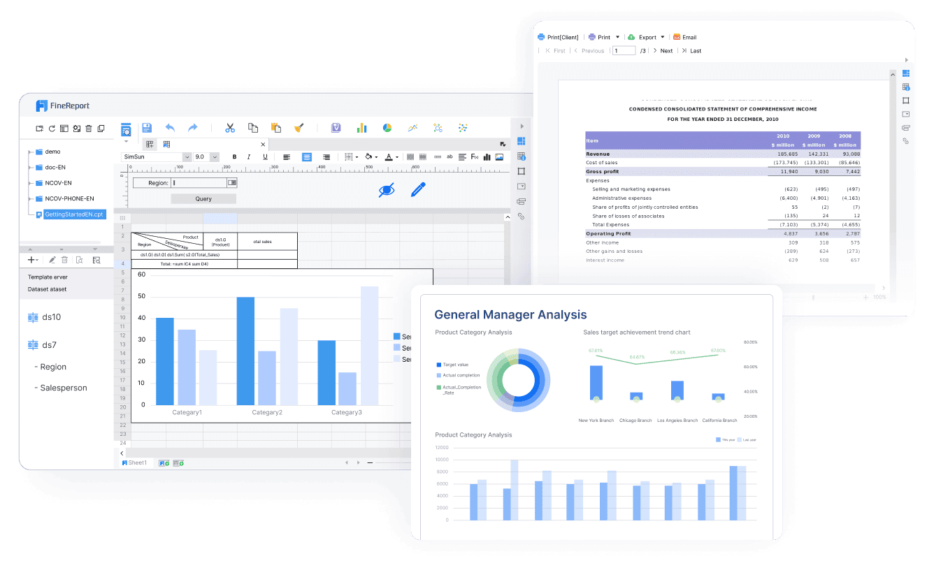
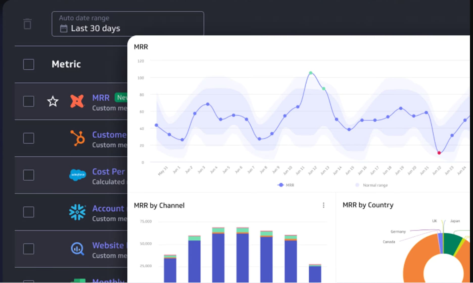
1. FineReport
One-sentence overview: FineReport is an enterprise-grade dashboard reporting tool designed for organizations that need pixel-perfect reports, interactive dashboards, and scalable operational reporting from a single platform.
 Key Features:
- Drag-and-drop report and dashboard designer
- Pixel-perfect reporting for invoices, statements, and management reports
- Real-time dashboards and large-screen data displays
- Strong parameter controls, drill-down, and data write-back capabilities
- Broad database connectivity and enterprise deployment support
- Role-based permissions and centralized governance
- Embedding support for portals, internal apps, and business systems
Pros & Cons:
- Pros: Strong balance between dashboarding and formal reporting; suitable for complex enterprise workflows; flexible formatting; useful for operational and management reporting; good fit for organizations that need more than lightweight BI dashboards
- Cons: Less commonly known in some Western markets than Power BI or Tableau; enterprise implementations may require planning and technical ownership
Best For (Target user/scenario):
- Enterprises that need both dashboard reporting tools and structured report output
- Operations, finance, manufacturing, retail, and management reporting teams
- Organizations looking for a scalable alternative to fragmented BI and reporting stacks
FineReport stands out because it covers a gap many tools only partially address: highly formatted business reporting plus interactive dashboards. While many BI platforms focus first on exploratory visualization, FineReport is especially useful when teams need repeatable, governed outputs for executives, operations leaders, and frontline users.
For companies comparing dashboard reporting tools in 2026, FineReport is a strong choice when reporting requirements go beyond charts and require forms, complex layouts, approval flows, or embedded analytics in existing systems. It is particularly attractive for teams that want one platform for dashboards, scheduled reports, and enterprise-wide distribution.
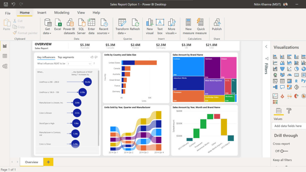
2. Power BI
One-sentence overview: Power BI is a widely adopted business intelligence platform that combines data modeling, interactive dashboards, and enterprise reporting with strong Microsoft ecosystem integration.
 Key Features:
- Power BI Desktop for report creation
- Strong data modeling with DAX
- Broad connector ecosystem
- Integration with Excel, Teams, Azure, Fabric, and Microsoft 365
- AI-assisted insights and natural language querying
- Embedded analytics options
- Enterprise governance and security controls
Pros & Cons:
- Pros: Excellent value; strong modeling; familiar for Microsoft users; scalable across departments; broad community support
- Cons: DAX learning curve; sharing and capacity models can get complex; best experience often depends on broader Microsoft stack adoption
Best For (Target user/scenario):
- Microsoft-centric organizations that need strong data visualization, modeling, and enterprise reporting
- BI analysts, finance teams, and operations teams
- Businesses that want a balance of self-service and IT governance
Power BI remains one of the most competitive dashboard reporting tools because it serves both analysts and business users relatively well. It is especially effective for companies already using Azure, Excel, Teams, and Microsoft 365, where report distribution and security can be tightly integrated.
Pricing is one of its biggest advantages. Teams can start small, but total cost may rise when broader sharing, premium capacity, or enterprise-scale governance is required. For many mid-sized and enterprise buyers, it remains one of the safest shortlist options.
3. Tableau
One-sentence overview: Tableau is a premium analytics and dashboard platform known for visual flexibility, deep exploration, and polished data storytelling.
 Key Features:
- Advanced interactive visualizations
- Strong support for exploratory analysis
- Dashboard actions, filters, and drill paths
- Broad data source connectivity
- Tableau Cloud and Tableau Server deployment options
- AI-assisted capabilities and analytics enhancements
- Strong presentation quality for executive storytelling
Pros & Cons:
- Pros: Exceptional visualization quality; highly flexible analysis experience; strong analyst adoption; effective for executive-facing dashboards
- Cons: Higher cost; can be overpowered for simple reporting needs; governance and scaling require discipline; less approachable for casual users than lighter tools
Best For (Target user/scenario):
- Advanced analytics teams that want flexible exploration and polished visual storytelling
- Data analysts, BI teams, and insight-heavy business functions
- Organizations prioritizing visual analysis over document-style reporting
Tableau remains a leading choice among dashboard reporting tools when analytical depth and presentation quality matter most. Teams that spend significant time exploring data, testing business questions, and creating visually refined dashboards often prefer Tableau’s workflow.
Its trade-off is cost and complexity. For organizations needing highly structured operational reports or lower-cost broad deployment, another platform may be more practical. But for visual exploration and insight communication, Tableau remains a strong benchmark.
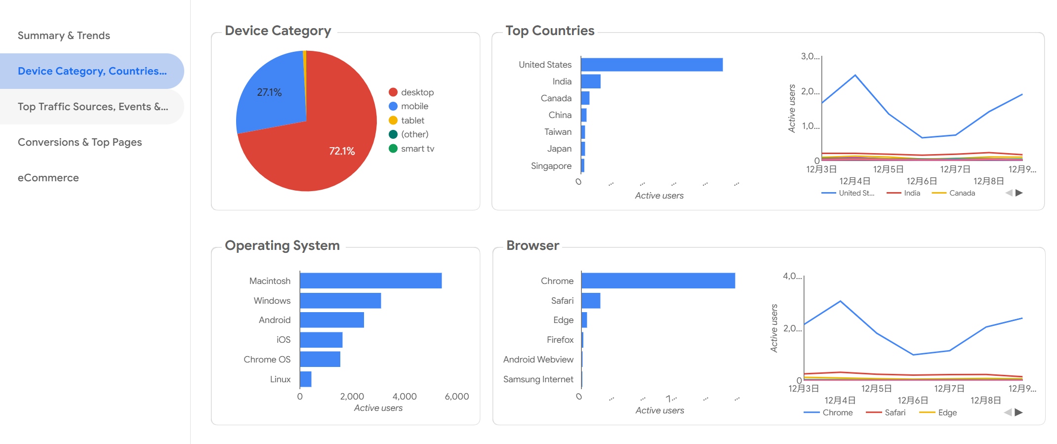
4. Looker Studio
One-sentence overview: Looker Studio is a lightweight reporting and dashboard tool that helps teams build shareable dashboards quickly, especially within the Google ecosystem.
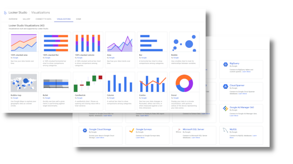 Key Features:
- Browser-based dashboard builder
- Native connectivity to Google Analytics, Google Ads, and other Google products
- Easy sharing and collaboration
- Embedding support
- Community and partner connectors
- Low learning curve for basic reporting
Pros & Cons:
- Pros: Accessible; free entry point; easy for marketers; simple collaboration; good fit for recurring performance dashboards
- Cons: Limited enterprise governance; less powerful modeling; performance and connector quality vary; not ideal for complex governed BI environments
Best For (Target user/scenario):
- Teams that want accessible reporting dashboards with simple sharing and Google ecosystem compatibility
- Marketing teams, small businesses, and agencies
- Users who need quick dashboards rather than full enterprise BI
Looker Studio is one of the most accessible dashboard reporting tools for teams that need speed more than sophistication. It is especially practical for marketing reporting, campaign tracking, and executive overviews built from Google data sources.
Its limitations appear when organizations need semantic consistency, enterprise security, or advanced modeling across many systems. For lightweight use cases, however, it remains an efficient and cost-effective option.
5. Qlik Sense
One-sentence overview: Qlik Sense is a governed self-service analytics platform known for flexible data exploration and its associative analysis engine.
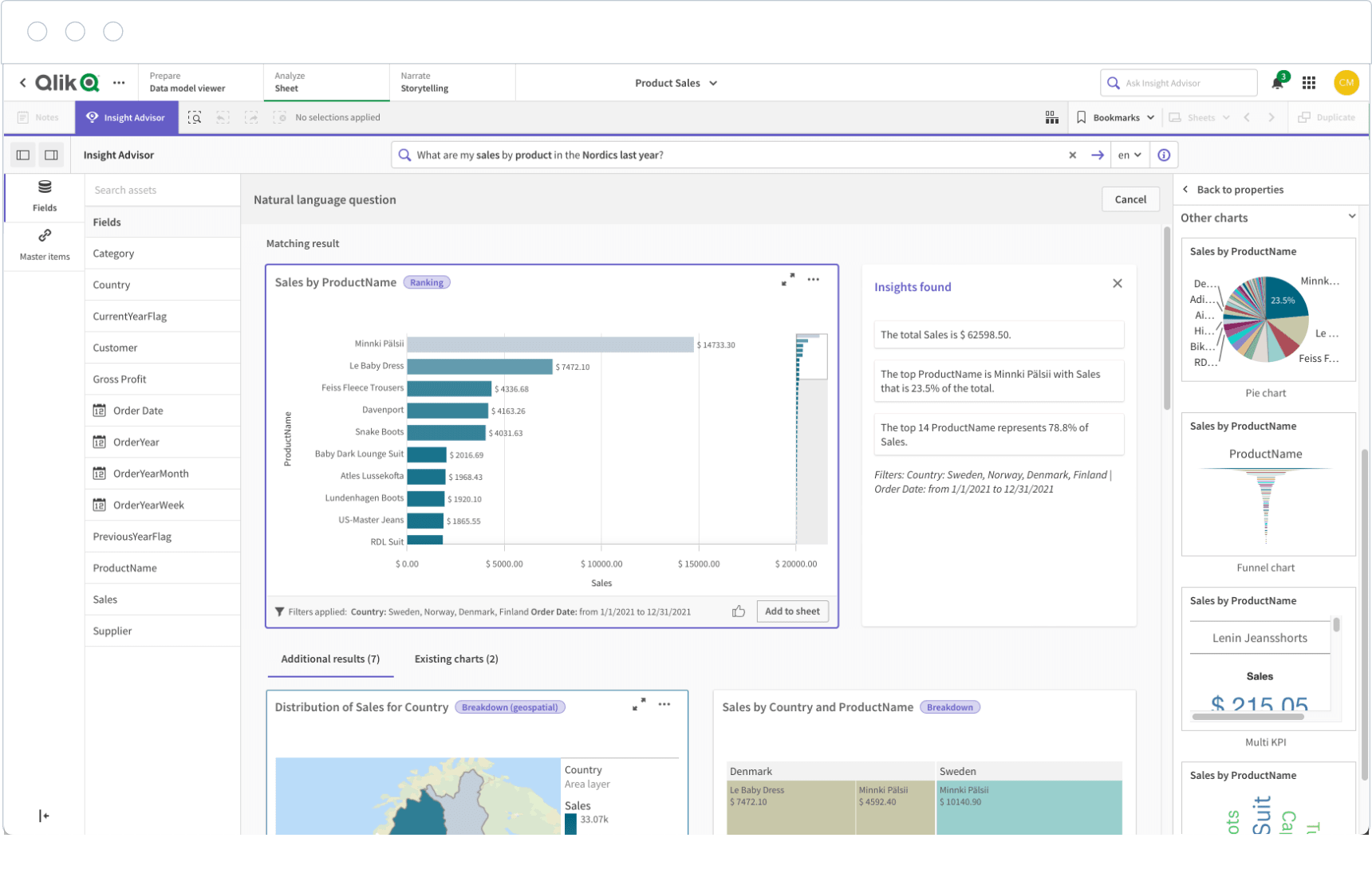 Key Features:
- Associative data engine
- Self-service dashboard creation
- AI-assisted insights
- Strong governance options
- Cloud and enterprise deployment
Pros & Cons:
- Pros: Strong data discovery; good for governed exploration; suitable for complex analytical questions
- Cons: Interface may feel less intuitive to some users; pricing can be less transparent
Best For (Target user/scenario):
- Enterprises needing guided self-service with stronger governance than lightweight dashboard tools
6. Metabase
One-sentence overview: Metabase is a user-friendly analytics platform that combines simple self-service reporting with strong embedded analytics potential.
 Key Features:
- No-code query builder
- SQL editor for analysts
- Dashboard subscriptions and alerts
- Embedding options
- Open-source deployment path
Pros & Cons:
- Pros: Easy to start; flexible for startups; strong value; useful for internal analytics and product reporting
- Cons: Less polished for advanced enterprise visualization; some governance needs may require higher tiers or custom setup
Best For (Target user/scenario):
- Startups, SaaS teams, and product-led businesses that want internal reporting or embedded analytics
7. Domo
One-sentence overview: Domo is a cloud-based analytics platform focused on executive visibility, operational dashboards, and broad data connectivity.
 Key Features:
- Large connector ecosystem
- Mobile-friendly dashboards
- Data preparation workflows
- Alerts and collaboration
- App-oriented analytics delivery
Pros & Cons:
- Pros: Strong cloud delivery; useful for business-wide visibility; good mobile access
- Cons: Pricing is often a barrier; may exceed the needs of smaller teams
- Best For (Target user/scenario):
- Organizations prioritizing centralized cloud dashboarding and executive reporting
8. Klipfolio
One-sentence overview: Klipfolio is a KPI-focused dashboard platform that helps teams monitor performance metrics with relatively quick setup.
 Key Features:
- KPI dashboards
- Multiple data connectors
- Custom metrics and formulas
- Client-facing dashboard support
Pros & Cons:
- Pros: Fast to deploy; useful for live KPI monitoring; practical for agencies and SMBs
- Cons: Less robust for deep BI or complex enterprise governance
Best For (Target user/scenario):
- Small and mid-sized teams that need operational KPI dashboards
9. DashThis
One-sentence overview: DashThis is a specialized marketing reporting platform built to automate recurring client and campaign reports.
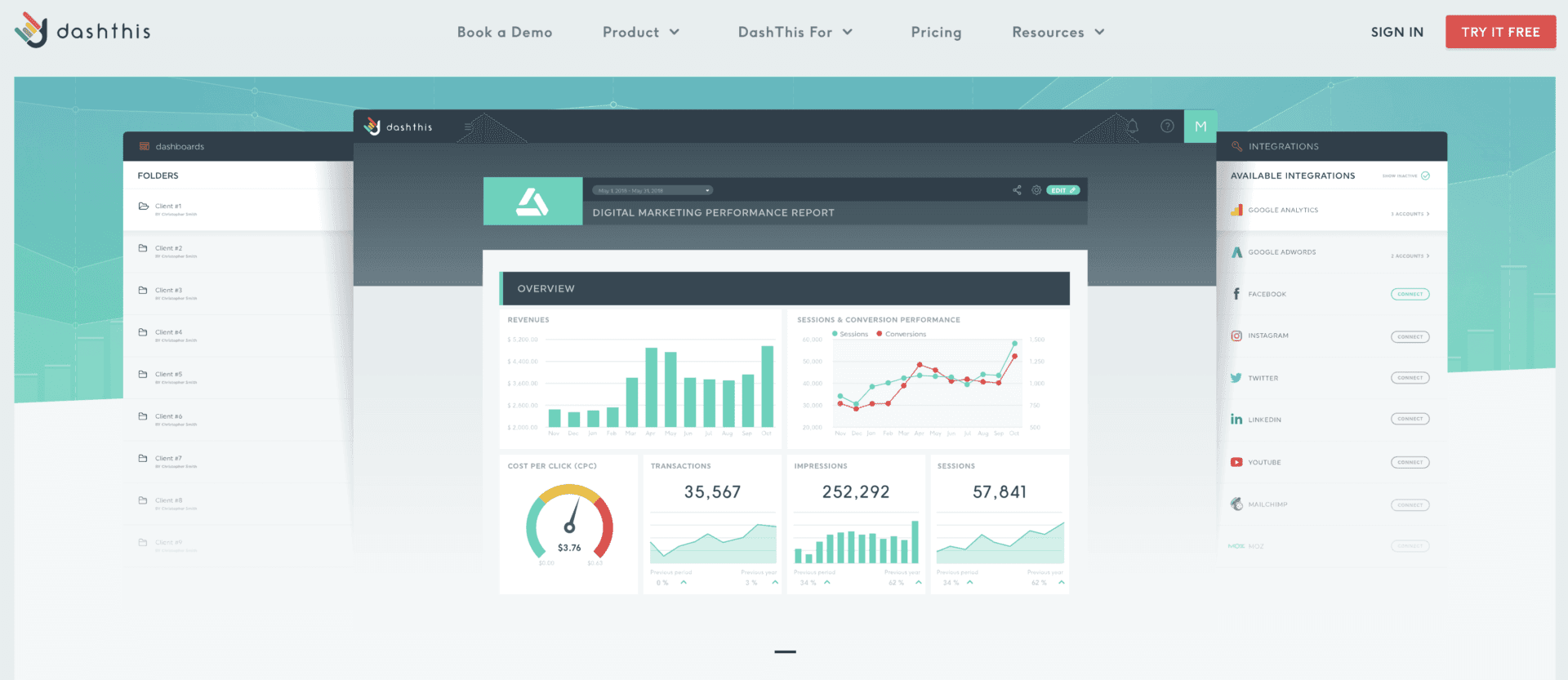 Key Features:
- Marketing-specific templates
- Multi-channel marketing connectors
- White-label sharing
- Automated report delivery
- AI-assisted summary features
Pros & Cons:
- Pros: Purpose-built for marketers; fast recurring reporting; simple client delivery
- Cons: Narrower use case; not a full BI platform for enterprise-wide reporting
Best For (Target user/scenario):
- Agencies and in-house marketing teams focused on campaign reporting
10. Looker
One-sentence overview: Looker is an enterprise analytics platform built around semantic modeling, governed metrics, and modern cloud data environments.
 Key Features:
- Semantic modeling layer
- Governed metrics
- Strong cloud warehouse integration
- Embedded analytics options
- API-driven extensibility
Pros & Cons:
- Pros: Strong consistency and governance; scalable for complex organizations; suitable for embedded and product analytics
- Cons: Technical setup; higher cost; less approachable for teams without data engineering support
Best For (Target user/scenario):
- Enterprises with mature cloud data stacks and centralized analytics teams
How to Choose the Best Dashboard Reporting Tools for 2026
Modern teams need more than static charts. The best dashboard reporting tools now have to support speed, governance, collaboration, and ease of use at the same time.
What Modern Teams Need From Reporting
In 2026, reporting expectations are higher across every department:
- Speed: Teams expect near real-time dashboards and faster report refresh cycles.
- Governance: Leadership needs trusted metrics, controlled access, and auditability.
- Collaboration: Reports should be easy to share, annotate, schedule, and embed in everyday workflows.
- Ease of use: Business users want self-service access without heavy technical bottlenecks.
This is why many buyers no longer evaluate reporting tools on visualization alone. They also assess whether the platform can support recurring management reporting, operational visibility, and governed decision-making across teams.
The Core Evaluation Criteria Used in This Comparison
This comparison focuses on five practical factors:
-
Features
- Dashboard creation
- Automated reporting
- AI assistance
- Embedded analytics
- Governance controls
-
Pricing
- Free plans
- Per-user pricing
- Capacity-based pricing
- Enterprise licensing
-
Scalability
- Performance with larger data volumes
- Support for more users and departments
- Suitability for enterprise rollout
-
Integrations
- Databases
- Cloud warehouses
- Marketing tools
- Business applications
-
Support
- Documentation
- Community ecosystem
- Vendor support quality
- Implementation resources
Who This Guide Is For
This guide is designed for:
- Marketing teams that want faster and clearer campaign reporting
- BI analysts comparing dashboard reporting tools for self-service and governance
- Operations leaders who need real-time visibility into performance
- Growing businesses choosing a platform that can scale without excessive complexity
Feature, Pricing, and Use-Case Comparison
Features That Matter Most in 2026
The most competitive dashboard reporting tools now include a mix of core BI and workflow capabilities.
1. Automated Reporting
Automated scheduling, subscriptions, and alerting reduce manual work. This is especially important for executive updates, client reporting, and recurring operational reviews.
2. Real-Time Dashboards
For operations, logistics, sales, and customer support, real-time or near real-time visibility is increasingly essential. Not every platform handles this equally well.
3. AI-Assisted Insights
AI features are becoming standard, but quality varies. Useful AI should help users summarize trends, generate formulas, explain anomalies, or answer natural language questions without undermining governance.


The Author
Lewis Chou
Senior Data Analyst at FanRuan
Related Articles

Financial Reporting Valuation Explained: A Practical Guide to ASC 820, ASC 805, ASC 350, and ASC 718
$1 valuation is the process companies use to measure assets, liabilities, equity instruments, and reporting units for compliant $1. For CFOs, controllers, finance directors, and audit facing accounting teams, the challen
Yida Yin
Jun 25, 2026

Best Ad Reporting Tool in 2026: 8 Options Compared for Marketers and Analysts
$1 is an $1 and dashboard platform that helps teams unify ad data, build highly customized reports, and automate distribution at scale. 8 ad reporting tool options compared 1. DashThis One sentence overview: DashThis is
Yida YIn
Jun 25, 2026
Office 365 Reporting Tool Guide: Track Usage, Security, and License Waste in One Dashboard
An office 365 $1 should do more than generate static usage charts. For IT managers, operations leaders, and Microsoft 365 administrators, the real value is operational visibility: who is actually using the platform, wher
Yida Yin
Jun 25, 2026