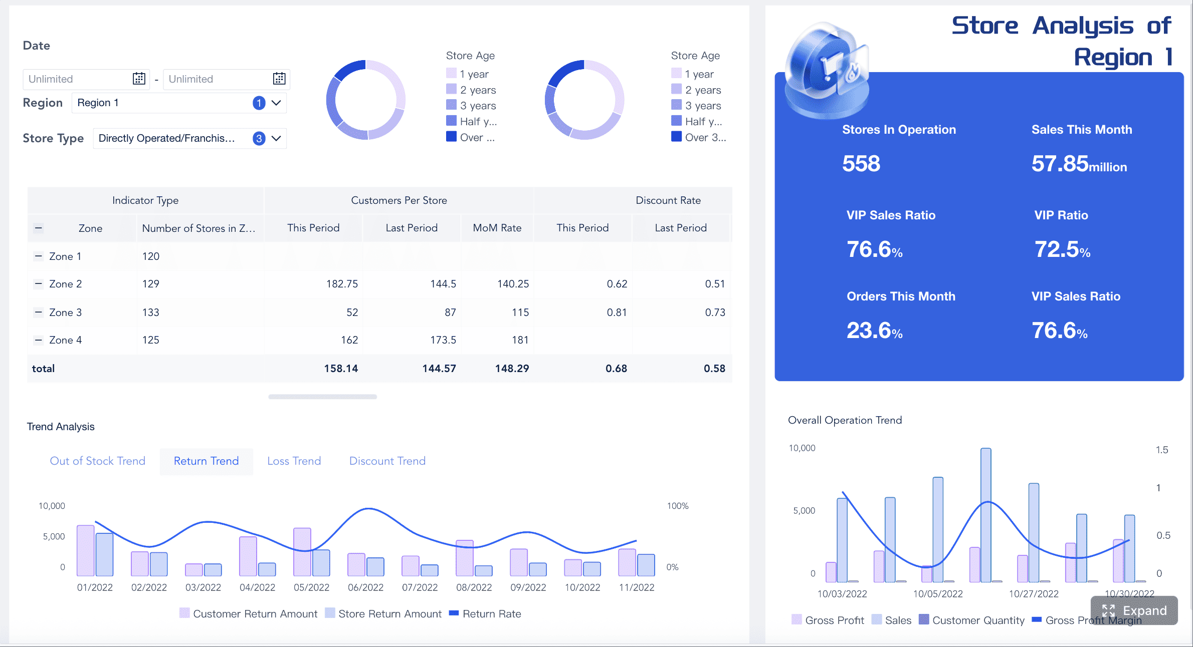
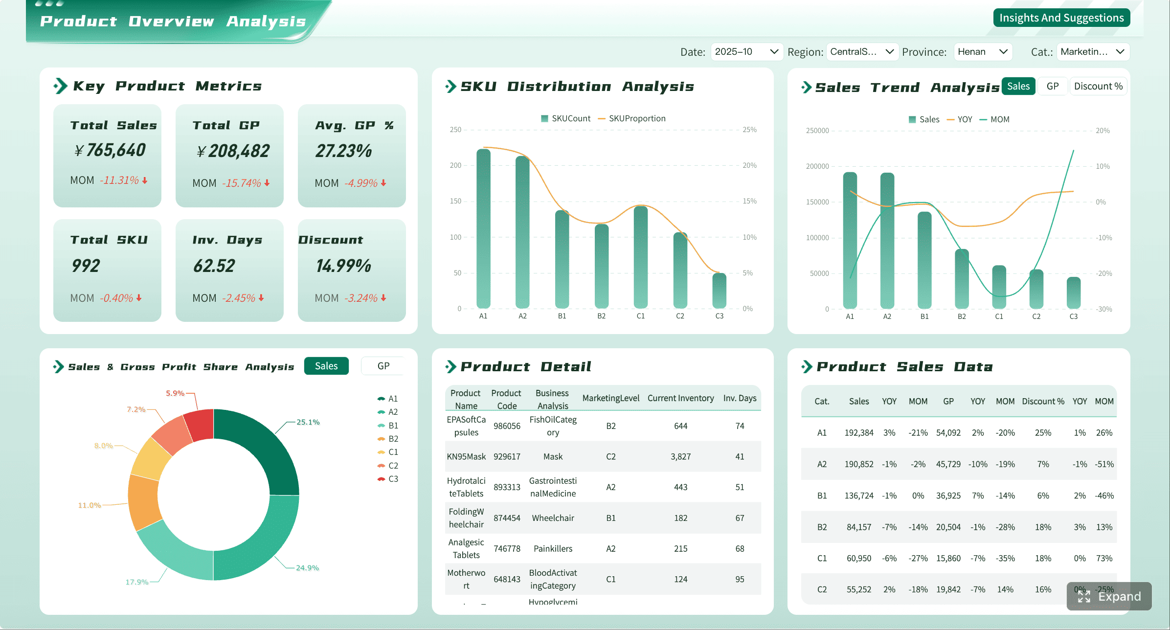
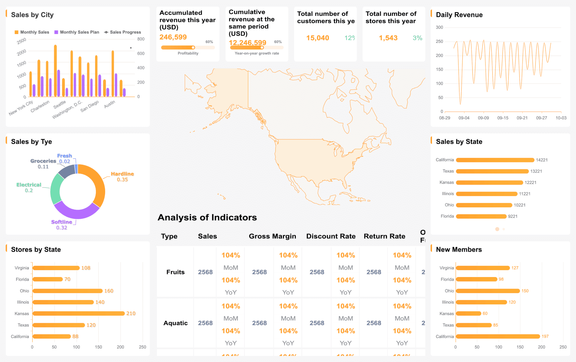
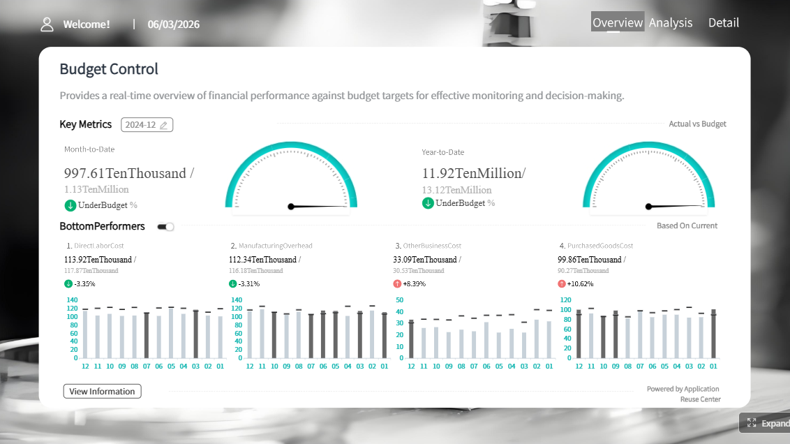
Excel dashboard templates are the fastest way to visualize business data without specialized software. Whether you track sales performance, cash flow, project timelines, or hiring pipelines, a well-structured template gives you an immediate, reusable view of what matters.
This guide provides 12 free Excel dashboard templates organized by function, practical customization tips, and clear guidance on when Excel templates are sufficient — and when it is time to upgrade to automated reporting with FineReport.
Free Excel Dashboard Templates: Quick Download List
Open roles, pass-through rates, offer acceptance, time-to-fill
Excel
Each template below includes a description of key metrics, when the template works well as-is, and signals that indicate it is time to move to an automated dashboard platform.
Sales Dashboard Excel Templates
1. Sales Performance Dashboard
Track revenue, win rate, pipeline value, and conversion rates in a single view. This template helps sales teams monitor individual and team-level performance against targets.
When this template works: Data is updated manually or via simple CSV import; one person owns the file; the team needs a shared visual reference for weekly sales meetings.
When to upgrade: Pipeline data lives in a CRM; multiple reps need real-time visibility; you need drill-down by rep, product line, or deal stage; leadership wants automated daily summaries instead of manual refreshes.
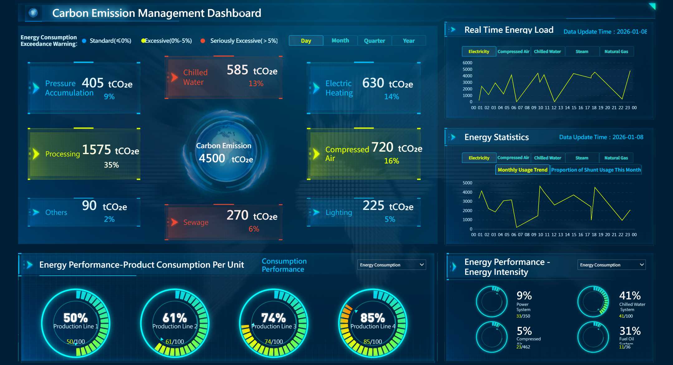
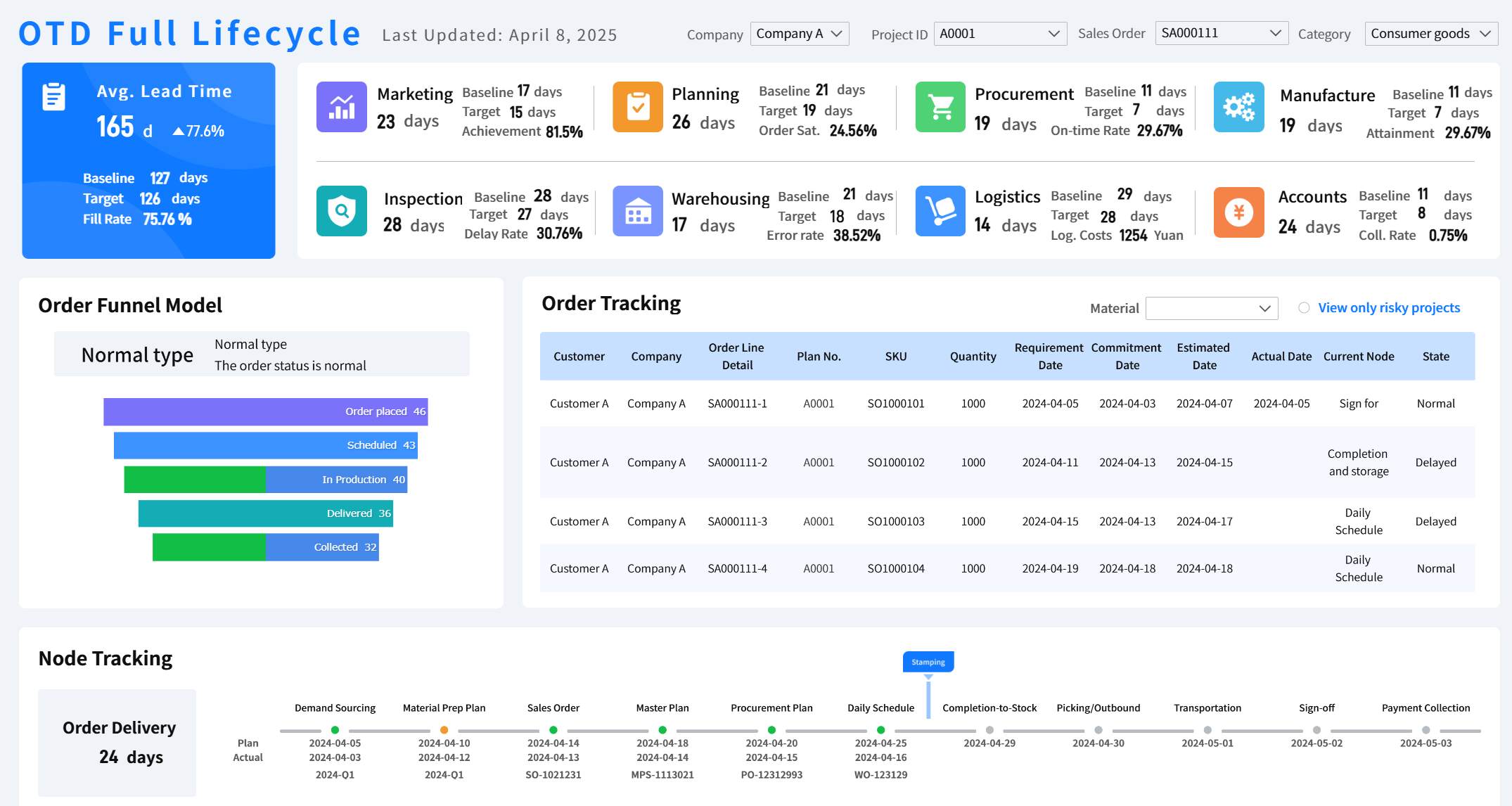
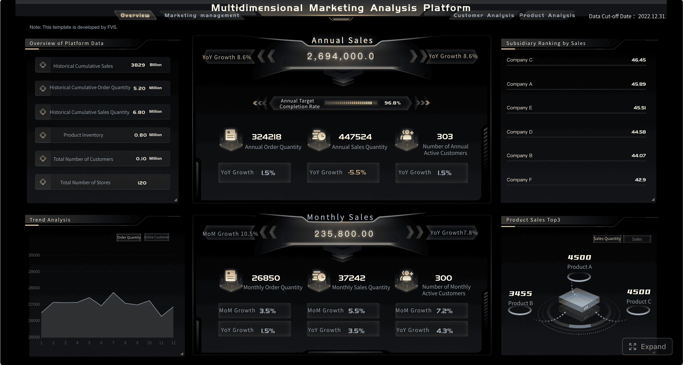
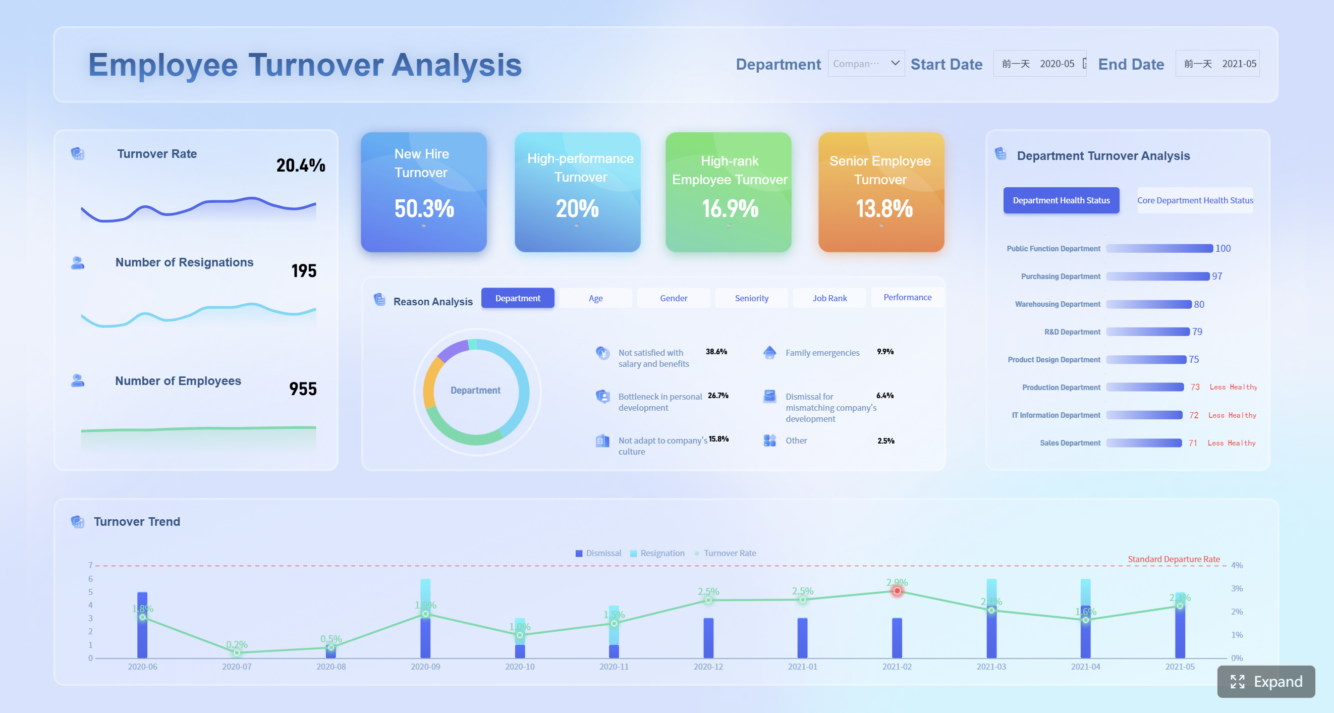
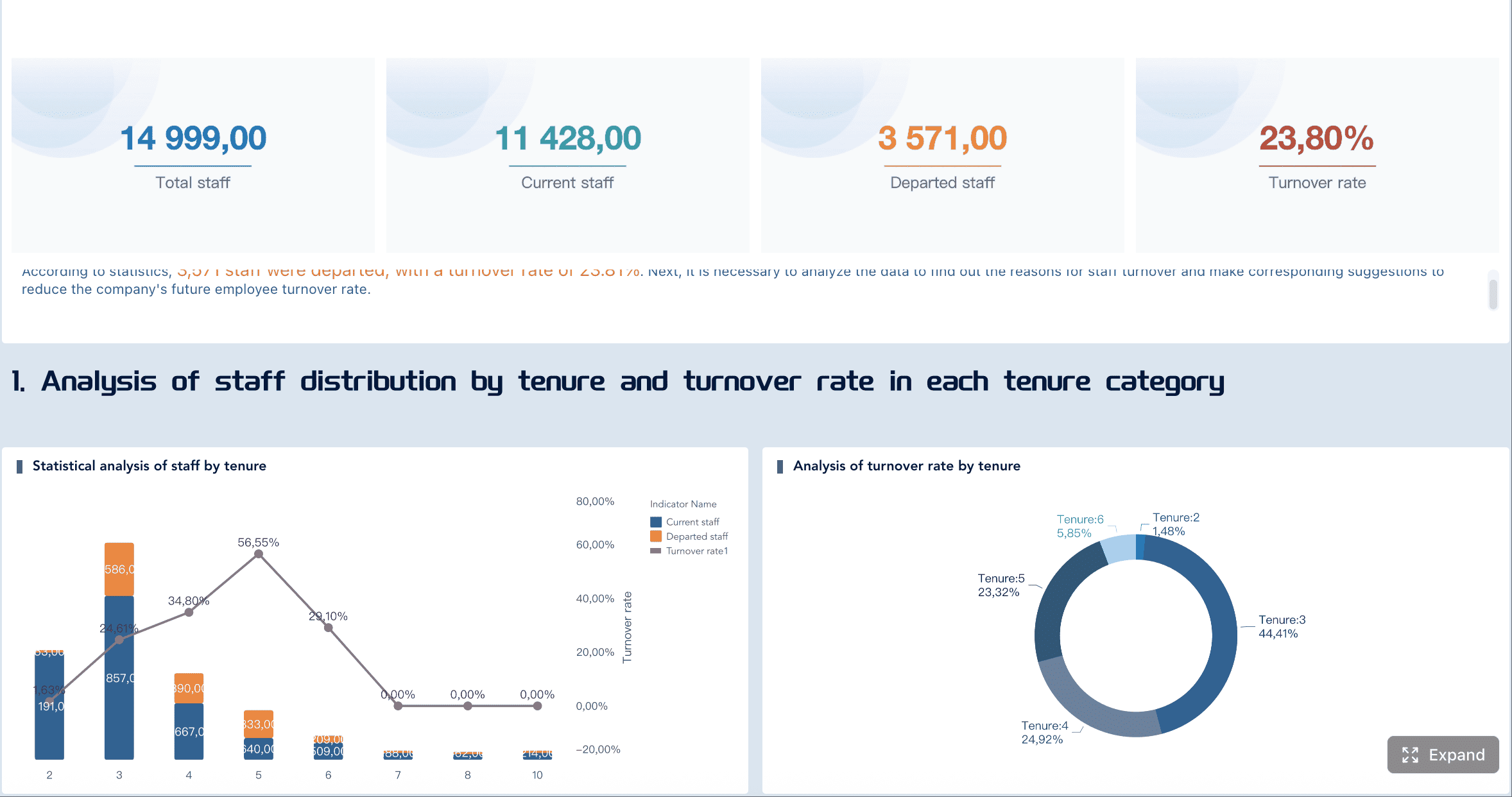
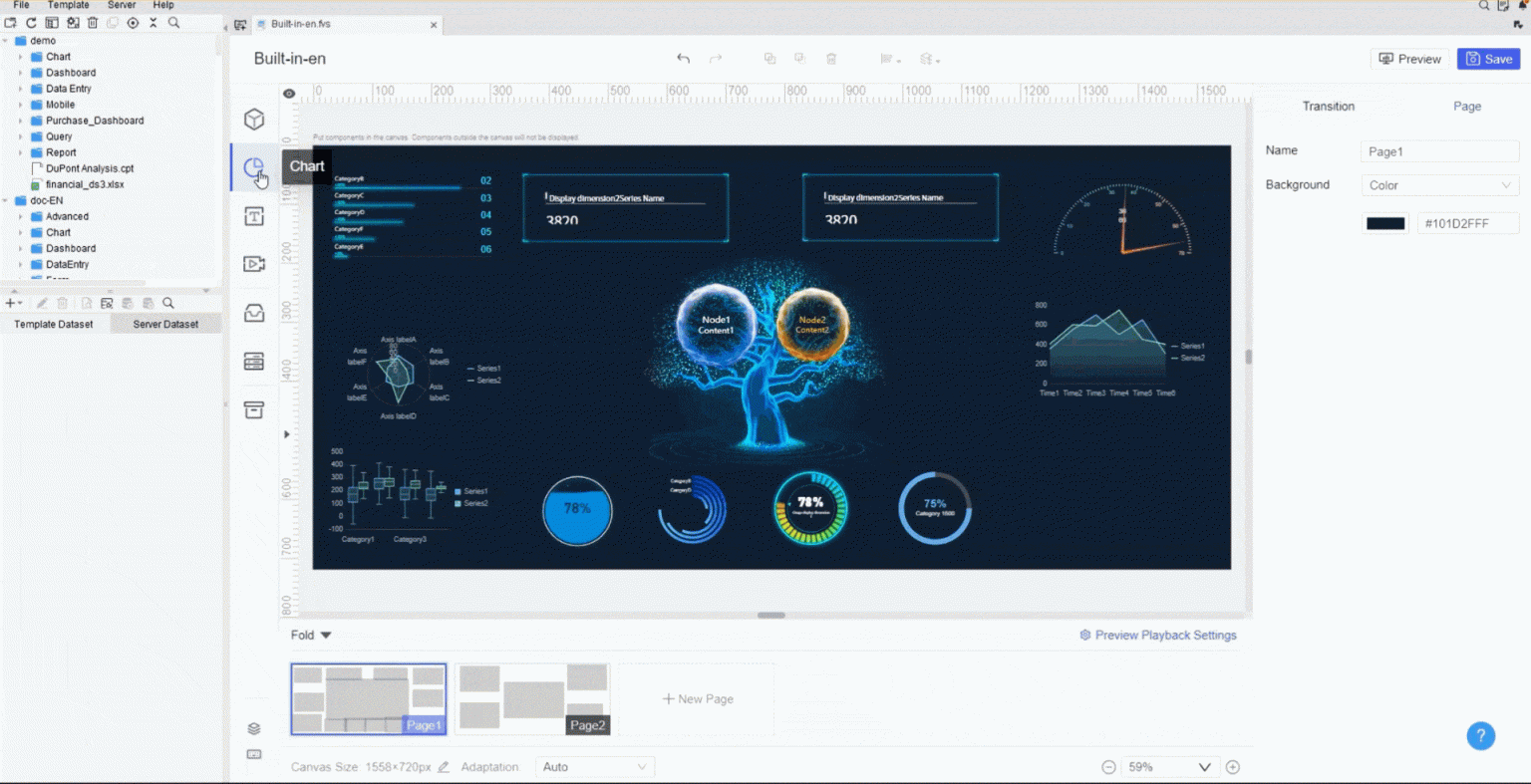
All dashboards in this article are created by FineReport.
Monitor average revenue per unit, sales pipeline velocity, cost of goods sold, gross profit margin, revenue per employee, EBIT, and working capital month over month.
Metric
Description
Average Revenue per Unit
Measures product profitability.
Sales Pipeline Velocity
Identifies bottlenecks.
Cost of Goods Sold (COGS)
Evaluates profitability.
Gross Profit Margin
Shows overall profitability.
Revenue per Employee
Measures productivity.
EBIT
Evaluates operating performance.
Working Capital
Aids in liquidity evaluation.
When this template works: Monthly reporting cadence is sufficient; finance and sales align on a single set of metrics; historical trend analysis is the primary use case.
When to upgrade: You need mid-month forecasting; metrics must reconcile automatically with ERP/GL data; variance explanations require drill-through to transaction-level detail.
3. Regional Sales Analysis Dashboard
Compare performance across territories with historical trends, seasonal adjustments, and predictive indicators.
When this template works: Regions report through a standardized spreadsheet submission process; analysis is quarterly or monthly; headcount is small enough for manual consolidation.
When to upgrade: Regional data originates from multiple CRMs or ERPs; currency conversion and localization must be automated; territory managers need self-service access without requesting updated files.
Finance Dashboard Excel Templates
4. Budget vs Actual Dashboard
Compare planned budgets against actual spending with automated variance calculations, color-coded indicators, and category-level drill-down.
When this template works: Budget data is maintained in Excel; department heads submit actuals via spreadsheet; variance review happens monthly in finance committee meetings.
When to upgrade: Actuals come from ERP or accounting systems; multiple departments need concurrent access; approval workflows are required for budget reallocation; auditors require version-controlled audit trails.
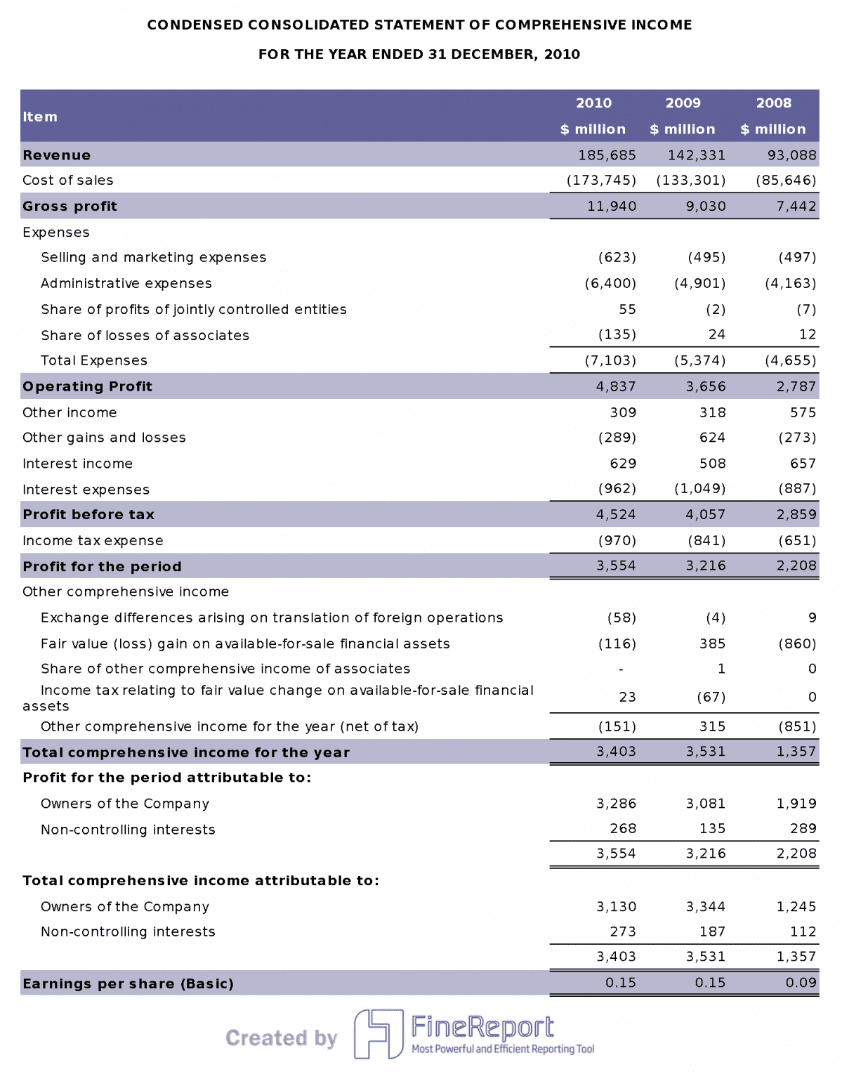
Visualize revenue, expenses, and net income over time with automated roll-ups and period comparisons.
When this template works: P&L structure is stable; data volume fits comfortably in Excel; stakeholders consume static snapshots rather than interactive exploration.
When to upgrade: Multi-entity consolidation is required; intercompany eliminations must be automated; executives need parameterized views (by division, product, geography) without separate files.
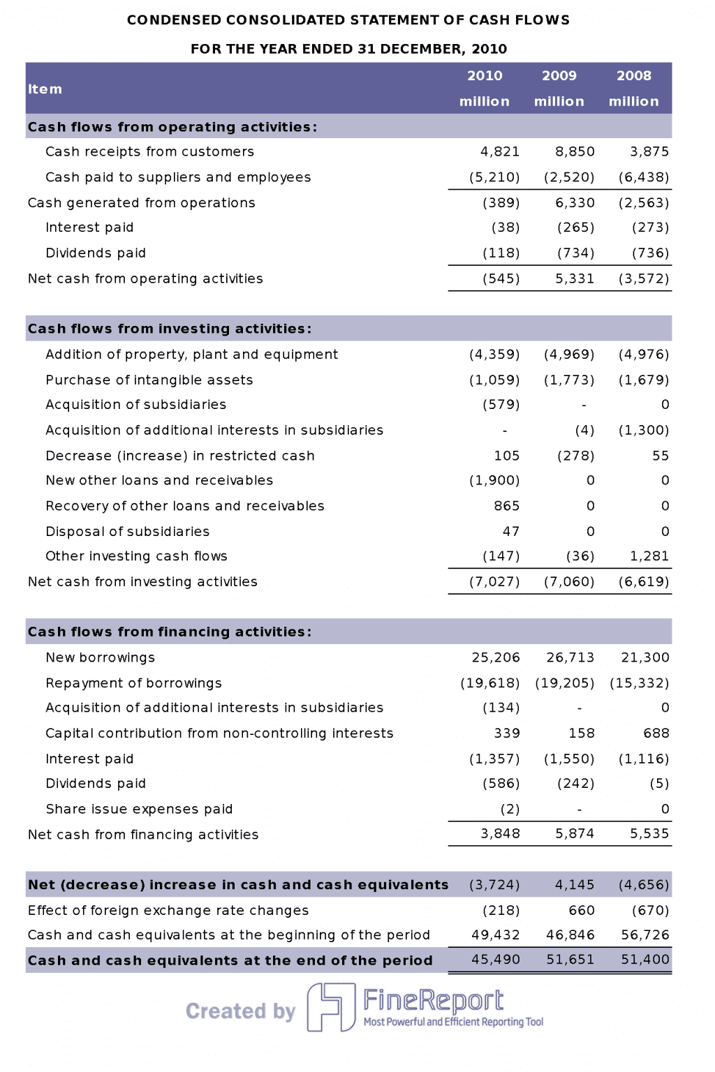
6. Cash Flow Management Dashboard
Track inflows, outflows, and net cash position year by year to identify spending patterns and liquidity risks.
When this template works: Cash flow data is compiled manually from bank statements; forecasting horizon is short-term; treasury team is small.
When to upgrade: Bank feeds and AP/AR systems should feed the dashboard directly; scenario modeling requires real-time recalculation; multiple stakeholders need simultaneous access with role-based visibility.
Project Management Dashboard Excel Templates
7. Project Timeline Tracker
Organize tasks, dates, dependencies, and progress percentages for schedule control and risk identification.
When this template works: Projects are small to medium; one project manager maintains the file; Gantt-style visualization is sufficient for stakeholder communication.
When to upgrade: Multiple projects share resources; dependencies span teams using different tools; resource allocation conflicts must be detected automatically; status updates should flow from task management systems rather than manual entry.
Show completion status, overdue items, workload distribution, and priority levels for team-level operational visibility.
When this template works: Teams use shared spreadsheets or simple task lists; update frequency is daily or weekly; team size is under 15 people.
When to upgrade: Tasks originate from Jira, Asana, or similar platforms; managers need cross-project portfolio views; overdue alerts must be pushed automatically; historical velocity tracking informs capacity planning.
Marketing Dashboard Excel Templates
9. Campaign Performance Dashboard
Track CPC, CTR, impressions, conversion rate, ROAS, CPA, and budget utilization across campaigns and channels.
When this template works: Campaign data is exported periodically from ad platforms; analysis is retrospective; marketing team consolidates manually before review meetings.
When to upgrade: Ad spend data flows from multiple platforms (Google Ads, Meta, LinkedIn); attribution models require cross-channel data integration; optimization decisions need near-real-time data rather than weekly exports.
10. Social Media Analytics Dashboard
Combine engagement, reach, follower growth, and content performance metrics from multiple social platforms into a unified view.
When this template works: Platform-native analytics are exported manually; reporting cadence is weekly or monthly; audience is internal marketing team.
When to upgrade: Cross-platform API integration is needed; sentiment analysis or comment categorization requires automation; executive stakeholders want scheduled briefings rather than dashboard navigation.
HR Dashboard Excel Templates
11. Employee Attendance Dashboard
Track daily, weekly, and monthly attendance patterns, leave requests, and absenteeism rates to improve scheduling and workforce planning.
When this template works: Attendance data comes from a single HRIS export or manual timesheet collection; team size is manageable for spreadsheet tracking; compliance reporting is periodic.
When to upgrade: Attendance data streams from badge readers, biometric systems, or cloud HRIS; overtime and leave policy compliance must be validated automatically; managers need self-service team views without HR intermediary.
Monitor open roles, aging requisitions, pass-through rates, offer acceptance ratios, time-to-fill, and sourcing channel effectiveness.
Metric
Description
Workload and priorities
Open roles, aging requisitions, at-risk vacancies.
Speed and bottlenecks
Time in stage, pass-through rates, stalled steps.
Quality and outcomes
Offer acceptance rates, quality of hire, early performance indicators.
Efficiency
Cost per hire, channel performance, sourcing investment.
Real-time visibility
Insight into hiring progress.
Improved accountability
Visible ownership, timelines, outcomes.
Reduced report compilation
Centralized hiring metrics.
Candidate velocity increase
Consistent measurement boosts speed.
When this template works: ATS exports are manageable in Excel; recruiting team is small; reporting supports weekly talent acquisition standups.
When to upgrade: ATS data volume exceeds Excel comfort zone; hiring managers need real-time pipeline visibility; SLA tracking and escalation alerts must be automated; diversity metrics require governed, auditable calculation.
You can find these free dashboard templates at Fine Gallery. FineReport lets you connect to multiple data sources, automate reporting, and create interactive dashboards with drag-and-drop ease.
Why Use Free Excel Dashboard Templates?
You want to get more done in less time. That’s where free project dashboard templates come in. These tools help you manage projects, track progress, and make smarter decisions—without spending a dime.
Save Time and Reduce Errors
You don’t want to waste hours building dashboards from scratch. Free project dashboard templates give you instant access to ready-made layouts. You can start tracking tasks, deadlines, and budgets right away. These templates automate calculations, so you don’t have to worry about manual errors.
Here’s how project dashboard templates help you work faster and smarter:
Feature
Benefit
Tracking and Visualization
Enhances clarity during project meetings and updates, saving time.
Automation of Calculations
Reduces manual reporting, minimizing errors.
Real-time Updates
Provides immediate insights, allowing for timely decision-making.
Comprehensive Overview
Collects various project metrics on one page for easier digestion.
Visual Data Representation
Graphs provide a snapshot of project status, aiding in quick assessments.
You can see everything you need at a glance. That means fewer mistakes and more time for what matters.
Professional Results with Minimal Effort
You want your reports to look sharp and organized. The best free project dashboard templates deliver professional results, even if you’re not a designer. You can use Gantt charts, employee schedules, and timesheets with just a few clicks. These templates include visual progress bars, automated calculations, and clear layouts.
For example:
Template Name
Key Features
Result
Project Timeline (Gantt Chart)
Task lists, start/end dates, visual progress bars
Projects stay on track, on time, and on budget.
Employee Schedule & Timesheet
Shift tracking, automated total hours calculation
Faster, error-free payroll and clear records.
You can customize dropdown lists, colors, and workflows to match your team’s needs. Many project dashboard templates also work with cloud platforms, so your team can collaborate in real time.
How to Choose the Right Excel Dashboard Template
Selecting the right template depends on three factors:
Audience: Who consumes this dashboard? Executives need summarized KPIs; operators need granular detail; cross-functional teams need shared definitions.
Data source: Where does the underlying data live? Single spreadsheet → Excel template works. Multiple systems → consider whether manual consolidation is sustainable.
Update frequency: How often must the dashboard reflect new data? Monthly manual refresh → Excel suffices. Daily or real-time → automation becomes necessary.
Start with the template closest to your current workflow. Customize it to match your metrics. Then evaluate honestly whether the maintenance burden is acceptable or growing.
How to Customize an Excel Dashboard Template
Effective customization preserves usability while adapting to your specific context:
Standardize metric definitions: Document how each KPI is calculated. Ambiguous definitions cause misalignment when multiple people use the same template.
Use Excel Tables: Convert data ranges to structured Tables for automatic formula expansion, filtering, and chart updating when new rows are added.
Apply conditional formatting strategically: Highlight variances, thresholds, and status changes. Avoid excessive color coding that creates visual noise.
Protect structure, unlock inputs: Lock formula cells and chart configurations; unlock only data entry ranges. This prevents accidental breakage during routine updates.
Add input validation: Use dropdown lists and data validation rules to standardize categorical entries and prevent typos that corrupt aggregations.
Document assumptions: Note data sources, refresh procedures, known limitations, and contact information for the template owner. Undocumented templates become orphaned when staff turnover occurs.
Well-customized Excel templates can serve teams effectively for months or years. The signal to move beyond them is not failure — it is when maintenance effort consistently displaces analytical value.
Excel Dashboard Templates vs BI Dashboard Software: When Should You Upgrade?
Excel dashboard templates are excellent starting points. But they hit predictable ceilings as organizations grow:
Limitation
Impact on Business
Manual data refresh
Reports are always stale; decisions based on outdated information
Single-user file locking
Teams cannot collaborate concurrently; version conflicts proliferate
No automated distribution
Someone must email or upload updated files every cycle
Limited access control
Anyone with the file sees all data; row-level security is impossible
Fragile formulas
Complex dashboards break when users accidentally modify hidden logic
No audit trail
Changes are untracked; compliance and accountability suffer
Scaling ceiling
Performance degrades beyond ~100K rows or complex multi-sheet models
As your data grows, the workflow often moves in three stages: first, a spreadsheet template; then, an automated BI dashboard built with FineReport; and eventually, an AI data agent such as Dora that can help teams ask questions, monitor risks, and receive proactive business insights.
Use Excel templates when...
Use FineBI/FineReport when...
Add Dora when...
You only update data monthly
You need real-time or scheduled refresh
You want AI-generated daily business briefings
One person manages the file
Multiple teams need shared dashboards
Managers need to ask data questions in natural language
Data comes from one spreadsheet
Data comes from databases, ERP, CRM, APIs
You need an AI agent to query governed business data
You only need simple charts
You need drill-down, permissions, alerts, automation
You want anomaly detection and proactive risk monitoring
Manual reporting is acceptable
Manual Excel work is slowing the team down
You want to move from reactive reporting to AI-assisted decisions
If your Excel dashboard takes hours to update every week, FineReport can help automate reporting, scheduling, and dashboard delivery.
You want deeper insights and more advanced features? FineReport by FanRuan takes project dashboard templates to the next level. You can connect multiple data sources, automate reporting, and create interactive dashboards with drag-and-drop tools. FineReport helps you visualize complex data and share real-time updates across your organization.
If you need more than what free project dashboard templates offer, FineReport gives you enterprise-level power. You can manage large projects, track KPIs, and make data-driven decisions with ease.
Free project dashboard templates let you start strong. FineReport helps you scale up when you’re ready for more.
How Dora Adds AI Summaries to Dashboard Reporting
After dashboards are automated in FineReport, Dora adds an AI insight layer for teams who need faster comprehension and proactive monitoring.
Use Dora when...
What Dora Does
You want AI to summarize dashboard changes
Generates natural-language summaries of key metric movements between reporting periods
You need scheduled insight briefings
Delivers daily or weekly digests highlighting anomalies, trends, and action items to designated recipients
Managers want to ask follow-up questions in natural language
Answers "Why did X change?" or "What drove Y variance?" grounded in governed dashboard data
Teams need alerts when key metrics change abnormally
Monitors configured thresholds and pushes contextual notifications before issues escalate
Dora operates on trusted FineReport assets. It does not replace dashboards; it accelerates the path from "dashboard viewed" to "insight acted upon."
How to Turn an Excel Dashboard Template into an Automated Dashboard
Excel dashboard templates are a useful starting point, but they hit a ceiling fast. Every reporting cycle requires manual data refreshes, chart adjustments, and file distribution. Version conflicts multiply as more stakeholders request copies. The template that saved time in month one becomes a maintenance burden by month three.
The solution is not to abandon Excel entirely — it is to graduate from static templates to automated dashboards that retain the familiar structure while eliminating manual effort. Here are five steps to make that transition:
Step 1: Start with a Clean Excel Dashboard Template Choose a template with clear layout logic: KPI cards at the top, trend charts in the middle, detail tables at the bottom. Remove decorative elements that do not serve analysis. Standardize color coding and metric definitions. This cleaned-up template becomes your design specification — not your final deliverable.
Step 2: Connect Your Excel File or Database Instead of copying data into the template manually, connect your dashboard tool directly to the data source. This could be the Excel file itself, a database, an ERP system, or a cloud application. Tools like FineDataLink automate this connection with incremental sync, so data stays current without manual exports. The dashboard now reflects live data, not last week's snapshot.
Step 3: Replace Manual Charts with Live BI Widgets Rebuild each Excel chart as an interactive BI widget. A static bar chart becomes a filterable, drillable visualization. A pivot table becomes a dynamic cross-tab with real-time sorting. FineBI provides drag-and-drop widgets that mirror Excel chart types while adding interactivity, filtering, and cross-chart linking. The visual language stays familiar; the capability expands significantly.
Step 4: Set Scheduled Refresh and Permissions Configure automatic data refresh on a schedule that matches your reporting cadence — hourly for operations, daily for sales, weekly for executive reviews. Apply role-based access controls so each stakeholder sees only relevant data. FineReport handles scheduled generation and distribution of formatted dashboard snapshots via email or web portal. No more "please send me the latest version" emails.
Step 5: Share the Dashboard with Managers or Teams Distribute the automated dashboard through a web portal, mobile app, or embedded link. Stakeholders access the same live view simultaneously, eliminating version conflicts. When managers need follow-up insights beyond what the dashboard shows, Dora enables natural language questions against the governed data layer — "Why did regional revenue drop last week?" or "Summarize this month's operational KPIs" — without requesting custom reports from IT.
You can boost your productivity with the best free dashboard Excel templates for 2026. These tools help you save time, reduce errors, and create professional reports with ease. Want more power? Try FineReport by FanRuan for advanced dashboards and real-time data integration.
Product Trial
FineReport
Pixel-perfect reports · Interactive dashboards · Easy data entry · Digital twins
Access a wealth of case studies, industry insights, and solution guides to accelerate digital transformation.
FAQ
How do I choose the right Excel dashboard template?
You should think about your goals first. Ask yourself what data you want to track. Look for templates that match your project type and skill level. Try a few and see which one feels easiest to use.
Can I customize these dashboard templates?
Absolutely! You can change colors, charts, and data fields. Most templates let you add your own branding or adjust layouts. Just open the template in Excel and start editing.
Are these templates really free to use?
Yes, you can download and use these templates at no cost. Some sites may ask for your email. Always check the download page for any extra requirements.
Can Excel dashboard templates update automatically?
Not natively. Excel dashboards require manual data refresh or VBA macros that are fragile and difficult to maintain. For true automatic updates, connect your Excel file or database to a BI platform. FineBI supports scheduled data refresh with live connections to databases, APIs, and cloud applications, so dashboards reflect current data without manual intervention. FineReport adds automated report generation and email distribution on any cadence — daily, weekly, or monthly — eliminating the copy-paste-refresh cycle entirely.
What is the best free Excel dashboard template for business KPIs?
The best template depends on your functional area. For sales, look for templates with pipeline tracking, win rate trends, and regional performance breakdowns. For finance, prioritize P&L summaries, budget variance charts, and cash flow waterfalls. For project management, choose templates with Gantt timelines, milestone trackers, and resource allocation views. For HR, seek headcount dashboards, turnover analysis, and attendance summaries. For marketing, focus on campaign ROI, lead funnel conversion, and channel attribution models. Regardless of category, ensure the template uses standardized metric definitions and clean layout logic before adapting it. If you outgrow manual templates, FineBI provides pre-built KPI dashboard templates across all these functions with live data connectivity.
Can Excel dashboards refresh automatically?
Excel supports limited automation through Power Query connections, Office Scripts, or VBA macros. However, true automated refresh with scheduled distribution, role-based access, and multi-user concurrency requires dedicated reporting software like FineReport. Excel automation works for personal or small-team use; enterprise-grade automation requires purpose-built tooling.
When should I replace Excel dashboards with reporting software?
Replace Excel dashboards when: (1) manual refresh consumes significant recurring time, (2) multiple users need concurrent access with different permission levels, (3) data must be pulled from databases or business systems rather than entered manually, (4) stakeholders require automated distribution rather than emailed attachments, or (5) audit trails and version control are required for compliance.