A big data dashboard is most valuable when it does more than display charts. It should help decision-makers detect change quickly, understand why performance is moving, and decide what action to take next. Across healthcare, retail, SaaS, logistics, and finance, the best dashboards share a common trait: they translate large, fast-moving, multi-source data into clear operational and strategic signals.
This guide explains what an effective dashboard should contain, then walks through 12 real-world big data dashboard examples by industry. It also covers layout principles, tool selection criteria, and common mistakes that reduce dashboard adoption.
What a Big Data Dashboard Should Show Across Industries
A useful Big Data Dashboard must handle the three defining characteristics of modern data environments: high volume, high velocity, and high variety. That means it should combine large historical datasets, real-time event streams, and data from multiple systems without overwhelming the user.
At a minimum, a strong dashboard should show:
- Core KPIs tied to business outcomes
- Trends over time
- Comparisons against targets, benchmarks, or prior periods
- Segmentation by region, product, customer group, payer, route, or channel
- Exception alerts that surface issues needing action
- Drill-down paths for diagnosis
The value of a dashboard increases when it is designed for a specific decision context rather than for general information sharing. A hospital operations lead, a retail merchandising manager, and a finance risk executive all need different views of the same business reality.
There are three broad dashboard modes to distinguish:
Executive KPI views
Executive pages focus on top-line performance. They usually summarize a limited set of strategic indicators such as revenue growth, cost control, customer retention, service levels, or risk exposure. The goal is rapid orientation. Leaders should be able to understand the state of the business within seconds.
Operational monitoring
Operational dashboards support fast response. These views prioritize near-real-time metrics, queue states, alert thresholds, and workflow bottlenecks. They are designed for teams that need to intervene quickly, such as dispatchers, care coordinators, fraud investigators, or warehouse managers.
Analytical drill-downs
Analytical pages help users investigate causes. They provide filters, comparisons, cohort analysis, segmentation, and detailed trend breakdowns. These views are often used by analysts, business managers, and department heads who need to explain performance shifts and identify improvement opportunities.
The best big data dashboard environments connect all three layers. Teams do not stop at viewing metrics; they move from summary to diagnosis to action. In practice, that means the dashboard is not just a reporting surface. It becomes a decision system.
This is also where modern BI platforms matter. Solutions such as FineBI help organizations connect multiple data sources, build role-based dashboards, and support self-service analysis so business teams can move from static reporting toward continuous data-driven management.
12 Big Data Dashboard Examples by Industry
Below are 12 Big Data Dashboard layouts that reflect how different industries structure KPIs for real business use.
Healthcare: Patient flow and care quality dashboard
A healthcare patient flow dashboard is designed for hospital operations, nursing leadership, and care coordination teams. Its purpose is to protect capacity, reduce delays, and maintain care quality under fluctuating demand.
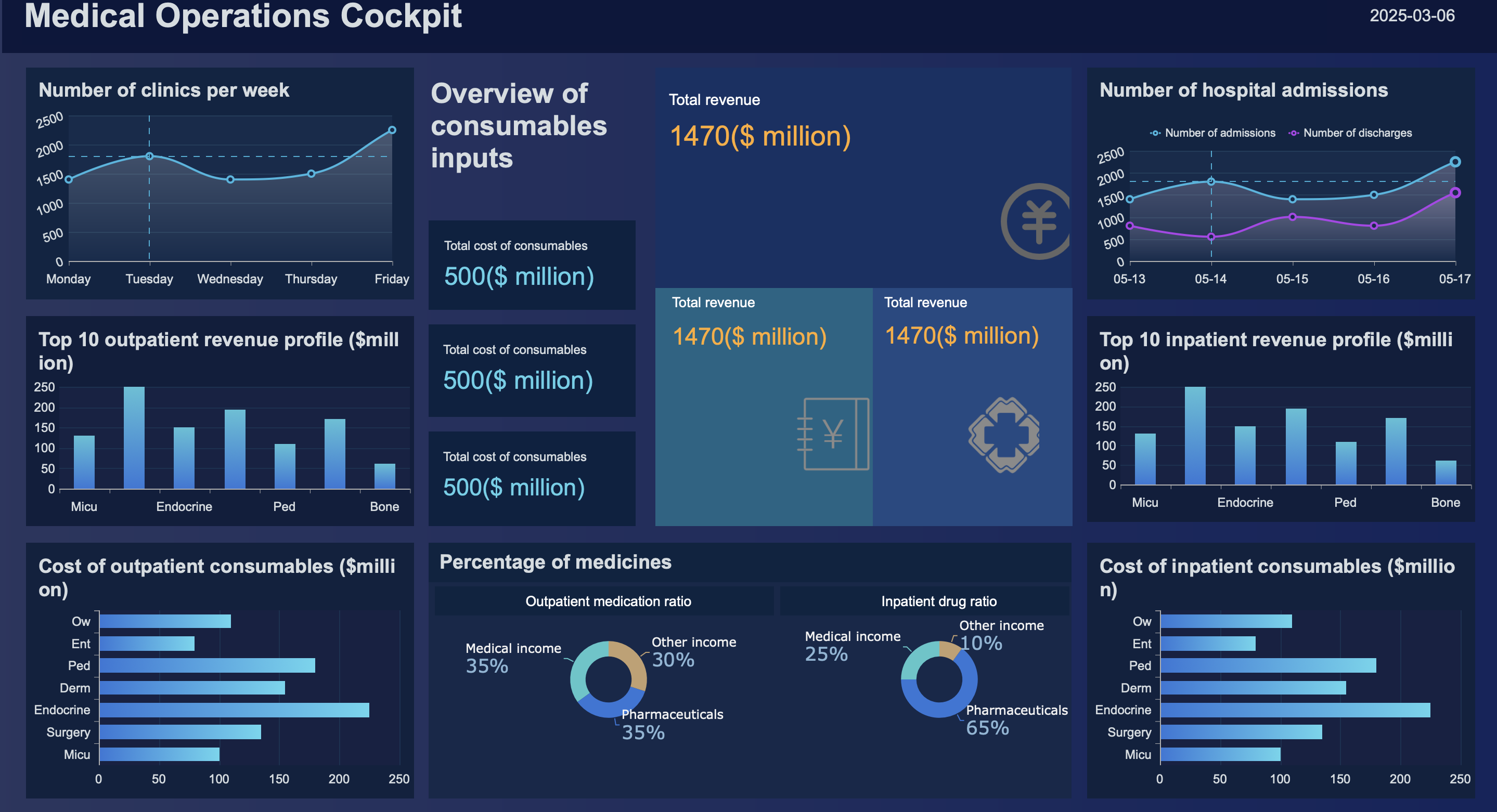 Figure 1: Hospital Dashboard created with FineReport
The top row typically contains the most urgent operating indicators:
- Bed occupancy rate
- Emergency department wait time
- Average length of stay
- Readmission rate
- Staff utilization rate
Below that, the layout often includes trend lines for admissions, discharges, transfers, and unit capacity by hour or day. A heatmap by department or ward can quickly show where congestion is building. On the right side, alert panels may flag thresholds such as overcrowding, delayed discharge, or staffing imbalance.
This big data dashboard works because it combines live operations with quality outcomes. Bed occupancy alone is not enough. Teams need to see whether pressure is affecting readmissions, length of stay, or emergency throughput.
Real-time alerts are especially important. If emergency wait time rises above target while occupancy remains high and staff utilization approaches maximum, clinical and operations teams can escalate discharge planning, redistribute staff, or activate surge capacity.
Healthcare: Revenue cycle and claims dashboard
A second healthcare Big Data Dashboard focuses on financial operations. Revenue cycle leaders, finance teams, and administrative managers use this layout to connect billing efficiency with revenue impact.
The most important KPIs usually include:
- Claim denial rate
- Reimbursement lag
- Payer mix
- Collection rate
- Outstanding balances
A practical layout starts with those headline metrics, then moves into pipeline views showing claims by stage: submitted, pending, denied, appealed, and paid. Denial reasons can be broken down by provider group, payer, procedure type, or location. Aging tables help teams see which receivables are becoming higher risk.
This dashboard becomes powerful when operational friction is linked directly to financial outcomes. For example, a spike in denial rate may be traced to coding errors in one department or to a specific payer rule change. Reimbursement lag can then be viewed alongside cash collections and outstanding balances to estimate short-term revenue pressure.
Because healthcare data often spans EHR, billing, payer, and scheduling systems, the dashboard must unify multiple sources cleanly. A platform like FineBI can support this by enabling centralized modeling and role-specific views for finance and administrative users.
Retail: Sales and inventory performance dashboard
For retailers, one of the most common big data dashboard examples is the sales and inventory performance page. It supports merchandising, store operations, and regional management.
 Figure 2: Retail Dashboard created with FineBI
The most effective KPI layout includes:
- Daily sales
- Gross margin
- Stockout rate
- Sell-through rate
- Average basket size
- Regional performance
The screen often begins with overall sales and margin cards, followed by trend charts by day or week. The middle section typically compares categories, SKUs, and regions. A matrix view can show high-sales, low-stock combinations that demand immediate attention. Another panel may identify excess inventory where sell-through is below target.
This dashboard is valuable because it shows both demand and supply-side risk. Fast-moving products are easy to celebrate, but if stockout rates rise at the same time, revenue leakage is likely. Conversely, strong inventory availability with weak sell-through may indicate overbuying or pricing issues.
Store teams use the page to monitor local execution, while merchandising teams use it to adjust assortment, promotions, and replenishment. In a mature setup, users can drill from enterprise summary to region, store, product family, and SKU.
Retail: Customer behavior and marketing dashboard
Another key retail Big Data Dashboard centers on customer activity and marketing performance across physical and digital channels. This layout helps teams understand what drives conversion, loyalty, and campaign return.
Core KPIs usually include:
- Conversion rate
- Repeat purchase rate
- Campaign ROI
- Customer lifetime value
- Channel attribution
A well-structured page shows customer funnel performance near the top: traffic, product views, add-to-cart, checkout, and purchase. Adjacent to that, a cohort section can show repeat purchase behavior over time. Lower on the page, marketing performance is often segmented by channel such as paid search, email, social, affiliate, and in-store promotion.
What makes this dashboard especially useful is channel comparison in one view. Retailers no longer manage store and ecommerce performance separately. They need to understand how online campaigns affect store purchases, how loyalty programs influence repeat buying, and how customer value differs by acquisition source.
A strong big data dashboard here allows filtering by audience segment, geography, product line, and campaign period. This helps marketers and ecommerce managers compare not only revenue, but efficiency and retention quality.
SaaS: Growth and subscription health dashboard
In SaaS, leadership teams depend on a Big Data Dashboard that captures recurring revenue health and growth efficiency. This page is typically used by executives, revenue operations, finance, and growth leaders.
The headline KPI set often includes:
- Monthly recurring revenue (MRR)
- Annual recurring revenue (ARR)
- Churn rate
- Expansion revenue
- Customer acquisition cost (CAC)
- Lifetime value (LTV)
- Trial-to-paid conversion rate
The layout usually starts with current MRR and ARR, plus period-over-period growth. The second row often splits revenue into new business, expansion, contraction, and churn. A customer funnel can then show lead-to-trial, trial-to-paid, and onboarding completion rates.
This dashboard helps leadership balance competing growth signals. Rapid acquisition may look positive until CAC rises and trial-to-paid conversion weakens. Similarly, strong top-line MRR growth may hide unhealthy logo churn unless retention metrics are visible at the same level of prominence.
A mature big data dashboard for SaaS also segments results by plan type, region, acquisition source, customer size, or product line. That allows leaders to see whether growth is durable or concentrated in one segment.
SaaS: Product usage and support dashboard
A second SaaS Big Data Dashboard focuses on user behavior and customer friction. It is commonly used by product teams, customer success, and support operations.
Important KPIs include:
- DAU/MAU
- Feature adoption rate
- Onboarding completion
- Ticket volume
- Average resolution time
- Net Promoter Score (NPS)
The top of the page often summarizes engagement and support load. Below that, teams can view feature adoption by cohort, account segment, or release version. Another section usually tracks support demand, including ticket inflow, backlog, severity mix, and resolution trends.
The strategic purpose of this dashboard is early churn prevention. Falling usage, low onboarding completion, and rising support tickets often appear before customers cancel. When these metrics are shown together, product and customer success teams can identify friction earlier and respond with targeted interventions.
This kind of dashboard benefits from event-level product data, CRM attributes, and support system records. FineBI is often relevant in such scenarios because it can consolidate operational and behavioral data into a single analytical workspace while maintaining role-based access.
Logistics: Fleet and route efficiency dashboard
A logistics fleet page is a classic operational big data dashboard. It is built for dispatchers, transport managers, and regional operations leaders who need immediate visibility into delivery performance and cost control.
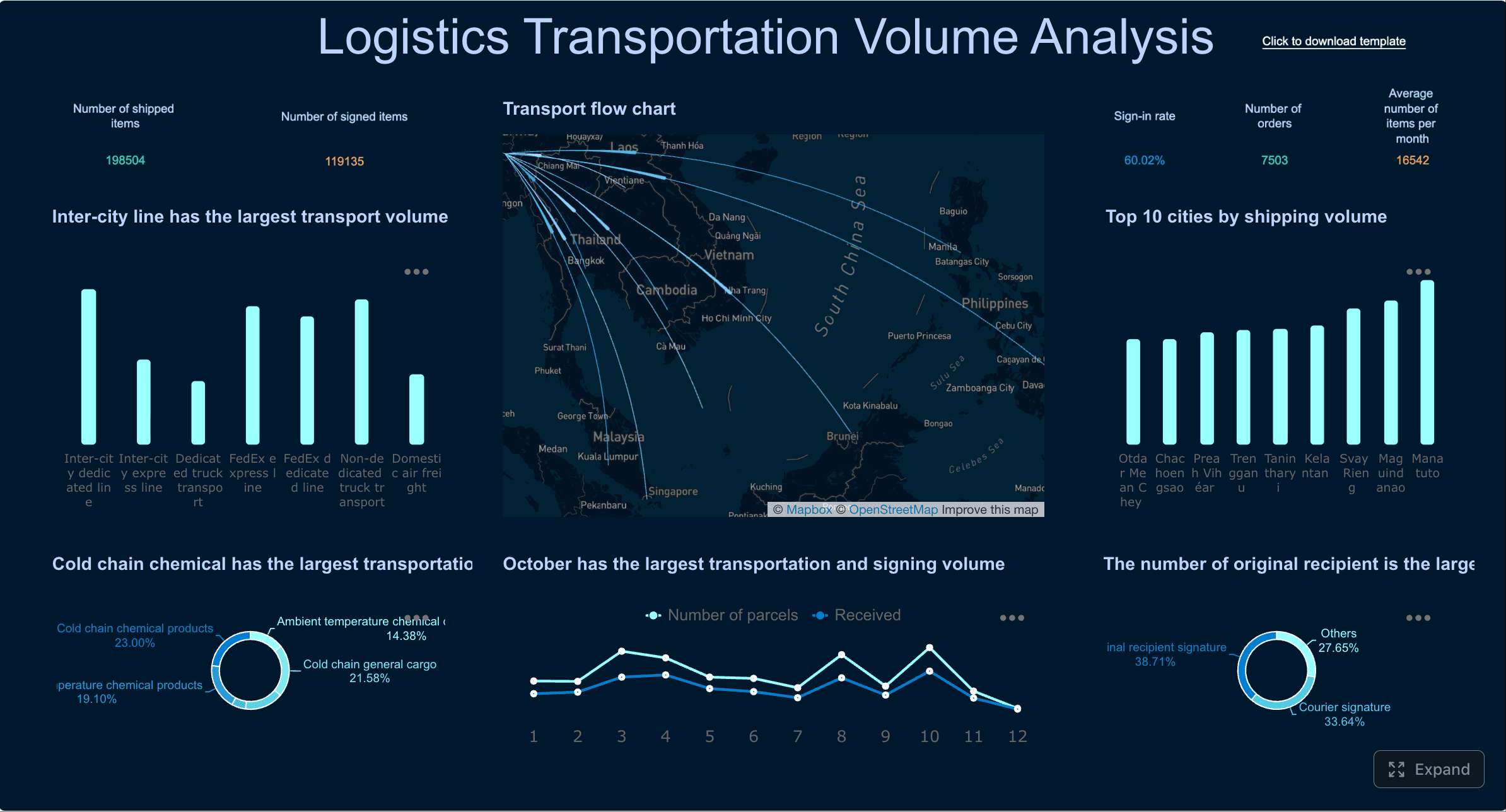 Figure 3: Logistics Dashboard created with FineReport
Typical KPIs include:
- On-time delivery rate
- Route deviation
- Fuel cost
- Vehicle utilization
- Idle time
- Maintenance status
The top row highlights service and efficiency. The center area often includes a live route map or route-status panel, while supporting charts compare driver, vehicle, region, or route performance. Maintenance indicators are often integrated so teams can distinguish dispatch problems from asset constraints.
This dashboard helps dispatchers make decisions in motion. If on-time delivery falls while route deviation and idle time increase, managers can identify disruption points quickly. Fuel cost trends may also reveal inefficient routing, underutilized assets, or driver behavior issues.
Because logistics environments involve telematics, TMS, GPS, and maintenance systems, the dashboard should support fast refresh and exception-driven design. Users need to find the problem first, not search through every metric equally.
Logistics: Warehouse operations dashboard
Warehouse leaders use another Big Data Dashboard to protect throughput and service levels inside the facility. The page is usually organized around processing speed, accuracy, labor, and SLA risk.
Common KPIs include:
- Order cycle time
- Picking accuracy
- Dock-to-stock time
- Labor productivity
- Backlog
- Fulfillment SLA attainment
The layout often begins with order volume, throughput, and backlog cards. Below that, operations managers review stage-specific metrics such as receiving, putaway, picking, packing, and shipping. Bottleneck views are especially useful, showing where queue depth and processing delays are accumulating.
This dashboard works because warehouse performance is highly interdependent. Rising backlog may be caused by receiving delays, labor shortages, picking errors, or shipping constraints. By arranging metrics in process order, managers can diagnose root causes faster.
For large-scale operations, drill-down by shift, zone, SKU class, or customer priority is essential. That allows teams to protect SLAs for the most important orders even when overall volume spikes.
Finance: Portfolio and risk dashboard
In financial services, a portfolio and risk Big Data Dashboard must support both oversight and analysis. Analysts, portfolio managers, and executives all need a shared view of return and exposure.
 Figure 4: Finance Dashboard created with FineBI
The KPI structure typically includes:
- Asset allocation
- Exposure by sector, geography, or instrument
- Volatility
- Drawdown
- Value at Risk (VaR)
- Benchmark performance
A strong layout places top-line portfolio value and performance at the top. The next layer breaks down allocation and concentration risk. Trend panels then show volatility, drawdown, and relative benchmark movement. On the right side, many teams include watchlists or exposure alerts for thresholds that require review.
The key strength of this dashboard is that it presents risk and return together. A portfolio may be outperforming its benchmark while also carrying unacceptable concentration or downside exposure. Without both views on the same page, decision-makers may overemphasize recent returns.
This big data dashboard should also allow scenario comparison and period filtering so users can examine behavior across market conditions, not just current snapshots.
Finance: Fraud detection and transaction monitoring dashboard
A fraud monitoring Big Data Dashboard is highly operational and alert-driven. It is used by fraud analysts, payment operations teams, compliance leaders, and investigators.
The most common metrics include:
- Suspicious transaction volume
- False positive rate
- Approval rate
- Loss exposure
- Alert resolution time
The top of the page typically summarizes incoming alerts and estimated risk exposure. The center shows anomalies by channel, geography, merchant, payment type, or transaction pattern. A case queue panel often displays investigator workload, prioritization scores, and aging.
This dashboard must balance vigilance with efficiency. If every anomaly becomes an alert, investigators are overwhelmed. If filters are too narrow, meaningful fraud activity may be missed. That is why false positive rate and alert resolution time belong on the same page as suspicious volume and loss exposure.
An effective big data dashboard in this context supports prioritization. Teams should be able to rank cases by severity, value, repeat pattern, and customer risk profile instead of treating all alerts equally.
Cross-industry executive dashboard
A cross-functional executive Big Data Dashboard is useful for organizations that want one board-level summary across departments. It is less detailed than a departmental view, but more focused than a general business scorecard.
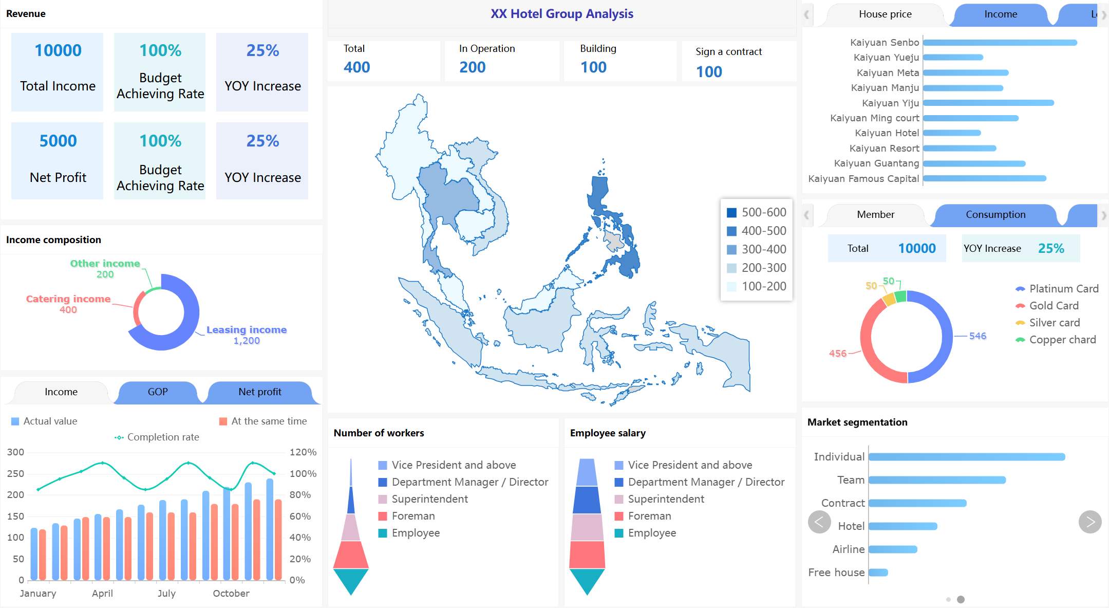 Figure 5: Hotel Group Dashboard created with FineReport
The one-screen summary usually includes:
- Revenue
- Cost
- Forecast variance
- Service level
- Customer trend indicators
- Top exceptions or risks
The top row presents the enterprise snapshot. The middle section often shows trend comparisons against plan, budget, and prior period. A lower panel can highlight exceptions that need executive attention, such as underperforming regions, rising churn, delayed claims, or declining fulfillment SLA.
What belongs on this page should be carefully controlled. Board-level users need signals, not operational noise. High-level KPIs, major trends, and a short list of exceptions belong here. Departmental ticket queues, route maps, or denial codes do not.
This big data dashboard works best when each KPI links to a department page for further diagnosis while preserving a clean leadership view.
Cross-industry operational control dashboard
The final example is an operational control Big Data Dashboard used by teams managing fast-moving workflows across many industries. It is common in customer service, logistics, healthcare operations, payment monitoring, and digital operations centers.
Typical elements include:
- Real-time alerts
- Workflow status
- Queue depth
- SLA risk
- Resource allocation
The layout is often designed around urgency. Critical alerts appear first, followed by workload status and resource deployment. Color should be used carefully to emphasize exceptions rather than decorate the page. Filters by region, team, shift, or queue let supervisors reallocate capacity quickly.
This layout is effective because it reflects how operational work happens. Teams need immediate visibility into what is late, what is blocked, and where staffing or process intervention is required. Historical trend panels can still be included, but they should support context rather than dominate the screen.
How to Design KPI Layouts That Work With a Big Data Dashboard
Designing an effective Big Data Dashboard is not mainly about visual variety. It is about creating a structure that supports fast interpretation and confident action.
Start with decision-making, not chart volume
The first rule is simple: choose KPIs based on what the user must decide. Every metric should connect to an owner, a threshold, and a likely action.
A useful planning sequence is:
- Define the user role
- Identify the decisions they make
- List the signals required for those decisions
- Set the review frequency
- Choose only the visuals needed to communicate change clearly
Many dashboards fail because they try to show everything available. Large datasets make this temptation worse. More data does not create more clarity. Excessive chart density hides signal and delays action.
A better big data dashboard highlights a small number of essential KPIs first, then allows exploration through filters and drill-downs.
Organize the layout from summary to diagnosis
Good dashboard structure follows a logical reading path. Users should move from top-line understanding to deeper explanation without friction.
A proven layout order is:
- KPI summary cards
- Time trends
- Comparisons against target or benchmark
- Segment breakdowns
- Exception analysis
- Drill-down links or detail tables
This creates a clean visual hierarchy. Users see the current state first, then the direction of change, then the likely causes.
Consistency matters. If revenue is always on the top left, service level on the top right, and trend analysis in the middle row, users learn the interface faster. Over time, this reduces cognitive load and improves daily use.
Apply dashboard design best practices for scale
As data volume grows, interpretation becomes harder unless the dashboard provides structure. The best Big Data Dashboard designs use a few scalable techniques:
- Alert thresholds to flag urgent deviation
- Filters to isolate business units, channels, periods, or customer groups
- Annotations to explain unusual shifts, releases, outages, or seasonality
- Benchmarks to compare actuals against targets or peer baselines
- Historical context so real-time values are not viewed in isolation
Real-time visibility is important, but it should not come at the cost of context. A sudden drop in conversion or spike in claim denials means little unless users can compare it with recent history, expected ranges, and business events.
FineBI is particularly useful in scalable dashboard design because it supports interactive analysis, data integration, and layered dashboard development, allowing organizations to maintain consistency while still serving different user roles.
How to Choose a Big Data Dashboard Example for Inspiration
The right software and the right examples can accelerate dashboard success, but only if selection is tied to actual requirements.
What to look for in dashboard software platforms
When evaluating a Big Data Dashboard platform, the core criteria usually include:
- Integration depth across databases, cloud apps, files, APIs, and streaming sources
- Refresh speed for near-real-time or real-time use cases
- Data governance and metric consistency
- Role-based access control
- Embedded analytics capabilities
- Customization and scalability
A lightweight BI tool may be sufficient when data sources are limited, refresh needs are moderate, and the primary goal is departmental reporting. Enterprise-scale architecture becomes necessary when the organization needs centralized governance, high concurrency, complex modeling, broad self-service access, or embedded dashboard delivery across systems.
For many organizations, FineBI is a strong option because it combines self-service analytics with enterprise BI capabilities, making it suitable for teams that need flexible dashboard creation without losing control over definitions and permissions.
Where to find more dashboard examples and visualization ideas
When reviewing examples for a big data dashboard, focus less on visual style alone and more on the logic behind the page.
Look for examples that help you compare:
- KPI selection by industry
- Layout order and page structure
- Storytelling flow from overview to detail
- Alert design and exception emphasis
- Use of filters, cohorts, maps, or drill-down paths
It is reasonable to borrow proven patterns, such as a top-row KPI strip, a central trend band, or a bottom-section exception table. What should not be copied blindly are the metrics themselves. A dashboard is effective only when the KPIs reflect your business model, definitions, and operating cadence.
Common Mistakes to Avoid When Building an Industry Big Data Dashboard
Even technically strong dashboards can fail if the design logic is weak. The most common mistakes are predictable and avoidable.
A frequent problem is tracking too many metrics without linking them to decisions or owners. This produces broad visibility but weak accountability. If no one is responsible for responding to a KPI, it does not belong in a primary dashboard view.
Another mistake is mixing strategic KPIs with operational alerts on the same page. Executives need summary indicators and trend signals. Frontline teams need queue states and intervention triggers. Combining both often creates clutter and makes neither audience well served.
Teams also underestimate data quality, latency, and definition consistency. A dashboard cannot create trust if revenue differs across departments, if inventory refreshes six hours late, or if readmission rate is defined differently by separate teams. Governance is not separate from design; it is part of usability.
Finally, many organizations still design dashboards for presentation instead of daily use. Presentation dashboards may look polished in review meetings, but operational users need speed, clarity, and repeatable logic. If the page is not helping people act every day, it is not performing its intended role.
A high-performing Big Data Dashboard is therefore not just attractive or information-rich. It is aligned to user decisions, structured for fast interpretation, supported by governed data, and built to scale as the business grows.
By studying practical examples across healthcare, retail, SaaS, logistics, and finance, organizations can move beyond generic templates and build dashboards that truly convert data into action.
FAQs
An effective big data dashboard shows the right KPIs, trend context, target comparisons, alerts, and drill-down paths in one clear view. It should help users move quickly from monitoring performance to understanding causes and taking action.
The best KPIs depend on the decision being supported, but they usually include outcome metrics, operational signals, and exception indicators. Common examples are revenue, wait time, conversion rate, utilization, risk exposure, and service level performance.
Industry-specific dashboards are designed around unique workflows, data sources, and decisions in sectors like healthcare, retail, SaaS, logistics, and finance. A general KPI dashboard may show performance broadly, while an industry dashboard adds the context needed for real operational use.
Most big data dashboards fall into executive, operational, and analytical categories. Executive dashboards summarize strategic KPIs, operational dashboards support real-time response, and analytical dashboards help users investigate performance changes in detail.
Choose a tool that can connect multiple data sources, handle large and fast-moving datasets, support role-based views, and make drill-down analysis easy. Platforms like FineBI are often evaluated on integration flexibility, self-service capability, and dashboard usability.


The Author
Yida Yin
FanRuan Industry Solutions Expert
Related Articles

How to Build an Investment Portfolio Reporting Dashboard for Executives: KPIs, Benchmarks, and Drill-Down Views
Investment portfolio reporting for executives is not about showing every holding, transaction, and chart your investment team can produce. It is about giving CEOs, CFOs, CIOs, boards, and investment committees a fast, re
Yida YIn
Jun 25, 2026

12 KPI Reporting Examples for Executive Dashboards: What to Show in Weekly, Monthly, and Quarterly Reviews
Executive leaders do not need more data. They need decision ready $1 examples that match how often they review the business and what actions they are expected to take. A weekly $1 should surface fast moving risks and per
Yida YIn
Jun 25, 2026

How to Build a Digital Marketing Reports Dashboard: Executive Examples, KPIs, and Templates
A $1 is the control layer that helps executives and marketing leaders turn scattered channel data into fast, confident decisions. If you are a CEO, CMO, operations director, or marketing analytics lead, the real problem
Yida Yin
May 07, 2026