Contact center reporting and analytics gives enterprise teams the operational visibility and decision-making depth they need to protect service levels, improve customer experience, and control workforce costs. If you lead operations, workforce management, QA, or CX, the challenge is familiar: too many disconnected metrics, too little context, and not enough speed to act before a small issue becomes a service failure. The goal is not to collect more data. It is to measure the right signals, monitor the right risks, and investigate the right causes so teams can improve outcomes consistently.
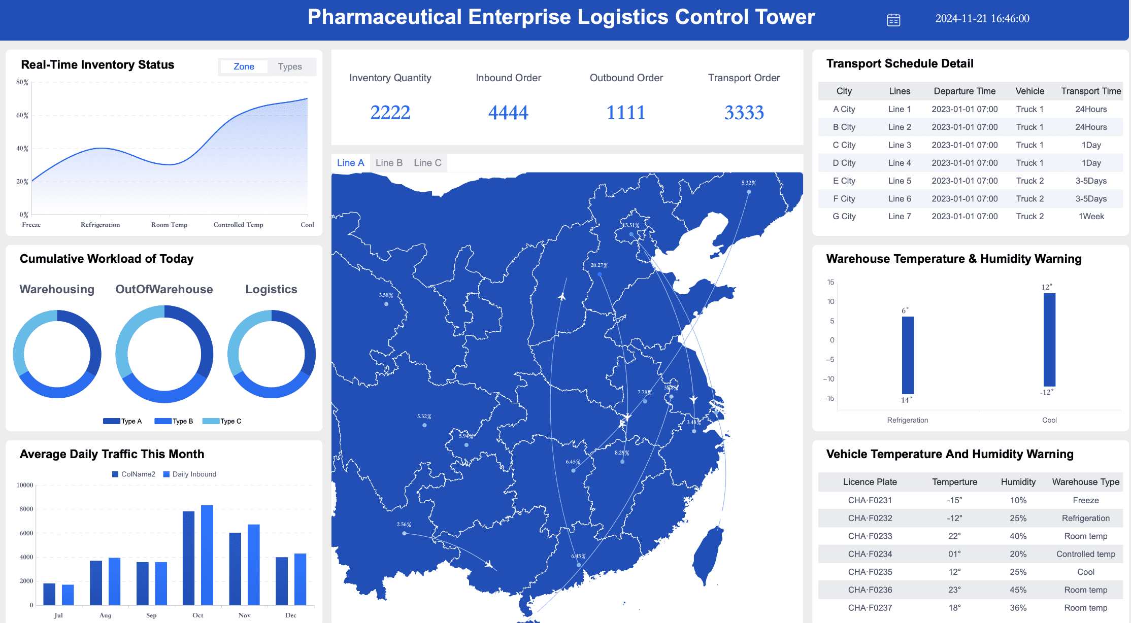
 Click To Try The Dashboard
All reports in this article are built with FineReport
Contact center reporting and analytics: what they are and why both matter
Contact center reporting and analytics are related, but they serve different business purposes.
Reporting provides structured visibility into past and current performance. It organizes operational data into dashboards, scorecards, and scheduled reports so teams can track activity, compare results to targets, and identify exceptions quickly.
Analytics goes deeper. It investigates causes, patterns, relationships, and likely outcomes. It helps teams understand why metrics changed, what factors are driving those changes, and which corrective actions are most likely to work.
For enterprise contact center teams, both disciplines are essential. Reporting helps leaders see whether service levels are on track. Analytics helps them understand what is driving performance, whether that is staffing mismatch, product complexity, poor routing logic, weak knowledge content, or rising customer frustration.
In practice, the distinction is simple:
- Reporting answers: What happened?
- Analytics answers: Why did it happen?
- Decision-making answers: What should we do next?
Without reporting, operations leaders lack a dependable view of performance. Without analytics, they react to symptoms instead of solving root causes. High-performing enterprises use both to move from activity tracking to measurable improvement in three areas:
- Customer experience: faster response, smoother resolution, fewer repeat contacts
- Agent effectiveness: better coaching, fairer performance evaluation, improved productivity
- Operational efficiency: stronger forecasting, lower waste, smarter staffing, tighter control of backlog
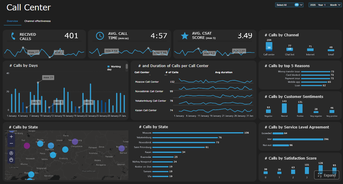
What enterprise contact center teams should measure
A strong contact center reporting and analytics framework starts with the right metrics. Enterprise teams should avoid drowning in dozens of disconnected KPIs. Instead, they should organize measures into service performance, customer experience, and workforce effectiveness.
Core performance and service metrics
These metrics form the backbone of daily contact center reporting. They show whether the operation is keeping up with demand and meeting service commitments.
Key Metrics (KPIs)
- Service level: The percentage of contacts answered within a defined target time. A core indicator of responsiveness.
- Average speed of answer (ASA): The average time customers wait before reaching an agent. Useful for queue management and staffing adjustments.
- Abandonment rate: The percentage of customers who leave before being served. Often a sign of excessive wait times or poor queue experience.
- First contact resolution (FCR): The share of issues resolved in the first interaction. A major driver of customer satisfaction and cost control.
- Average handle time (AHT): The average total interaction time, including talk time, hold time, and after-call work. Important, but it should never be optimized in isolation.
- Occupancy: The percentage of logged-in time agents spend handling contacts versus waiting. Indicates workload intensity and burnout risk.
- Backlog: The volume of unresolved or pending interactions. Critical for email, ticket, and case-based environments.
Enterprise teams should also distinguish between leading indicators and lagging indicators.
Leading indicators for daily operations
- Queue volume
- ASA
- Active backlog
- Occupancy
- Staffing coverage
- Intra-day service level
Lagging indicators for longer-term review
- Monthly FCR
- Trend in AHT
- Complaint rates
- Quarterly service consistency
- Cost per contact
- Retention-linked service outcomes
That distinction matters. Supervisors need fast-moving operational signals. Executives need stable measures that show whether the operating model is improving over time.
Customer experience and quality indicators
Operational speed is only part of the story. A contact center can hit response targets and still create poor experiences. That is why customer and quality indicators must sit alongside service metrics.
The most important measures include:
- CSAT: Direct post-interaction satisfaction feedback
- NPS: Broader loyalty and advocacy signal
- Sentiment: Emotional tone detected in voice, chat, or survey responses
- Quality assurance scores: Structured evaluation of interaction quality against internal standards
- Complaint trends: Patterns in formal dissatisfaction by issue type, product, or region
- Escalation rates: Frequency of contacts requiring supervisor involvement or transfer to higher support tiers
These metrics are most useful when analyzed together. For example, a stable AHT with declining CSAT may suggest rushed interactions. Strong service level but rising escalations may point to unresolved complexity, weak frontline authority, or inaccurate knowledge guidance.
Enterprise teams should review customer feedback and interaction quality in the same workflow as operational reporting. Otherwise, quality issues remain isolated in QA reviews while operations leaders focus only on speed and volume.
Workforce and agent performance metrics
Agent and workforce metrics help managers balance productivity, consistency, fairness, and coaching effectiveness.
Key measures include:
- Schedule adherence: How closely agents follow assigned schedules
- Shrinkage: Paid time not available for customer handling due to meetings, training, leave, or other factors
- Transfer rate: Frequency of handing contacts to another agent or queue
- After-call work (ACW): Time spent completing post-contact tasks
- Coaching needs: Skill gaps identified through QA, productivity trends, or customer feedback
- Agent utilization: The degree to which available workforce capacity is being used effectively
These metrics should be compared carefully. Enterprise teams need to evaluate performance across:
- Individual agents
- Teams
- Channels
- Sites
- Geographies
- Tenure groups
- Contact types
Fair comparison is essential. An agent handling complex escalations should not be judged against one handling simple transactional requests without context. Mature contact center reporting and analytics uses segmentation to normalize evaluation and make coaching more accurate.
What teams should monitor in real time
Real-time monitoring is where contact center reporting directly protects customer experience and service commitments. The objective is not to watch every metric all day. It is to identify the operational signals that require immediate intervention.
Signals that require immediate attention
Some live conditions should trigger alerts, escalations, or rapid staffing decisions because they can degrade service quickly.
Key real-time signals include:
- Queue spikes: Sudden increases in inbound contacts beyond forecasted levels
- SLA breaches: Service level dropping below target for a defined interval
- Sudden handle-time increases: A sign of emerging process issues, agent confusion, or system friction
- Staffing gaps: Unexpected absenteeism, low adherence, or under-coverage in key intervals
- Channel outages: Failures in telephony, chat, email routing, CRM, or self-service systems
- Repeat contact surges: A spike in customers reaching out again for the same issue
The right thresholds depend on business model, service commitments, and channel behavior, but every enterprise should define:
- Warning threshold: Signals to watch closely
- Action threshold: Signals requiring supervisor response
- Escalation threshold: Signals requiring leadership or cross-functional intervention
For example, an abandonment rate above a set interval threshold might trigger overflow routing. A spike in repeat contacts tied to one product line may require a rapid review with product support or digital teams.
Building an effective live reporting cadence
Technology alone does not create real-time control. Teams need a clear operating rhythm.
An effective live reporting cadence typically answers three questions:
Who watches the dashboards?
Usually:
- Workforce management for staffing and adherence
- Supervisors for queue and agent action
- Operations leads for escalation management
- IT or support teams for system-health monitoring
How often is data refreshed?
For true frontline action, refresh intervals should align with operational risk:
- Near real-time for queue, staffing, and SLA metrics
- Frequent interval refreshes for adherence and occupancy
- Continuous alerting for outage or routing failure events
How do supervisors respond during the day?
Supervisors need predefined actions, such as:
- Reassigning skilled agents between queues
- Approving overtime or shift changes
- Triggering contingency staffing plans
- Prioritizing backlog clearance
- Escalating routing, product, or system incidents
The most effective live dashboards are simple. Frontline teams do not need dozens of visuals. They need fast clarity on what is wrong, where it is happening, who owns it, and what action comes next.
What teams should investigate with analytics
Reporting tells teams where performance changed. Analytics explains why it changed and what the business should do about it.
Finding root causes behind performance changes
When service levels fall, transfers rise, or customer satisfaction drops, enterprise teams should investigate with structured analysis instead of assumptions.
Effective root-cause analysis typically combines:
- Trend analysis: Compare current performance against prior periods
- Segmentation: Break results down by product, channel, region, team, customer type, or contact reason
- Interaction review: Examine calls, chats, emails, transcripts, and QA findings for behavioral or process patterns
Useful investigation paths include comparing:
- Products with higher contact complexity
- Customer segments with lower satisfaction
- Contact reasons with higher repeat rates
- Channels with unusual wait or escalation behavior
- Time periods before and after policy, campaign, or system changes
This is where contact center reporting and analytics becomes strategically valuable. A drop in service level may not be a pure staffing issue. It may be caused by one product launch, one broken workflow, one confusing self-service path, or one region-specific outage.
Turning patterns into decisions
Analytics only creates value when insights are converted into action.
Enterprise teams should use identified patterns to guide decisions in areas such as:
- Staffing models: Adjust forecasts, schedules, and skill coverage based on true demand drivers
- Self-service improvements: Fix containment failures, routing confusion, or poor knowledge paths
- Coaching plans: Target specific agent behaviors affecting FCR, QA, or escalations
- Knowledge base updates: Close information gaps causing long handle times or inconsistent answers
- Process redesign: Remove friction points that create repeat contacts, transfers, or complaints
A practical way to prioritize action is to rank issues by:
- Business impact: Revenue, cost, retention, compliance, or customer risk
- Urgency: How fast the issue is worsening or affecting service
- Effort to fix: Time, dependencies, and resource requirements
This helps teams avoid spending weeks analyzing minor anomalies while high-impact failures continue.
Using integrated data across systems
Enterprise contact centers rarely operate from one platform. Performance insight improves dramatically when reporting and analytics connects data across systems.
The most useful integrations typically include:
- CRM: Customer profile, case history, account value, retention signals
- Workforce management: Forecast, schedule, adherence, shrinkage
- Ticketing or case systems: Resolution steps, backlog, reopen rates
- QA platforms: Scorecards, coaching themes, compliance gaps
- Business outcome data: Sales conversion, renewal, churn, claims, or payment outcomes
Cross-system visibility improves decision quality in several ways:
- Better forecasting through full demand history
- More accurate customer journey analysis across channels
- Stronger accountability across operations, product, IT, and CX teams
- Clearer linkage between contact center performance and business outcomes
Without integrated data, teams often optimize local metrics while missing enterprise-wide consequences. For example, lowering AHT may look positive in the contact center but damage FCR, increase repeat contacts, and reduce customer loyalty.

Best practices for an enterprise reporting and analytics framework
A scalable framework keeps metrics trustworthy, dashboards usable, and decisions actionable. This is where many enterprises fail: not from lack of data, but from unclear definitions, fragmented ownership, and weak follow-through.
Standardize definitions and governance
Start by creating a shared measurement model.
That means documenting:
- Metric definitions
- Calculation logic
- Inclusion and exclusion rules
- Benchmark methods
- Reporting frequency
- Data quality checks
- Ownership for each KPI
This governance layer prevents common enterprise problems such as different teams calculating FCR differently, inconsistent abandonment logic across channels, or executive dashboards that do not match operational views.
Alignment should include:
- Operations leadership
- QA teams
- Workforce management
- Analytics teams
- IT and data teams
- Customer experience stakeholders
One source of truth is not a slogan. It is a governance discipline.
Design dashboards for different audiences
Different users need different levels of detail. One dashboard cannot serve everyone well.
Build separate views for:
- Executives: High-level trends, target performance, business impact
- Managers: Team performance, exceptions, comparisons, action status
- Supervisors: Real-time queues, staffing, adherence, immediate interventions
- Analysts: Drill-down analysis, segmentation, trend diagnostics, root-cause exploration
The best dashboard design balances two needs:
- Summary KPIs for fast scanning
- Drill-down paths for investigation
If executives get buried in operational noise, adoption drops. If analysts cannot drill into segment-level detail, problem-solving stalls.
Review, refine, and act on insights
Reporting must lead to action, not just discussion.
A practical review cadence looks like this:
- Daily monitoring: Live performance, service risk, staffing response
- Weekly reviews: Team trends, emerging issues, operational exceptions
- Monthly analysis: KPI movement, coaching effectiveness, process bottlenecks
- Quarterly trend reviews: Structural changes, benchmark shifts, strategic priorities
Each review should produce:
- A defined action plan
- Named owners
- Deadlines
- Expected outcomes
- Follow-up measurement
This is the difference between a reporting culture and a performance culture.
4 practical implementation steps
-
Start with a compact KPI set
Focus first on service, experience, efficiency, and workforce metrics. Avoid vanity metrics. -
Set threshold logic before building dashboards
Decide what counts as normal, warning, and critical. Visualization should follow operational rules, not replace them. -
Build role-based workflows around each dashboard
Every view should support a decision: monitor, investigate, coach, escalate, or optimize. -
Close the loop on every major insight
If analytics identifies a root cause, track the corrective action and confirm whether results improved.
How to get started without overcomplicating the process
The smartest way to build contact center reporting and analytics is to start focused, not exhaustive.
Begin with a metric set tied to four priorities:
- Service performance
- Customer experience
- Operational efficiency
- Workforce effectiveness
Then add real-time monitoring for urgent operational risks such as SLA threats, queue spikes, staffing gaps, and channel failures. Once that foundation is stable, expand into deeper analytical workflows for root-cause analysis, segmentation, and forecasting.
A practical starting roadmap looks like this:
-
Audit current reporting tools and dashboards
Identify duplication, low-trust metrics, and missing operational views. -
Map data gaps and integration needs
Determine which systems hold the required service, QA, CRM, WFM, and business outcome data. -
Define your first decision-driven dashboard set
Build for executives, managers, supervisors, and analysts separately. -
Establish review cadence and ownership
Make sure insights lead to operational changes, not passive observation. -
Revisit the framework regularly
Channels evolve, customer expectations rise, and business goals shift. Your reporting model should adapt with them.
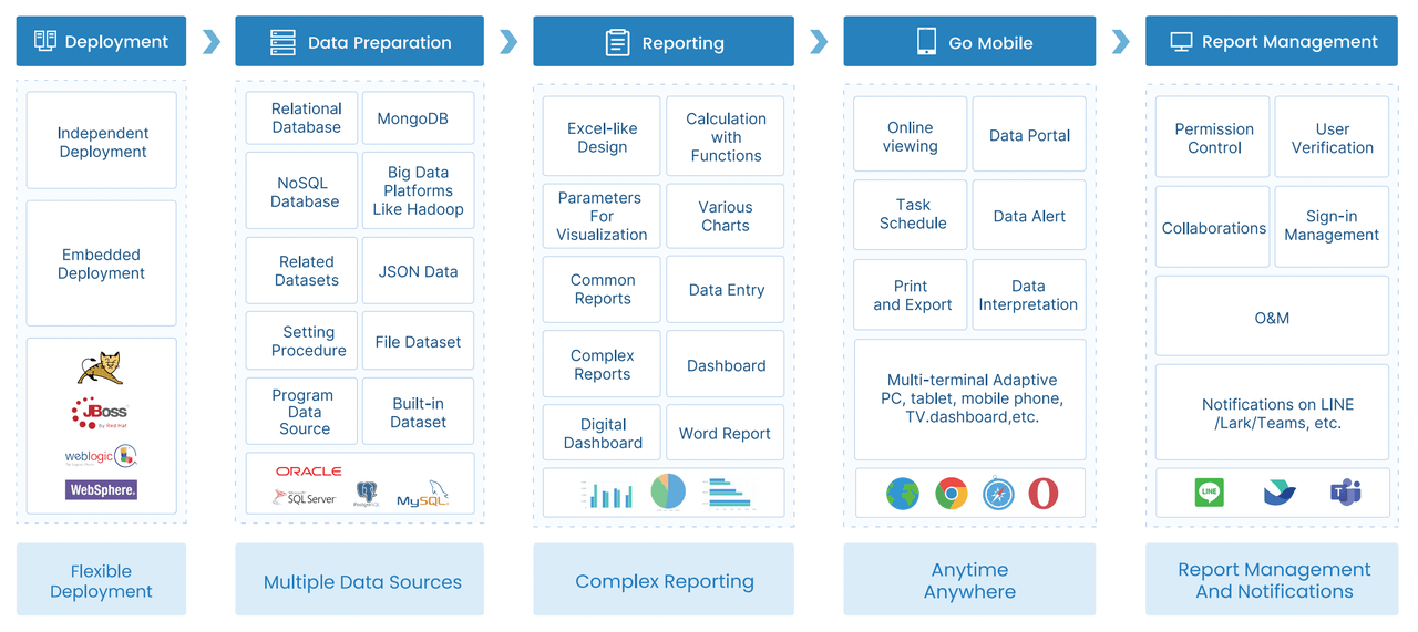
Building this manually is complex; use FineReport to utilize ready-made templates and automate this entire workflow. With the right platform, enterprise teams can unify data, standardize KPI logic, design role-based dashboards, enable drill-down analysis, and respond faster to service risk without relying on fragile spreadsheets or one-off reports.

Get Ready-to-Use Dashboard Templates in Fine Gallery
When contact center reporting and analytics is implemented well, leaders stop arguing about numbers and start improving outcomes. That is the real advantage: faster decisions, clearer accountability, and a better customer experience at enterprise scale.
FAQs
Contact center reporting shows what happened through dashboards, scorecards, and scheduled reports. Contact center analytics goes further by explaining why performance changed and helping teams decide what to do next.
The most important KPIs usually include service level, average speed of answer, abandonment rate, first contact resolution, average handle time, occupancy, backlog, and customer satisfaction. The right mix depends on whether you are managing daily operations, customer experience, or workforce efficiency.
Analytics helps teams connect operational metrics with customer outcomes such as CSAT, complaints, sentiment, and repeat contacts. That makes it easier to find root causes like poor routing, knowledge gaps, or staffing mismatches before they damage service.
Real-time monitoring helps supervisors catch queue spikes, staffing risks, and service level threats during the shift. Historical analysis reveals longer-term patterns in resolution, cost, quality, and customer satisfaction that support better planning and process improvement.
FineReport can help enterprises unify contact center data into dashboards, alerts, and drill-down analysis for operations, QA, workforce management, and CX teams. This gives decision-makers faster visibility into KPIs, root causes, and performance trends across channels.


The Author
Yida Yin
FanRuan Industry Solutions Expert
Related Articles

ERP Reporting Explained: What It Is, How It Works, and Why Enterprise Teams Rely on It
ERP reporting is the process of turning data inside your enterprise resource planning system into usable business insight. For finance leaders, operations directors, supply chain managers, and IT teams, that matters beca
Yida Yin
Jun 25, 2026
8 Best Restaurant Reporting Software Tools for 2026: Compare FineReport, Toast, SpotOn & More
$1 is a highly customizable business intelligence and reporting platform that helps restaurants turn POS, labor, inventory, finance, and multi location data into real time dashboards and decision ready reports. 8 Best Re
Yida Yin
Jun 24, 2026

Database Reporting Architecture: When to Use a Reporting Database vs Your Operational System
$1 is not just about pulling data into a dashboard. It is an architecture decision that affects application performance, reporting speed, data trust, and how confidently your teams can make decisions. If you are an IT ma
Yida Yin
Jun 24, 2026