Dashboard
How to Build a CX Dashboard: Metrics, Layout Tips, and Customer Experience Dashboard Examples
Lewis Chou
May 02, 2026
A cx dashboard gives teams one shared view of how customers feel, where service is breaking down, and what actions will improve retention, satisfaction, and operational performance. For IT managers, support leaders, operations directors, and product owners, this is not a “nice-to-have” reporting layer. It is the control center for customer experience decisions.
Without a clear dashboard, customer data usually lives in silos: survey tools show sentiment, help desk systems show case volume, CRM shows accounts, and product analytics shows behavior. Teams end up reacting too late, debating whose numbers are right, or over-focusing on lagging metrics that explain yesterday instead of guiding today.
A well-built cx dashboard solves that by combining customer feedback and operational data into a single decision-making framework. It helps leadership spot risk early, helps frontline teams prioritize action, and helps analysts connect experience signals to business outcomes.
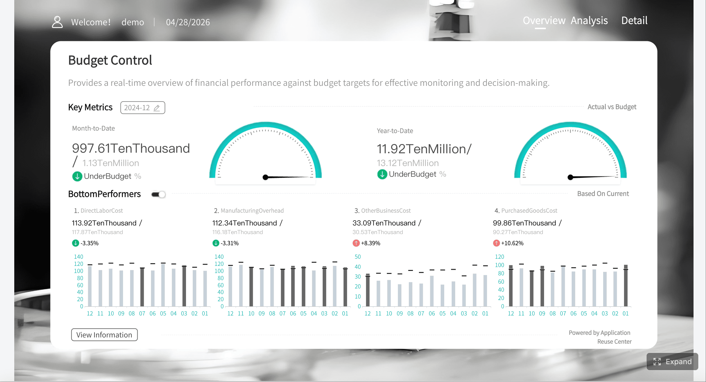
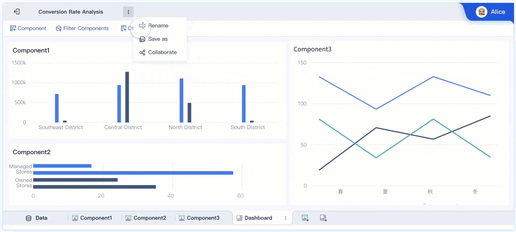
All dashboards in this article are created by FineBI
What a CX Dashboard Is and Why It Matters
A cx dashboard is a visual workspace that combines customer feedback, service performance, and journey behavior into one live or regularly refreshed view. In plain language, it tells your organization three things:
- How customers feel
- What is happening operationally
- Where to act next
That matters because customer experience rarely fails in a single department. A drop in satisfaction might come from slower support, a product onboarding issue, poor service reliability, or unclear communication. A dashboard makes those relationships visible.
Dashboard vs. report vs. scorecard
Many teams use these terms interchangeably, but they serve different purposes.
- Dashboard: An interactive, ongoing view of current performance and trends. It is designed for monitoring, filtering, and fast decisions.
- Report: A fixed or scheduled summary, often more detailed and retrospective. It explains what happened over a defined period.
- Scorecard: A compact performance snapshot against targets. It is useful for accountability and executive reviews.
If your goal is continuous visibility and quick action, you need a dashboard. If your goal is formal monthly review, a report may be enough. If your goal is target tracking, a scorecard works well. Most mature organizations use all three, but the cx dashboard is the operational center.
Who uses a CX dashboard
A strong customer experience dashboard is cross-functional by design. Different teams use the same data in different ways:
- Customer support teams monitor response times, backlog, SLA breaches, and post-case CSAT.
- Product teams track onboarding friction, adoption milestones, in-app feedback, and journey drop-off.
- Operations teams review service reliability, complaint themes, escalation patterns, and process bottlenecks.
- Leadership teams watch headline loyalty, churn risk, service health, and trend direction for weekly decisions.
The real value comes when all of these groups align around one source of truth instead of separate departmental views.
Core Metrics to Include in a CX Dashboard
A cx dashboard only works when the metrics are tied to actual business decisions. Too many dashboards become cluttered because teams add every available number rather than the few that drive action.
Key Metrics (KPIs)
Below are the core KPI groups most organizations should evaluate when designing a customer experience dashboard:
- CSAT (Customer Satisfaction Score): Measures satisfaction after a specific interaction, such as a support ticket or service event.
- NPS (Net Promoter Score): Tracks customer loyalty and likelihood to recommend your brand.
- CES (Customer Effort Score): Measures how easy it was for the customer to complete a task or resolve an issue.
- Review score: Aggregates public ratings from review platforms or app stores to reflect external sentiment.
- Survey response trend: Monitors feedback volume and response-rate quality over time.
- First response time: Measures how quickly teams acknowledge customer issues.
- Resolution time: Tracks the average time to fully resolve a case or request.
- Backlog volume: Shows open work still waiting for action.
- First-contact resolution: Measures the percentage of cases solved without follow-up.
- SLA attainment: Tracks whether service commitments are being met.
- Churn signal rate: Highlights accounts or users showing signs of disengagement or exit risk.
- Repeat contact rate: Measures how often customers must contact you again for the same issue.
- Conversion drop-off: Identifies journey stages where prospects or users abandon the process.
- Onboarding completion: Tracks how many customers successfully complete initial setup or activation.
- Adoption milestone rate: Measures usage of key features linked to retention and long-term value.
Customer sentiment and loyalty metrics
Sentiment metrics show whether the experience is improving from the customer’s point of view.
CSAT
CSAT is best used after specific touchpoints such as support interactions, order fulfillment, onboarding sessions, or service appointments. It gives a near-term read on satisfaction, which makes it valuable for frontline improvements.
NPS
NPS is broader than CSAT. It helps leadership understand whether the overall relationship is strengthening or weakening. It is especially useful for account-level tracking, segment comparisons, and trend reviews over longer periods.
CES
Customer effort is one of the most practical indicators of friction. If customers must repeat steps, switch channels, or chase updates, effort rises and loyalty typically falls.
Review scores and survey trends
Public review scores matter because they affect both customer trust and acquisition. Survey response trends also matter because low response quality can distort the dashboard. A sudden spike or drop in responses may indicate channel issues or sampling bias.
Service and operational performance metrics
Customer experience deteriorates quickly when operations become unstable. That is why every cx dashboard should include service health metrics alongside feedback scores.
Response time
This is often the earliest visible sign of service strain. Rising first response time can predict lower CSAT, more complaints, and SLA risk.
Resolution time
Resolution time shows whether teams are closing issues efficiently. It should be segmented by issue type, channel, and customer tier to avoid misleading averages.
Backlog
Backlog volume and backlog aging reveal whether unresolved work is accumulating. A queue can look manageable by total count but still hide old, high-risk cases.
First-contact resolution
This metric connects efficiency with customer convenience. A high first-contact resolution rate usually reduces effort, repeat contacts, and cost to serve.
SLA attainment
SLA performance is critical where service commitments are formalized. Track both overall attainment and imminent breaches. Averages alone often hide urgent failures.
Journey and behavioral metrics
Feedback tells you what customers say. Behavioral metrics tell you what customers do. The best cx dashboard combines both.
Churn signals
These may include declining usage, unresolved complaints, missed milestones, reduced login frequency, or renewal risk flags. Even if churn is a lagging outcome, the signals leading up to it are powerful early warnings.
Repeat contacts
If customers contact you multiple times for the same issue, your process is likely creating friction. This metric is especially useful in support, field service, telecom, utilities, SaaS, and public services.
Conversion drop-off
For digital journeys, drop-off identifies where users abandon onboarding, checkout, registration, booking, or service applications. This is where product, marketing, and service teams should collaborate.
Onboarding completion and adoption milestones
These metrics help you understand whether customers are reaching value quickly. In software and subscription businesses, poor onboarding often causes downstream support volume and churn.
How to choose the right metrics for your business
The right dashboard is not the one with the most metrics. It is the one that links each metric to a specific action.
Use this filter for every KPI:
- Business goal: What outcome does this metric support?
- Decision owner: Who is accountable for acting on it?
- Review cadence: How often should it be reviewed?
- Action threshold: What level triggers intervention?
For example:
- If your goal is reduce churn, track churn signals, onboarding completion, support repeat contacts, and NPS by account segment.
- If your goal is improve service efficiency, track response time, backlog aging, first-contact resolution, and SLA attainment.
- If your goal is improve digital experience, track conversion drop-off, in-app feedback, CES, and adoption milestones.
Also balance leading indicators and lagging outcomes. A dashboard that only shows NPS, monthly churn, and quarterly complaints is descriptive but not operational. Add leading metrics such as backlog, effort, adoption friction, and repeat contact rate so teams can intervene earlier.
How to Build a CX Dashboard Step by Step
Building a cx dashboard is part data integration project, part operating model design. The dashboard itself is only the visible output. The real work is aligning systems, definitions, owners, and actions.
Getting started with your data sources
Most customer experience dashboards pull from a mix of systems, including:
- CRM platforms
- Help desk or ticketing systems
- Survey and feedback tools
- Web analytics platforms
- Product usage or telemetry tools
- Call center systems
- Review sites or reputation monitoring tools
- Service operations databases
Before building any views, define the basics:
Data quality checks
Validate field consistency, timestamp formats, account identifiers, duplicate records, and missing values. If survey responses cannot be matched to support interactions or accounts, your dashboard will lose trust fast.
Data ownership
Each source should have an operational owner and a reporting owner. Someone must be accountable for the quality and business meaning of the numbers.
Update frequency
Not every metric needs real-time refresh. Support queue metrics may need near-live updates, while NPS and onboarding completion may only need daily or weekly refreshes. Match update frequency to decision urgency.
Designing the dashboard layout for clarity
The layout of a customer experience dashboard should follow a simple logic: headline KPIs first, trends second, root-cause detail third.
Recommended layout structure
-
Top row: Headline KPIs
Include the 4 to 6 numbers leadership asks for first, such as CSAT, NPS, first response time, churn risk rate, onboarding completion, and SLA attainment. -
Middle section: Trends and comparisons
Use line charts, segmented bars, and period-over-period comparisons to show whether metrics are improving or worsening. -
Lower section: Root-cause analysis
Add breakdowns by segment, region, channel, product line, issue type, or customer cohort. -
Sidebar or top filter bar: Context filters
Include date range, customer segment, channel, geography, product, and priority level.
Layout tips that improve scanability
- Use consistent labels across every page
- Limit chart types to a small, familiar set
- Apply simple color rules, such as green for on-target and red for risk
- Avoid overcrowding one screen with too many widgets
- Show targets or thresholds next to KPI values
- Add concise metric definitions where confusion is likely
A dashboard should be understandable in under 30 seconds by an executive and still useful for deeper investigation by operators.
Turning dashboard views into action
A dashboard without next steps becomes passive reporting. To drive outcomes, build action logic directly into the experience.
Add thresholds
Define what counts as healthy, at-risk, and critical. For example:
- CSAT below target for two consecutive weeks
- SLA attainment below 90%
- Repeat contacts above threshold by issue type
- Conversion drop-off rising more than a set percentage
Add alerts
Set alerts for metrics that need immediate intervention, such as SLA breaches, negative sentiment spikes, or major service reliability issues.
Add annotations
Context matters. A metric change without explanation often creates confusion. Annotate known events such as policy changes, product releases, staffing shifts, outages, or campaign launches.
Add next-step guidance
Make the dashboard operational by linking each metric to a follow-up action. If first-contact resolution drops, who investigates? If onboarding completion falls, which team owns the fix?
CX Dashboard Examples by Business Use Case
Different teams need different views. The best approach is to build one shared data model and then tailor dashboards by audience.
Executive overview dashboard example
An executive cx dashboard should be compact and decision-oriented. Leaders do not need every detail. They need a reliable summary of customer health, top risks, and where intervention is required this week.
Include:
- CSAT and NPS trend
- Churn risk segment or at-risk accounts
- Service reliability or SLA status
- Top complaint themes
- Onboarding or adoption health
- Regional or business-unit comparison
This dashboard should answer three questions fast:
- Are customers healthier or less healthy than last period?
- What are the top emerging risks?
- Which areas need executive attention now?
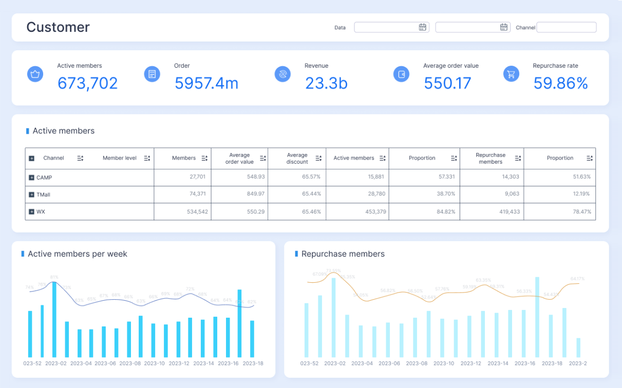
Support and service dashboard example
A support-focused customer experience dashboard should help team leads manage daily operations while connecting service activity to customer outcomes.
Include:
- New, open, and aging cases
- First response time
- Resolution time
- SLA attainment and imminent breaches
- First-contact resolution
- Post-interaction CSAT
- Quality assurance or response quality indicators
- Ticket volume by channel and issue type
This view is especially useful for workforce planning, coaching, escalation management, and root-cause analysis.
Product and digital experience dashboard example
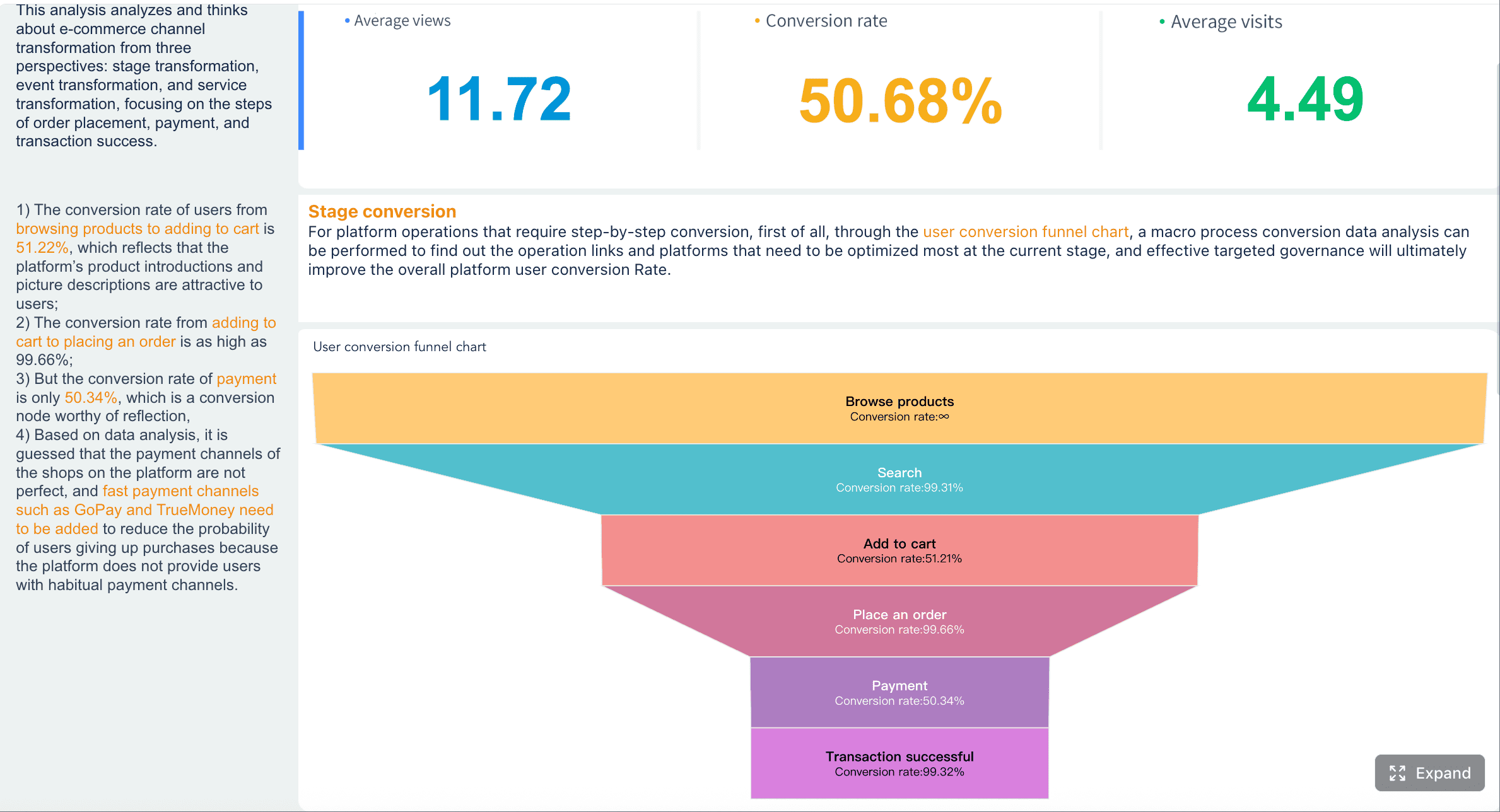
For product and digital teams, the dashboard should show where friction appears across onboarding and usage journeys.
Include:
- Funnel conversion by stage
- Onboarding completion
- Time to first value
- Feature adoption milestones
- In-app sentiment or micro-feedback
- Error-related drop-off or abandonment
- Repeat support contacts linked to product flows
This dashboard helps product managers prioritize fixes that have measurable CX impact, not just feature-level activity.
Public sector or transit dashboard example
In public sector, transit, and citizen services, customer experience must include accessibility, reliability, and communication quality, not just classic commercial loyalty metrics.
A public-facing or internal agency dashboard may include:
- Rider or citizen satisfaction trends
- Service reliability and on-time performance
- Complaint volume and complaint themes
- Accessibility-related incidents or requests
- Cleanliness, safety, or communication ratings
- Channel responsiveness
- Service disruption reporting quality
This use case is particularly important because trust depends on transparency. Agencies need dashboards that help internal teams improve service while also communicating progress clearly to the public.
Best Practices for Maintaining and Improving Your CX Dashboard
A cx dashboard is not finished when it launches. It becomes valuable only when people trust it, review it regularly, and use it to change decisions.
Common mistakes to avoid
The most common failure patterns are predictable.
Vanity metrics
If a metric looks impressive but does not drive action, it should not dominate the dashboard. Total survey sends, page views without context, or undifferentiated ticket totals often fall into this category.
Cluttered layouts
Too many widgets reduce focus. If everything is important, nothing stands out.
Missing context
A KPI without target, trend, segment, or business event annotation is easy to misread.
No owner
Every core metric needs a named owner. Otherwise problems get noticed but not resolved.
Lagging-only design
If the dashboard mostly shows historical outcomes, teams cannot intervene early enough to improve them.
Governance, review routines, and iteration
To keep your customer experience dashboard useful, put governance around it.
Set refresh schedules
Different metrics can refresh at different intervals, but the schedule should be documented and visible to users.
Standardize metric definitions
Make sure teams agree on how CSAT, response time, churn risk, and similar metrics are calculated. Definition drift destroys credibility.
Hold regular review meetings
Use a recurring cadence:
- Daily or intraday: Support operations and service exceptions
- Weekly: Cross-functional CX review
- Monthly: Strategic trend review and metric refinement
Revisit the dashboard as priorities change
Customer expectations evolve. Channels change. New products launch. Service models shift. Your cx dashboard should be updated when the business changes, not treated as a static asset.
Choosing CX Dashboard Tools and Next Steps
Tool choice depends on your data complexity, collaboration needs, and decision speed.
Compare your main tool options
Spreadsheet-based tracking
Best for:
- Very early-stage teams
- Low data volume
- Manual, periodic reporting
Limitations:
- Weak automation
- Limited scale
- High risk of inconsistent definitions
- Poor collaboration for enterprise use
BI tools
Best for:
- Multi-source data integration
- Custom visualizations
- Broad organizational sharing
- Strong governance and drill-down analysis
Limitations:
- Can require more modeling effort
- Manual setup becomes complex at scale without templates
Customer support analytics tools
Best for:
- Team-level service monitoring
- Faster implementation for support use cases
- Channel-specific visibility
Limitations:
- Often narrow in scope
- May not connect well to product, CRM, or broader customer journey data
Experience management platforms
Best for:
- Survey-heavy CX programs
- Sentiment and feedback workflows
- Structured listening programs
Limitations:
- May need additional BI layers for full operational and business context
When a lightweight dashboard is enough
A lightweight dashboard is usually enough when:
- You only need a few KPIs
- One department owns most of the workflow
- Data sources are limited
- Review cadence is weekly or monthly
- Little drill-down is required
When you need a more advanced shared workspace
You likely need a full BI-based cx dashboard when:
- Multiple teams need one version of the truth
- You must combine surveys, CRM, service, and behavior data
- Leaders want self-service filtering
- You need role-based views
- Metrics must be trusted across the enterprise
Practical checklist for planning your first CX dashboard
Use this checklist before you build:
- Define the primary business objective
- Identify the audience by role
- Choose 5 to 10 core KPIs
- Assign an owner to each KPI
- Document metric definitions
- Inventory the source systems
- Confirm data quality and refresh frequency
- Design a simple layout with KPI, trend, and root-cause layers
- Add thresholds, alerts, and annotations
- Set a review cadence and improvement routine
Build Faster With FineBI
Building this manually is complex; use FineBI to utilize ready-made templates and automate this entire workflow.
 For enterprise teams, the challenge is rarely just creating charts. The hard part is connecting fragmented data, standardizing definitions, creating role-based views, and keeping dashboards trusted over time. FineBI helps solve that with a business-friendly analytics environment designed for fast deployment and scalable self-service.
With FineBI, teams can:
- Connect data from CRM, help desk, survey, web, and operational systems
- Build a unified cx dashboard without relying on spreadsheet stitching
- Use ready-made templates to accelerate executive, support, and journey-based views
- Enable self-service exploration for business users
- Standardize KPIs across teams and locations
- Share dashboards in a collaborative workspace with controlled access
 For organizations trying to operationalize customer experience at scale, this is the practical path forward. Instead of spending months building and maintaining manual reporting logic, you can use FineBI to automate the data pipeline, streamline dashboard design, and give every stakeholder a clear, actionable view of customer experience.
 Utilize ready-made templates and automate this entire workflow with FineBI
If your goal is to move from scattered CX reporting to a real decision system, start with a narrow use case, define the few metrics that matter most, and build on a platform that can scale. FineBI makes that transition faster, cleaner, and easier to govern.
FAQs
A strong CX dashboard should combine customer sentiment, service performance, and journey behavior in one view. Most teams start with CSAT, NPS, response time, resolution time, backlog, SLA attainment, and churn or adoption signals.
A CX dashboard is built for ongoing monitoring and quick action, while a report usually summarizes past performance and a scorecard tracks results against targets. Dashboards are more interactive and better suited for day-to-day decision-making.
The most useful metrics depend on your goals, but common priorities include CSAT, NPS, CES, first response time, resolution time, first-contact resolution, and churn risk. The key is choosing measures that clearly connect to actions your team can take.
CX dashboards are typically used by support teams, product managers, operations leaders, and executives. Each group looks at different views, but they benefit most when everyone works from the same shared data.
It should be updated often enough to support timely decisions, which usually means real-time or frequent scheduled refreshes. Fast-moving support and operations teams often need live data, while executive views may be reviewed daily or weekly.


The Author
Lewis Chou
Senior Data Analyst at FanRuan
Related Articles

How to Build an Investment Portfolio Reporting Dashboard for Executives: KPIs, Benchmarks, and Drill-Down Views
Investment portfolio reporting for executives is not about showing every holding, transaction, and chart your investment team can produce. It is about giving CEOs, CFOs, CIOs, boards, and investment committees a fast, re
Yida YIn
Jun 25, 2026

12 KPI Reporting Examples for Executive Dashboards: What to Show in Weekly, Monthly, and Quarterly Reviews
Executive leaders do not need more data. They need decision ready $1 examples that match how often they review the business and what actions they are expected to take. A weekly $1 should surface fast moving risks and per
Yida YIn
Jun 25, 2026

How to Build a Digital Marketing Reports Dashboard: Executive Examples, KPIs, and Templates
A $1 is the control layer that helps executives and marketing leaders turn scattered channel data into fast, confident decisions. If you are a CEO, CMO, operations director, or marketing analytics lead, the real problem
Yida Yin
May 07, 2026