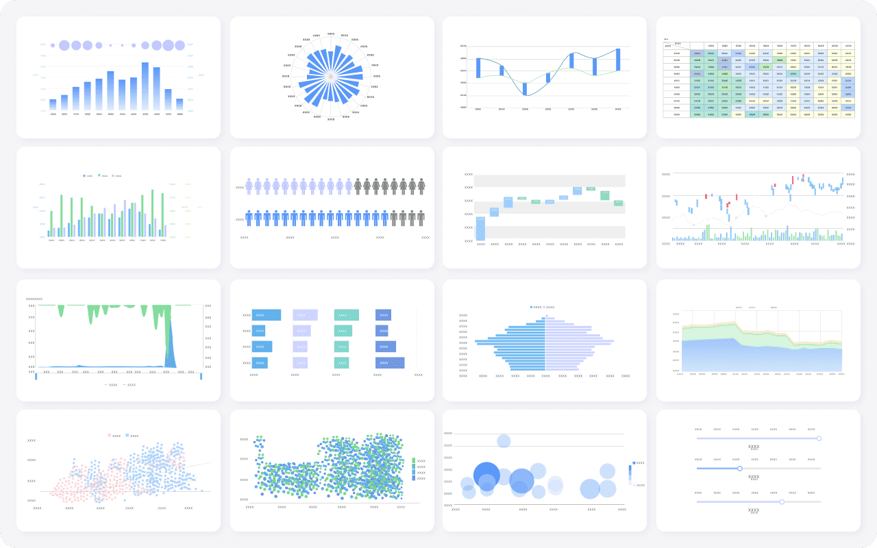
Dynamic dashboards revolutionize how you interact with data. Unlike static dashboards, they provide real-time updates, allowing you to make informed decisions swiftly. These dashboards serve as a single source of truth, enhancing collaboration and efficiency. With tools like FineReport and FineBI, you can explore data independently, thanks to their self-service capabilities. Their interactive visualizations and customizable features empower you to tailor insights to your needs, transforming data analysis into a more engaging and insightful experience.
Understanding Dynamic Dashboard
What is Dynamic Dashboard?
A dynamic dashboard revolutionizes the way you engage with data by providing real-time updates and interactive capabilities. Unlike static dashboards, which present a fixed snapshot of data, dynamic dashboards continuously refresh, ensuring you always have the latest insights at your disposal. This adaptability allows you to make informed decisions quickly, as you can respond to evolving trends and shifts in data in real-time. Beyond just viewing, dynamic dashboards let you dive deeper into your data, offering interactive elements that allow you to explore different dimensions, filter information, and customize the display to meet your unique business needs.
Key Features
- Real-Time Updates: Stay ahead of the curve with continuously refreshed data, ensuring that every decision you make is based on the most up-to-date information available.
- Interactivity: Engage with your data by applying filters, drilling down into specific metrics, or exploring trends from multiple perspectives. This interactive feature empowers you to uncover deeper insights.
- Customization: Personalize your dashboard by selecting which data points to highlight, organizing the layout, and configuring metrics that align with your specific goals. This flexibility ensures that your dashboard is as relevant and actionable as possible.

Differences from Static Dashboards
Static dashboards, while useful for capturing a moment-in-time snapshot of data, are limited by their lack of real-time updating. They rely on manual refreshes or periodic updates, which can result in decisions being based on outdated or incomplete information. In contrast, dynamic dashboards provide a live feed of your key metrics and performance indicators. This ensures that your decisions are informed by the most current data, significantly improving operational efficiency and enhancing the accuracy of strategic planning. The dynamic nature of these dashboards helps organizations stay agile in fast-paced environments.
Evolution of Data Visualization
The field of data visualization has seen a remarkable transformation, evolving from basic charts and graphs to sophisticated, interactive dashboards that provide deep insights and real-time data analysis. This journey reflects the growing importance of visual tools in interpreting complex information, allowing users to understand patterns, trends, and relationships at a glance.
Historical Context
In the 19th century, data visualization entered its Golden Age, a period of groundbreaking innovation. Visionaries like William Playfair, Florence Nightingale, and Charles Minard used visual representations to make data more accessible and insightful, introducing many of the charts we still use today. However, the early 20th century witnessed a decline in this progress, often referred to as the "Modern Dark Ages" of data visualization. During this era, statisticians and analysts prioritized raw numerical accuracy over visual representation, limiting the advancement of data visualization techniques.
Technological Advancements
The introduction of computers in the late 20th century revolutionized the way data was visualized. In 1981, the launch of the first commercial graphical user interface (GUI) and the popularization of spreadsheet programs such as Microsoft Excel made it easier to present and manipulate data. These tools allowed users to move beyond static visuals and engage with their data in new ways. Pioneering researchers like John W. Tukey, who contributed to exploratory data analysis, and Jacques Bertin, known for his work on visual semiotics, played a crucial role in advancing the science behind information visualization.
Today, thanks to technological innovation, modern data visualization tools—like dynamic dashboards—enable users to monitor, analyze, and interpret data from multiple sources in real-time. These platforms allow for interactivity, letting users customize their views, filter information, and drill down into specific data points to uncover deeper insights. By offering a holistic view of complex datasets, these tools enhance decision-making, allowing businesses and analysts to stay agile and data-driven in a fast-paced world.
Benefits of A Dynamic Dashboard
Dynamic dashboards bring a wealth of advantages, transforming the way users interact with and analyze data. Their ability to provide real-time insights, enhanced interactivity, and customization offers a significant edge over traditional static dashboards, enabling businesses to make more informed decisions with ease and agility.
Enhanced Interactivity
One of the key benefits of dynamic dashboards is the unparalleled level of interactivity they offer. Unlike static dashboards that present fixed data views, dynamic dashboards allow users to directly engage with the data. This makes the analysis process more intuitive, enabling users to uncover trends and patterns quickly.
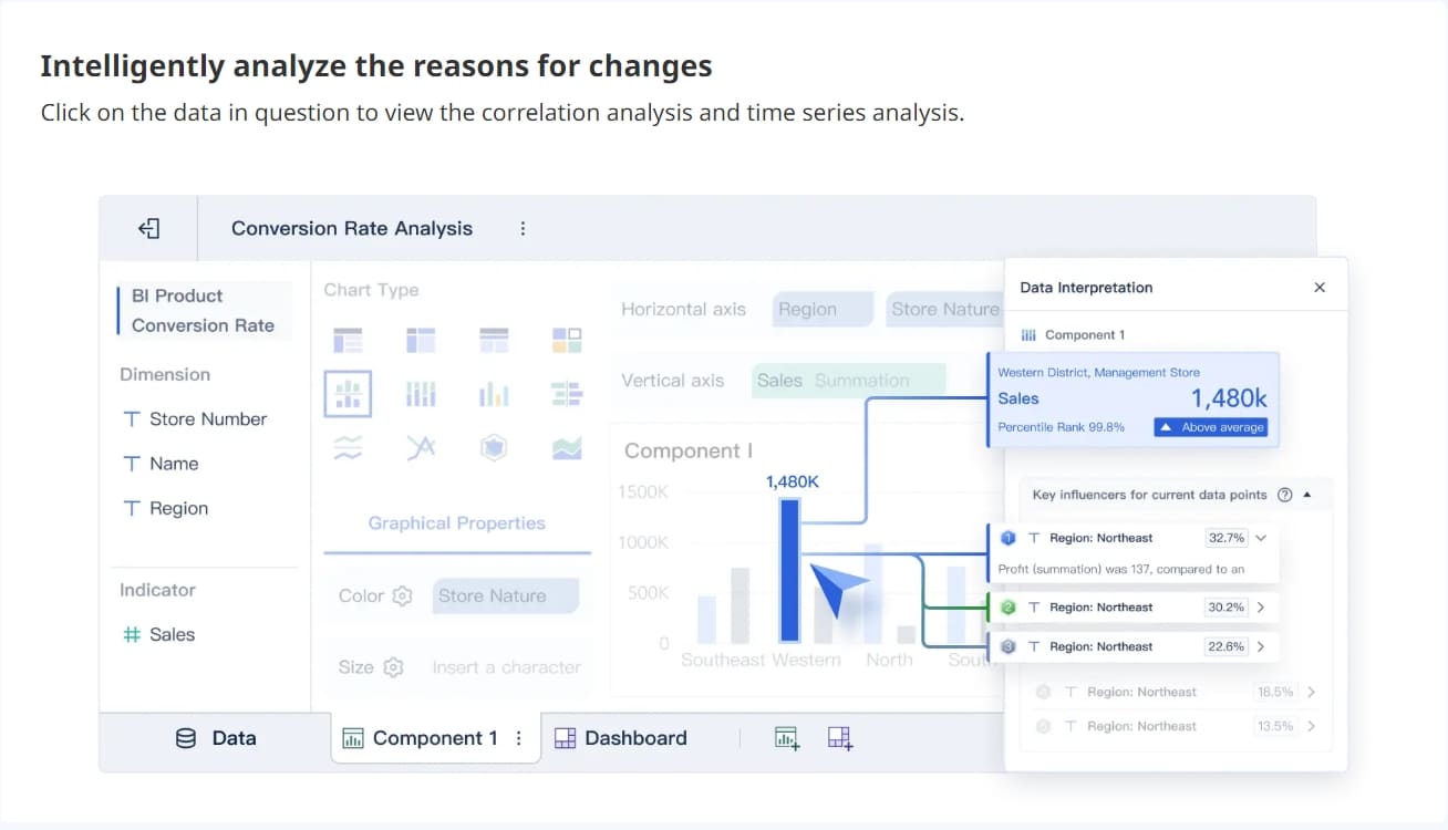
The interactivity goes beyond simple viewing. Users can click on data points, apply filters, and drill down into specific metrics to explore different perspectives. This interactive nature was effectively demonstrated as follows, which utilized FineBI's interactive dashboards to give users the power to explore their data in real time. By engaging with data more dynamically, users are empowered to gain deeper insights, fostering more strategic, data-driven decision-making.
User Engagement
Dynamic dashboards also significantly enhance user engagement by offering an immersive experience. Instead of passively viewing static reports, users can manipulate the dashboard to focus on the data that interests them most. This makes the experience more engaging and helps to foster a deeper understanding of the information presented.
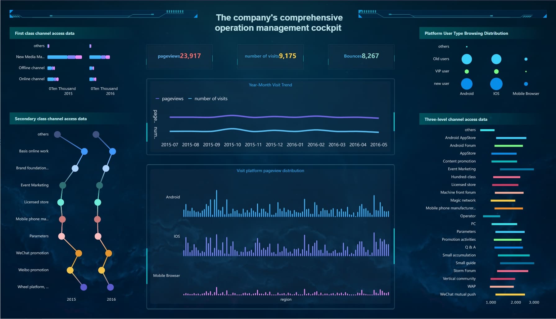
By harnessing the interactive capabilities of FineBI dashboards, users can easily click, drag, and examine data points. This level of engagement not only makes the data more accessible but also uncovers critical insights that might otherwise go unnoticed. Allowing users to interact directly with the data, dynamic dashboards foster a more immersive and productive analytical process.

Real-time Data Manipulation
One of the most valuable features of dynamic dashboards is the ability to manipulate data in real-time. Users can adjust filters, change parameters, and instantly see the impact of their changes reflected in the dashboard. This real-time interaction is crucial in fast-paced industries where timely insights are key to success.
Customization and Flexibility
Dynamic dashboards excel in offering a high degree of customization and flexibility. They allow users to tailor the visual representation of data to fit their unique needs and preferences, ensuring that the most relevant information is always readily available.
Tailored Views
Customizing dynamic dashboards to display data that aligns with specific goals is one of their most powerful features. Users can create personalized views that highlight the metrics most important to them, ensuring they can focus on key performance indicators without distraction.
Adaptability to Different Needs
Another strength of dynamic dashboards is their adaptability to different industries and scenarios. Whether it's retail, healthcare, finance, or any other field, these dashboards can be configured to suit a wide range of business demands. Their flexible design allows users to easily adjust and adapt their dashboards as their needs evolve over time.
This adaptability ensures that dynamic dashboards remain valuable, even as business conditions change. Whether monitoring sales data, tracking healthcare outcomes, or analyzing customer behavior, dynamic dashboards provide the tools to keep pace with evolving objectives and industry trends, making them indispensable in today's data-driven environment.
In summary, the benefits of dynamic dashboards—ranging from enhanced interactivity and real-time data manipulation to customization and adaptability—offer significant advantages for organizations seeking to make smarter, faster, and more informed decisions.
Dynamic Dashboard Impact on Data Analysis
Dynamic dashboards have revolutionized data analysis by significantly enhancing decision-making, speeding up response times, and improving overall efficiency. Their real-time capabilities and interactive features provide a transformative edge, enabling businesses to stay agile and informed.
Improved Decision Making
Dynamic dashboards empower users to make faster, more informed decisions by offering real-time insights and increasing response agility.
Data-Driven Insights
Dynamic dashboards transform raw data into actionable insights. By providing continuous real-time updates, they allow you to track performance, identify trends, and react to changes instantly. This capability ensures that you are always working with the most current information, making your decisions timely and well-informed. For example, companies that use dynamic dashboards to monitor market trends can quickly adjust their strategies, staying ahead of competitors and responding proactively to shifts in the market landscape.
Faster Response Times
With dynamic dashboards, you can respond quickly to emerging challenges or opportunities. Their self-service capabilities and interactive visualizations allow you to explore data from different angles, filter information, and customize your views on the fly. This interactivity speeds up the decision-making process by enabling real-time exploration of critical data points. Whether addressing operational inefficiencies or seizing growth opportunities, dynamic dashboards allow for prompt and effective action, keeping your organization responsive and nimble.
Increased Efficiency
Dynamic dashboards streamline complex data processes and optimize resource management, leading to greater efficiency across the board.
Streamlined Processes
By consolidating data from multiple sources into a single, cohesive view, dynamic dashboards drastically reduce the time spent on manual data compilation. Instead of pulling together fragmented datasets, you can access a comprehensive overview of your operations in one place. This simplification of processes allows you to focus more on analyzing data and deriving insights rather than gathering it. As a result, dynamic dashboards significantly improve workflow efficiency, saving valuable time and reducing operational overhead.
Resource Optimization
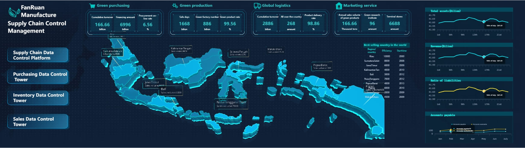
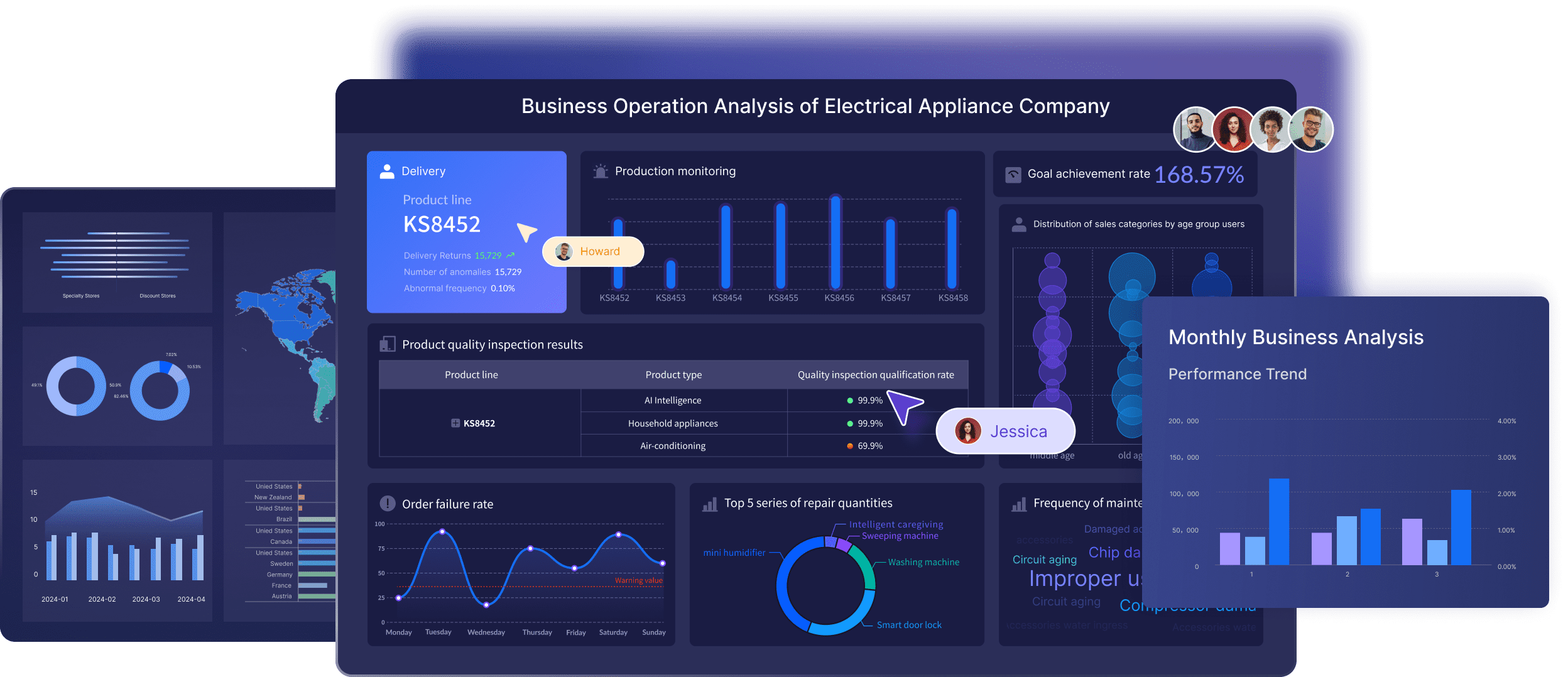
Dynamic dashboards play a key role in optimizing resource allocation by providing real-time insights into performance metrics. By continuously monitoring key performance indicators (KPIs), you can identify underperforming areas and allocate resources where they are needed most. In industries such as manufacturing, dynamic dashboards can track production metrics and highlight inefficiencies, enabling better resource management and improving operational performance. This optimization leads to more effective use of resources and enhanced overall productivity.
In summary, dynamic dashboards not only enhance decision-making through real-time, data-driven insights but also boost efficiency by streamlining processes and optimizing resource use. Their ability to adapt and provide actionable intelligence ensures they are a critical tool in today’s fast-paced, data-centric business environment.
Practical Applications of Dynamic Dashboard
Dynamic dashboards have found their place in various industries, offering practical solutions to complex data challenges. You can leverage these dashboards to enhance business intelligence and healthcare operations.
Business Intelligence with FineBI
FineBI stands out as a powerful tool for business intelligence. It provides you with the ability to analyze markets and track performance effectively.
Market Analysis
With FineBI, you can conduct comprehensive market analysis. The software allows you to visualize market trends and consumer behavior in real time. You can identify opportunities and threats quickly, enabling you to make strategic decisions. FineBI's dynamic capabilities ensure that you always have access to the latest market data, helping you stay ahead of competitors.
Performance Tracking
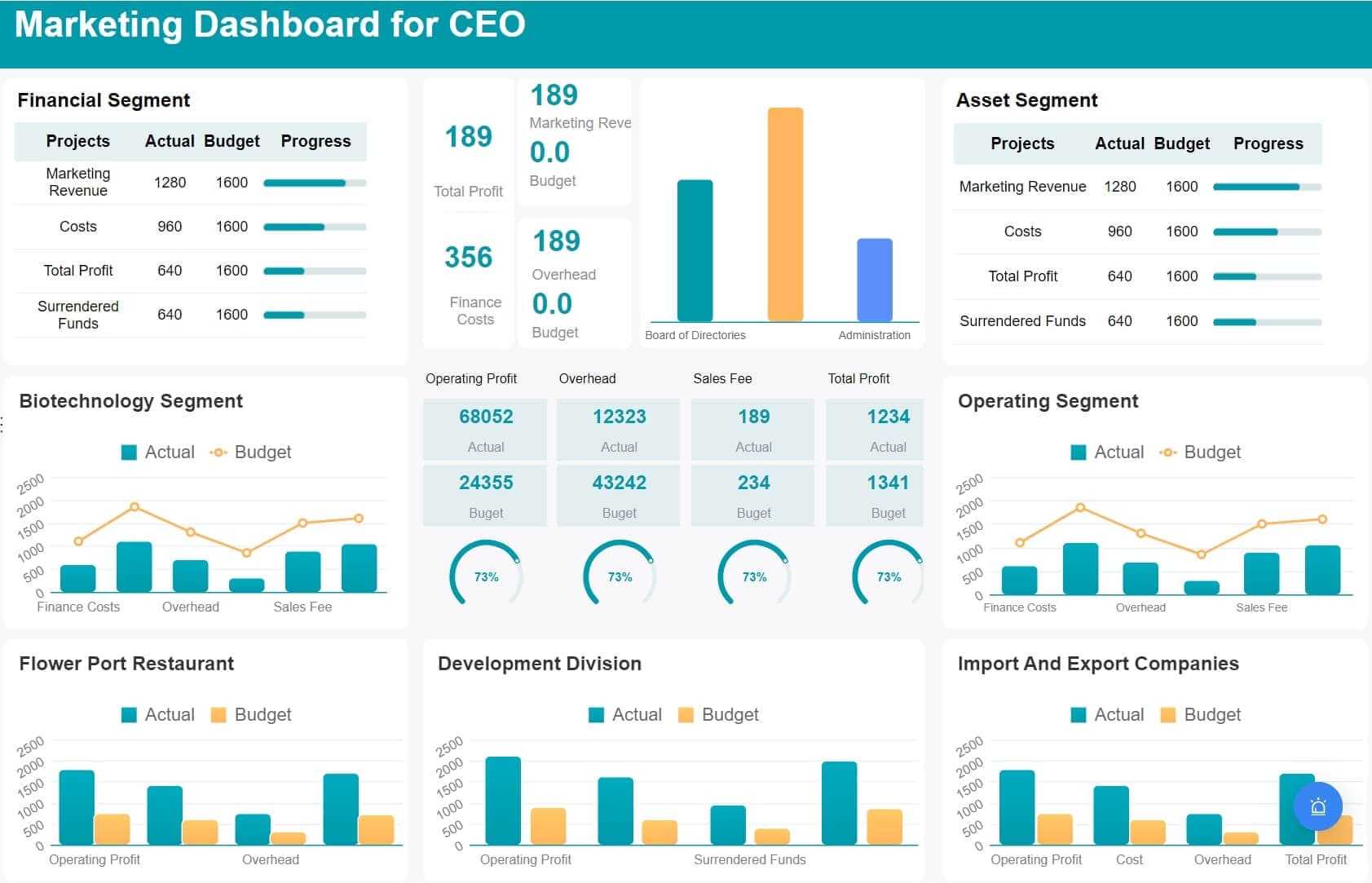
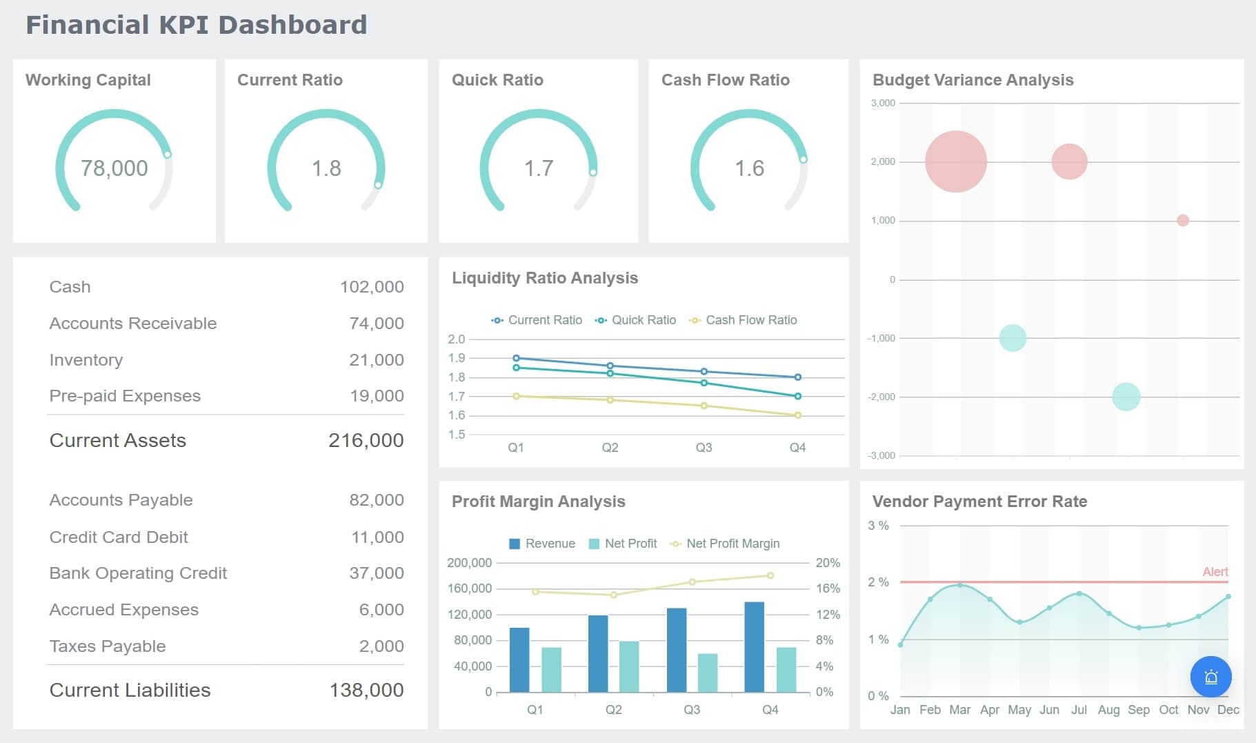
FineBI excels in performance tracking. You can monitor key performance indicators (KPIs) across different departments. This feature helps you assess productivity and efficiency. By using FineBI, you can identify areas for improvement and implement changes promptly. The software's interactive dashboards allow you to customize views, ensuring that you focus on the metrics that matter most to your business.
Healthcare
In healthcare, dynamic dashboards play a crucial role in managing patient data and predicting outcomes. FineBI offers solutions that enhance healthcare operations.
Patient Data Management
FineBI simplifies patient data management. You can consolidate patient records from various sources into a single dashboard. This integration provides you with a comprehensive view of patient information, improving care coordination. FineBI's real-time updates ensure that you always work with the most current data, enhancing decision-making in patient care.
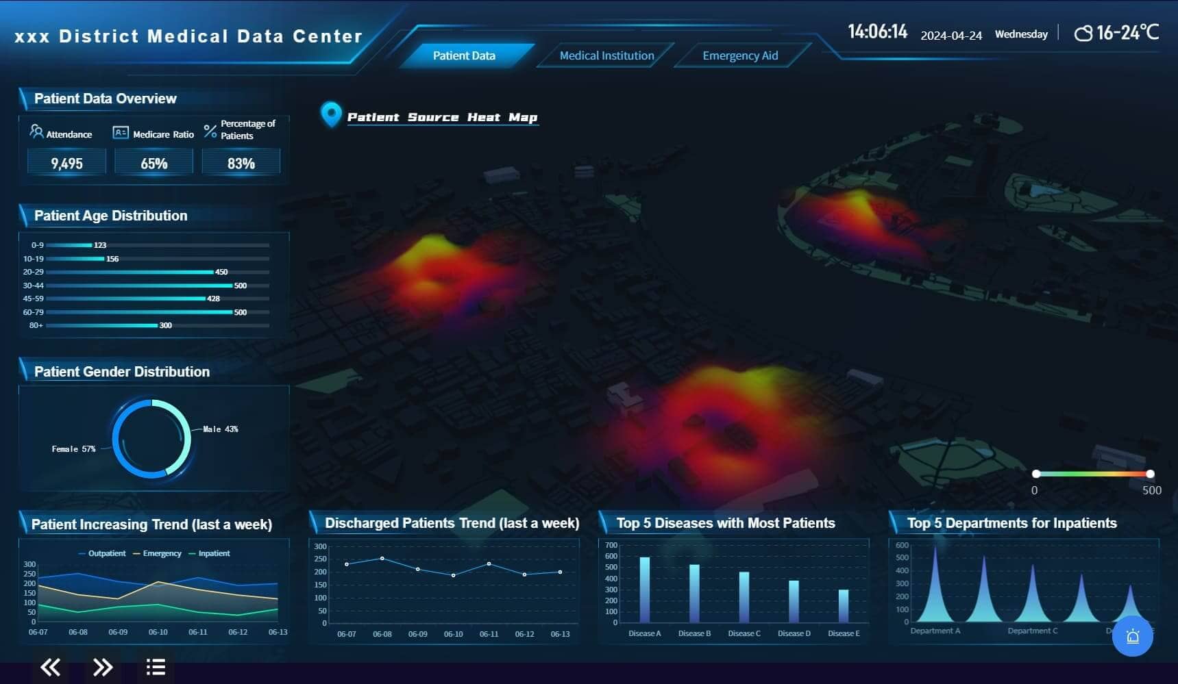
Predictive Analytics
Predictive analytics in healthcare becomes more accessible with FineBI. You can analyze historical data to forecast patient outcomes and identify potential health risks. This capability allows you to implement preventive measures and improve patient care. FineBI's dynamic dashboards enable you to visualize predictive models, making it easier to understand complex data and make informed decisions.
Best Practices for Implementation of Dynamic Dashboard
Choosing the Right Dynamic Dashboard Tools
Selecting the right tools is crucial for creating effective dynamic dashboards. You need to consider several factors to ensure the tools meet your needs.
Evaluation Criteria
- User-Friendliness: Choose tools that offer an intuitive interface. This makes it easier for you to create and modify dashboards without extensive training.
- Scalability: Ensure the tool can grow with your organization. It should handle increasing data volumes and user demands.
- Cost-Effectiveness: Evaluate the pricing structure. Consider both initial costs and ongoing expenses to ensure the tool fits your budget.
- Support and Community: Look for tools with strong customer support and an active user community. This provides valuable resources and assistance when needed.
Integration Capabilities
Integration is key to maximizing the effectiveness of dynamic dashboards. You should ensure the tool can connect seamlessly with your existing systems.
- Data Source Compatibility: Verify that the tool supports various data sources. This includes databases, cloud services, and APIs.
- Real-Time Data Access: Ensure the tool can access and update data in real-time. This feature is essential for making timely decisions.
- Custom Integration Options: Look for tools that offer APIs or other methods for custom integrations. This flexibility allows you to tailor the dashboard to your specific needs.
Designing Effective Dynamic Dashboards
Design plays a vital role in how users interact with and interpret data. Following best practices ensures your dashboards are both informative and user-friendly.

User-Centric Design
- Simplicity: Keep the design clean and straightforward. Avoid clutter to help users focus on key insights.
- Intuitive Navigation: Organize information logically. Use clear labels and intuitive layouts to guide users through the data.
- Accessibility: Ensure the dashboard is accessible to all users. Consider color contrast and font size for readability.
Data Accuracy and Relevance
- Data Validation: Regularly check data sources for accuracy. This ensures the information displayed is reliable.
- Relevance: Tailor the dashboard to display only the most pertinent data. Focus on metrics that align with your goals.
- Continuous Updates: Keep the dashboard updated with the latest data. This practice maintains its relevance and usefulness.
By adhering to these best practices, you can create dynamic dashboards that enhance decision-making and drive organizational success.
Challenges and Considerations of Dynamic Dashboard
Data Security
Dynamic dashboards offer powerful insights, but they also present security challenges. You must prioritize protecting sensitive information to maintain trust and compliance.
Protecting Sensitive Information
To safeguard data, implement robust security measures. Use Role-Based Access Control to ensure only authorized users access specific data. Encryption adds another layer of protection, keeping your information secure during transmission. Consider Multi-Factor Authentication for an extra security step. Real-time monitoring helps detect and respond to threats promptly.
Compliance with Regulations
Adhering to regulations is crucial. Compliance dashboards track regulatory requirements and standards, providing clear visibility into your status. Regular privacy audits help identify gaps and prioritize remediation efforts. By maintaining data protection controls, you can showcase your compliance to third parties and regulatory bodies.
User Training
Effective use of dynamic dashboards requires proper training. Equip your team with the skills needed to maximize these tools.
Skill Development
Invest in training programs that focus on developing essential skills. Teach users how to interact with dashboards, customize views, and interpret data. This knowledge empowers them to make informed decisions and enhances overall productivity.
Ongoing Support
Provide continuous support to address any challenges users may face. Establish a helpdesk or support team to assist with technical issues. Regularly update training materials to reflect new features and best practices. This ongoing support ensures users remain confident and proficient in using dynamic dashboards.
Future Trends in Dynamic Dashboard
AI and Machine Learning Integration
Artificial Intelligence (AI) and Machine Learning (ML) are transforming dynamic dashboards. These technologies enhance your ability to analyze data and make predictions.

Predictive Capabilities
AI can identify patterns and predict trends based on historical data. This allows you to anticipate future outcomes and make proactive decisions. For example, AI can forecast sales trends, helping you adjust strategies in advance.
Automated Insights
AI-powered dashboards automatically generate insights. They recommend visualization types and optimize dashboard layouts. This streamlines your data analysis process, making it more efficient and user-friendly.
Increased Personalization
Personalization is key to making dashboards more relevant to your needs. It ensures that you see the most pertinent information.
User-Specific Dashboards
Dynamic dashboards can be tailored to individual users. You can customize views to focus on metrics that matter most to you. This personalization enhances your ability to make informed decisions quickly.
Adaptive Interfaces
Adaptive interfaces adjust to your preferences and usage patterns. They provide a seamless experience, ensuring that you interact with data in the most effective way. This adaptability makes your data analysis more intuitive and engaging.
FanRuan's Role in Dynamic Dashboard
FanRuan plays a pivotal role in transforming data analysis with its innovative tools, FineReport and FineBI. These products empower you to harness the full potential of dynamic dashboards.
FineReport's Contribution
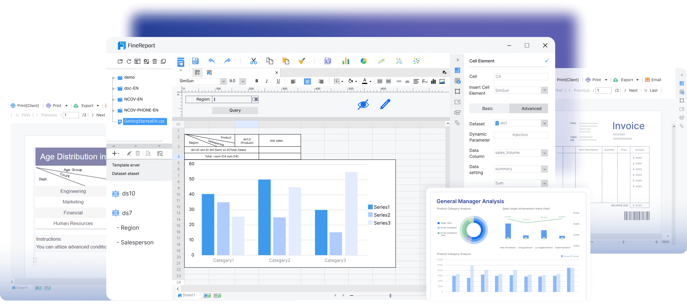
Features and Advantages
FineReport offers a suite of features that enhance your data analysis experience:
- Real-Time Data Updates: Access the most current information, enabling swift decision-making.
- Interactive Visualizations: Engage with data through dynamic charts and graphs.
- Customization: Tailor dashboards to meet your specific needs, ensuring relevance and clarity.
These features make FineReport a powerful tool for businesses seeking to optimize their data strategies.
Real-world Use Cases
In practice, FineReport has proven invaluable across various industries. For instance, companies use it for market analysis, allowing them to visualize trends and consumer behavior effectively. This capability helps businesses stay competitive by making informed strategic decisions.
FineBI's Impact
FineBI revolutionizes how you interact with data, offering self-service analytics and enhanced collaboration.
Self-Service Analytics
With FineBI, you can independently explore and analyze data. This self-service capability reduces reliance on IT teams, empowering you to gain insights quickly. You can connect to multiple data sources, perform complex analyses, and visualize results effortlessly.
Enhanced Data Collaboration
FineBI fosters collaboration by providing a unified platform for data sharing. Teams can work together seamlessly, accessing the same data and insights. This shared access promotes consistency and enhances decision-making across your organization.
By integrating FineReport and FineBI, FanRuan equips you with the tools needed to excel in data analysis. These dynamic dashboards not only streamline processes but also enhance your ability to make data-driven decisions.
Dynamic dashboards have transformed data analysis, offering real-time insights and enhanced decision-making capabilities. You can harness these tools to drive innovation and efficiency in your organization.
As you embrace these technologies, consider their future potential. Dynamic dashboards will continue to evolve, integrating AI and machine learning for even more powerful insights. Adopting these tools now positions you at the forefront of data-driven innovation.
Continue Reading About Dashboard


FAQ

The Author
Lewis
Senior Data Analyst at FanRuan
Related Articles

What Is a PPC Dashboard? Metrics, Views, and Use Cases Explained for Beginners
A $1 is a single view that pulls your paid advertising data into one place so you can quickly see what is working, what is wasting budget, and where to optimize next. For beginners, this matters because PPC data usually
Yida Yin
Jun 08, 2026

How to Build a Customer Service Metrics Dashboard: 12 KPIs, Use Cases, and Examples
A $1 should help support leaders make faster operational decisions, reduce service risk, and improve customer outcomes without waiting for static weekly reports. If you manage a support team, you already know the pain po
Yida Yin
Jun 05, 2026

Email Metrics Dashboard: 15 Essential KPIs and Templates for Ecommerce, SaaS, and B2B
An email $1 is the operating console that helps marketing leaders, CRM managers, lifecycle teams, and revenue operations stakeholders see campaign health, engagement quality, and business impact in one place. If you are
Yida Yin
Jun 04, 2026