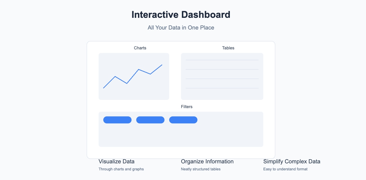
Imagine having all your data in one place, neatly organized and easy to explore. That’s exactly what an interactive dashboard in Excel offers. It’s a tool that lets you visualize data through charts, tables, and filters, making complex information simple to understand.
Why is this important? Interactive dashboards make data analysis faster and decision-making smarter. Real-time updates let you spot trends and outliers instantly. For example:
| Dashboard Type | Purpose |
| Financial Dashboard | Monitors financial performance using key KPIs for executives and finance teams. |
| Marketing Performance Dashboard | Visualizes marketing metrics to assess progress towards marketing goals. |
| Sales Management Dashboard | Evaluates sales performance by region, outlet, and individual sales representatives. |
| Project Management Dashboard | Tracks project timelines, budgets, and task statuses for efficient management. |
Let's look at some real-world examples:
- A retail dashboard that tracks daily sales, inventory levels, and top-selling products across multiple store locations
- A healthcare dashboard monitoring patient wait times, bed occupancy rates, and staff scheduling across different departments
- A manufacturing dashboard displaying production line efficiency, quality control metrics, and equipment maintenance schedules"
With tools like these, you can respond quickly to changes and make informed decisions. Ready to learn how to create a dashboard in Excel? While Excel is a great starting point, some organizations might also consider specialized business intelligence tools like FineReport from FanRuan, which offers enhanced data visualization capabilities while maintaining a familiar spreadsheet-like interface. However, let's focus on how to create your dashboard in Excel.This comprehensive guide will show you exactly how to create a dashboard in Excel from start to finish.
How to Create a Dashboard in Excel: Planning and Purpose
Creating an interactive dashboard in Excel starts with a solid plan. Without a clear purpose, your dashboard can quickly become cluttered and confusing. Let’s break down the planning process into three simple steps.
Identify the Goal of Your Dashboard
Before you dive into Excel, ask yourself: What do you want your dashboard to achieve? Are you tracking sales performance, monitoring financial health, or analyzing marketing campaigns? Defining your objectives helps you focus on the right data and avoid unnecessary distractions. For example, if your goal is to track sales growth, you might prioritize metrics like total revenue, conversion rates, and customer acquisition costs.
Think about your audience too. Executives might need high-level summaries, while analysts may require detailed insights. Knowing who will use the dashboard ensures you include the right information. Once you’ve identified your goals, gather accurate and relevant data. Clean, organized data is the foundation of any successful Excel dashboard. For instance:
An e-commerce company might create a dashboard tracking:
- Daily website traffic and conversion rates
- Shopping cart abandonment rates
- Average order value by product category
- Customer acquisition costs
A human resources department could build a dashboard showing:
- Employee turnover rates by department
- Time-to-hire metrics
- Training completion rates
- Recruitment pipeline status
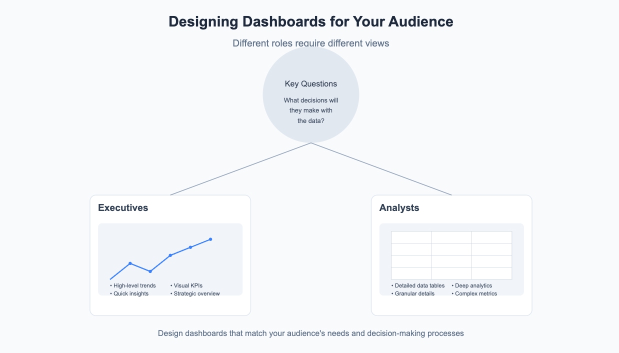
Understand the Needs of Your Audience
Your audience plays a huge role in shaping your dashboard. What decisions will they make based on the data? What information do they need to see first? Asking these questions helps you design a dashboard that’s both useful and user-friendly. For instance, you might include graphs for executives to visualize trends or detailed tables for analysts to dig deeper into the numbers.
You can also explore other dashboards your audience has used and liked. This gives you a sense of what works and what doesn’t. Keep in mind that too much information can overwhelm users. Stick to the essentials and make navigation simple.
Plan the Layout and Key Metrics to Display
A well-organized layout makes your dashboard easy to read and understand. Start by sketching a rough design. Place the most important metrics at the top or center, where they’re immediately visible. Use sections to group related data logically. For example, you could dedicate one area to financial KPIs and another to sales performance.
Choosing the right metrics is equally important. Focus on key performance indicators (KPIs) that align with your goals. For a financial dashboard, you might include metrics like net profit, cash flow, and operating income. For a sales dashboard, consider metrics like closed deals, sales growth, and customer lifetime value. Use visuals like charts and graphs to make the data more engaging and easier to interpret.
By following these steps, you’ll set a strong foundation to create an interactive dashboard in Excel that’s both functional and visually appealing. For more complex enterprise scenarios, tools like FineDatalink can complement Excel by providing robust data integration capabilities, but for most business needs, Excel's built-in features are sufficient. Let's continue exploring how to create a dashboard in Excel by looking at data import.
How to Create a Dashboard in Excel: Data Import Guide
Before you can create an interactive dashboard in Excel, you need to get your data ready. This step is all about collecting, importing, and organizing your data so it’s easy to work with. Let’s break it down.
Collect and Organize Your Data
Start by gathering the data you’ll use in your dashboard. Think about your objectives. Are you tracking sales, monitoring KPIs, or analyzing trends? Knowing your goal helps you focus on the right data. For example, if you’re building a sales dashboard, you might collect data on revenue, customer acquisition, and sales growth.
Once you have your data, make sure it’s clean and accurate. Remove duplicates, fix errors, and ensure consistency in formatting. Organized data saves you time and prevents mistakes later. Also, consider where your data comes from. Is it in a spreadsheet, a database, or an external source? Reliable data sources ensure your dashboard stays accurate and up-to-date.
Import Data into Excel
Now it’s time to bring your data into Excel. If your data is already in a spreadsheet, you’re good to go. But if it’s stored elsewhere, like in a database or an online tool, you’ll need to import it. Excel makes this easy with its built-in tools.
For example, you can use the “Get & Transform” feature to connect to external data sources. This tool lets you pull in data from websites, databases, or even other Excel files. Enterprise users might also leverage FineDatalink for more sophisticated data integration needs, especially when dealing with multiple database types and real-time data synchronization. However, for standard reporting needs, Excel's native features work well.Once imported, check that everything looks correct. If something seems off, go back and fix it before moving forward.

Use Tables to Structure Your Data
Tables are your best friend when organizing data in Excel. They make it easier to manage and analyze your information. To create a table, select your data and press Ctrl + T. This adds filters and formatting automatically, making your data more readable.
Tables also make your dashboard dynamic. When you add new data, the table updates automatically. This means your charts and visuals will refresh without extra work. Plus, tables work well with features like slicers and pivot tables, which you’ll use later to create an interactive dashboard.
By following these steps, you’ll have a solid foundation to create an Excel dashboard that’s both functional and easy to update. With your data imported and organized, you’re ready to move on to the fun part—visualizing your data!
How to Create a Dashboard in Excel: Data Preparation Steps
Before you dive into creating visuals for your interactive dashboard in Excel, you need to prepare your data. Clean and well-organized data ensures your dashboard works smoothly and delivers accurate insights. Let’s go through the key steps to get your data ready.
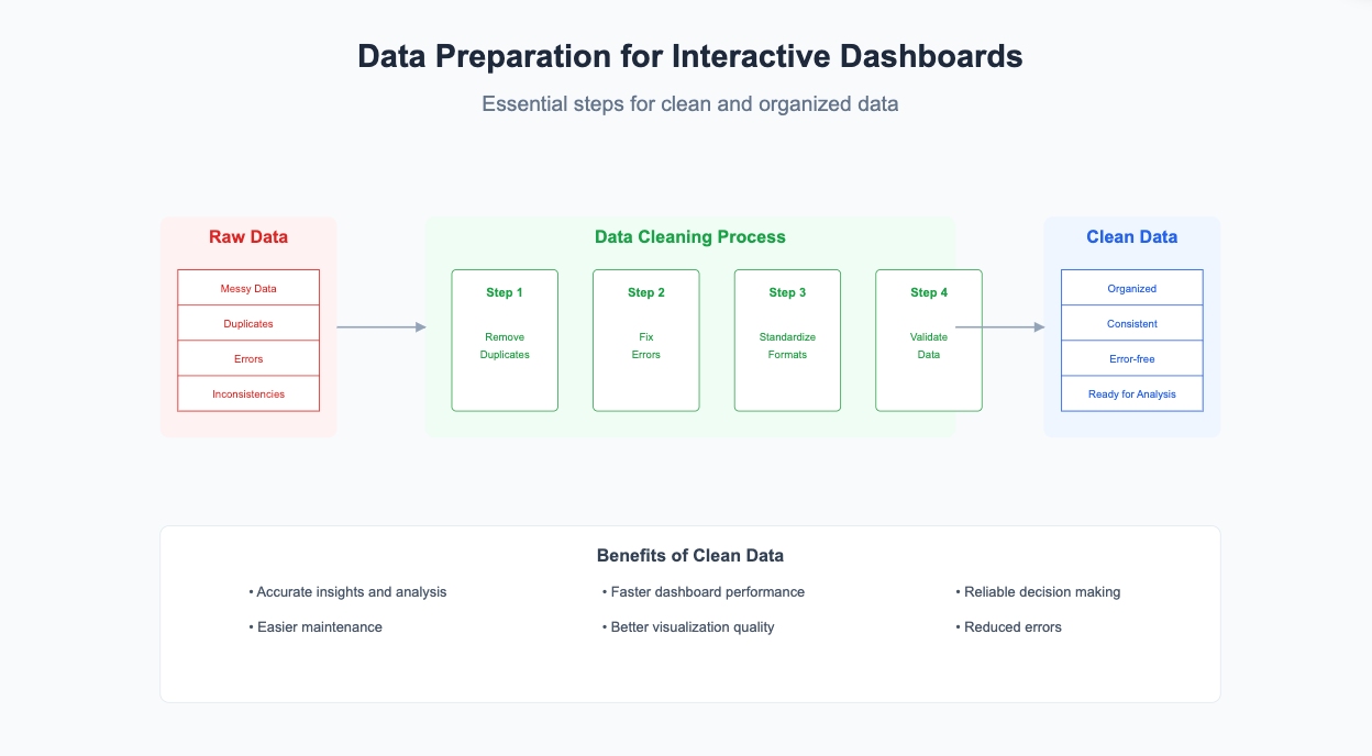
Remove Duplicates and Errors
Duplicate entries and errors can mess up your analysis. Removing them is essential for a reliable dashboard. Excel offers simple tools to help you clean your data:
- Highlight duplicates using Conditional Formatting. Select your data, go to the Home tab, and choose Highlight Cell Rules > Duplicate Values. Pick a color scheme to highlight duplicates, then review and remove unnecessary entries.
- Use the Remove Duplicates feature. Click any cell in your dataset, go to the Data tab, and select Remove Duplicates. Excel will prompt you to choose the columns to check for duplicates.
These steps ensure your data is error-free and ready for analysis. This preparation is crucial when learning how to create a dashboard in Excel.
Format Data for Consistency
Consistent formatting makes your data easier to read and analyze. It also builds trust in your dashboard. For example, ensure dates follow the same format, numbers have the correct decimal places, and text entries are uniform.
Here’s why formatting matters:
| Benefit | Description |
| Promotes trust | Ensures that core metrics driving growth are reliable and trustworthy. |
| Saves time and resources | Reduces the time spent on generating reports and minimizes bottlenecks caused by formatting issues. |
| Increases visibility | Enhances understanding of data quality, aiding in informed decision-making across the organization. |
| Creates accountability | Allows managers to track key performance metrics and ensure standards are met. |
Taking the time to format your data properly will save you headaches later when you create an excel dashboard.
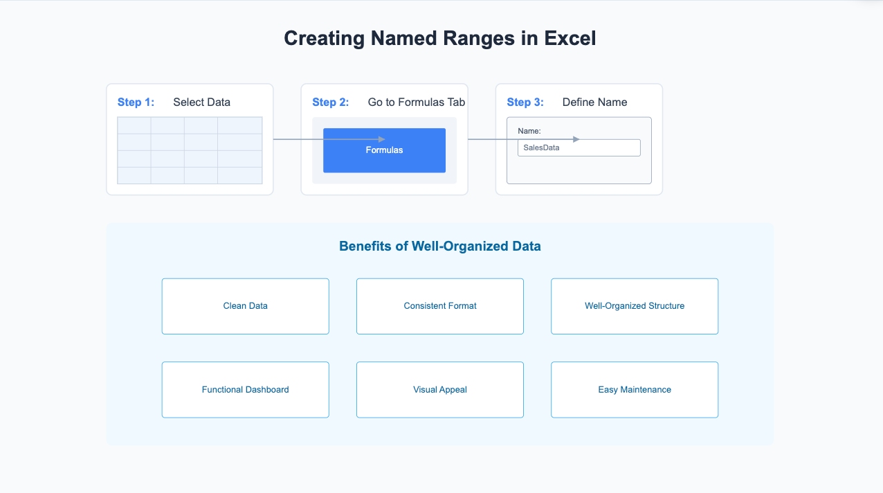
Use Named Ranges for Better Management
Named ranges make managing your data easier, especially when you create an interactive dashboard. Instead of referring to cells like A1:A100, you can assign a name like SalesData. This makes formulas and references clearer and reduces errors.
Dynamic named ranges are even better. They automatically adjust as you add or remove data, ensuring your dashboard stays up-to-date. For example, if you’re tracking monthly sales, a dynamic range will include new months without requiring manual updates. This feature is perfect for dashboards that rely on constantly changing data.
To create a named range, select your data, go to the Formulas tab, and click Define Name. Give your range a meaningful name, and you’re all set!
By following these steps, you’ll have clean, consistent, and well-organized data. This solid foundation will make it easier to create a dashboard in Excel that’s both functional and visually appealing.
How to Create a Dashboard in Excel: Visualization Basics
Now that your data is clean and organized, it’s time to bring it to life with visuals. Charts, pivot tables, and conditional formatting are the building blocks of an engaging and insightful dashboard. Let’s explore how you can use these tools to create an interactive dashboard in Excel.
Build Charts (Bar, Line, Pie, etc.)
Charts are the heart of any dashboard. When learning how to create a dashboard in Excel, choosing the right charts is essential. They transform raw numbers into visuals that are easy to understand. But not all charts are created equal. Choosing the right one depends on the story you want to tell.
Here’s a quick guide to help you decide:
| Chart Type | Description | Use Case Example |
| Bar and Column | Present data clearly and visually. | Compare sales across regions or products. |
| Line | Spot trends over time by connecting data points. | Track monthly revenue or expenses. |
| Pie | Show how categories contribute to a total. | Illustrate budget allocation across departments. |
| Combo | Combine multiple chart types for deeper insights. | Compare revenue and profit margins simultaneously. |
| Waterfall | Visualize cumulative effects of sequential values. | Analyze profit margins or cost breakdowns. |
For example, if you’re tracking sales growth, a line chart can highlight trends over time. On the other hand, a pie chart works well for showing how different products contribute to total revenue. Experiment with different types to find what works best for your dashboard.
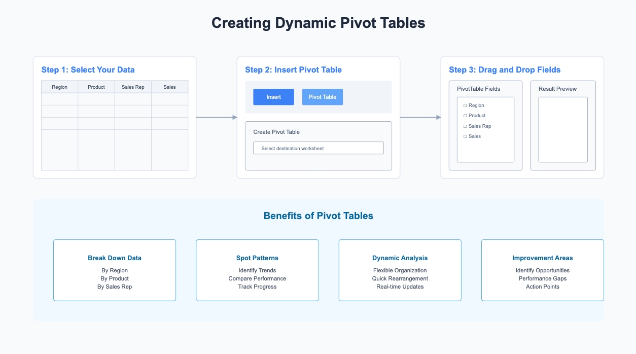
Use Pivot Tables for Summarized Data
Pivot tables are a game-changer for summarizing large datasets. They let you group, filter, and analyze data without complex formulas. With just a few clicks, you can create summaries that highlight key insights.
For instance, you can use a pivot table to break down sales by region, product, or salesperson. This makes it easier to spot patterns and identify areas for improvement. To get started, select your data, go to the Insert tab, and choose Pivot Table. From there, drag and drop fields to organize your data however you like. Pivot tables are flexible and perfect for creating a dynamic excel dashboard.
Apply Conditional Formatting for Insights
Conditional formatting adds a layer of interactivity to your dashboard. It highlights important data points automatically, so you can focus on what matters most.
Here are some ways you can use it:
- Highlight cells based on conditions like greater than or less than specific values.
- Use color scales to show performance, with green for high values and red for low ones.
- Add data bars to represent value magnitude directly within cells.
- Apply icon sets like arrows or flags to indicate trends or thresholds.
For example, in a sales report, you could color cells red if sales fall below a target or green if they exceed it. This makes it easy to spot underperforming areas at a glance. Conditional formatting turns your dashboard into a powerful tool for quick decision-making.
By combining charts, pivot tables, and conditional formatting, you can create an interactive dashboard that’s both functional and visually appealing. These tools make it easier to analyze data and share insights effectively.
How to Create a Dashboard in Excel: Adding Interactive Features

Interactive features make your dashboard more engaging and user-friendly. Understanding how to create a dashboard in Excel means mastering these interactive elements. They allow users to explore data, filter information, and interact with visuals effortlessly. To help you master these interactive features, we'll provide step-by-step instructions and practical examples for each method.
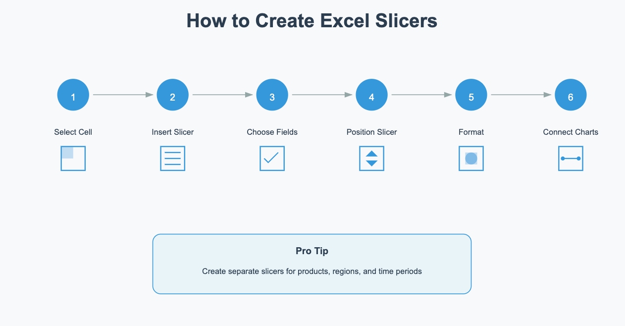
Use Slicers to Filter Data
Slicers are a fantastic way to make your dashboard dynamic and interactive. Detailed steps to create and implement slicers:
- Select any cell in your data table or PivotTable
- Navigate to Insert > Slicer
- Choose the fields you want to filter
- Position your slicer on the dashboard
- Format your slicer:
- Right-click > Slicer Settings to customize style
- Adjust size, colors, and caption
- Choose single/multi-select options - Connect to multiple charts:
- Right-click > Report Connections
- Select which charts to control
Pro tip: Create separate slicers for different dimensions (e.g., products, regions, time periods) to allow multi-dimensional analysis.
They act as visual filters, letting users select specific data categories and instantly see the impact on charts and tables.
- Slicers visually represent data categories, making them easy to understand.
- They allow users to drill down into specific data points, uncovering trends and patterns.
- By filtering out unnecessary data, slicers reduce clutter and improve focus.
- Their intuitive design makes them accessible to users of all technical backgrounds.
For example, if your dashboard tracks sales, you can add slicers for regions or product categories. Users can click on a region to see its sales performance without affecting other parts of the dashboard. This feature encourages exploration and helps users discover insights independently.
Add Drop-down Menus for User Input
Drop-down menus are another great way to create an interactive dashboard.
They let users select options that automatically update charts and tables. Here’s how you can set one up:
- Go to the Data Tab in Excel’s Ribbon.
- Select Data Validation and choose Allow: List.
- Enter the source for your list, such as a named range like
=Db1_Country.
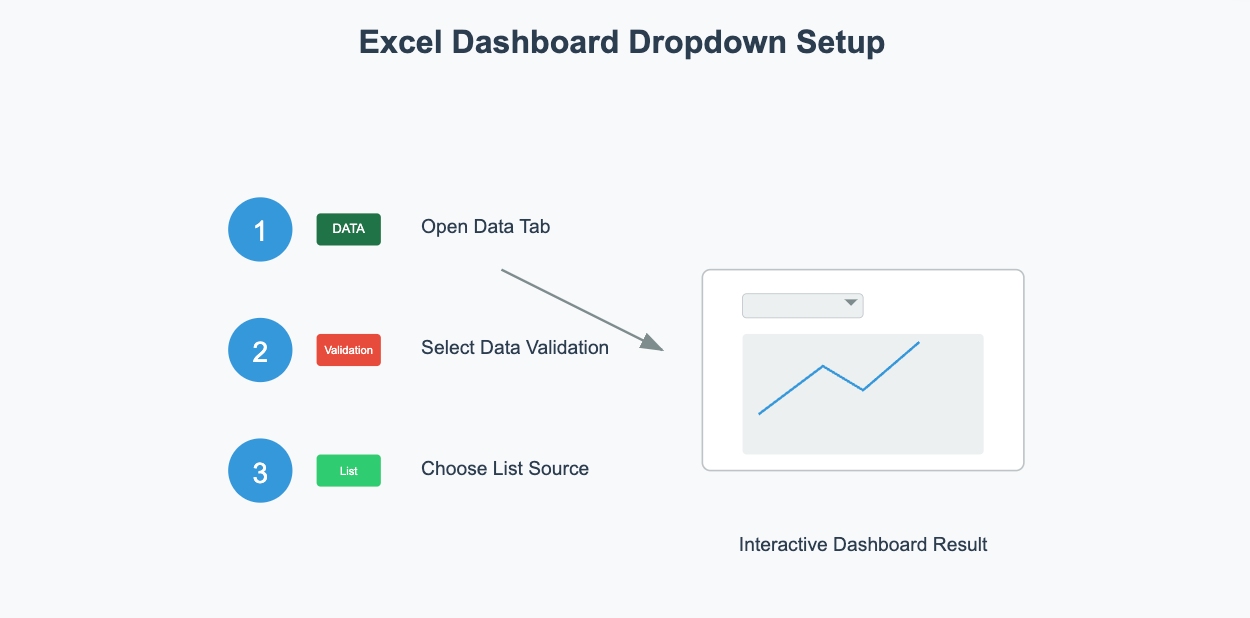
Drop-down menus are perfect for dashboards that need user input. For instance, you can use them to let users choose a time period, such as monthly or quarterly data. This makes your dashboard more flexible and engaging.
Create Buttons for Navigation or Actions
Buttons add another layer of interactivity to your Excel dashboard. They can help users navigate between sheets or trigger specific actions, like refreshing data or resetting filters. You can create buttons using Excel’s Form Controls. Assign macros to these buttons to automate tasks and make your dashboard more dynamic.
For example, you could add a button labeled “Reset Filters” to clear all slicers and drop-down selections. This makes it easier for users to start fresh without manually undoing changes. Buttons not only enhance usability but also give your dashboard a polished, professional look.
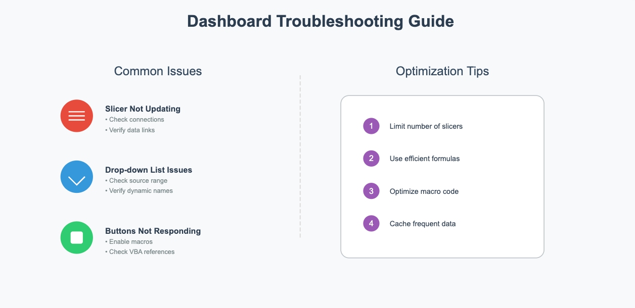
By incorporating slicers, drop-down menus, and buttons, you can create an interactive dashboard that’s both functional and engaging. You can peruse this interactive feature troubleshooting guide.
1. Slicer not updating charts
- Check report connections
- Verify data source links
2. Drop-down list not showing all items
- Check source range
- Verify dynamic range names
3. Buttons not responding
- Enable macros
- Check VBA references
Performance Optimization Tips:
1. Limit number of slicers to prevent slowdown
2. Use efficient formulas for drop-down dependencies
3. Optimize macro code for faster execution
4. Cache data for frequently used filters
These features transform your Excel dashboard into a powerful tool for exploring and analyzing data.
How to Create a Dashboard in Excel: Design and Polish
Once you’ve added interactivity to your dashboard, it’s time to focus on design. This final stage of how to create a dashboard in Excel will polish your work to professional standards. A polished dashboard not only looks professional but also makes data easier to understand. Let’s explore how you can refine your dashboard with consistent colors, clear labels, and usability testing.
Use Colors and Fonts Consistently
Colors and fonts play a huge role in making your dashboard visually appealing and easy to read. Here are some best practices to follow:
- Stick to two fonts—one for headings and another for body text. This creates a clean and professional look.
- Use different sizes or styles (like bold or italic) to highlight important information.
- Choose easy-to-read fonts. Avoid overly decorative ones that can distract users.
When it comes to colors, less is more. A simple color scheme with four or fewer colors works best. Consider these tips:
- Use green for positive results, red for negative ones, and gray for neutral data.
- Incorporate gradients to show trends or changes over time.
- Treat white as a color, not just a background. It can help highlight key areas.
Consistency in colors and fonts ensures your dashboard feels cohesive and professional.
Add Titles, Labels, and Tooltips
Titles, labels, and tooltips are essential for clarity. They guide users and help them understand the data at a glance. Here’s why they matter:
| Benefit | Explanation |
| Clarity | Titles and labels provide context, making it clear what each chart or table represents. |
| Reduced Confusion | Users can interpret visuals more easily, reducing the chance of misinterpretation. |
| Enhanced Value | Descriptive labels and tooltips add depth, improving the overall user experience. |
For example, add a title like “Monthly Sales Performance” to a line chart. Use labels to show exact values on data points. Tooltips can provide additional details when users hover over a chart. These small touches make your dashboard more user-friendly.
Test Usability and Make Adjustments
Before sharing your dashboard, test it thoroughly. Start by checking all links, calculations, and visuals. Compare the results to your original data to ensure accuracy.
Next, share the dashboard with stakeholders and ask for feedback. They might spot areas for improvement that you missed. Use their input to refine your design and functionality.
Testing and adjustments ensure your dashboard works smoothly and meets user needs. A well-tested dashboard builds trust and delivers reliable insights.
By focusing on design and usability, you’ll create a dashboard in excel that’s not only functional but also a pleasure to use.
How to create a dashboard in Excel might seem overwhelming, but breaking it into steps makes it manageable. Here’s a quick recap:
- Define your objectives and identify key metrics.
- Gather and organize your data into tables.
- Use PivotTables and charts to design your dashboard.
- Add slicers and drop-down menus for interactivity.
- Test your dashboard to ensure everything works smoothly.
Excel offers several advantages for building dashboards.
| Benefit | Description |
| Familiarity | Many users already know Excel, so there’s no steep learning curve. |
| Flexibility | It provides tools for data analysis and visualization. |
| Cost-Efficiency | It’s part of Microsoft Office, so no extra software costs are needed. |
| Integration | Works seamlessly with other Microsoft Office applications. |
However, Excel has its limits. It struggles with large datasets and lacks real-time updates. Collaboration can also be tricky. For organizations facing these limitations, solutions like FineReport and FineVis offer enhanced capabilities for handling large-scale data visualization and real-time updates while maintaining a familiar interface for Excel users. These tools can serve as a natural progression when your reporting needs outgrow Excel's capabilities. If you need advanced features, consider tools like Power BI or Tableau. These platforms handle big data better and offer more customization options.
By following these steps and understanding Excel’s strengths and weaknesses, you can create a dashboard that’s both functional and visually appealing.
Key Takeaways
- Start with clear goals and organized data - decide what you want to show and arrange your data neatly in Excel tables.
- Choose effective visualizations - use appropriate charts and pivot tables that best communicate your insights.
- Make it interactive and user-friendly - add features like filters and get feedback to ensure your dashboard serves its purpose well.
Click the banner below to experience FineReport for free and empower your enterprise to convert data into productivity!

Continue Reading About Dashboard
How to Quickly Build a Core App Dashboard
Store Performance Dashboard: Your Retail Command Center
Dynamic Dashboard: A Game Changer for Data Analysis
Master the Square Dashboard in Easy Steps
How to Design a Client Dashboard That Delivers Results
Draft Dashboard Review - Is It the Ultimate DFS Tool?
Mastering the Twitch Dashboard for Streamer Success
Using the Blooket Dashboard to Boost Student Engagement
Mastering the Unity Cloud Dashboard for Effective Use
How to Access the Clover Dashboard Easily
How to Access the Chrysler Employee Portal Easily
Covers Dashboard: Find Your Perfect Match


FAQ

The Author
Lewis
Senior Data Analyst at FanRuan
Related Articles

How to Build an Investment Portfolio Reporting Dashboard for Executives: KPIs, Benchmarks, and Drill-Down Views
Investment portfolio reporting for executives is not about showing every holding, transaction, and chart your investment team can produce. It is about giving CEOs, CFOs, CIOs, boards, and investment committees a fast, re
Yida YIn
Jun 25, 2026

12 KPI Reporting Examples for Executive Dashboards: What to Show in Weekly, Monthly, and Quarterly Reviews
Executive leaders do not need more data. They need decision ready $1 examples that match how often they review the business and what actions they are expected to take. A weekly $1 should surface fast moving risks and per
Yida YIn
Jun 25, 2026

How to Build a Digital Marketing Reports Dashboard: Executive Examples, KPIs, and Templates
A $1 is the control layer that helps executives and marketing leaders turn scattered channel data into fast, confident decisions. If you are a CEO, CMO, operations director, or marketing analytics lead, the real problem
Yida Yin
May 07, 2026