Creating a pie chart in Microsoft Excel helps you visualize data proportions effortlessly. This guide will show you how to make pie chart in excel, whether you're summarizing survey results or breaking down sales data. A well-designed chart can simplify complex datasets into clear visuals. Follow this pie chart tutorial to master the basics and make your data stand out with an excel pie chart.
Key Takeaways
- Arrange your data in two columns: one for names, one for numbers. This setup helps Excel make correct pie charts.
- Keep your pie chart to 5-7 pieces for easy reading. Combine tiny pieces into an 'Other' section to keep it neat.
- Pick different colors for each piece to make them stand out. Bright colors help people tell the pieces apart quickly.
- Add labels and percentages to your chart to explain it better. This makes the chart easier to understand.
- Give your chart a clear title and simple legends. This helps people read and understand the data faster.
How to Make Pie Chart in Excel in Malaysia

Step 1: Prepare Your Data
Before you know how to make pie chart in Excel, ensure your data is well-organized. Place your categories in one column and their corresponding values in the adjacent column. For example, if you're visualizing sales data, list product names in one column and their sales figures in the next. This structure helps Excel interpret your data accurately.
Tip: Keep the number of categories (or slices) to a minimum. Too many slices can make your chart cluttered and hard to read. If your data has many small values, consider grouping them into an "Other" category.
Here are some best practices to follow when preparing your data for an excel pie chart:
- Limit the number of slices to avoid overwhelming your audience in Malaysia.
- Use a bar or column chart if your data points are close in value.
- Avoid 3D pie charts, as they can distort proportions.
- Never use multiple pie charts for comparisons; opt for other chart types instead.
- Remove legends and place data labels directly on or outside the slices.
- Use pie charts sparingly to highlight proportions, not trends.
Step 2: Select Your Data Range
Once your data is ready, highlight the range you want to visualize. Click and drag your cursor over the cells containing your categories and values. For example, if your data is in cells A1 to B5, select this range.
Selecting the correct data range is crucial for creating an accurate pie chart. Missteps here can lead to misleading visuals. The table below illustrates the difference between a misleading and an accurate pie chart:
| Type of Pie Chart | Description |
|---|---|
| Misleading Pie Chart | Misrepresents data by inflating smaller categories and shrinking larger ones, leading to incorrect assumptions about significance. |
| Accurate Pie Chart | Correctly represents proportions and includes percentages, ensuring viewers interpret data correctly and avoid misleading techniques. |
Note: Double-check your selection to ensure it includes all relevant data and excludes unnecessary rows or columns in Malaysia .
Step 3: Insert a Pie Chart
After selecting your data, it's time to insert the pie chart. Navigate to the Insert tab in the ribbon at the top of Microsoft Excel. Under the Charts group, click on the pie chart icon. From the dropdown menu, choose the type of pie chart you want to create. Options include a standard pie chart, a 3D pie chart, or a doughnut chart.
Pro Tip: Stick to the standard pie chart for clarity. While 3D pie charts may look appealing, they often distort data and mislead viewers.
Once you select your preferred chart type, Excel will automatically generate the chart based on your data. You can then move and resize the chart to fit your worksheet layout.
Emoji Tip: 🎉 Congratulations! You’ve just learned how to insert pie chart in Excel. Now, let’s move on to customizing it for maximum impact.
Step 4: Customize Your Excel Pie Chart
Customizing your Excel pie chart enhances its visual appeal and ensures it communicates your data effectively. Microsoft Excel offers several built-in tools to help you personalize your chart. Follow these steps to make your pie chart stand out.
Adjusting Colors and Styles
Colors play a crucial role in making your chart visually appealing in Malaysia . To change the colors of your pie chart, click on the chart and select the Chart Tools tab. Under the Format section, choose a color scheme that complements your data. For example, use contrasting colors to differentiate slices clearly. Avoid using similar shades for adjacent slices, as this can confuse viewers.
You can also experiment with chart styles. Excel provides pre-designed styles under the Design tab. These styles adjust the overall look of your chart, including borders, shadows, and slice effects. Select a style that aligns with your presentation theme or branding in Malaysia .
Tip: Use bold colors for larger slices and lighter shades for smaller ones to emphasize proportions effectively.
Adding Data Labels and Percentages
Data labels make your chart easier to interpret in Malaysia . To add labels, click on your pie chart and select Add Chart Element from the ribbon. Choose Data Labels and pick a placement option, such as inside or outside the slices. Including percentages alongside labels provides additional clarity.
For example, Sarah, a coffee shop owner, customized her pie chart by adding percentage labels to visualize her budget breakdown. This helped her identify areas where she could cut costs. Similarly, Jason, from a tech company, used detailed labels in a pie of pie chart to highlight sales contributions of specific product categories.
Exploding Slices for Emphasis
Highlighting a particular slice can draw attention to important data. To explode a slice, click on it and drag it away from the center of the chart. This technique works well for emphasizing key categories, such as the highest sales or largest expenses.
Emoji Tip: 💡 Use exploded slices sparingly to avoid cluttering your chart.
Formatting Titles and Legends
A clear title and legend improve your chart’s readability. Double-click the default title to edit it and make it descriptive. For example, instead of "Pie Chart," use "Sales Distribution by Product Category."
To format the legend, click on it and choose options like font size, position, or color. Place the legend where it doesn’t overlap with the chart, ensuring viewers can easily identify slices.
Customizing your Excel pie chart transforms it into a powerful tool for storytelling. Whether you're creating excel pie charts for business reports or personal projects, these techniques ensure your chart is both informative and visually appealing in Malaysia .
Preparing Data: The First Step in How to Make Pie Chart in Excel in Malaysia
Organizing Data for Accuracy
Accurate data organization is the foundation of a clear and effective excel pie chart. Start by arranging your data in a single column or row. Place category names in the first column or row and their corresponding values in the adjacent one. This structure ensures that Microsoft Excel interprets your data correctly.
For example, if you’re visualizing monthly expenses, list categories like "Rent," "Groceries," and "Utilities" in one column and their amounts in the next. Avoid empty rows or columns, as they can disrupt the chart's accuracy.
Here are some proven techniques to improve data organization:
- Ensure all data values are greater than zero.
- Limit the number of categories to 7-9 to prevent clutter.
- Leave a blank row and column around your data for better processing.
| Technique | Description |
|---|---|
| Proper Data Arrangement | Organize source data in one column or row to ensure only one data series. |
| Include Category Names | Use the first column or row for category names to enhance chart clarity. |
| Limit Data Categories | Keep the number of categories between 7-9 to avoid cluttering the chart. |
Ensuring Data Adds Up to 100%
Pie charts represent proportions, so your data must total 100%. Double-check your values to ensure accuracy. If your data includes percentages, verify that their sum equals 100%. Mismatched totals can confuse viewers in Malaysia and misrepresent your message.
Follow these steps to ensure your data adds up correctly:
- Calculate the total of your values.
- Confirm that the sum equals 100%.
- Adjust any discrepancies to maintain accuracy.
| Step | Description |
|---|---|
| 1 | Ensure Accuracy: Double-check that your percentages add up to 100%. |
| 2 | Check Total: Verify that the sum of your values equals 100%. |
Avoiding Common Data Preparation Errors
Errors in data preparation can lead to misleading or ineffective pie charts. Studies show that visualization errors, including those in pie charts, occur frequently. For example, 83 instances of common pie chart errors were identified in a recent analysis.
To avoid these pitfalls:
- Ensure your data is free of empty rows or columns.
- Avoid using negative values, as they distort proportions.
- Use the correct chart type for your data. For instance, if your data shows trends, a line chart may be more suitable than an excel pie chart.
By organizing your data carefully and verifying its accuracy, you can create a visually appealing and informative pie chart in Microsoft Excel. These steps ensure your chart effectively communicates your data story in Malaysia.
How to Make Pie Chart in Excel in Malaysia: Types and Their Use Cases
Standard Pie Chart
The standard pie chart is the most commonly used type in Microsoft Excel. It visually represents proportions or percentages, making it ideal for part-to-whole comparisons. For example, you can use it to display the percentage of sales contributed by different products. This chart type works best when your data has limited categories, typically between 3 to 7.
Tip: Avoid using a standard pie chart if your dataset includes too many categories. Too many slices can clutter the chart and confuse viewers.
However, pie charts rely on an uncommon encoding method, representing values as areas within a circle. This can make it harder to assess slice sizes accurately compared to other chart types like bar charts.
| Chart Type | Best Use Case | Limitations |
|---|---|---|
| Pie Chart | Showing proportions or percentage breakdowns | Can become cluttered with too many categories |
3D Pie Chart
A 3D pie chart adds depth and visual appeal to your data. It can make your chart more engaging in Malaysia, especially in presentations. However, this type of chart often sacrifices accuracy for aesthetics. The 3D effect can distort slice sizes, exaggerating or diminishing their proportions.
| Aspect | 3D Pie Charts | 2D Pie Charts |
|---|---|---|
| Data Integrity | Can distort data perception, exaggerating or diminishing slice sizes. | Provides a clearer representation of data proportions. |
| Clarity | May complicate comparisons due to the 3D effect. | Simplicity allows for easier assessment of proportions. |
You should use 3D pie charts sparingly. They work well when you want to grab attention but are less effective for precise data analysis.
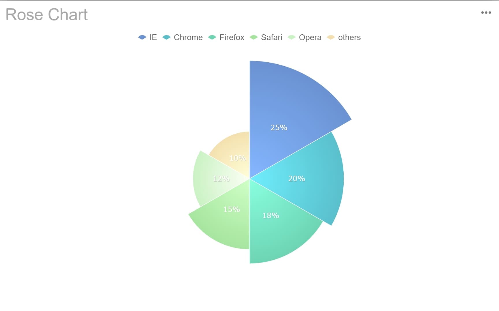
Doughnut Chart
The doughnut chart is a variation of the standard pie chart. It features a hole in the center, which creates a cleaner look and provides space for additional information, such as a total value or a key metric. This makes it particularly useful for dashboards or reports where you need to display extra context.
| Feature | Doughnut Charts | Pie Charts |
|---|---|---|
| Clarity | Cleaner look due to the absence of a center | Can become cluttered with too many categories |
| Additional Information | Center hole can display extra information or labels | No space for additional context |
Doughnut charts retain the part-to-whole comparison while emphasizing individual parts. For example, you can use them to show departmental contributions to a company’s revenue while displaying the total revenue in the center.
Note: Doughnut charts are less effective when you need to compare exact slice sizes. Use them when clarity and additional context are priorities.
Exploded Pie Chart
An exploded pie chart is a variation of the standard pie chart that separates one or more slices from the rest of the chart. This design emphasizes specific data segments, making it easier for viewers to focus on key information. You can use this type of chart in Microsoft Excel to highlight significant data points, such as a leading product in sales or a dominant market share.
To create an exploded pie chart, follow these steps:
- Insert a standard pie chart using your data.
- Click on the slice you want to emphasize.
- Drag the slice outward to separate it from the rest of the chart.
This simple action transforms your chart into a powerful visual tool for storytelling. For example, if you’re presenting a business report, an exploded slice can draw attention to a market leader in Malaysia or a standout performance.
Tip: Use exploded slices sparingly. Highlighting too many slices can clutter your chart and confuse viewers.
Exploded pie charts are effective in various contexts:
- They clarify complex information by isolating key segments.
- They enhance business reports and academic presentations.
- They improve data communication through advanced customization.
When designing your chart, focus on visual appeal and clarity. Choose contrasting colors for the slices and ensure the labels are easy to read. Thoughtful design not only makes your chart more attractive but also strengthens your data storytelling.
By using an exploded pie chart in Microsoft Excel, you can create a visually engaging and informative representation of your data. This chart type works best when you need to emphasize specific proportions within a dataset.
Customizing Your Pie Chart with FineReport in Malaysia: Beyond How to Make Pie Chart in Excel
Changing Colors and Styles
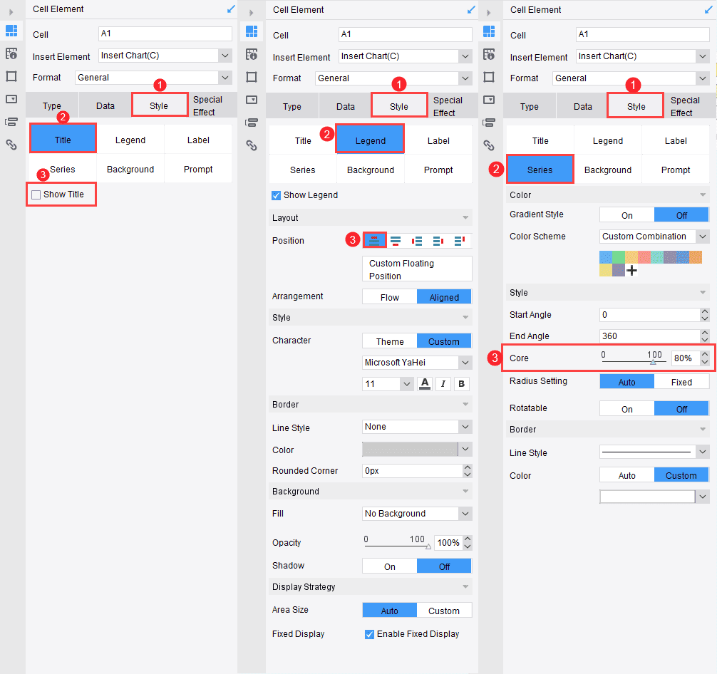
Colors and styles play a vital role in making your pie chart visually appealing and easy to interpret. FineReport offers a wide range of customization options to help you create a chart that aligns with your data and presentation needs. You can adjust the colors of individual slices to make them stand out or apply a cohesive color scheme to enhance readability.
To change the colors, select your pie chart and access the color palette. Choose contrasting colors for adjacent slices to ensure clarity. For example, if you’re visualizing departmental budgets, use distinct colors for each department to avoid confusion. FineReport also allows you to apply pre-designed themes that automatically adjust the chart’s colors and styles to match your branding or presentation theme.
Experimenting with styles can further enhance your chart’s appearance. You can add shadows, borders, or gradients to give your chart a polished look. These features not only improve aesthetics but also make your chart more engaging for your audience in Malaysia.
Tip: Use bold colors for larger slices and lighter shades for smaller ones. This technique emphasizes the most significant data points effectively.
Adding Data Labels and Percentages
Data labels and percentages make your pie chart more informative by providing context for each slice. FineReport simplifies this process with its intuitive interface. You can add labels directly to the slices, showing either the category name, the value, or both. Including percentages alongside these labels helps your audience in Malaysia understand the proportions at a glance.
To add data labels, select your chart and enable the labeling option. FineReport allows you to customize the placement of these labels, such as inside or outside the slices. For example, if you’re presenting a chart on market share, placing the labels outside the slices ensures they remain legible even for smaller segments.
Adding percentages is equally straightforward. FineReport calculates these values automatically based on your data. Displaying percentages alongside category names provides a clear picture of how each segment contributes to the whole. This feature is particularly useful in business reports, where precise data representation is crucial.
Pro Tip: Avoid overcrowding your chart with too much text. If a slice is too small to accommodate a label, consider grouping it with similar categories or using a legend.
Exploding Slices for Emphasis
Exploding slices is an effective way to draw attention to specific data points in your pie chart. This technique separates one or more slices from the rest of the chart, making them stand out. FineReport makes it easy to implement this feature, allowing you to highlight critical information effortlessly in Malaysia.
To explode a slice, click on the chart to select it. Then, click again on the slice you want to emphasize and drag it outward. This action isolates the slice, creating a visual focus. For instance, in a chart showing software bugs by severity, you can explode the "Critical" slice to emphasize its importance.
| Evidence Type | Description |
|---|---|
| Insight | Exploding a slice draws attention to specific data points. Use this sparingly. |
| Example | In a pie chart showing software bugs by severity, explode the 'Critical' slice to emphasize its impact. |
Steps to Explode a Slice:
- Select the pie chart.
- Click on the slice you want to emphasize.
- Drag it away from the center.
This feature works well in presentations and reports where you need to highlight key insights. However, use it sparingly to avoid cluttering your chart. Overusing exploded slices can make your chart harder to read and reduce its overall impact in Malaysia.
By customizing your pie chart with FineReport, you can create a visually stunning and highly informative representation of your data. Whether you’re adjusting colors, adding labels, or emphasizing slices, these tools ensure your chart communicates your message effectively in Malaysia.

Formatting Titles and Legends
Titles and legends play a crucial role in making your pie chart easy to understand in Malaysia. A well-crafted title provides context, while a clear legend helps viewers identify each slice. By formatting these elements effectively, you can enhance the overall impact of your chart.
Crafting a Descriptive Title
Your title should summarize the purpose of your chart in a few words. Avoid generic titles like "Pie Chart" or "Data Visualization." Instead, use specific and meaningful titles that reflect the data being presented. For example, "Monthly Expenses Breakdown" or "Market Share by Product Category" immediately tells viewers what to expect.
To format your title in Microsoft Excel:
- Click on the default chart title to select it.
- Type your new title directly into the text box.
- Use the Home tab to adjust the font size, style, and color. Choose a bold font to make the title stand out.
Tip: Keep your title concise but informative. A long title can overwhelm the chart and distract viewers.
Positioning and Styling the Legend
The legend explains what each slice of the pie represents. Proper placement and styling ensure that your audience in Malaysia can quickly interpret the chart. Microsoft Excel allows you to customize the legend’s position and appearance to suit your needs in Malaysia.
Follow these steps to format the legend:
- Click on the legend to select it.
- Use the Chart Elements button (the plus icon) to choose a position, such as top, bottom, left, or right.
- Adjust the font size and color using the Home tab. Ensure the text is legible and contrasts with the chart background.
Pro Tip: Place the legend where it doesn’t overlap with the chart. For smaller charts, consider removing the legend and using data labels instead.
When to Remove the Legend
In some cases, you may not need a legend at all. If your pie chart includes data labels with category names and percentages, the legend becomes redundant. Removing it can simplify the chart and make it more visually appealing.
To remove the legend:
- Click on the legend to select it.
- Press the Delete key on your keyboard.
Emoji Tip: ✂️ Simplify your chart by removing unnecessary elements like legends when data labels provide all the needed information.
By thoughtfully formatting titles and legends, you can create an excel pie chart that is both professional and easy to understand. These small adjustments make a big difference in how effectively your chart communicates its message.
How to Make Pie Chart in Excel: Best Practices for Clear and Effective Charts
Keep It Simple and Clear
Simplicity is key when designing a pie chart. A clean and straightforward chart ensures your audience in Malaysia can quickly grasp the data. Avoid overloading your chart with unnecessary elements like excessive text or decorative effects. Instead, focus on presenting the data in a way that is easy to interpret.
For example, place the most important segment at the top of the chart to draw attention. Label each slice directly with its category name and percentage. This eliminates the need for a separate legend, making your chart more intuitive in Malaysia. Studies show that pie charts with fewer distractions improve user interpretation and data communication.
| Best Practice | Explanation |
|---|---|
| Place segment of interest at top | Keeps attention focused on the most important slice. |
| Label each segment with category name and percentage | Direct labels are easier to read than using a legend. |
| Avoid creating too many slices | More than 7 or 8 slices make pie charts hard to read. Simplifying enhances readability. |
Tip: Maintain adequate white space around your chart. This helps viewers focus on the data without feeling overwhelmed.
Limit the Number of Slices
A pie chart becomes harder to read as the number of slices increases. Ideally, limit your chart to five to seven slices. If your data includes many small categories, group them into an "Others" slice. This keeps the chart focused on the most significant data points.
Research highlights that charts with fewer slices are more effective. Over-segmentation can confuse viewers and dilute the impact of your message. By grouping minor categories, you ensure clarity while still representing all data.
- Limit slices to a maximum of 7 for better readability.
- Group smaller categories under an "Others" slice to maintain focus.
- Avoid over-segmentation, which can make the chart difficult to interpret.
Pro Tip: If your data has too many categories, consider using a bar chart instead of a pie chart. Bar charts are better suited for comparing multiple data points.
Use Contrasting Colors for Better Visibility
Colors play a crucial role in making your pie chart visually appealing and easy to understand. Use high-contrast colors to differentiate between slices. For instance, pairing dark and light shades can highlight smaller slices that might otherwise go unnoticed. A green-red color scheme can intuitively represent profit and loss.
Avoid using colors that are too similar, as this can confuse viewers. Consider accessibility by choosing a color palette that is distinguishable for colorblind individuals. Tools like color blindness simulators can help you test your chart’s visibility.
- Use distinct colors to prevent confusion between slices.
- Ensure high contrast between adjacent colors for better differentiation.
- Choose accessible color palettes to accommodate all viewers.
Emoji Tip: 🎨 A well-chosen color scheme not only enhances readability but also makes your chart more engaging in Malaysia.
By following these best practices, you can create an excel pie chart in Microsoft Excel that is both effective and visually appealing. These guidelines ensure your chart communicates your data clearly and leaves a lasting impression on your audience in Malaysia.
Avoid Overloading with Too Much Data
Overloading your pie chart with too much data can confuse your audience in Malaysia and obscure your message. When you include excessive categories, the chart becomes cluttered, making it hard for viewers to focus on what matters most. Instead of clarifying your data, a crowded chart may overwhelm your audience in Malaysia and leave them struggling to understand the visualization.
To avoid this, limit your pie chart to five to seven slices. If your data contains many small categories, group them into an "Other" slice. This approach keeps the chart clean and ensures the most important information stands out. For example, if you’re visualizing departmental expenses, combine minor costs like office supplies and snacks into a single category. This way, your chart highlights the major contributors without losing context.
Presenting too much information in a single chart can also give the false impression of effective data management. Viewers may not know where to direct their attention, making it difficult to decipher the message quickly. To address this, focus on the most relevant data points and use additional charts for secondary insights. For instance, instead of cramming all sales data into one pie chart, create separate charts for different regions or product categories.
Here’s why limiting data is essential:
- Too much information overwhelms viewers.
- Excessive details obscure the intended message.
- Cluttered visuals make it hard to identify key insights.
By keeping your pie chart simple and focused, you ensure it communicates your data effectively in Malaysia. Whether you’re using microsoft excel or another tool, a well-designed excel pie chart can transform complex datasets into clear, impactful visuals.
Excel pie charts simplify data visualization by showcasing proportions and percentages clearly. You can create effective charts by organizing your data, selecting the right chart type, and applying best practices. These steps ensure your chart communicates insights effectively. For advanced customization, tools like FineReport offer features to enhance your visuals beyond what Microsoft Excel provides. Explore these options to elevate your data storytelling and make your charts more impactful in Malaysia.
Click the banner below to try FineReport for free and empower your enterprise to transform data into productivity!
Continue Reading About Pie Chart
How to make a pie of pie chart or bar of pie chart?


FAQ

The Author
Lewis
Senior Data Analyst at FanRuan
Related Articles

10 Good Data Visualization Examples by Use Case: Sales, Surveys, Finance & Time-Series
If you are searching for $1 , you likely do not need another gallery of pretty charts. You need examples that help sales leaders hit targets, finance teams explain variance, operations managers monitor change, and analys
Yida Yin
Jun 15, 2026

12 Best Data Visualization Tools for 2026: Features, Pricing, Pros and Cons
$1 are software platforms that turn raw data into charts, dashboards, maps, and interactive visual stories for analysis and decision making. 12 best data visualization tools for 2026 at a glance
Lewis Chou
Apr 23, 2026

Top 8 Data Visualization softwares You Should Try in 2026
Compare the top 8 data visualization software for 2026, including FineReport, Tableau, Power BI, and more to find the best fit for your business needs.
Lewis
Mar 19, 2026