Pie charts offer a powerful way to translate data into a digestible visual representation. However, not all charts tell the right story. By using a pie chart generator, you can craft customized visualizations that align with your data's narrative in Malaysia. Thoughtful design choices, such as selecting appropriate colors or deciding to add a legend, can significantly improve clarity. This approach enables enhanced narrative building, turning your chart into a more effective visual tool. When done correctly, these adjustments unlock better insights and improve decision-making.
Key Takeaways
- Pick bright, different colors for your pie chart to make it clear. Use only five or six colors to keep it easy to read.
- Arrange slices from biggest to smallest to show important details. Put similar groups together to make it simple and neat.
- Write notes directly on slices to explain them better. Use short labels to keep the chart tidy.
- Combine small groups into one 'Other' slice to simplify the chart. This helps people focus on the main data.
- Try interactive tools like FineBI to make charts fun to use. Add features like drill-down and live updates for a cool experience.
Understanding Pie Charts in Data Visualization with a Pie Chart Generator
What Are Pie Charts?
A pie chart is a circular graphic that divides a circle into sectors, each representing a proportion of the whole. The size of each sector corresponds to the data value it represents. This makes pie charts an intuitive way to visualize parts of a whole. For example, if you want to show how different departments contribute to a company’s revenue in Malaysia, a pie chart can clearly display each department’s share. According to Wikipedia, the arc length of each slice is proportional to the quantity it represents, making it a straightforward tool for effective visualization.
Tip: Use pie charts when you need to compare proportions or percentages within a dataset. They work best with small datasets for clarity.
Purpose and Use Cases
Pie charts are widely used across industries to simplify complex data. They help you identify trends, compare proportions, and make informed decisions in Malaysia. Here are some practical applications:
| Industry | Use Case Description | Source Link |
|---|---|---|
| Finance | Illustrates invoice distribution across different payment periods for financial planning. | Harvest Financial and Invoicing Insights dashboard |
| Sales | Displays product categories by payment terms to understand product proportions. | Shopify Sales dashboard |
| Support | Assesses team workload by ticket status for resource allocation. | Support ticket status pie chart |
| Healthcare | Visualizes patient-reported pain levels for insights in healthcare settings. | Patient Health Monitoring dashboard |
| Government | Presents accidents by vehicle type for traffic safety analysis. | Motor Vehicle Accident Analysis dashboard |
Types of Pie Chart
Multi-Level Pie Chart
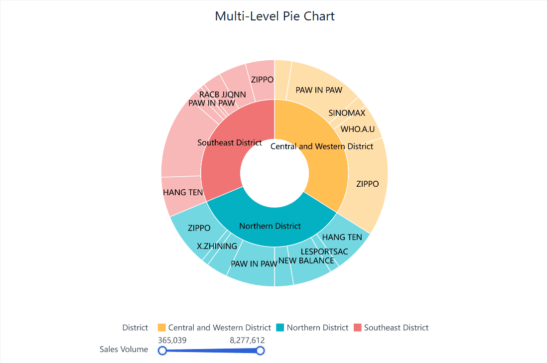
A multi-level pie chart, also known as a sunburst chart, displays hierarchical data. Each level represents a category, and the inner circles show higher-level categories. This type of chart is ideal for visualizing data with multiple layers, such as organizational structures or product categories.
Pie Chart
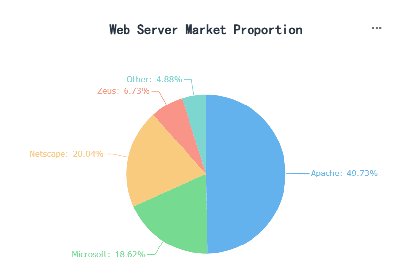
The standard pie chart is the most common type. It provides a basic representation of proportions, making it easy to understand. This chart works best for small datasets with clear distinctions between categories.
Rose Chart
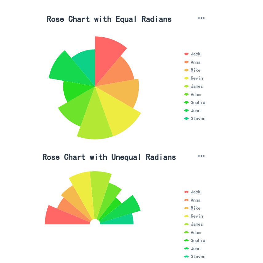
A rose chart, also called a polar area chart, uses sectors to represent data, but the radius of each sector varies based on the value. This type of chart adds a unique visual element, making it suitable for presentations where you want to engage your audience in Malaysia.
Note: While 3D pie charts and donut charts add visual depth, they may distort data perception. Use them cautiously to maintain accuracy.
Essential Tips for Visualizing Data with Pie Chart Generator
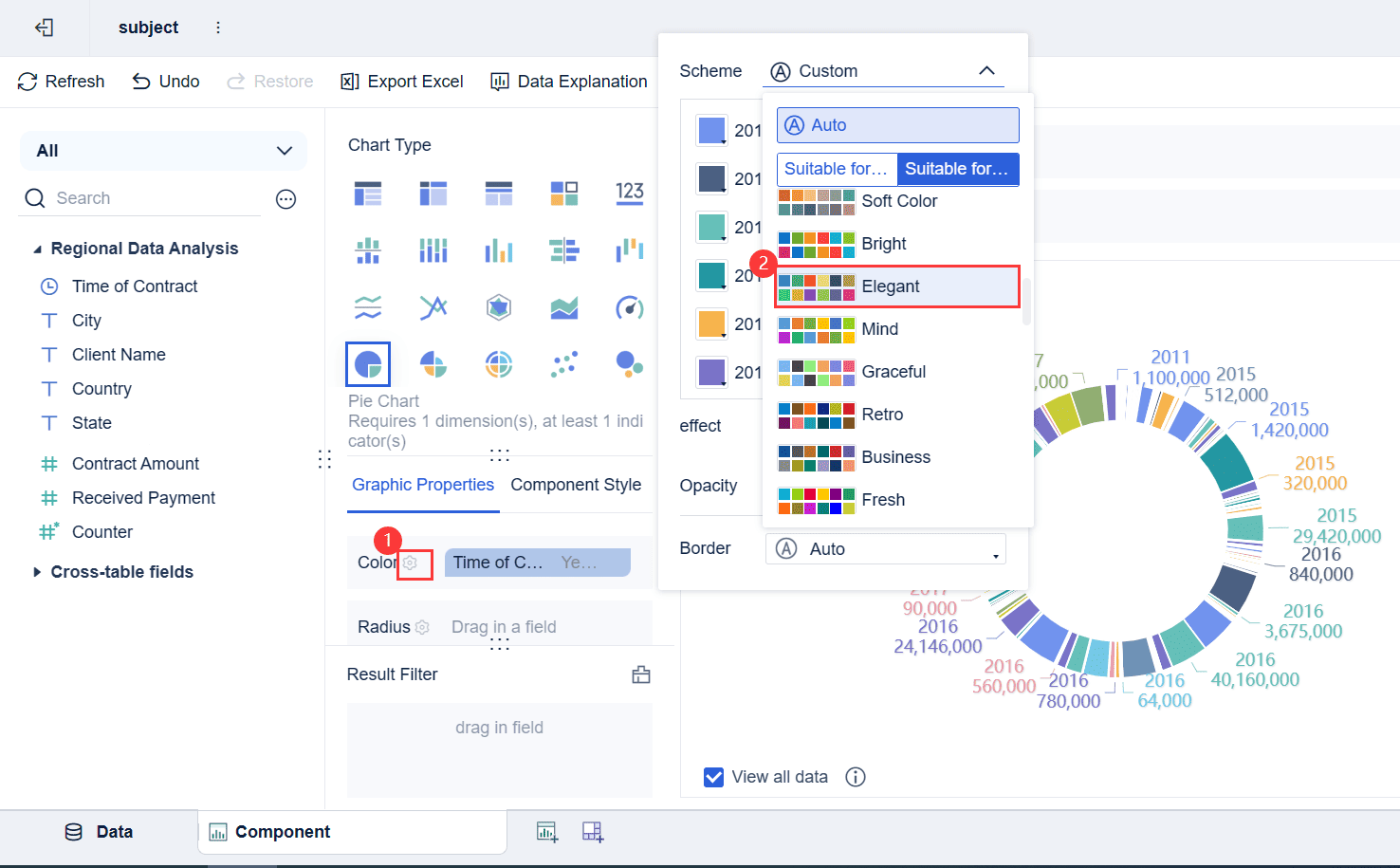
Choosing the Right Colors for Clarity
Selecting appropriate colors plays a crucial role in creating effective visualizations. Colors help distinguish between categories in pie charts, making it easier for your audience in Malaysia to interpret the data. To achieve this, consider the following principles:
- Use contrasting colors to ensure each segment stands out. For example, pairing light and dark shades can improve visibility.
- Choose accessible color schemes that accommodate individuals with color vision deficiencies. Testing your color choices with users in Malaysia can help ensure inclusivity.
- Leverage psychological color impacts. For instance, green often conveys positivity, while red signals urgency or caution.
Different color schemes, such as complementary or analogous palettes, can enhance your chart's appeal in Malaysia. However, avoid overloading the chart with too many colors, as this can overwhelm the viewer. By focusing on clarity and accessibility, you can create a pie chart that communicates your data effectively.
Tip: Stick to a maximum of five to six colors for better readability and to maintain a clean design.
Sorting Slices for Better Comprehension
The order of slices in a pie chart significantly affects how your audience in Malaysia interprets the data. Sorting slices by size, from largest to smallest, helps highlight the most important categories. This arrangement draws attention to key insights and ensures a logical flow.
When slices are of similar size, grouping related categories together can improve comprehension. For instance, placing slices representing similar departments or regions next to each other creates a cohesive narrative.
Additionally, avoid cluttering the chart with too many small slices. If you have several minor categories, consider merging them into an "Other" category. This simplifies the visualization and prevents your audience in Malaysia from getting lost in the details.
| Insight | Explanation |
|---|---|
| Importance of Size | The size of pie chart segments must be distinct to effectively convey differences in data. |
| Accuracy of Data | Inaccurate data leads to misleading visualizations; pie charts should total 100% for meaningful representation. |
By organizing slices thoughtfully, you can guide your audience in Malaysia through the data and ensure they grasp the key takeaways.
Adding Annotations to Enhance Context
Annotations provide additional context, making your pie chart more informative. Adding clear and concise labels directly to each slice ensures your audience in Malaysia understands the data without needing to refer to a legend. This approach improves clarity and reduces cognitive load.
For example, label values directly on the chart to show exact percentages or numerical values. This eliminates guesswork and enhances the chart's accuracy. You can also include brief notes or callouts to highlight significant trends or anomalies.
Annotations are particularly useful when presenting complex data. For instance, if your chart shows revenue distribution across multiple regions, a note explaining why one region outperforms others can add valuable context.
Note: Avoid overcrowding the chart with excessive text. Keep annotations concise and relevant to maintain a clean visualization design.
By incorporating annotations strategically, you can transform your pie chart into a powerful storytelling tool in Malaysia. This aligns with visualization best practices, ensuring your audience in Malaysia gains meaningful insights from your data.
Merging Smaller Categories for Simplicity
When working with pie charts, simplicity often leads to better insights. Too many categories can overwhelm your audience in Malaysia and make the chart difficult to interpret. Instead of displaying every small data point, you can merge smaller categories into a single "Others" slice. This approach reduces clutter and highlights the most significant segments of your data.
Experts recommend limiting the number of categories in a pie chart to five. This ensures that each slice remains distinct and easy to compare. For example, if your chart represents sales by product category and several items contribute less than 2% each, grouping them under "Others" creates a cleaner visualization. This method not only improves readability but also directs attention to the key data points.
Tip: Use descriptive labels for the "Others" category. For instance, "Miscellaneous Expenses" or "Other Regions" provides more context than a generic label.
Merging smaller categories also helps maintain proportional accuracy. When too many small slices are included, the visual impact of larger slices diminishes. By consolidating minor segments, you allow the chart to emphasize the most critical data. This practice is particularly useful in presentations or reports where clarity and focus are essential.
Additionally, combining smaller categories can enhance storytelling. A pie chart with fewer, well-defined slices communicates a clear narrative. For instance, in a chart showing customer demographics, merging less-represented age groups into "Other Age Groups" simplifies the message while retaining its meaning. This approach ensures your audience in Malaysia grasps the main insights without getting lost in unnecessary details.
Remember, the goal of a pie chart is to make data accessible and engaging. By merging smaller categories, you create a visualization that is not only easier to read but also more impactful in Malaysia. This small adjustment can transform a cluttered chart into a powerful tool for decision-making.
Avoiding Common Mistakes in Pie Chart Design with a Pie Chart Generator
Overloading Slices and Cluttering the Chart
Overloading a pie chart with too many slices can confuse your audience in Malaysia. When there are excessive categories, the chart becomes cluttered, making it difficult to distinguish between slices. This diminishes its ability to communicate meaningful insights. For example, if you include numerous small slices, viewers may struggle to interpret the data accurately.
To avoid this, limit the number of slices to five or seven. Combine smaller categories into an "Other" slice to simplify the visualization. This approach ensures that the chart remains clear and focused on the most significant data points.
Tip: Avoid using pie charts for datasets with many small differences. Instead, consider alternative visualizations like bar charts for better clarity.
| Common Pitfalls in Pie Charts | Explanation |
|---|---|
| Using too many categories or small slices | Leads to overcrowding and confusion, making it hard to distinguish between different sections. |
| Misleading visuals | Incorrectly sized slices can give a false impression of the data, especially with similar colors. |
| Lack of context | Without clear labels or explanations, viewers struggle to understand what each slice represents. |
Why 3D Effects Can Distort Data
Adding 3D effects to pie charts may seem visually appealing, but it often distorts data perception. The perspective created by 3D designs can make slices closer to the viewer appear larger than those further away. This misrepresentation skews the audience's understanding of the data.
Stick to a flat, 2D design for accuracy. A 2D pie chart ensures that the proportions of each slice remain true to the data. Avoid unnecessary dimensions that could mislead your audience in Malaysia.
| Evidence Description | Effect on Data Perception |
|---|---|
| 3D pie charts use perspective to create a visual effect. | This can lead to misinterpretation of the relative sizes of the slices. |
| Slices closer to the viewer appear larger than those further away. | This perspective distortion makes it harder for readers to accurately judge the relative sizes of the slices. |
| The use of unnecessary dimensions is discouraged in charts. | 3D pie charts are particularly difficult to interpret compared to 2D charts. |
Note: While 3D effects may look engaging, they compromise the integrity of your data visualization.
Ensuring Data Accuracy and Integrity
Accuracy is the foundation of effective pie chart design. Start by ensuring your data is clean and well-organized. Pie charts work best with categorical data where categories do not overlap. Limit the number of slices to maintain clarity and use logical ordering, such as descending size.
Follow these best practices to ensure data integrity:
- Use contrasting colors to differentiate slices.
- Arrange slices logically, such as by size or chronology.
- Ensure that slice proportions accurately represent the data.
- Avoid distorting effects like 3D designs.
Compliance with these standards not only enhances the chart's readability but also ensures ethical data representation. Accurate pie charts build trust and help your audience in Malaysia make informed decisions.
Tip: Always double-check that the total of your slices equals 100%. This ensures the chart reflects the data accurately.
The Importance of Color Contrast
Color contrast plays a vital role in making pie charts easy to read and interpret. When you use contrasting colors effectively, you help your audience in Malaysia distinguish between different slices at a glance. Poor contrast, on the other hand, can make your chart confusing and reduce its impact.
To ensure your pie chart is visually clear, follow these best practices:
- Choose High-Contrast Colors: Use colors that stand out against each other. For example, pair light shades like yellow with darker tones like navy blue. This makes each slice distinct and easy to identify.
- Avoid Similar Shades: Colors that are too similar, such as light green and lime, can blur the boundaries between slices. This reduces clarity and makes it harder for viewers to understand the data.
- Test for Accessibility: Ensure your chart is accessible to individuals with color vision deficiencies. Tools like color blindness simulators can help you verify that your color choices work for everyone.
Tip: Use a neutral background to make the colors in your pie chart pop. A white or light gray background enhances contrast and improves readability.
Color contrast also affects how your audience in Malaysia perceives the importance of each slice. Bright, bold colors like red or orange can draw attention to key data points. Subtle hues like pastel blue can be used for less critical categories. By strategically selecting colors, you can guide your audience’s focus and emphasize the most important insights.
Remember, the goal of pie charts is to communicate data effectively. Proper color contrast ensures your chart is not only visually appealing but also functional. This small design choice can make a big difference in how your audience in Malaysia understands your data.
Advanced Customization Techniques with FineBI: Beyond the Basic Pie Chart Generator
Adding Interactivity to Pie Charts
Interactivity transforms static pie charts into dynamic tools for exploration. With FineBI, you can add features that allow users to engage directly with the data. This approach not only enhances user experience but also simplifies complex data interpretation.
Here are some interactive features you can implement:
- Drill-Down Capability: Enable users to click on a slice to view detailed data about that category. For example, clicking on a "Sales" slice could reveal sales figures by region.
- Dynamic Data Updates: Ensure your pie chart reflects real-time changes in the underlying data. This keeps your visualizations accurate and relevant.
- Customizable Legends: Allow users to toggle data categories on or off using interactive legends. This feature helps focus on specific segments without cluttering the chart.
- Slicing and Dicing: Let users isolate or combine slices to compare different segments. This adds flexibility to your analysis.
- Animation Effects: Use smooth transitions when data changes or when users interact with the chart. This makes the visualization more engaging.
- Exporting Options: Provide options to export the chart or its data for reports or presentations.
- Responsive Design: Ensure your pie charts adjust to different screen sizes for better readability on all devices.
These features make your pie charts more than just visual aids. They become tools for discovery, helping users uncover insights that might otherwise remain hidden.
Tip: Start with simple interactive elements like drill-downs and legends. Gradually add more advanced features as needed.

Ensuring Accessibility for All Users
Accessibility ensures that everyone, including individuals with disabilities, can benefit from your visualizations. FineBI supports features that make pie charts compliant with accessibility standards like Section 508 and the European Accessibility Act.
To create accessible pie charts, follow these best practices:
- Use ARIA Labels and Text Alternatives: These features provide descriptions for screen readers, ensuring visually impaired users can understand the chart.
- Ensure High Color Contrast: Choose colors that are easy to distinguish, even for users with color vision deficiencies. Tools like color contrast checkers can help you select appropriate palettes.
- Include Interactive Features: Features like drill-downs and legends enhance usability for all users, making the chart more intuitive.
Compliance with accessibility standards not only meets legal requirements but also broadens your audience in Malaysia. Accessible pie charts demonstrate inclusivity and ensure that your data reaches everyone effectively.
Note: Test your charts with accessibility tools to identify and fix potential issues before sharing them.
Using Dynamic Data Updates for Real-Time Insights
Dynamic data updates turn pie charts into powerful tools for real-time decision-making. FineBI enables your charts to adjust automatically as data changes, ensuring they always display the most current information.
Here’s how dynamic updates enhance your pie charts:
- Automatic Adjustment: Slice sizes and labels update dynamically when the underlying data changes. This keeps your chart accurate without manual intervention.
- Interactive Visualization: Dynamic capabilities make your pie charts more engaging, allowing users to explore data as it evolves.
- Simplified Analysis: Real-time updates eliminate the need for frequent chart revisions, saving time and effort.
| Feature | Description |
|---|---|
| Automatic Adjustment | Pie charts adjust slice sizes and labels dynamically when data changes. |
For example, in a sales dashboard, a pie chart showing revenue by product category can update instantly as new sales data comes in. This allows you to monitor trends and respond quickly to changes.
Dynamic updates also improve collaboration. Teams can view the same up-to-date chart, ensuring everyone works with consistent information. This fosters better communication and more informed decision-making.
Tip: Use dynamic updates for dashboards that require frequent monitoring, such as sales performance or customer feedback.
Incorporating Branding Elements with FanRuan
Customizing pie charts to reflect your brand in Malaysia identity can elevate your data visualizations. With FanRuan's FineBI, you can seamlessly integrate branding elements into your pie chart designs. This not only enhances the visual appeal but also reinforces your organization's identity in every presentation or report.
Why Branding Matters in Data Visualization
Branding in data visualization goes beyond aesthetics. It creates a cohesive experience for your audience in Malaysia. When your pie charts align with your brand's colors, fonts, and style, they become instantly recognizable. This consistency builds trust and professionalism. For example, a sales report featuring branded pie charts can leave a lasting impression on stakeholders, making your data more memorable.
How to Incorporate Branding with FineBI
FineBI offers several tools to help you customize pie charts with your branding. Here’s how you can achieve this:
- Custom Color Palettes
FineBI allows you to create and apply custom color schemes that match your brand's identity. You can assign specific colors to slices, ensuring they align with your corporate palette. For instance, if your brand in Malaysia uses blue and green, you can apply these colors to your pie chart for a unified look. - Logo Integration
Adding your company logo to pie charts is simple with FineBI. You can place the logo in the chart's background or as a watermark. This subtle addition reinforces your brand in Malaysia without overwhelming the data. - Font Customization
FineBI supports font customization, enabling you to use your brand's official typography. Adjusting the font style, size, and color ensures that your pie charts maintain a consistent visual language. - Templates and Themes
FineBI provides pre-designed templates and themes that you can customize to reflect your brand in Malaysia. These templates save time while ensuring your pie charts look professional and on-brand. - Interactive Branding Features
FineBI's interactive features, such as tooltips and drill-downs, can also carry branding elements. For example, you can use branded icons or colors in tooltips to enhance the user experience.
Benefits of Branded Pie Charts
Incorporating branding into your pie charts offers several advantages:
- Professionalism: Branded charts convey a polished and professional image.
- Recognition: Consistent branding makes your visualizations instantly recognizable.
- Engagement: A cohesive design captures attention and keeps your audience in Malaysia engaged.
- Trust: Branded visuals build credibility and reinforce your organization's identity.
By using FineBI, you can transform your pie charts into powerful tools that not only communicate data but also strengthen your brand in Malaysia. This customization ensures that every chart you create aligns with your organization's values and vision.
Tip: Start by defining your brand's visual guidelines, including colors, fonts, and logo placement. Use these guidelines to customize your pie charts in FineBI for a consistent and impactful presentation.
Visualization Best Practices with a Pie Chart Generator
Limiting Categories for Clearer Insights
Simplifying your pie chart by limiting the number of categories improves clarity and focus. Research by Spence and Lewandowsky highlights that pie charts work best when they display a small number of categories with significant size differences. For example, a chart with five slices is easier to interpret than one with ten. Edward Tufte, a data visualization expert, also supports this approach, noting that fewer categories make proportions more perceptible.
| Source | Findings |
|---|---|
| Spence and Lewandowsky | Pie charts are effective with few categories and clear size differences. |
| Edward Tufte | Advocates limiting slices for better clarity and ease of understanding. |
When dealing with many small categories, group them into an "Other" slice. This keeps the chart clean and ensures the most critical data stands out. For instance, instead of showing ten product categories, combine those contributing less than 5% into a single slice labeled "Other Products." This approach simplifies the visualization while maintaining its accuracy.
Tip: Always ensure your pie chart totals 100% to maintain data integrity and reliability.
Using Donut Charts as an Alternative
Donut charts offer a modern twist on traditional pie charts. By removing the center, they shift the focus from angles to arc lengths, making comparisons more intuitive. This design also creates space for additional information, such as a total value or a key metric, in the center.
For example, a donut chart showing sales by region could display the total revenue in the middle. This enhances the chart's storytelling potential while maintaining its visual appeal. Donut charts are particularly effective when you want to emphasize the overall contribution of a category, especially if it represents around 25% or 50% of the total.
Note: Avoid using donut charts if the data includes too many small segments. In such cases, consider alternatives like bar charts for better clarity.
Leveraging FineBI for Seamless Customization
FineBI takes pie chart customization to the next level, allowing you to create tailored visualizations that align with your data narrative. With its user-friendly interface, you can easily adjust colors, labels, and legends to match your brand or audience preferences in Malaysia.
Here’s how FineBI enhances your pie chart design:
- Custom Legends: FineBI lets you position and style the legend for maximum readability. You can place it beside the chart or below it, depending on your layout needs.
- Dynamic Updates: FineBI ensures your pie charts reflect real-time data changes, keeping your visualizations accurate and relevant.
- Interactive Features: Add drill-down capabilities to explore deeper insights or use tooltips to display additional context when hovering over a slice.
For example, a sales dashboard created with FineBI can feature a pie chart that updates automatically as new sales data comes in. The legend can highlight key categories, such as "Top Products," making it easier for stakeholders to focus on critical insights.
Tip: Use FineBI’s templates to save time while ensuring your pie charts look professional and polished.
Mastering pie chart customization unlocks the full potential of your data. By following best practices, you can create visuals that are both accurate and impactful. For example, always choose the right chart type, maintain simplicity, and use colors intentionally to guide focus.
| Best Practice | Description |
|---|---|
| Choose the right chart type | Selecting the appropriate chart is essential to convey the correct message. |
| Maintain visual simplicity | Simplify visuals by highlighting essential data points, avoiding unnecessary elements. |
| Focus on accuracy | Ensuring accuracy in data visuals is vital to prevent misleading representations. |
| Use color intentionally | Colors can enhance understanding when used purposefully, guiding the viewer's focus. |
FineBI makes this process seamless. Its advanced features allow you to customize charts effortlessly while ensuring clarity and precision. Thoughtful design transforms your data into actionable insights, empowering better decisions. Start applying these techniques today to elevate your visual storytelling!
Click the banner below to try FineBI for free and empower your enterprise to transform data into productivity!
Continue Reading About Pie Chart
How to make a pie of pie chart or bar of pie chart?


FAQ

The Author
Lewis
Senior Data Analyst at FanRuan
Related Articles

What Is Business Management? A Real-World Guide to Strategy, Operations, Finance, and People
$1 is the discipline of turning goals into results. It connects strategy with execution, money with decisions, and people with performance. Whether a company has 5 employees or 50,000, strong management is what keeps pri
Lewis Chou
Jun 24, 2026

What Recruiters Look for in a Data Analysis Portfolio: 10 Criteria to Score Yours Fast
A $1 is not judged like a school assignment. It is judged like a hiring shortcut. Recruiters, hiring managers, and analytics leads use it to answer one question fast: Can this person solve business problems with data in
Lewis Chou
May 29, 2026

What Is Data Analytics Consulting? Beginner’s Guide to Services, Deliverables, and Business Value
$1 helps organizations turn raw data into decisions they can trust. For many business leaders, the challenge is not a lack of data. It is a lack of clarity. Reports conflict, teams track different KPIs, dashboards are un
Lewis Chou
Jun 03, 2026