Dashboard
How to Build an Ops Dashboard: Key Metrics, Best Layouts, and Examples for Operations Teams
Lewis Chou
May 05, 2026
An ops dashboard gives operations leaders a live, decision-ready view of what is happening across workflows, teams, systems, and service levels. If you manage delivery, support, logistics, IT operations, or multi-site performance, the business value is straightforward: faster issue detection, better prioritization, fewer surprises, and tighter daily coordination.
Static reports tell you what happened last week. Spreadsheets often fragment ownership and go stale the moment they are exported. An ops dashboard is different because it centralizes current operational signals, shows exceptions clearly, and helps teams act before small problems become service failures, missed targets, or bottlenecks.
For operations directors, service managers, IT leads, and frontline supervisors, the real pain point is not lack of data. It is too much disconnected data with no shared operational picture. A well-built ops dashboard solves that by aligning people around the few metrics that matter most right now.
All dashboards in this article are created by FineBI
What an Ops Dashboard Is and Why Operations Teams Use One
An ops dashboard is a visual control center for operational performance. It pulls data from the systems your teams already use—ticketing tools, ERP platforms, WMS systems, CRM software, workforce systems, monitoring tools, and spreadsheets—and turns that data into a real-time or near-real-time view of work in motion.
Unlike a static report, an ops dashboard is designed for active use. Teams check it during standups, shift handovers, incident reviews, dispatch planning, and daily management routines. Unlike spreadsheets, it is not dependent on one analyst manually updating tabs and formulas. It is built to refresh automatically, apply consistent metric definitions, and support quick drilling into the source of a problem.
Operations teams use dashboards for three core reasons:
- To monitor performance continuously
- To spot issues early
- To coordinate decisions across functions
When a backlog spikes, a queue slows, a site underperforms, or SLA compliance drops, the dashboard should make that visible immediately. That visibility reduces reaction time and improves accountability.
The teams that benefit most include:
- Operations teams managing throughput, staffing, and service delivery
- Support teams tracking tickets, response times, and escalations
- Logistics teams monitoring routes, delays, inventory movement, and regional demand
- IT operations teams watching uptime, incidents, alerts, and infrastructure health
- Field service teams coordinating work orders, technician coverage, and completion rates
- Franchise or multi-site operators comparing locations and standardizing reporting
Key Metrics to Include in an Ops Dashboard
The best ops dashboard does not try to show everything. It shows the metrics that help teams answer three questions fast:
- What is happening now?
- Where is performance off target?
- What action should happen next?
Performance and throughput metrics
Performance and throughput metrics show how efficiently work is moving through your operation. These are essential for detecting bottlenecks and understanding whether the team can keep up with demand.
Key Metrics (KPIs):
- Output volume: Total units, tasks, tickets, orders, or jobs completed in a defined period.
- Cycle time: Average time required to complete one unit of work from start to finish.
- Completion rate: Percentage of assigned or opened work completed within the target window.
- Backlog volume: Total uncompleted work waiting in queue.
- Backlog aging: How long open work has remained unresolved.
- Capacity utilization: Percentage of available team or system capacity currently being used.
- Queue length: Number of work items waiting at a specific step in the process.
- Throughput rate: Number of units processed per hour, shift, or day.
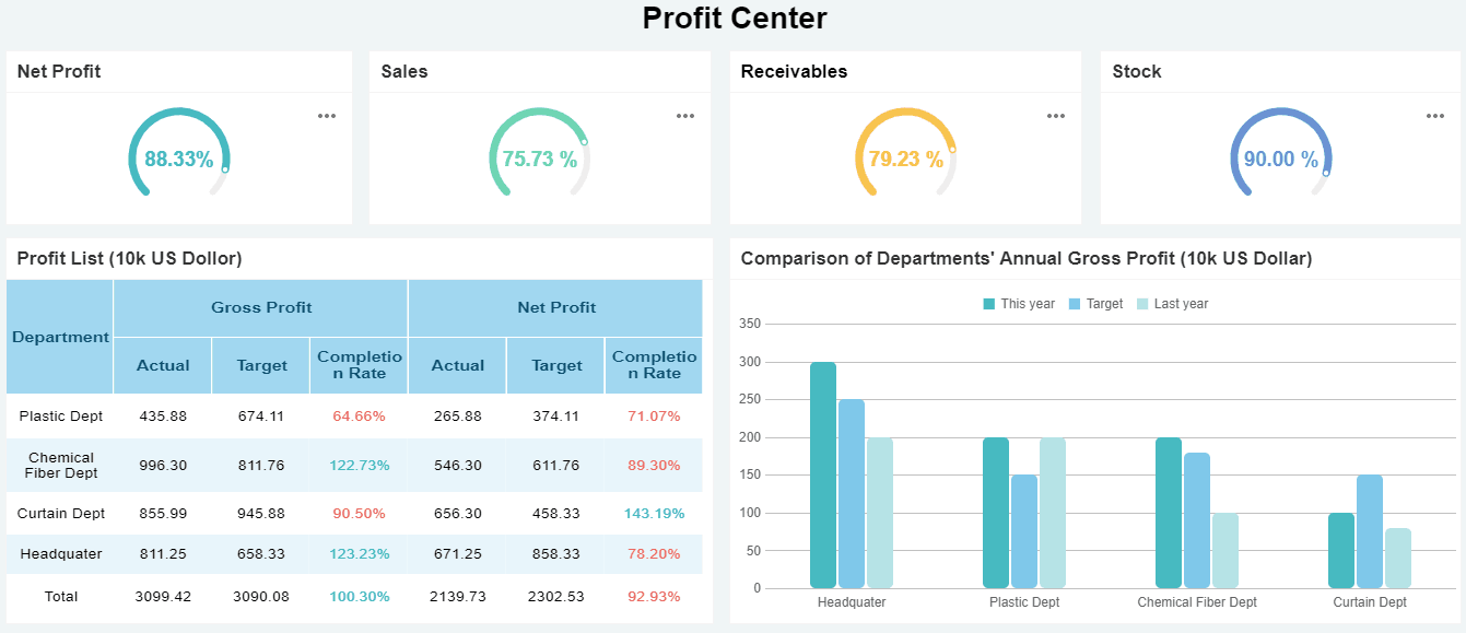
 OPS Dashboard created with FineBI
These metrics are especially useful in service desks, fulfillment operations, shared services, dispatch environments, and high-volume processing teams.
Quality, reliability, and service metrics
Operational speed without quality is expensive. This section of an ops dashboard should show whether work is being completed accurately, consistently, and within service commitments.
Key Metrics (KPIs):
- Error rate: Percentage of transactions, jobs, or cases completed with defects or rework.
- First-pass resolution: Share of issues resolved correctly without reopening or escalation.
- SLA attainment: Percentage of work completed within agreed service targets.
- Uptime: Percentage of time systems, services, or assets remain available.
- Mean response time: Average time between issue creation and first response.
- Mean time to resolution (MTTR): Average time needed to fully resolve an issue.
- Incident volume: Number of issues, outages, or service disruptions during a period.
- Incident trend: Direction of incident volume over time to identify worsening patterns.
- Reopen rate: Share of previously completed work that returns for further action.
These metrics are non-negotiable in IT operations, customer support, service delivery, and regulated environments where consistency matters as much as speed.
Resource and team activity metrics
Many operational issues come from resource imbalance rather than demand alone. A strong ops dashboard should make staffing, workload distribution, and handoff risks visible.
Key Metrics (KPIs):
- Staffing level: Number of available employees, agents, technicians, or operators on shift.
- Shift coverage: Percentage of required staffing filled by time slot or location.
- Workload balance: Distribution of tasks or cases across individuals or teams.
- Handoff efficiency: Speed and success rate of moving work between teams or stages.
- Utilization by team or role: Relative workload compared with planned capacity.
- Absence rate: Share of scheduled staff unavailable during a period.
- Overtime hours: Extra hours worked beyond standard scheduling, often a stress indicator.
- Tasks per employee: Average task load handled by each team member.
- Escalation rate: Percentage of work transferred upward due to complexity, delay, or risk.
These metrics help operations leaders prevent burnout, reduce idle time, and identify where process flow is breaking between functions.
Leading vs. lagging indicators
A mature ops dashboard balances what has already happened with signals that warn what is about to happen. This is where many teams fall short. They report outcomes after the fact instead of giving managers a chance to intervene early.
Leading indicators are forward-looking signals. They include rising backlog, increasing queue times, lower staffing coverage, abnormal alert volume, or declining first response speed.
Lagging indicators are outcome measures. They include missed SLAs, customer complaints, downtime totals, and monthly throughput achieved.
Both matter. But if your dashboard is overloaded with lagging indicators, it becomes a scoreboard rather than a management tool.
Core Elements to balance:
- Leading indicators: Queue growth, alert spikes, staff shortages, utilization pressure, and delays forming in early process stages.
- Lagging indicators: SLA misses, downtime, defect rates, final output, and cost overruns.
- Exception thresholds: Target bands that show when a leading signal needs intervention.
- Trend context: Historical comparison that shows whether a problem is isolated or systemic.
Best Layouts for Building an Effective Ops Dashboard
Layout drives usability. Even with the right KPIs, a poorly structured ops dashboard slows decision-making. The best design mirrors how users think and act under pressure.
Executive summary layout
This layout is ideal for executives, regional managers, and department heads who need a fast performance snapshot. Put the most important KPIs in a top-row summary and support them with compact trend visuals underneath.
A strong executive summary layout typically includes:
- KPI cards for backlog, SLA attainment, output, uptime, and staffing coverage
- Period-over-period trend lines
- Top risks or exception lists
- Filters for business unit, site, region, or service line
This format works best for daily reviews, leadership meetings, and high-level performance checks. It is not built for detailed queue management. It is built for fast scanning and prioritization.
Operational command-center layout
This is the classic ops dashboard for active monitoring. It is ideal for network operations centers, service desks, logistics control towers, and dispatch teams.
The command-center layout should prioritize:
- Live status indicators
- Alerts and threshold breaches
- Current queue volumes
- Maps for location-based operations
- Drill-downs into incidents, regions, or process stages
The design should answer: what needs attention right now? Use color sparingly but deliberately. Red should mean immediate action, not general decoration.
 Dashboard created with FineBI
This layout is especially effective when displayed on large screens in shared operational spaces or used during shift management and incident response.
Team workflow layout
Some operations teams do not think in terms of enterprise KPIs first. They think in terms of workflow stages, ownership, and handoffs. In these environments, the best ops dashboard follows the actual process.
You can organize panels by:
- Process stage such as intake, assignment, execution, QA, closure
- Owner such as team, supervisor, or technician group
- Region such as zone, branch, or territory
- Service line such as product family, queue type, or delivery channel
This layout helps managers see where work accumulates, where transfers break down, and where accountability is unclear. It is very effective in shared services, field operations, claims processing, and order management.
Design principles that improve usability
The most effective ops dashboard is usually the simplest one that still supports action. Enterprise teams often overbuild dashboards by adding too many widgets, too many colors, and too many metrics without clear priority.
Use these practical design principles:
- Keep charts simple: Use line charts, bar charts, tables, and KPI cards before using complex visuals.
- Reduce clutter: Every widget should support a decision or trigger an action.
- Apply consistent color rules: Green, amber, and red should always mean the same thing.
- Make exceptions obvious: Highlight outliers, overdue work, and breached thresholds.
- Use logical grouping: Place related metrics together by workflow, audience, or urgency.
- Support drill-downs: Start with summary views and allow deeper analysis only when needed.
- Optimize for scanning: Key information should be visible within seconds.
A dashboard should reduce cognitive load, not increase it.
How to Build an Ops Dashboard Step by Step
Building an ops dashboard that teams actually use requires more than connecting data and dropping in charts. You need governance, context, and operational fit.
Start with goals, users, and decisions
Before choosing any KPI, define the operational decisions the dashboard must support. This is where experienced teams separate useful dashboards from vanity dashboards.
Ask:
- Who is the primary user: executive, manager, supervisor, analyst, or frontline operator?
- What decisions should they make using this dashboard?
- How often do they need fresh data: real time, every 15 minutes, hourly, daily?
- What action should occur when a metric moves outside target?
Best practice: create one primary use case per dashboard. If one screen tries to serve executives, analysts, and frontline teams equally, it often serves none of them well.
Step-by-step approach:
- Identify the core business process you need to monitor.
- Define the users and their decision moments.
- List the top 5 to 8 KPIs tied directly to those decisions.
- Separate nice-to-have metrics from must-have metrics.
- Confirm what action each KPI should trigger.
Choose data sources and refresh cadence
A dashboard is only as trustworthy as its data pipeline. Operations teams often make the mistake of combining multiple inconsistent exports without standard definitions or refresh logic.
Choose source systems that represent real operational activity, such as:
- Ticketing or case management systems
- ERP and order management platforms
- WMS and TMS platforms
- CRM and service systems
- Workforce management or HR scheduling tools
- Infrastructure monitoring tools
- IoT or telematics feeds
- Shared operational databases
Then set the refresh cadence based on business urgency:
- Real time or near-real-time for incident response, service status, and active queues
- 15 to 60 minutes for dispatch, staffing, and high-volume workflow monitoring
- Daily for trend analysis, site comparison, and less time-sensitive operational reviews
Do not default everything to real time. That raises complexity and can create noise. Match refresh speed to operational value.
Define thresholds, alerts, and ownership
Without thresholds and ownership, an ops dashboard becomes a passive display. Teams see issues but do not know whether they matter or who should act.
For each critical metric, define:
- Target range
- Warning threshold
- Critical threshold
- Escalation path
- Named owner
- Expected response
For example, if backlog aging exceeds 48 hours, the service manager may review queue allocation. If uptime falls below 99.5%, the IT operations lead may trigger incident protocol. If shift coverage drops below plan, workforce scheduling may initiate contingency staffing.
This structure turns your dashboard into an operational control mechanism rather than a reporting interface.
Test, refine, and document the dashboard
No first version of an ops dashboard is perfect. Usage feedback is essential. Observe how teams interact with it during actual meetings, escalations, and handovers.
Refinement should focus on three questions:
- Which metrics are heavily used?
- Which visuals create confusion?
- Which widgets never influence action?
Then document the dashboard clearly. Every metric should have:
- A business definition
- A calculation rule
- A source system
- A refresh frequency
- An owner
- An action expectation
This documentation is what prevents future disputes over metric meaning and keeps the dashboard reliable as teams and systems evolve.
Consultant best practices for implementation:
-
Pilot with one team first
Start with a focused operational use case before rolling out enterprise-wide. -
Limit the first release
Launch with essential KPIs only. Expand after adoption is proven. -
Build for exceptions, not just averages
Managers need to see what is wrong now, not just the overall monthly mean. -
Review dashboard effectiveness monthly
Processes, volumes, and priorities change. The dashboard must change too. -
Train users on action logic
A good dashboard is not self-executing. Teams need to know how to respond.
Real-World Ops Dashboard Examples and Common Use Cases
Different operations teams need different dashboard structures. The right design depends on what is being monitored, how quickly action is required, and how distributed the work is.
Service and support operations
In service and support teams, an ops dashboard usually centers on queue health and SLA delivery. Managers need to know whether ticket volumes are rising, whether response commitments are at risk, and whether specific teams are overloaded.
Common components include:
- Open ticket volume by priority
- SLA attainment by queue or team
- First response time
- MTTR
- Escalation and reopen rates
- Incident trend by hour or day
- Agent workload and availability
This type of dashboard supports daily standups, manager reviews, and escalation control. It is especially effective when combining summary KPIs with drill-down tables of at-risk tickets.
Field, logistics, and location-based operations
Location-based operations need a more spatial view. A standard list or chart is often not enough. Maps, route overlays, and regional comparisons become central.
Typical metrics include:
- Route status and delay counts
- Delivery completion rate
- On-time arrival percentage
- Regional demand volume
- Asset or vehicle visibility
- Technician or driver coverage
- Inventory or order movement by geography
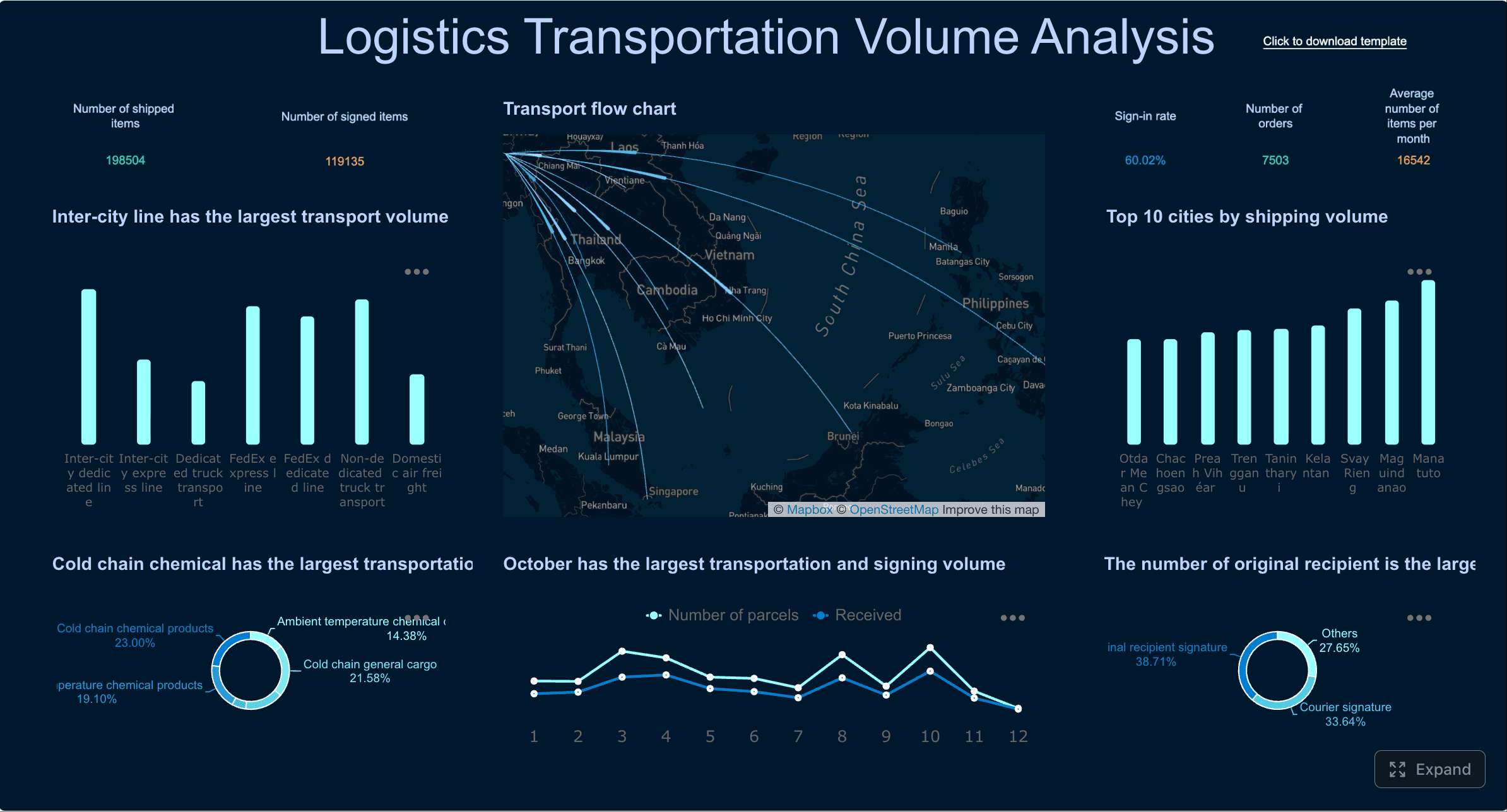 Dashboard created with FineBI
For distributed operations, the ops dashboard should allow users to move from enterprise view to region, site, or route level quickly. Geospatial context often reveals issues that trend charts alone can hide.
IT and infrastructure operations
IT teams need an ops dashboard that brings technical health and service risk into one place. The goal is not just to show alerts, but to connect alerts to business service impact.
Core dashboard elements often include:
- Server and application health
- Service availability and uptime
- Alert volume by severity
- Open incidents and active outages
- Response and resolution times
- Capacity utilization
- Error trends
- Dependency or environment status
The best IT ops dashboards distinguish noise from true operational risk. They show what is degraded, what is failing, and what requires action now.
Multi-site and franchise operations
For multi-site environments, the ops dashboard should support comparison and standardization. Leaders need to know which locations are underperforming, which are improving, and which require intervention.
Useful views include:
- Site-by-site performance comparison
- Ranking tables for output, service quality, or compliance
- Staffing and demand by location
- Variance from target by site
- Trend lines across regions
- Exception flags for low-performing branches
This format helps enterprise operators replicate best-performing site behaviors while addressing underperformance quickly.
Common Mistakes to Avoid and Final Tips
Many ops dashboard projects fail for predictable reasons. The issue is rarely the visualization tool alone. It is usually poor scope control, weak governance, or lack of operational alignment.
Avoid these common mistakes:
- Overcrowding the dashboard with too many KPIs, widgets, and visual types
- Mixing strategic and real-time metrics on one screen without clear separation
- Using inconsistent metric definitions across teams or sites
- Showing metrics without owners or defined response actions
- Failing to distinguish leading from lagging indicators
- Ignoring refresh logic and surfacing stale data as if it were current
- Not revisiting the dashboard regularly as processes, systems, and priorities change
Final practical tips:
- Start with the decision, not the chart.
- Design for action under time pressure.
- Keep the first screen focused on exceptions and core KPIs.
- Make ownership explicit for every important measure.
- Review usage data and stakeholder feedback continuously.
From Manual Reporting to Scalable Ops Visibility With FineBI
Building a high-quality ops dashboard manually is possible, but it is rarely efficient at enterprise scale. You have to connect multiple systems, standardize definitions, manage refresh schedules, design layouts for different users, and maintain everything as processes evolve. That complexity is exactly why many dashboards become outdated or underused.
This is where FineBI becomes the practical enabler. Instead of stitching together fragmented reports and hand-built visuals, teams can use FineBI to create an ops dashboard with ready-made templates, automated data integration, interactive drill-downs, and governed self-service analysis.

With FineBI, operations teams can:
- Connect to multiple business systems in one environment
- Build executive, command-center, and workflow-based dashboards faster
- Standardize KPI definitions across teams and sites
- Automate refreshes and reduce manual reporting work
- Enable managers to explore root causes without waiting on analysts
- Scale dashboards across departments, regions, and operational layers
In simple terms: building this manually is complex; use FineBI to utilize ready-made templates and automate this entire workflow. That lets your team spend less time assembling reports and more time improving performance, reducing risk, and making faster operational decisions.
FAQs
An ops dashboard gives operations teams a live view of performance, workload, and service health so they can spot issues early and act faster. It is commonly used during daily standups, shift handovers, and incident reviews.
The most useful metrics depend on the operation, but common choices include backlog volume, cycle time, throughput, SLA attainment, uptime, MTTR, and staffing or capacity utilization. Focus on metrics that show what is happening now, where performance is off target, and what needs action next.
A static report shows past results at a fixed point in time, while an ops dashboard updates automatically and supports real-time monitoring. Dashboards also make it easier to highlight exceptions, compare trends, and drill into root causes.
Refresh frequency should match the speed of your operation and the decisions the dashboard supports. Many teams use real-time or near-real-time refresh for fast-moving environments and less frequent updates for slower processes.
A strong layout puts the most important KPI cards and alerts at the top, trends in the middle, and detailed breakdowns below. It should stay simple, fit on one screen when possible, and make exceptions easy to notice at a glance.


The Author
Lewis Chou
Senior Data Analyst at FanRuan
Related Articles

How to Build an Investment Portfolio Reporting Dashboard for Executives: KPIs, Benchmarks, and Drill-Down Views
Investment portfolio reporting for executives is not about showing every holding, transaction, and chart your investment team can produce. It is about giving CEOs, CFOs, CIOs, boards, and investment committees a fast, re
Yida YIn
Jun 25, 2026

12 KPI Reporting Examples for Executive Dashboards: What to Show in Weekly, Monthly, and Quarterly Reviews
Executive leaders do not need more data. They need decision ready $1 examples that match how often they review the business and what actions they are expected to take. A weekly $1 should surface fast moving risks and per
Yida YIn
Jun 25, 2026

How to Build a Digital Marketing Reports Dashboard: Executive Examples, KPIs, and Templates
A $1 is the control layer that helps executives and marketing leaders turn scattered channel data into fast, confident decisions. If you are a CEO, CMO, operations director, or marketing analytics lead, the real problem
Yida Yin
May 07, 2026