Dashboard
Talent Acquisition Dashboard: A Scenario-Based Guide to Faster, Better Hiring Decisions
Lewis Chou
May 05, 2026
A talent acquisition dashboard gives hiring leaders one thing most recruiting teams lack: a decision-ready view of what is slowing hiring down, degrading candidate quality, and increasing cost. If you are an HR leader, TA director, operations manager, or executive stakeholder, the real issue is rarely a lack of recruiting data. The problem is that the data sits in disconnected reports, ATS exports, spreadsheets, and recruiter updates that do not clearly answer, “What is happening, why is it happening, and what should we do next?”
A strong dashboard turns hiring activity into operational intelligence. It helps leaders spot bottlenecks early, compare performance across teams and roles, and connect recruiting performance to business outcomes such as headcount attainment, quality of hire, budget efficiency, and workforce readiness.
Raw recruiting reports tell you what happened. A leadership dashboard tells you what needs attention now. That distinction matters when open roles are delaying revenue, burdening teams, or putting strategic initiatives at risk.
All dashboards in this article are created by FineBI
What a talent acquisition dashboard helps leaders see at a glance
A talent acquisition dashboard is designed to help leaders make faster, higher-quality hiring decisions. It should not be a dumping ground for every recruiting metric. It should surface the few measures that explain hiring speed, candidate quality, recruiting efficiency, and pipeline health in a way that supports action.
For example, if time to fill is rising, the dashboard should reveal whether the issue is delayed approvals, weak sourcing, slow interview scheduling, or declining offer acceptance. If application volume looks healthy, the dashboard should also show whether qualified candidate flow is actually improving or whether recruiters are simply processing more unfit applicants.
The best dashboards connect four business dimensions:
- Hiring speed: How quickly roles move from requisition to accepted offer
- Hiring quality: Whether candidates progressing through the funnel are actually strong hires
- Hiring cost and efficiency: Whether effort and spend are producing the right outcomes
- Pipeline health: Whether the current candidate flow can support future hiring targets
Talent acquisition dashboard Key Metrics (KPIs)
Below are the core KPIs that make a talent acquisition dashboard useful for leadership decision-making:
- Time to apply: How long it takes candidates to complete the application process; helps identify friction at the top of the funnel.
- Time to screen: The elapsed time between application and recruiter review; shows screening responsiveness.
- Time to interview: The time from initial qualification to scheduled interview; exposes coordination and capacity issues.
- Time to offer: The time from final interview stage to offer creation; often reflects approval delays.
- Time to fill: Total time from job opening to accepted offer; the primary speed metric for leadership.
- Qualified applicant rate: The percentage of applicants who meet baseline job requirements; reveals source and role targeting quality.
- Stage conversion rate: The percentage of candidates advancing from one stage to the next; identifies funnel leakage.
- Interview-to-offer rate: How often interviews produce viable finalists; useful for evaluating screening precision and interview quality.
- Offer acceptance rate: The percentage of offers accepted; signals competitiveness, candidate experience, and compensation alignment.
- Source effectiveness: The ability of each channel to produce qualified candidates, interviews, offers, and hires—not just volume.
- Quality of hire: A post-hire measure using proxies such as ramp time, retention, performance, or hiring manager satisfaction.
- Recruiter workload: Open req load, active candidates, and stage volume by recruiter; helps balance capacity and productivity.
- Diversity pipeline movement: Representation and progression across stages; highlights equity issues in the hiring process.
- Hiring plan attainment: Progress against approved hiring targets by month, quarter, or business unit.
Talent Acquisition Dashboard Scenario 1: When hiring is slowing down and no one knows why
This is one of the most common executive complaints: “Hiring is taking too long.” The problem is that broad averages do not explain the cause. A good talent acquisition dashboard isolates where cycle time is increasing and whether the issue is local or systemic.
Metrics that reveal bottlenecks across the funnel
When hiring slows, start by breaking cycle time into stage-based metrics rather than relying only on overall time to fill.
Track:
- Time to apply
- Time to screen
- Time to interview
- Time to offer
- Time to fill
Then compare those measures across:
- Teams
- Roles
- Recruiters
- Hiring managers
- Locations
- Business units
This comparison is where bottlenecks become visible. For example:
- Long time to screen may signal recruiter overload or poor ATS workflow discipline.
- Long time to interview often points to interviewer availability, scheduling inefficiency, or excessive interview rounds.
- Long time to offer may indicate compensation approvals or requisition sign-off delays.
- Long time to fill in one function but not another suggests a role-specific market or process issue.
A dashboard should make these patterns obvious through trend lines, stage comparison charts, and filters by role family or recruiter.
Questions leaders should ask when speed drops
A dashboard becomes valuable when it drives sharper operational questions. When hiring speed declines, leaders should ask:
- Are requisition approvals delaying the start of recruiting?
- Is sourcing weak, causing recruiters to wait too long for qualified applicants?
- Are interview panels overloaded or hard to coordinate?
- Are candidates dropping off because the process is too slow or confusing?
- Are delays concentrated in a few roles, or spread across the organization?
- Are these temporary spikes, or recurring process failures?
The goal is to separate one-off exceptions from structural problems. One difficult executive search should not drive system-wide changes. But if multiple teams show elevated time to interview over several months, that is a process design issue, not random variance.
Best practices for diagnosing hiring slowdowns
-
Decompose time to fill into stage-level metrics
Never manage speed with one aggregate metric alone. Break the process into stages so delays can be assigned to the right owner. -
Compare across meaningful dimensions
Slice performance by recruiter, hiring manager, team, location, and role type. Bottlenecks usually hide inside averages. -
Add trend context, not just point-in-time numbers
Weekly and monthly trend views help distinguish temporary disruptions from chronic process drag. -
Pair timing metrics with workload indicators
If screening time rises while recruiter req load also spikes, the fix may be staffing or prioritization—not process redesign.
Talent Acquisition Dashboard Scenario 2: When pipeline volume looks healthy but quality is weak
Many TA teams report strong top-of-funnel activity while hiring managers still complain about poor candidate quality. This is exactly where a talent acquisition dashboard needs to go beyond vanity metrics.
Application volume is not proof of recruiting effectiveness. More candidates can actually create more noise, slow screeners down, and hide weak sourcing strategy.
Signals that quantity is not translating into better hires
To evaluate quality, leaders should look at metrics that show whether candidate flow is producing viable, high-fit hires.
Key indicators include:
- Qualified applicant rate
- Interview-to-offer rate
- Offer acceptance rate
- Quality of hire indicators
- Source effectiveness
These metrics reveal whether pipeline quantity is translating into decision-worthy candidates.
For example:
- A high application count with a low qualified applicant rate suggests poor targeting or a low-friction apply process attracting the wrong audience.
- A low interview-to-offer rate may indicate weak screening criteria, poor intake calibration, or inconsistent interviewer evaluation.
- A low offer acceptance rate can mean compensation mismatch, candidate experience issues, or late-stage process weakness.
- Weak quality of hire despite strong funnel conversion may mean the process is optimized for speed, not fit.
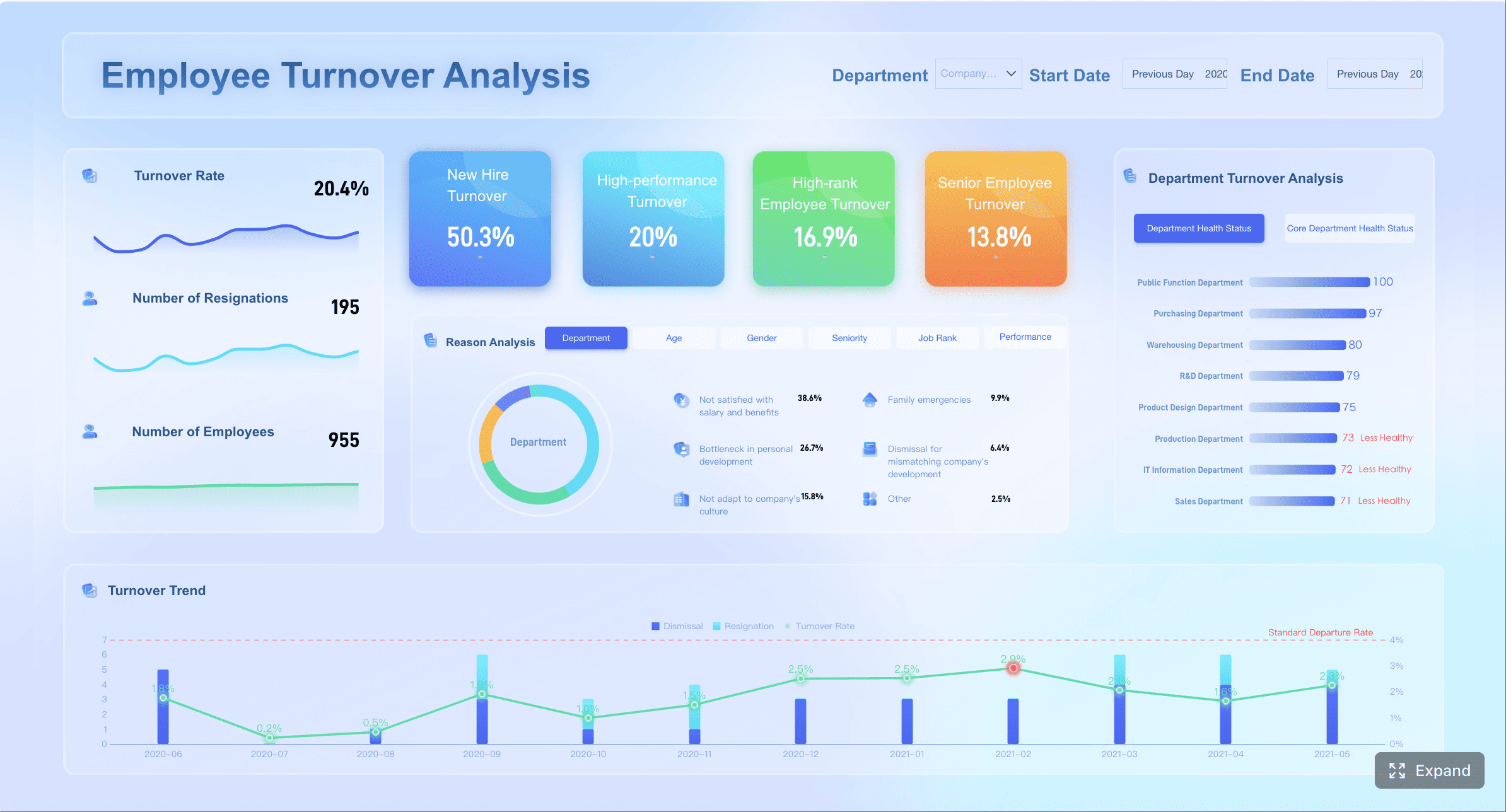
 Talent acquisition dashboard created with FineBI
A useful dashboard shows these metrics side by side rather than in isolation.
Recruitment dashboard examples that expose quality problems
Strong recruitment dashboard examples do not just show candidate counts. They show where quality breaks down.
The most effective views include:
- Source quality dashboard: Compare sources by qualified applicants, interview rates, offers, acceptances, and post-hire outcomes.
- Stage conversion dashboard: Identify where promising volume fails to convert into finalists or hires.
- New-hire outcomes dashboard: Connect recruiting inputs to retention, performance, or manager satisfaction.
- Segment analysis dashboard: Highlight quality patterns by role type, location, seniority, and hiring manager.
This side-by-side structure is critical. A source that generates the most applicants may produce the fewest strong hires. A location with slower hiring may still outperform on quality of hire. Without these comparisons, teams optimize the wrong thing.
Best practices for improving hiring quality through dashboards
-
Stop rewarding top-of-funnel volume alone
Make qualified applicant rate and downstream conversion standard dashboard metrics. -
Measure source effectiveness end to end
Evaluate channels based on hires and hire quality, not clicks or applications. -
Segment quality by role and hiring context
Quality patterns differ by function, geography, and level. One global average hides too much. -
Introduce post-hire feedback loops
Add hiring manager satisfaction, early retention, or ramp performance to validate whether recruiting inputs are producing strong outcomes.
Talent Acquisition Dashboard Scenario 3: When executives want a clearer story behind recruiting performance
Executives do not want a dense recruiting operations report. They want a concise, defensible story: Are we hiring fast enough, hiring well enough, spending efficiently, and staying on track against business demand?
This is where dashboard architecture matters. One dashboard cannot serve every audience equally well. Recruiting leaders need diagnostic depth. Executives need business-aligned summary views. Recruiters need operational detail.
The 6 hiring dashboards every talent acquisition team needs
A mature talent acquisition function usually needs six distinct dashboard views.
1. Executive summary dashboard for trend visibility and business alignment
This is the leadership view. It should answer:
- Are we on plan?
- Is hiring speeding up or slowing down?
- Are quality and acceptance rates improving?
- Where are the biggest risks?
Include metrics such as time to fill, open roles, hires vs plan, offer acceptance, pipeline health, and critical role status.
2. Funnel dashboard for conversion and bottleneck analysis
This dashboard shows candidate flow across stages and highlights leakage, delays, and bottlenecks.
Include:
- Stage volume
- Stage conversion rate
- Stage aging
- Drop-off rates
- Time in stage
3. Source performance dashboard for channel effectiveness
This view helps teams reallocate sourcing effort and budget.
Include:
- Applicants by source
- Qualified applicants by source
- Interviews, offers, hires by source
- Cost per hire by source
- Quality of hire by source where available
4. Recruiter performance dashboard for workload and output balance
This dashboard supports fair distribution of work and better coaching.
Include:
- Reqs per recruiter
- Active candidates per recruiter
- Time to screen
- Time to fill
- Offer volume
- Hire outcomes
5. Diversity dashboard for representation and stage-by-stage movement
This should focus on movement, not just static representation.
Include:
- Representation by stage
- Conversion by demographic segment
- Drop-off analysis
- Offer rates
- Acceptance rates
6. Forecast and capacity dashboard for hiring plan progress
This is essential for workforce planning.
Include:
- Approved headcount vs hires completed
- Forecasted hires vs actuals
- Recruiter capacity
- Open requisition aging
- Future pipeline sufficiency
Recruiting dashboards as a guide to recruitment analytics
The purpose of recruiting dashboards is not to display every available metric. It is to match each dashboard to a specific decision, audience, and meeting cadence.
A practical rule:
- Executives need strategic summary dashboards reviewed weekly or monthly.
- TA leaders need operational dashboards reviewed weekly.
- Recruiters and coordinators need workflow dashboards reviewed daily.
- Finance and workforce planning teams need forecast dashboards aligned to monthly and quarterly planning cycles.
This structure turns recruitment analytics into a management system rather than a reporting exercise. It also forces discipline: if a metric does not support a decision, it probably does not belong on the dashboard.
How to create a talent acquisition dashboard step by step
The most effective dashboards are built backward from decisions, not forward from whatever fields happen to exist in the ATS.
Start with decisions, not just available data
Before selecting charts or metrics, define the business questions the dashboard must answer.
Examples:
- Why are we missing hiring targets in specific teams?
- Where is hiring slowing down?
- Which sources produce the best hires?
- Are candidate quality and acceptance rates improving?
- Do we have enough recruiter capacity to support forecast demand?
Then define success criteria for:
- Speed
- Quality
- Efficiency
- Candidate experience
This prevents a common failure mode: building a dashboard around convenient data rather than high-value decisions.
Build the dashboard structure that actually works
Once the decisions are clear, design the structure around audience-specific use cases.
Step 1: Select the core metrics
Choose a short list of essential KPIs for each audience. Avoid clutter. Every metric should answer one of three questions:
- What is happening?
- Why is it happening?
- What action should we take?
Step 2: Add comparison views
Dashboards become useful when users can compare metrics by:
- Team
- Role
- Recruiter
- Location
- Hiring manager
- Time period
- Source
Step 3: Include filters and drill-downs
Executives may start with summaries, but TA leaders need to investigate exceptions. Drill-downs should allow users to move from company-wide trends to business unit, role family, and recruiter-level views.
Step 4: Standardize metric definitions
This is non-negotiable. Finance, HR, recruiting, and business leaders must interpret the numbers the same way.
Examples of definitions to standardize:
- When does time to fill start and end?
- What counts as a qualified applicant?
- How is source attribution assigned?
- What qualifies as an accepted offer?
- How is quality of hire measured?
Without definition control, dashboards create debates instead of decisions.
Launch, review, and improve over time
A dashboard should not be rolled out as a one-time reporting artifact. It should be treated like an operating product.
Step 1: Test with real hiring scenarios
Before broad rollout, validate the dashboard against real cases:
- A role with long time to fill
- A role with weak conversion
- A business unit behind plan
- A source that appears high-volume but low-quality
If the dashboard cannot explain those scenarios quickly, it needs redesign.
Step 2: Assign ownership
Set clear ownership for:
- Data quality
- Metric definitions
- Refresh cadence
- Dashboard maintenance
- Stakeholder training
Step 3: Establish review rhythms
Use recurring reviews to drive behavior:
- Daily for recruiter workflow dashboards
- Weekly for funnel and source dashboards
- Monthly for executive and forecast dashboards
Step 4: Create feedback loops
Business needs change. Dashboards should evolve with hiring strategy, organizational priorities, and leadership questions.
Consultant-recommended implementation best practices
-
Design for decisions first
Build around leadership questions and operational actions, not data availability. -
Keep the executive layer simple
Senior leaders need a clear story with exceptions and trends, not a wall of charts. -
Use drill-downs to preserve detail without clutter
Summary first, diagnostics second. -
Treat metric definitions as governance, not preference
Alignment on definitions is essential for trust and adoption. -
Review dashboard usefulness quarterly
Remove metrics that are not driving decisions and add views tied to current hiring priorities.
Common mistakes that make hiring dashboards less useful
Many hiring dashboards fail not because of technology, but because of poor design logic and weak governance.
The most common mistakes include:
-
Overloading the view with too many metrics and not enough context
If everything is important, nothing is actionable. -
Reporting activity without linking it to outcomes or decisions
Candidate counts, calls, and screens are not enough unless they explain hires, quality, or plan attainment. -
Ignoring data quality, inconsistent definitions, and delayed updates
Leaders stop trusting dashboards quickly when numbers conflict with operational reality. -
Failing to tailor views for executives, recruiting leaders, and frontline recruiters
One generic dashboard usually serves no audience well.
A practical test is simple: can each dashboard user answer what action they should take after looking at the screen? If not, the dashboard is informative but not operational.
Build the methodology, then automate it with FineBI
The framework is straightforward: define the decisions, standardize the KPIs, build audience-specific views, and review the dashboard against real hiring scenarios. The challenge is execution. Building this manually is complex; use FineBI to utilize ready-made templates and automate this entire workflow.
 Utilize ready-made templates and automate this entire workflow with FineBI
FineBI helps talent acquisition teams move faster by turning fragmented recruiting data into usable, interactive dashboards without relying on endless spreadsheet work or custom reporting cycles. Instead of stitching together ATS exports, source reports, and recruiter updates by hand, teams can centralize hiring data, apply consistent metric definitions, and deliver dashboards tailored to executives, TA leaders, and recruiters.
With FineBI, organizations can:
- Use ready-made dashboard templates for executive hiring summaries, funnel analysis, source performance, and recruiter productivity
- Automate data refreshes to reduce reporting lag
- Create filters and drill-downs for teams, roles, locations, and recruiters
- Standardize KPI definitions across HR, finance, and leadership
- Scale from one dashboard to a full recruitment analytics framework
For enterprise decision-makers, the value is not just faster reporting. It is better hiring control. A well-built talent acquisition dashboard gives leaders earlier visibility into bottlenecks, stronger evidence behind resource decisions, and a clearer path to faster, better hiring outcomes. FineBI makes that model operational.
FAQs
A strong talent acquisition dashboard should focus on a small set of decision-making metrics such as time to fill, stage-by-stage cycle times, conversion rates, offer acceptance, source effectiveness, and quality of hire. The goal is to show what is happening, why it is happening, and where action is needed.
It breaks the hiring process into stages like screening, interviewing, and offer creation so leaders can see exactly where delays are building up. That makes it easier to fix issues such as approval bottlenecks, recruiter overload, or scheduling problems.
Leadership usually cares most about hiring speed, candidate quality, pipeline health, and cost efficiency. Common priority metrics include time to fill, qualified applicant rate, stage conversion rate, offer acceptance rate, hiring plan attainment, and quality of hire.
A bottleneck becomes visible when one stage takes much longer than expected or has an unusually low conversion rate compared with other teams, roles, or periods. A dashboard makes this easier to spot through stage-level timing and trend comparisons.
Most teams should review it weekly for operational decisions and monthly for leadership and planning discussions. More frequent reviews may be useful when hiring volume is high or critical roles are at risk.


The Author
Lewis Chou
Senior Data Analyst at FanRuan
Related Articles

How to Build an Investment Portfolio Reporting Dashboard for Executives: KPIs, Benchmarks, and Drill-Down Views
Investment portfolio reporting for executives is not about showing every holding, transaction, and chart your investment team can produce. It is about giving CEOs, CFOs, CIOs, boards, and investment committees a fast, re
Yida YIn
Jun 25, 2026

12 KPI Reporting Examples for Executive Dashboards: What to Show in Weekly, Monthly, and Quarterly Reviews
Executive leaders do not need more data. They need decision ready $1 examples that match how often they review the business and what actions they are expected to take. A weekly $1 should surface fast moving risks and per
Yida YIn
Jun 25, 2026

How to Build a Digital Marketing Reports Dashboard: Executive Examples, KPIs, and Templates
A $1 is the control layer that helps executives and marketing leaders turn scattered channel data into fast, confident decisions. If you are a CEO, CMO, operations director, or marketing analytics lead, the real problem
Yida Yin
May 07, 2026