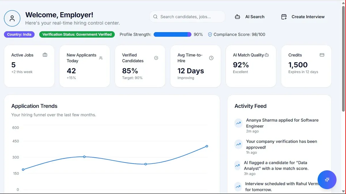
A project management dashboard template only creates value when it helps leaders make faster, better decisions. That is the real scenario most organizations face: teams build detailed status reports, but executives need a compact operating view that shows what is on track, what is slipping, where money is moving, and what decisions need attention now.
For PMO leaders, operations directors, CIOs, and transformation sponsors, the pain is familiar. Dashboard reviews get bogged down in task-level noise. Budget issues surface too late. Risks are buried in project notes. And the meeting ends without clear actions. An executive-ready dashboard fixes that by turning fragmented project data into a decision system.
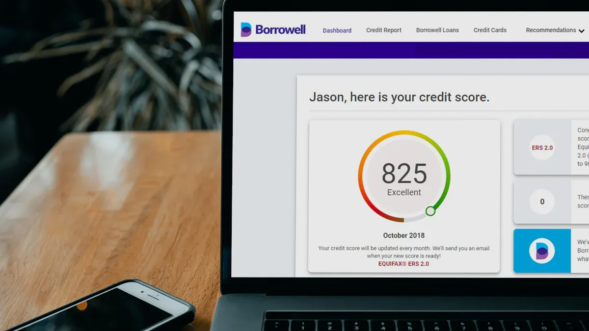
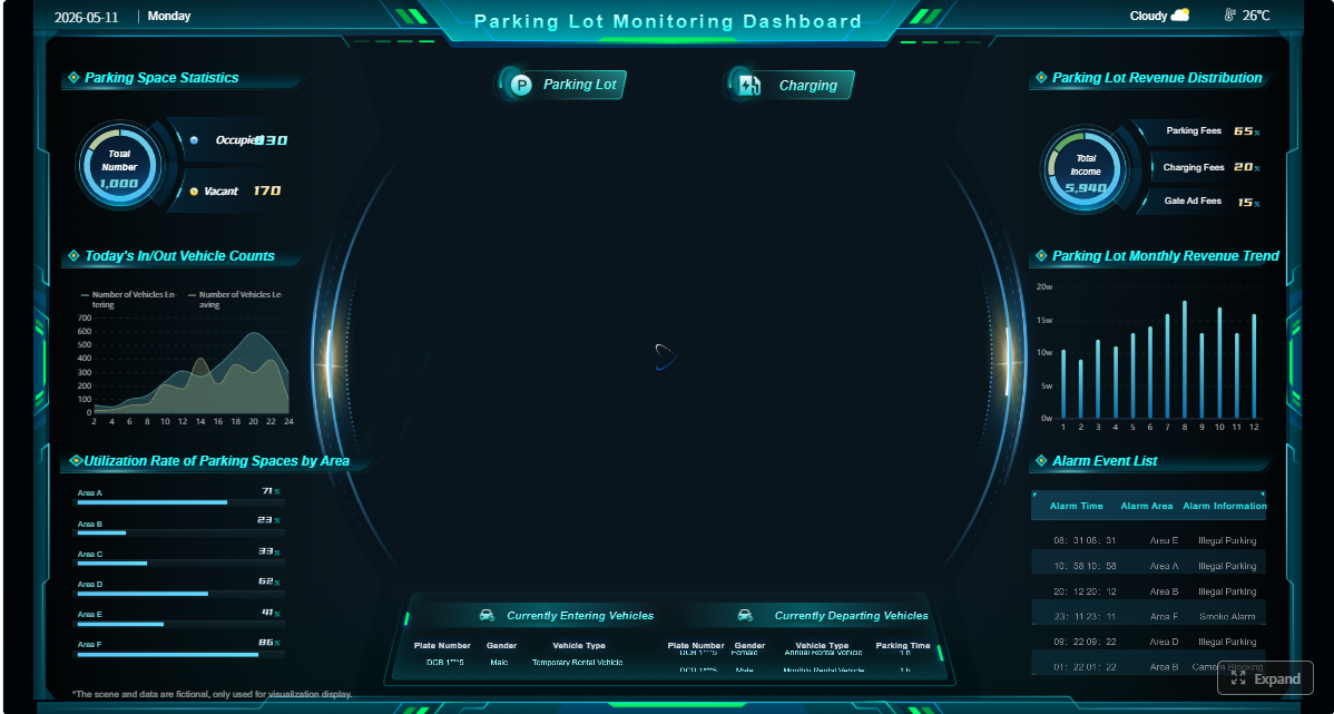 Click To Try The Dashboard
There is a clear gap between the dashboards teams build and the dashboards executives actually review. Teams often focus on activity: tasks completed, tickets closed, hours logged, and lengthy status commentary. Executives care about a different layer: delivery confidence, financial exposure, strategic impact, and decisions required.
A strong project management dashboard template bridges that gap by translating project operations into leadership signals.
Executives typically want answers to five questions in under a minute:
That is why a reporting dashboard is not the same as a decision-making dashboard.
A reporting dashboard tells people what happened.
A decision-making dashboard tells leaders what requires action.
A reporting dashboard may include dozens of metrics, raw project updates, and supporting detail. A decision-making dashboard is curated. It surfaces only the signals that affect priorities, funding, risk response, and execution control.
To make a dashboard useful at the leadership level, include a structured set of KPIs that support action:
These KPIs form the backbone of an executive-ready project management dashboard template. If a metric does not influence a real decision, it likely does not belong on the first screen.
The first section should answer a simple question: how healthy is the portfolio right now?
This is where concise red-yellow-green indicators work well. They let executives scan multiple initiatives and immediately identify where attention is needed. Add a trend signal next to each project so leaders can distinguish between a temporary issue and a worsening pattern.
A strong portfolio health view should show:
The mistake many teams make is filling this section with too many categories. Keep it tight. Executives want a summary that can be absorbed in seconds.
A dashboard that does not clearly show deadlines is incomplete. Leadership teams need to know which milestones are due soon, which dates were missed, and whether completion forecasts remain credible.
This section should make schedule risk visible without requiring deep interpretation. A concise milestone panel or timeline summary can highlight:
Delivery confidence is especially important. A project may still be technically “green” while leading indicators suggest slippage is likely. That nuance matters to executives managing dependencies across programs.
Financial and capacity visibility are non-negotiable in an executive dashboard. If leaders cannot see whether spending and staffing align with plan, they cannot govern the portfolio effectively.
Your project management dashboard template should compare:
This is where dashboard design matters. Use exception-based views. Rather than showing every financial detail, flag material variances and emerging constraints.
For example, if a project is only 40% complete but has consumed 70% of its budget, the dashboard should surface that as an executive exception, not bury it in a supporting report.
Executives do not need the full risk register. They need the shortlist of issues that require intervention now.
This section should distinguish between operational blockers that teams can handle and strategic escalations that need sponsor attention. That distinction prevents unnecessary escalation while ensuring critical risks do not sit unresolved.
A practical layout includes:
This turns the dashboard into a working governance tool rather than a passive report.
Project reporting becomes executive-ready when it connects delivery activity to business outcomes. Leaders fund initiatives because they expect measurable impact, not because they want to see a task plan executed perfectly.
Use this section to connect progress with outcomes such as:
Simple trend lines work well here. The goal is not advanced analytics for its own sake. The goal is to show whether business performance is moving in the right direction as projects advance.
When a dashboard includes both delivery metrics and business impact metrics, executives can make smarter trade-off decisions across the portfolio.
One reason dashboards fail is that they describe problems without naming who owns them. An executive review should always make accountability visible.
For each major priority area, identify:
This is where your project management dashboard template moves beyond observation into execution management. Clear ownership reduces meeting ambiguity and shortens follow-up cycles.
If a project is at risk, the dashboard should make it obvious who is accountable for recovery and what support they need from leadership.
The top layer of the dashboard should stay concise. That does not mean shallow. It means well structured.
Executives want a clean summary view. PMO leads, project managers, and operations teams often need more detail. The best dashboard supports both by providing drill-down paths from summary indicators into underlying project, financial, risk, or resource data.
A strong summary-to-detail structure helps users move from:
This layered design improves trust and adoption. Leaders can stay at the executive level until something needs investigation.
This is the most important design principle. Begin by asking what decisions executives make in weekly, monthly, or quarterly reviews.
Typical executive decisions include:
Once those decisions are clear, choose metrics that directly support them. Remove fields that add detail but do not change action. This is where many dashboards become cluttered. Teams include available data instead of useful data.
Best practice: draft the dashboard agenda first, then build the visual layout around those decisions.
A dashboard is only as reliable as its data flow. Most organizations need to pull information from multiple systems, such as:
The update cadence matters just as much as the source. A dashboard refreshed too infrequently loses credibility. A dashboard updated too often can create noise and operational burden.
Best practice: match refresh frequency to the decision cycle.
For example:
If users do not trust the dashboard, they will revert to side spreadsheets and manual status calls. Consistency builds confidence.
Standardize:
Then simplify the visual layer. Use whitespace, logical grouping, and restrained chart selection. Avoid decorative charts that look impressive but do not support decision-making.
Best practice: if a senior leader cannot explain the dashboard structure after one review, the design is too complex.
Here are the practical steps I recommend when deploying a project management dashboard template in an enterprise setting:
Define governance before visualization
Decide who owns each metric, how status is calculated, and when updates are due. This prevents reporting disputes later.
Use exception thresholds
Set explicit rules for when schedule, cost, or risk indicators change status. This keeps reporting objective and repeatable.
Pilot with one executive audience first
Start with a single governance forum, refine based on feedback, then scale. Broad rollout without audience validation usually leads to low adoption.
Review the dashboard in live meetings
Dashboards improve when used in active decision forums, not just distributed by email. Real usage exposes what matters and what can be removed.
Excel is often the fastest way to stand up a dashboard for smaller teams, early-stage PMOs, or departments that need a low-cost starting point. It works especially well when:
An Excel-based project management dashboard template can provide immediate structure and help teams clarify what executives actually want to see.
But Excel also has clear limits. Manual updates create lag. Version control becomes difficult. Drill-down paths are weaker. Cross-functional data integration is cumbersome. And trust declines when different teams maintain different copies.
So Excel is a useful starting point, not always the ideal long-term operating model.
There are many free templates on the market, but visual polish is not the same as executive usefulness. When evaluating free templates, look for these qualities:
Also compare single-project layouts with portfolio-level views. A project manager may need task-level progress detail, while an executive sponsor needs cross-project trade-off visibility. Those are different use cases, and the dashboard template should reflect that.
PMO and operations teams usually structure dashboards around governance needs, not just project mechanics. That often means combining three layers:
This is a smart pattern to follow. Do not copy another organization’s layout blindly. Instead, adapt proven structures to your own decision cycles, stakeholders, and data maturity.
Even a visually polished dashboard can fail if it does not support executive decision-making. The most common problems are predictable.
First, teams overload the view with too many charts, metrics, and project details. This creates cognitive friction. Leaders stop scanning because nothing stands out.
Second, dashboards often report activity instead of outcomes. Completed tasks are useful operationally, but executives care more about progress against commitments, risk exposure, and business impact.
Third, inconsistent definitions destroy trust. If “on track” means one thing for IT and another for operations, leadership confidence drops quickly.
Fourth, teams fail to tailor the dashboard to the audience and review cadence. A weekly PMO review needs different depth than a monthly executive steering committee.
To avoid these mistakes, pressure-test every section with a simple question: What decision does this support?
If the answer is unclear, remove or redesign it.
A dashboard should evolve with the portfolio. Priorities change. Teams change. Funding rules change. Strategic initiatives shift. A static dashboard gradually loses relevance.
Review the dashboard regularly with stakeholders and trim low-value sections. Ask which elements actually drive discussion in meetings and which are ignored. Expand the former. Eliminate the latter.
You should also update measures as reporting needs mature. For example, many organizations begin with basic status and budget tracking, then later add delivery confidence, forecast quality, dependency risk, or business outcome trends.
Most importantly, treat the dashboard as a living management tool. It should support governance, prioritization, and action, not just archive historical status.
Building an executive-grade project management dashboard template manually is possible, but it gets complex fast. You need data integration, metric standardization, refresh governance, exception logic, drill-down paths, and audience-specific views. In most enterprises, that manual process becomes slow, fragile, and hard to scale.
This is where FineBI becomes the practical answer.
With FineBI, teams can utilize ready-made templates and automate this entire workflow. Instead of stitching together spreadsheets and disconnected reports, you can build a centralized dashboard environment that connects project, financial, risk, and resource data into one trusted executive view.
FineBI is especially valuable when you need to:
For organizations serious about turning dashboards into decision systems, FineBI helps move beyond static reporting. It provides the structure, automation, and template foundation needed to deliver dashboards executives will actually use.
If your current reporting process depends on manual updates, fragmented files, and meeting-by-meeting rework, the next step is clear: stop rebuilding the same dashboard every cycle. Use FineBI to standardize the model, automate delivery, and give leadership a dashboard built for action.
An executive-ready template should show portfolio health, milestone status, budget variance, resource capacity, major risks, and decisions that need escalation. The goal is to help leaders understand what needs action in under a minute.
A standard status report explains what happened in detail, while an executive dashboard highlights what is off track, what is changing, and where decisions are needed. It removes task-level noise and focuses on business impact.
The most useful KPIs usually include overall project health, schedule variance, budget variance, forecast at completion, milestone attainment, resource utilization, and critical risk count. These metrics help executives spot delivery and financial issues early.
Excel can work for simple or early-stage dashboards, especially for single projects or small portfolios. As reporting needs grow, teams often need more automation, live data updates, and easier cross-project visibility than spreadsheets can provide.
It should be updated often enough to support real decisions, which for many teams means weekly at minimum and more frequently for fast-moving programs. The right cadence depends on project complexity, executive review cycles, and how quickly risks can change.

The Author
Yida YIn
FanRuan Industry Solutions Expert
Related Articles

How to Build a Training Dashboard That Proves Learning Impact to Leadership
A training dashboard should do one thing exceptionally well: help leadership decide whether learning investments are improving workforce capability and business performance. If your dashboard only shows course completion
Yida YIn
May 10, 2026
What Is a PM Dashboard? A Practical Guide to the Metrics, Views, and Decisions That Matter
A pm dashboard is not just a reporting screen. It is the operating view teams use to answer urgent delivery questions fast: Are we on schedule? Are we overspending? Where are the blockers? Who is overloaded? What needs l
Yida YIn
May 10, 2026
How to Choose the Right Financial Dashboard Template for Executive Reporting
Choosing the right $1 template is not a design decision. It is a reporting strategy decision that directly affects how fast executives can detect risk, approve action, and steer the business. If you are a CFO, finance ma
Yida YIn
May 10, 2026


