Choosing a BI platform is rarely about features alone. It is about how your organization makes decisions, how often questions change, how much governance you need, and what kind of outputs stakeholders actually use.
That is why tableau reporting deserves a more practical evaluation than the usual “best BI tool” debate. Tableau is excellent in some environments and less ideal in others. For many teams, it is a powerful visual analytics layer. For others, a more standardized reporting tool—or a platform like FineReport—may deliver faster time to value.
This guide compares Tableau with other BI tools through the lens that matters most to business leaders: usability, reporting depth, dashboard quality, governance, cost, and organizational fit.
Tableau Reporting vs Other BI Tools at a Glance
Before comparing platforms, it helps to define three terms that are often used interchangeably but should not be.
- Reporting usually refers to recurring, structured outputs such as monthly management reports, finance packs, or operational summaries.
- Dashboards provide at-a-glance monitoring of KPIs, trends, exceptions, and business performance.
- Analytics goes a step further, enabling users to explore, filter, drill down, compare segments, and answer evolving questions.
In practice, modern BI platforms often cover all three. The difference is in emphasis.
Tableau reporting sits closer to the intersection of dashboards and analytics. It is designed to help users move from a chart to a question, and from that question to deeper exploration. It can support executive reporting, but its real advantage appears when users want to interact with data rather than simply receive fixed outputs.
Other BI tools often prioritize different strengths:
- highly standardized operational reporting
- pixel-perfect layout control
- built-in financial statements
- lower-cost self-service dashboards
- tighter integration with a dominant ecosystem such as Microsoft
- easier report scheduling and large-scale distribution
For most buying teams, the decision comes down to five factors:
| Decision factor | Tableau strength | Where others may lead |
|---|---|---|
| Usability | Strong for analysts and visual thinkers | Simpler tools may be easier for casual users |
| Visual exploration | Excellent interactive dashboards | Some tools focus more on static reporting |
| Governance | Mature enterprise controls available | Some platforms offer simpler centralized management |
| Cost | Powerful, but can become expensive at scale | Lower-cost tools may win in budget-sensitive cases |
| Scalability | Strong for broad analytical use cases | Specialized reporting platforms may scale distribution better |
If your users need to ask new questions every week, Tableau usually deserves serious consideration. If your business mostly needs repeatable reports with strict templates, another tool may be a better operational fit.
Where Tableau Reporting Is the Better Choice
Tableau stands out when reporting is not just about distributing numbers, but about helping people understand what changed, why it changed, and what to do next.
Its core advantage is visual reporting combined with rapid data exploration. Users can move quickly from high-level summaries to more detailed analysis without rebuilding every view. This matters in environments where decision-makers do not want to wait for a new report every time a question shifts.
Interactive dashboards are a major reason teams adopt Tableau. Instead of reading a static report line by line, users can:
- filter by region, product, segment, or time period
- compare trends across multiple business dimensions
- drill into exceptions and outliers
- explore root causes from the same dashboard
- present insights in a format that is easy to discuss in meetings
This is especially valuable when reporting serves both operational review and strategic analysis. A sales leader, for example, may start with pipeline KPIs, then drill down by rep, territory, or stage without requesting a separate report build.
Tableau is also strong when business users need flexibility. If the audience expects polished visuals, interactive storytelling, and data-driven conversations, Tableau often performs better than tools built mainly for routine distribution.
Strong fit for data-rich teams
Tableau is particularly well suited to teams working across multiple data sources and evolving business questions. These organizations usually share three characteristics:
- they pull data from several systems
- they need to combine metrics across functions
- their reporting needs change frequently
In these environments, rigid report structures become a bottleneck. Analysts spend too much time rebuilding templates instead of answering new questions. Tableau helps reduce that friction by making iteration faster.
A marketing analyst can start with campaign performance, add customer segment filters, compare channels, and then layer in conversion metrics. A finance partner can review margin trends by business unit and quickly isolate unusual variances. The key advantage is not just dashboard creation. It is analytical adaptability.
For data-rich teams, that flexibility often translates into real business value:
- faster decision cycles
- fewer one-off report requests
- better cross-functional alignment
- stronger adoption among analytical users
Best for presentation-ready dashboards
Some organizations need dashboards that are not only informative but also executive-ready. Board reviews, leadership meetings, quarterly business reviews, and strategic planning sessions all benefit from visual clarity.
This is another area where Tableau reporting performs well. It supports:
- polished visual design
- strong interactive filtering
- storytelling through dashboards
- compact display of multiple KPIs and trends
- easy comparison across categories and time periods
When stakeholders expect dashboards to support discussion—not just archival reporting—Tableau is often the better fit.
That said, presentation quality is only valuable if the audience also benefits from interactivity. If executives only want a locked monthly report package, the visual polish alone may not justify the platform investment.
Where Other BI Tools May Be the Better Fit
Tableau is not the right answer for every reporting model.
Some organizations care less about visual analysis and more about consistency, repeatability, and distribution discipline. In those cases, BI tools designed around structured reporting may offer a better fit.
This is common when teams need:
- standardized report formats that rarely change
- fixed layouts for regulatory, operational, or financial reporting
- scheduled distribution to large user groups
- lower training overhead
- easier deployment inside an existing software ecosystem
For example, a plant operations team may need the same daily production report sent at 6 a.m. every day. A finance department may require pixel-perfect board packs. A regional business may want simple dashboards but place stronger weight on license cost and ease of rollout than on advanced exploration.
In these situations, alternatives can outperform Tableau not because they are more powerful overall, but because they align better with the real reporting job.
Better for highly standardized reporting
When reporting formats are stable and consistency matters more than flexibility, other BI tools often have an edge.
This is especially true for organizations that rely on:
- templated operational reports
- forms, statements, and print-ready documents
- repetitive report generation with minimal redesign
- centralized control over report definitions
A tool like FineReport is particularly relevant here. FineReport is strong in enterprise reporting scenarios where structured output, complex forms, and controlled distribution matter as much as dashboard visibility. For teams that need both BI dashboards and highly formatted reports, it can be a practical alternative to Tableau’s more exploration-centered model.
FineReport is often attractive when organizations want:
- stronger support for pixel-perfect reports
- flexible report design for tabular and form-style outputs
- easier handling of complex business documents
- a balance between dashboarding and enterprise reporting workflows
In other words, if Tableau is strong at helping users ask new questions, FineReport can be especially effective when the organization already knows the required output and needs to deliver it reliably at scale.
Better for cost-sensitive or Microsoft-centric environments
Budget and ecosystem alignment are often decisive.
Many organizations choose another BI platform because the total cost of ownership matters more than top-tier visual exploration. That cost includes more than licenses. It also includes:
- implementation effort
- user training
- dashboard maintenance
- administration and governance
- dependence on scarce analyst resources
In Microsoft-centric environments, for example, a tightly integrated tool may be easier to adopt across finance, operations, and IT. If users already work inside Microsoft products and need lightweight dashboards more than advanced visual analytics, ecosystem fit can outweigh Tableau’s strengths.
Similarly, organizations with limited BI maturity may not be ready to fully exploit Tableau’s capabilities. In such cases, a simpler platform can produce better business outcomes because adoption is faster and support needs are lower.
The strategic lesson is simple: the “best” BI tool is often the one that fits the organization’s operating model, not the one with the most impressive demo.
Key Comparison Areas: Tableau vs Other BI Platforms
A serious platform comparison should focus on how different user groups work, not just what features appear in a product sheet.
Reporting depth vs analytical flexibility
This is the most important distinction.
Some platforms are designed mainly for recurring reports. They are optimized for stable layouts, distribution, and standardization. Others are designed for interactive exploration, where users refine questions as they go.
Tableau reporting is strong on analytical flexibility. It allows users to:
- explore dimensions dynamically
- interact with visual elements
- drill from summary to detail
- reshape views without starting over
- discover patterns quickly
By contrast, tools like FineReport can be stronger where reporting depth requires:
- fixed forms
- complex layouts
- print-oriented design
- operational schedules
- consistent output across departments
A useful way to frame the choice is this:
| Priority | Better fit |
|---|---|
| Interactive dashboards and ad hoc analysis | Tableau |
| Structured enterprise reporting with complex layouts | FineReport or similar reporting-centric tools |
| Lightweight BI within a larger software ecosystem | Simpler or native-stack BI tools |
| High-volume routine distribution | Reporting-focused platforms |
The wrong choice usually happens when a company buys an analytics-first tool for a reporting-first problem, or vice versa.
Deployment and organizational fit
Even a technically strong platform can fail if it does not match internal capabilities.
Consider the following questions:
- Do you have analysts who can design and maintain dashboards?
- Are business users comfortable interacting with filters and drill-downs?
- Does IT require centralized governance and tight data control?
- Is the company large enough to justify a more advanced BI stack?
- Are reporting needs growing more exploratory over time, or staying standardized?
Tableau often performs best in organizations with:
- moderate to high data maturity
- active analyst teams
- demand for self-service exploration
- cross-functional decision-making needs
- willingness to invest in dashboard design and governance
Other platforms may be a better fit for organizations with:
- smaller BI teams
- highly repetitive reporting cycles
- less analytical end-user behavior
- strict formatting requirements
- tighter budget controls
Ease of use, dashboard quality, data, and governance
Here is the practical trade-off many decision-makers face:
| Comparison area | Tableau | Other BI platforms |
|---|---|---|
| Ease of use for analysts | Strong, flexible, fast for exploration | Varies; some are simpler but less powerful |
| Ease of use for casual users | Good once dashboards are built | Simpler tools may require less training |
| Dashboard quality | Excellent visual storytelling and interactivity | Some tools are adequate but less refined |
| Data connectivity | Broad and mature | Often strong, depending on platform focus |
| Modeling flexibility | Good, though approach varies by architecture | Some tools offer tighter semantic modeling |
| Governance | Enterprise-capable, but requires setup discipline | Some platforms simplify centralized control |
| Collaboration | Strong for shared dashboards and insight consumption | Distribution-first tools may handle scheduled delivery better |
| Total cost of ownership | Can rise with scale and complexity | Lower-cost or bundled options may win |
The right decision depends on which row matters most to your business.
Common Use Cases and Decision Signals
A practical buying decision becomes easier when you map tools to real scenarios.
Executive dashboards and performance tracking
Tableau is often an effective choice for executive dashboards because leaders rarely want just a static summary. They want a clear top-line view with the option to dig deeper when something looks off.
A strong executive dashboard use case includes:
- KPI monitoring across multiple functions
- performance trend analysis
- drill-down from company to region, team, or product
- exception identification
- visual discussion during meetings
For these scenarios, Tableau’s combination of strong visual design and interactivity is highly persuasive. It helps leaders see the story behind the numbers, not just the numbers themselves.
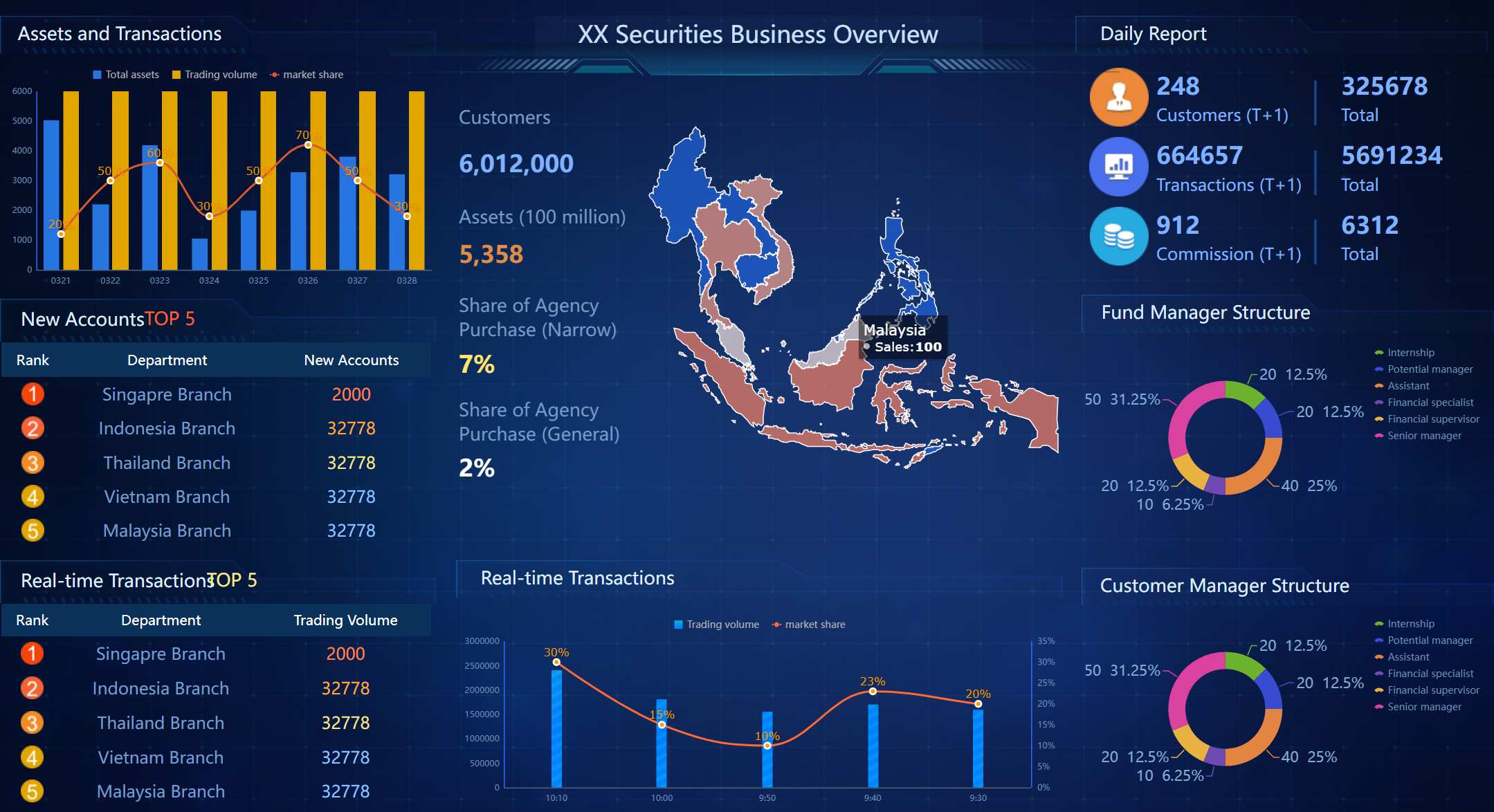
 An Interactive Report Created by FineReport
Decision signals that Tableau is likely the right choice:
- leaders regularly ask follow-up questions in review meetings
- dashboards are used interactively, not just passively viewed
- metrics come from multiple systems
- analytical users need to iterate often
- visual communication quality matters
Operational reporting and routine distribution
Other tools may be better when the main requirement is routine delivery of consistent reports.
This includes use cases such as:
- daily operations summaries
- weekly compliance reports
- finance statements with fixed layouts
- scheduled distribution to large recipient groups
- print-ready or export-heavy workflows
In these cases, the most important success factor is often not interactivity. It is reliability, consistency, and formatting control.
Decision signals that another BI tool may be the better fit:
- reports rarely change month to month
- users mostly consume PDFs, spreadsheets, or printed outputs
- there is little demand for filtering or drill-down
- layout precision is business-critical
- low administration overhead is a priority
This is where FineReport often deserves consideration. It can support dashboard needs while also serving organizations that require robust enterprise reporting discipline.
How to Choose the Right BI Tool for Your Organization
A smart BI decision starts with business goals, not vendor demos.
Too many evaluations begin with feature checklists and end with a platform that looks impressive but does not fit daily workflows. A better approach is to work backward from how decisions are made inside your organization.
Start with these questions:
-
What is the primary reporting goal?
Is it recurring operational reporting, executive visibility, self-service analysis, or a mix? -
Who are the main users?
Analysts, managers, frontline operators, finance teams, or executives will use BI differently. -
How do decisions actually happen?
In static review packs, live dashboard meetings, scheduled emails, or ad hoc analysis sessions? -
What data environment are you working with?
Multiple systems, fragmented data, strong central models, or mostly one ecosystem? -
What governance and compliance requirements exist?
Role-based access, certified metrics, approval workflows, auditability, and report consistency all matter. -
What budget and support model are realistic?
Consider not only software cost, but also implementation, enablement, and maintenance capacity.
A practical evaluation framework looks like this:
| Evaluation question | If yes, lean toward Tableau | If yes, lean toward another BI tool |
|---|---|---|
| Do users need frequent ad hoc analysis? | Yes | No |
| Are polished interactive dashboards a priority? | Yes | Not necessarily |
| Are report layouts highly standardized? | Less critical | Very important |
| Is pixel-perfect reporting required? | Sometimes limiting | Strong priority |
| Is cost sensitivity a major factor? | Evaluate carefully | Often stronger fit |
| Is enterprise reporting discipline the top requirement? | Partial fit | Often better fit with reporting-centric tools like FineReport |
The final step is to pilot real use cases. Do not test with generic dashboards. Use actual reporting needs from finance, sales, operations, or management review. Compare:
- speed to build
- ease of maintenance
- user adoption
- governance fit
- output quality
- total effort required
That pilot will usually reveal more than any feature matrix.
In balanced terms, here is the recommendation:
- Choose Tableau reporting when your organization values visual exploration, interactive dashboards, and flexible analysis across changing business questions.
- Choose another BI platform when you need lower cost, simpler adoption, tighter ecosystem alignment, or highly standardized reporting workflows.
- Give FineReport special attention if your business needs both dashboards and strong enterprise reporting, especially where formatted documents, recurring distribution, and layout control are essential.
The best BI investment is not the most famous platform. It is the one that helps your teams make better decisions, with less friction, at a sustainable cost.
FAQs
Tableau is usually stronger for interactive dashboards and exploratory analysis than for highly fixed, repetitive reporting. If your team needs pixel-perfect layouts and strict templates, another BI tool may be a better fit.
Tableau is a strong choice when users frequently ask new questions, work across multiple data sources, and need to drill into trends and exceptions. It fits organizations that value visual analysis over static report distribution.
Tableau can become expensive at scale and may feel less efficient for large volumes of standardized reports. Some alternatives also offer simpler governance, easier scheduling, or stronger built-in financial reporting.
Tableau is generally better for visual exploration and executive-style dashboards, while FineReport may be better for structured operational reporting and template-driven outputs. The better option depends on whether your priority is analysis flexibility or standardized report delivery.
Yes, Tableau supports enterprise governance and broad analytical scalability, especially in mature data environments. However, specialized reporting platforms may handle centralized distribution and recurring report operations more efficiently.


The Author
Yida Yin
FanRuan Industry Solutions Expert
Related Articles

Best Lawn Care Reporting Software Compared: 8 Tools for Scheduling, Invoicing, and Performance Tracking
$1 is an $1 and dashboard platform that helps lawn care businesses turn scheduling, invoicing, crew, and revenue data into clear $1. Best lawn care reporting software at a glance Below is a quick comparison of the best l
Yida YIn
Jun 25, 2026

Hong Kong Financial Reporting Standards Explained: 9 Practical Rules Finance Teams Need to Know
Hong Kong $1 standards matter because they determine how your business recognises revenue, values assets, reports risk, and withstands audit scrutiny. For finance teams, controllers, and compliance leaders, the challenge
Yida YIn
Jun 25, 2026

What Are Regulatory Reporting Services? A Practical Guide for Financial Institutions
$1 services help financial institutions collect, validate, format, and submit required data to regulators in a controlled, repeatable way. For banks, insurers, asset managers, fintechs, and enterprise compliance teams, t
Yida Yin
Jun 25, 2026