A daily dashboard is a simple, high-visibility view of the few metrics your team needs to review every morning to understand performance, spot risk early, and decide what to do next. For operations teams, that matters because most daily problems are expensive when discovered too late: backlog grows, service levels slip, customer issues stack up, and teams lose time debating priorities instead of acting on them.
If you manage operations, customer support, sales, or service delivery, a daily dashboard gives you a faster start to the day. Instead of waiting for weekly reporting, you can identify exceptions in real time, align owners around the right actions, and prevent small issues from becoming end-of-week surprises.
 Click To Try The Dashboard
A daily dashboard is a compact performance view updated at least once per day, often before the workday begins. It is designed for action, not historical analysis. The purpose is to answer a few critical questions quickly:
That is what makes a daily dashboard different from weekly or monthly reporting. Weekly and monthly reports are useful for trend analysis, planning, and executive review. A daily dashboard is operational. It supports immediate decision-making.
A daily dashboard is built for speed and intervention. Weekly and monthly reports are built for reflection and optimization.
Here is the practical difference:
In other words, if a metric should trigger a same-day response, it belongs on a daily dashboard. If it only informs quarterly planning, it probably does not.
The morning review matters because it sets direction before distractions take over. A well-designed daily dashboard helps teams:
For operations leaders, the real business value is consistency. When the team starts each day from the same source of truth, execution improves.
While the term daily dashboard can apply broadly, it is especially valuable for teams with fast-moving workflows and measurable daily output.
The strongest use cases include:
Any team that needs to react within hours rather than weeks can benefit from a daily dashboard.
A useful daily dashboard is not a giant scorecard. It is a focused decision tool. Most teams should start with five to eight metrics that directly affect daily execution.
Below are the core KPI categories most operations teams should consider for a practical morning dashboard:
Operations teams need leading indicators, not just lagging results. These metrics show whether the team is on track before the day gets away from them.
Common operational health metrics include:
These metrics help operations managers answer a crucial question: can the team absorb today’s demand without compromising quality or speed?
Not every daily dashboard needs revenue data, but most customer-facing teams should include at least a few commercial and experience signals.
Important daily metrics in this category include:
These indicators connect daily execution to business outcomes. That is important because a daily dashboard should not only track activity. It should show whether activity is producing results.
For many teams, a daily task dashboard is the operational layer that turns strategy into visible work.
The most practical task and execution metrics include:
This category is often what makes a daily dashboard actionable. Without clear tasks and owners, metrics become passive observations instead of management tools.
A daily dashboard only works if people open it, trust it, and know what to do after reading it. Design matters because overloaded dashboards get ignored.
A morning dashboard should be readable in under two minutes. That means the most urgent information should appear first.
Best practices for layout:
Teams do not need a wall of charts at 8:00 a.m. They need clarity. If everything is emphasized, nothing stands out.
One of the biggest dashboard design mistakes is trying to serve every audience with a single crowded page.
A better approach is layered visibility:
The summary should answer, “What is happening?” Drill-downs should answer, “Where is it happening and who needs to respond?”
Even the best daily dashboard fails without a review habit. A dashboard is not just a visual. It is part of an operating rhythm.
A strong morning review routine includes:
This is where dashboards become management systems rather than reporting tools.
Here is the consultant view: keep implementation simple, disciplined, and operationally grounded.
Define the main daily business question first. Examples:
Then choose only the metrics needed to answer that question.
If backlog, utilization, or response time mean different things to different managers, adoption will fail. Create one agreed definition for every KPI and one update schedule for the entire team.
A daily dashboard should not just show that something is wrong. It should show who is responsible for responding. Red metrics without owners create noise, not accountability.
Do not alert on every fluctuation. Set thresholds that signal meaningful operational risk, such as SLA breach likelihood, conversion drop, staffing shortfall, or high-priority overdue work.
A daily dashboard can live in many forms. The right format depends less on sophistication and more on whether your team will reliably use it every morning.
Teams typically choose from three broad formats:
A web-based dashboard is usually the best option when teams need consistent updates, low manual effort, and role-based visibility. Spreadsheets can work early on, especially for pilot use cases. Manual notebook routines may support discipline, but they are not ideal when operational speed, auditability, and shared ownership matter.
Different industries use the daily dashboard concept in different ways, but the pattern is similar: review what matters most before the day unfolds.
Examples include:
The takeaway is not the industry-specific terminology. It is the structure: daily visibility, clear exceptions, and immediate action paths.
Some people use a daily dashboard for personal mindfulness, planning, or habit tracking. That can be useful for individual productivity, but operations teams need a stronger link to business outcomes.
For enterprise teams, the dashboard should prioritize:
The more closely the dashboard maps to measurable business performance, the more valuable it becomes.
Most dashboard failures are not technology failures. They are prioritization failures.
The most common mistake is dashboard bloat. Teams include every available metric, then bury the few that actually matter in the morning.
Avoid this by asking:
If the answer is no, remove it.
A daily dashboard loses trust quickly when the numbers are outdated or inconsistently calculated. If updates happen at different times across systems, morning users will question every KPI.
To prevent this:
Trust is the foundation of dashboard adoption.
A dashboard is not complete until each signal has a response path. If backlog spikes, what happens next? If conversion drops, who investigates? If response time increases, what gets reprioritized?
Every critical metric should connect to:
Without this, the dashboard becomes an information display rather than an operating tool.
The best first version of a daily dashboard is small, practical, and easy to maintain. Do not wait for perfect data architecture before proving value.
Choose one business goal for the first version. Then select five to eight metrics that directly support it.
A strong pilot approach looks like this:
This creates fast feedback and avoids overengineering.
The best dashboard is the one your team will actually open every morning. Accessibility matters as much as feature depth.
Choose a tool based on:
Low-friction access is essential. If users have to dig for the dashboard, adoption will drop.
After the first two weeks, evaluate what worked.
Ask questions like:
Then improve in phases. Remove low-value metrics first. Add segments, filters, or alerts only when the team is ready for them. Scale by use case, not by dumping more data on the same screen.
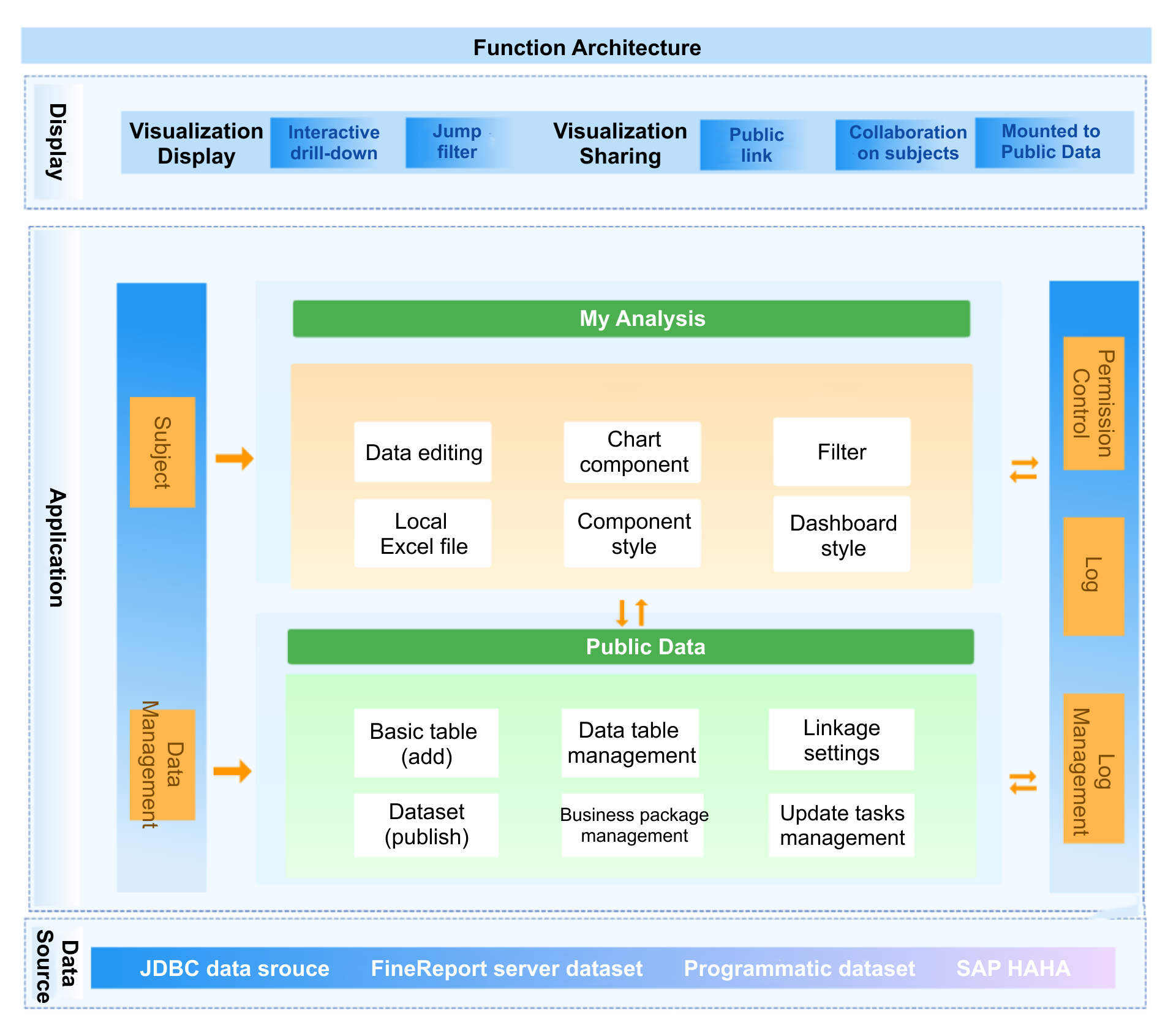
Building a reliable daily dashboard manually is more complex than it looks. You need clean data pipelines, consistent KPI definitions, automated refreshes, role-based views, and a design that people will actually use every morning. That is a lot to maintain with spreadsheets or disconnected reporting tools.
This is where FineBI becomes the practical choice for enterprise teams.
Instead of stitching the process together by hand, use FineBI to build a daily dashboard with ready-made templates, self-service analysis, and automated workflows that reduce manual reporting effort. Operations leaders can create clear morning views for throughput, backlog, capacity, service levels, sales pace, customer response times, and daily task dashboard tracking without forcing analysts to rebuild reports every day.
With FineBI, teams can:
If your goal is to make every morning review faster, sharper, and more actionable, a daily dashboard is the right operating tool. And if your goal is to implement that capability without the overhead of building everything from scratch, use FineBI to utilize ready-made templates and automate this entire workflow.
A daily dashboard helps operations teams review the most important metrics each morning so they can spot issues early, set priorities, and assign action quickly. It is built for same-day decisions rather than long-term reporting.
A daily dashboard focuses on what changed since yesterday and what needs attention today. Weekly and monthly reports are better for trend analysis, performance reviews, and planning.
Most teams should track a small set of action-oriented KPIs such as throughput, backlog, cycle time, capacity, utilization, SLA performance, overdue work, and ownership status. The right mix depends on what your team can influence within the same day.
In most cases, five to eight KPIs is enough for a practical morning dashboard. Too many metrics make it harder to focus on exceptions and decide what to do first.
Operations managers, team leads, frontline supervisors, and any team responsible for fast-moving work should review it. It is especially useful for operations, customer support, sales, and service delivery teams that need to react within hours.

The Author
Yida YIn
FanRuan Industry Solutions Expert
Related Articles

Dashboard Image Best Practices: 7 Ways to Clarify KPIs in Executive Reports
A dashboard image is only valuable if it helps an executive understand performance fast enough to make a decision. In leadership reporting, that is the standard. CFOs, COOs, business unit heads, and operations directors
Yida YIn
Jan 01, 1970

Profitability Dashboard Examples, Templates, and KPIs: How to Build One That Drives Decisions
A profitability dashboard is not a reporting accessory. It is a decision system. For founders, CFOs, finance managers, and department heads, its job is simple: show where profit is created, where it leaks, and what actio
Yida YIn
Jan 01, 1970

Why Most Dashboard LMS Setups Fail—and How to Build One That Improves Decisions
A dashboard lms is supposed to help training leaders, LMS administrators, instructors, and people managers make faster, better decisions. In practice, most dashboards do the opposite: they create noise, bury priorities,
Yida YIn
Jan 01, 1970


