A bank dashboard is a decision-making interface that turns fragmented banking data into a fast, visual, actionable view. For banking leaders, analysts, and operations teams, that matters because critical decisions cannot wait for end-of-month spreadsheets, static board packs, or manually consolidated reports.
If you manage branch performance, lending growth, liquidity, risk exposure, service operations, or digital banking adoption, you already know the pain points: too many systems, inconsistent metrics, delayed reporting, and limited visibility into what is changing right now. A well-designed bank dashboard solves that by bringing the right metrics, alerts, and drill-downs into one governed view.
In practical terms, a bank dashboard helps teams answer questions like:
This guide explains what a bank dashboard is, what it should include, which KPIs matter most, and how modern banking teams use it to improve performance and control risk.
 Click To Try The Dashboard
A bank dashboard is a centralized visual workspace that displays the most important banking metrics in near real time or on a scheduled refresh cycle. It combines charts, scorecards, alerts, and interactive filters so users can monitor performance and act quickly.
In plain language, it is the banking equivalent of a control tower. Instead of forcing teams to open multiple systems and reconcile different versions of the truth, the dashboard provides a single, decision-ready view of what is happening across the institution.
A modern bank dashboard is not just for executives. Different teams depend on it for different decisions:
A bank dashboard is fundamentally different from static reporting tools.
Static reports usually summarize the past. They are useful for documentation, but weak for rapid intervention.
Spreadsheets are flexible, but often depend on manual updates, inconsistent formulas, and one-off logic that does not scale well across departments.
One-time presentations may tell a story for a specific meeting, but they are not designed for daily operational monitoring.
A bank dashboard is different because it is:
That is why banks use dashboards to move from hindsight to active management.
A high-performing bank dashboard is more than a screen full of charts. It is a governed operating layer that combines trusted data, smart visual design, and strict controls.
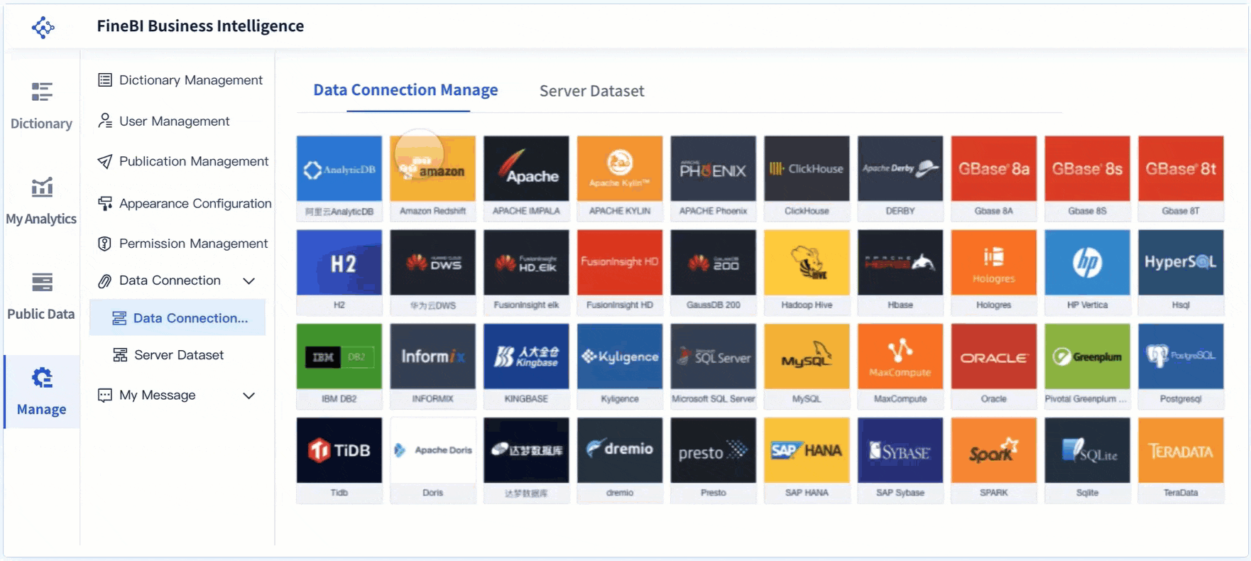
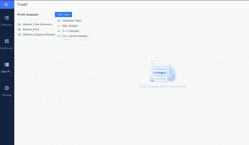
Banking data rarely lives in one place. A useful dashboard must pull together information from multiple internal and external systems so teams can see the full picture.
Common data sources include:
The value of a bank dashboard increases when these sources are integrated under common definitions. Without that foundation, users may see conflicting loan growth numbers, mismatched profitability calculations, or different versions of customer activity depending on the source system.
A bank dashboard should reduce cognitive load, not increase it. Good design makes the most important insights obvious in seconds.
The best layouts typically include:
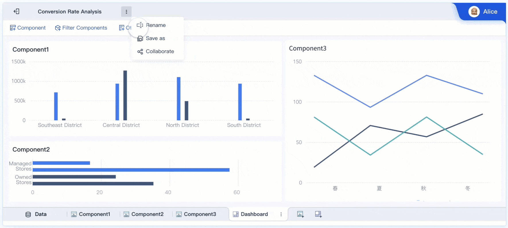
For example, an executive may start with a high-level branch performance dashboard, notice that one region is missing deposit targets, then drill into branch-level trends, product mix, and relationship-manager activity in minutes. That is the operational power a bank dashboard should deliver.
In banking, a dashboard is only as valuable as the trust behind it. If users question the numbers, adoption collapses.
That is why governance is a core component, not an afterthought. An enterprise-grade bank dashboard should support:
A dashboard used by finance may need broad visibility into profitability and margin metrics. A frontline branch dashboard may require restricted access to only local performance data. Risk teams may need exposure views unavailable to retail teams. Strong governance ensures the right users see the right data at the right level.
The right KPIs depend on the institution’s strategy, line of business, and user role. But most banking organizations track a core set of metrics across financial performance, risk, operations, and customer engagement.
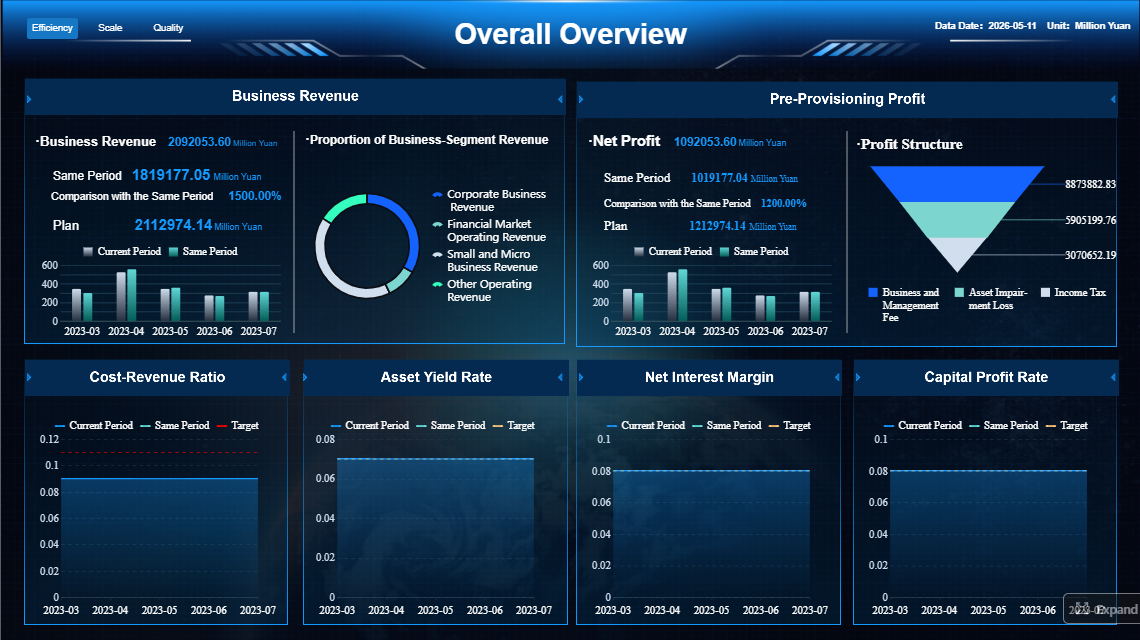
These metrics show whether the bank is growing profitably and sustainably.
These KPIs help finance leaders and executives understand not just whether the bank is growing, but whether it is doing so with healthy margins and efficient economics.
These indicators help control losses, protect liquidity, and ensure operational resilience.
These KPIs are critical for early intervention. A rising exception queue or worsening delinquency trend often appears in the dashboard before it escalates into a broader balance-sheet or regulatory problem.
Modern banks must see not just financial outcomes, but how customers engage across channels and products.
For retail and digital banking leaders, these metrics reveal where experience is improving, where friction exists, and which channels are driving growth.
A bank dashboard becomes most valuable when tied directly to day-to-day decisions. The following scenarios show how different teams use dashboards in practice.
Executives and regional leaders use a bank dashboard to compare branch and business-unit performance against targets. Instead of waiting for periodic reviews, they can identify underperformance early and respond faster.
Typical use cases include:
A branch manager may use a localized dashboard to see daily account openings, loan referrals, service backlog, and target attainment. An executive version may roll those same metrics up to region or enterprise level.
Risk and treasury teams need highly specialized views that update frequently and support rapid assessment.
A dashboard in this context may track:
The advantage of a dashboard here is speed. When funding conditions shift, delinquency worsens, or market volatility rises, users need a consolidated monitoring layer that supports action immediately.
Bank dashboards are not only internal tools. They can also support customer-facing or relationship-driven experiences, especially in small business and digital banking.
Examples include:
These use cases improve both internal productivity and customer experience. Relationship teams can identify cross-sell opportunities faster, while digital users gain a simpler view of their financial activity.
Not every bank dashboard should look the same. The strongest implementations are tailored to the role, business question, and decision cadence of the user.
An enterprise-wide banking dashboard usually focuses on institution-level performance. It gives executives a broad view of revenue, growth, asset quality, operational health, and strategic KPIs across the bank.
A branch manager dashboard is narrower and more tactical. It emphasizes local targets, staffing, sales, customer service, and branch activity trends.
A risk dashboard is built around exception monitoring, exposure visibility, delinquency, liquidity, and compliance controls. These views prioritize thresholds, alerting, and drill-down investigation.
A market or treasury dashboard highlights rate sensitivity, funding structure, liquidity buffers, and market-linked indicators that may shift throughout the day.
A digital banking dashboard may be designed around customer self-service, product engagement, app usage, or personalized financial insight. In some cases, customers can even customize the cards and widgets they see.
Some dashboards are designed for regulatory oversight, helping institutions track required controls and risk metrics. Others focus on business performance, such as margin improvement, branch optimization, or customer growth. Still others are built for customer-facing personalization, especially in online and mobile banking environments.
Banks may also use different branded solutions or public-interest dashboards depending on their goals. The brand name matters less than the operating model behind it: trusted data, role-based relevance, and fast decision support.

If you are selecting or designing a bank dashboard, start with business questions, not visuals. Too many projects begin by choosing charts before agreeing on what decisions the dashboard should improve.
Ask first:
Once those questions are clear, match the dashboard to the audience.
Different stakeholders need different levels of detail:
Trying to force one dashboard design on all audiences usually creates clutter and low adoption.
A scalable bank dashboard should prioritize:
If I were advising a bank on rollout, I would recommend these four practical steps:
Start each dashboard with a decision use case. For example: “Identify branches likely to miss deposit goals this month” is stronger than “show deposit data.” This sharpens KPI selection and improves adoption.
Do not let different departments calculate loan growth, profitability, or service levels differently. Create a metric dictionary first. This avoids credibility problems after launch.
An executive dashboard should not look like a fraud analyst workspace. Build role-specific views based on what users must review daily, weekly, or monthly.
Every headline KPI should support investigation. If delinquency worsens, users should be able to drill into region, product, segment, and account-level drivers without leaving the environment.
Do not overload version one. Begin with the KPIs that support the most important banking decisions, validate trust and usage, then extend the model to more teams and workflows.
Use this checklist to assess whether a bank dashboard is useful, scalable, and aligned with banking goals:
If the answer to several of these is no, the dashboard may look attractive but fail operationally.
The methodology is straightforward: define the business questions, integrate the right data, standardize KPIs, tailor views by role, and build governance in from day one. The challenge is execution.
In most banks, building this manually is complex. Teams must connect multiple systems, clean inconsistent data, create secure role-based access, maintain dashboards for different users, and continuously update logic as products, regulations, and reporting needs evolve.
That is where FineBI becomes the practical solution.
With FineBI, banks can utilize ready-made templates and automate this entire workflow. Instead of relying on fragile spreadsheet chains or custom-built reporting stacks that are expensive to maintain, teams can:
For enterprise decision-makers, the real value is not just better visualization. It is faster alignment between data, decisions, and action.
If your bank is still piecing together insight from static reports and disconnected tools, now is the right time to modernize. A well-implemented bank dashboard gives leaders visibility, gives teams accountability, and gives the institution a more agile operating model. And if building it manually feels too slow or too risky, use FineBI to accelerate deployment with proven templates and automation built for scalable business intelligence.
A bank dashboard gives teams a centralized view of performance, risk, operations, and customer activity so they can make faster decisions. It helps replace fragmented spreadsheets and static reports with a more actionable, current view.
Common banking KPIs include revenue, deposits, loan growth, net interest margin, fee income, delinquency, liquidity, fraud alerts, and branch performance. The right mix depends on whether the dashboard is built for executives, finance, operations, or risk teams.
A traditional report is usually static and focused on summarizing past results, while a dashboard is interactive and designed for ongoing monitoring. Users can filter, drill down, and respond to issues faster.
Bank dashboards are used by executives, branch leaders, finance teams, operations managers, and risk and compliance staff. Each group relies on different views to track the metrics most relevant to their role.
An effective bank dashboard combines trusted data sources, clear visual design, relevant KPIs, and strong governance. It should also support alerts, role-based access, and drill-down analysis so users can move from insight to action quickly.

The Author
Yida YIn
FanRuan Industry Solutions Expert
Related Articles

Dashboard Image Best Practices: 7 Ways to Clarify KPIs in Executive Reports
A dashboard image is only valuable if it helps an executive understand performance fast enough to make a decision. In leadership reporting, that is the standard. CFOs, COOs, business unit heads, and operations directors
Yida YIn
Jan 01, 1970

Profitability Dashboard Examples, Templates, and KPIs: How to Build One That Drives Decisions
A profitability dashboard is not a reporting accessory. It is a decision system. For founders, CFOs, finance managers, and department heads, its job is simple: show where profit is created, where it leaks, and what actio
Yida YIn
Jan 01, 1970

Why Most Dashboard LMS Setups Fail—and How to Build One That Improves Decisions
A dashboard lms is supposed to help training leaders, LMS administrators, instructors, and people managers make faster, better decisions. In practice, most dashboards do the opposite: they create noise, bury priorities,
Yida YIn
Jan 01, 1970


