Data Visualization
12 Best Data Visualization Tools for 2026: Features, Pricing, Pros and Cons
Lewis Chou
Apr 23, 2026
Data visualization tools are software platforms that turn raw data into charts, dashboards, maps, and interactive visual stories for analysis and decision-making.
12 best data visualization tools for 2026 at a glance
Here is a quick comparison of the top data visualization tools covered in this guide, including who they suit best and where they stand out.
| Tool | Best For | Ease of Use | Customization | Collaboration | Deployment | Pricing Overview |
|---|---|---|---|---|---|---|
| FineBI | Self-service analytics, business teams, flexible dashboards | High | High | High | Cloud / On-premises | Custom quote |
| Tableau | Advanced analytics, enterprise dashboards | Medium | Very High | High | Cloud / On-premises | Starts around per-user subscription tiers |
| Power BI | Microsoft-centric organizations, cost-effective BI | High | High | High | Cloud / On-premises | Low entry cost, premium tiers available |
| Flourish | Interactive storytelling, media, embeddable content | High | Medium | Medium | Cloud | Free tier + paid plans |
| Datawrapper | Editorial charts, maps, public-facing publishing | Very High | Medium | High | Cloud / Self-hosted options | Free tier + paid plans |
| Looker Studio | Google ecosystem reporting, lightweight dashboards | High | Medium | High | Cloud | Free, with enterprise options via Google stack |
| Qlik Sense | Associative exploration, governed analytics | Medium | High | High | Cloud / On-premises | Custom quote |
| Zoho Analytics | SMB reporting, value-focused BI | High | Medium | High | Cloud / On-premises | Affordable subscription tiers |
| RAWGraphs | Experimental and custom visual models | Medium | High | Low | Web app / Open source | Free |
| Infogram | Quick business visuals, infographics, presentations | High | Medium | Medium | Cloud | Free tier + paid plans |
Key differences at a glance:
- Best for business teams: FineBI, Power BI, Zoho Analytics
- Best for enterprise analytics: Tableau, Qlik Sense, FineBI
- Best for journalists and publishers: Flourish, Datawrapper
- Best for designers and custom chart exploration: RAWGraphs, Flourish
- Best for budget-conscious teams: Power BI, Looker Studio, Zoho Analytics, RAWGraphs
What is data visualization and why it matters in 2026
Data visualization is the process of converting raw data into visual formats such as charts, dashboards, maps, scorecards, and interactive reports so people can understand patterns faster.
In 2026, data visualization matters more because teams are dealing with:
- Higher data volumes across cloud apps, databases, and operational systems
- Faster decision cycles that require near real-time reporting
- More non-technical users who need self-service access to insights
- Greater pressure to communicate findings clearly across departments
Common use cases now span:
- Business intelligence: KPI dashboards, executive reporting, sales analysis
- Operations: supply chain monitoring, service performance, exception tracking
- Finance: revenue analysis, profitability reporting, forecasting dashboards
- Marketing: campaign performance, attribution views, funnel visualizations
- Media and publishing: interactive charts, maps, scrollytelling, public embeds
- Research and education: statistical exploration, survey reporting, presentation-ready charts
When comparing modern data visualization tools, focus on these criteria:
- Usability: Can non-technical users build useful dashboards without heavy training?
- Integrations: Does it connect to your databases, spreadsheets, cloud apps, and APIs?
- Interactivity: Can users drill down, filter, and explore on their own?
- Governance: Are permissions, metric definitions, and data access controlled properly?
- Scalability: Will the tool still perform when data, users, and dashboards grow?
- Cost: What is the true total cost once licenses, implementation, and support are included?
How we evaluated the best data visualization tools
To identify the best data visualization tools for 2026, we compared each platform using practical buying criteria rather than feature lists alone.
Evaluation criteria
- Features: Dashboard creation, chart variety, drill-downs, maps, storytelling, AI assistance, export, and embedding
- Pricing: Entry-level affordability, enterprise pricing flexibility, and long-term value
- Learning curve: How quickly beginners, analysts, and business users can become productive
- Scalability: Ability to support larger datasets, more users, and enterprise governance
- Support: Documentation, training resources, vendor support, and implementation ecosystem
Why the “best” tool depends on the user
Different teams need different capabilities:
- Startups often prioritize cost, quick setup, and flexible reporting
- Enterprises need governance, security, role-based access, and deployment options
- Analysts value modeling depth, advanced calculations, and richer visual exploration
- Non-technical users need drag-and-drop workflows and intuitive dashboard building
- Publishers and journalists care about visual polish, embeds, responsiveness, and audience engagement
Questions to ask before choosing a platform
Before you shortlist any data visualization tool, ask:
- Who will build dashboards: analysts, business users, or both?
- Where does your data live today: spreadsheets, cloud warehouses, ERP, CRM, or mixed sources?
- Do you need self-service analytics or tightly controlled enterprise reporting?
- Is public sharing or embedding important?
- Do you need cloud-only deployment, or is on-premises still required?
- How important are branding, design control, and presentation quality?
- What budget do you have for licenses, rollout, and training?
- Can the tool scale without creating reporting bottlenecks later?
Detailed comparison of the top 12 data visualization tools
1. FineBI
One-sentence overview: FineBI is a self-service analytics and data visualization platform designed for teams that need flexible dashboard building, broad data access, and governed business reporting.
 Key Features:
- Drag-and-drop dashboard creation for business users
- Self-service analytics with reusable datasets
- Interactive filtering, drill-down, and cross-analysis
- Strong support for enterprise reporting scenarios
- Multi-source data connectivity and data preparation
- Cloud and on-premises deployment options
- Permission controls for governed access
Pros & Cons:
- Pros:
- Strong balance of self-service usability and enterprise control
- Well suited for teams that want business users to build dashboards independently
- Flexible dashboard design for operational and management reporting
- Good fit for organizations that need scalable deployment choices
- Cons:
- Pricing is typically quote-based, so buyers may need a demo cycle to evaluate fit
- Smaller mindshare in some Western markets compared with Tableau or Power BI
Best For (Target user/scenario):
- Mid-sized to large organizations
- Business teams that want self-service analytics without losing governance
- Companies evaluating alternatives to traditional BI stacks
Pricing overview: Custom pricing based on deployment, scale, and organizational needs
Among the data visualization tools in this list, FineBI stands out for organizations that want to give business users more control without forcing every dashboard request through analysts or IT. Its strength is not just chart creation, but the combination of reusable data assets, interactive exploration, and governed dashboard publishing. For teams building recurring operational dashboards, executive views, or departmental analytics, FineBI is one of the most practical options to evaluate in 2026.
2. Tableau
One-sentence overview: Tableau is a leading data visualization platform known for rich dashboarding, advanced analytics, and broad enterprise adoption.
 Key Features:
- Extensive charting and visual exploration capabilities
- Strong drag-and-drop analysis experience
- Advanced calculations, geospatial analysis, and forecasting
- Broad connectivity to databases, spreadsheets, and cloud platforms
- Sharing via Tableau Cloud and Tableau Server
- Integration with Python and R for advanced analytics
Pros & Cons:
- Pros:
- Excellent visual depth and analytical flexibility
- Strong ecosystem, community, and training availability
- Suitable for complex enterprise reporting environments
- Cons:
- Can become expensive at scale
- Learning curve is steeper for advanced dashboard design
- Governance and content sprawl may require stronger administration
Best For (Target user/scenario):
- Enterprises with experienced analysts
- Teams needing advanced exploration and polished dashboards
- Organizations with diverse data environments
Pricing overview: Subscription-based pricing with different creator, explorer, and viewer tiers
Tableau remains one of the strongest choices when visual sophistication and analytical depth are top priorities. It is especially effective for analyst-led environments where teams need more than standard dashboard templates.
3. Power BI
One-sentence overview: Power BI is a cost-effective BI and data visualization platform that fits especially well in Microsoft-based organizations.
 Key Features:
- Tight integration with Excel, Azure, Teams, and the Microsoft ecosystem
- Interactive dashboards and drill-through reporting
- Data modeling with Power Query and DAX
- Broad sharing options through Power BI Service
- AI-assisted insights and natural language query features
- Desktop plus cloud workflow
Pros & Cons:
- Pros:
- Strong value for money
- Familiar environment for Microsoft users
- Powerful modeling and reporting capabilities
- Large user base and partner ecosystem
- Cons:
- Advanced modeling can become complex
- Interface and licensing structure can be confusing for new buyers
- Best experience often depends on broader Microsoft stack adoption
Best For (Target user/scenario):
- Organizations already using Microsoft 365 or Azure
- Budget-conscious teams scaling BI across departments
- Analysts who need strong modeling and dashboard distribution
Pricing overview: Low-cost per-user entry tiers, with premium capacity options for larger deployments
Power BI is still one of the most attractive options for teams that want capable dashboards at a relatively accessible cost. If your organization already relies on Microsoft infrastructure, it is often the fastest path to scaled reporting.
4. Flourish
One-sentence overview: Flourish is a no-code visualization platform focused on interactive storytelling, embeddable graphics, and audience-facing content.
Key Features:
- Template-driven creation for charts, maps, and stories
- Strong support for interactive and animated visual content
- Embedding across websites and digital publishing environments
- Scrollytelling and presentation-style sequences
- Collaboration and branding options for teams
Pros & Cons:
- Pros:
- Excellent for storytelling and public-facing visuals
- Very approachable for non-coders
- Strong embed experience for publishers and marketers
- Cons:
- Not a full BI platform
- Less suitable for heavily governed enterprise analytics
Best For (Target user/scenario):
- Newsrooms, content teams, research communications, and marketers
- Teams that want polished, interactive visual stories
Pricing overview: Free tier available, with paid team and business plans
5. Datawrapper
One-sentence overview: Datawrapper is a web-based tool for creating clean, publish-ready charts, maps, and tables with minimal friction.
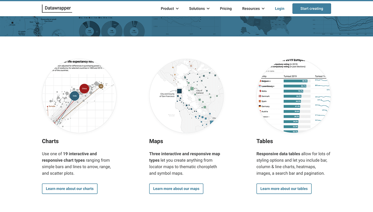 Key Features:
- Fast workflow for charts, maps, and tables
- Strong defaults for typography, accessibility, and layout
- Easy embedding and responsive outputs
- Team collaboration and custom themes
- Useful for editorial and public reporting workflows
Pros & Cons:
- Pros:
- Very easy to use
- Excellent output quality for publishing
- Strong accessibility and presentation defaults
- Cons:
- Less depth for internal BI and advanced analytics
- Limited compared with broader dashboarding platforms
Best For (Target user/scenario):
- Journalists, policy teams, communications teams, and public institutions
- Users who need fast, professional charts without complex setup
Pricing overview: Free tier, with paid plans for teams and advanced features
6. Looker Studio
One-sentence overview: Looker Studio is a lightweight reporting and dashboard tool that works well for teams invested in Google products.
 Key Features:
- Free dashboard creation for many common reporting needs
- Connectors for Google Analytics, BigQuery, Sheets, and more
- Shareable cloud-based reports
- Simple interactive filtering and collaboration
Pros & Cons:
- Pros:
- Easy entry point
- Useful for marketing and web analytics reporting
- Strong fit for Google ecosystem users
- Cons:
- Can feel limited for more complex enterprise BI
- Performance varies depending on data connectors and report design
Best For (Target user/scenario):
- Small teams, marketers, and Google-centric reporting workflows
Pricing overview: Core product is free; broader costs depend on connected Google services
7. Qlik Sense
One-sentence overview: Qlik Sense is an analytics platform known for associative exploration, governed self-service, and enterprise-ready deployment.
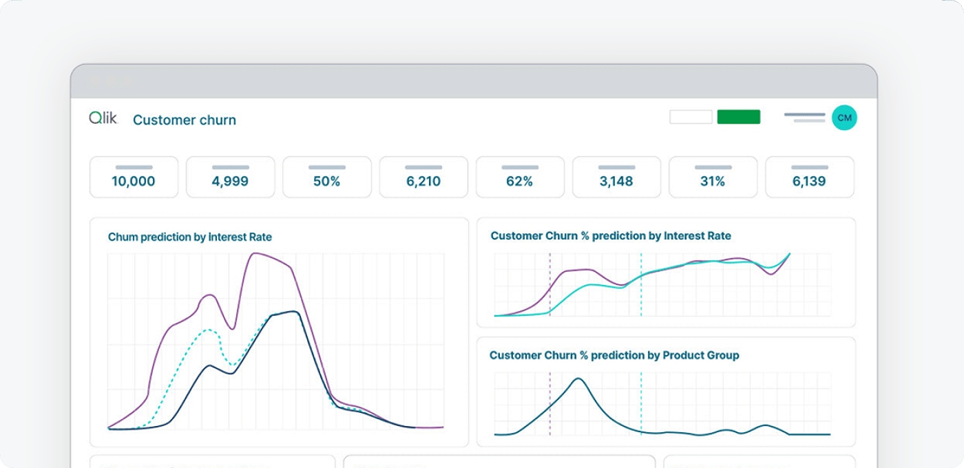 Key Features:
- Associative data engine for flexible discovery
- Interactive dashboards and guided analysis
- AI-assisted insights
- Strong governance and enterprise administration
- Cloud and on-premises options
Pros & Cons:
- Pros:
- Powerful exploration model
- Strong enterprise controls
- Good for complex multi-source analysis
- Cons:
- Can require more onboarding than beginner-oriented tools
- Pricing may be better suited to larger organizations
Best For (Target user/scenario):
- Enterprises that want governed self-service and deeper exploration
Pricing overview: Typically quote-based, depending on environment and scale
8. Zoho Analytics
One-sentence overview: Zoho Analytics is a value-focused BI and visualization tool for small and mid-sized businesses that want accessible reporting.
 Key Features:
- Drag-and-drop dashboard builder
- Data preparation and blending
- Scheduled reporting and sharing
- Integrations across business apps
- AI-assisted query features
Pros & Cons:
- Pros:
- Affordable for smaller teams
- Broad functionality for the price
- Relatively easy to deploy
- Cons:
- Less powerful than top enterprise platforms in advanced scenarios
- Visualization depth may feel more limited for expert analysts
Best For (Target user/scenario):
- SMBs, startups, and teams seeking a practical BI entry point
Pricing overview: Lower-cost subscription tiers compared with many enterprise tools
9. Infogram
One-sentence overview: Infogram is a user-friendly visualization platform for creating business visuals, infographics, reports, and presentation assets quickly.
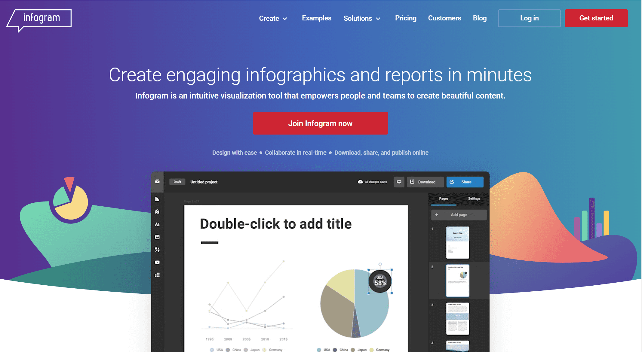 Key Features:
- Templates for charts, infographics, reports, and slides
- Collaboration and brand controls
- Embeddable content
- Fast visual creation for non-specialists
Pros & Cons:
- Pros:
- Easy for non-technical users
- Useful for marketing, education, and internal communication
- Good for polished, presentation-ready outputs
- Cons:
- Less capable for deep BI workflows
- Not ideal for complex data modeling
Best For (Target user/scenario):
- Small teams, marketers, educators, and communications teams
Pricing overview: Free tier with paid plans for advanced use
10. RAWGraphs
One-sentence overview: RAWGraphs is an open-source data visualization tool built for unusual chart types and exploratory visual design.
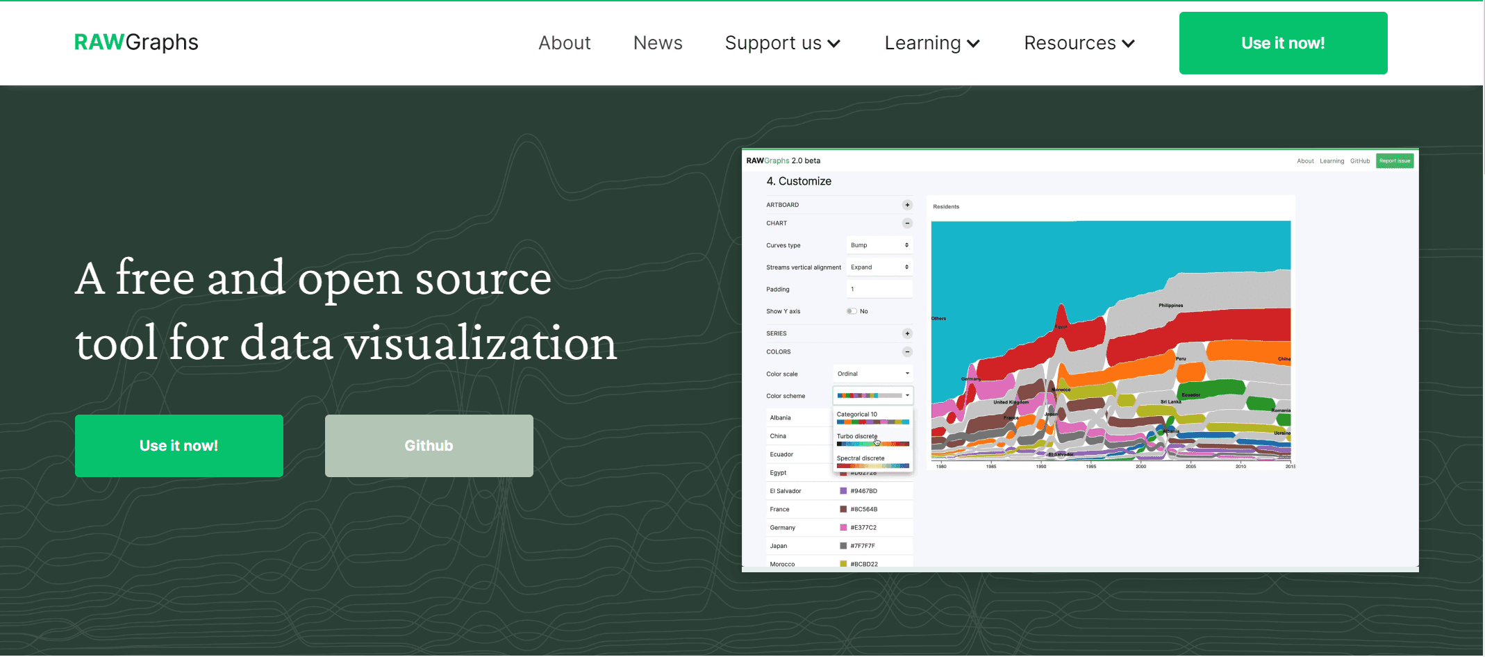 Key Features:
- Broad collection of less common chart models
- Open-source access
- Browser-based processing
- Export to vector and raster formats
Pros & Cons:
- Pros:
- Free and flexible
- Great for custom visual experimentation
- Useful for designers and researchers
- Cons:
- Not a BI dashboard platform
- Limited collaboration and governance features
Best For (Target user/scenario):
- Designers, data storytellers, and users exploring uncommon chart forms
Pricing overview: Free
11. The Data Visualisation Catalogue
One-sentence overview: The Data Visualisation Catalogue is not a dashboard tool, but a valuable reference for choosing the right chart type for a dataset or story.
Key Features:
- Searchable library of chart types
- Helpful reference for chart selection
- Good educational resource for teams improving data communication
Pros & Cons:
- Pros:
- Useful for planning visual design
- Helps non-experts understand chart choices
- Free to access
- Cons:
- Not a chart-building platform
- Works best as a companion resource
Best For (Target user/scenario):
- Teams learning data storytelling and chart selection
Pricing overview: Free
12. Domo
One-sentence overview: Domo is a cloud-based BI platform that combines dashboards, data connectivity, and collaboration in a business-facing environment.
 Key Features:
- Cloud-native dashboarding
- Broad connectors and data integration
- Mobile-friendly reporting
- Collaboration features for business teams
Pros & Cons:
- Pros:
- Strong cloud orientation
- Useful for cross-functional business visibility
- Good mobile experience
- Cons:
- Pricing can be a barrier for smaller teams
- May be more than some organizations need
Best For (Target user/scenario):
- Organizations wanting an all-in-one cloud analytics experience
Pricing overview: Custom quote
Which data visualization tool is best for your use case
Best for business intelligence and enterprise dashboards
If governance, security, and large-scale reporting matter most, the strongest options are:
- FineBI for self-service analytics with governed dashboard building
- Tableau for advanced visual analysis and enterprise dashboard depth
- Power BI for scalable reporting in Microsoft-based environments
- Qlik Sense for associative exploration and controlled self-service
For many organizations, FineBI is the most balanced option if the goal is to expand dashboard access across departments while keeping reporting structured and manageable.
Best for interactive storytelling and publishing
If presentation quality, embeds, and audience engagement are the priority, choose:
- Flourish for interactive stories, animated visuals, and embeddable explainers
- Datawrapper for clean, editorial charts, maps, and tables
- Infogram for fast, presentation-friendly visuals
- RAWGraphs for experimental and custom visuals
These tools are better for communication and publishing than for full-scale BI governance.
Best for beginners, small teams, and budget-conscious buyers
If ease of use, fast setup, and value matter more than deep customization, consider:
- Power BI for low entry cost and strong capabilities
- Zoho Analytics for affordable SMB reporting
- Looker Studio for simple cloud reporting
- Datawrapper for quick visual publishing
- RAWGraphs if budget is zero and use cases are exploratory
What data visualization tools can I use for data visualization?
A practical shortlist based on common needs:
- For internal business dashboards: FineBI, Power BI, Tableau, Qlik Sense
- For executive reporting: FineBI, Tableau, Power BI
- For public charts and media content: Flourish, Datawrapper
- For Google-based reporting: Looker Studio
- For small business analytics: Zoho Analytics
- For uncommon chart types: RAWGraphs
- For infographic-style outputs: Infogram
- For chart selection guidance: The Data Visualisation Catalogue
If you are unsure where to start, narrow the field by asking:
- Do I need BI or storytelling?
- Will non-technical users build reports?
- Do I need governance and permissions?
- Is public embedding important?
- What is my realistic budget over 12 months?
Final verdict and buying tips for data visualization tools
The best data visualization tools for most teams in 2026 are FineBI, Tableau, Power BI, Flourish, and Datawrapper, but the right choice depends on whether your main goal is business intelligence, self-service reporting, or public storytelling.
Best overall for balanced self-service BI: FineBI
Best for advanced analytics: Tableau
Best value for Microsoft users: Power BI
Best for interactive storytelling: Flourish
Best for editorial publishing: Datawrapper
How to balance features, pricing, and long-term adoption
Use this simple framework:
- Start with the use case: internal dashboards, executive reporting, or public-facing stories
- Match the user type: analysts, business users, or content creators
- Check data connectivity: confirm your core systems are supported
- Evaluate governance needs: especially for multi-team or enterprise rollouts
- Estimate total cost: not just license fees, but deployment, training, and support
- Run a real pilot: test with actual datasets and business questions
A smart shortlist for most buyers
If you are evaluating platforms now, a practical shortlist is:
- FineBI for self-service analytics and flexible departmental dashboards
- Tableau for high-end visual analytics
- Power BI for cost-effective BI at scale
- Flourish for interactive storytelling
- Datawrapper for clean public-facing charts and maps
The final decision should come from live trials, not feature pages alone. If your team needs a platform that supports self-service analytics, flexible dashboard creation, and governed reporting in one environment, FineBI deserves a place near the top of your shortlist.
FAQs
For beginners, tools like Power BI, Looker Studio, Zoho Analytics, and FineBI are often the easiest to learn because they offer drag-and-drop interfaces and faster setup. The best choice depends on your data sources, budget, and whether you need business dashboards or simpler reports.
Start by checking where your data lives, who will build dashboards, and whether you need self-service analytics, governance, or public sharing. Then compare pricing, integrations, deployment options, and how well the tool can scale with your team.
BI tools focus on dashboarding, analysis, governance, and ongoing reporting for internal decision-making. Data storytelling tools like Flourish and Datawrapper are more geared toward interactive, presentation-ready visuals for publishing, embedding, and audience engagement.
Yes, free options like Looker Studio, RAWGraphs, and free tiers from Flourish, Datawrapper, and Infogram can work well for lightweight projects or early-stage teams. They are useful for testing needs before moving to a paid platform with more control and scalability.
Tableau, Power BI, FineBI, and Qlik Sense are strong choices for interactive dashboards and business analysis. For interactive charts, maps, and visual stories aimed at websites or media, Flourish and Datawrapper are especially effective.


The Author
Lewis Chou
Senior Data Analyst at FanRuan
Related Articles

10 Good Data Visualization Examples by Use Case: Sales, Surveys, Finance & Time-Series
If you are searching for $1 , you likely do not need another gallery of pretty charts. You need examples that help sales leaders hit targets, finance teams explain variance, operations managers monitor change, and analys
Yida Yin
Jun 15, 2026

Top 8 Data Visualization softwares You Should Try in 2026
Compare the top 8 data visualization software for 2026, including FineReport, Tableau, Power BI, and more to find the best fit for your business needs.
Lewis
Mar 19, 2026

10 Must-Have Data Visualization Tools for Modern Businesses
Compare the top 10 data visualization tools for 2025 to boost business insights, streamline analytics, and empower smarter decision-making.
Lewis
Dec 17, 2025