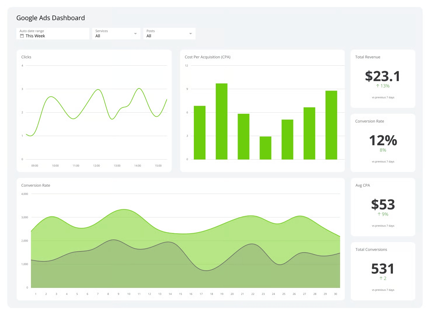
Dashboard
Best KPI Dashboard Software in 2026: 10 Tools Compared by Features, Pricing, and Use Case
Lewis Chou
Apr 19, 2026
KPI dashboard software is a business reporting tool that connects your data sources, visualizes performance metrics, and helps teams monitor progress against goals in one place.
10 Best KPI Dashboard Software Tools Compared
1.FineBI
One-sentence overview: FineBI is a modern self-service business intelligence and KPI dashboard software platform built for teams that want flexible dashboards, strong data connectivity, and enterprise-grade analysis without making every report request depend on IT.
 Key Features:
- Drag-and-drop dashboard and report builder
- Real-time and scheduled data refresh
- Strong support for multiple data sources and databases
- Interactive drill-down, slicing, filtering, and ad hoc analysis
- Role-based permissions for team and enterprise governance
- Mobile-friendly dashboards and sharing capabilities
- Visual analytics for sales, finance, operations, and executive reporting
Pros & Cons:
- Pros: Strong balance of ease of use and analytical depth; suitable for both departmental dashboards and broader BI deployments; scalable for growing companies; good option for organizations that want more than basic KPI tracking.
- Cons: More capable platforms like FineBI may require more planning than ultra-simple dashboard tools; smaller teams using only a few static KPIs may not need its wider BI functionality.
Best For (Target user/scenario): SMBs and enterprise teams that want powerful KPI dashboard software with room to scale into deeper analytics, governed self-service reporting, and cross-department decision-making.
FineBI stands out in this list because it does more than display metrics. It gives business users a practical way to build KPI dashboards while also supporting the data modeling, governance, and analytical workflows that larger organizations eventually need. That makes it a strong fit for companies that want a dashboard tool today without outgrowing it next year.
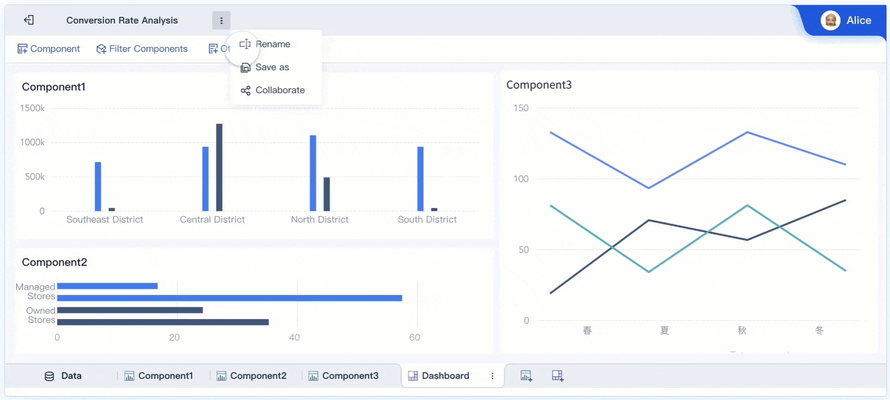
For teams comparing long-term value, FineBI is especially compelling as kpi dashboard software because it supports both fast visual reporting and deeper analysis. Executives can track high-level KPIs, while analysts and operational teams can drill into causes, trends, and exceptions from the same environment. If you want dashboard software that can serve leadership reporting and everyday business intelligence together, FineBI deserves a close look.
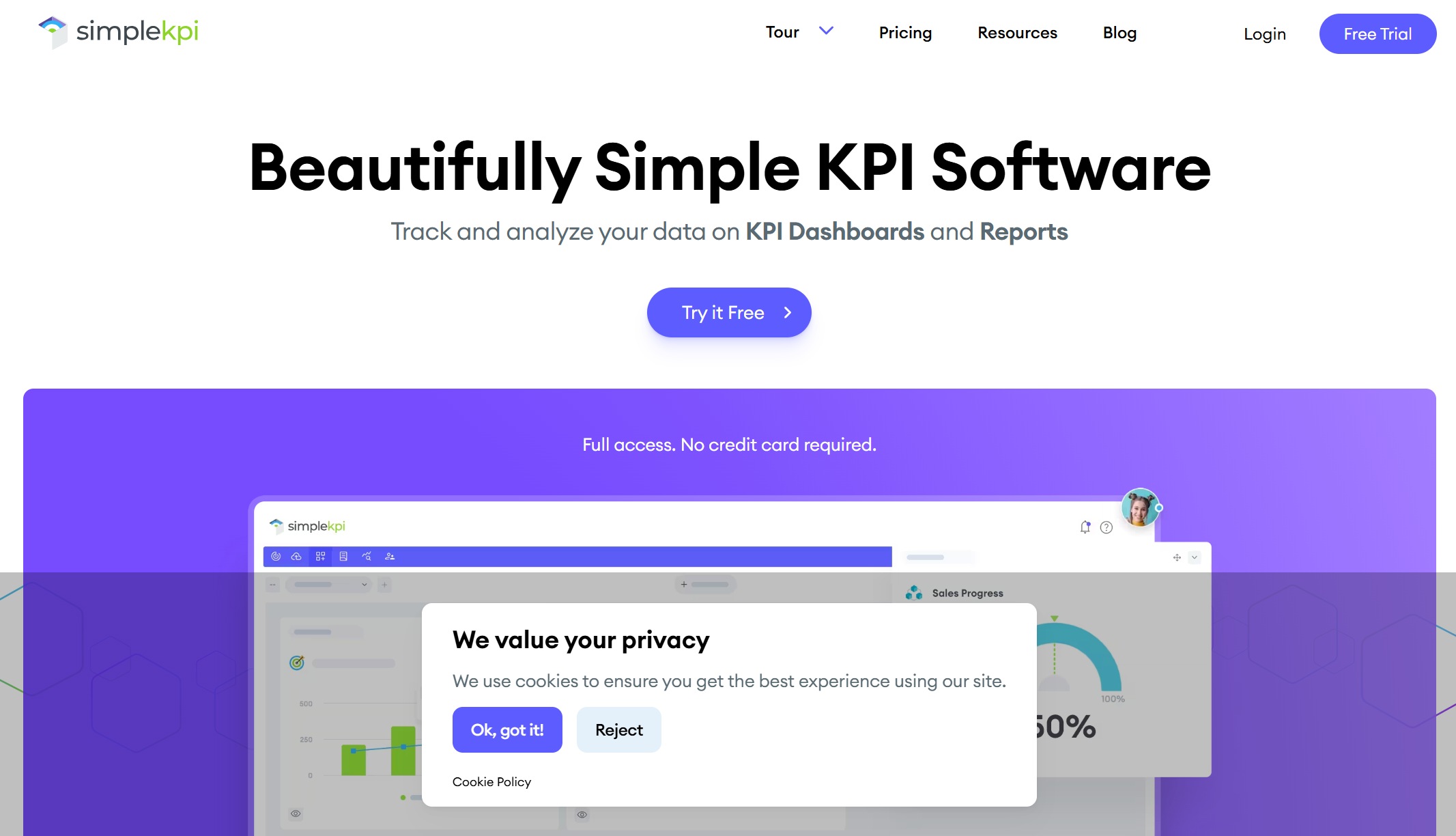
2.SimpleKPI
One-sentence overview: SimpleKPI is a straightforward KPI dashboard software option focused on fast setup, clear visualizations, and scheduled reporting for teams that do not want a heavy BI platform.
 Key Features:
- Easy dashboard creation
- KPI reporting and scheduled exports
- Spreadsheet-friendly workflows
- Interactive charts and tables
- Goal and trend monitoring
- Collaboration and sharing tools
Pros & Cons:
- Pros: Easy to learn; useful for non-technical users; works well for simple KPI reporting; good for teams moving away from manual spreadsheets.
- Cons: Less suitable for advanced analytics, complex data modeling, or highly customized BI environments.
Best For (Target user/scenario): Small businesses, department managers, and teams that want a simple way to build dashboards and recurring reports without a long implementation.
SimpleKPI is best viewed as an accessibility-first platform. It focuses on helping teams centralize metrics and present them clearly, rather than providing a full analytics stack. That makes it appealing for organizations that mainly need periodic KPI visibility and lightweight reporting workflows.
Its limitations appear when your data environment becomes more complex. If you need extensive data transformation, multi-layer governance, or more advanced analytical exploration, you may eventually need a broader BI platform. Still, for clean, quick KPI reporting, it remains a practical option.
3.Geckoboard
One-sentence overview: Geckoboard is KPI dashboard software built for real-time visibility, live team performance displays, and highly visible dashboards across sales, support, and operations teams.
Key Features:
- Real-time data connections
- TV dashboards and office wallboards
- Slack and Microsoft Teams notifications
- Shareable live dashboards
- Goal indicators, leaderboards, and comparisons
- Mobile and browser access
Pros & Cons:
- Pros: Excellent for live monitoring; strong visibility features for team accountability; quick to launch; works well for fast-moving operational environments.
- Cons: Not ideal for deep business intelligence analysis or advanced data modeling; more monitoring-oriented than analytics-heavy.
Best For (Target user/scenario): Sales teams, support teams, and operations leaders who need everyone aligned around real-time performance metrics.
Geckoboard is one of the strongest choices when the main goal is visibility. Its value comes from making KPIs hard to ignore, whether on a team screen, mobile device, or shared link. That is especially useful in customer support, inside sales, and ecommerce operations where timing matters.
If your use case goes beyond monitoring into deeper root-cause analysis, Geckoboard may need to sit alongside a more advanced BI platform. But for shared performance awareness and team alignment, it does its job very well.
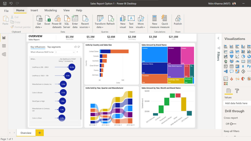
4.Power BI
One-sentence overview: Power BI is advanced KPI dashboard software from Microsoft, designed for organizations that need flexible visualization, strong data modeling, and close integration with the Microsoft ecosystem.
 Key Features:
- Advanced dashboard and report creation
- Deep data modeling and transformation
- Microsoft 365, Excel, Azure, and Teams integration
- Interactive reports and drill-through analysis
- AI-assisted insights and forecasting features
- Enterprise security and governance options
Pros & Cons:
- Pros: Highly capable analytics platform; excellent for complex reporting; strong value in Microsoft-centric environments; scalable from team dashboards to enterprise BI.
- Cons: Steeper learning curve; setup can be more technical; may be more than some teams need for basic KPI tracking.
Best For (Target user/scenario): Mid-sized and enterprise organizations that need advanced analytics and already work heavily within Microsoft tools.
Power BI is often the right choice when KPI dashboards need to be part of a wider analytics strategy. It can support executive scorecards, finance reporting, operational analysis, and custom data models in one ecosystem.
It is a better fit than simpler tools when you need serious analytical flexibility. If your team has data expertise or IT support and wants robust reporting depth, Power BI is a strong contender. If you only need quick dashboards with minimal setup, it may feel more complex than necessary.
5.Databox
One-sentence overview: Databox is a metrics-focused dashboard platform that helps teams consolidate data from many business apps into easy-to-read KPI dashboards.
 Key Features:
- Prebuilt dashboard templates
- Wide connector library
- Goal tracking and alerts
- Forecasting and performance summaries
- Mobile dashboards
Pros & Cons:
- Pros: Fast setup; strong for marketing and sales reporting; template-rich environment.
- Cons: Advanced features can get expensive; some plans limit refresh rates and historical depth.
Best For (Target user/scenario): SMBs and marketing-driven teams that need quick dashboard deployment across multiple SaaS tools.
6.Klipfolio
One-sentence overview: Klipfolio is a flexible dashboard and BI tool that supports both simple KPI displays and more customized reporting builds.
 Key Features:
- Custom dashboards and widgets
- Numerous integrations
- Formula and data manipulation capabilities
- Automated reporting
- Cloud-based access
Pros & Cons:
- Pros: Flexible; supports tailored dashboards; suitable for varied reporting needs.
- Cons: Learning curve can be significant; some setups require more technical comfort.
Best For (Target user/scenario): Agencies and mid-sized businesses that need customizable dashboards beyond template-only solutions.
7.Tableau
One-sentence overview: Tableau is an analytics-heavy platform known for rich visual exploration, strong data storytelling, and advanced dashboard customization.
 Key Features:
- High-end visual analytics
- Interactive dashboards
- Broad data connectivity
- Drill-down exploration
- Enterprise deployment options
Pros & Cons:
- Pros: Best-in-class visualization flexibility; strong for analysts and enterprise reporting teams.
- Cons: Higher cost; steeper learning curve; often more than needed for basic KPI tracking.
Best For (Target user/scenario): Enterprises and analytics teams that want deep visualization power and data exploration.
8.Looker Studio
One-sentence overview: Looker Studio is a lightweight dashboarding tool that gives users a free or low-cost way to visualize data, especially within Google-centric environments.
 Key Features:
- Google ecosystem integrations
- Custom reports and dashboards
- Shareable live views
- Template support
- Collaborative editing
Pros & Cons:
- Pros: Accessible pricing; easy to share; convenient for marketers and Google users.
- Cons: Less robust governance and modeling than enterprise BI platforms; connector reliability can vary.
Best For (Target user/scenario): Startups, marketers, and small teams already using Google Analytics, Google Ads, and Google Sheets.
9.Scoro
One-sentence overview: Scoro combines KPI dashboards with work management, project visibility, and financial tracking for service-based businesses.
Key Features:
- Project and utilization dashboards
- Financial performance reporting
- Sales pipeline reporting
- Prebuilt templates
- Automation for recurring reporting
Pros & Cons:
- Pros: Strong business context for professional services; useful all-in-one visibility.
- Cons: Higher pricing than simpler tools; best value depends on using broader platform features.
Best For (Target user/scenario): Agencies, consultancies, and professional services firms needing operations and profitability dashboards.
10.Spider Strategies
One-sentence overview: Spider Strategies is performance management software focused on KPI tracking, scorecards, and strategy execution.
Key Features:
- KPI scorecards
- Strategy maps
- Performance tracking
- Reporting workflows
- Governance-focused management
Pros & Cons:
- Pros: Strong for structured performance management; good for formal KPI ownership and scorecard processes.
- Cons: Less mainstream for general BI use; may feel specialized for teams seeking broader dashboard flexibility.
Best For (Target user/scenario): Organizations with mature strategic planning and formal scorecard management processes.
Best KPI Dashboard Software in 2026: What Matters Most
Strong kpi dashboard software should do more than place charts on a screen. It should help different types of organizations turn scattered performance data into action. For a startup, that usually means quick setup, low admin overhead, and affordable reporting. For an SMB, it often means better cross-team visibility, more integrations, and automation that reduces manual reporting. For enterprise teams, it means governance, scalability, role-based access, and enough analytical depth to support both executives and analysts.
The best tools also match different decision-making styles. Some teams want live operational dashboards that update throughout the day. Others need weekly scorecards for management reviews. Some rely on simple top-line KPIs, while others want to investigate trends, anomalies, and performance drivers. A good platform should support the pace and complexity of how your team actually works.
This comparison uses six practical evaluation criteria:
- Dashboard customization: Can users create dashboards that fit their KPIs, teams, and workflows?
- Integrations: Does the software connect cleanly to CRMs, spreadsheets, databases, finance tools, and marketing platforms?
- Automation: Can it refresh data automatically, schedule reports, and reduce repetitive manual tasks?
- Pricing: Is the cost reasonable relative to features, team size, and reporting needs?
- Scalability: Can the tool support more users, more data sources, and more sophisticated reporting over time?
- Ease of use: Can business users build and understand dashboards without relying too heavily on technical teams?
This guide is designed for multiple buyer types:
- Startups looking for easy setup and affordable KPI tracking
- SMBs that need scalable reporting without enterprise complexity
- Agencies managing client, campaign, or utilization dashboards
- Enterprise teams that require advanced BI, governance, and cross-functional reporting
Feature Comparison: How the Top Tools Differ
Dashboard Creation and Reporting
Dashboard creation is one of the biggest dividing lines between tools. Some platforms prioritize speed. Others prioritize analytical depth.
Best for fast setup:
- SimpleKPI
- Geckoboard
- Databox
- Looker Studio
These tools make it relatively easy to get dashboards running with templates, drag-and-drop widgets, and straightforward visual setup. They are a good fit when speed matters more than highly customized modeling.
Best for deeper customization:
- FineBI
- Power BI
- Tableau
- Klipfolio
These tools support more advanced dashboard design and are better suited for organizations that need interactive filtering, role-specific dashboards, or customized reporting logic. FineBI is especially strong here because it balances user-friendly dashboard design with more advanced BI capability, making it a good middle ground between lightweight KPI tools and heavyweight analytics platforms.
Best for presentation-ready reporting:
- FineBI
- Power BI
- SimpleKPI
- Scoro
These platforms are well suited for scheduled management reporting, board-style summaries, and recurring business reviews. If polished presentation and recurring report delivery matter, these options tend to perform better than live-monitoring-first tools.
KPI Tracking, Alerts, and Monitoring
Not all dashboard tools handle KPI management in the same way. Some are focused on monitoring current performance. Others support structured goal tracking over time.
Best for real-time monitoring:
- Geckoboard
- Databox
- FineBI
Geckoboard excels in visible, shared monitoring for teams. Databox is strong for cross-channel marketing and sales tracking. FineBI is a strong choice when real-time monitoring needs to connect with deeper analysis and broader reporting across the organization.
Best for goals, scorecards, and KPI ownership:
- Spider Strategies
- SimpleKPI
- FineBI
- Power BI
These tools are better suited for organizations that want to define KPIs formally, assign accountability, compare targets vs. actuals, and review performance across periods.
Best for alerts and exception visibility:
- Geckoboard
- Databox
- Power BI
Alerts matter when teams need to react quickly rather than review metrics passively. If immediate action is part of your workflow, strong notification and monitoring features should rank high in your buying decision.
Integrations, Data Sources, and Automation
Integration quality is often what separates a useful dashboard from a frustrating one. If your KPI dashboard software cannot reliably pull clean data from the systems you use most, your reporting process will remain fragmented.
Best for broad business data connectivity:
- FineBI
- Power BI
- Tableau
- Klipfolio
These platforms are better suited for organizations with mixed data environments, including databases, cloud apps, spreadsheets, and internal systems. FineBI performs well for teams that need scalable data integration without sacrificing dashboard usability.
Best for SaaS app connectivity and quick deployment:
- Databox
- Geckoboard
- Looker Studio
- SimpleKPI
These tools are generally easier for teams that rely on mainstream SaaS products and want dashboards running quickly with minimal data engineering.
Why integration depth matters:
- Better integrations improve data accuracy
- Automated refresh reduces manual reporting work
- Deeper data access supports scale and consistency
- Flexible connectors help future-proof your reporting stack
If your organization expects reporting needs to grow, choosing a tool with stronger automation and deeper source support can prevent painful migrations later.
Pricing, Pros and Cons, and Best Use Cases
Pricing Overview
Pricing for kpi dashboard software varies widely. Most vendors use one or more of these models:
- Per-user pricing: Common with BI tools such as Power BI and Tableau
- Tiered subscription plans: Common with dashboard-focused platforms like Geckoboard, Databox, and SimpleKPI
- Usage-based or feature-based pricing: Often tied to connectors, dashboard count, refresh frequency, or data volume
- Custom enterprise pricing: Common for platforms with governance, embedded analytics, or large-scale deployments
Here is a practical way to think about total cost:
- Low-cost entry tools: Looker Studio, entry-level dashboard products, or limited free plans
- Mid-range dashboard tools: Geckoboard, Klipfolio, SimpleKPI, Databox
- Higher-capability BI platforms: FineBI, Power BI, Tableau, Scoro, enterprise scorecard platforms
When comparing pricing, do not just look at the entry plan. Check for:
- Connector limits
- User minimums
- Refresh frequency restrictions
- Feature gating for alerts or automation
- Extra charges for viewers, editors, or administrators
- Scalability costs as data and team usage grow
A platform that appears affordable at first can become expensive if you need more dashboards, higher refresh rates, or wider access across departments.
Pros and Cons by Tool
Here is a quick decision-friendly summary.
| Tool | Main Strengths | Main Weaknesses |
|---|---|---|
| FineBI | Strong balance of self-service BI, KPI dashboards, integrations, and scalability | More capability may mean more setup than ultra-simple tools |
| SimpleKPI | Easy to use, clean KPI reporting, fast adoption | Limited advanced analytics and modeling |
| Geckoboard | Excellent real-time visibility and TV dashboards | Less suitable for deep BI analysis |
| Power BI | Advanced analytics, data modeling, Microsoft integration | Steeper learning curve |
| Databox | Great templates, broad SaaS connections, strong for marketing metrics | Advanced features can become costly |
| Klipfolio | Flexible custom dashboards | Can require more technical effort |
| Tableau | Powerful visual analytics | Expensive and often overpowered for simple KPI tracking |
| Looker Studio | Accessible and low-cost | Lighter governance and variable connector depth |
| Scoro | Strong for professional services operations and profitability | Best value depends on broader platform adoption |
| Spider Strategies | Strong structured KPI and scorecard management | More specialized than general dashboard tools |
A useful way to separate the market is this:
Built for simplicity:
- SimpleKPI
- Geckoboard
- Looker Studio
- Databox
Built for advanced business intelligence:
- FineBI
- Power BI
- Tableau
- Klipfolio
Built for specialized performance workflows:
- Scoro
- Spider Strategies
Best Fit by Business Type
Different organizations should prioritize different tools.
Best for startups
- Looker Studio
- SimpleKPI
- Databox
These are better for limited budgets, fast rollout, and low-complexity reporting.
Best for agencies
- Scoro
- Klipfolio
- Databox
These work well for campaign visibility, utilization tracking, client reporting, and multi-source dashboards.
Best for sales teams
- Geckoboard
- Databox
- Power BI
These are useful for pipeline visibility, leaderboard reporting, live activity tracking, and forecast analysis.
Best for operations leaders
- FineBI
- Geckoboard
- Power BI
Operations teams often need a mix of live visibility and deeper analysis. FineBI is particularly strong when operational dashboards need to evolve into more sophisticated reporting across multiple systems.
Best for larger enterprises
- FineBI
- Power BI
- Tableau
- Spider Strategies
These platforms better support scale, governance, permissions, complex data sources, and structured reporting across many teams.
How to Choose the Right KPI Dashboard Software
Questions to Ask Before You Buy
Before you choose a platform, ask these practical questions:
- What KPIs do we need to track daily, weekly, and monthly?
- Who will use the dashboards: executives, managers, analysts, frontline teams, or clients?
- Do we need simple visibility, or deeper analytics and root-cause analysis?
- Which systems must integrate on day one?
- How often does data need to refresh?
- Do we need alerts, scorecards, or target tracking?
- How much internal technical support do we have?
- Will business users need to build dashboards themselves?
- How important are governance, permissions, and audit control?
- Will this still fit our reporting needs in 12 to 24 months?
Also consider implementation effort. A tool that looks powerful in a demo may require more data preparation, training, or administrative ownership than your team can realistically support. Adoption matters as much as features.
Long-term scalability is another common blind spot. Many companies buy based on current simplicity, then run into limitations when they need new connectors, department-specific dashboards, or more advanced analysis. That is why a scalable option like FineBI can be attractive: it supports immediate KPI reporting while leaving room for broader BI maturity.
Final Recommendation
The best kpi dashboard software depends on what problem you are trying to solve first.
- Best for overall balance of dashboarding and scalable BI: FineBI
- Best for simplicity and straightforward KPI reporting: SimpleKPI
- Best for real-time team visibility: Geckoboard
- Best for analytics depth in Microsoft environments: Power BI
- Best for marketing-heavy multi-source dashboards: Databox
- Best for high-end visualization: Tableau
If you want the shortest path to clean KPI reporting, start with a simpler tool. If you need live wallboards and team accountability, choose a real-time-first platform. If you need advanced analytics, pick a stronger BI environment.
For many growing businesses, though, the smartest choice is the one that handles today’s dashboard needs without creating tomorrow’s migration problem. That is where FineBI stands out. It is a strong option for teams that want capable, flexible, and scalable kpi dashboard software that supports both fast dashboard creation and deeper business analysis as reporting needs expand.
FAQs
KPI dashboard software brings data from different systems into one place so teams can track performance, monitor goals, and spot issues faster. It helps turn raw metrics into visual dashboards that are easier to understand and act on.
Start by comparing integrations, ease of use, dashboard customization, reporting features, and pricing. The best choice depends on your team size, technical needs, and whether you need simple KPI tracking or deeper business intelligence.
Tools like Geckoboard are well suited for live performance tracking, TV dashboards, and team visibility. Platforms with real-time refresh and alerts are especially useful for sales, support, and operations teams.
Yes, KPI dashboard software often focuses on monitoring and visualizing performance metrics, while BI software usually includes broader analytics, data modeling, and deeper exploration. Some tools, such as FineBI and Power BI, can do both.
Look for data source integrations, drag-and-drop dashboard building, filtering and drill-down, automated refresh, sharing options, and role-based permissions. Mobile access and scheduled reporting are also valuable for many teams.


The Author
Lewis Chou
Senior Data Analyst at FanRuan
Related Articles

How to Build an Investment Portfolio Reporting Dashboard for Executives: KPIs, Benchmarks, and Drill-Down Views
Investment portfolio reporting for executives is not about showing every holding, transaction, and chart your investment team can produce. It is about giving CEOs, CFOs, CIOs, boards, and investment committees a fast, re
Yida YIn
Jun 25, 2026

12 KPI Reporting Examples for Executive Dashboards: What to Show in Weekly, Monthly, and Quarterly Reviews
Executive leaders do not need more data. They need decision ready $1 examples that match how often they review the business and what actions they are expected to take. A weekly $1 should surface fast moving risks and per
Yida YIn
Jun 25, 2026

How to Build a Digital Marketing Reports Dashboard: Executive Examples, KPIs, and Templates
A $1 is the control layer that helps executives and marketing leaders turn scattered channel data into fast, confident decisions. If you are a CEO, CMO, operations director, or marketing analytics lead, the real problem
Yida Yin
May 07, 2026