A well-designed marketing kpis dashboard does more than display numbers. It gives teams a structured view of performance, helps leaders identify risk and opportunity early, and turns reporting into a repeatable decision-making process. Whether the goal is to optimize campaigns every week or evaluate broader performance each month, the right dashboard template should connect daily execution with business outcomes.
Many teams already track metrics across advertising platforms, web analytics tools, CRM systems, email software, and social channels. The challenge is not a lack of data. The real challenge is organizing that data into a dashboard that is clear, actionable, and suitable for different reporting cadences. A weekly dashboard should support quick adjustments, while a monthly dashboard should reveal patterns, efficiency, and strategic contribution.
This article explains what a strong dashboard template should include, the seven most important layout features, which KPIs to prioritize, and how to build a reporting framework your team can use consistently over time.
What a Marketing KPIs Dashboard Template Should Include
A practical marketing kpis dashboard template begins with clarity of purpose. Before choosing charts, colors, or metrics, teams need to define exactly what the dashboard is meant to accomplish.
For weekly and monthly reporting, the dashboard should serve as a central view of marketing performance across time horizons. Weekly reporting focuses on pace, campaign health, and near-term optimization. Monthly reporting looks at trends, outcomes, and how marketing is contributing to pipeline, revenue, and retention goals.
A good dashboard template should also distinguish between activity metrics and business outcome metrics. Activity metrics show what the team did or what users did at an operational level. These may include impressions, email sends, clicks, or published content volume. Business outcome metrics, by contrast, show whether those activities produced meaningful results. Examples include qualified leads, conversion rate, customer acquisition cost, influenced revenue, and retention rate.
This distinction matters because a dashboard overloaded with activity data can create a false sense of progress. High traffic or engagement may be encouraging, but they do not automatically indicate business impact. A balanced dashboard should show how top-of-funnel activity connects to measurable outcomes further down the funnel.
The dashboard should also reflect its users. In most organizations, weekly and monthly reporting is reviewed by more than one audience:
- Marketing managers need channel and campaign insights
- Department heads need trend summaries and performance against targets
- Executives need a concise view of business impact, efficiency, and risk
- Cross-functional stakeholders such as sales or finance need shared definitions and reliable numbers
For this reason, the best template is one that supports both detailed analysis and executive readability. It should help users answer questions such as:
- Are we on pace this week?
- Which channels are overperforming or underperforming?
- Are lead quality and conversion efficiency improving?
- Is budget being spent effectively?
- What should change next week or next month?
When these questions guide the design, the marketing kpis dashboard becomes a management tool rather than a static report.
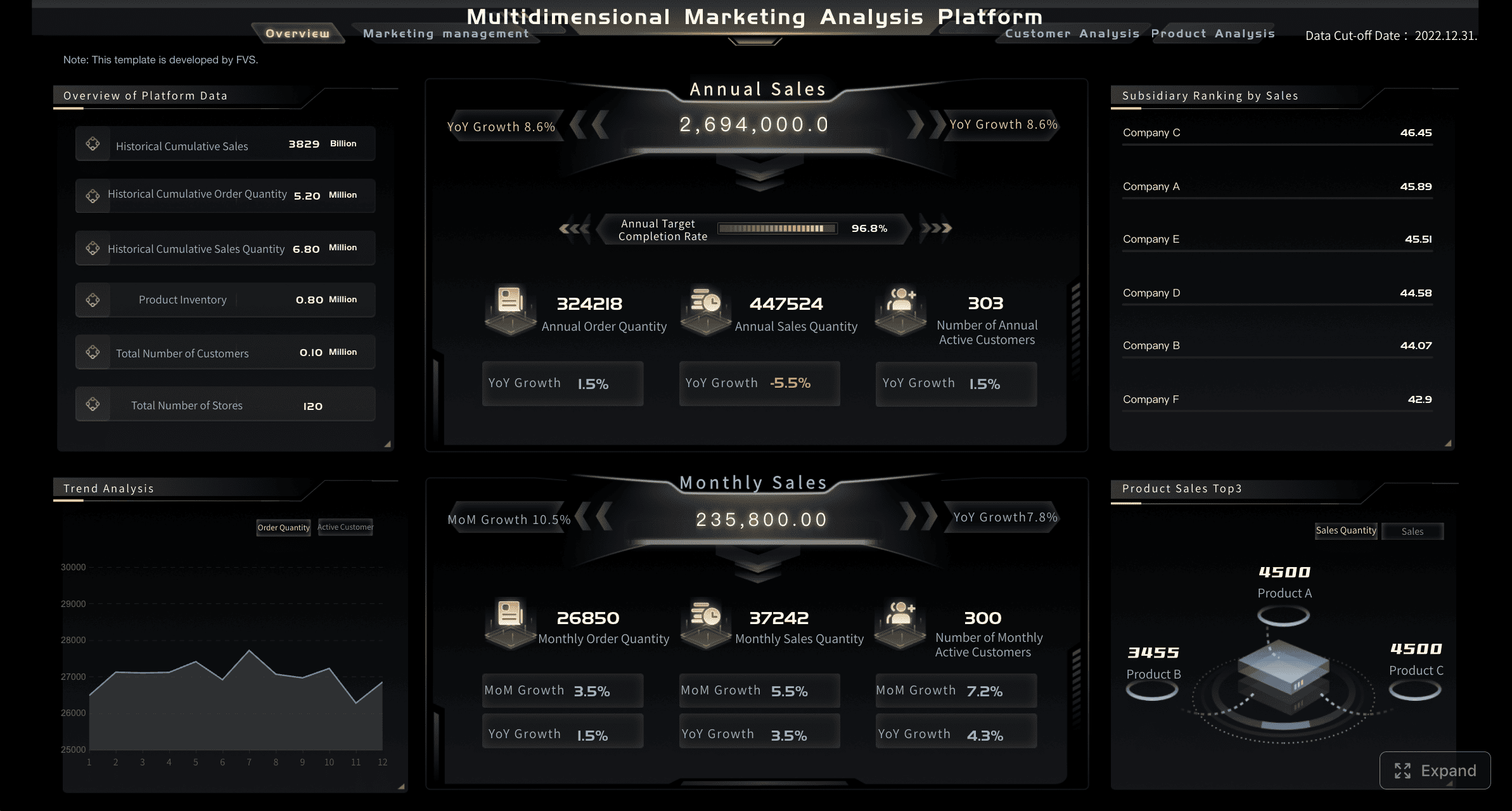 A Marketing KPIs Dashboard Example created with FineBI
7 Key Features of an Effective Marketing KPIs Dashboard Layout
An effective layout should not simply look organized. It should guide attention, reduce interpretation time, and make performance movement visible at a glance. The following features are the foundation of a high-quality dashboard template.
Clear reporting sections for weekly and monthly views
Weekly and monthly reporting should be clearly separated within the dashboard structure. Although they may share some metrics, they support different decisions.
The weekly view should emphasize:
- Short-term pacing
- Campaign status
- Budget burn rate
- Sudden anomalies
- Immediate optimization opportunities
The monthly view should emphasize:
- Longer-term trends
- Goal attainment
- Channel contribution
- Efficiency over time
- Strategic adjustments
This separation prevents confusion. A metric that looks unstable in a seven-day view may appear healthy in a monthly trend. Likewise, a monthly average may hide recent underperformance that needs immediate action.
A useful template often places these sections in separate tabs, panels, or stacked modules. This creates a natural reporting rhythm and helps stakeholders focus on the right time frame.
Core metrics grouped by funnel stage
One of the most valuable ways to structure a marketing kpis dashboard is by funnel stage. This gives users a more complete understanding of performance and reduces the risk of overemphasizing one part of the customer journey.
A strong dashboard groups metrics into four broad stages:
- Awareness: reach, impressions, sessions, new users, share of voice
- Engagement: click-through rate, engagement rate, time on page, bounce or engagement metrics
- Conversion: leads, MQLs, conversion rate, cost per lead, cost per acquisition
- Retention: repeat purchase rate, customer retention, renewal rate, customer lifetime value
This layout makes cause and effect easier to interpret. For example, traffic growth without lead growth signals a conversion issue. Rising lead volume with declining retention may indicate weak quality or misaligned targeting.
By keeping funnel stages in one view, teams can identify where performance is strengthening and where intervention is needed.
Visual trend indicators and comparisons
Dashboards are most effective when they highlight change, not just current values. A metric without context is difficult to interpret. Trend indicators solve this problem.
Key comparison elements include:
- Week-over-week change
- Month-over-month change
- Year-over-year change where relevant
- Target versus actual
- Forecast versus pace
- Threshold alerts for abnormal movement
These visual cues help stakeholders quickly understand whether performance is improving, declining, or holding steady. Simple directional arrows, conditional formatting, and compact sparklines can communicate a large amount of meaning without clutter.
For example, if lead volume is up 12% but cost per lead is up 35%, the dashboard should make both movements visible immediately. Effective design supports judgment, not just observation.
Flexible fields for team and channel reporting
No two marketing organizations operate with the exact same channel mix, ownership model, or reporting priorities. A dashboard template should therefore include flexible fields that can be customized without rebuilding the entire layout.
This flexibility is especially important for teams reporting across:
- Paid search
- Paid social
- Organic search
- Email marketing
- Social media
- Website performance
- Content marketing
- Partner or referral channels
Customizable channel sections allow teams to preserve a common dashboard framework while adapting to real operating needs. One business may prioritize SQL generation from paid campaigns, while another may focus on ecommerce revenue, content influence, or retention metrics.
This is also where a modern BI platform becomes valuable. With FineBI, teams can integrate data from multiple sources, build flexible visual layers, and tailor dashboard views for different departments without losing consistency in core KPI logic. That is particularly useful when weekly tactical reporting and monthly executive reporting need to pull from the same trusted data foundation.
Role-based summaries for executives and specialists
An effective dashboard should not force every audience to consume the same level of detail. Executive users usually need a concise summary with high-level KPIs, while channel owners need more granularity.
A strong template often includes:
- A top summary row for executive review
- Mid-level sections for funnel or channel performance
- Detailed drill-down areas for specialists
 Detailed drill-down areas
This layered design helps preserve one version of the truth while still supporting different decision levels. It also improves adoption, because users are more likely to rely on dashboards that match how they work.
Consistent metric definitions and labeling
A dashboard loses value quickly if stakeholders interpret the same metric differently. Terms such as lead, conversion, acquisition cost, or influenced revenue should be defined consistently across weekly and monthly views.
Consistency should apply to:
- Metric names
- Date ranges
- Attribution rules
- Currency and percentage formatting
- Color logic
- Target methodology
For example, if conversion rate in one section means lead form completion and in another means closed-won customer rate, reporting will become unreliable. Dashboard templates should reduce ambiguity from the start.
Action-oriented space for notes and next steps
The best marketing kpis dashboard templates do not end with visualization. They create room for interpretation and action.
Including a compact commentary or insights section allows teams to document:
- What changed
- Why it changed
- What action is recommended
- Who owns the next step
This transforms the dashboard from a monitoring surface into a performance management tool. It also improves continuity between weekly and monthly reviews, since stakeholders can see which decisions were made and whether those actions improved results.
Which Metrics to Track in Your Marketing KPIs Dashboard
Selecting metrics is one of the most important parts of dashboard design. A dashboard succeeds when it tracks a manageable set of KPIs tied to goals, not when it attempts to display every available data point.
Essential KPI categories to prioritize
Most marketing teams should prioritize KPI categories that connect channel performance to business outcomes. While exact selections vary by business model, the following categories are broadly relevant:
- Traffic and audience acquisition
- Sessions
- Users
- New users
- Traffic by channel
- Lead generation
- Leads
- Marketing qualified leads
- Form submissions
- Demo requests
- Conversion performance
- Landing page conversion rate
- Lead-to-MQL rate
- MQL-to-SQL rate
- Customer conversion rate
- Cost efficiency
- Cost per click
- Cost per lead
- Cost per acquisition
- Customer acquisition cost
- Revenue impact
- Pipeline influenced
- Revenue influenced
- Return on ad spend
- Marketing ROI
- Retention and customer value
- Repeat purchase rate
- Customer retention rate
- Churn rate
- Customer lifetime value
These categories help ensure the marketing kpis dashboard reflects both front-end performance and downstream business value.
How to choose the right number of KPIs
A common reporting mistake is trying to include too many KPIs. This usually creates clutter and weakens focus. Stakeholders stop engaging when a dashboard becomes visually dense or conceptually scattered.
For most weekly and monthly dashboards, a practical range is:
- 5 to 9 primary KPIs in the executive summary
- Supporting metrics in funnel or channel sections
- Detailed diagnostics available in drill-down views, not the main surface
A useful selection principle is simple: if a metric changes significantly, should it trigger a discussion or a decision? If the answer is no, it may not belong in the core dashboard.
This approach keeps attention on what matters most while preserving access to deeper context when needed.
Balancing leading and lagging indicators
A high-quality dashboard should include both leading indicators and lagging indicators.
Leading indicators are early signals that help teams respond before final outcomes are affected. Examples include:
- Traffic quality
- Click-through rate
- Engagement rate
- Landing page conversion rate
- MQL volume
Lagging indicators reflect business outcomes that occur later in the customer journey. Examples include:
- Revenue
- Customer acquisition cost
- Return on marketing investment
- Retention rate
- Customer lifetime value
Balancing these metrics improves decision-making. If teams look only at lagging indicators, they may react too late. If they focus only on leading indicators, they may optimize for activity without proving impact.
An effective marketing kpis dashboard connects the two. It should show how early performance patterns relate to downstream results over time.
How to Structure Weekly and Monthly Reporting with a Marketing KPIs Dashboard
The same dashboard framework can support both weekly and monthly reporting, but each reporting cycle should have a distinct structure and emphasis.
Weekly reporting: fast insights and immediate actions
Weekly reporting is designed for speed. It should help teams identify whether campaigns are on pace, where issues are emerging, and what actions should be taken in the short term.
Weekly dashboards typically focus on:
- Spend pacing
- Traffic and lead volume versus plan
- Cost per lead or cost per conversion
- Channel-level anomalies
- Campaign health indicators
- Top-performing and underperforming assets
The goal is not deep strategic analysis. The goal is to answer operational questions quickly and accurately. If paid social costs rise sharply, if email engagement drops, or if conversion rates fall on a landing page, the weekly dashboard should surface the issue immediately.
A weekly view should favor concise visuals, threshold alerts, and simple comparisons with the previous week or target pace.
Monthly reporting: trends, outcomes, and strategy adjustments
Monthly reporting should step back from day-to-day variation and evaluate broader marketing effectiveness. This is where teams assess whether their work is moving the business in the right direction.
Monthly reporting often highlights:
- Trend lines across major KPIs
- Performance against goals
- Budget efficiency
- Channel contribution to leads, pipeline, or revenue
- Audience or segment performance
- Retention and lifecycle outcomes
This is also the right reporting level for strategic questions:
- Which channels are scaling efficiently?
- Are lead quality and conversion rates improving?
- Is the current budget mix still justified?
- Which initiatives should be expanded, reduced, or reworked?
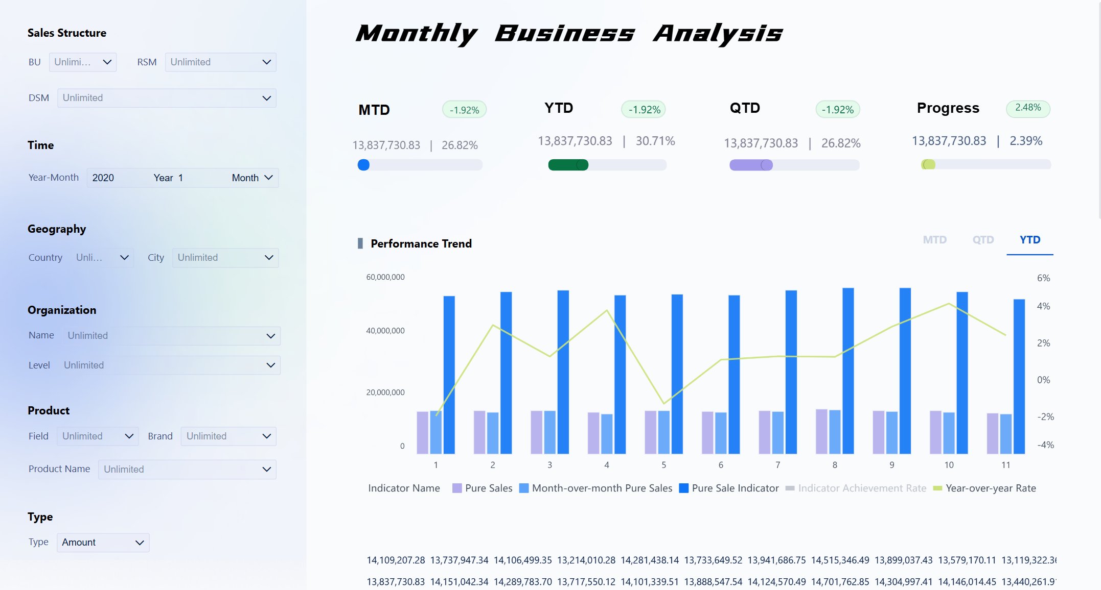
When supported by a robust BI environment such as FineBI, monthly reporting can move beyond static summaries and enable deeper analysis across dimensions like campaign type, region, product line, or customer segment. This is especially important for organizations with more complex marketing and sales structures.
Common formatting tips for readability
Formatting has a direct effect on dashboard usability. Even strong KPI selection can underperform if the layout is cluttered or inconsistent.
Practical formatting guidelines include:
- Keep labels short and standardized
- Use the same metric order each reporting cycle
- Limit color to meaningful emphasis
- Avoid overly complex chart types
- Place summary metrics at the top
- Group related KPIs visually
- Add concise written summaries for executive review
Whitespace is also valuable. A dashboard that breathes is easier to scan, interpret, and trust.
Marketing KPIs Dashboard Template Examples and Practical Use Cases
Marketing teams use a variety of dashboard formats depending on reporting maturity, stakeholder needs, and data complexity. Reviewing common formats can help teams choose the right starting point.
Common dashboard formats marketing teams use
Several dashboard structures are widely used because they align well with common reporting needs.
1. Simple scorecard dashboard
This format places the main KPIs in a compact grid with trend indicators and target comparisons. It is useful for executive overviews and weekly team check-ins.
2. Channel performance dashboard
This dashboard breaks performance down by paid, organic, email, social, and web channels. It works well for managers responsible for budget allocation and channel optimization.
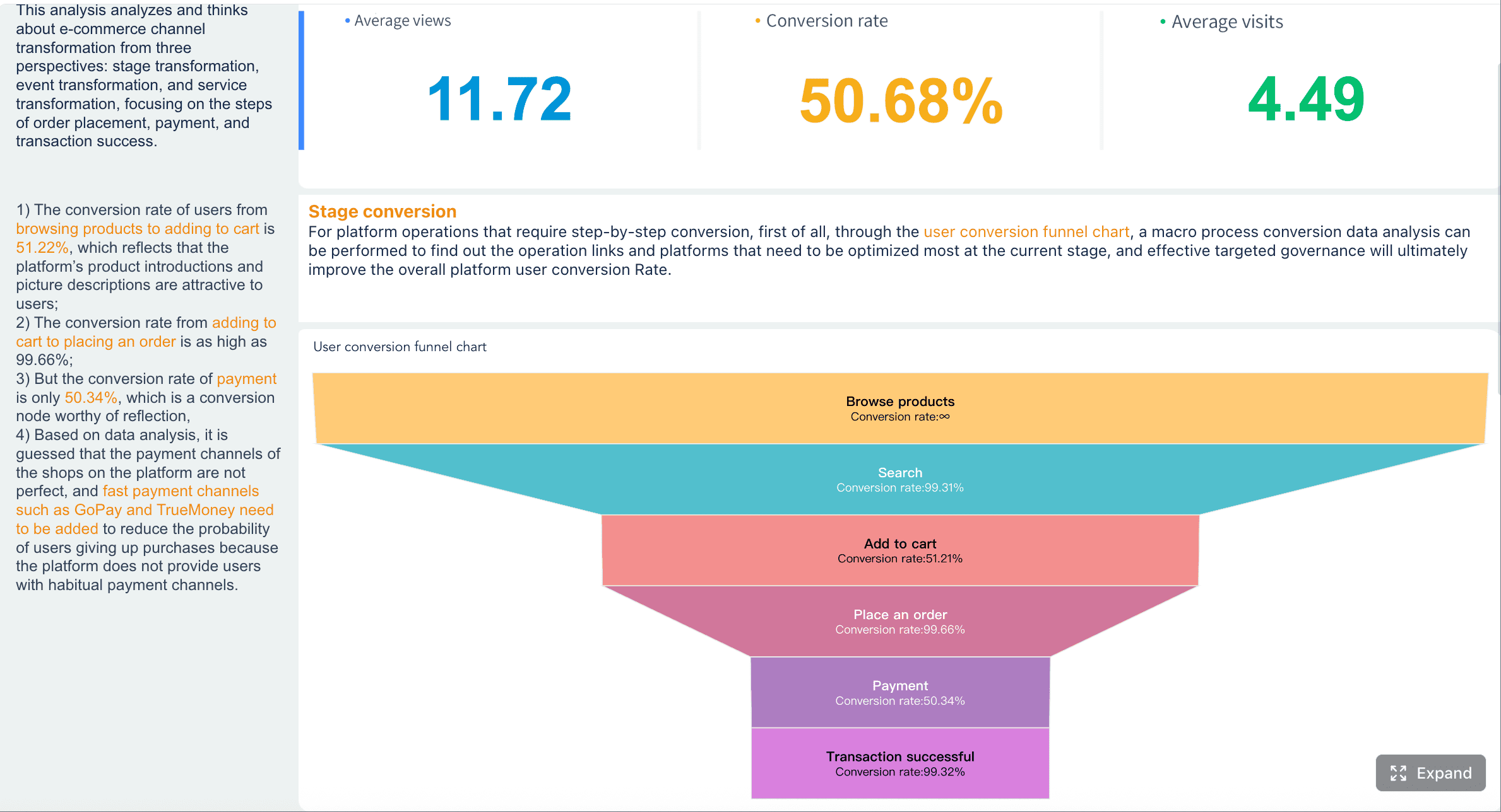
3. Funnel dashboard
A funnel layout tracks awareness, engagement, conversion, and retention metrics in sequence. It is effective for showing how activity translates into business results.
4. Executive summary dashboard
This format combines a small number of strategic KPIs with short commentary and a few trend charts. It is often used in monthly leadership reviews.
Each format has strengths. The best option depends on who uses the dashboard and what decisions it should support.
How real-world examples can guide your setup
Real examples can be useful, but they should be treated as structural inspiration rather than formulas to copy directly. A template that works for one company may not suit another if the sales cycle, attribution model, customer journey, or channel mix is different.
What teams can borrow effectively from proven examples includes:
- Section order
- Use of summary rows
- Funnel grouping logic
- Target and variance displays
- Executive commentary placement
- Drill-down patterns
What should not be copied blindly are the exact metrics. The right KPIs depend on business model, growth stage, and stakeholder priorities.
A B2B SaaS company may prioritize MQL-to-SQL conversion and pipeline influence. An ecommerce business may emphasize ROAS, average order value, and repeat purchase rate. A content-led brand may focus on organic traffic quality and assisted conversions.
When to use a template versus building from scratch
Templates are ideal when speed, consistency, and adoption matter. They reduce design time and help establish reporting discipline quickly.
A template is the better choice when:
- The team needs a standardized reporting structure
- Stakeholders review reports on a recurring cadence
- KPI logic is mostly established
- The dashboard needs to be deployed quickly
Building from scratch may be necessary when:
- The business model is unusual
- Reporting logic is still evolving
- The organization has highly specialized stakeholder needs
- Data sources or definitions require a custom architecture
In practice, most teams benefit from starting with a template and refining it over time. This approach provides immediate structure while leaving room for improvement based on actual reporting behavior.
How to Build a Repeatable Marketing KPIs Dashboard Reporting Framework
The most effective marketing kpis dashboard is not a one-time artifact. It is part of a repeatable reporting framework that aligns goals, owners, definitions, and review routines.
Start by aligning the dashboard structure with three elements:
- Business goals such as revenue growth, efficiency, or retention
- Campaign objectives such as acquisition, demand generation, or customer expansion
- Stakeholder expectations regarding reporting depth, frequency, and decision use
This alignment ensures that every KPI has a clear purpose. It also reduces the risk of reporting metrics that are visible but not strategically relevant.
Next, create a reporting cadence with clear ownership. This should define:
- Which metrics update weekly versus monthly
- Who owns each KPI
- Which systems are the source of truth
- How exceptions or data quality issues are handled
- When reporting logic should be reviewed
Without ownership and cadence, dashboards often degrade over time. Metrics become outdated, definitions drift, and trust declines.
It is also important to establish rules for change. As business priorities evolve, dashboards should evolve as well. Quarterly reviews are often useful for asking:
- Are these still the right KPIs?
- Are targets still realistic?
- Do stakeholders still use this view?
- Which sections add value, and which create noise?
Finally, the reporting framework should connect insight to action. Every weekly or monthly review should end with specific next steps. A useful structure is:
- Observation: what changed
- Interpretation: why it likely changed
- Decision: what will be done next
- Owner: who is responsible
- Timing: when it will be reviewed again
This closes the loop between measurement and execution. The dashboard then becomes more than a visual report. It becomes a system for improving marketing performance over time.
In larger organizations or data-mature teams, tools such as FineBI can strengthen this framework by supporting governed data access, cross-source integration, and dashboard customization for different user groups. That makes it easier to maintain consistency while still giving teams the flexibility they need for weekly action and monthly strategic review.
A strong marketing kpis dashboard template ultimately succeeds when it is easy to read, aligned with business goals, and embedded in a regular decision process. When weekly and monthly reporting are structured correctly, marketing teams gain faster visibility, stronger accountability, and a more direct line between data and business growth.
FAQs
A strong template should separate weekly and monthly views, show a mix of activity and outcome metrics, and connect channel data to business goals. It should also be easy for managers and executives to read without losing useful detail.
The most useful KPIs usually include traffic, engagement, conversion rate, leads, cost per lead, customer acquisition cost, and revenue or pipeline influence. The right mix depends on your goals, funnel stage, and reporting audience.
A weekly dashboard focuses on pacing, campaign health, spend, and issues that need quick action. A monthly dashboard is better for trend analysis, efficiency, goal progress, and strategic decisions.
Most teams get better results by focusing on a small set of high-impact KPIs instead of tracking everything available. Start with the metrics that directly influence decisions and tie clearly to revenue, lead quality, or efficiency.
Organize metrics by funnel stage, add trend comparisons, and include targets or benchmarks so changes are easy to interpret. A useful dashboard should quickly show what is off track, why it matters, and where the team should act next.


The Author
Yida Yin
FanRuan Industry Solutions Expert
Related Articles

How to Build an Investment Portfolio Reporting Dashboard for Executives: KPIs, Benchmarks, and Drill-Down Views
Investment portfolio reporting for executives is not about showing every holding, transaction, and chart your investment team can produce. It is about giving CEOs, CFOs, CIOs, boards, and investment committees a fast, re
Yida YIn
Jun 25, 2026

12 KPI Reporting Examples for Executive Dashboards: What to Show in Weekly, Monthly, and Quarterly Reviews
Executive leaders do not need more data. They need decision ready $1 examples that match how often they review the business and what actions they are expected to take. A weekly $1 should surface fast moving risks and per
Yida YIn
Jun 25, 2026

How to Build a Digital Marketing Reports Dashboard: Executive Examples, KPIs, and Templates
A $1 is the control layer that helps executives and marketing leaders turn scattered channel data into fast, confident decisions. If you are a CEO, CMO, operations director, or marketing analytics lead, the real problem
Yida Yin
May 07, 2026