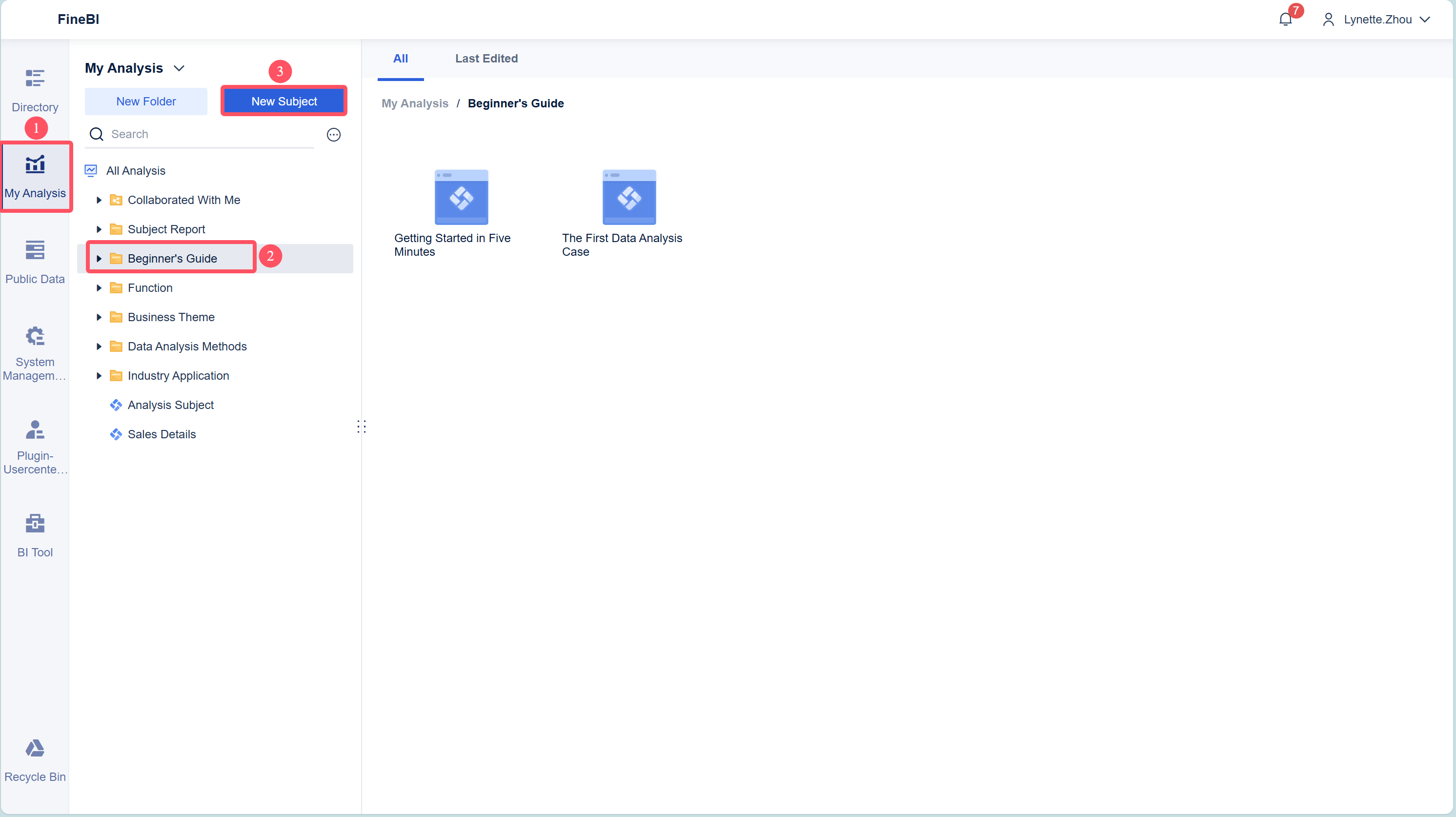
Creating a bubble diagram online has never been faster or easier. You can use a free online bubble diagram maker and see results in minutes. Many online platforms now feature drag-and-drop tools and simple point-and-click interfaces, which help you build a bubble diagram without any design or coding experience. These free tools let you visualize ideas, organize information, and share your work online. With a few clicks, you can access templates and customize your bubble diagram for any purpose. Try a free online bubble diagram maker today and discover how simple online diagramming can be.
What is Bubble Diagram
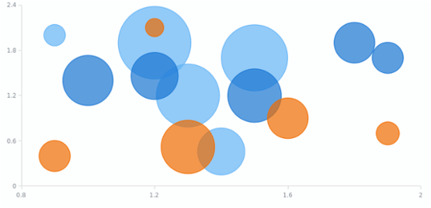
A bubble diagram is a type of chart that uses circles (bubbles) to represent data visually. Each bubble’s position shows its relationship to two variables (X and Y axes), while its size represents a third variable, such as quantity, value, or magnitude.
A bubble diagram gives you a powerful way to visualize complex information. You can use it to show relationships between three or more numeric variables at once. In a typical bubble diagram, each bubble stands for a single data point. The position of the bubble on the horizontal (x-axis) and vertical (y-axis) lines shows two different values. The size of the bubble shows a third value. Sometimes, color or even animation can add more details, making it possible to see several layers of information in one view.
You might see a bubble diagram used in business, science, or education. For example, you can compare sales numbers, population sizes, or test scores across different groups. When you look at a bubble chart infographic, you can quickly spot patterns, trends, or outliers. Larger bubbles often draw your attention to the most important or highest values. Smaller bubbles may show areas that need improvement or further study.
A bubble map diagram works well when you want to compare categories or groups. You can use it to show how different regions perform in a survey or how various products sell in a store. The visual layout helps you understand the data at a glance. You do not need to read long tables or lists. Instead, you see the big picture right away.
Tip: When you create a bubble diagram, keep the number of bubbles reasonable. Too many bubbles can make the chart hard to read. Choose clear colors and labels to help others understand your message.
Bubble diagrams help you make sense of multi-dimensional data. They turn numbers into shapes and colors, making your analysis more engaging and easier to share.
Best Free Online Bubble Diagram Makers
Top Tool Comparison
You have many options when searching for a free bubble diagram maker online. Each tool offers unique features for creating bubble diagrams, bubble infographic templates, and more. Here are some of the most popular choices:
- Canva: This online bubble diagram tool provides a wide range of bubble diagram templates and customizable templates. You can drag and drop elements, add text, and export your work easily. Canva is great for beginners who want quick results.
- Visual Paradigm: This bubble diagram software supports advanced diagramming and collaboration. You can use it for both simple and complex bubble diagram design tool needs.
- Creately: Creately offers a user-friendly interface and many bubble diagram templates online. You can work with your team in real time and use their library of shapes.
- Bubbl.us: This free bubble diagram maker focuses on mind mapping and brainstorming. You can create colorful bubble diagrams and share them with others.
- Miro: Miro is a collaborative online whiteboard. You can use it as a bubble diagram tool for team projects and workshops.
- Venngage: Venngage provides bubble infographic templates and easy customization. You can use it to make engaging visuals for reports or presentations.
- FineBI: FineBI stands out as the best bubble diagram maker for business users and data analysts. It combines powerful data integration, advanced analytics, and easy-to-use bubble diagram software features.
Note: When choosing a bubble diagram software, always consider data protection. Look for user-level permissions, secure collaboration, and access control to keep your information safe.
Why Choose FineBI by FanRuan
FineBI by FanRuan gives you a unique advantage if you need a free bubble diagram maker for business or data analysis. You can use FineBI to create interactive bubble diagrams and dashboards with ease. Here’s why many users prefer this bubble diagram tool:
- FineBI offers a self-service dataset module. You can group, calculate, join, and union data without coding.
- You can preview changes in real time and track every step. This makes data exploration flexible and easy.
- FineBI balances enterprise-grade features with simple operation. Both business users and analysts can use this bubble diagram software effectively.
- The platform includes BI administration, security, cloud analytics, and natural language generation. Many free tools do not offer these features.
- FineBI supports secure collaboration. You can manage access rights and keep sensitive data private.
FineBI’s multi-dimensional data visualization stands out. You can build interactive dashboards and share them with your team. A recent case study showed a 40% improvement in meeting efficiency using FineBI’s real-time visuals. Experts praise FineBI for its modular design and ability to make complex data easy to understand. User surveys report a 33% increase in data processing speed and better team collaboration.
| Feature Aspect | FineBI 6.0 Highlights | Supporting Evidence Summary |
|---|---|---|
| Interactive Visualizations | Instant creation of dashboards | 40% improvement in meeting efficiency through real-time visuals |
| Collaboration Tools | Real-time collaboration modules | 33% increase in team collaboration efficiency |
| Data Preparation & Calculation | Advanced algorithms for large datasets | Turns complex data into practical insights |
| Ease of Use | Intuitive design and learning resources | Non-technical staff can use it easily |
| Comparative Advantage | Customization and scalable collaboration | More intuitive and collaborative than Tableau and PowerBI |
If you want a bubble diagram software that combines ease of use, security, and advanced analytics, FineBI is your top choice. You can start with free bubble diagram templates and explore all features with no coding required.
How to Create a Bubble Diagram
Creating a bubble diagram online is simple when you follow a clear process. Whether you use FineBI or another top tool, you can turn your data into a visual story in just a few steps. Let’s break down the process into three main stages: data preparation, component creation, and dashboard creation.
Data Preparation
Start by organizing your data. Good preparation helps you build a clear and effective bubble diagram. Here are some best practices:
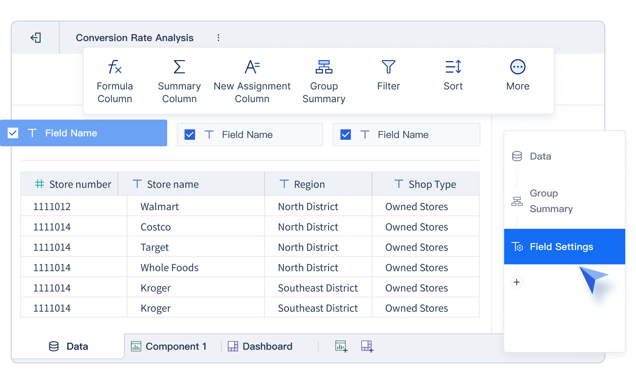
- Arrange your data in a flat table. Each column should represent a variable, and each row should show an observation.
- Pick meaningful variables for the X-axis and Y-axis. These should highlight the main message you want to share.
- Choose a variable for bubble size that has a wide range. This makes it easier to see differences between bubbles.
- Style your axes with clear ticks, gridlines, and labels. This keeps your chart easy to read.
- Use color schemes that group bubbles clearly. Categorical colors work well for groups, while numerical palettes can add extra detail.
- Adjust bubble opacity to handle overlap. A setting between 0.5 and 0.8 usually works best.
Tip: Clean and well-organized data leads to better visualizations. Take time to check your data before you move to the next step.
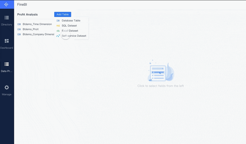
If you use FineBI, log in and create a new subject. Upload your data, such as an Excel file, and save your changes. FineBI makes it easy to connect to different data sources, so you can prepare your information quickly.
Component Creation
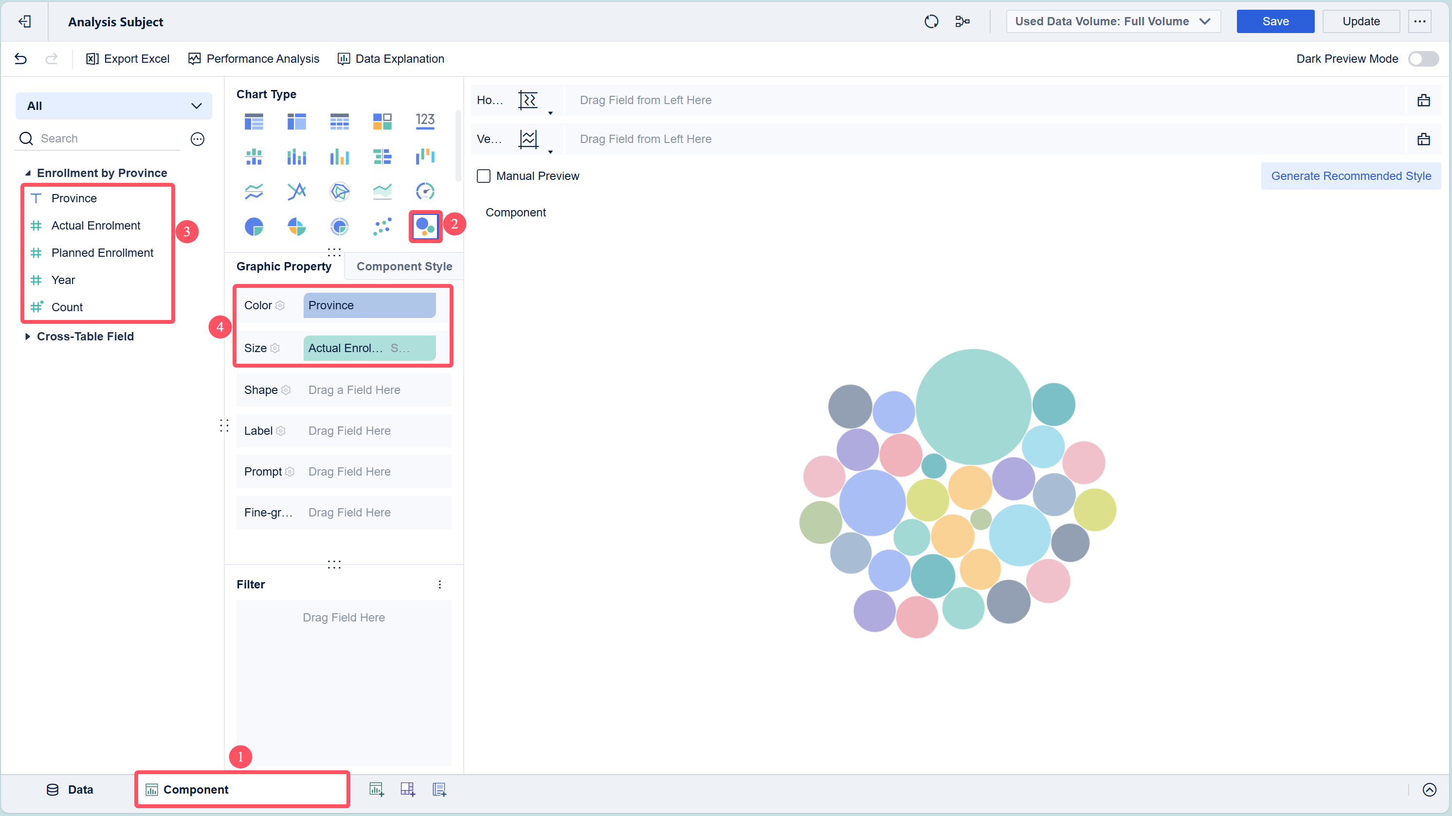
Now you can build the main part of your bubble diagram. In FineBI, this means creating a bubble chart component. Here’s how you do it:
- Select "Bubble Chart" as your chart type.
- Drag your chosen fields into the right places. For example, put "Province" in the Color property and "Actual Enrollment" in the Size property.
- Adjust the chart’s appearance. You can hide legends, change colors, and add comments to highlight important data points, like the top three provinces by enrollment.
- Preview your chart to make sure it looks clear and easy to understand.
Most online tools use a similar drag-and-drop interface. You can add bubbles, set their size and color, and customize the look to match your needs.

Note: Always check your chart for clutter. Too many bubbles can make it hard to read. Limit the number of data points if possible.
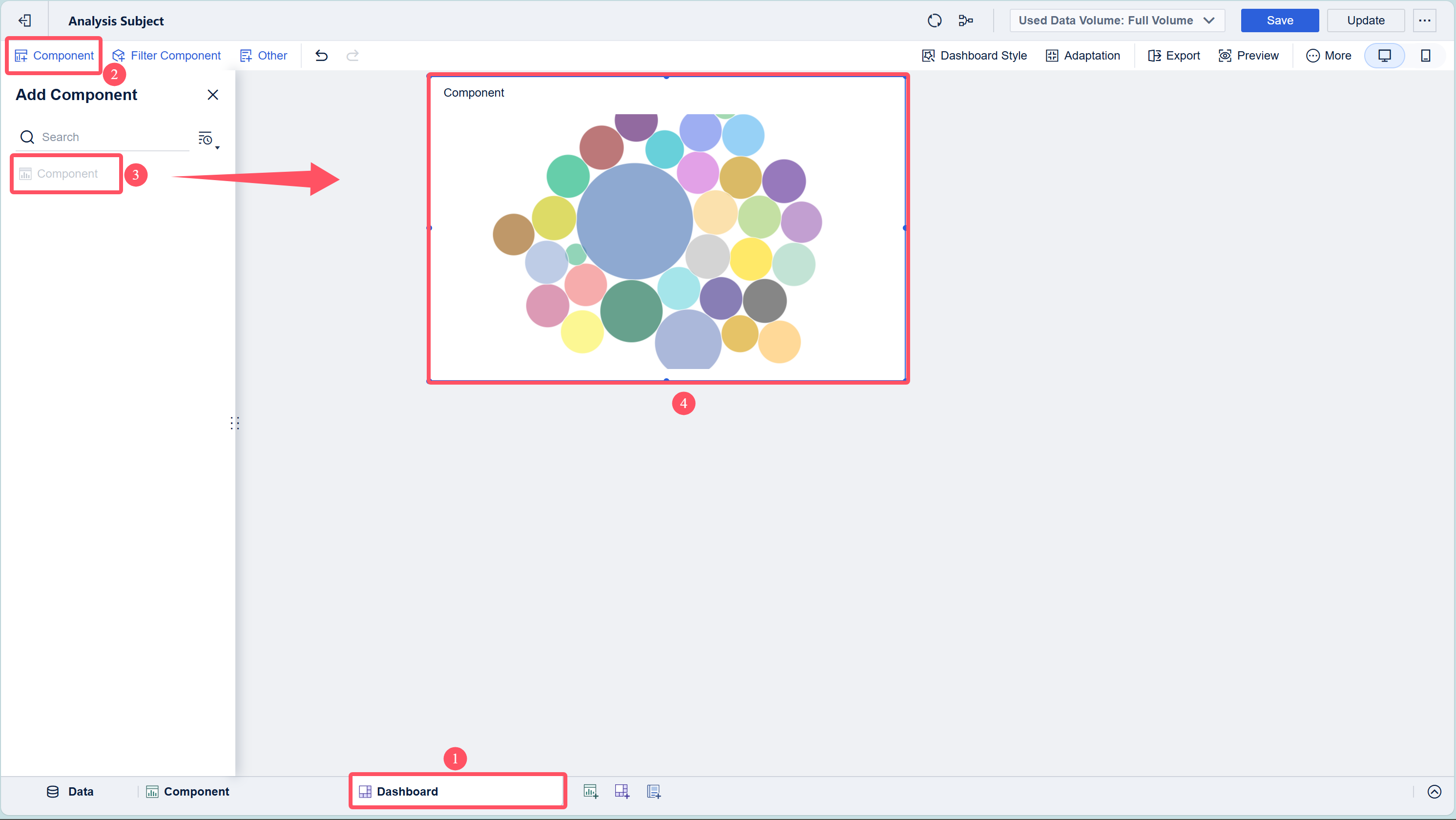
Dashboard Creation
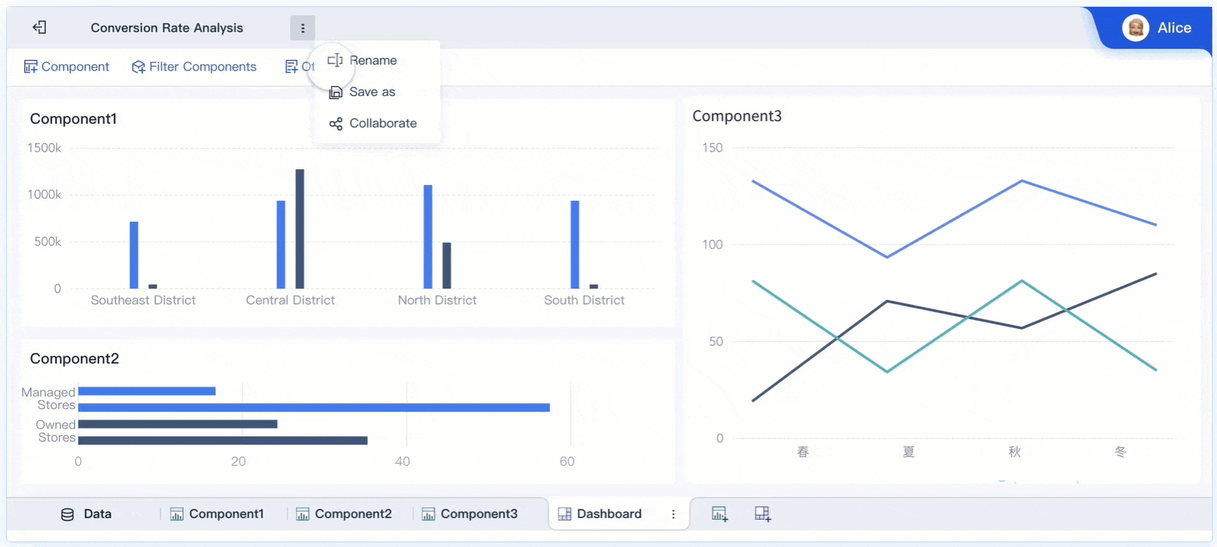
The final step is to bring your bubble diagram into a dashboard. This lets you combine different charts and share your insights with others.
- In FineBI, add a new dashboard.
- Drag your bubble chart component into the dashboard area.
- Set a custom title that explains what your chart shows.
- Arrange other charts or tables if you want to give more context.
- Save and publish your dashboard. You can view it on both PC and mobile devices.
Many online platforms let you export your bubble diagram as an image or PDF. You can also share a link with your team or audience.
Tip: Dashboards help you tell a complete story with your data. Use clear titles and labels so everyone understands your message.
By following these steps, you can create bubble diagrams online that are both informative and visually appealing. FineBI’s drag-and-drop interface and dashboard integration make the process smooth, even if you have no coding experience.
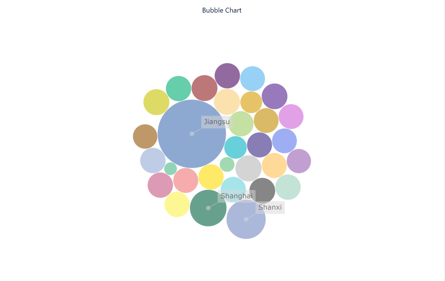
Effect Display of Bubble Diagram Created by FineBI
Detailed steps can be found in FanRuan's help documentation.
Tips for Using a Bubble Diagram Maker
Keep Diagrams Clear
You want your bubble diagram to communicate information quickly. Start by defining the purpose of each bubble. Think about what each one represents, such as a user group or a specific value. Use a program matrix to organize your ideas before you begin. This helps you decide which factors matter most, like privacy levels or square-footage targets. Place the most important bubbles where people will notice them first. Use clear labels and legends so everyone understands what each bubble means. Limit the number of bubbles to avoid clutter. Too many bubbles can make your diagram hard to read.
Tip: Always check your diagram for overlapping bubbles. Adjust the size or spacing if you see too much overlap.
Organize Data Effectively
Good organization makes your bubble diagram easy to follow. Prioritize the main drivers of your project, such as public flow or security. Place these factors along the main axes of your diagram. Use color coding to group related bubbles. For example, you can use one color for a specific user group and another for a different group. Size your bubbles to show which areas are most important. Larger bubbles can highlight key spaces or values. Try layering different versions of your diagram to explore new ideas. You might want to see how changing the layout affects the flow or relationships.
- Arrange your data in a logical order.
- Use consistent colors and sizes.
- Annotate your diagram to explain why certain bubbles are next to each other.
Enhance Visual Appeal
A visually appealing bubble diagram draws attention and helps people understand your message. Choose colors that stand out but do not distract. Use a simple background so the bubbles remain the focus. Add legends and labels to explain what each color and size means. You can also add comments to highlight important points. If you use a bubble diagram maker like FineBI, take advantage of built-in beautification tools. These features let you customize your chart and make it look professional. Remember to preview your diagram before sharing it.
Note: A clean and attractive diagram makes your data easier to understand and more engaging for your audience.
Troubleshooting Free Online Bubble Diagram
Common Issues and Solutions
When you use bubble diagram software, you may face some common problems. Overlapping bubbles can make your chart hard to read. To fix this, try reducing the number of data points or adjust the bubble size. Many software tools let you change the opacity or spacing between bubbles. This helps you see each bubble clearly.
Export errors sometimes happen when you try to save your diagram as an image or PDF. If you see this problem, check your internet connection first. Refresh the page or restart the software. Make sure you use the latest version of your bubble diagram software. Some software works best with certain browsers, so try switching browsers if you still have trouble.
Login issues can stop you from accessing your projects. If you forget your password, use the password reset option. Clear your browser cache if the software does not load. Contact customer support if you cannot solve the problem on your own.
Tip: Always save your work often. Many software tools have an autosave feature. Turn it on to avoid losing your progress.
Collaboration and Sharing Tips
Working with others in bubble diagram software can help you finish projects faster. FineBI makes collaboration easy. You can invite team members to view or edit your diagrams. Set user permissions to control who can make changes. This keeps your data safe.
When you want to share your bubble diagram, use the export or share link feature. FineBI lets you publish dashboards for both PC and mobile devices. You can also add comments or notes to explain your ideas. This helps everyone understand the data.
- Use clear labels and legends so your team knows what each bubble means.
- Check the sharing settings before you send your diagram to others.
- Update your software regularly to get the latest collaboration features.
Note: Good communication and clear diagrams make teamwork smoother. Review your bubble diagram together before making final decisions.
You can create a bubble diagram online in minutes using intuitive tools. You get access to free templates, easy customization, and real-time collaboration. You export your diagrams in multiple formats and work with others efficiently. FineBI makes the process smooth and secure. You improve clarity and share insights with your team. Try making your own diagram today and discover more data solutions with FanRuan.
Click the banner below to try FineBI for free and empower your enterprise to transform data into productivity!

Continue Reading About Bubble Diagram


FAQ

The Author
Lewis
Senior Data Analyst at FanRuan
Related Articles

10 Good Data Visualization Examples by Use Case: Sales, Surveys, Finance & Time-Series
If you are searching for $1 , you likely do not need another gallery of pretty charts. You need examples that help sales leaders hit targets, finance teams explain variance, operations managers monitor change, and analys
Yida Yin
Jun 15, 2026

12 Best Data Visualization Tools for 2026: Features, Pricing, Pros and Cons
$1 are software platforms that turn raw data into charts, dashboards, maps, and interactive visual stories for analysis and decision making. 12 best data visualization tools for 2026 at a glance
Lewis Chou
Apr 23, 2026

Top 8 Data Visualization softwares You Should Try in 2026
Compare the top 8 data visualization software for 2026, including FineReport, Tableau, Power BI, and more to find the best fit for your business needs.
Lewis
Mar 19, 2026