A scatter plot lets you see how two numbers relate to each other. You can spot patterns, clusters, and outliers quickly, which helps you make smart choices in business. Many teams use scatter plot examples to find links between things like prices and customer churn, or training budgets and employee performance.
FanRuan and FineBI lead the way in data visualization and analytics, helping you unlock the full power of data analysis with easy-to-use scatter plots.
Here is a detailed guide of No Correlation Scatter Plot Examples.
Scatter Plot Examples: What Is a Scatter Plot
Definition
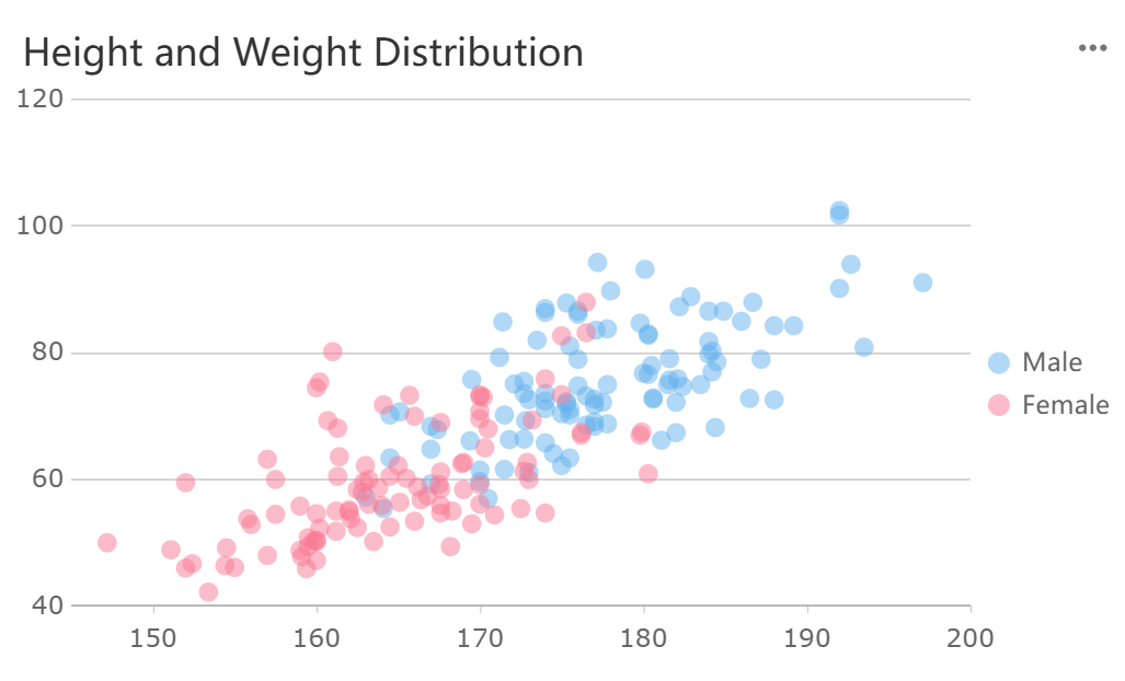
A scatter plot is a chart that shows data points on a grid using Cartesian coordinates. You place each point where the values of two variables meet. The horizontal axis usually represents the independent variable, while the vertical axis shows the dependent variable. You use scatter plot examples to examine the relationship between two variables. Each dot stands for a pair of values. Scatter plots are also called scatter charts or scattergrams. You can use a scatter graph to see how one variable changes as the other changes. This method works best when you have continuous variables and want to find patterns or trends. FineBI’s Scatter Chart makes it easy for you to create these visualizations and explore your data.
Purpose
You use scatter plots to find out if two variables move together or apart. The main goal is to spot correlation between them. Here are some reasons why you might use scatter plot examples in your analysis:
- You can quickly see if there is a positive, negative, or no correlation between variables.
- You can find clusters, gaps, or outliers in your data.
- You can check how strong or weak the relationship is between the independent variable and the dependent variable.
- You can select specific data points for deeper analysis.
- You can use scatter plots to support advanced data exploration and make your findings more robust.
- You can use this type of data visualization to match how your eyes and brain naturally spot patterns.
Scatter plots help you understand correlational relationships, but they do not prove that one variable causes the other to change.
Scatter Plot Examples: How to Creat Scatter Plot with FineBI
Data Preparation
You start your journey with scatter plots by preparing your data. FineBI makes this step straightforward. First, you select a dataset that contains at least two quantitative variables. These variables will become your independent variable and dependent variable. For example, you might choose sales figures and marketing spend, or height and weight. FineBI’s documentation recommends using scatter plots when you want to explore the relationship between two variables, such as analyzing how sales growth relates to margin percentage.
Upload your data into FineBI. You can use Excel files, CSVs, or connect directly to a database. Once your data is in the system, review the fields. Make sure you have at least one dimension and one indicator field. Dimensions often represent categories or groups, while indicators are the numeric values you want to analyze. Clean your data by checking for missing values or outliers. This step ensures your scatter plot will display accurate data points.
Tip: Scatter plots work best when you want to find trends, clusters, or outliers between two quantitative variables. You can also use advanced types like bubble plots to add a third measure.
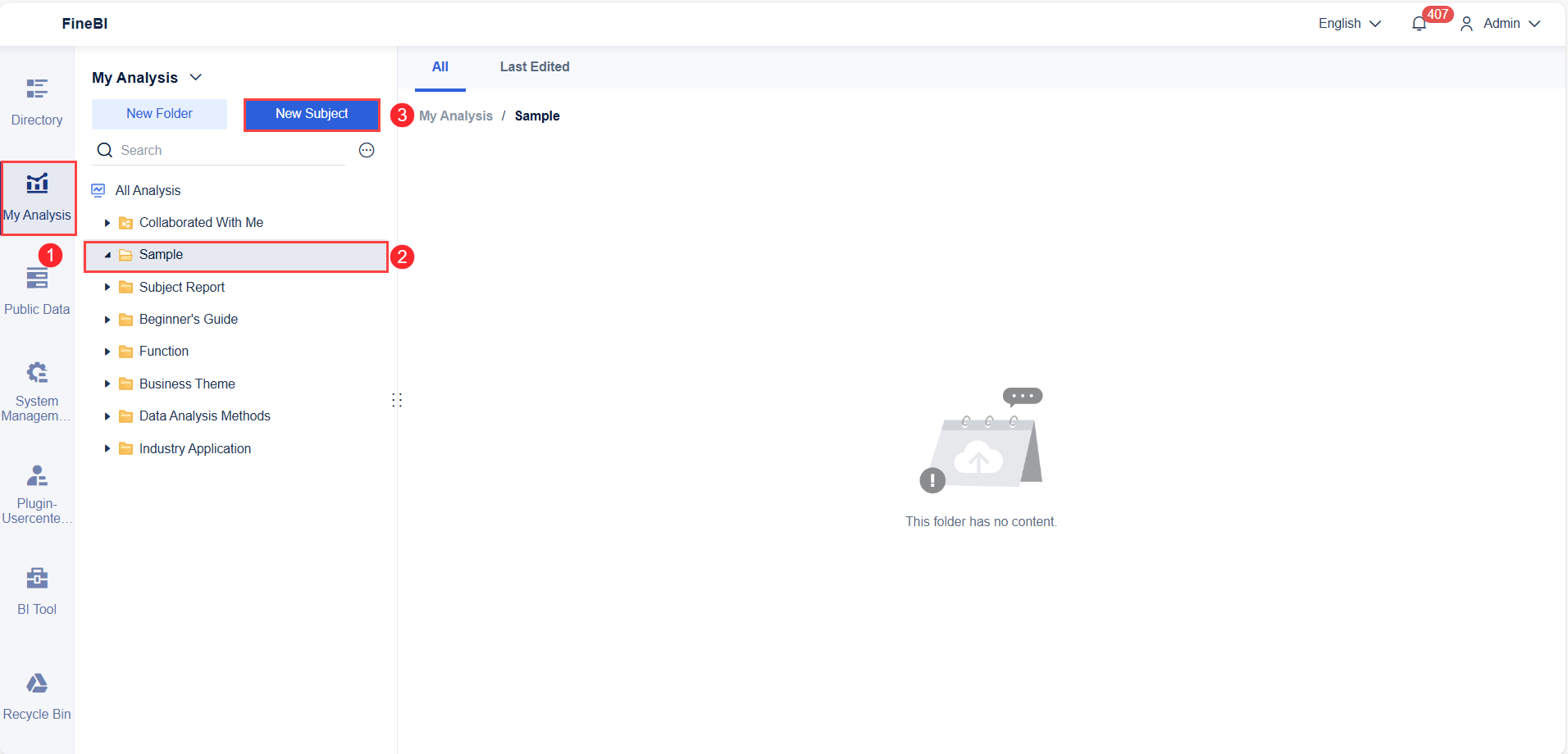
Creating a Component
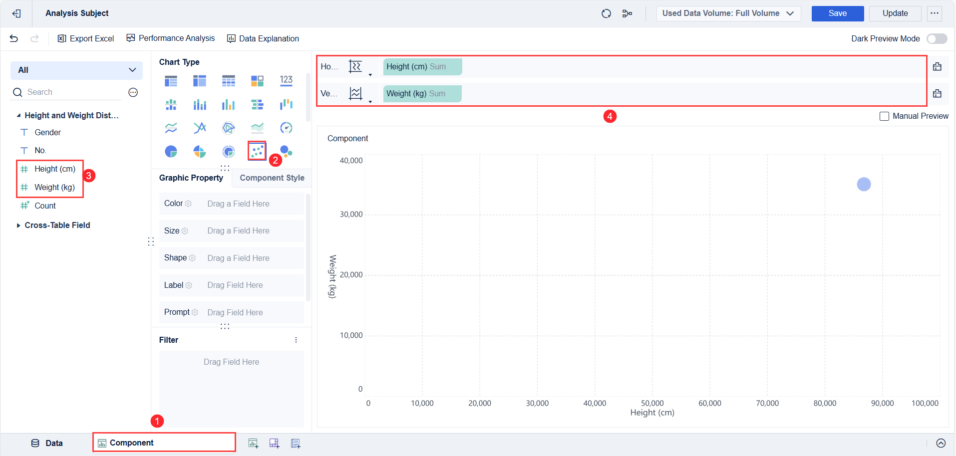
After preparing your data, you move on to creating the scatter plot component. In FineBI, this process uses a drag-and-drop interface. Select the scatter chart option from the visualization menu. Drag your chosen independent variable to the X-axis and your dependent variable to the Y-axis. Each pair of values forms a dot on the chart. These dots are your data points.
You can enhance your scatter plot by adding a third variable. Assign a category field to color or size, which helps you spot clusters or segments within your data. For example, you might color-code products by region or size the dots by profit margin. FineBI lets you adjust axis ranges, add labels, and use conditional coloring for better clarity.
Note: Formatting options like constant lines and labels help you highlight important trends or thresholds in your data.
Dashboard Creation
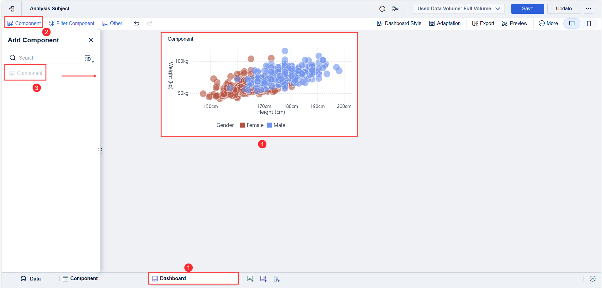
Once you have your scatter plot component, you can add it to a dashboard. FineBI’s dashboard editor allows you to combine multiple charts, tables, and filters in one view. Drag your scatter plot onto the dashboard canvas. Arrange it alongside other visualizations, such as bar charts or tables, to provide context.
You can set up interactive filters. These filters let you drill down into specific data points or segments. For example, you might filter by product category or time period. FineBI supports real-time updates, so your dashboard always reflects the latest data. You can share dashboards with your team, making it easy for everyone to explore the relationships between variables.
If you want to know how to get started using scatter plots, FineBI’s intuitive workflow guides you from data upload to dashboard sharing. This approach helps you uncover insights quickly and make informed decisions.
Effect Display
When you finish building your scatter plot in FineBI, you see more than just a simple chart. FineBI gives you a range of visual effects and interactive features that make your data come alive. These features help you understand your data points and spot important patterns quickly.
- You can view your scatter plot in both 2D and 3D. FineBI supports 3D scatter plots on a globe, which uses WebGL technology. This lets you see your data points from different angles and gives you a fresh way to explore global or spatial data.
- FineBI adds dynamic effects to your scatter plot. For example, you might see flashing animations that highlight key data points. These effects draw your attention to important changes or outliers in your data.
- You can interact with your scatter plot in real time. When you click on a data point, you trigger data linkage. This means other charts on your dashboard update instantly to show related information. You can explore relationships between different variables without leaving your dashboard.
- FineBI uses HTML5 technology to create smooth animations and interactive features. You can zoom in on clusters of data points, highlight selected areas, and see prompts on the axes. These features make it easier to focus on specific parts of your scatter plot.
- On mobile devices, FineBI adapts the display for touch screens. You can use gestures to zoom, drill down, or link data points. This makes it simple to explore your scatter plot even when you are away from your desk.
Tip: Interactive features like zooming and highlighting help you find trends and outliers faster. You can also use dynamic refresh to see updates as your database changes, so your scatter plot always shows the latest data.
These visual and interactive effects do more than just make your scatter plot look good. They help you dig deeper into your data. You can emphasize key data points, explore how different variables relate, and interact with your charts in ways that make analysis easier and more fun. FineBI’s scatter plot features turn raw numbers into clear, actionable insights. Detailed steps can be found in FanRuan's help documentation.
Download the Scatter Plot Sample Dataset
Want to recreate these scatter plot examples yourself?
Download a free dataset package containing examples of positive, negative, and no-correlation relationships.
Included in the Dataset
✓ Scatter plot sample data
✓ Excel format
✓ CSV format
✓ Business analysis examples
✓ Statistical practice datasets
✓ Ready-to-use chart templates
How to Create a Scatter Plot Using the Example Dataset
After understanding how no-correlation scatter plots work, the next step is to create your own chart and explore the data visually.
You can use either Excel or FineBI to build the chart in just a few minutes.
Create a Scatter Plot in Excel
Excel is one of the easiest tools for creating scatter plots and identifying whether two variables are correlated.
Step 1: Download the Example Dataset
Download the sample scatter plot dataset and open it in Excel.
Step 2: Select the Data
Highlight the two numerical columns you want to compare. For example:
- Advertising Spend
- Monthly Revenue
or
- Study Hours
- Exam Scores
Step 3: Insert a Scatter Plot
Navigate to:
Insert → Charts → Scatter → Scatter with Only Markers
Excel will automatically generate a scatter plot using the selected data.
Step 4: Interpret the Pattern
Observe how the data points are distributed:
- Upward trend → Positive Correlation
- Downward trend → Negative Correlation
- Random distribution → No Correlation
Step 5: Customize the Chart
To improve readability:
- Add chart titles
- Label the X and Y axes
- Adjust marker size and color
- Add a trendline if needed
By experimenting with different variables in the sample dataset, you can quickly learn how different correlation patterns appear in practice.
Create a Scatter Plot in FineBI
While Excel works well for basic analysis, FineBI makes it easier to explore larger datasets, apply interactive filters, and build dashboards around your visualizations.
Step 1: Download the Example Dataset
Start by downloading the scatter plot sample dataset.
Step 2: Import the Dataset into FineBI
Upload the Excel or CSV file into FineBI and create a new analysis project.
Step 3: Create a Scatter Plot
From the visualization panel:
- Drag one numerical field to the X-axis.
- Drag another numerical field to the Y-axis.
- Select Scatter Plot as the chart type.
FineBI automatically generates the visualization.
Step 4: Add Dimensions and Filters
To gain deeper insights, you can:
- Color points by category
- Filter by date, region, or product
- Compare multiple groups within a single chart
This helps reveal hidden relationships that may not be obvious in a basic scatter plot.
Step 5: Turn Analysis into a Dashboard
Once your scatter plot is complete, you can combine it with:
- KPI cards
- Trend charts
- Bar charts
- Geographic maps
to create a complete analytical dashboard.
Why Use FineBI for Scatter Plot Analysis?
Compared with spreadsheet-based analysis, FineBI offers:
- Interactive filtering and drill-down
- Faster exploration of large datasets
- Automated dashboard creation
- Multi-source data integration
- Easy sharing across teams
Whether you're learning data visualization or building business reports, FineBI helps you move from static charts to interactive analysis.
Scatter Plot Examples by Industry
Sales and Marketing
You can use scatter plot examples to uncover valuable insights in sales and marketing. Many leading companies rely on these charts to make smarter decisions and improve their strategies. Here are some ways businesses apply scatter plots in real-world scenarios:
- Starbucks analyzes the relationship between marketing spend and revenue for different campaigns. By plotting these variables, you can see which campaigns deliver the highest returns. Starbucks discovered that digital ads aimed at loyalty program members generated more revenue per dollar spent than broad campaigns. This insight led to a shift in budget toward personalized marketing.
- Scatter plots also help you spot diminishing returns. Starbucks found that spending too much on some campaigns did not increase revenue. This allowed them to optimize their marketing spend and boost profitability.
- Sephora uses scattergrams to segment customers by age and purchase frequency. You can identify clusters, such as younger shoppers who buy often but spend less, and older customers who shop less frequently but spend more per visit. With this information, you can tailor marketing strategies. For example, you might create targeted promotions for younger shoppers and offer exclusive perks to older, high-value customers. This approach helps you engage customers more effectively and maximize your marketing budget.
When you use scatter plot examples in sales and marketing, you can visualize the correlation between key variables, spot trends, and make data-driven decisions that improve results.
Manufacturing and Operations
In manufacturing and operations, scatter plots play a key role in process improvement and efficiency. You can use these charts to explore the correlation between production variables, such as machine run time and output or employee hours and defect rates. By plotting these variables, you can reveal hidden relationships and anomalies that guide process optimization.
Manufacturing teams often use scatter plots within interactive dashboards to monitor real-time data. For example, you might track how changes in machine settings affect product quality. When you see a cluster of points or a clear trend line, you can adjust processes to reduce defects and increase output. Companies like Toyota and General Electric have used scatter plots as part of Six Sigma projects. Toyota reduced defects by 45% and increased throughput by 30%. General Electric cut inspection time by 75% and improved accuracy by 25%. These improvements came from using visual analysis to identify critical process factors and inefficiencies.
You can also use scatter plots to set up alerts for unusual patterns. If you notice a sudden shift in the trend line or an outlier, you can investigate and take action before small issues become major problems. This proactive approach leads to better resource allocation, less downtime, and higher productivity.

FineBI Use Cases
FineBI’s Scatter Chart gives you powerful tools for KPI tracking, trend analysis, and operational insights across industries. You can connect to multiple data sources, upload Excel files, or use real-time data streams. With FineBI, you can drag and drop fields to create scatter plots that reveal the correlation between variables like sales growth and margin percentage.
You can add a trend line or fitted line to your scatter plot to highlight the overall direction of your data. This makes it easy to spot positive or negative trends and understand how one variable affects another. For example, you might track the relationship between marketing spend and lead quality, or monitor how production hours relate to defect rates. FineBI lets you customize your scatter plots with color coding, size adjustments, and dynamic filters. You can also integrate these charts into interactive dashboards for a complete view of your business.

When you use FineBI, you can share dashboards with your team, set up alerts for key metrics, and access visual analysis on any device. This flexibility helps you respond quickly to changes, optimize performance, and drive better outcomes. FineBI’s Scatter Chart empowers you to turn raw data into actionable insights, making it an essential tool for modern business intelligence.
Tip: Always add a trend line to your scatter plot when you want to see the overall pattern or direction in your data. This helps you make more accurate predictions and spot important changes over time.
Scatter Plot in FineBI
Creating a Scatter Chart
You can create a scatter plot in FineBI with just a few steps. Start by uploading your data. FineBI supports Excel files, CSV files, and direct connections to databases. After you upload your data, check that you have at least two numeric fields. These fields will become your X and Y axes. Open the dashboard editor and select the scatter chart component. Drag your chosen fields to the X-axis and Y-axis areas. Each data point will appear as a dot on the chart. You can also add a category field to color the dots by group, such as product type or region. FineBI lets you preview your chart before saving it.
Tip: You can use real-time data sources. FineBI updates your scatter plot automatically when your data changes.
Customization Options
FineBI gives you many ways to customize your scatter plot. You can change the color, size, and shape of the dots. This helps you highlight important groups or trends. You can add a third variable by adjusting the size of each dot. For example, you might show sales amount as the dot size while using revenue and profit as the axes. FineBI also lets you set axis ranges, add labels, and use dynamic formulas for more control. You can add trend lines to show the overall direction of your data. Conditional formatting helps you spot outliers or key data points quickly.
- Adjust axis scales for better clarity.
- Use color coding to show categories.
- Add constant lines to mark important thresholds.
Note: Customization makes your scatter plot easier to read and helps you find insights faster.
Dashboard Integration
You can add your scatter plot to any FineBI dashboard. Drag the chart onto your dashboard canvas. Arrange it with other charts, tables, or filters. FineBI supports interactive dashboards. You can set up filters that let users focus on certain groups or time periods. When you click a data point, other charts on the dashboard can update to show related information. FineBI dashboards work on both computers and mobile devices. This means you can view and interact with your scatter plot anywhere.
| Feature | Benefit |
|---|---|
| Real-time updates | Always see the latest data |
| Mobile support | Access dashboards on the go |
| Interactive filters | Drill down into specific groups |
Tip: Sharing dashboards with your team helps everyone make better decisions using the same data.
When to Use Scatter Plots
Advantages
You can use scatter plots when you want to explore how two numeric variables relate. These charts help you quickly spot patterns, clusters, and outliers. In business intelligence, you often need to identify correlations between variables to make better decisions. Experts recommend scatter plots for financial market analysis, healthcare outcome studies, and environmental data analysis. You can see these scenarios and strategies in the table below:
| Scenario | Business Intelligence Application | Key Expert Strategies and Insights |
|---|---|---|
| Financial Market Analysis | Exploring relationship between trading volume and stock price volatility | Use color-coding by sector, trend lines to identify outliers, logarithmic scales for extreme values |
| Healthcare Outcome Studies | Analyzing drug dosage effects on patient recovery times | Outlier management to highlight adverse reactions, clustering detection, detailed labels, interactive hover features |
| Environmental Data Analysis | Correlating CO₂ levels with temperature changes | Combining scatter plots with marginal histograms, clear trend lines to quantify relationships |
You gain several advantages when you use scatter plots for data analysis:
- You get a clear visual representation of relationships between variables.
- You can interpret data patterns quickly.
- You spot clusters, trends, and outliers with ease.
- You assess correlation between variables.
- You use scatter plots for exploratory data analysis and hypothesis generation.
- You support advanced statistical modeling, including regression and forecasting.
- You improve communication in research and business settings.
Tip: Experts suggest using clear axis labels, appropriate scaling, and color coding to enhance your scatter plots.
Limitations
Scatter plots have some limitations you should consider. When you work with large datasets, points can overlap and create visual clutter. This makes it hard to see individual data points or detect outliers. If you display many variables or groups, the chart can become confusing and lose clarity. Handling multiple scalar fields is difficult, and color blending may not work well. Advanced scatter plot types, such as warped or binned plots, often require extra training to interpret. You may also find it challenging to compare datasets or make precise numerical inferences. Some users struggle with complex visualizations due to differences in visual capacity and preferences.
- Overlapping points in dense regions make it hard to see patterns.
- Large datasets can reduce interpretability.
- Multivariate scatter plots may become cluttered.
- Lack of precise numerical scaling limits solid conclusions.
- Complex variants need more user training.
Note: You can manage these limitations by adjusting point size, spacing, and transparency, or by filtering data before plotting.
Comparison with Other Charts
You should choose scatter plots when you want to identify correlations and patterns between two continuous variables. Bubble charts let you add a third variable by changing bubble size, but they can be harder to interpret if bubbles overlap. Line charts work best for showing trends over time or ordinal data, not for variable relationships unless time-based. Bar charts help you compare categories, but they do not show relationships between continuous variables.
- Scatter plots: Best for exploring relationships and clusters between two numeric variables.
- Bubble charts: Add a third variable, useful for patterns but less precise.
- Line charts: Show trends over time, less suited for variable relationships.
- Bar charts: Compare categories, not designed for continuous variable relationships.
You can use regression lines in scatter plots to summarize data trends and support forecasting. Scatter plots give you a precise, data-rich view of how variables interact, while other charts serve different purposes in your analysis toolkit.
Tips for Effective Scatter Plots
Choosing Variables
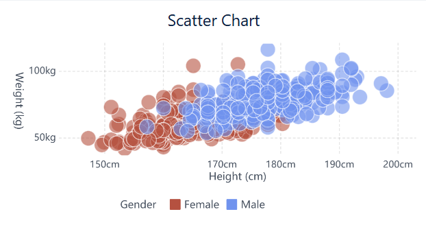
You should start by picking the right variables for your scatter plot. The best results come from using two quantitative variables, such as height and weight or sales and profit. These variables help you see patterns, trends, or correlations. If you want to add more information, you can use color, shape, or size to show a third variable. For example, you might use color to show product categories or size to show sales volume.
- Use numeric or continuous data for both axes.
- Think about what you want to learn from your chart. If you want to compare values or study relationships, choose variables that make sense for your goal.
- If you have more than two variables, consider using a scatter plot matrix or adding dimensions like color or size.
- For non-numeric data, try other visualizations such as heatmaps.
FineBI makes it easy to select and assign variables. You can drag and drop fields and see instant results. This helps you explore relationships and spot outliers in scatter plots.

Enhancing Clarity
You can make your scatter plot easier to read by following a few simple steps. Clear charts help you and your team find insights faster.
- Label your axes with variable names and units.
- Use colors to show groups or categories, but make sure your choices work for people with color vision deficiencies.
- Change the shape or size of points to highlight important data groups.
- Add gridlines and detailed ticks to help users read values.
- Include a legend if you use multiple colors or shapes.
- Add annotations, such as trend lines or text boxes, to highlight clusters or outliers.
- Choose axis scaling that fits your data. For data with a wide range, try logarithmic scales.
- Clean and normalize your data before plotting.
FineBI offers customization options, including axis formatting, color coding, and dynamic filters. You can add regression lines to show overall trends and use interactive features to zoom or highlight key areas.
Tip: Always check your chart on different devices to make sure it looks good and is easy to understand.
Avoiding Pitfalls
You can avoid common mistakes by following best practices. Many users make errors that lead to confusion or wrong conclusions.
- Do not use incorrect axis scales. This can distort your data.
- Make sure your points are sized properly. If points are too big or too small, your chart becomes hard to read.
- Always label your axes and include a clear title.
- Do not overinterpret your data. Correlation does not mean causation.
- Pay attention to context. Know where your data comes from and what it means.
- Identify outliers in scatter plots. Outliers can show important trends or errors.
- Avoid using too much or too little data. Too many points can clutter your chart, while too few may hide patterns.
- Do not manipulate data to fit a story. Stay objective.
- Review your chart for clarity. Ask others for feedback.
FineBI helps you avoid these pitfalls with built-in review tools and easy-to-use formatting options. You can set up alerts for outliers and use peer review features to improve your charts.
Note: Always remember that scatter plots show relationships, not causes. Use regression lines for trend analysis, but check your data for accuracy and context.
You gain powerful advantages when you use scatter plots for data analysis and business intelligence:
- You reveal trends, patterns, and correlations that raw numbers cannot show.
- You spot outliers and clusters, helping you make informed decisions.
- You create interactive visuals that engage your team and support strategic planning.
FanRuan and FineBI give you the tools to build insightful visualizations with ease. To deepen your skills, explore books like "R for Data Science" or attend workshops by leading experts.
Click the banner below to try FineBI for free and empower your enterprise to transform data into productivity!

Continue Reading About Scatter Plot


FAQ

The Author
Lewis
Senior Data Analyst at FanRuan
Related Articles

10 Good Data Visualization Examples by Use Case: Sales, Surveys, Finance & Time-Series
If you are searching for $1 , you likely do not need another gallery of pretty charts. You need examples that help sales leaders hit targets, finance teams explain variance, operations managers monitor change, and analys
Yida Yin
Jun 15, 2026

12 Best Data Visualization Tools for 2026: Features, Pricing, Pros and Cons
$1 are software platforms that turn raw data into charts, dashboards, maps, and interactive visual stories for analysis and decision making. 12 best data visualization tools for 2026 at a glance
Lewis Chou
Apr 23, 2026

Top 8 Data Visualization softwares You Should Try in 2026
Compare the top 8 data visualization software for 2026, including FineReport, Tableau, Power BI, and more to find the best fit for your business needs.
Lewis
Mar 19, 2026