A bullet chart is a streamlined data visualization tool that helps you compare actual performance against targets and benchmarks. You see multiple data points—such as actual results, target lines, and qualitative ranges—all in one compact view. A bullet graph uses a clean, linear design, making it easy for you to assess progress, variance, and risk. You can quickly spot how close you are to your goals, which supports faster decision-making. FanRuan and FineBI give you the power to use bullet charts for tracking KPIs and gaining clear insights from your business data.
- Bullet charts save space and reduce visual clutter, so your dashboards stay clear and focused.
- Qualitative ranges in bullet charts help you judge performance levels instantly, whether you track sales, financial metrics, or project progress.
Bullet Chart Overview
What is a 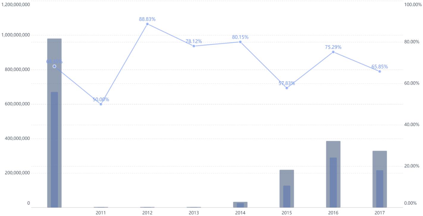
A bullet chart gives you a powerful way to see how your performance stacks up against your goals. Stephen Few invented the bullet chart to help you fit more information into a small space. He wanted to improve how you track key performance indicators (KPIs) by combining actual results, targets, and performance ranges in one clear visual.
You use a bullet chart when you want to compare a single measure, like sales or revenue, to a target. The chart shows a main bar for your actual value. It adds a marker for your target and shaded bands for performance ranges, such as poor, satisfactory, or good. This design helps you see not just the numbers, but also the context—are you meeting your goals, falling short, or exceeding expectations?
A bullet chart lets you spot trends and gaps at a glance. You can quickly see if you are on track or need to take action.
Here are some features that set bullet charts apart from other charts:
- They focus on one main measure instead of many data points.
- They compare your result to a target value.
- They show qualitative ranges, giving you context beyond just the numbers.
- They use plotBands or shaded areas to highlight performance levels.
- The design makes it easy to judge progress and spot risks.
You often see bullet charts in dashboards where space is limited. They help you track KPIs, compare forecasts to actuals, and monitor progress over time. You can use them in sales, finance, marketing, HR, and project management.
Common Use Cases for Bullet Charts
- Comparing your performance against a target.
- Showing progress toward goals.
- Visualizing key metrics like revenue or customer growth.
- Highlighting performance bands such as poor, average, or good.
Bullet Graph vs. Bar Chart
You might wonder how a bullet graph differs from a bar chart. Both use bars to show values, but they serve different purposes.
A bar chart helps you compare values across categories. For example, you can see which product sold the most units. The length of each bar shows the value for each category. This makes it easy to spot differences, trends, or outliers.
A bullet graph, on the other hand, gives you more context in the same space. You see your actual performance as a bar. You also see a target line and shaded bands for performance ranges. This lets you compare your result to a goal and see how you measure up against different thresholds.
With a bullet graph, you get a compact view of your current value, your target, and your performance bands—all in one place.
Here is a quick comparison:
| Feature | Bullet Graph | Bar Chart |
|---|---|---|
| Main Purpose | Compare measure to target and ranges | Compare values across categories |
| Visual Elements | Bar, target line, shaded ranges | Bars only |
| Context Provided | Actual, target, qualitative bands | Value only |
| Best Use | KPI tracking, dashboards | Category comparison |
Bullet graphs help you monitor KPIs, track progress, and make quick decisions. You can see if you meet, exceed, or fall short of your targets. This makes bullet graphs a favorite tool for business dashboards and performance reviews.
Bullet Chart Components
Main Bar
When you look at a bullet chart, the main bar stands out as the thick, dark line running horizontally. This bar shows the actual value of the metric you want to measure. For example, if you track monthly sales, the main bar displays your current sales number. You can quickly see how your real results compare to your goals. The main bar sits on top of colored background bands, making it easy to spot your performance at a glance. In a bullet graph, this bar acts as the primary visual element. It helps you judge your progress and see if you are moving in the right direction.
The main bar gives you a direct view of your actual performance, making it simple to compare your results with your targets and benchmarks.
Target Line
The target line in a bullet chart is a thin, vertical marker. You use this line to set your goal for the metric. For example, if your sales target is $10,000, the target line marks this value on the chart. The line is often a different color, so you can spot it easily. You decide where to place the target line based on your business goals. This marker helps you see your performance against a reference line, which is your chosen target. Bullet graphs use this feature to make sure you always know if you are meeting, exceeding, or falling short of your goals.
Qualitative Ranges
Qualitative ranges appear as colored bands in the background of bullet charts. These bands divide the chart into sections like "poor," "average," and "good." You can use these ranges to judge how well you are doing. If your main bar falls in the "good" range, you know your business is on track. If it lands in the "poor" area, you may need to take action. Bullet graphs use these background bands to add context to your data. You get a quick sense of where your performance stands, not just the numbers. These ranges help you interpret results faster and make better decisions.
- Qualitative ranges make it easy to see if you are below, meeting, or exceeding expectations.
- Bullet graphs use these bands to give you a multi-layered view of your data.
Bullet charts and bullet graphs combine these three components to give you a clear, compact way to track your progress and compare your results to your goals.
Create a Bullet Chart in FineBI
FineBI makes it easy for you to create a bullet chart that tracks your business performance. You do not need advanced technical skills. The platform guides you through each step, from preparing your data to visualizing key metrics like contract amounts and payback rates. Let’s walk through the process together.
Data Preparation
Before you start building your chart, you need to prepare your data. FineBI provides a user-friendly workflow that helps you organize your information for analysis.
- Open the 'My Analysis' section in FineBI. Choose a folder and create a 'New Subject' for your project.
- Upload your data by selecting 'Local Excel' and using the 'Upload Data' option. This step lets you bring in contract and payback information from your files.
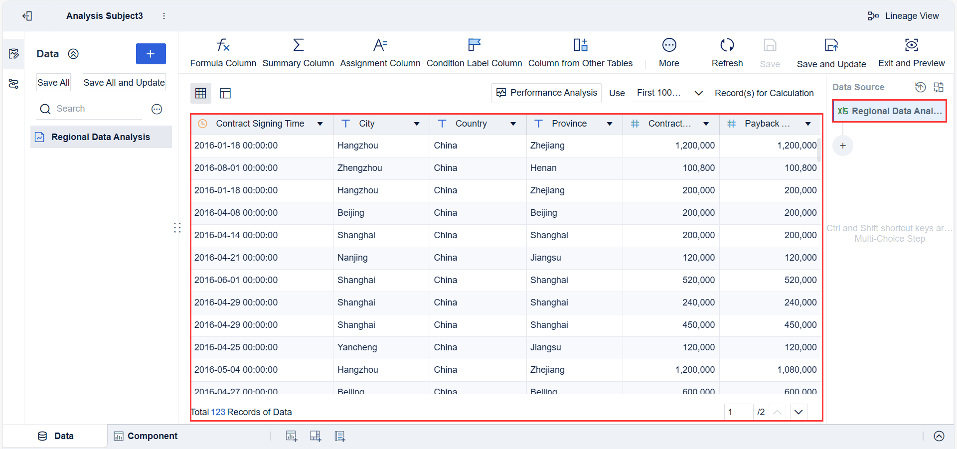
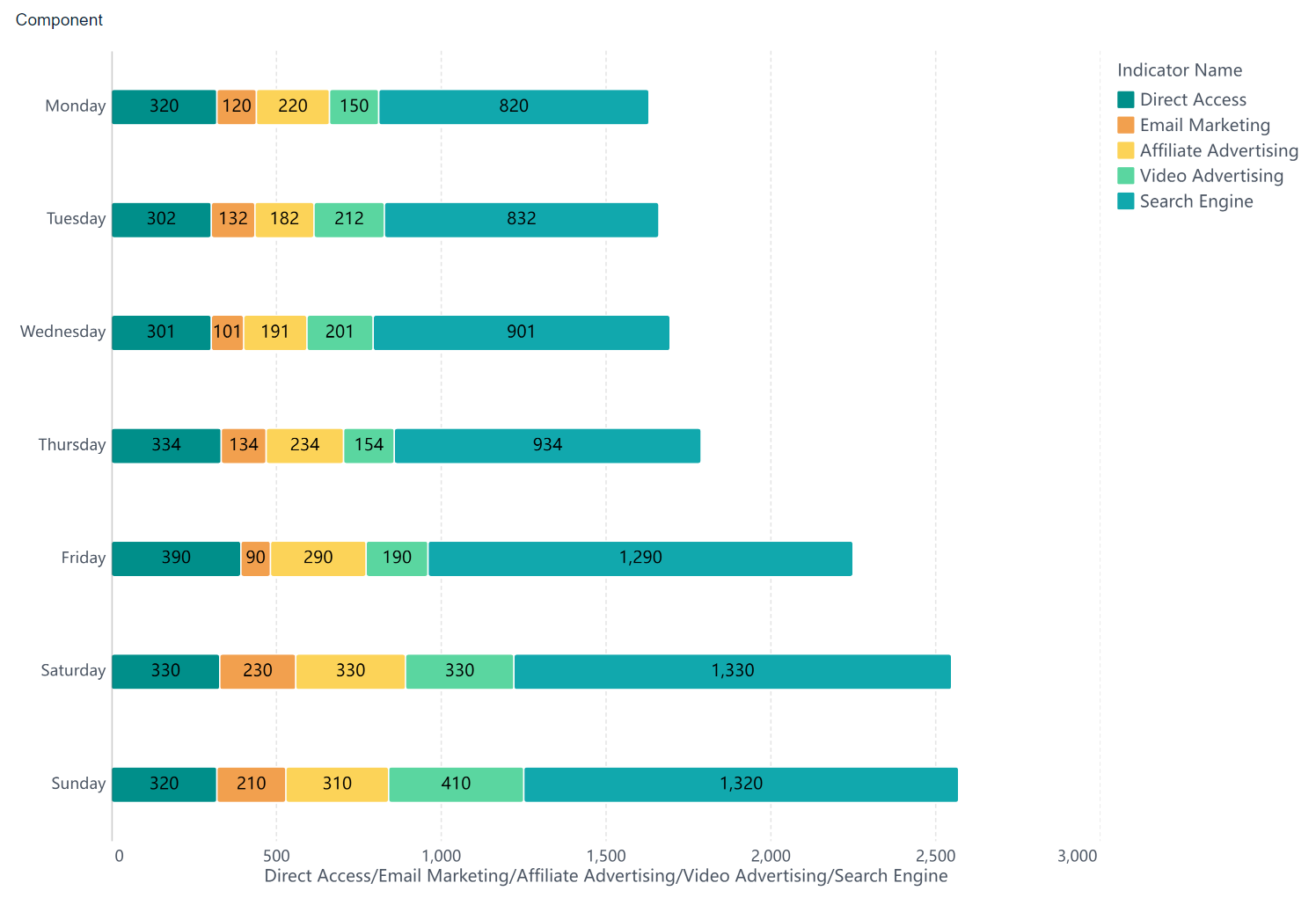
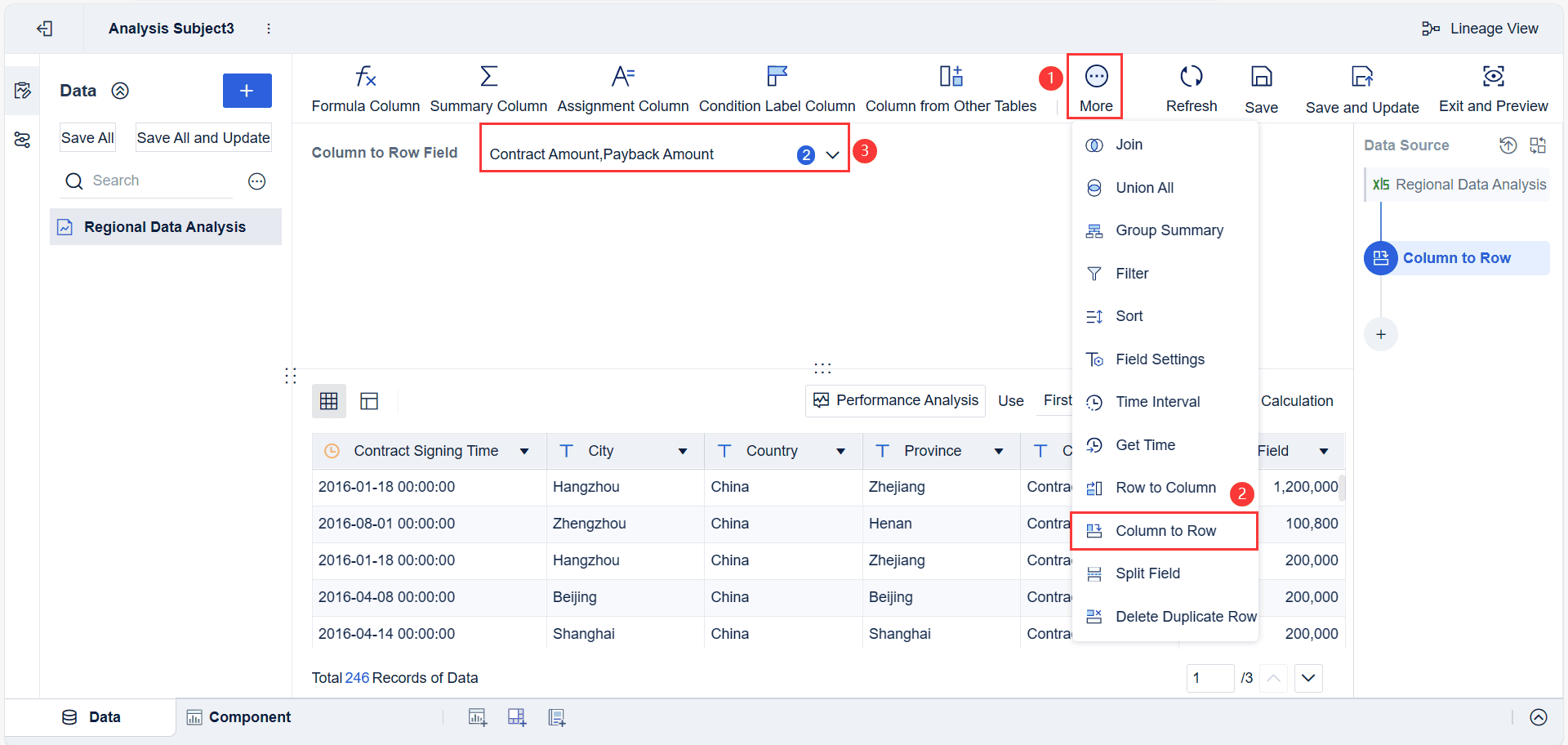
- Transform the 'Contract Amount' and 'Payback Amount' columns into rows. This structure makes it easier to compare different metrics in your bullet graph.
- Rename the converted fields for clarity. Deselect any fields you do not need. This keeps your dataset focused and clean.
Tip: Clean data leads to more accurate and meaningful visualizations. Always review your fields before moving to the next step.
Chart Building Steps
Once your data is ready, you can start creating bullet graphs in FineBI. The platform uses a drag-and-drop interface, so you can build complex visuals without writing code.
- Create a new component and select the 'Custom Chart' icon.
- Drag 'Contract Signing Time' to the Horizontal Axis. Group this field by year to compare performance over time.
- Drag 'Amount' to the Vertical Axis. This shows your contract and payback values as bars.
- Place 'Amount Type' into both the Color and Size fields. This step helps you distinguish between contract amounts and payback amounts visually.
- Adjust the color opacity to 60%. This setting improves readability and highlights differences between data types.
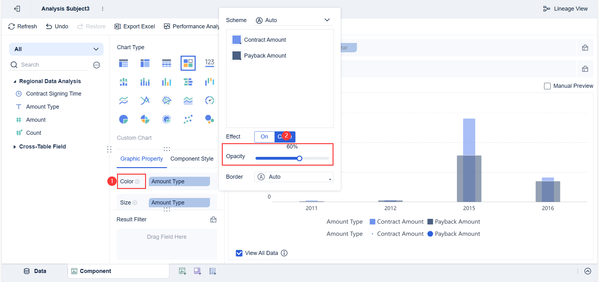
- Customize the sorting for 'Amount Type' in the Size field. Reverse the order of 'Contract Amount' and 'Payback Amount' to control the width of each column.
FineBI’s intuitive design means you can build and adjust your bullet graphs quickly. You can focus on analysis instead of technical details.
Note: You can use these steps to visualize financial KPIs, contract performance, or any metric where you need to compare actuals to targets.
Payback Rate Calculation
A key advantage of using bullet graphs in FineBI is the ability to calculate and display payback rates. This metric shows how much of your contract amount has been paid back, which is vital for financial analysis.
- Duplicate the 'Amount' field to create two new fields: 'Amount 1' and 'Amount 2'.
- Filter 'Amount 1' to include only records where 'Amount Type' equals 'Contract Amount'.
- Filter 'Amount 2' to include only records where 'Amount Type' equals 'Payback Amount'.
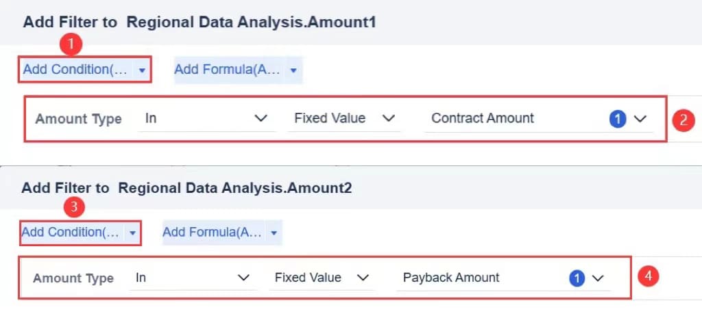
- Create a calculated indicator called 'Payback Rate'. This indicator divides 'Payback Amount' by 'Contract Amount' to show the ratio.
- Add 'Payback Rate' to the Vertical Axis. Set it to the right-value axis and limit the maximum scale to 1.
- Change the graphic property of 'Payback Rate' to 'Line'. This overlays a line graph on your bullet graph, making trends easy to spot.
- Add 'Payback Rate' to Labels and format the value as a percentage for clear interpretation.
Detailed steps can be found in FanRuan's help documentation.
You can use this approach for other ratios or performance metrics. FineBI lets you customize calculations and visuals to match your business needs.
Practical Use Cases
You can use FineBI to create a bullet chart for many business scenarios. Track financial KPIs, monitor contract amounts, or analyze payback rates over time. Manufacturing companies use bullet graphs to compare production targets with actual output. Finance teams rely on these charts to visualize revenue versus goals. If you want to learn how to make bullet graphs for your own data, FineBI provides a clear, step-by-step process that anyone can follow.
With FineBI, you can turn complex data into actionable insights. The platform empowers you to make informed decisions and drive business success.
When to Use Bullet Chart
Best Scenarios
You should use bullet charts when you want to track performance against a single target. These visuals work best for showing progress towards goals in a clear and compact way. You can easily compare actual results to targets and see how close you are to meeting expectations.
Here are some situations where bullet charts shine:
- Monitoring monthly income and comparing sales to profit targets.
- Tracking website downloads in annual or monthly reports.
- Displaying sales performance against set goals.
- Managing expenses by comparing spending to budget limits.
- Analyzing profit margins to check if you meet financial targets.
Bullet charts help you save space on your dashboard. Their simple design makes it easy to spot trends and gaps. You can use them across many industries, from finance to manufacturing, whenever you need to focus on a single metric and its target. These charts also make it easier for you to communicate results to others, even if they do not have a financial background.
Tip: Use bullet charts when you want to quickly see if you are on track, need to improve, or have exceeded your goals.
When to Avoid
Bullet charts are not always the best choice. Sometimes, other chart types give you a clearer picture. You should avoid bullet charts in these cases:
- When your audience is not familiar with the chart style, as the information density can be confusing.
- If you need to compare many categories or show trends over time, bar or line charts work better.
- When you want to display proportions or relationships between variables, pie charts or scatter plots are more effective.
- If your data uses different units or scales, bullet charts can make comparisons difficult.
- When lower numbers mean better performance, bullet charts may require extra explanation.
Here is a quick guide to help you choose the right chart:
| Chart Type | Best Use Case | Why Choose It Over Bullet Charts |
|---|---|---|
| Line Chart | Trends over time | Shows changes and patterns clearly |
| Pie Chart | Parts of a whole | Highlights proportions and percentages |
| Scatter Plot | Relationships between variables | Reveals correlations and distributions |
| Bar Chart | Comparing categories | Makes category differences easy to see |
Note: Bullet charts can look busy if you add too many elements. Keep your visuals simple for the best results.
Bullet Chart Best Practices
Design Tips
You want your charts to be clear and easy to read. Start by keeping the design simple. Avoid extra decorations and use a minimalist color scheme. Show only what matters—actual performance, past results, and goal thresholds. Use a horizontal scale so you can compare values quickly. Represent performance zones with different colors or shades. Apply color to highlight important data points, such as targets or critical thresholds.
Make sure you use consistent scales across all your charts. This helps you compare different metrics without confusion. Focus each chart on a single measure. Add labels that explain what each bar and range means. Align your charts horizontally or vertically to help you spot patterns. Design your charts to look good on any device, whether you use a computer or a phone.
Tip: Use color-blind-friendly palettes like orange and blue. This makes your charts accessible to everyone.
Here is a quick checklist for effective design:
| Tip | Why It Matters |
|---|---|
| Simple design | Reduces distractions |
| Comparative measures | Adds context |
| Consistent scales | Enables cross-comparison |
| Functional color | Highlights key data |
| Clear labels | Improves understanding |
| Responsive layout | Ensures legibility everywhere |
Common Pitfalls
You may run into problems if you add too much data to one chart. Overcrowding makes it hard to see what is important. Using similar colors for different data points can cause confusion. If you set the wrong scale, you might hide the real performance context. Failing to define targets and actual values clearly leads to ambiguity.
Some charts become visually busy when you include too many elements. If you compare metrics that do not match, you risk misleading your audience. Metrics where lower values are better need special designs, which can increase cognitive load. "Goldilocks" metrics, where the ideal value is in the middle, require unique chart variants.
Note: Keep labels short and use tooltips or legends to help users understand your charts. If you have many metrics, use several charts side by side instead of overloading one.
You can avoid these pitfalls by simplifying your design, using clear color coding, and providing context for each measure. Remove anything that does not support your main message. Add data labels for actual and target values to give precise information. Visualize performance gaps with numbers or percentages so users do not have to calculate them mentally.
You have seen how bullet charts help you track performance and spot trends quickly. These visuals show if you meet targets, highlight urgent issues, and make it easy to compare results. Stephen Few recommends this chart for dashboards where space and clarity matter. If you want to go further, try FineBI’s drag-and-drop reporting, join workshops, or pursue Fanruan Certified Professional certification. These steps will help you master advanced data visualization and real-time analysis.
Click the banner below to try FineBI for free and empower your enterprise to transform data into productivity!

Continue Reading About Bullet Chart


FAQ

The Author
Lewis
Senior Data Analyst at FanRuan
Related Articles

10 Good Data Visualization Examples by Use Case: Sales, Surveys, Finance & Time-Series
If you are searching for $1 , you likely do not need another gallery of pretty charts. You need examples that help sales leaders hit targets, finance teams explain variance, operations managers monitor change, and analys
Yida Yin
Jun 15, 2026

12 Best Data Visualization Tools for 2026: Features, Pricing, Pros and Cons
$1 are software platforms that turn raw data into charts, dashboards, maps, and interactive visual stories for analysis and decision making. 12 best data visualization tools for 2026 at a glance
Lewis Chou
Apr 23, 2026

Top 8 Data Visualization softwares You Should Try in 2026
Compare the top 8 data visualization software for 2026, including FineReport, Tableau, Power BI, and more to find the best fit for your business needs.
Lewis
Mar 19, 2026