Investment portfolio reporting for executives is not about showing every holding, transaction, and chart your investment team can produce. It is about giving CEOs, CFOs, CIOs, boards, and investment committees a fast, reliable view of performance, risk, benchmark context, and portfolio health so they can make better capital allocation and governance decisions with confidence.
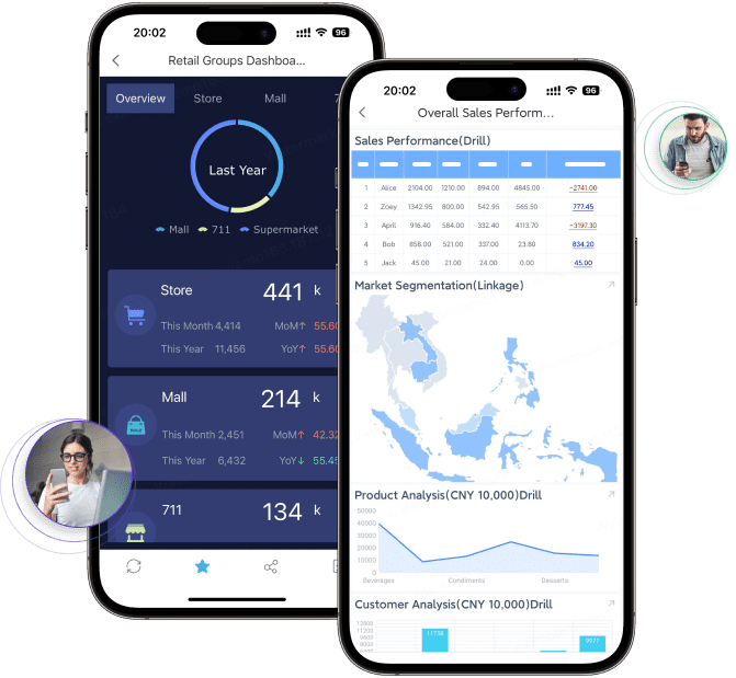
 Click To Try The Dashboard
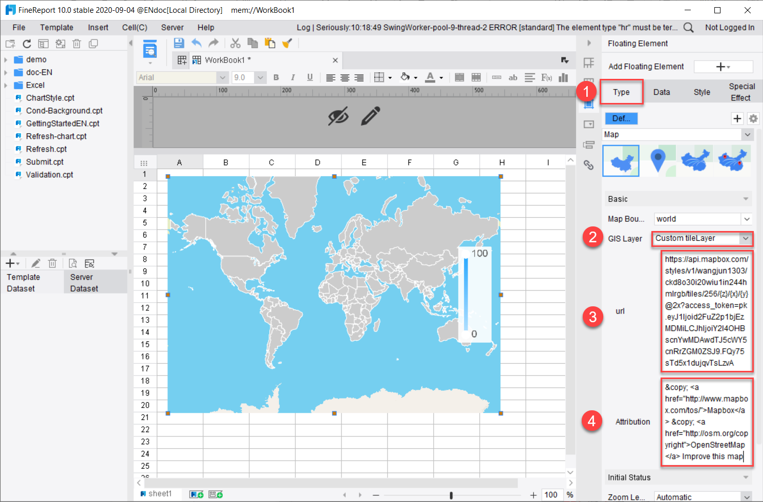
All reports in this article are built with FineReport
What executives need from investment portfolio reporting
The first job of executive-level investment portfolio reporting is to shorten decision cycles. Leaders need to know whether the portfolio is on plan, what changed since the last review, where risk is building, and whether action is required. If the dashboard cannot answer those questions in under a minute, it is too dense or too technical.
Executive audiences are different from analysts. A CEO may want to understand enterprise liquidity, strategic asset allocation drift, and broad portfolio direction. A CFO will focus on net return, cash availability, fee drag, and downside exposure. A CIO and investment committee will expect deeper context around attribution, mandate compliance, and benchmark-relative results. The board usually wants a concise oversight package, not a research workstation.
That is why strong investment portfolio reporting separates strategic summary views from analyst-level detail. The executive layer should present a clean summary with only the most decision-relevant numbers. Detailed holdings, transactions, factor exposures, and model diagnostics should sit behind drill-down paths, not on the opening screen.
The reporting cadence matters just as much as the layout. Monthly reviews often support tactical oversight, quarter-end reviews support board reporting and strategy checks, and ad hoc reviews support market events or allocation decisions. Each dashboard review should be tied to specific decisions, such as:
- Whether current performance is within tolerance
- Whether asset allocation has drifted from policy
- Whether any manager or strategy requires escalation
- Whether rebalancing, de-risking, or liquidity action is needed
- Whether benchmark assumptions remain appropriate
Choose the KPIs that matter most
A high-value dashboard starts with metric discipline. Executives do not need more indicators. They need the right ones, consistently defined and clearly visualized.
Core performance metrics
Core performance metrics should explain both absolute outcomes and relative success. That means the dashboard must show what the portfolio earned, what investors kept after fees, and how results compare with the agreed benchmark.
Key Metrics (KPIs)
- Total Return: The gross performance of the portfolio over a selected period before fees and certain expenses.
- Net Return: The return after management fees, trading costs, or other applicable charges.
- Benchmark-Relative Return: The excess return versus policy, blended, peer, or custom benchmark.
- Risk-Adjusted Return: Performance evaluated relative to risk taken, often using ratios such as Sharpe or information ratio.
- Month-to-Date (MTD): Current-month performance snapshot for short-term monitoring.
- Quarter-to-Date (QTD): Performance over the current quarter for formal review cycles.
- Year-to-Date (YTD): Calendar-year performance used in executive and board reporting.
- Since Inception: Long-term performance from portfolio launch or mandate start date.
- Contribution to Return: The impact of each asset class, strategy, manager, or region on total portfolio return.
- Allocation Drift: The difference between current allocation and target policy weights.
- Volatility: The degree of return variability over time.
- Maximum Drawdown: The largest peak-to-trough decline during a selected period.
- Concentration: Exposure to a small number of positions, sectors, managers, or regions.
- Liquidity Level: How much of the portfolio can be converted to cash quickly without significant value impact.
- Duration: Interest-rate sensitivity for fixed income portfolios.
- Currency Exposure: Portfolio sensitivity to foreign exchange movements.
- Limit Breaches: Instances where exposure, mandate, or policy thresholds have been exceeded.
- Cash Position: Available liquidity for operations, capital calls, redemptions, or tactical deployment.
- Fee Impact: The effect of costs on reported net performance.
- Rebalancing Status: Whether the portfolio is aligned with target weights or requires action.
- Mandate Compliance: Status against investment guidelines, concentration limits, or policy restrictions.
- Portfolio Checkup Score: A simplified health indicator combining performance, risk, allocation, and compliance status.
At the executive level, these metrics should be displayed across multiple time windows: MTD, QTD, YTD, and since inception. This prevents short-term noise from dominating the narrative and allows leadership to balance recent conditions against long-term objectives.
Contribution analysis is especially useful. A portfolio may outperform overall while hiding underperformance in a key strategy or manager. Showing contribution to return by asset class, strategy, manager, or region makes the source of results easier to understand.
Risk and exposure indicators
Performance without risk context is incomplete investment portfolio reporting. Executives need to know not only what happened, but how much risk was taken to achieve it and where the portfolio may be vulnerable next.
The dashboard should track:
- Volatility trends over time
- Current and historical drawdown
- Concentration by holding, manager, sector, or region
- Liquidity buckets and restricted assets
- Duration profile for fixed income exposure
- Currency exposure by base and non-base currencies
- Allocation shifts versus target
- Risk limit breaches and unresolved exceptions
These indicators should trigger alerts when thresholds are crossed. Executives should never need to search manually for a material breach. A dashboard that surfaces concentration spikes, liquidity deterioration, or off-policy allocation drift immediately is far more useful than one that simply archives static numbers.
Operational and portfolio health measures
Many dashboards fail because they treat portfolio reporting as performance reporting only. Executive oversight also depends on operational readiness and portfolio health.
Useful operational measures include:
- Current cash levels and projected liquidity needs
- Fee impact by strategy or manager
- Rebalancing completion status
- Mandate and policy compliance
- Recent changes in positioning
- A simple portfolio checkup panel summarizing whether strategy, current allocation, and recent performance remain aligned
A portfolio checkup view is particularly effective for board and committee discussions. It translates technical data into a practical summary: Is the portfolio aligned with strategy, within risk tolerance, and positioned appropriately given recent results?
Build benchmark views that create context
Benchmarks are what turn raw performance into decision-ready information. Without them, executives cannot tell whether a gain is strong, weak, or simply market beta.
Select the right benchmarks
The benchmark must match the portfolio’s objective, asset mix, mandate, and time horizon. A mismatch will distort interpretation and create misleading executive conversations.
Use cases for benchmark selection often look like this:
- Policy benchmark: Best for governance oversight and strategic allocation reviews
- Blended benchmark: Best for multi-asset portfolios with diversified target weights
- Custom benchmark: Best when mandates are specialized or liabilities require tailored comparison
- Peer benchmark: Best for external competitiveness or industry context, but should not replace policy benchmarking
The important point is consistency. If benchmark logic changes often, executives lose confidence in reported results. Any benchmark change should be clearly labeled and explained.
Compare performance in a meaningful way
Executive dashboards should show absolute and relative performance side by side. That means one view for total and net portfolio returns, and another for excess return against benchmark.
Attribution is what makes relative performance actionable. If the portfolio outperformed, leaders need to know whether that came from:
- Strategic asset allocation
- Tactical overweight or underweight decisions
- Manager selection
- Security selection
- Currency positioning
- Market beta or broad factor exposure
A strong attribution view also separates market effects from manager skill. This is crucial in executive meetings. Otherwise, teams may claim success that was largely market-driven, or overlook genuine alpha masked by broad market weakness.
Prevent misleading comparisons
Benchmarking errors can damage trust quickly. The dashboard should call out the most common sources of distortion:
- Benchmark changes during the reporting period
- Style drift in managers or sleeves
- Different valuation timing across sources
- Inconsistent treatment of fees, accruals, or cash flows
- Incomplete benchmark history
- Different methodologies for annualization or attribution
When executive audiences see clear notes on methodology and assumptions, the investment portfolio reporting becomes more credible. Transparency is a governance feature, not an afterthought.
Design drill-down views without overwhelming leaders
Executives want optional detail, not forced detail. The right drill-down structure gives them a clean summary first, then lets them investigate only when needed.
Start with an executive summary layer
The landing page should answer four questions immediately:
- How is the portfolio performing?
- How does that compare with benchmark?
- What risks or exceptions need attention?
- What changed since the last review?
That means the first screen should include:
- Headline KPI cards
- Benchmark-relative snapshot
- Top movers or notable changes
- Alert summary
- Brief commentary or management notes
Visual hierarchy matters here. The most important information should be visible in seconds. Use larger KPI cards for total return, benchmark-relative return, drawdown, and cash position. Keep commentary short and decision-oriented.
Add progressive detail by dimension
Once the summary is clear, the dashboard should support drill-down by the dimensions executives actually use in meetings:
- Asset class
- Account or legal entity
- Geography
- Sector
- Manager
- Strategy
- Security
Those drill-downs should connect summary metrics to the underlying data, including holdings, transactions, exposures, and attribution.
For example, if an executive clicks on an underperforming equity sleeve, they should be able to see the responsible manager, regional breakdown, sector weights, top positions, and attribution drivers without leaving the reporting environment.
Make the dashboard easy to read and trust
Clarity is a design choice. Executive investment portfolio reporting should use:
- Consistent metric names across all views
- Uniform time periods and date logic
- Simple chart types such as line charts, bar charts, heatmaps, and waterfalls
- Minimal decoration and no unnecessary 3D visuals
- Clear legends and labels
- Notes that explain how to read the report
Trust also depends on definitional consistency. If “net return” means one thing on the summary page and another in the board PDF, adoption will suffer. Keep calculations, labels, and timing rules standardized across every output.
Build the data and reporting workflow behind the dashboard
A polished front end cannot compensate for a weak reporting pipeline. Most investment portfolio reporting challenges come from fragmented data, inconsistent calculations, and manual reconciliation.
Define source data and calculations
Your reporting model should consolidate all critical inputs into one governed layer:
- Custodial and portfolio accounting data
- Market prices and reference data
- Benchmark files
- Manager reports and external valuations
- Transaction and cash flow records
- Exposure, duration, and factor data where relevant
Standardization is non-negotiable. Define calculation logic centrally for:
- Time-weighted and money-weighted returns
- Gross and net performance
- Exposure calculations
- Valuation rules
- Contribution and attribution
- Risk indicators
- Compliance exceptions
Without this, different teams will report different answers to the same executive question.
Set governance and quality controls
Executives need reporting they can trust in board meetings and audit reviews. That requires explicit governance.
Best-practice controls include:
- Named data owners for each source and metric family
- Validation workflows before publication
- Exception queues for stale or missing data
- Approval checkpoints for benchmark changes and methodology edits
- Audit trails for historical restatements
- Version control for published dashboards and PDFs
If a benchmark series changes, or a valuation is restated, that change should be tracked automatically. Good investment portfolio reporting is as much about process integrity as visual clarity.
Choose tools and delivery formats
The right toolset depends on complexity, scale, and audience expectations. Many organizations use a combination of portfolio systems, data warehouses, and BI or reporting tools.
Delivery should support multiple consumption formats:
- Live executive dashboards
- Board-ready PDF packs
- Email summaries for review cycles
- Mobile-friendly views for leadership on the move
- Exportable drill-down reports for committee follow-up
The goal is one governed reporting workflow that can serve multiple channels without rebuilding the same report manually every month.
Common mistakes and a practical rollout plan
Many investment reporting programs fail not because they lack data, but because they skip prioritization and stakeholder alignment.
Mistakes to avoid
The most common mistakes are predictable:
- Overloading the dashboard with too many metrics
- Mixing executive oversight with analyst workflow detail
- Using inconsistent time frames across pages
- Reporting returns without benchmark context
- Showing risk without explaining why it matters
- Omitting commentary on major allocation shifts or exceptions
- Allowing manual spreadsheet adjustments to bypass controls
A dashboard should simplify governance, not create more debate about what the numbers mean.
Roll out in phases
The most effective rollout is phased and practical. As a consultant, I recommend the following approach:
-
Start with the core executive questions
Identify the 8 to 12 questions leaders ask in every review. Build the first version of the dashboard to answer those questions only. -
Launch a minimum viable dashboard
Begin with core performance, benchmark, risk, allocation, and alert views. Do not wait for every drill-down and edge case before release. -
Test with real stakeholders
Review the dashboard with executives, finance, investment teams, and governance owners. Watch where they hesitate, what they click, and what they ask for next. -
Add drill-downs based on usage
Expand by dimension only after the summary layer is working well. Build deeper views for manager, sector, geography, or security based on actual demand. -
Review the dashboard quarterly
Portfolio strategy, mandates, and governance needs change. Your reporting design should evolve with them.
After implementing these practices, organizations usually see faster review meetings, fewer reconciliation disputes, and better executive alignment around portfolio decisions.
Build faster with FineReport instead of doing it manually
Building this manually is complex; use FineReport to utilize ready-made templates and automate this entire workflow.
FineReport is especially well suited for executive investment portfolio reporting because it helps teams combine governed data, flexible dashboard design, and drill-down interactions in one reporting layer. Instead of stitching together spreadsheets, static slide decks, and disconnected BI pages, you can deliver a single experience for performance, benchmark analysis, risk oversight, and board-ready reporting.
With FineReport, teams can:
- Build executive summary dashboards with KPI cards, alerts, and commentary
- Connect drill-down views to holdings, transactions, and attribution data
- Standardize calculations and reuse reporting logic across templates
- Automate scheduled delivery for dashboards and PDF board packs
- Maintain governance with permission controls and centralized reporting workflows

Get Ready-to-Use Dashboard Templates in Fine Gallery
If your current investment portfolio reporting process relies on manual consolidation, repetitive formatting, and last-minute validation, that is usually a sign the workflow has outgrown spreadsheets. FineReport gives enterprise teams a faster path to standardized executive dashboards without sacrificing detail, control, or presentation quality.
The practical outcome is simple: better decisions, less reporting friction, and more trust in every executive review.
FAQs
It should focus on a small set of decision-making KPIs such as total return, net return, benchmark-relative return, allocation drift, drawdown, liquidity, and compliance status. The goal is to show portfolio health quickly without overwhelming leaders with analyst-level detail.
An executive dashboard emphasizes summary, speed, and action, while analyst reports go deeper into holdings, transactions, and model-level diagnostics. Executives need clear signals and drill-down paths, not a research workstation on the first screen.
Most executive reports should show MTD, QTD, YTD, and since inception views. This helps leaders balance short-term movement with long-term performance and strategy alignment.
Benchmark comparison shows whether results are strong in context, not just in isolation. It helps executives judge if performance, risk taken, and portfolio direction are meeting policy or strategic expectations.
Monthly reviews are common for ongoing oversight, while quarterly reviews are often used for board and committee reporting. Additional reviews may be needed during major market events, liquidity changes, or rebalancing decisions.


The Author
Yida YIn
FanRuan Industry Solutions Expert
Related Articles

12 KPI Reporting Examples for Executive Dashboards: What to Show in Weekly, Monthly, and Quarterly Reviews
Executive leaders do not need more data. They need decision ready $1 examples that match how often they review the business and what actions they are expected to take. A weekly $1 should surface fast moving risks and per
Yida YIn
Jun 25, 2026

How to Build a Digital Marketing Reports Dashboard: Executive Examples, KPIs, and Templates
A $1 is the control layer that helps executives and marketing leaders turn scattered channel data into fast, confident decisions. If you are a CEO, CMO, operations director, or marketing analytics lead, the real problem
Yida Yin
May 07, 2026
ESG Sustainability Reporting Dashboard: Step-by-Step Guide for CSRD, GRI, and SASB
An ESG sustainability reporting dashboard is the operating system for turning scattered sustainability data into decision ready intelligence. For sustainability leaders, finance teams, compliance managers, and board stak
Eric
Jan 01, 1970