You need to see your money clearly to manage revenue. A revenue cycle dashboard shows important numbers right away. You face many problems in revenue cycle management. Here are some common issues:
Challenge
Description
Dynamic Regulations
Rules change a lot and are hard to follow.
Rising Costs vs Reimbursement
Costs go up but payments do not match.
Billing and Medical Code Complexities
Different codes slow down billing.
Interoperability Challenges
Systems do not connect well and cause mistakes.
Timely Patient Collections
Almost half of teams have trouble getting payments on time.
Modern tools like FineBI turn raw data into simple charts. Real-time analytics help you see patterns and make choices fast. Experts say real-time analytics can help you see operations better, lower denial rates, and get more revenue.
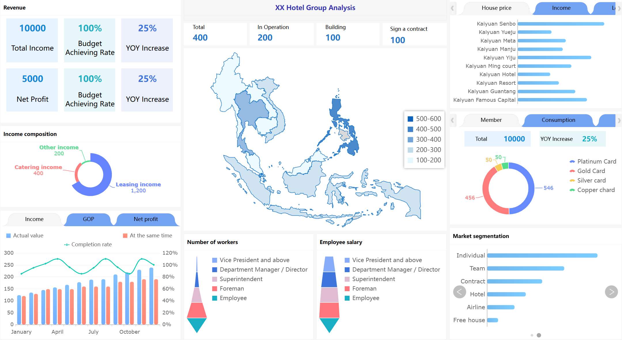
What Is a Revenue Cycle Dashboard?
A revenue cycle dashboard helps you see your money clearly. In healthcare, it shows how money moves from patient care to payment. You can check daily money activity and notice patterns fast. The dashboard lets you watch medical billing, patient access, and payments. You get real-time updates that help you find problems and fix them.
FanRuan gives tools that make dashboards simple to use. With FineBI, you can change raw data into easy charts and graphs. You can set up your dashboard the way you want. You get correct data and can check many numbers at once.
Core Purpose and Users
You use a revenue cycle dashboard to handle money and work tasks. The dashboard helps you see what people owe, how cash moves, and if you are meeting goals. You can use built-in tools to check your targets each month or year.
Here is a table that shows who uses these dashboards and why:
User Type
Description
Healthcare CFOs
Need better financial and operational data analytics to optimize revenue cycle.
Revenue cycle operations leaders
Require multivariate views of financial information to track cash flow and allocate resources.
Healthcare executives and administrators
Monitor admission rates, treatment outcomes, staffing levels, and expenditures to forecast trends and identify overspending.
Billing departments and insurance companies
Monitor charges, payments, and claims processing and rejections.
Patients and their families
Use dashboards to choose doctors, follow treatment plans, monitor prescriptions, and view test results.
Government agencies and public health officials
Monitor quality, safety, and financial standing of healthcare organizations and analyze public health data.
Front-line healthcare providers
Use dashboard data for diagnostic and treatment decisions.
You can use the dashboard to make choices faster. You spend less time making reports and more time using the information. Dashboards give you updates all the time, so you can see changes right away.
Key Metrics Tracked
You watch important numbers with a revenue cycle dashboard. These numbers help you know how your money is doing and find problems early.
Here are some key metrics:
Metric
Description
Accounts Receivable (AR) Aging
Ranks outstanding receivables by length of time, helping organizations detect issues and prioritize collections.
Collection Effectiveness Index (CEI)
Measures the proportion of charged amounts that are paid within a certain period, indicating collection efficiency.
Patient Satisfaction Scores
Reflects the patient experience, linking satisfaction to timely bill payments and financial health.
Clean Claim Rate
Evaluates the proportion of error-free claims, indicating billing process efficiency.
Average Reimbursement Time
Shows how long payers take to reimburse, helping identify delays in the revenue cycle.
You also check days in account receivable, aged accounts receivable rate, claim denial rate, and claim appeal rate. Dashboards often have scorecards for payers, claim numbers, and user work. You can see how well your team does billing and collections.
You get a full look at your money. You can see patterns, find mistakes, and make your revenue cycle better. Dashboards help you make smart choices and reach your goals faster.
How Revenue Cycle Dashboards Work
A revenue cycle dashboard makes hard data easy to see. You collect data from many places. Health Information Systems and Revenue Cycle Management tools give most of the data. You can add other data, like FHIR bundles, to see the whole revenue process.
Data Integration and Processing
You follow steps to get your data ready:
Connect to all your data sources, like billing systems and patient records.
Clean and match the data so it fits together.
Put the data in order and check that it is right.
Make datasets that have the information you need for your dashboard.
FineBI helps make these steps easy. You can connect to many databases and files. You use simple tools to clean and join your data. Real-time updates show you the newest numbers. Automation saves you time and stops mistakes.
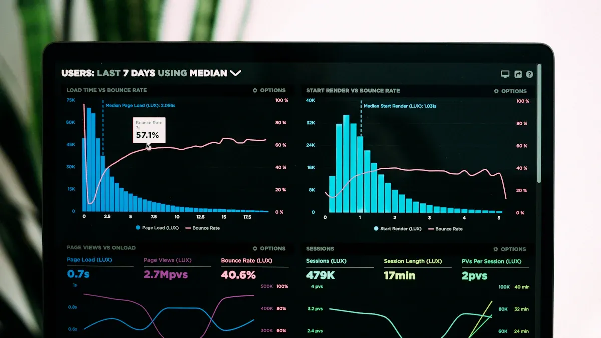
Visualization and Reporting
When your data is ready, you make dashboards and reports. You use different charts to show the numbers. Here are some common chart types and what they do:
Chart Type
Purpose
Line Charts
Show how numbers change over time and compare revenue streams.
Bar Charts
Compare revenue in different times or groups. Stacked bars give more details.
Area Charts
Show total growth and how different streams add up.
Automated reports give you updates right away. You can see denial trends and other important facts fast. Self-service analytics let you look at the data yourself. This helps you make quick choices and find ways to do better.
Challenges and Solutions in Revenue Cycle Management
Managing your revenue cycle is not always easy. You have to work with data from many systems. Your team needs to learn new tools. You also must make sure your data is right. Let’s see what problems you might face and how you can fix them with good tools and plans.
Data Silos and Integration
Many groups have trouble with data silos. This happens when teams use their own systems or just spreadsheets. About 31% of healthcare groups use spreadsheets for audits. This shows that data silos are very common. These silos make it hard to see all your revenue cycle data together.
You might have silos because of:
Different EHRs and practice management systems in hospitals
Standalone tools for departments like oncology or cardiology
Separate billing, claims, and contract management systems
External sources such as HIE feeds and payers
To fix these problems, you can:
Teach your team to share data.
Use HIPAA-compliant tools to connect systems.
Let partners help with tasks that take a lot of time.
Check new tech so you do not make more silos.
Use automation to do less work by hand.
Think about what patients need to make things better.
FineBI and FineDataLink help you link all your data. You can clean, join, and manage your data in one place. This helps you see everything in your revenue cycle dashboard.
It can be hard to get your team to use new dashboards. Some things that make it hard are:
Barrier Type
Description
Unclear decision ownership
No clear roles can slow down decisions.
Vague problem statements
Unclear goals make dashboards less useful.
Metric sprawl and inconsistent definitions
Too many metrics confuse users and create distrust.
Insufficient enablement
Not enough training keeps users from using dashboards well.
Money limits can also make things tough. To help your team, give them training on revenue cycle management and checking data. Keep helping them so they stay up to date. When you build a data-driven culture, your team will use analytics every day.
Ensuring Data Quality
You need good data to trust your revenue cycle dashboard. Problems like bad data or wrong denial rates can cause mistakes. Sometimes, teams must wait for the BI department to get the right reports. This can slow things down.
To keep your data good:
Use automated tools to clean and check your data.
Make clear rules for entering and updating information.
Check your data often to find mistakes early.
FineBI gives you strong tools to manage your data. You can set up checks and keep your dashboards right and trustworthy.
When you use a revenue cycle dashboard, you get many good things. You can see billing and cash flow right away. This helps you find problems early and make fast choices. Your team works better because everyone sees the same money data. Many groups say they make choices faster, earn more money, and spend less after using dashboards. FineBI lets you link your data and find answers quickly. Try a BI solution to help manage your money and reach your goals. Go to FanRuan to get started today.
Product Trial
FineReport
Pixel-perfect reports · Interactive dashboards · Easy data entry · Digital twins
Access a wealth of case studies, industry insights, and solution guides to accelerate digital transformation.
FAQ
What is a revenue cycle dashboard??
A revenue cycle dashboard shows you important money numbers in one place. You can see how much you earn, what you spend, and where problems happen. This helps you make better choices fast.
How does FineBI help with revenue cycle management?
FineBI lets you connect all your data sources. You can clean and organize your data. You build dashboards with easy drag-and-drop tools. You see real-time updates and find answers quickly.
Can I use a revenue cycle dashboard without coding skills?
Yes! You do not need to know how to code. FineBI uses simple tools. You can build charts and reports by dragging and dropping. Anyone can use it.
Why is real-time data important in revenue cycle dashboards?
Real-time data lets you spot problems right away. You can act fast if something goes wrong. This helps you keep your money safe and your business running smoothly.