What is an operational dashboard? An operational dashboard is a visual tool that lets you monitor key business activities and performance indicators as they happen. You use a dashboard to see important metrics in one place, helping you respond quickly to changes.
Real-time data gives you the power to make faster decisions. Studies show that organizations using visual dashboards find timely information 28% more often and reduce decision-making time by 64%. Modern BI tools like FineBIhelp you build dashboards that drive business success.
Operational Dashboard Overview
What Is an Operational Dashboard
Anoperational dashboard is a tool you use to track and manage your daily business activities. It brings together important data and displays it in a way that helps you see what is happening right now. You can use an operations dashboard to monitor key performance indicators (KPIs), spot issues, and make quick decisions. Unlike strategic or analytical dashboards, which focus on long-term goals or deep data analysis, an operational dashboard gives you a real-time view of your current operations.
You will often find these dashboards in industries like manufacturing, healthcare, and logistics. They help you keep track of production rates, response times, and quality indicators. Themain features of an operations dashboard include frequent updates, KPI tracking, and alert systems. Here is a quick overview:
Characteristic
Description
Frequent Updates
Data is constantly updated to reflect the current situation.
Key Performance Indicators (KPIs)
Essential metrics for daily operation, such as response time, production rate, and quality indicators.
Alerts and Notifications
Alert system to highlight deviations from expected standards.
You can use an operations dashboard to monitor specific processes in real-time. This focus on real-time data helps you respond quickly to changes and keep your business running smoothly.
Core Purpose in Business Operations
The core purpose of an operations dashboard is to help you manage your business operations efficiently. You get a clear view of what is happening at any moment. This awareness allows you to solve problems as they arise, such as fixing staffing shortages or improving workflows.
You can use an operations dashboard to:
Track key metrics and KPIs in real-time.
Receive alerts when something goes off track.
Link daily tasks to larger business goals.
Motivate your team by making performance visible.
Operational dashboards support your daily operations by providing immediate insights. For example, in manufacturing, digital dashboards improve efficiency and productivity by showing real-time production data. In healthcare, dashboards have helped hospitals save millions by reducing unnecessary costs and staff time.
You rely on an operations dashboard to keep your business agile and responsive. By focusing on real-time monitoring and actionable data, you ensure your operations stay on target and your team meets its goals.
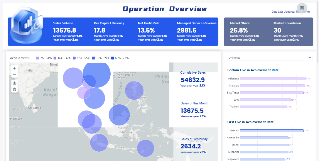
FineBI'sOperation Overview Analysis Dashboard - Click To Engage
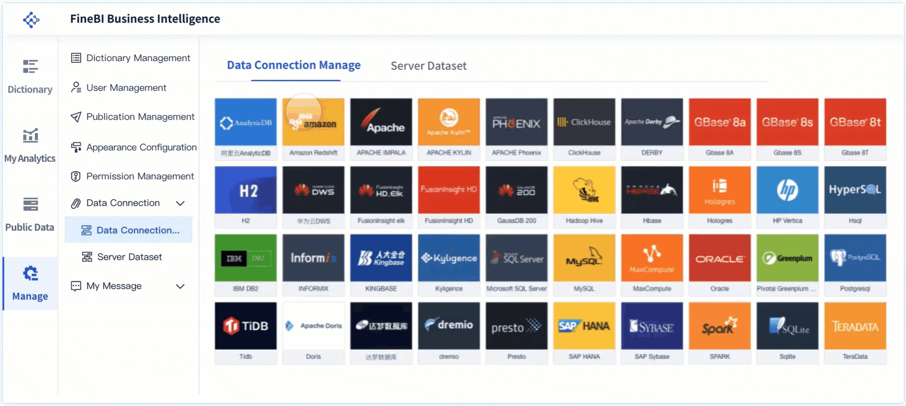
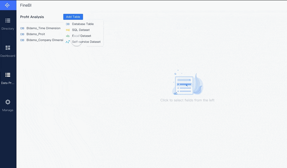
You need youroperations dashboardto deliver accurate, up-to-the-minute information. The first step is data integration. This process brings together information from many sources so you can see the full picture of your business operations. Most organizations connect their dashboards to a variety of data sources. Here is a table showing the main types:
Data Source Type
Structured data from SQL or NoSQL databases
Data from third-party services via APIs
Web analytics tools
Internet of Things (IoT) devices
Real-time data streams (sensor data, log files, user interactions)
When you integrate these sources, your operations dashboard updates automatically. You see what is happening as it unfolds. Real-time monitoringmeans you do not have to wait for end-of-day reports. You can act on issues as soon as they arise.
Real-time data integration provides instantaneous access to critical data. This capability allows you to react to current situations and anticipate future needs. You improve your business responsiveness and stay ahead of problems.
You benefit from real-time integration in several ways:
Immediate access to current information helps you adapt quickly to changing conditions.
Customer service teams can view complete, current customer profiles during interactions.
Sales teams can adjust pricing strategies based on current market conditions.
Supply chain managers can reroute shipments around delays or constraints.
You streamline your processes and reduce data latency. This leads to prompt responses and a better customer experience.
FineBI's Real Time Multi Source Data Integration Feature
Once your data is integrated, your operations dashboard must present it in a clear, actionable way. Visualization techniques help you understand complex information at a glance. Here is a table of common visualization methods used in operations dashboards:
Visualization Technique
Description
Bar and Column Charts
Compare categories or groups, track changes over time.
Pie Charts
Show proportions of a whole, best with fewer data points.
Line Graphs
Display trends over time, track metrics like sales or traffic.
Scatter Plots
Show relationships between two variables, identify trends.
Heat Maps
Visualize large data sets using colors, analyze user behavior.
Histograms
Show distribution of a single variable, identify patterns.
Represent values over time, compare multiple categories.
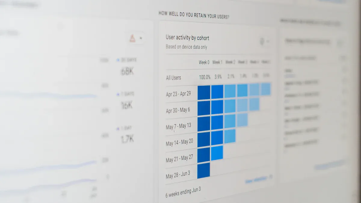
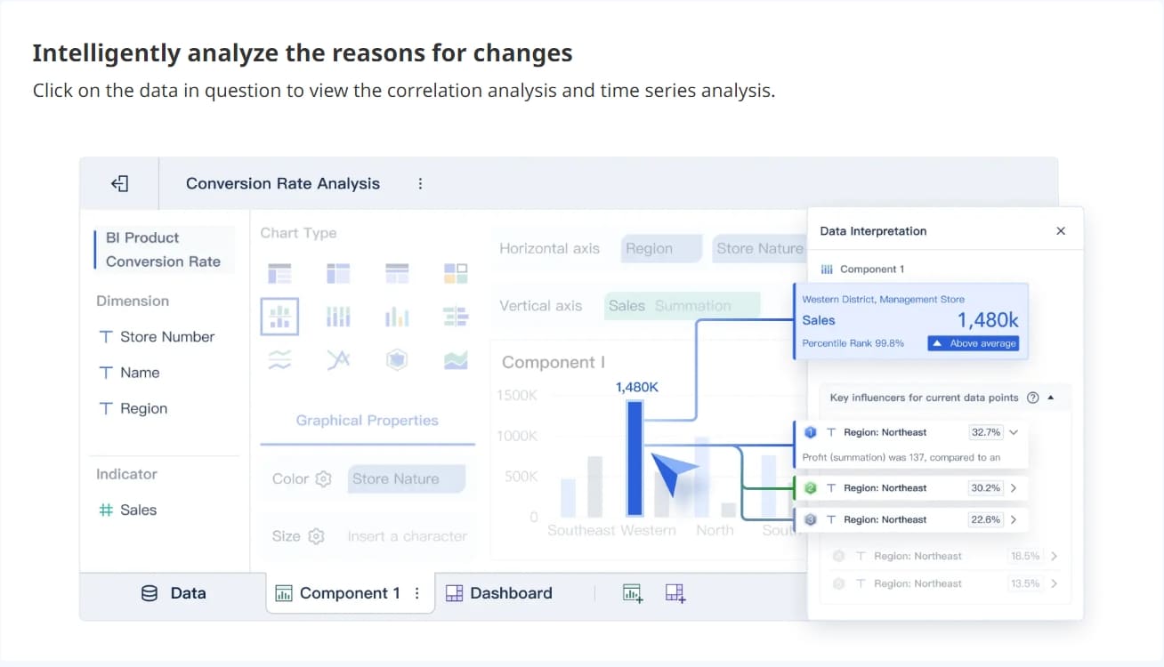
You interact with your operations dashboard by filtering data, drilling down into details, and customizing views. Studies show that 60% of business users prefer dashboards they can personalize. This interactivity increases your engagement and helps you extract insights that matter to your role.
You use interactive features to:
Access real-time data and customize your view.
Take immediate action based on insights.
Discover timely information more often than with static reports.
Companies using interactive dashboards are 28% more likely to find timely insights. You drive better business outcomes when you engage directly with your dashboard.
FineBI'sMultiple Built-in Charts For Visualization
FineBI provides a structured workflow to help you build and manage your operations dashboards efficiently. You follow these steps:
Step Number
Workflow Step
1
Data Integration
2
Data Classification
3
Data Modeling
4
Data Editing
5
Data Visualization
6
Dashboard Creation
You start by connecting to your data sources. FineBIsupports over 60 connectors, including databases, APIs, and files. You classify and model your data, ensuring it is clean and ready for analysis. You edit and refine your data sets, then use drag-and-drop tools to visualize your information. Finally, you create and publish your dashboard, making it available to your team.
FineBI’s workflow supports real-time updates and interactive features. You can filter, drill down, and customize your dashboard without technical skills. This approach empowers you to monitor your operations and respond quickly to changes.
A real-world example comes from BOE Technology Group. BOE faced challenges with fragmented data and inconsistent metrics. By implementing FineBI, BOE unified its data sources and built a comprehensive operational dashboard. This transformation led to a 5% reduction in inventory costs and a 50% increase in operational efficiency. BOE’s experience shows how a well-designed operations dashboard can drive significant business improvements.
You can use FineBI to create dashboards that support your daily operations, improve responsiveness, and enable data-driven decisions. The right workflow ensures your dashboard delivers value from integration to action.
You rely on an operations dashboard to simplify complex business data. The main components include current performance metrics, key performance indicators, clarity, and interactivity. These elements work together to give you a clear view of your operations. The table below highlights the essential features:
Key Component
Description
Current Performance
Focuses on real-time data to assess organizational status.
KPIs
Key performance indicators provide measurable values for success.
Clarity
Ensures information is easy to understand and act upon.
Interactivity
Lets you engage with data for deeper insights.
You use anoperations dashboardto track KPIs, monitor tasks, and deliver the right information to the right people. The dashboard helps you spot cost-saving opportunities and manage detailed duties. You transform complex data into actionable insights, making informed decisions based on real-time metrics.
Business Value and Benefits
An operations dashboard gives you measurable business benefits. You improve decision-making by accessing critical information quickly. Real-time visibility into performance metrics allows you to make timely adjustments. You enhance tracking of key performance indicators, which helps you measure progress and optimize processes. Companies using advanced process analytics see better optimization ROI and faster improvement cycles. You align your team’s activities with long-term goals and promote accountability. The dashboard facilitates feedback loops, enabling continuous improvement and effective resource allocation.
FineBI’s Unique Advantages
FineBI elevates your operations dashboard experience. You gain self-service analytics, allowing you to build dashboards without technical skills. Real-time filtering lets you analyze data instantly and adjust views as needed. FineBI supports collaboration, so your team works from the same real-time insights. Enterprise-grade governance ensures secure data sharing and role-based access. In manufacturing, FineBI helps you monitor quality control, track defect rates, and optimize production. BOE Technology Group used FineBIto unify data sources, reduce inventory costs, and boost operational efficiency by 50%. You benefit from a platform that combines agility, security, and powerful analytics for your operations dashboard.
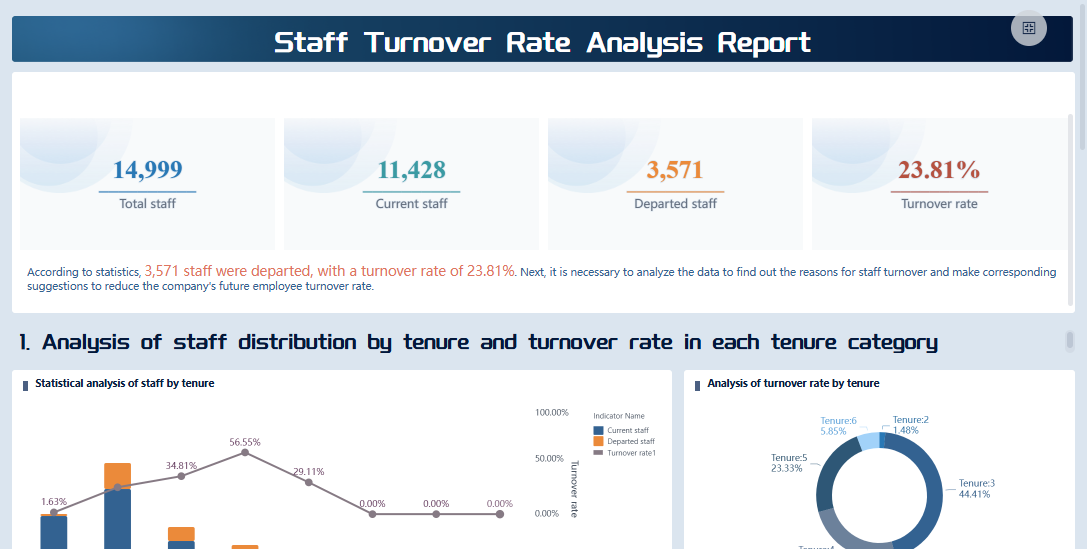
FineBI'sStaff Turnover Rate Analysis Dashboard - Click To Engage
You begin the process to create an operational dashboard by planning carefully. You need to identify what matters most for your business operations. Start by defining your business goals and selecting 5 to 10 key performance indicators (KPIs) that measure progress. These KPIs should reflect your strategic objectives and drive decision-making.
Guideline
Description
Align with Strategic Goals
Metrics must support your business objectives.
Ensure Actionability
Choose metrics that prompt action and improvement.
Maintain Simplicity
Keep your dashboard easy to understand for all users.
Provide Context
Present data with enough background for clear interpretation.
You map out your data sources to ensure reliable access to accurate information. You select a dashboard platform that integrates with your existing systems and meets user needs. Plan your layout before building. Prioritize the most important KPIs for usability. Connect, integrate, and automate your data so metrics update regularly. Customize visualizations and metrics to suit your audience. Test your dashboard with users and refine it based on feedback.
Tip: Organizations use operational KPIs to spot real-time issues and opportunities. Effective dashboards connect operational metrics to financial goals, improving resource allocation and efficiency.
Implementation Steps with FineBI
You can create an operational dashboard using FineBIby following a structured workflow. FineBI simplifies each step, making the process accessible even if you lack technical expertise. Here is a step-by-step guide:
Connect Data Sources You start by connecting FineBI to your data sources. FineBI supports over 60 connectors, including databases, APIs, and files. You bring together information from across your operations for unified analysis.
Prepare and Process Data You build self-service datasets. FineBI lets you select fields, join tables, add calculated metrics, and apply filters. You clean and refine your data to ensure accuracy and consistency.
Build Dashboards You use drag-and-drop tools to create your dashboard. FineBI offers a wide range of visualization components, such as bar charts, line graphs, and pie charts. You arrange components for clarity and prioritize key metrics.
Publish and Govern You preview your dashboard, then publish it for your team. FineBI provides secure sharing and role-based access control. You monitor usage and ensure data governance.
Note: FineBI supports real-time filtering and interaction. You can analyze data instantly and adjust views as needed. The platform is mobile-friendly, so you access dashboards anywhere.
You see these steps in action in manufacturing quality control. Manufacturers use FineBI to monitor product qualification rates, defect rates, and scrap rates. Real-time dashboards help managers identify problems quickly and correct them immediately. By tracking quality indicators, companies maintain high standards and reduce production defects.
You ensure long-term success for your operations dashboard by following best practices. Focus on a specific goal and prioritize critical KPIs that impact business decisions. Avoid clutter and keep your dashboard simple. Use verified data sources to maintain trust and reliability. Design for clarity with intuitive visualizations that make complex data easy to digest.
Automate data refreshes so your dashboard always shows up-to-date insights. Make your dashboard accessible across devices forreal-time monitoring. Collaborate with stakeholders to identify what is needed and get buy-in. Provide training and documentation to help users navigate and interpret the dashboard effectively.
Alert: Overcrowded dashboards can overwhelm users. Simplicity and clarity are essential. Design with mobile users in mind and ensure interactivity works on all screen sizes.
Manufacturing quality control dashboards illustrate these best practices. Managers make informed decisions using accurate, up-to-date information. Real-time monitoring allows quick identification and correction of problems. By tracking quality indicators, companies maintain high standards and reduce defects.
You create anoperational dashboard that drives better business outcomes when you plan carefully, implement with the right tools, and follow proven best practices.
You use an operational dashboard to track ongoing activities and performance metrics. This type of dashboard gives you real-time visibility, helping you identify inefficiencies and optimize operations. FineBI enables you to build operations dashboards with features like real-time data processing, robust modeling, and mobile access. You improve decision-making and drive continuous improvement in your operations. Explore FineBIto create dashboards that support your business goals and deliver actionable insights.
Access a wealth of case studies, industry insights, and solution guides to accelerate digital transformation.
FAQ
What is the main purpose of an operational dashboard?
You use an operational dashboard to monitor real-time business activities. It helps you track key performance indicators and spot issues quickly. This tool gives you a clear view of your operations so you can make fast, informed decisions.
How does an operational dashboard differ from other dashboards?
You use an operational dashboard for real-time monitoring of daily activities. Analytical dashboards focus on trends and deeper analysis. Strategic dashboards show long-term goals. Operational dashboards help you respond to immediate changes in your business.
What data sources can you connect to an operational dashboard?
You can connect your operational dashboard to databases, APIs, spreadsheets, and cloud services. This integration lets you see all your important data in one place. FineBI supports over 60 connectors for easy data integration.
Who should use an operational dashboard?
You should use an operational dashboard if you need to track ongoing activities. Operations managers, team leaders, and executives benefit most. This tool helps anyone who needs to monitor performance and respond quickly to changes.
How often does an operational dashboard update its data?
You can set your operational dashboard to update in real time or at regular intervals. Real-time updates help you react to changes as they happen. This ensures you always see the most current information.