If you wonder, "why would someone make a histogram instead of a bar chart?", the answer is simple: you use histograms to visualize your data when you need to see how continuous values are distributed. Bar charts work best when you want to compare separate categories.
FineBI from FanRuan helps you choose the best way to visualize your data for better decision-making.
For business intelligence, knowing why would someone make a histogram instead of a bar chart? helps you pick the right visualization and get clearer insights.
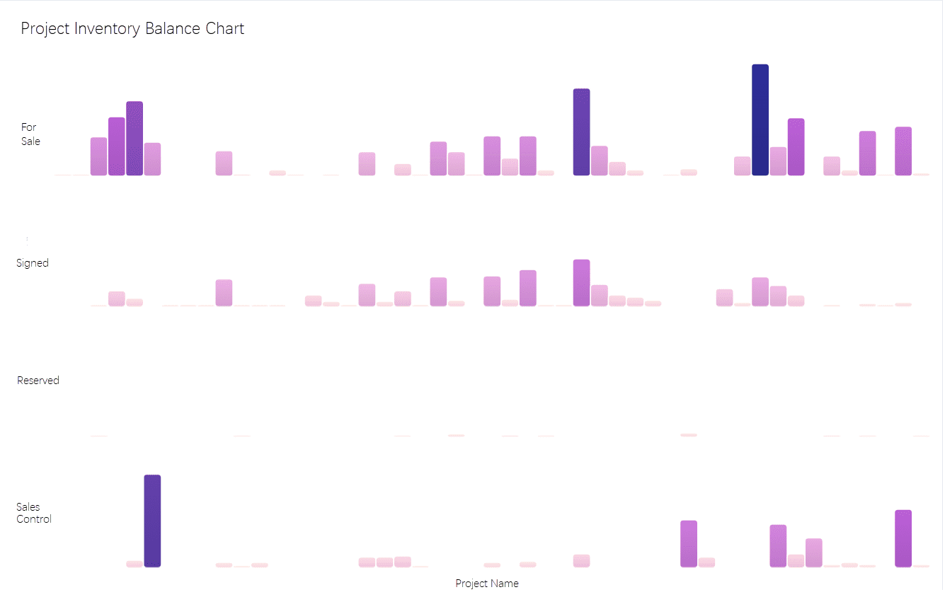
A histogram is a powerful tool in data visualization that helps you see how data points are spread across continuous ranges. When you use a histogram, you group your data into intervals called bins. Each bin covers a specific range of values, and the height of each bar shows the frequency of data within that bin. The bars in a histogram touch each other, which shows that the data is continuous and not divided into separate categories.
Histograms let you look at the frequency of data and quickly spot patterns, such as peaks, gaps, or outliers. You can also use them to estimate the relative frequency of values in different ranges.
FineBI by FanRuan makes it easy to create histograms for business analytics. You can drag and drop your data, adjust bin sizes, and instantly see how your data distribution changes.
When you want to understand how data points are spread, histograms give you a clear picture of the distribution. By grouping data into bins, you can see if your data forms a bell shape, has multiple peaks, or shows skewness. This helps you identify trends, spot unusual values, and make better decisions.
Histograms show the frequency distribution of continuous data. For example, if you track customer visits per hour, a histogram will show how often different visit ranges occur. The bars touch to show that the data covers continuous ranges, not separate categories. This makes it easy to see the overall shape, center, and spread of your data.
In business analytics, histograms help you analyze data distribution, detect outliers, and understand variability. FineBI supports this process by letting you visualize data spread across intervals, so you can make informed choices based on real insights.
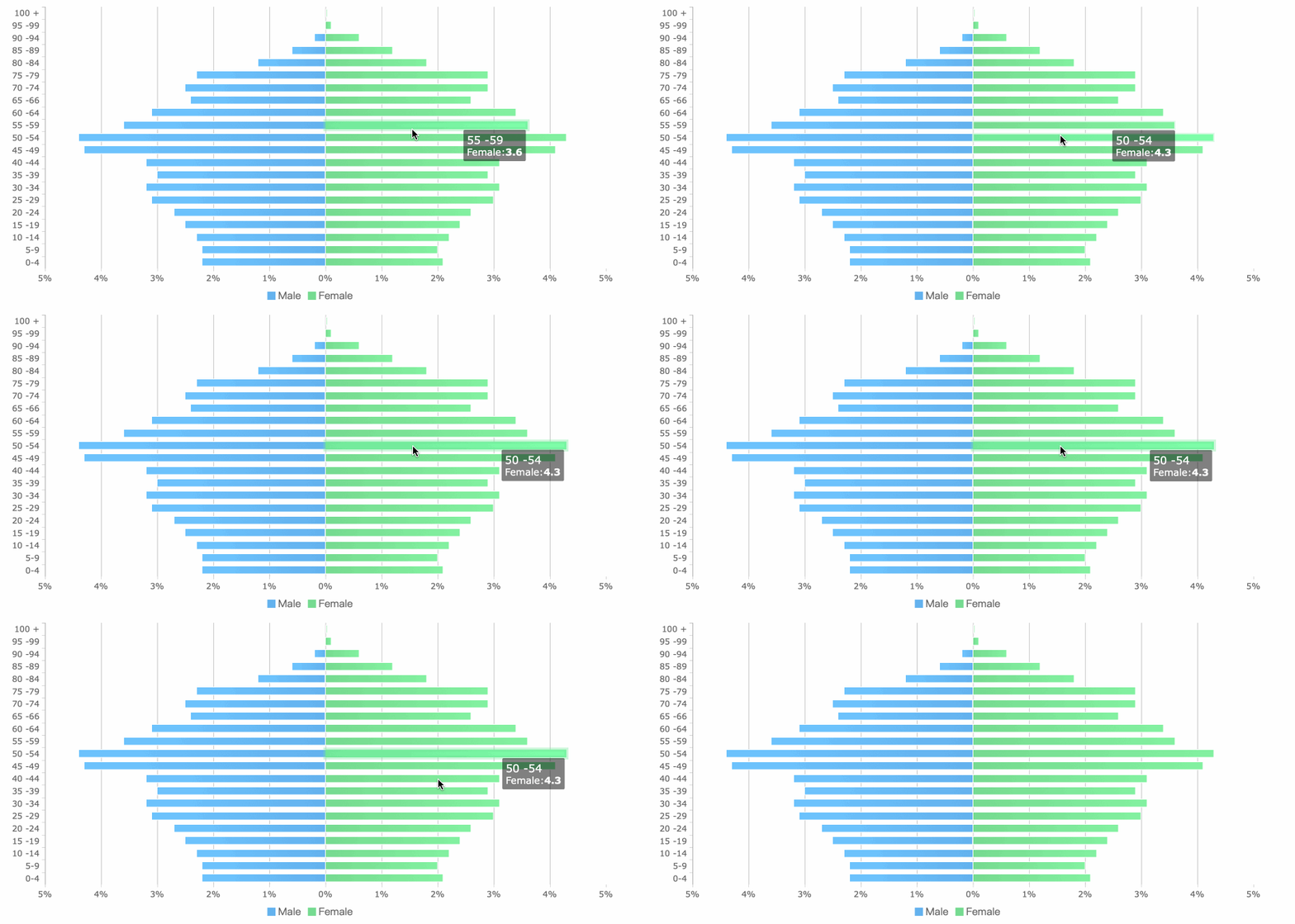
A bar chart is a common tool in data visualization. You use it to compare values across different categories. Each bar stands for a single category. The length or height of the bar shows the value for that category. You can use bar charts to display counts, sums, averages, or other summary statistics.
Bar charts make it easy to see which categories have higher or lower values. The bars do not touch each other. This gap shows that each category is separate and not part of a continuous range. You can use bar charts for both vertical and horizontal layouts.
Bar charts help you quickly spot differences between categories. You can use them to find trends or patterns in your data.
FineBI by FanRuan lets you build bar charts with just a few clicks. You can drag and drop your data, choose your categories, and see your results right away. This makes it simple to compare sales by region, product types, or any other group important to your business.
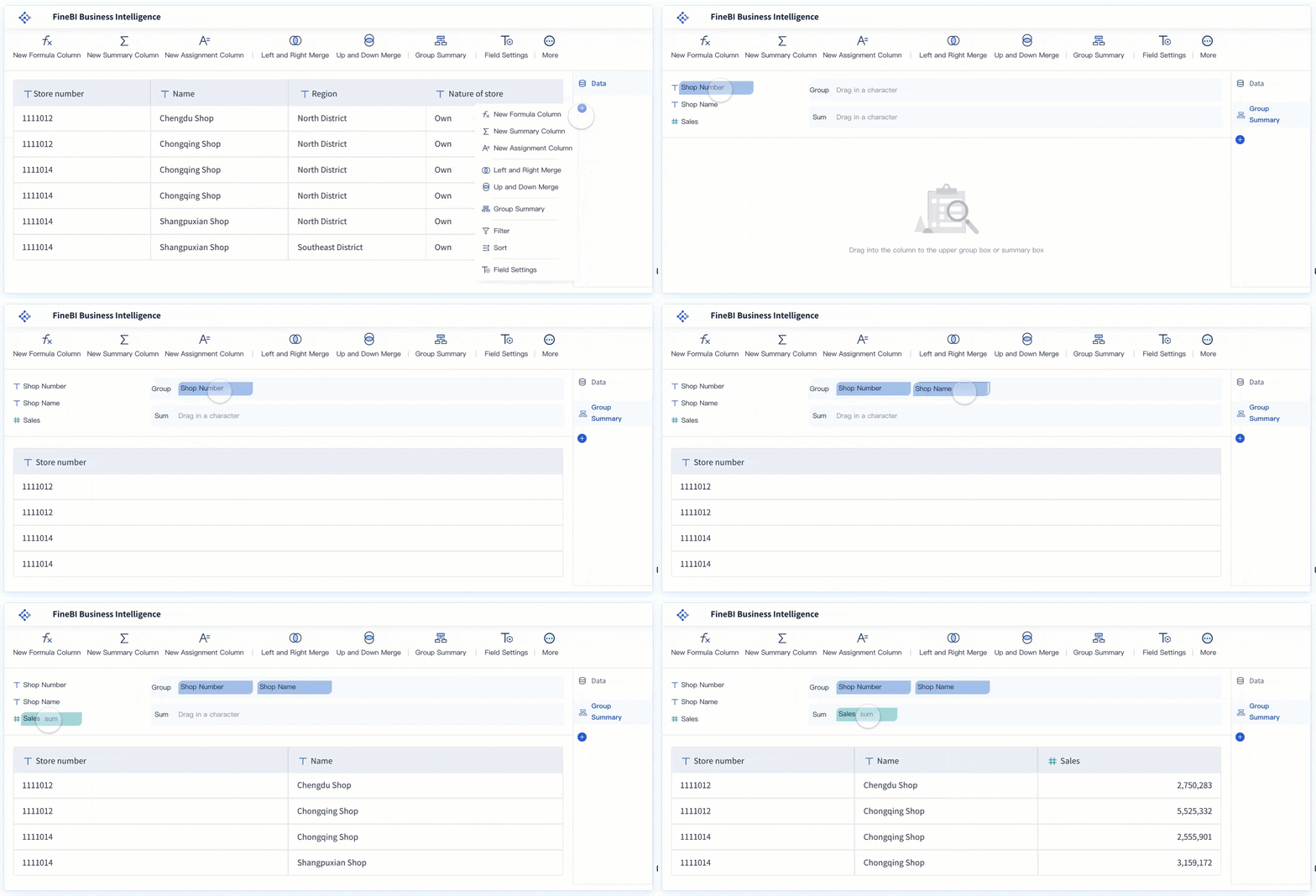
You use bar charts when your data falls into distinct groups or categories. These categories could be things like product names, departments, or survey responses. Bar charts work best when you want to compare how much or how often something happens in each group.
Bar charts highlight the differences between categories. You can see which group has the highest or lowest value at a glance. This type of visualization is different from a histogram, which shows the distribution of continuous data. In a bar chart, the space between bars makes it clear that the categories do not overlap.
FineBI supports many types of bar charts. You can use simple bar charts, stacked bars, or grouped bars to fit your analysis needs. This flexibility helps you turn your data into clear, actionable insights.
You might wonder about the key differences between histograms and bar graphs. The table below helps you see how these two chart types compare in terms of data type, axis, and appearance:
| Aspect | Histogram | Bar Chart |
|---|---|---|
| Data Type | Continuous or interval data | Discrete or categorical data |
| X-Axis | Continuous numerical scale with bins or ranges | Categorical labels (e.g., months, product types) |
| Bars | Contiguous bars (touching) representing bins | Separate bars with spaces between them |
| Bar Width | Can vary if bin sizes differ | Equal width bars |
| Bar Order | Fixed natural order (e.g., ascending bins) | Flexible order (can be rearranged) |
| Purpose | Show distribution and frequency within ranges | Compare distinct categories or groups |
A histogram groups your data into bins along a continuous x-axis. The bars touch each other, which shows the continuity of the data. In contrast, a bar chart displays separate bars for each category, with gaps to highlight the difference between groups. The order of bars in a histogram is fixed by the natural order of the data, while you can rearrange the bars in a bar chart.
You should use a histogram when you want to analyze the distribution of continuous data. For example, if you want to see how customer order values spread across different ranges, a histogram will show you which bins have the most orders. This helps you spot trends, outliers, and the overall data distribution. In business intelligence, you might use a histogram to understand user engagement time on your website or to analyze the age distribution of your customers.
A bar chart works best when you need to compare values across distinct categories. For instance, you can use a bar chart to compare sales numbers for different products or to see which marketing campaign had the most participants. The gaps between bars make it easy to see that each bar stands for a separate group.
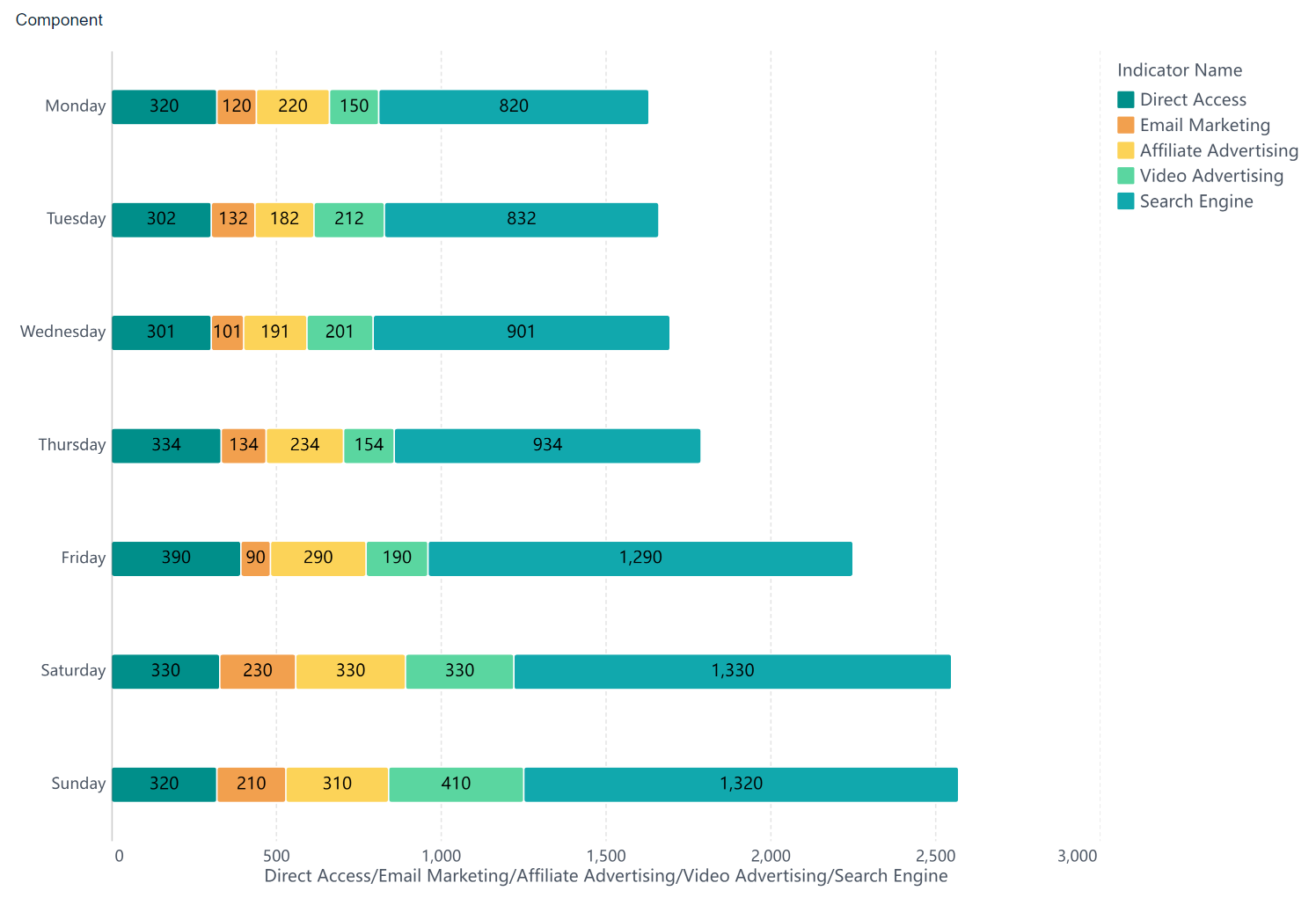
FineBI makes it simple to choose the right chart. You can drag and drop your data, select either a histogram or a bar chart, and instantly visualize your results. This helps you answer questions like "What is the distribution of order values?" or "Which product category sells the most?" By understanding the key differences between histograms and bar graphs, you can select the best visualization for your analysis.
Tip: Use a histogram when you want to explore data distribution and frequency within ranges. Choose a bar chart when you need to compare values across categories.
You will find that the histogram vs bar graph decision depends on your data type and your analysis goal. In summary, histograms reveal patterns in continuous data, while bar charts highlight differences between categories. Knowing when to use each chart ensures you get the most insight from your data.
When you want to understand your data, histograms give you a clear view of how values spread across a range. You can quickly identify patterns and outliers that might go unnoticed in raw tables. Here are the main advantages of histograms for data analysis:
Tip: When you use histograms, you turn complex numbers into easy-to-understand visuals. This helps you act faster and with more confidence.
Histograms group your data into bins, showing the frequency of values in each range. This visual grouping lets you see concentrations, gaps, and clusters. For example, you might notice that most sales fall within a certain price range or that a few products have much higher returns than others. These insights support data-driven decisions in any business.
You will find common uses of histograms in quality control, manufacturing, and business analytics. In manufacturing, histograms help you monitor product quality by displaying data distribution patterns. You can spot process variations, track defect rates, and improve production efficiency. Quality managers use histograms to identify trends and make decisions that boost product standards.
In business analytics, histograms reveal customer segments, spending habits, and seasonal trends. You can compare data sets, such as sales across regions or customer ages, to find opportunities for growth. FineBI by FanRuan makes it easy to build and customize histograms. You can drag and drop your data, adjust bins, and instantly see frequency and distribution patterns. This empowers you to identify patterns and outliers, optimize processes, and communicate findings with your team.
With FineBI, you unlock the full advantages of histograms for smarter, faster data analysis.
When you need to decide between a histogram and a bar chart, you should start by looking at your data and your goal. If you want to compare different categories, such as sales by region or product type, a bar chart is the best choice. Bar charts work well for discrete or categorical data. Each bar stands for a separate group, and you can quickly see which group has the highest or lowest value.
If your goal is to analyze data distribution, especially for continuous values, you should use a histogram. A histogram helps you visualize your data by showing how values are spread across intervals or bins. This type of chart is perfect when you want to see patterns, such as where most values cluster, if there are any outliers, or if the data is skewed.
Many people ask, "why would someone make a histogram instead of a bar chart?" The answer is simple: you use a histogram when you need to see the shape and spread of continuous data, not just compare categories.
Here is a table that can help you choose the right chart for your business analytics:
| Decision Criteria | Bar Chart | Histogram |
|---|---|---|
| Data Type | Discrete or categorical data | Continuous or interval data |
| X-Axis Labels | Categorical labels (e.g., months, product types) | Continuous intervals or bins (e.g., age groups) |
| Purpose | Compare distinct categories or groups | Show distribution and frequency of data points |
| Bar Arrangement | Separate bars with gaps | Contiguous bars without gaps |
| Analytical Goal | Category comparison | Distribution and frequency analysis |
You should avoid common mistakes, such as using a bar chart for continuous data or a histogram for categories. This can lead to confusion and incorrect conclusions. Always check your data type and your analysis goal before you choose a chart.
Some best practices for using a histogram include:
In business settings, you often use histograms for quality control, customer service, and financial analysis. For example, you can use a histogram to check if product dimensions are consistent in manufacturing, or to see how customer response times vary in a call center. These insights help you improve processes, allocate resources, and make better decisions.
FineBI by FanRuan makes it easy to visualize your data and pick the right chart for your needs. The platform offers a wide range of chart types, including both histograms and bar charts. You can drag and drop your data, and FineBI will guide you through the process of building the best visualization for your analysis.
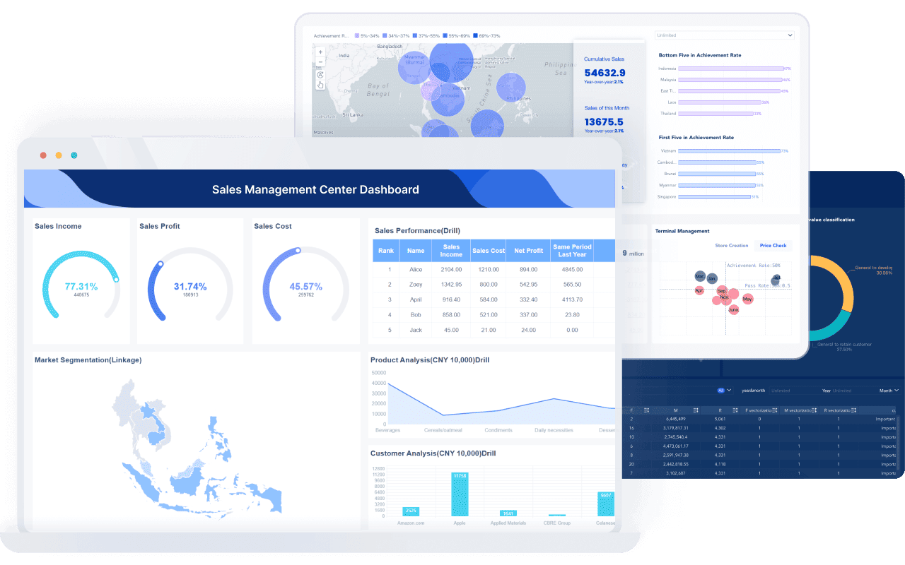
FineBI’s user-friendly interface helps you avoid common mistakes, such as confusing bar charts with histograms or choosing the wrong bin size. You can preview your chart, adjust settings, and see how changes affect your results in real time.
With FineBI, you can:
For example, if you want to analyze data distribution in customer spending, you can use a histogram in FineBI to spot common spending ranges and outliers. If you need to compare sales by product, you can switch to a bar chart with just a few clicks. This flexibility lets you focus on data analysis and decision-making, not technical details.
In real-world business scenarios, histograms help you detect outliers in customer behavior, monitor product quality, and understand trends in large datasets. FineBI empowers you to visualize your data, analyze data distribution, and turn insights into action.
When you ask, "why would someone make a histogram instead of a bar chart?", remember that the right chart helps you see the story in your data. FineBI gives you the tools to make that choice with confidence.
You should use a histogram when you want to understand the distribution of continuous data, such as customer ages or spending habits. Choose a bar chart to compare categories like product types or sales regions. Picking the right chart helps you avoid confusion and ensures your business insights are clear and accurate. FineBI by FanRuan lets you visualize and analyze your data with confidence. Always match your chart to your analysis goal for the best results.
Click the banner below to try FineBI for free and empower your enterprise to transform data into productivity!
Bar Chart Race: A Complete Guide
16 Types of Chart for Effective Data Visualization
22 Different Types of Graphs in Data Visualization: A Practical Guide

The Author
Lewis
Senior Data Analyst at FanRuan
Related Articles

12 Best Data Visualization Tools for 2026: Features, Pricing, Pros and Cons
$1 are software platforms that turn raw data into charts, dashboards, maps, and interactive visual stories for analysis and decision making. 12 best data visualization tools for 2026 at a glance
Lewis Chou
Apr 23, 2026

Top 8 Data Visualization softwares You Should Try in 2025
Compare the top 8 data visualization software for 2025, including FineReport, Tableau, Power BI, and more to find the best fit for your business needs.
Lewis
Dec 19, 2025
10 Must-Have Data Visualization Tools for Modern Businesses
Compare the top 10 data visualization tools for 2025 to boost business insights, streamline analytics, and empower smarter decision-making.
Lewis
Dec 17, 2025