Business intelligence dashboard examples are interactive visual tools that help you track, analyze, and present data from various sources, turning complex information into actionable insights for better business decisions across industries.
Here are the top 10 business intelligence dashboard examples for 2026 you need to know:
Sales dashboards
Financial dashboards
Marketing analytics dashboards
Executive KPI dashboards
Customer insights dashboards
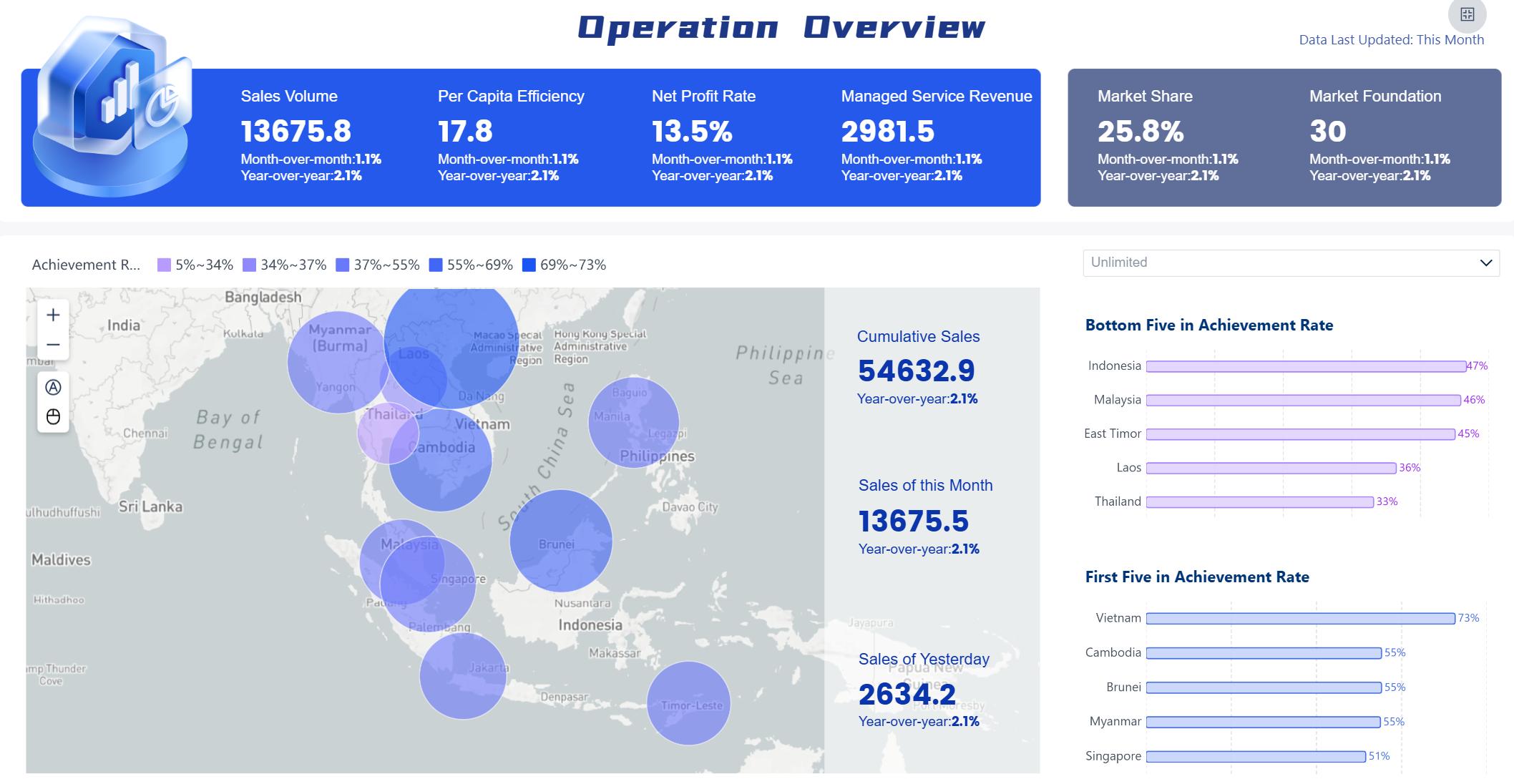
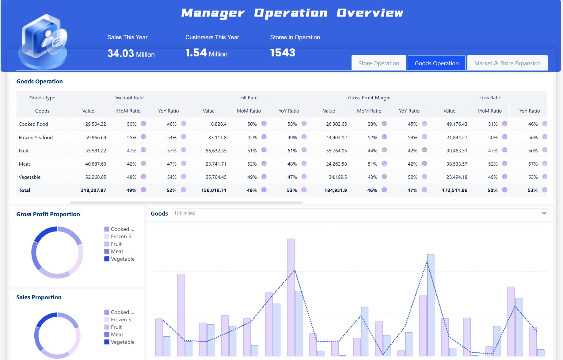
Operations management dashboards
HR dashboards
Supply chain dashboards
Project management dashboards
IT and security dashboards
You see business intelligence dashboards transform how you approach data-driven decision making. In 2026, you benefit from these trends:
AI integration drives automation, anomaly detection, and actionable insights.
Real-time monitoring and augmented analytics streamline performance tracking.
Natural language queries and conversational BI make custom dashboards easier to use.
FineBI stands out as a business intelligence tool that offers seamless data integration, self-service dashboard solution creation, and advanced AI-driven features. You connect to big data platforms, SQL sources, Excel files, and more, ensuring robust data visualization and real-world examples for any industry. Whether you work in retail, banking, healthcare, or manufacturing, you can leverage business intelligence software like FineBI to unlock business analytics, tracking, and visualization for every department.
Industry
Example Use Case
Retail
Predict product sales trends
Banking
Detect and flag fraud instantly
Healthcare
Optimize patient care with real-time data
Manufacturing
Prevent breakdowns with performance tracking
E-commerce
Personalize recommendations to boost sales
Logistics
Improve delivery efficiency with route optimization
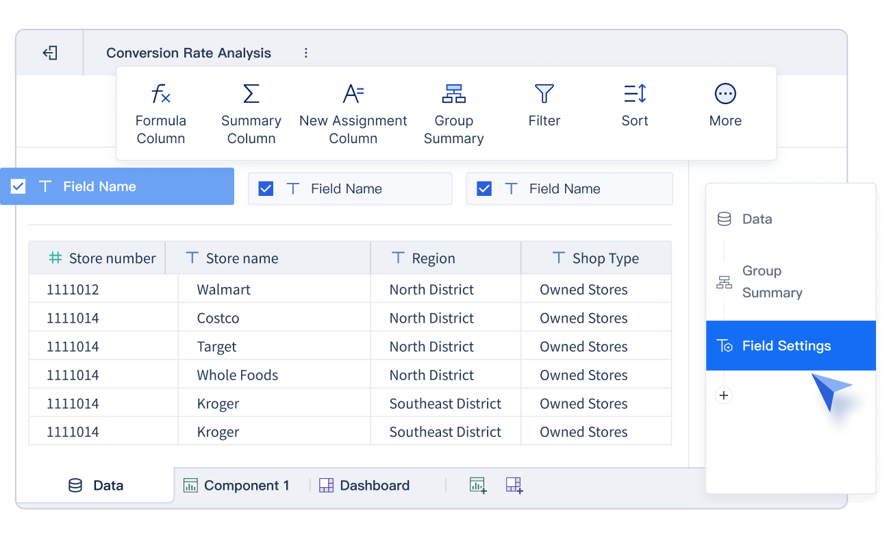
Sales Dashboard Examples with FineBI
Business intelligence dashboard examples are interactive visual tools that help you track, analyze, and present sales data, making it easier to understand trends and drive data-driven decision making for your organization.
Sales Dashboard Examples with FineBI
Key Features and Metrics
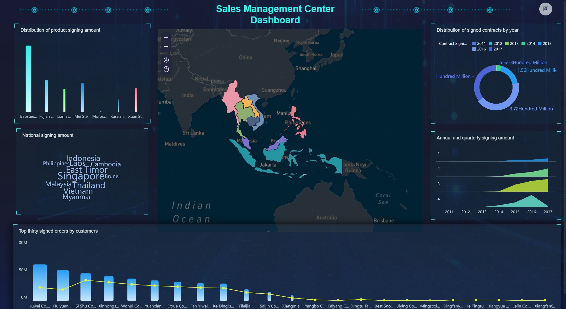
You can use FineBI to build a sales dashboard that tracks pipeline health, regional performance, and customer segmentation. The dashboard solution supports real-time monitoring, so you see updates as soon as new data arrives. You select from a wide range of visualization options, including bar charts, maps, and tables. FineBI lets you include essential KPIs such as sales growth, win rates, and regional comparisons. You also add metrics like conversion rates, average deal size, and customer lifetime value. The sales performance dashboard helps you spot trends and identify actionable insights quickly.
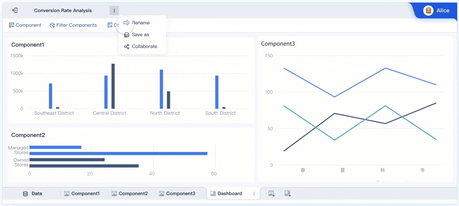
Sales Dashboard created by FineBI (Click to Engage)
Sales teams benefit from using business intelligence tools like FineBI because they get instant access to performance tracking and data visualization. You can compare results across regions, products, or time periods. The dashboard makes it easy to share insights with your team and management. You reduce manual reporting and focus on selling. With real-time monitoring, you respond faster to changes in the market. The executive KPI dashboard gives leaders a clear view of sales targets and progress.
Sales Dashboard created by FineBI (Click to Engage)
Many industries use business intelligence software to improve sales results. For example, BOE Technology Group used FineBI to unify data and standardize metrics, leading to a 50% increase in operational efficiency. You can apply these dashboard examples in retail, manufacturing, or e-commerce. Real-world examples show how dashboards help track sales, optimize inventory, and boost revenue.
Implementation Tips
To create an effective sales dashboard, connect FineBI to your CRM, ERP, or Excel files. Choose KPIs that match your business goals. Use filters and drill-down features for deeper analysis. Schedule automatic updates for your dashboard solution to keep data fresh. Compare FineBI with other business intelligence tools like Power BI dashboard to find the best fit for your needs.
Tip: Start with a simple dashboard and add more metrics as your team gets comfortable with data visualization.
KPI
Description
Sales Growth
Tracks revenue increases
Win Rate
Measures deal success
Regional Comparison
Compares sales by location
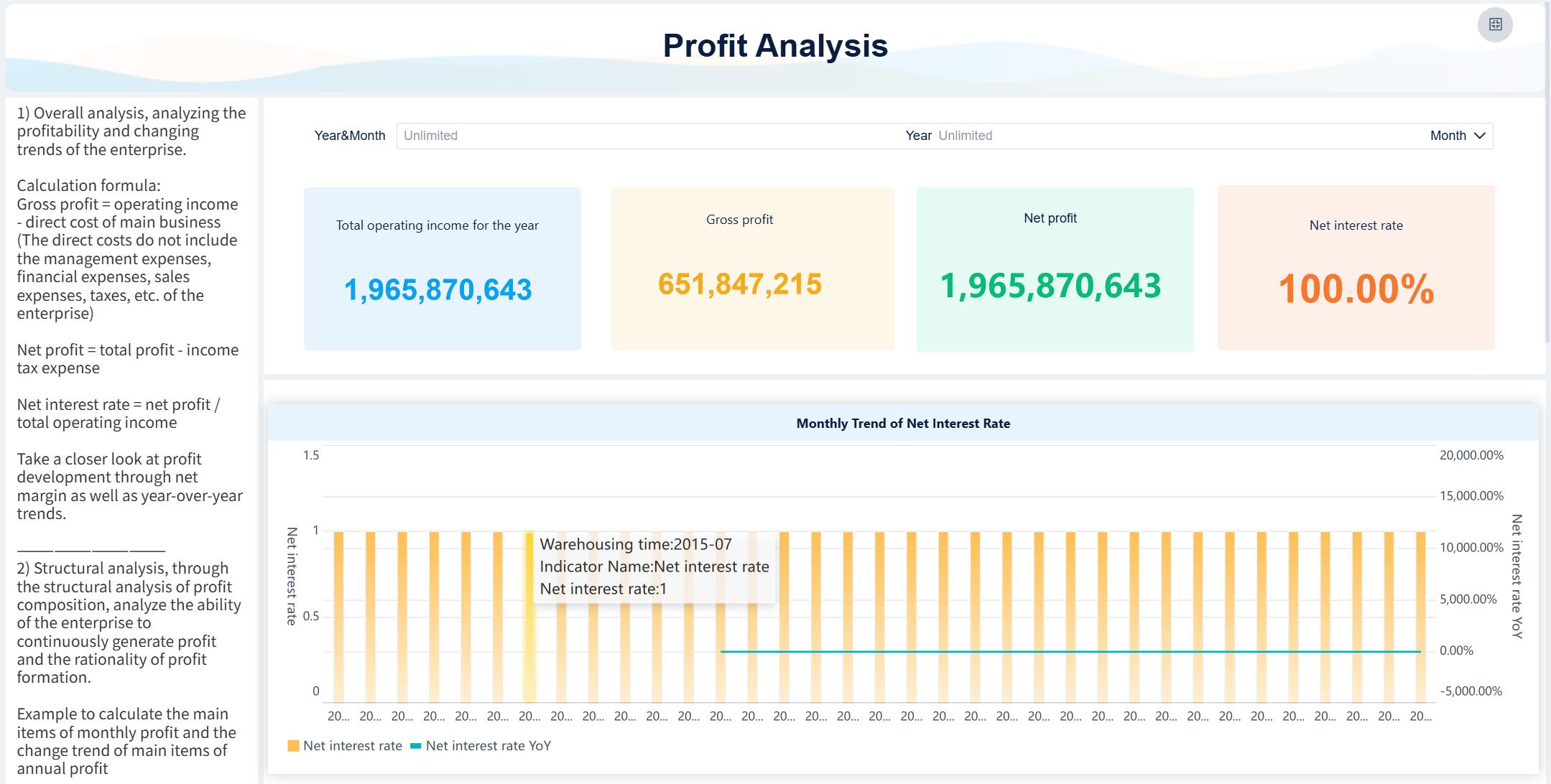
Financial Business Intelligence Dashboard Examples
Core Financial Metrics
You need to track the right financial metrics to get the most value from your dashboard. Here are some of the most important metrics you should include:
KPI dashboard: Focuses on eight key metrics that show business performance.
Budget vs. Actuals dashboard: Highlights differences between planned and actual results.
These dashboards help you see where your business stands and where you need to take action.
Strategic Value for Finance
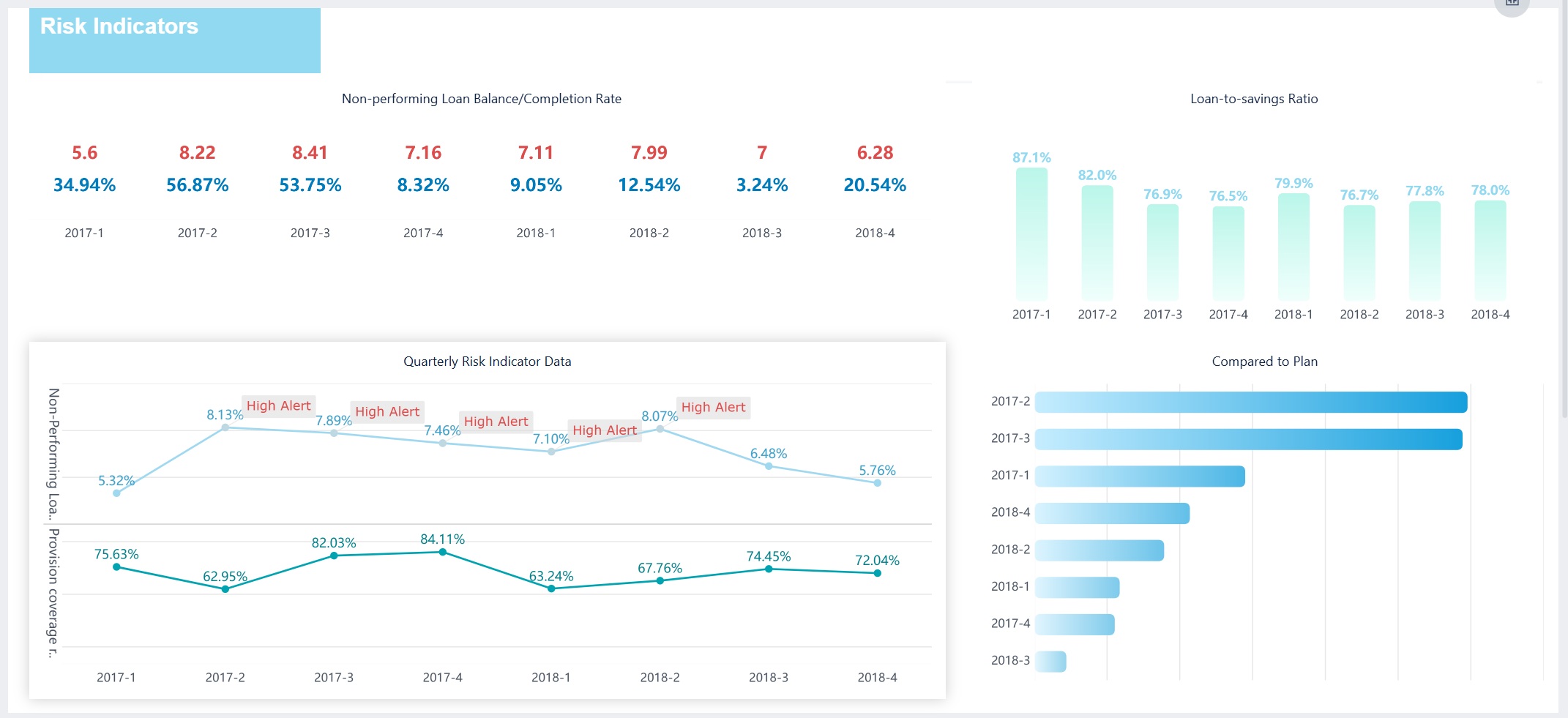
When you use business intelligence tools like FineBI, you bring all your financial data together in one place. This unified dashboard reduces your reliance on spreadsheets and manual reporting. You save time and get more actionable insights. In banking and insurance, dashboards help you meet regulations and improve decision-making. You can act quickly because you have accurate information at your fingertips.
Note: Analytical dashboards are essential for compliance and performance tracking in finance. They help you manage risk and spot trends early.
Industry Applications
You can use a financial dashboard in many industries. In banking, you track loan performance and risk. In insurance, you monitor claims and compliance. Enterprise finance teams use dashboards for revenue tracking, budget management, and forecasting. Real-world examples show that dashboards improve efficiency and help you make better decisions.
To get the most from your dashboard solution, connect FineBI to all your financial systems. Use real-time monitoring to keep your data fresh. Set up role-based access to protect sensitive information. Compare your dashboard with a power bi dashboard to see which features fit your needs. Use data governance tools to ensure accuracy and compliance. Always focus on clear visualization and easy navigation for your executive kpi dashboard, marketing analytics dashboard, and revenue dashboard.
Tip: Start with simple dashboards and add more features as your team grows comfortable with business intelligence tools.
Marketing Dashboard Examples for 2026
Essential KPIs
You need to track the right KPIs to measure your marketing success. A marketing analytics dashboard gives you a clear view of your performance. Focus on metrics like monthly recurring revenue, customer acquisition cost, and return on ad spend. You should also monitor lead-to-customer ratio, unique visitors, conversion rate, and engagement rate. Organic traffic, keyword rankings, and bounce rate help you understand your website’s reach and effectiveness. These KPIs let you see which campaigns drive results and where you can improve.
Monthly recurring revenue
Customer acquisition cost
Return on ad spend
Lead-to-customer ratio
Unique visitors
Conversion rate
Engagement rate
Organic traffic
Keyword rankings
Bounce rate
ROI and Campaign Tracking
You want to know which campaigns deliver the best results. FineBI helps you track ROI by connecting to your ad platforms, CRM, and website analytics. You can see revenue generated for every dollar spent and compare campaign performance side by side. The dashboard updates in real time, so you always have the latest numbers. Performance tracking becomes simple when you use business intelligence tools to visualize your data and spot trends quickly.
Tip: Use a revenue dashboard to compare campaign results and adjust your strategy for higher returns.
Use Cases in Digital Marketing
You can use a dashboard to analyze campaign performance, track leads, and measure multi-channel attribution. For example, you might want to see how social media, email, and paid ads contribute to conversions. FineBI integrates with cloud data sources, so you get a complete view of your marketing efforts. Business intelligence tools help you uncover insights that drive better decisions and higher ROI.
You can customize your dashboard to fit your needs. Start by choosing the most important KPIs for your business. Use filters to focus on specific campaigns or time periods. FineBI lets you drag and drop charts for easy visualization. If you use power bi, compare its features with FineBI to find the best fit. Always keep your dashboard simple and clear, so your team can act on insights quickly.
Dashboard Feature
Benefit
Real-time updates
Always see current results
Multi-channel tracking
Understand campaign impact
Custom filters
Focus on what matters
Executive Overview Business Intelligence Dashboards
High-Level Metrics
You need a dashboard that gives you a clear view of your company’s health. Executive overview dashboards bring together high-level metrics from every department. These dashboards help you see the big picture and spot trends quickly. You can use a table to organize the most important metrics:
Category
Key Metrics
Financial Health
Revenue Growth (MoM/QoQ), Net Profit Margin, EBITDA, Cash Flow
Customer Health
Customer Lifetime Value, Customer Acquisition Cost, Net Promoter Score
You can also focus on company-wide KPIs like revenue growth, profit margin, customer satisfaction, and market share. These metrics give you a holistic view and support better performance tracking.
Decision-Making Benefits
When you use business intelligence dashboards, you empower your leadership team to make faster and smarter decisions. Real-time dashboards let you spot risks early and act before problems grow. Many companies report a 25% increase in cross-departmental efficiency and a 30% reduction in time-to-decision after switching to executive dashboards. You get automated data updates, which means less time spent on manual reporting and more time for strategic planning.
Tip: Use dashboards to centralize project metrics and automate data compilation for better decision-making.
Cross-Departmental Use
Executive dashboards work best when you include KPIs from sales, finance, operations, and marketing. You can see how each department contributes to overall goals. For example, Deloitte improved project oversight and collaboration by integrating data from multiple sources into one dashboard. You can identify risks, track progress, and encourage teamwork across your organization.
Centralized dashboards improve visibility for all departments.
Real-time updates support proactive management.
Unified data sources lead to better collaboration.
Implementation Strategies
You can use business intelligence tools like FineBI to build executive dashboards with real-time, mobile access and role-based permissions. Start by connecting your dashboard to all major data sources. Choose KPIs that matter most to your leadership team. Use visualization features for easy tracking and insights. Compare FineBI with power bi to find the best fit for your needs. Make sure your dashboard supports secure sharing and mobile access for executives on the go.
Note: Begin with a simple dashboard and expand as your team’s needs grow. Focus on clear visualization and actionable insights.
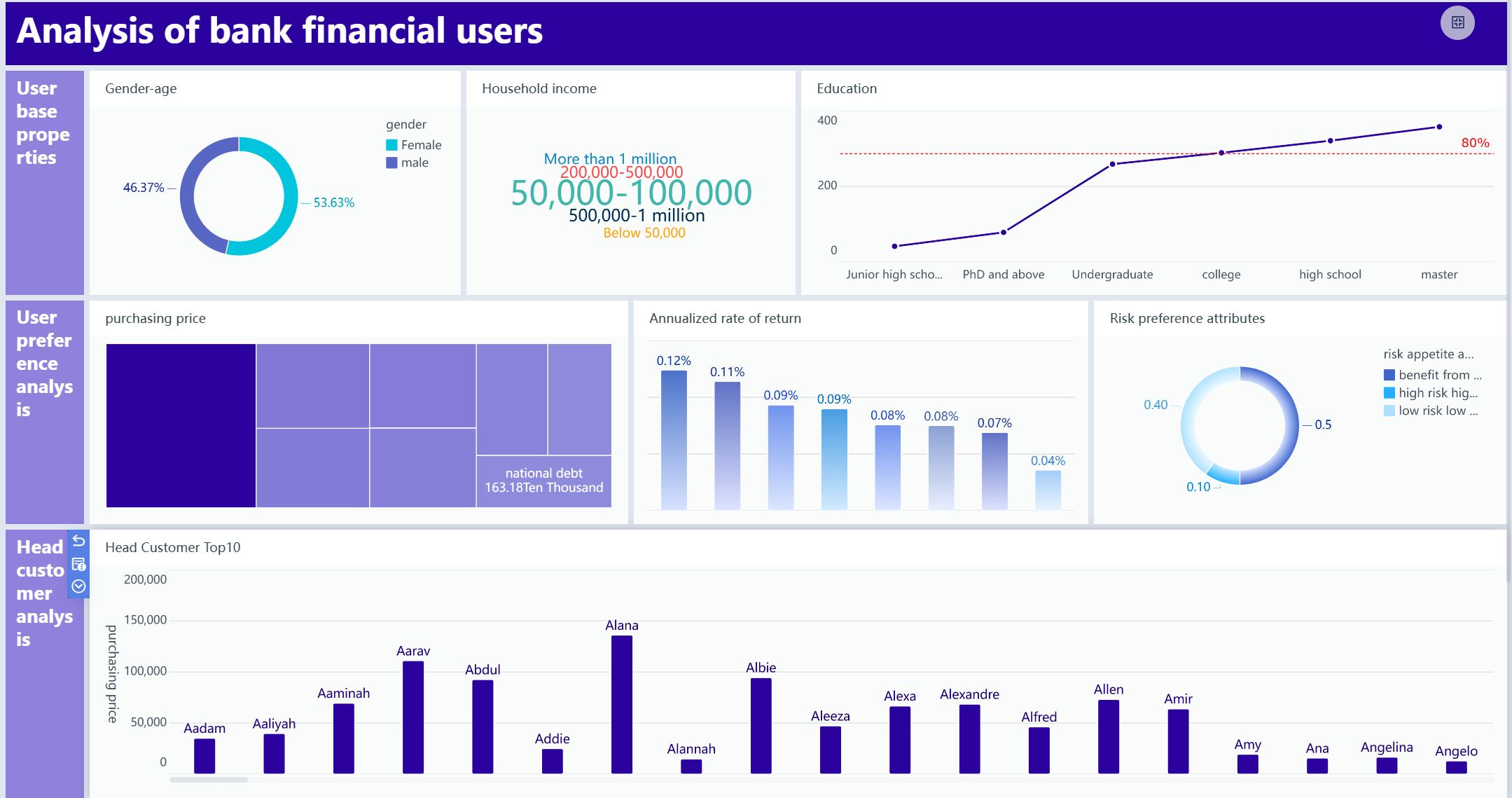
Customer Insights Dashboard Examples
Business intelligence dashboard examples are visual tools that help you organize, analyze, and present customer data from multiple sources, making it easier to gain actionable insights and improve decision-making in your business.
Customer Metrics and Segmentation
You can use a customer insights dashboard to track important metrics that reveal how your customers interact with your business. Some of the most impactful metrics include customer lifetime value, average order value, and conversion rates. You can also use RFM analysis, which stands for Recency, Frequency, and Monetary value. This method helps you score customers based on their buying behavior. You might label segments as "Frequent Buyers" or "Lapsed Loyalists" to make your dashboard clear and actionable. Focusing on long-term value helps you identify which customers deserve premium treatment and justifies higher acquisition costs for valuable segments.
Customer lifetime value (CLV)
Average order value (AOV)
Conversion rates
RFM analysis for segmentation
Enhancing Experience and Retention
A customer insights dashboard gives you the power to improve experience and retention. In retail, you can use the dashboard to enhance product recommendations and streamline return processes. In healthcare, you can boost patient engagement and satisfaction by tracking communication and treatment adherence. Personalized support increases loyalty and sales. You can monitor key KPIs such as customer satisfaction, sales metrics, inventory turnover, return rates, and profit margins.
Measures how satisfied customers are with their shopping experience.
Sales Metrics
Tracks sales performance over time to identify trends and outliers.
Inventory Turnover
Indicates how quickly inventory is sold and replaced, impacting customer availability.
Return Rates
Monitors the frequency of product returns, which can affect customer satisfaction and loyalty.
Profit Margins
Assesses the profitability of sales, influencing business sustainability and customer service.
Industry Applications
You can apply customer insights dashboards in many industries. In retail, you track buying patterns and personalize offers. In healthcare, you monitor patient communication and treatment adherence. In finance, you analyze customer segments to improve service and retention. These dashboard examples show how business intelligence tools help you make better decisions and drive growth.
Analytics Type
Impact on Customer Experience
Patient Communication Analytics
Enhances the quality of interactions, leading to better patient engagement and satisfaction.
Treatment Adherence Insights
Improves patient outcomes by ensuring adherence to treatment plans.
Support Analytics
Optimizes assistance throughout the customer journey, enhancing overall satisfaction.
Integration Tips
You can unify customer data from CRM, web, and support systems using business intelligence tools like FineBI. Connect your dashboard to all relevant sources for a complete view. Use real-time tracking to keep your insights current. If you use power bi, compare its integration features with FineBI to find the best fit for your needs. Focus on clear visualization and easy navigation to help your team act on insights quickly.
Tip: Start with a simple dashboard and add more metrics as you learn what drives customer loyalty.
Operations Management Business Intelligence Dashboards
Operational KPIs
You need to track the right operational KPIs to improve efficiency in manufacturing and logistics. A dashboard gives you a clear view of your most important metrics. Common KPIs you should include are:
Overall Equipment Effectiveness (OEE)
Cycle time
Yield
Downtime
Throughput
First Pass Yield (FPY)
Capacity utilization
Machine downtime rate
Production volume
Inventory turnover rate
Supplier delivery punctuality
Tracking these KPIs on your dashboard helps you spot bottlenecks and take action quickly.
A well-designed dashboard lets you see where you can reduce costs and boost efficiency. You can monitor inventory levels, minimize unplanned stockouts, and optimize production schedules. By using business intelligence tools, you identify trends and make decisions that lower waste and improve resource use. Real-time dashboards help you react to issues before they become costly problems.
Tip: Use your dashboard to set alerts for downtime or low inventory so you can respond immediately.
Use Cases in Manufacturing
Manufacturing companies rely on dashboards for cross-factory benchmarking and operational analysis. For example, BOE used FineBI to unify data and standardize metrics, which led to a 50% increase in operational efficiency. You can use dashboards to compare production lines, track machine health, and monitor safety incidents. These examples show how dashboards drive continuous improvement.
Implementation Considerations
When you set up your dashboard, connect it to all relevant data sources, such as ERP and MES systems. Choose business intelligence tools that support real-time tracking and easy integration. FineBI and power bi both offer strong options, but FineBI stands out for its self-service features and manufacturing focus. Make sure your dashboard is easy to use and provides actionable insights for your team.
HR Dashboard Examples with FineBI
Workforce Analytics
You can use a dashboard to unlock powerful workforce analytics for your HR team. With business intelligence tools like FineBI, you visualize key metrics that drive better decisions. Here are some valuable analytics you should track:
Identify skills gaps by assessing current employee skills.
Forecast workforce needs using predictive analytics.
Enhance succession planning by spotting high-potential employees.
Optimize talent acquisition by analyzing recruitment data.
Improve employee retention by finding turnover factors.
Align workforce planning with business goals.
Monitor and manage performance for improvement.
Budget effectively for HR resources.
Enhance employee engagement by understanding sentiment.
Support diversity, equity, inclusion, and belonging by tracking DEIB metrics.
HR Dashboard created by FIneBI (Click to Engage)
Organizations using real-time people analytics reduce unwanted turnover by up to 40% because they catch warning signs before employees walk out the door.
HR Benefits
A dashboard gives you clear visibility into every aspect of your workforce. You can track retention, recruitment, and payroll metrics with ease. FineBI offers self-service features and strong data permission controls, so you protect sensitive information while empowering HR teams. The table below shows how different dashboards support your HR goals:
Dashboard Type
Benefits
Recruitment Dashboard
Real-time visibility into talent acquisition, optimizing hiring strategies.
Attrition Dashboard
Monitors turnover patterns for targeted interventions.
Engagement Dashboard
Offers insights into workforce satisfaction and retention.
Learning and Development Dashboard
Tracks training effectiveness and skill growth.
Attendance Dashboard
Highlights presence patterns and disengagement issues.
Compensation Dashboard
Ensures fair pay practices and strategic rewards.
Comprehensive HR Reporting Dashboard
Provides an overview of key workforce metrics for better decision-making.
Talent Management Use Cases
You can use a dashboard to support talent management in many ways. Track recruitment sources to find top talent. Monitor engagement to boost satisfaction. Analyze training data to close skills gaps. Use attrition tracking to reduce turnover and improve workforce stability. These examples show how business intelligence tools help you make smarter HR decisions.
Adoption Tips
Start by connecting FineBI to your HRIS, payroll, and recruitment systems. Choose the most important metrics for your organization. Use role-based access to protect sensitive data. Compare features with power bi to find the best fit for your needs. Keep your dashboard simple and focus on tracking the metrics that matter most. As your team grows comfortable, add more insights to drive continuous improvement.
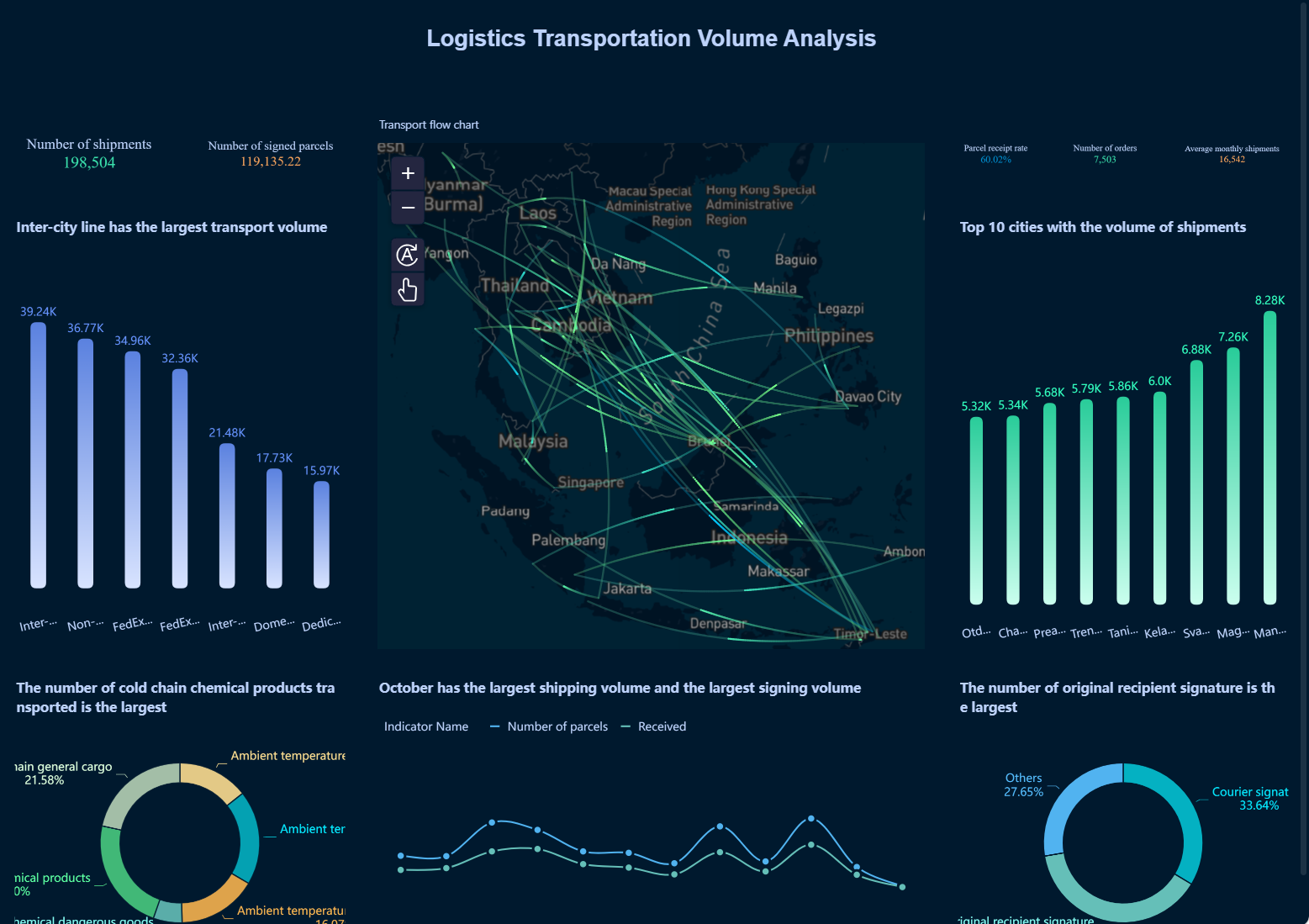
Supply Chain Business Intelligence Dashboard Examples
Business intelligence dashboard examples are visual tools that help you track, analyze, and present supply chain data, making it easier to spot trends, improve efficiency, and support better decisions in your organization.
Key Supply Chain Metrics
You need to track the right metrics to keep your supply chain running smoothly. A dashboard helps you see important numbers at a glance. Here are some key metrics you should include:
Metric
Description
Supplier On-Time Delivery
Monitors vendors’ punctuality, crucial for maintaining production schedules.
Supplier Quality Index (SQI)
Evaluates product quality from suppliers, indicating potential safety concerns.
Supplier Lead Time
Measures the time taken by suppliers to fulfill orders, impacting production schedules.
Order Fill Rate
Percentage of customer orders fulfilled completely and on time, indicating efficient inventory management.
Perfect Order Rate
Percentage of orders delivered without errors, contributing to customer satisfaction.
On-Time Delivery
Measures the percentage of orders delivered on time, essential for customer trust.
Cycle Time
Total time for a product to move through the supply chain, indicating efficiency.
Inventory Turnover
Measures how quickly inventory is sold, indicating effective inventory management.
Days of Inventory on Hand (DOI)
Average number of days to sell or consume inventory, indicating efficient management.
Cash-to-Cash Cycle Time (C2C)
Time taken to convert cash invested in the supply chain back into cash through sales.
Tracking these metrics on your dashboard gives you a clear view of your supply chain’s strengths and weaknesses.
Inventory and Logistics
You can use a dashboard to monitor inventory levels and logistics in real time. FineBI integrates with ERP and logistics systems, so you always have up-to-date information. You see how much stock you have, where it is, and when you need to reorder. This helps you avoid stockouts and reduce excess inventory. You can also track delivery times and spot delays before they become bigger problems.
iLogistics Transportation Volume Analysis (Click to Engage)
Tip: Set up alerts in your dashboard for low inventory or late shipments. This helps you act quickly and keep your supply chain moving.
Industry Use Cases
Many industries use business intelligence tools for supply chain management. In manufacturing, you track supplier performance and production schedules. Retailers use dashboards to manage inventory across stores and warehouses. Distribution companies monitor delivery routes and order fulfillment. These examples show how dashboards help you make better decisions and improve efficiency.
Implementation Tips
Start by connecting your dashboard to all your supply chain data sources, such as ERP, warehouse, and logistics systems. Choose business intelligence tools that support real-time tracking and easy integration. FineBI stands out for its self-service features and strong integration with supply chain platforms. You can compare FineBI with power bi to see which fits your needs best. Keep your dashboard simple at first, then add more features as your team gets comfortable. Focus on clear visualization and actionable insights.
Project Management Dashboard Examples
Business intelligence dashboard examples are interactive visual displays that help you organize, monitor, and analyze project data, making it easier to track progress, allocate resources, and improve team collaboration for successful project delivery.
Project Tracking Features
You need a dashboard that makes project tracking simple and effective. With business intelligence tools like FineBI, you can visualize project status, monitor productivity, and manage resources in real time. You see updates instantly, which helps you respond quickly to changes. Common dashboard features include:
Data visualization for project timelines and progress
Project status tracking to monitor completion rates
Productivity tracking to measure team output
Resource management for assigning tasks and balancing workloads
You can add Gantt charts to your dashboard for clear milestone tracking. Resource allocation charts show who is working on each task. These dashboard examples help you keep every project on schedule.
Team Collaboration
A dashboard improves collaboration by giving everyone access to the same information. FineBI lets you create dashboards independently, which encourages exploratory analysis and innovation among team members. You reduce workflow bottlenecks and improve efficiency between departments. The table below shows how FineBI supports better teamwork and faster project delivery:
You can use a dashboard for project management in many industries. Construction teams track building progress and resource allocation. IT departments monitor software development milestones and bug fixes. Marketing teams follow campaign timelines and deliverables. Business intelligence tools like FineBI and power bi help you adapt dashboards for any project type, giving you insights that drive better results.
Setup Tips
Start by connecting your dashboard to all project data sources. Choose features like Gantt charts, resource allocation, and milestone tracking. Use real-time alerts to notify your team about changes or delays. Keep your dashboard layout simple so everyone can find the information they need. As your team gets comfortable, add more tracking features to improve project delivery.
Tip: Use your dashboard to set up automated alerts for key milestones. This helps you stay on track and meet deadlines.
IT & Security Business Intelligence Dashboards
IT Performance Metrics
You need to keep your IT systems running smoothly. A dashboard helps you track the most important metrics for your infrastructure and service delivery. With business intelligence tools, you can monitor:
System performance, including CPU usage, memory, and disk space, to spot bottlenecks.
Network status, such as traffic flows and bandwidth usage, to ensure optimal performance.
Security data, tracking intrusion attempts and malware detections to protect your environment.
Service desk stats, analyzing ticket volumes and resolution speeds for better support.
Resource usage, evaluating server and application utilization for capacity planning.
A dashboard gives you a clear view of your IT landscape, making tracking and troubleshooting much easier.
Security and Compliance
Protecting your organization’s digital assets is critical. You can use a dashboard to monitor security incidents and compliance KPIs in real time. Many companies, like Kraft Systems, use business intelligence tools to integrate predictive analytics and real-time monitoring. This approach helps you anticipate and mitigate risks before they become major issues. Customized security dashboards allow you to respond quickly to vulnerabilities and maintain compliance with standards such as NIST. Real-time monitoring helps you identify anomalies that could signal a breach.
Note: Organizations that use data-driven insights are much more likely to gain a sustainable competitive advantage.
Industry Use Cases
You can apply IT and security dashboards in many industries. For example, financial services use dashboards to monitor compliance and detect fraud. Healthcare organizations track system uptime and patient data security. Manufacturing companies monitor network health and protect intellectual property. These dashboard examples show how you can adapt your dashboard to fit your industry’s unique needs.
Implementation Guidance
To get started, connect your dashboard to all relevant IT and security data sources. FineBI supports monitoring of IT infrastructure, security incidents, and compliance KPIs. You can set up role-based access and audit trails for strong governance. Compare FineBI with power bi to see which business intelligence tools best fit your requirements. Focus on clear visualization and easy navigation to help your team act on insights quickly.
Comparison of Top Business Intelligence Dashboard Examples
Business intelligence dashboard examples are visual tools that help you turn raw data into clear, actionable insights, making it easier to track performance, spot trends, and support decision-making across all areas of your business.
Unique Strengths
You can choose from many business intelligence dashboard examples, each with unique strengths. For instance, a sales performance dashboard lets you track sales activities, view your pipeline, and analyze team results. An executive KPI dashboard gives you a clear view of company performance, helping you make smarter strategic decisions. Financial performance dashboards allow you to monitor financial health in real time, visualize profit and loss, and analyze budgets. Customer service dashboards measure satisfaction and team efficiency, which helps you improve retention and support. Supply chain dashboards provide end-to-end visibility, integrating data for risk management and cost optimization.
Dashboard Type
Unique Strengths
Sales Performance Dashboard
Tracks sales activities, provides revenue tracking, pipeline views, team analytics, and product insights.
Executive KPI Dashboard
Offers a clear view of company performance, enabling smarter strategic decisions with vital data.
Financial Performance Dashboard
Monitors financial health in real-time, visualizes P&L, tracks cash flow, and analyzes budgets.
Customer Service Dashboard
Measures customer satisfaction and team efficiency, enhancing customer retention and support operations.
Supply Chain Dashboard
Provides end-to-end visibility of the supply chain, integrating data for risk management and cost optimization.
FineBI stands out among business intelligence tools. You get self-service dashboard creation, AI-driven analytics, and strong enterprise governance. These features make FineBI a top choice for organizations that want flexibility and control.
You should match your dashboard to your business needs. For example, a finance dashboard helps CFOs and leaders assess vital financial data and performance indicators. A sales dashboard provides real-time sales metrics for executives who need to make quick decisions and track performance. Marketing campaign dashboards enable teams to analyze campaign results, budget spending, and conversion rates.
Dashboard Type
Business Need Addressed
Finance Dashboard
Allows CFOs and decision-makers to assess vital financial data and performance indicators.
Sales Dashboard
Provides real-time sales metrics for executives to make informed decisions and track performance.
Marketing Campaign Dashboard
Enables marketing teams to analyze campaign performance, budget spending, and conversion rates effectively.
You can use business intelligence dashboard examples for tracking, analysis, and reporting in any department. FineBI and power bi both offer strong options, but FineBI’s AI features and self-service approach give you more control and faster insights.
Tip: Choose the dashboard that matches your goals and data needs. The right dashboard helps you turn information into action.
You gain real business value when you use a dashboard for tracking, analysis, and decision-making. The top dashboard examples help you unify data, improve forecast reliability, and drive cross-functional alignment. Business intelligence tools like FineBI and power bi let you design dashboards that match your goals. Start by defining objectives, connecting sources, and choosing the right visualizations. Embrace trends in AI and self-service analytics to unlock deeper insights and faster actions.
Step
Recommendation
1
Select dashboard software that fits your needs.
2
Connect all data sources for complete tracking.
3
Define KPIs and visualizations for clear insights.
Tip: Explore FineBI to build dashboards that empower your team and support smarter decisions.
Continue Reading About Business Intelligence Dashboard
Access a wealth of case studies, industry insights, and solution guides to accelerate digital transformation.
FAQ
What is a business intelligence dashboard?
A dashboard is a visual tool that helps you track, analyze, and present data from different sources. You use it to see key metrics, spot trends, and make better decisions. Dashboards give you real-time insights for your business.
How do business intelligence tools help with tracking?
Business intelligence tools let you collect and organize data from many places. You use dashboards for tracking sales, expenses, or customer activity. This helps you see patterns and act quickly. You get a clear view of your business performance.
Can I compare FineBI with power bi for dashboards?
Yes, you can compare FineBI with power bi. Both offer dashboard creation and data visualization. FineBI focuses on self-service and AI-driven features. You choose the tool that fits your needs for tracking and insights.
What are some examples of dashboard use in business?
You use dashboards for sales tracking, financial analysis, project management, and customer support. These examples show how dashboards help you organize information and improve decision-making. You see results faster and respond to changes quickly.
How do dashboards provide insights for my team?
Dashboards turn raw data into clear charts and tables. You spot trends, track progress, and share results with your team. This makes it easier to find insights and take action. Everyone stays informed and focused on goals.