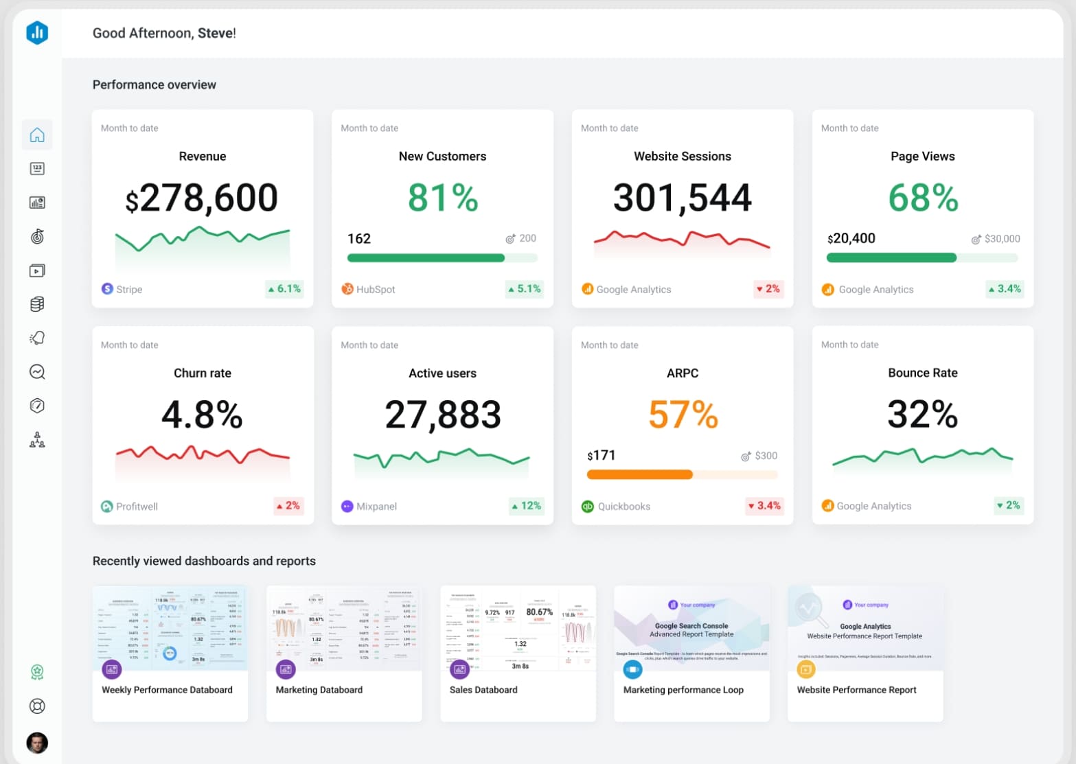
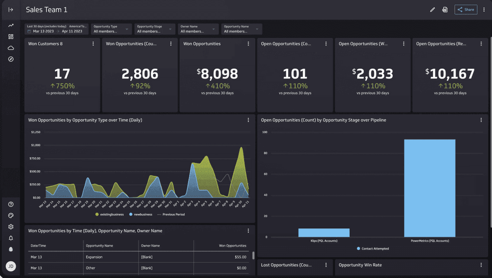
A mobile dashboard gives you instant access to business insights, analytics, and real-time data from any device. You need fast, actionable insights as the demand for mobile analytics grows. The surge in mobile app adoption, with 5.6 billion users worldwide and 70% of enterprises seeking real-time analytics, drives your need for powerful business insights on the go.
A mobile dashboard is a digital interface that lets you view, analyze, and share business data and insights on your smartphone or tablet, giving you real-time access to key metrics and analytics wherever you are.
You use mobile dashboards to track important data and monitor analytics without being tied to your desk. These dashboards play a central role in business analytics by putting critical insights in your hands. You can check sales numbers, customer engagement, or operational performance at any time. This helps you make decisions quickly and stay ahead in a fast-moving business world.
Mobile dashboards focus on simplicity and clarity. They highlight the most important data points and analytics, so you do not get overwhelmed. You can share insights with your team, annotate charts, and keep everyone on the same page. The design stays consistent across devices, making it easy for you to switch between your phone, tablet, or computer.
Here are the core functions and components of a mobile dashboard in business analytics:
Core Functions and Components
Description
Easier access to real-time insights
Mobile dashboards provide immediate access to data, enabling users to make timely decisions.
Increased sharing capabilities
They facilitate sharing insights across teams, enhancing collaboration and informed decision-making.
Collaboration capabilities
Users can annotate visualizations, allowing for direct communication and clarification within the dashboard.
Faster decision making
Decision-makers can quickly diagnose issues and respond to them using real-time data.
Simple design
Effective mobile dashboards prioritize simplicity to ensure clarity and usability on smaller screens.
Wise chart selection
Using simpler charts enhances readability and understanding on mobile devices.
Consistent design
Maintaining a uniform look across platforms encourages user adoption and reduces confusion.
Focus on key metrics
Mobile dashboards should highlight the most critical KPIs to provide a clear overview without overwhelming users.
Why mobile dashboards matter in 2026
You need mobile dashboards more than ever in 2026. The world of analytics is changing fast. Digital transformation is reshaping how you work. Companies invest billions in new technology, with a large share going to analytics and mobile access. You see more remote work and hybrid teams. Over 40% of knowledge workers now need mobile access to business intelligence tools.
Industry 4.0 is also driving change. In manufacturing, you rely on analytics for real-time production monitoring and supply chain visibility. Mobile dashboards give you the data and insights you need to manage complex operations and respond to problems as they happen.
Key trends fueling the rise of mobile dashboards include:
Digital transformation modernizes technology and boosts operational efficiency.
Remote work increases the need for seamless collaboration and mobile access to analytics.
Industry 4.0 requires real-time data for production and supply chain management.
With mobile dashboards, you gain instant insights, faster decision-making, and better collaboration. You can access business intelligence tools from anywhere, making your analytics more powerful and your data more actionable. This keeps you competitive and ready for the future.
Best mobile dashboard apps: quick comparison
A mobile dashboard is a digital tool that lets you view, analyze, and share business insights and data on your smartphone or tablet, giving you instant access to key analytics wherever you are.
Top 12 best dashboard apps summary table
You want to choose the best dashboard apps for your business analytics. The table below compares the top 12 apps, focusing on pricing, platform compatibility, and user ratings. This helps you see which dashboard fits your needs for data insights and analytics.
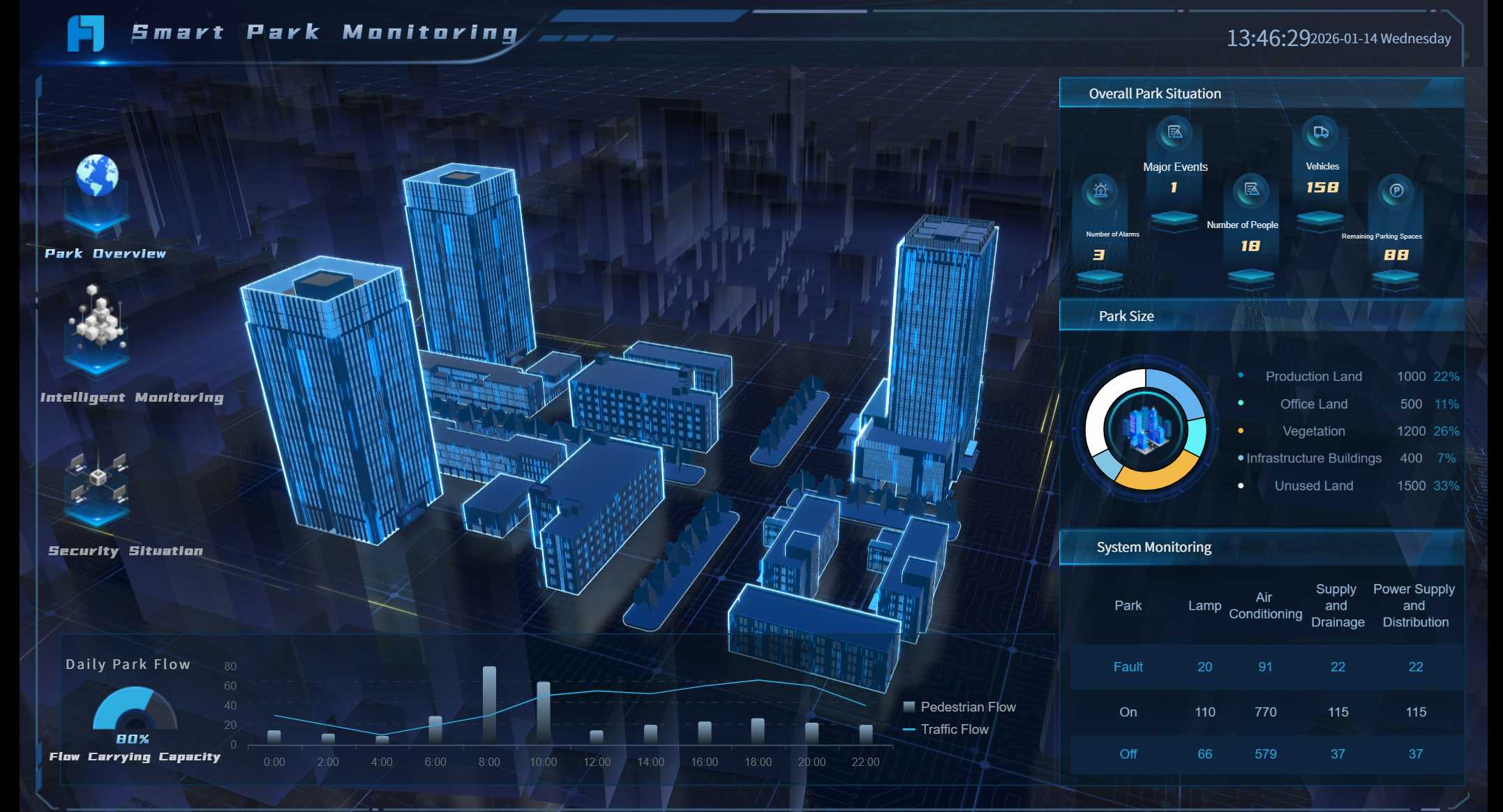
FineReport stands out among the best dashboard apps. You get flexible design, advanced 3D dashboards, and mobile BI features. FineReport supports real-world use cases, such as smart factories and public sector analytics, helping you unlock deeper insights from your data.
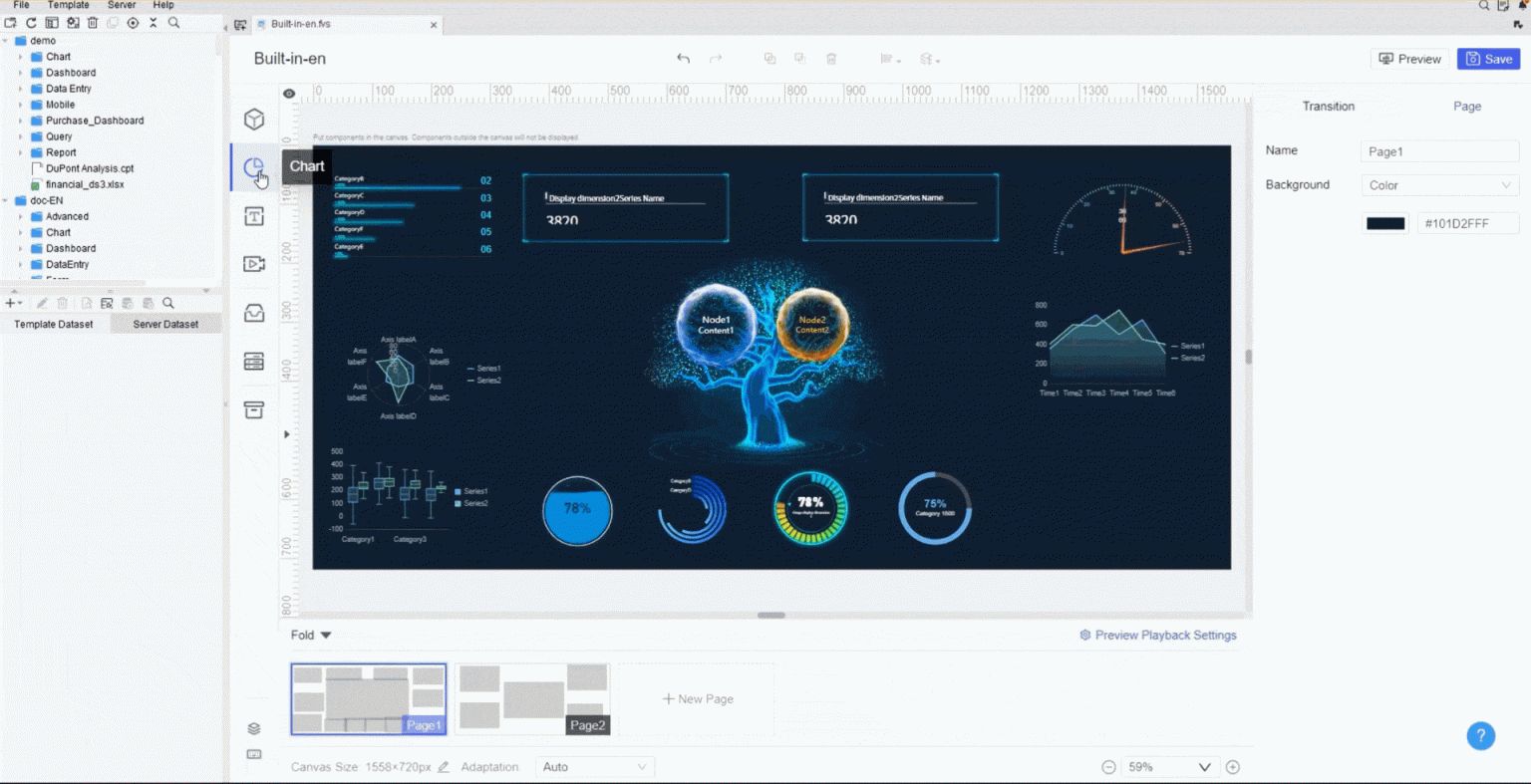
3D dashboard created by FineReport (Click to Engage)
When you select the best dashboard apps for analytics, you need to focus on several important criteria. These factors help you find apps that deliver the most value for your business data and insights.
Criteria
Description
Extensive Template Libraries
Access a wide range of dashboard templates and styles for fast setup.
Integration Capabilities
Connect seamlessly with third-party tools and platforms.
Mobile Responsiveness
Ensure compatibility with all devices and screens.
Customization Options
Control dashboard appearance and features to match your needs.
Data Control
Use role-based management for secure data access.
KPI Tracking
Combine multiple KPIs and metrics from various sources.
Alerts and Notifications
Get prompt alerts for important trends or milestones.
Performance Updates
Receive automated reports and updates via email or messaging apps.
Gamification
Boost user engagement and morale with interactive features.
You should also consider data visualization, integration, mobile compatibility, pricing, and support. These criteria help you choose the best dashboard apps that fit your analytics needs and give you actionable insights from your data.
Mobile dashboard app reviews and features
A mobile dashboard is a digital tool that lets you view, analyze, and interact with business data and analytics on your smartphone or tablet, delivering actionable insights wherever you are.
1.FineReport mobile dashboard: features and use cases
FineReport gives you a powerful business dashboard software that puts actionable insights at your fingertips. You can use its drag-and-drop designer to build custom dashboards with both 2D and 3D data visualization. FineReport supports real-time data integration, so you always see the latest numbers. The mobile dashboard adapts to any device, letting you access interactive dashboards on your phone, tablet, or desktop.
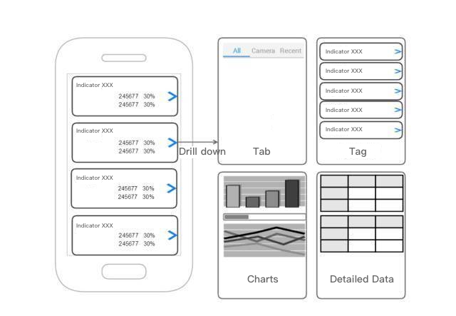
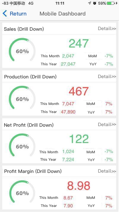
You can monitor KPIs, sales, and operations with interactive dashboards that update instantly. FineReport’s mobile BI features let you drill down into data, filter results, and share insights with your team. The platform connects to over 500 data sources, making real-time data integration seamless. You can embed dashboards into your own app or use the FineReport app for a branded experience.
FineReport shines in real-world scenarios. For example, the Abu Dhabi Projects and Infrastructure Centre (ADPIC) used FineReport to create a CXO dashboard for government project oversight. This helped leaders make faster, data-driven decisions. In manufacturing, smart factories use FineReport’s 3D dashboards to visualize production lines, monitor equipment, and track logistics in real time. These solutions help you turn complex data into actionable insights and support business intelligence across industries.
3D dashboard created by FineReport (Click to Engage)
Tip: FineReport’s decision-making platform lets you manage users, permissions, and scheduled reports, making it a complete business analytics tool for enterprises.
2.Tableau mobile dashboard: strengths and weaknesses
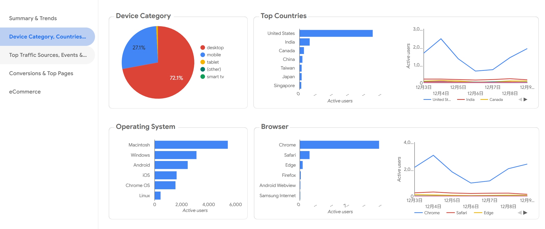
Tableau’s mobile dashboard gives you interactive dashboards with advanced analytics and strong data visualization. You can explore data on the go and share insights with your team. The app supports real-time data integration and works on iOS, Android, and web platforms.
Pros
Cons
User-friendly interface
High cost
Handles large data volumes
Steep learning curve
Interactive dashboards
Limited customization options
Tableau works best for organizations that need advanced analytics and interactive dashboards. You can use it for sales, marketing, or operations, but you may face a higher learning curve and cost.
3.Power BI mobile dashboard: analytics and integrations
Power BI’s mobile dashboard brings business intelligence to your pocket. The app is optimized for touch, making interactive dashboards easy to use on any device. You get real-time data integration, alerts, and geolocation-based filtering. Copilot AI lets you ask questions and get instant summaries or visualizations.
The mobile dashboard integrates with Microsoft Teams and SharePoint for collaboration.
You can access real-time data and interactive dashboards with advanced analytics.
Power BI supports integration with R and AI-powered insights.
You can share insights quickly, boosting communication and value from your data.
Power BI fits businesses that want seamless integration with Microsoft tools and need strong analytics on the go.
4.Looker mobile dashboard: data visualization focus
Looker’s mobile dashboard stands out for its intuitive interface and strong data visualization. You can interact with polished, interactive dashboards and connect to many databases, cloud tools, and CRMs. The platform supports real-time data integration and offers enterprise security.
Strength
Description
Intuitive interface
Easy for non-technical users to interact with dashboards.
Domo’s mobile dashboard focuses on usability and automation. You can access real-time data, customize dashboards, and use self-service analytics. The platform uses AI and augmented analytics to help you spot trends and gain actionable insights.
Feature
Benefit
Real-time data access
Analyze data anytime, anywhere for better decisions.
Customizable interface
Tailor dashboards to your needs for efficiency.
Self-service capabilities
Explore data independently and automate analysis.
AI and Augmented Analytics
Identify trends and insights quickly.
Domo is ideal if you want interactive dashboards that support automation and real-time data integration.
Databox gives you a mobile dashboard designed for KPI tracking. You can swipe to navigate dashboards, favorite key metrics, and rearrange them for quick access. The app supports goal tracking, performance alerts, and annotations, all optimized for mobile.
Feature
Description
Interactivity
Swipe to navigate dashboards and view metrics.
Customization
Favorite and rearrange metrics for easy access.
Goal Tracking
Track team progress on goals within the app.
Mobile-Specific Design
Dashboards display and interact natively on mobile devices.
Performance Alerts
Receive alerts on your device based on set criteria.
Annotations
Add insights to metrics directly from your mobile device.
Databox is a great choice for teams that need interactive dashboards and real-time data integration for KPI management.
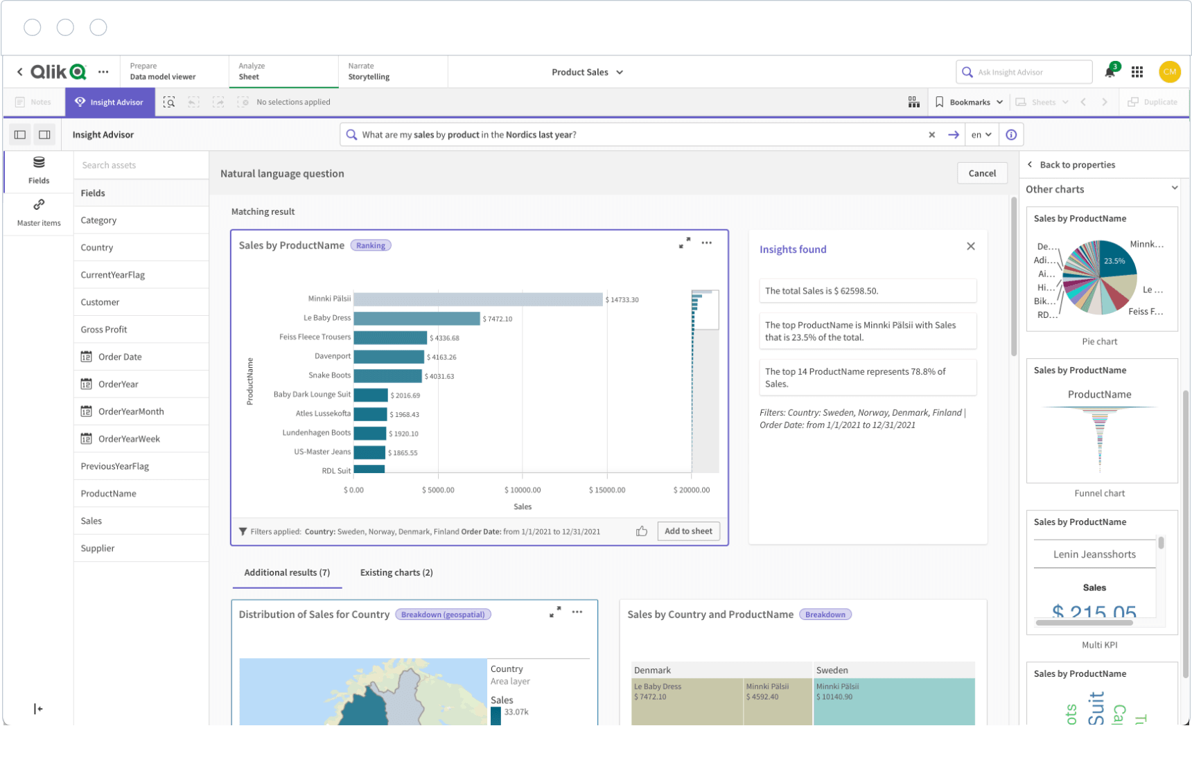
7.Qlik Sense mobile dashboard: interactive analytics
Qlik Sense offers interactive dashboards that let you explore data and gain insights from anywhere. You can access real-time data integration and interact with dashboards on any device. The platform is especially useful for industries like finance and sales, where quick decisions matter.
You can create, share, and distribute interactive dashboards efficiently. Qlik Sense supports business intelligence by making data insights available on the go. This helps you respond to changes and make informed decisions faster.
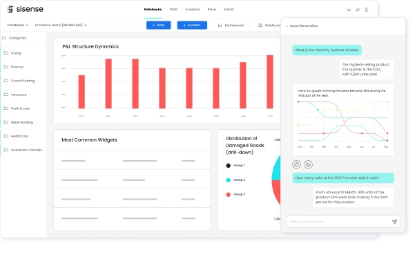
Sisense delivers embedded analytics through its mobile dashboard. You can use drag-and-drop dashboard builders and AI chatbots to generate reports and customize visualizations. Natural language querying lets you ask questions in plain English and get instant insights.
Embedded analytics provide faster, easier insights for users.
Drag-and-drop tools and AI chatbots simplify dashboard creation.
Natural language querying makes data exploration accessible.
Sisense empowers you to make strategic decisions with actionable insights, supporting business intelligence in a competitive environment.
Zoho Analytics positions its mobile dashboard as an affordable solution for small and medium-sized businesses. You get transparent pricing, pre-built reports, and automated insights. The mobile dashboard gives you easy access to critical business data and supports real-time data integration.
Transparent, simple pricing models make it accessible for SMBs.
Pre-built reports and automated insights help you get started quickly.
The mobile dashboard lets you access business insights on the go.
Zoho Analytics is a smart choice if you want affordable, interactive dashboards and business intelligence without a large IT team.
Klipfolio’s mobile dashboard gives you strong customization options. You can build custom dashboards with a wide range of visualization types. The platform supports real-time data integration and interactive dashboards, letting you monitor KPIs and share insights with your team.
You can connect to many data sources and design dashboards that fit your business needs. Klipfolio works well for organizations that want flexible, interactive dashboards and advanced data visualization.
11.Google Data Studio mobile dashboard: free analytics
Google Data Studio offers a free mobile dashboard for analytics. You can use interactive live reports and customize dashboards for your needs. The platform is cloud-based and easy to use, with access and sharing controls.
Advantages
Limitations
Free to use
No on-premise deployment option
Easy to use
Lack of real-time updates
Live connection
Limited data visualization options
Customizable
Slow speed when using live connection
You can use Google Data Studio for basic analytics and interactive dashboards, but you may face limits with real-time data integration and advanced visualization.
12.SAP Analytics Cloud mobile dashboard: enterprise features
SAP Analytics Cloud gives you an enterprise-grade mobile dashboard. You can access interactive dashboards, advanced analytics, and real-time data integration. The platform supports business intelligence with features like predictive analytics, planning, and collaboration.
You can use SAP Analytics Cloud to build custom dashboards for finance, operations, or HR. The app works on iOS, Android, and web, making it a strong choice for large organizations that need secure, scalable analytics and actionable insights.
Note: Each of these business analytics tools offers unique strengths. You should match your choice to your business needs, data sources, and the level of interactive dashboards and data visualization you require.
Mobile dashboard comparison: data visualization and analytics tools
A mobile dashboard is a digital tool that lets you view, analyze, and interact with business data and analytics on your smartphone or tablet, delivering actionable insights wherever you are.
Feature comparison: data visualization and integrations
You want a dashboard that delivers clear data insights and connects with your favorite mobile app analytics tools. The table below compares leading dashboard apps on data visualization, integration, and analytics features:
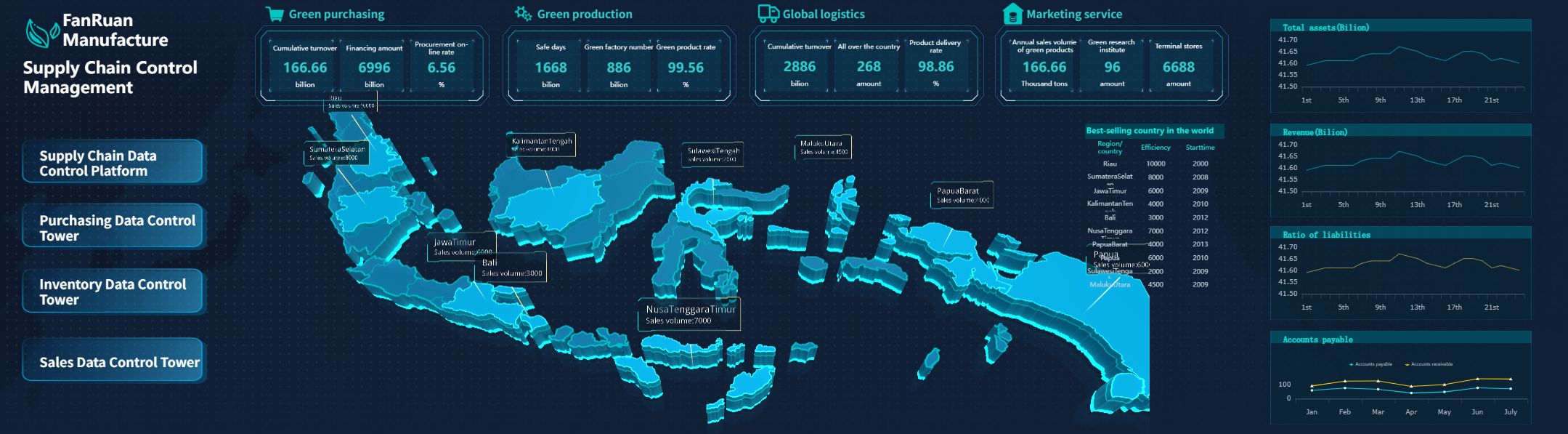
FineReport stands out with its 3D dashboards, animated visuals, and seamless integration with over 500 data sources. You can embed dashboards into your own app using SDK or OEM, making it easy to connect with mobile app analytics tools for real-time data insights.
Usability and user experience
You need a dashboard that feels intuitive and easy to use. The best dashboards focus on minimalism, showing only essential data and insights. This approach helps you avoid distractions and makes it easier to find what matters. You benefit from dashboards that tell a story with data, guiding you to make smart decisions without feeling overwhelmed.
Minimalist design keeps your focus on key data and insights.
Dashboards simplify complex analytics, making them accessible to everyone.
Clear layouts and actionable information improve your experience.
FineReport uses a drag-and-drop designer and responsive layouts, so you can build dashboards that look great on any device. You get a smooth experience whether you use a phone, tablet, or desktop.
You want your dashboard to work with the mobile app analytics tools you already use. FineReport offers deep integration options, letting you connect to tools like Mixpanel, Amplitude, Firebase, and more. You can track user behavior, analyze app performance, and combine these insights with business data for a complete view.
FineReport supports SDK and OEM integration for embedding dashboards into your own apps.
You can connect to mobile app analytics tools for unified data and insights.
Real-time data integration ensures you always see the latest analytics.
Prototype:
From FineReport
Demo:
From FineReport
With FineReport, you gain a flexible dashboard that brings together all your data and insights, helping you make informed decisions faster.
Choosing the right mobile dashboard app for your business
A mobile dashboard is a digital tool that lets you view, analyze, and share business data and insights on your smartphone or tablet, giving you instant access to key analytics wherever you are.
You need a dashboard that matches your business size, industry, and analytics needs. The right dashboard helps you turn data into actionable insights, supports your team, and drives better decisions. You should consider your goals, user preferences, and usage scenarios before choosing a dashboard.
Matching best dashboard apps to business size and industry
When you select a dashboard for your business, you should look at several important factors:
Understand the purpose and motivation for using analytics and dashboards.
Identify the characteristics of your end users and their preferences for viewing data and insights.
Consider the usage scenario, such as whether you need dashboards for manufacturing, public sector, or retail.
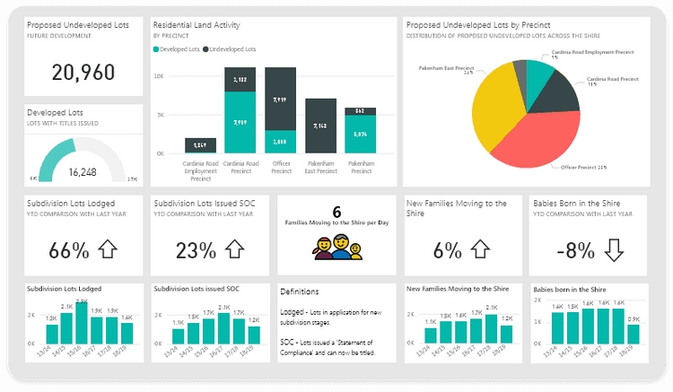
Small businesses often need dashboards that are easy to set up and manage. You may want simple analytics and quick access to data. Large enterprises usually require dashboards with advanced analytics, integration with multiple data sources, and strong security controls. If you work in manufacturing, you need dashboards that visualize production data and provide real-time insights. Public sector organizations benefit from dashboards that support strategic planning and oversight, like the CXO dashboard used by ADPIC with FineReport.
FineReport adapts to different industries and business sizes. You can use it to create dashboards for smart factories, public sector management, retail analytics, and more. The flexible design lets you customize dashboards for any scenario, helping you get the most value from your data and insights.
A mobile dashboard is a tool that lets you access, analyze, and share business data and insights from any device, anywhere. You saw how the best dashboard apps help you align tool selection with business goals, prioritize data integrity, and plan for future needs. FineReport stands out for flexible design, real-time analytics, and scalable data integration. To get started, define your goals, identify key metrics, and map your data sources. Mobile dashboards give you real-time insights, reduce meeting times, and help you stay competitive with fast, data-driven decisions in 2026.
Access a wealth of case studies, industry insights, and solution guides to accelerate digital transformation.
FAQ
What is a mobile dashboard?
A mobile dashboard is a digital tool that lets you view, analyze, and share business data and insights on your smartphone or tablet. You use it to track key metrics, monitor analytics, and access real-time data for better decision-making wherever you are.
How can a dashboard help you make better business decisions?
A dashboard brings all your data together in one place. You see real-time analytics and insights, which help you spot trends and act quickly. You use dashboards to compare performance, set goals, and make informed choices based on accurate data.
What types of data can you display on a dashboard?
You can display sales numbers, customer feedback, inventory levels, and financial data on a dashboard. You also track project progress, employee performance, and marketing analytics. Dashboards let you combine different data sources for a complete view of your business insights.
Why is real-time data important in a dashboard?
Real-time data gives you up-to-date insights. You react faster to changes and avoid delays in your business. A dashboard with real-time analytics helps you catch problems early, adjust your strategy, and keep your team focused on the latest information.
Can you customize dashboards for different users or teams?
Yes, you can customize dashboards to show the most relevant data and insights for each user or team. You choose which analytics and metrics to display. This way, everyone gets the information they need to do their job and make smart decisions.