Data analytics and reporting turns raw numbers into decisions. For IT managers, operations directors, finance leads, and analysts, the challenge is rarely a lack of data. The real problem is producing a report that answers the right business question, highlights what changed, explains why it matters, and tells stakeholders what to do next. A strong report reduces decision latency, aligns teams, and prevents executives from wasting time on disconnected dashboards or overly technical analysis.

All reports in this article are built with FineReport.
What data analytics and reporting means and why it matters
Data analytics and reporting is the discipline of collecting, organizing, analyzing, and presenting data so decision-makers can understand performance and act with confidence. Reporting shows the current state and historical results. Analytics adds interpretation, causes, patterns, and often likely next outcomes.
In practice, the purpose of a report is simple: convert raw data into clear findings, business implications, and recommended actions. If a report does not help someone decide faster or better, it is not doing its job.
A useful report should always answer three questions:
- Who is this report for? Executives need concise summaries. Managers need operational drivers. Analysts need deeper definitions and methods.
- What business questions should it answer? For example: Why did conversion drop? Which region missed target? Where are operational bottlenecks increasing?
- How often should it be updated? Real-time, daily, weekly, monthly, or quarterly cadence depends on how fast the business changes and how quickly action must follow.
The distinction between monitoring performance and interpreting causes is critical. Monitoring tells you whether KPIs moved. Interpretation tells you why they moved, whether the change is meaningful, and what should happen next. Strong data analytics and reporting combines both.
Core structure of effective data analytics and reporting
A report should follow a repeatable structure that readers recognize immediately. Consistency improves trust, speeds review, and makes it easier to compare results over time.
Start with the business question and audience
Before building charts or selecting KPIs, define the decision the report should support. This step prevents a common failure: creating a report full of data that nobody can use.
Ask these questions first:
- What decision is this report meant to enable?
- What is the primary audience?
- What level of detail is appropriate?
- What action should happen if performance is above or below threshold?
A CEO may want five KPIs and a one-minute summary. A regional operations manager may need trend breakdowns by location, process stage, and shift. A data analyst may need methodology notes, filters, and calculation logic.
The report should be written at the reader’s altitude, not the analyst’s.
Organize the report in a logical flow
The most effective data analytics and reporting format follows a top-down sequence. Lead with insight, then support it with evidence.
A practical structure looks like this:
-
Context
What period, business unit, product, or initiative is being reviewed? -
Methodology
What data sources, definitions, filters, and assumptions were used? -
Key findings
What changed? What stands out? What requires attention? -
KPI results
Which measures are on target, off target, improving, or declining? -
Visuals
Which charts make the patterns easiest to interpret? -
Recommendations
What should the business do next, by when, and who owns it?
This structure works because it matches how decision-makers consume information: fast summary first, supporting detail second.
Key Metrics (KPIs)
A high-quality data analytics and reporting report should include a focused KPI layer. The exact metrics vary by function, but these KPI categories are the most useful:
- Performance KPIs: Measure progress toward strategic goals such as revenue growth, conversion rate, output volume, or project completion rate.
- Operational KPIs: Track process efficiency, cycle time, backlog, error rate, uptime, or throughput.
- Customer KPIs: Show customer acquisition, retention, churn, satisfaction, response time, or engagement.
- Financial KPIs: Measure profitability, margin, cost variance, budget utilization, or return on investment.
- Quality KPIs: Monitor defect rate, rework, compliance adherence, or service-level performance.
- Risk KPIs: Identify early warning signs such as incident frequency, unresolved tickets, failed controls, or forecast deviation.
A strong report does not include every available number. It includes only the KPIs that affect business action.
Build a concise executive summary
The executive summary is the most-read part of the report. It should tell a senior stakeholder what happened, why it matters, and what should happen next in less than a minute.
A good executive summary usually includes:
- Objective: What the report covers
- Top insight: The most important outcome or movement
- Wins: What improved and why
- Risks: What declined or threatens target attainment
- Next steps: Clear actions for owners
Keep it short, but avoid vague language. “Performance was mixed” is not helpful. “Revenue rose 6% above target, but fulfillment delays increased 14%, risking customer satisfaction next month” is useful.
Choose the right KPI metrics for data analytics and reporting
Choosing KPIs is where many reports fail. Too many metrics create noise. Too few metrics can hide the real issue. The goal is to build a KPI set that explains both current outcomes and future risk.
Separate leading and lagging indicators
Leading indicators signal what is likely to happen. Lagging indicators confirm what already happened. Both are necessary in data analytics and reporting.
- Leading indicators are early signals, such as pipeline volume, active users, open incidents, website traffic, or production queue length.
- Lagging indicators are outcome measures, such as revenue, churn, profit margin, service-level attainment, or completed orders.
A useful report pairs them. For example:
| KPI Type | Example | What It Tells You |
|---|---|---|
| Leading | Sales qualified leads | Future revenue potential |
| Leading | Average response time | Early sign of customer service pressure |
| Lagging | Closed revenue | Confirmed commercial outcome |
| Lagging | Customer churn rate | Confirmed retention result |
This pairing helps stakeholders move from reactive reporting to proactive management.
Add context to every metric
A KPI alone is not an insight. Every number needs comparison and explanation.
Add context through:
- Target comparison: Is the KPI above or below goal?
- Historical baseline: Is it improving or worsening over time?
- Benchmark comparison: Is performance competitive internally or externally?
- Segment comparison: Which region, team, channel, or product drove the change?
Then explain the likely cause. A 12% drop in conversion means little without context. A 12% drop after a landing page change in paid traffic segments is actionable.
Use this formula when writing commentary:
Metric movement + comparison + likely driver + business implication
Example:
- Conversion rate fell to 2.8%, down 0.6 points vs last month and 0.4 below target, primarily due to lower mobile checkout completion, increasing acquisition cost per order.
That is the level of interpretation stakeholders need.
Include examples of useful KPI groupings
A report becomes clearer when KPIs are grouped by business theme rather than listed randomly.
Performance metrics
These show whether strategic objectives are being achieved.
- Revenue growth
- Conversion rate
- Output volume
- Goal attainment percentage
Operational metrics
These explain process efficiency and delivery capability.
- Cycle time
- Throughput
- Backlog volume
- Error or incident rate
Customer metrics
These measure demand, loyalty, and experience.
- Customer acquisition cost
- Retention rate
- Churn rate
- Net promoter or satisfaction score
Financial metrics
These connect operational performance to business value.
- Gross margin
- Operating cost
- Budget variance
- ROI
A small, well-chosen KPI set tells a stronger story than a dashboard overloaded with unrelated measures. For most executive reports, 5 to 10 primary KPIs is enough.
Use visuals that make data analytics and reporting insights easier to understand
Visuals should reduce cognitive effort, not increase it. A chart is successful when the reader can understand the pattern within seconds.
Match chart types to the message
Choose the visual based on the business question.
- Line charts: Best for trends over time
- Bar charts: Best for comparing categories, teams, or regions
- Tables: Best for precise values and detailed review
- Funnels: Best for staged conversion or pipeline analysis
- Heatmaps: Best for identifying concentration, intensity, or anomalies
- Scatter plots: Best for correlation and outlier detection
A chart should answer one main question clearly. If a visual tries to show trend, ranking, variance, segmentation, and forecast all at once, it usually fails.
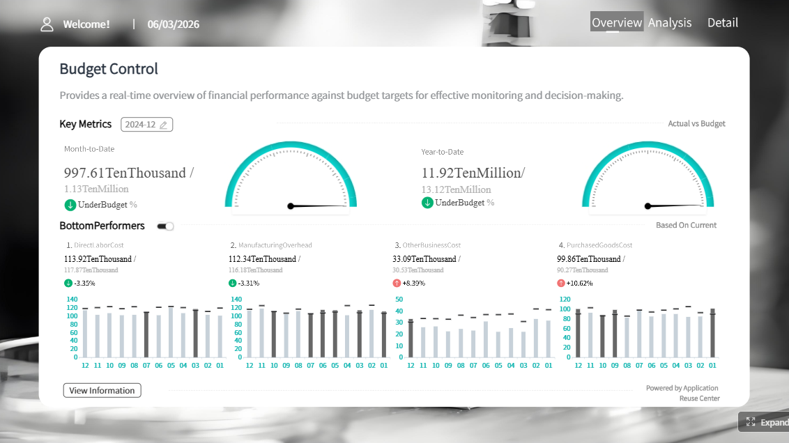
 FineReport's Chart Visuals
Design for clarity and trust
Decision-makers trust reports that are easy to read and hard to misinterpret.
Best practices include:
- Label axes and units clearly
- Keep scales consistent
- Remove decorative clutter
- Use color intentionally, not excessively
- Highlight exceptions, thresholds, and variances
- Show date range and filters
- Note calculation methods when definitions are not obvious
Good design is not just visual polish. It is a control mechanism against misunderstanding.
For enterprise reporting, trust also depends on consistent metric definitions. If “active customer” means one thing in sales and another in operations, the report loses credibility quickly.
Point out insights, not just numbers
The reader should not have to guess why a spike happened. Add concise annotations and callouts directly in the report.
Useful annotation examples:
- “Traffic spike driven by campaign launch on May 12”
- “Margin decline linked to discounting in Region East”
- “Support backlog reduced after workflow automation rollout”
- “Conversion dipped after checkout release update”
This is where data analytics and reporting becomes decision support instead of passive presentation.
Data analytics and reporting: where the line is and how the roles differ
Many teams use the words reporting and analytics interchangeably, but they serve different purposes. Knowing the difference improves ownership, workflow design, and stakeholder expectations.
Understand reporting vs analytics
Reporting focuses on what happened. It organizes data into structured outputs such as dashboards, recurring KPI packs, status summaries, and compliance reports.
Analytics focuses on why it happened and what may happen next. It explores drivers, patterns, scenarios, forecasts, and recommendations.
A simple example:
- Reporting: Website conversions dropped 9% this week.
- Analytics: The drop was concentrated in mobile users after a checkout UX change, with the largest effect in paid social traffic.
Another example:
- Reporting: Fulfillment time increased from 2.1 to 2.8 days.
- Analytics: The increase was driven by warehouse backlog on high-volume SKUs and labor constraints during peak shifts.
Both matter. Reporting creates visibility. Analytics creates understanding.
Know what data reporting analysts do
Data reporting analysts play a critical role in keeping business information accurate, accessible, and actionable. Their responsibilities often include:
- Gathering data from multiple systems
- Validating accuracy and resolving inconsistencies
- Maintaining recurring reports and dashboards
- Applying business rules and metric definitions
- Segmenting results by region, product, channel, or team
- Writing commentary for stakeholders
- Escalating anomalies or performance risks
The most valuable analysts combine technical skill with business judgment.
Common skills include:
- SQL for extracting and transforming data
- Spreadsheet modeling for validation and quick analysis
- Data visualization for dashboard and chart design
- Business context for turning numbers into decisions
- Stakeholder communication for presenting findings clearly
The best data analytics and reporting professionals do more than publish numbers. They shape how leaders understand the business.
Data analytics and reporting templates and final review checklist
A repeatable template saves time, improves consistency, and raises report quality across teams.
Simple executive summary template
Use this format when leaders need the essentials fast:
| Section | What to Write |
|---|---|
| Objective | What business area, period, or initiative the report covers |
| Key findings | The top 2 to 3 insights that matter most |
| KPI movement | Which KPIs improved, declined, or missed target |
| Major risks | What could affect performance if not addressed |
| Recommended actions | What should happen next and who should own it |
| Conclusion | One short takeaway sentence |
| Next step | One clear immediate action |
Example summary:
- Objective: Review monthly sales and operational performance for North America.
- Key findings: Revenue exceeded target by 4%, but order processing time increased 18%.
- KPI movement: Conversion improved, margin remained stable, backlog worsened.
- Major risks: Delayed fulfillment may increase cancellations next month.
- Recommended actions: Reallocate staffing to high-volume order queues and review warehouse bottlenecks.
- Conclusion: Growth is strong, but operational strain threatens service quality.
- Next step: Launch weekly backlog review with operations leads.
Full report template
For a complete data analytics and reporting document, use this structure:
- Title
- Reporting period
- Audience
- Business objective
- Data sources
- Methodology and definitions
- Executive summary
- Key findings
- KPI table
- Visual analysis
- Recommendations
- Appendix
This format works for monthly business reviews, operational performance packs, board updates, and department dashboards.
Review checklist before sharing
Before publishing or presenting the report, run a final quality review.
Final review checklist
- Accuracy: Are the numbers validated against source systems?
- Consistency: Are metric definitions aligned across teams and time periods?
- Relevance: Does every section support the original business question?
- Clarity: Are visuals easy to understand for non-technical readers?
- Context: Does each KPI include targets, baselines, or segment comparisons?
- Actionability: Are recommendations specific and owned by someone?
- Conciseness: Can executives get the main message quickly?
- Trustworthiness: Are date ranges, filters, and methods clearly stated where needed?
Best practices to implement data analytics and reporting effectively
If you want your reporting process to drive action instead of just distributing information, follow these field-tested practices.
1. Define the decision before you define the dashboard
Start with the operational or strategic decision. Then work backward to metrics, dimensions, and visuals. This prevents vanity dashboards and ensures every element has a purpose.
2. Standardize KPI definitions across departments
Create one shared definition for each core metric. This reduces conflict in meetings, avoids duplicate logic in spreadsheets, and improves executive trust.
3. Build role-based reporting views
Do not force the same report on executives, managers, and analysts. Create layered views: summary for leaders, diagnostic views for managers, and detail for analysts.
4. Automate recurring data refresh and distribution
Manual reporting creates delays, errors, and version-control issues. Automate data pipelines, refresh schedules, and distribution wherever possible.
5. Add commentary and alerts to highlight exceptions
Dashboards alone are not enough. Include short narrative commentary and threshold-based alerts so stakeholders know what changed and why attention is needed.
Build data analytics and reporting faster with FineReport
Building this manually is complex; use FineReport to utilize ready-made templates and automate this entire workflow.
For enterprise teams, the challenge is not just writing one good report. It is creating a scalable reporting system that combines trusted data, consistent KPI logic, executive-ready visuals, and repeatable delivery across departments. That is where FineReport becomes a practical advantage.
With FineReport, teams can:
- Build dashboard-driven reports faster with ready-made templates
- Standardize KPI definitions across business units
- Connect to multiple data sources for centralized reporting
- Automate recurring report generation and distribution
- Create drill-down views for executives, managers, and analysts
- Design clear visual layouts without relying on disconnected manual files
Whether you are producing monthly management reports, operational dashboards, or executive KPI summaries, FineReport helps reduce reporting effort while increasing consistency and decision speed.
The result is straightforward: less time spent compiling numbers, more time spent interpreting insights and driving action.
FAQs
Reporting shows what happened through current and historical performance metrics, while analytics explains why it happened and what is likely to happen next. Strong business reports usually combine both so stakeholders can act faster.
A clear report should include the business question, audience context, methodology, key findings, KPI results, supporting visuals, and recommended actions. This structure helps readers move from insight to decision without unnecessary detail.
Select KPIs that directly support the decision the report is meant to guide. Focus on a small set of performance, operational, customer, financial, quality, or risk metrics that can trigger action.
Start with the objective, then state the most important result, why it matters, and what should happen next. Keep it brief, specific, and written for the stakeholder’s level of detail.
Use visuals that make trends, comparisons, and variances easy to spot, such as KPI cards, bar charts, line charts, and variance views. The best chart is the one that makes the decision clearer, not the one that looks most advanced.


The Author
Yida Yin
FanRuan Industry Solutions Expert
Related Articles

Inventory Reporting: The KPI Framework That Prevents Stockouts, Overstock, and Margin Leakage
Inventory reporting is the operating system behind smarter replenishment, tighter working capital control, and more reliable customer service. For supply chain leaders, finance managers, and operations directors, the cha
Yida Yin
Jun 25, 2026

Best Oil and Gas Production Reporting Software in 2026: 7 Tools Compared for Operators
$1 is an $1 and dashboard platform that helps oil and gas teams turn production, operations, and business data into governed, shareable reports and real time $1. Best oil and gas production reporting software in 2026 at
Yida Yin
Jun 24, 2026

Environmental Social and Governance Reporting: A Step-by-Step Guide to Building an ESG Reporting Dashboard
Environmental social and governance reporting is no longer a side project for sustainability teams. It is now a management discipline that affects investor confidence, regulatory readiness, capital access, brand trust, a
Yida Yin
Jun 23, 2026